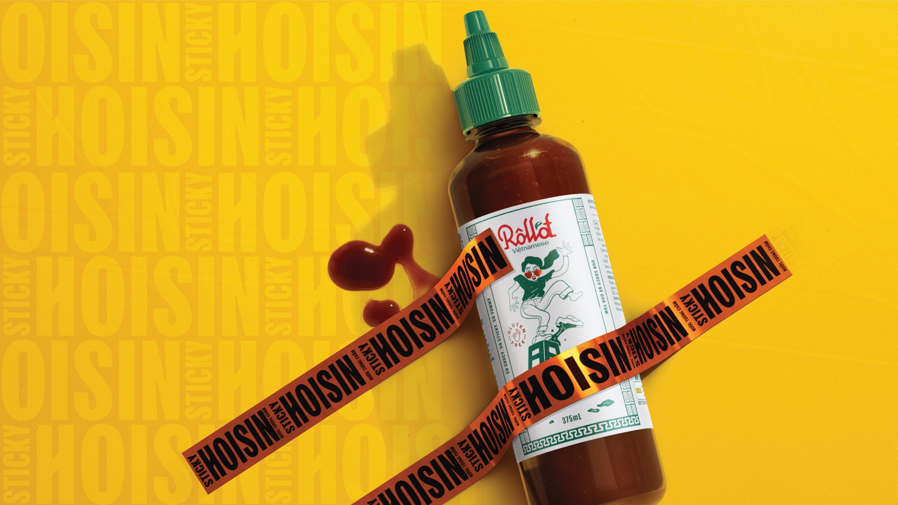
For years, Roll’d has been serving up fresh and fast Vietnamese food in over 100 restaurants across Australia. Hungry for more, they set the wheels in motion to launch a Roll’d retail range.
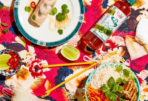
With everything from rice paper and vermicelli noodles to rolling trays and sauces, the range had everything you’d need to get rolling at home, Roll’d style.
the thrills™ were engaged to create the visual identity and craft the packaging. The challenge being to ensure the designs would stand out on shelf as unequivocally Roll’d and inspire a consumer appetite to recreate the famous dishes themselves.
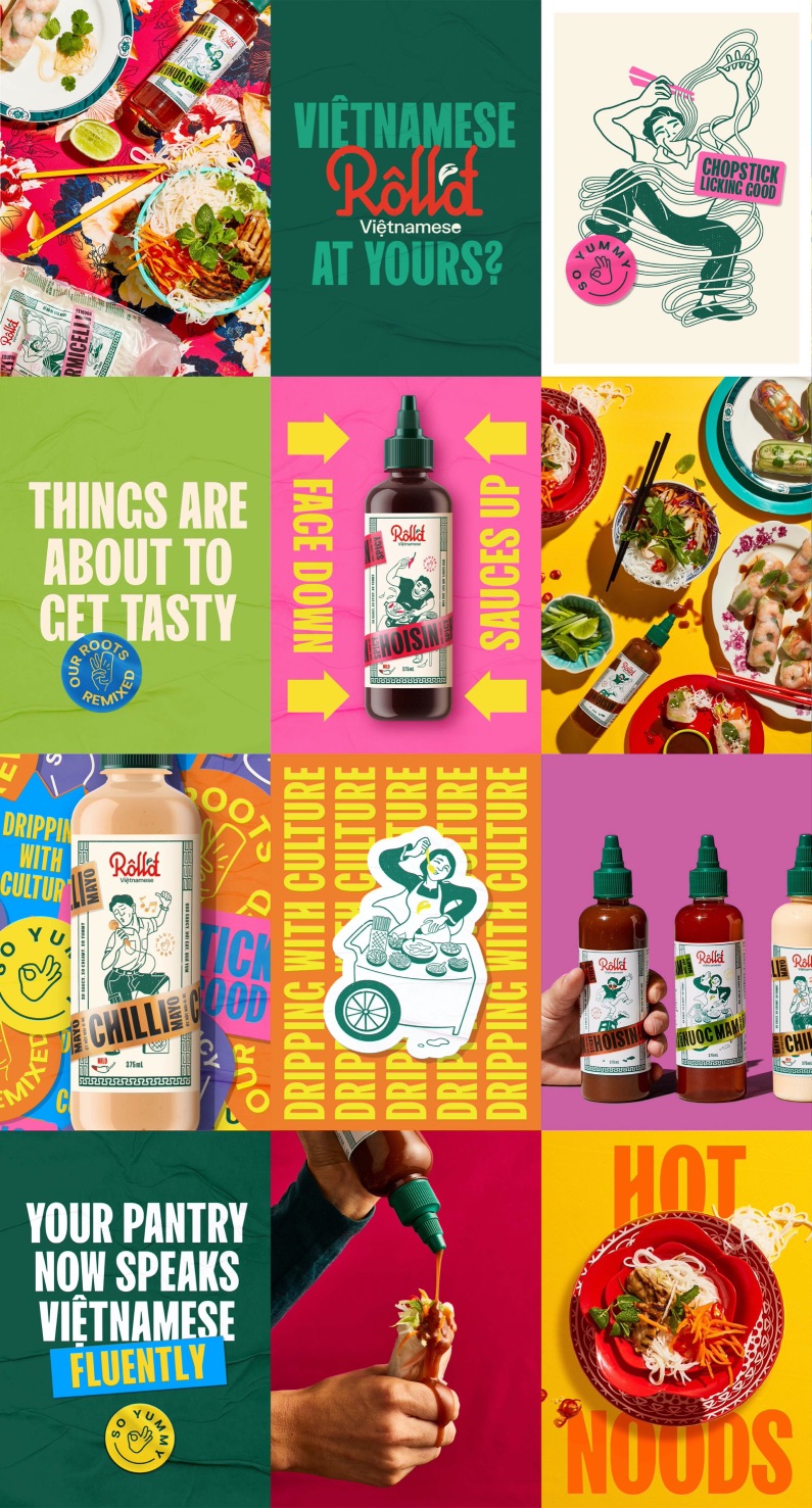
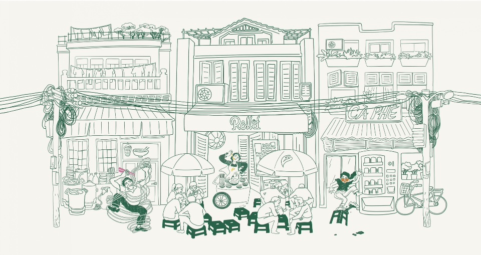
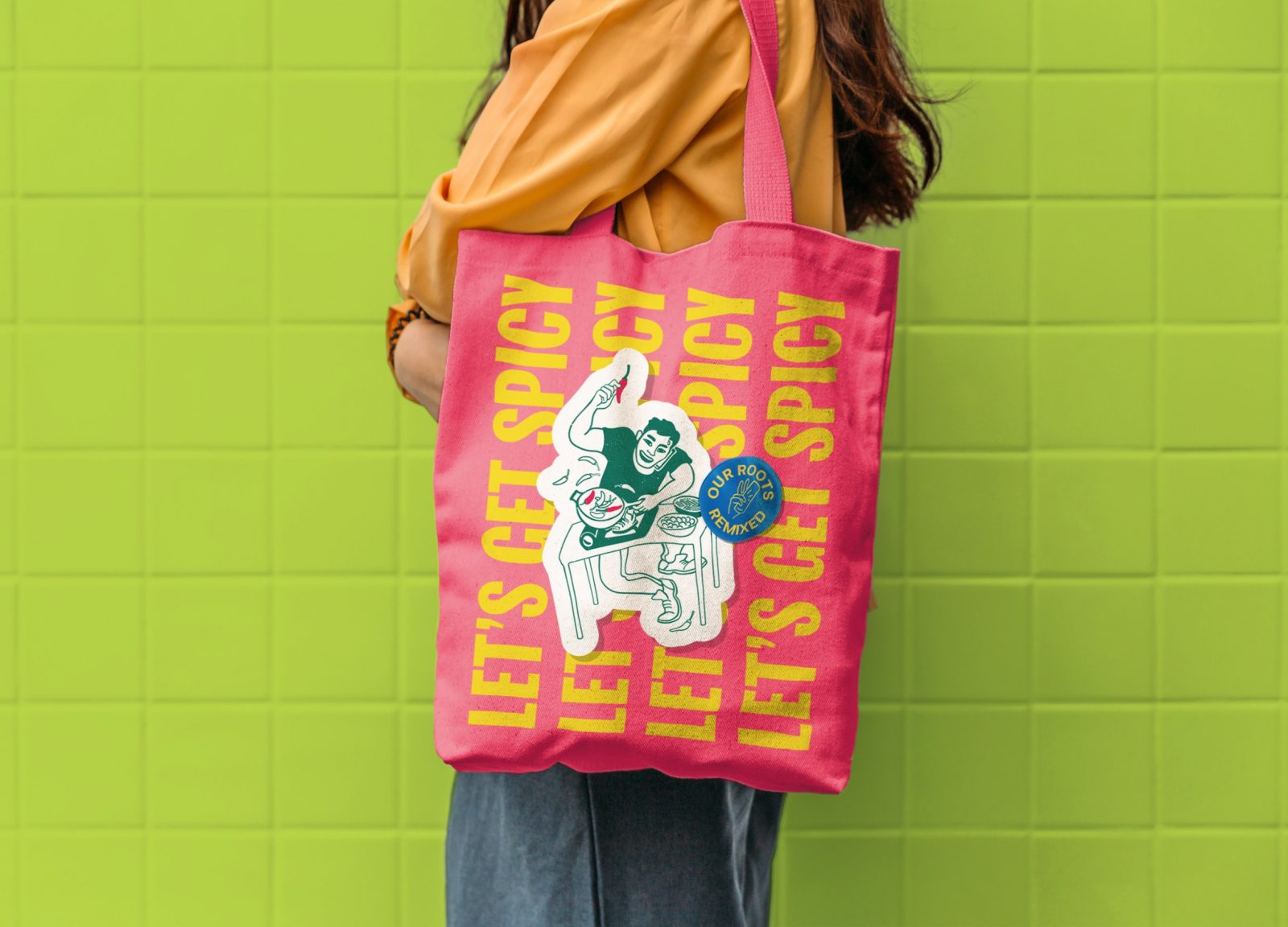
The conceptual idea was ‘our roots remixed’. A fusion of traditional Vietnamese culture and the modern Australian lifestyle, where food acts as the ultimate societal unifier. So, it was crucial that our designs captured the brand’s heritage in a way that was authentically Vietnamese yet accessible enough to appeal to the contemporary Australian consumer.
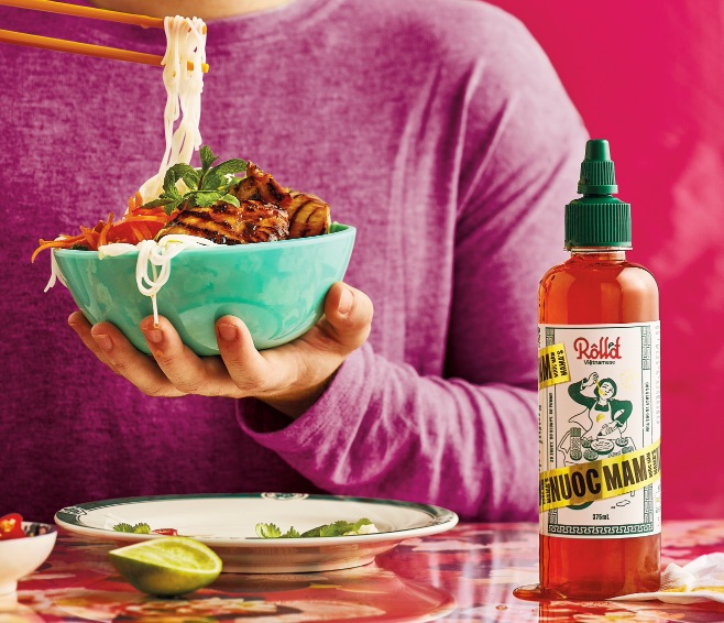
We chose transparent packaging to hero the products and highlight the realness of the ingredients. And make a statement about Roll’d finally sharing its ‘special sauce’ with the public.
On the label, we infused the brand’s beautiful tones and patterns in an imaginative way, proudly representing Vietnamese culture through distinctive semiotics. Disrupted by a colourful tape element across every product to signal varianting in a bold way.
Part of that process was building distinct and memorable assets. Ones that could stretch across the whole range of Mama Hoang’s delicious recipes. And across any future products.
To inject more vibrancy and personality into the designs, we created distinctive characters that represented the real multi-generational Hoang family behind the brand. At the centre of the story is one of the founders, Bao Hoang. And his insatiable appetite for sharing his family’s recipes. Tried and tasted over generations. To bring them to life, we engaged an Australian-Vietnamese illustrator whose unique insights helped us capture authentic cultural nuances, from fashion accessories to quirky personalities and product attributes.
Finally, we included pack copy in both English and Vietnamese, leveraging language as a tool to highlight the coming together of cultures and signal the authenticity of the recipes and flavours within.
The identity was designed to encourage and empower Australians everywhere to bring the real flavours of Vietnam into their home. And with $1 Million retail sales value brand within first 4 months post launch, exceeding its own planned targets.
What we did
Visual Identity, Illustration, Packaging design
Effective feels like this
$1 Million retail sales value brand within first 4 months post launch
2 weeks national media through Coles ‘what’s for dinner’ campaign
“the thrills™ demonstrated great partnership throughout and their experience helped us delivered an exceptional result for our first venture into grocery supermarkets.”
Rachel Estlin | Head of Marketing
CREDIT
- Agency/Creative: The thrills
- Article Title: Roll’d Vietnamese Packaging Design by The Thrills
- Organisation/Entity: Agency
- Project Type: Packaging
- Project Status: Published
- Agency/Creative Country: Australia
- Agency/Creative City: Australia
- Market Region: Global
- Project Deliverables: Packaging Design
- Format: Bottle
- Substrate: Plastic
- Industry: Food/Beverage
- Keywords: WBDS Agency Design Awards 2021/22
-
Credits:
Managing Partner: Kate Richardson
Creative Director: Paul Greskie
Designer: Ania Drozd
Designer: Jas Tsan
Production: Rob Jeary
Illustrator: Matt Huynh
Managing Partner: Rick McEvoy


