


Naming is very simple in the project, we use the real product name to the project. Naming is very simple to read and write too.
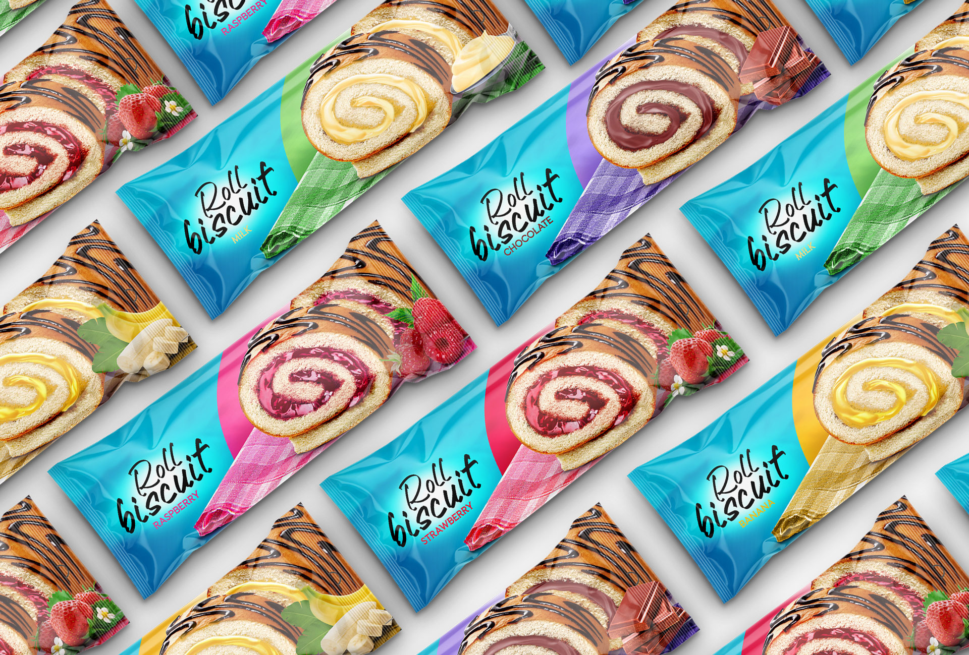
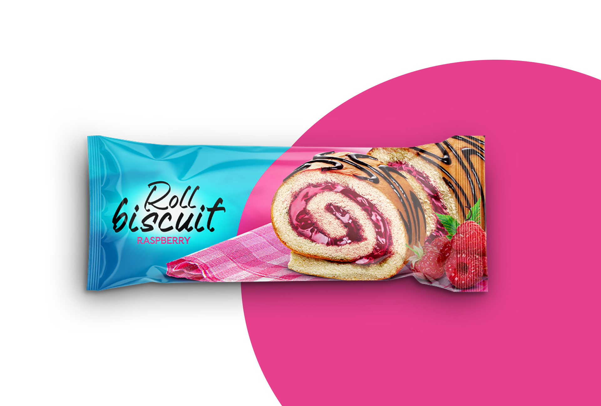
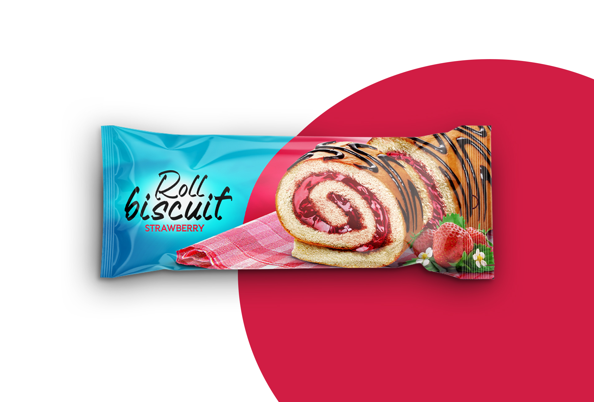
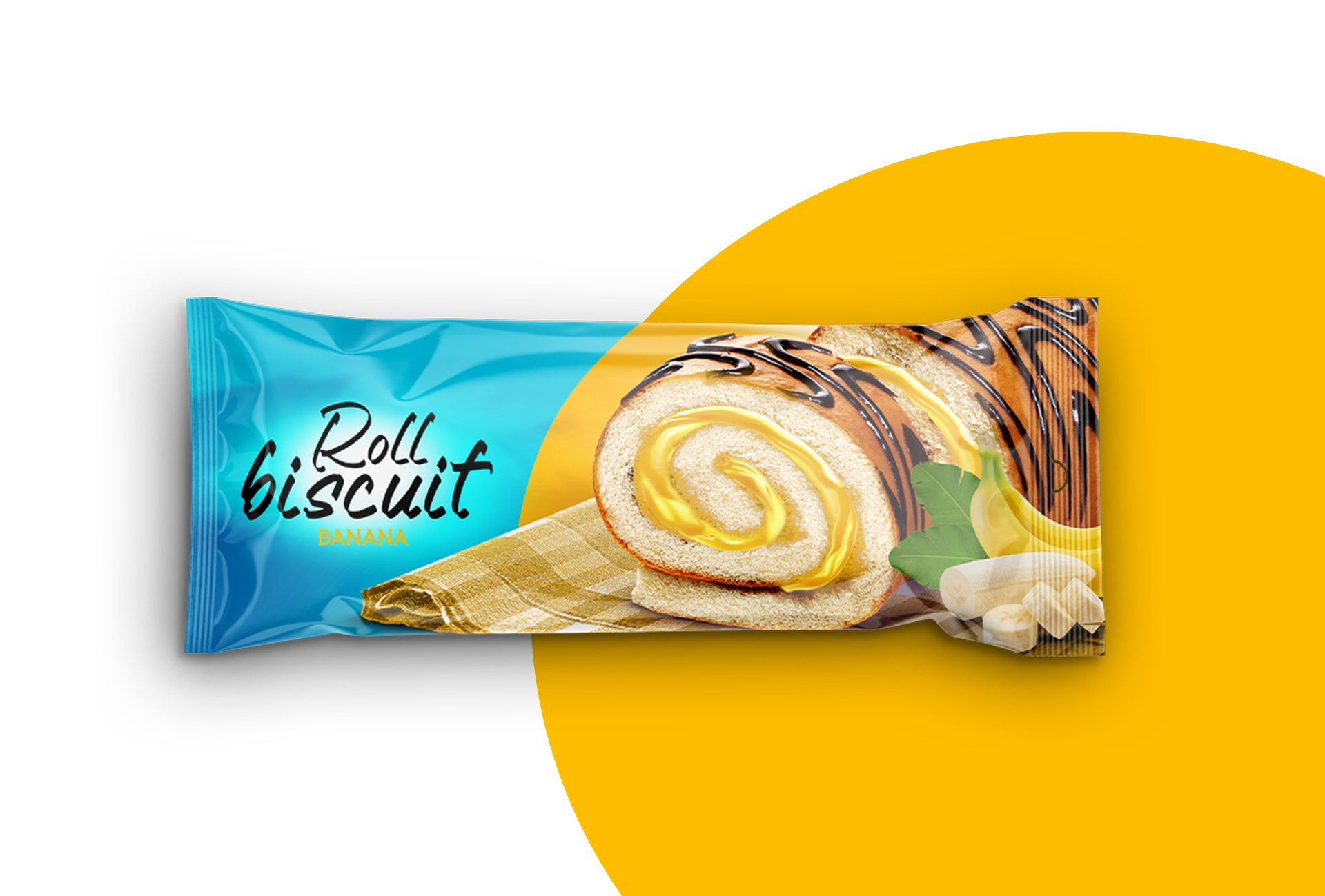
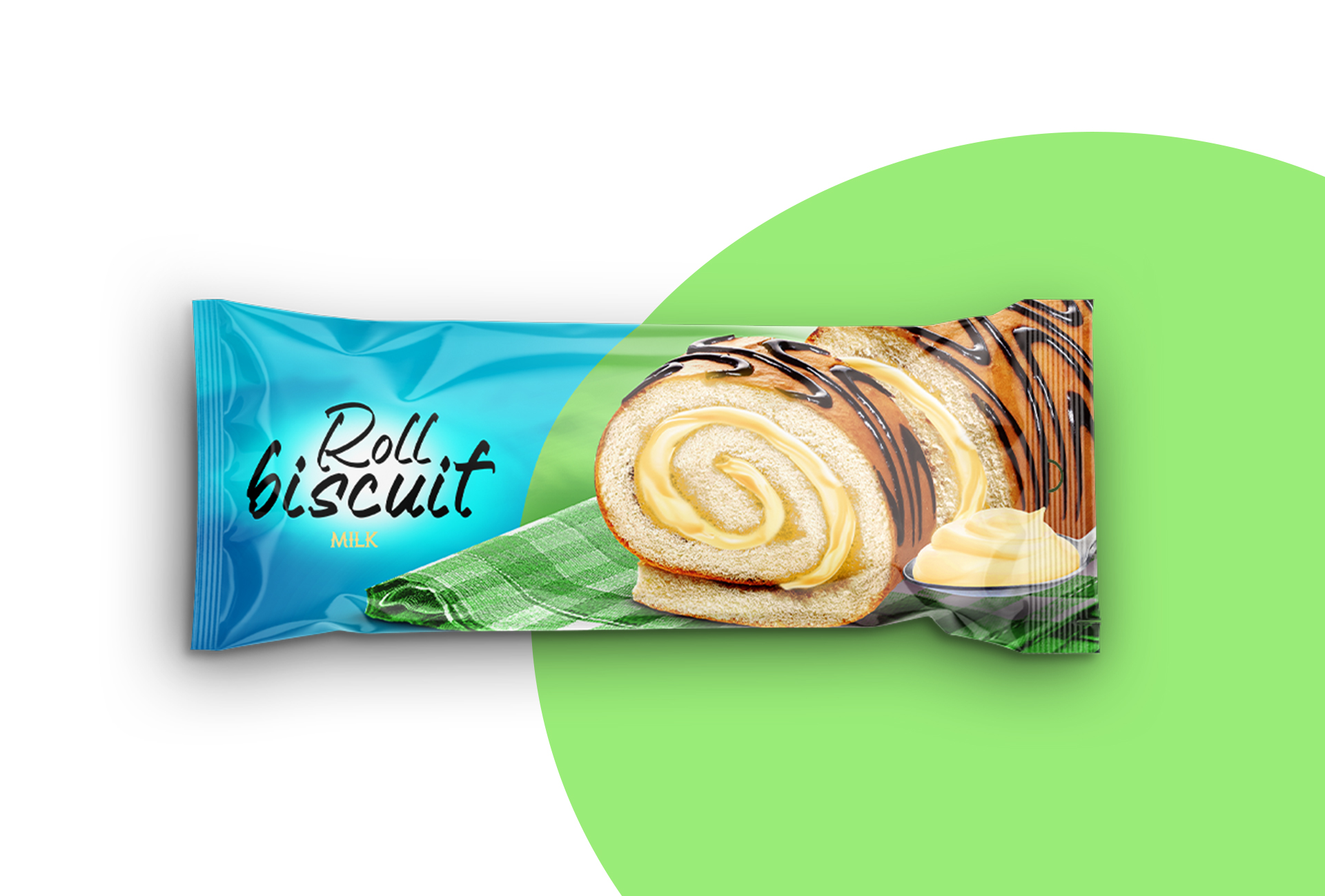
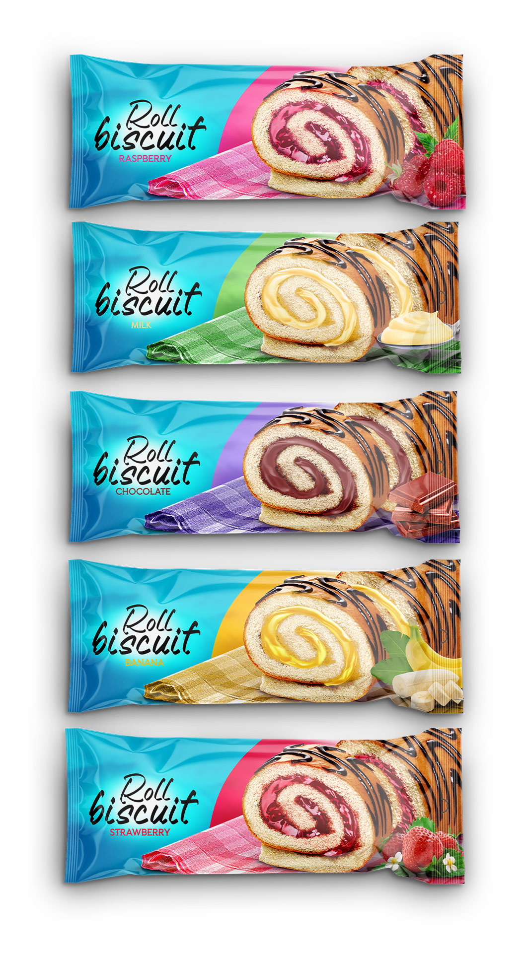
Packaging is the most active thing for selling, we show the product overview in each pack, and each product shows us which product or food is in it. We use a manipulation design style for packaging!
Color is the most common thing in this project! We must use contrasting colors to show our product is awesome! Our primary color is light blue! Light blue’s meaning is peace and it hasn’t got dangerous! And we use contrasting colors to divide our products and background!
Typography: Fonts is similar to soft dessert and it has a very cool meaning we use two types of fonts the fist type is handwritten, the second type of font is decorative font styles
Branding: At launch, four flavors were created, with a simple color coding. The color of the flavor and the color of the product inside cup. With a simple construction where the brand’s logo remains a predominantly black and white identifier, new flavors in the brand’s lineup will easily emerge in the future. The design can be easily inserted into any other media: bags, posters, brand advertising. By simply changing the color background, a branding system was developed for different advertising media.
Memorablitiy: The design is built on a contrasting product, which makes it easy to remember, even with a multi-colored background of roll biscuits. The bright display of colored products also favorably emphasizes the design of the brand logo and its quick memorization.

CREDIT
- Agency/Creative: Daler Xusinov
- Article Title: Roll Biscuit Packaging Design
- Organisation/Entity: In-House
- Project Type: Packaging
- Project Status: Non Published
- Agency/Creative Country: Uzbekistan
- Agency/Creative City: Tashkent
- Market Region: Asia
- Project Deliverables: Packaging Design
- Format: Pouch
- Substrate: Plastic
- Industry: Food/Beverage
- Keywords: roll biscuit, packaging design
-
Credits:
Graphic Designer, Art Director: Daler Xusinov


