


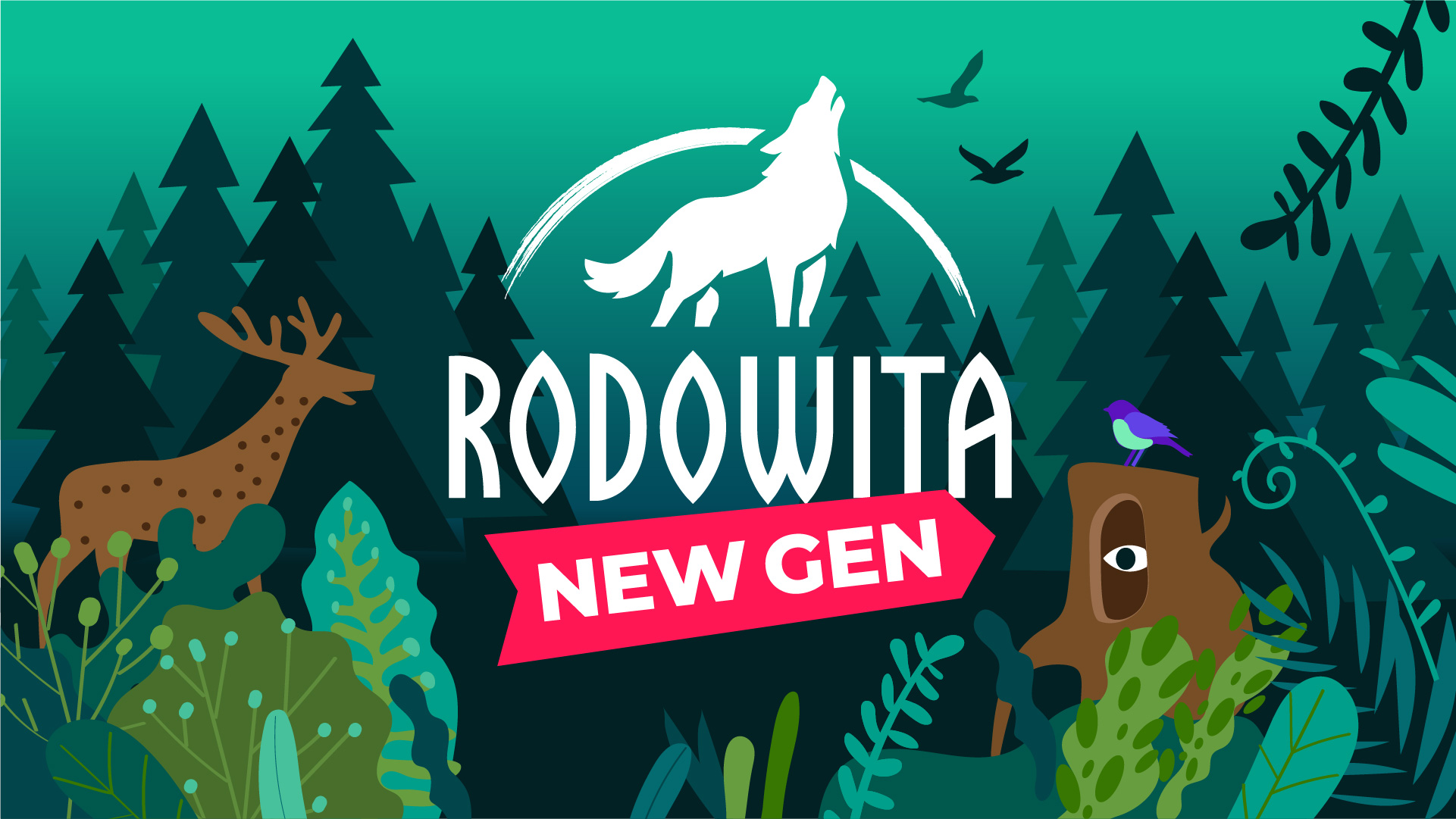
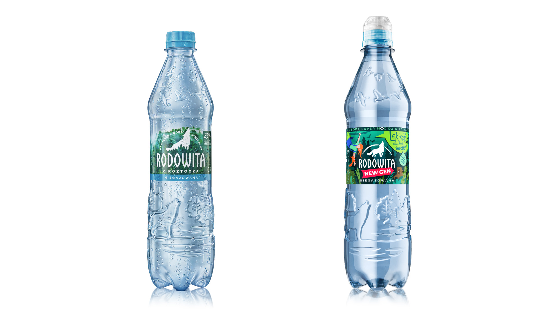
Rodowita Z Roztocza is a natural mineral spring water. Also, it is a team that extracts this water and bottles it in the wilderness untouched by civilisation in the Southeastern highlands of Poland. Rich in natural minerals, the water has a balanced formula, making it ideal for everyday consumption for many people. Therefore, the parent brand Rodowita approached us to create a teenager-focused sub-brand. Was usual, having the existing brand logo and thematic natural embossing on the bottle was a must.
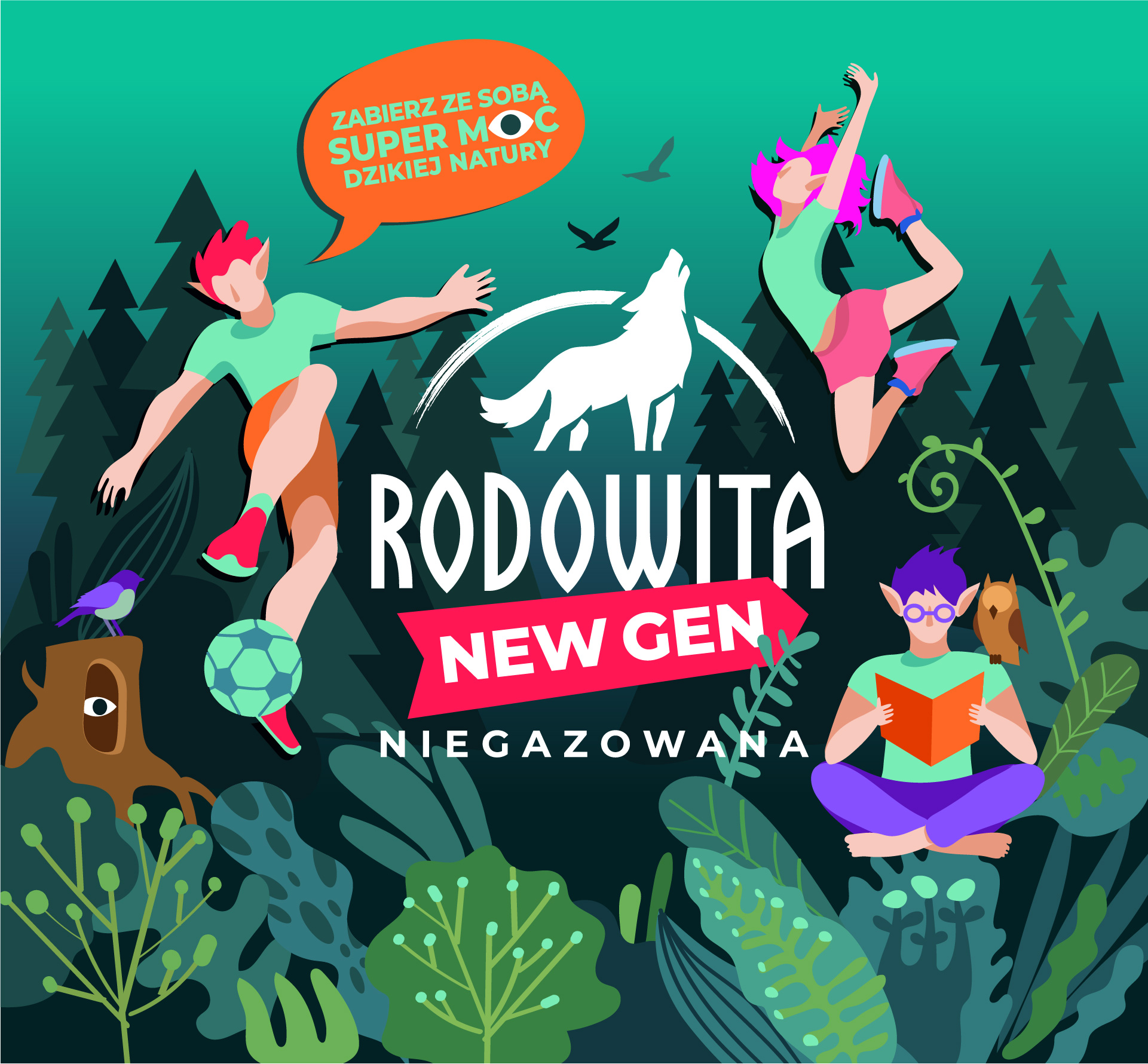
In the beginning was the word, –so the project’s first stage was finding a name for the new product line as well as a slogan that would later be translated into a design concept. What was our line of thinking? Wild nature, wild water, wild youth—these are all full of explosive energy. NewGen—short for New Generation—works on two levels: “the new generation of water” and “the water for the new generation.” The slogan “Take the superpower of wild nature with you” amplified the parent brand’s global message and set the tone for an entire story about the superpowers of magic forest dwellers.
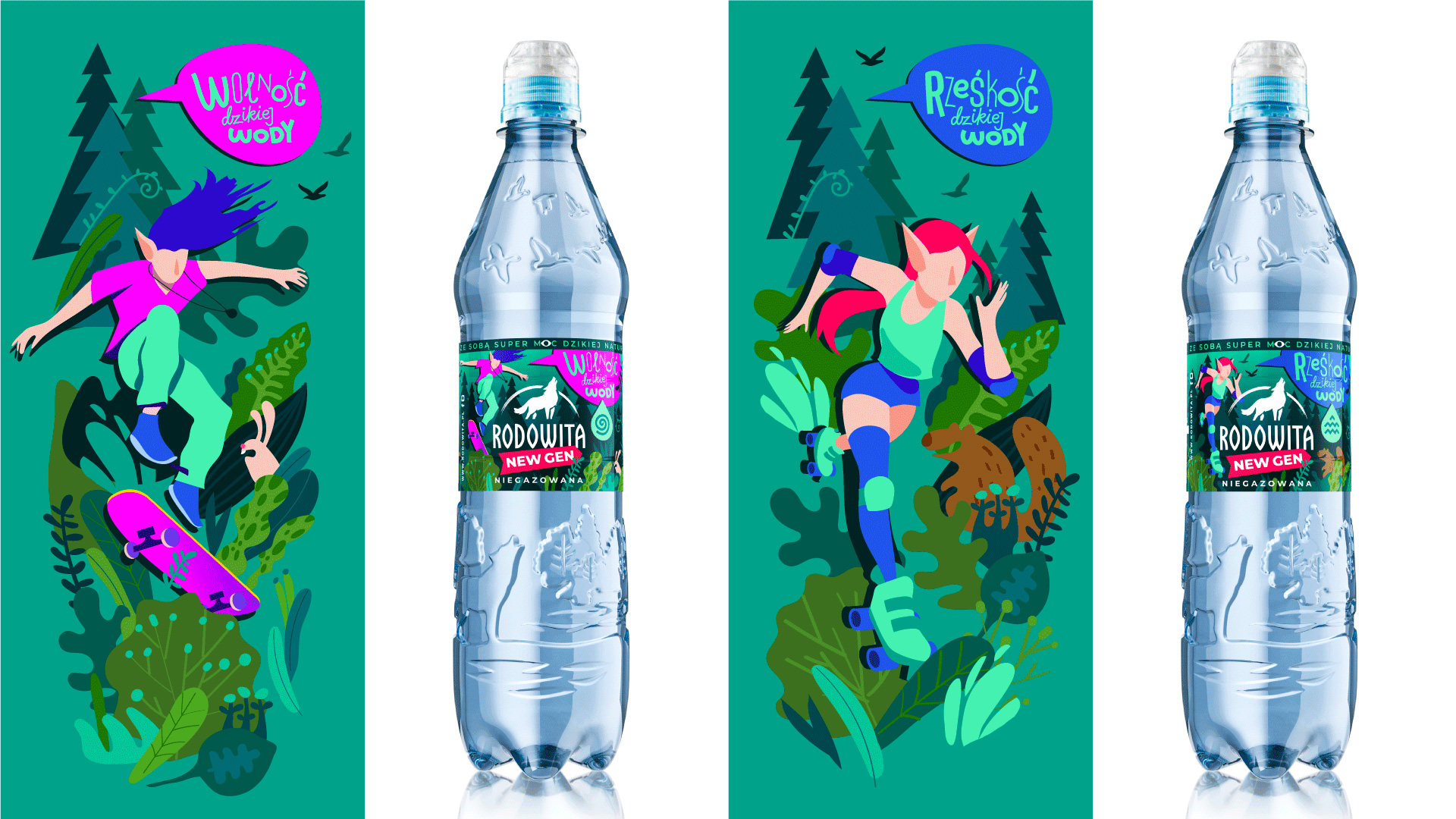
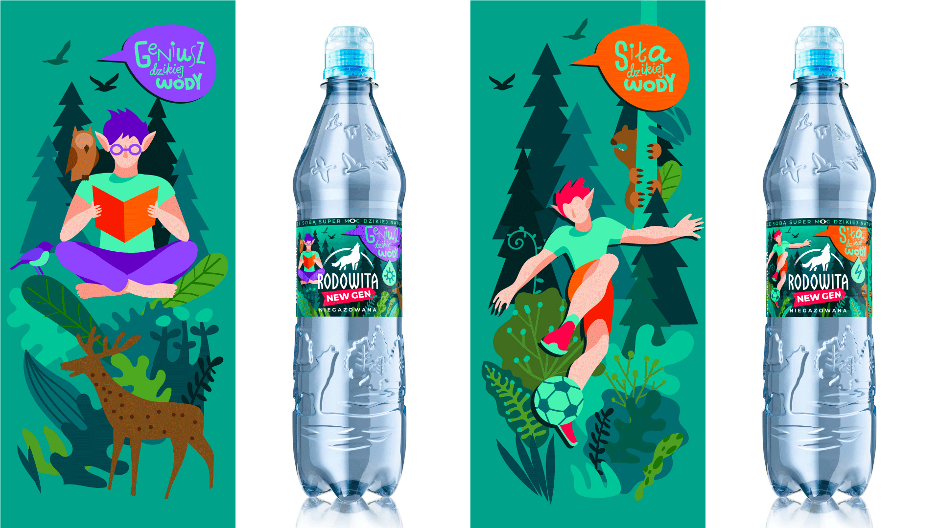
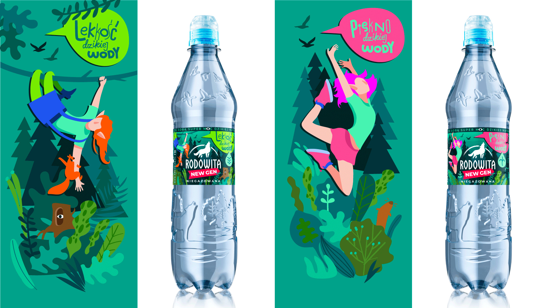
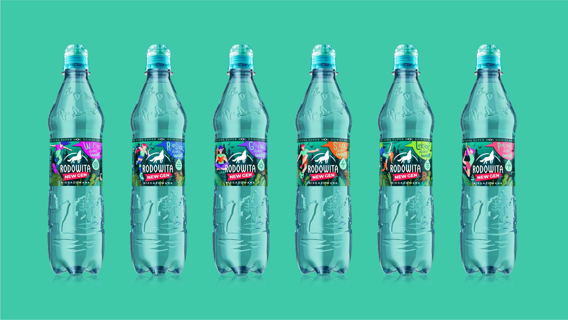
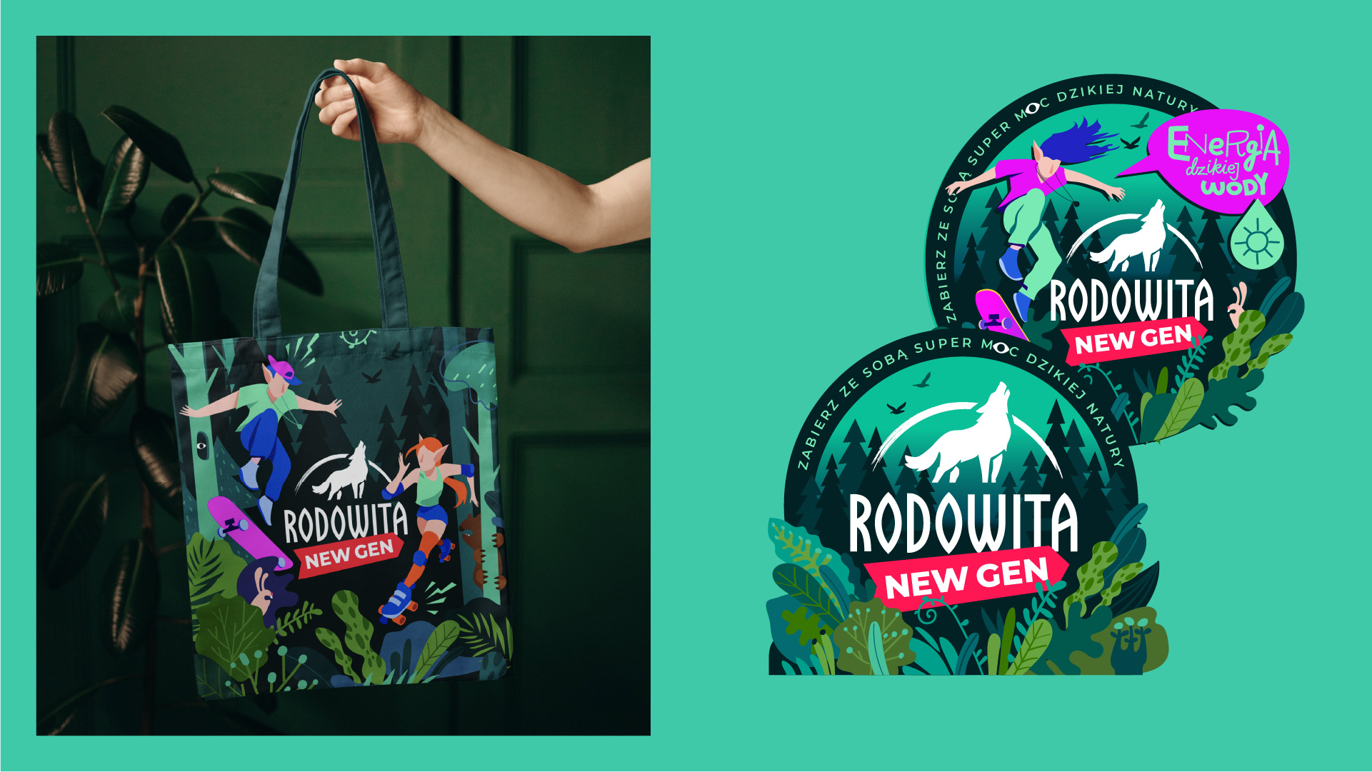
Who are they? Teenagers, boys and girls, half-children and half-elves. Each has their own preferences and lives in the global world as well as in the world of their fantasies. We decided to stray from the “water for sports” direction, as teenagers lead very different lifestyles. At the same time, Rodowita, with its energizing flavor, had to appeal to everyone. This water born in the primal forest gives anyone the superpower they desire the most: freedom, freshness, wisdom, strength, lightness, or beauty.
The drop of superpower transformed not just into a vivid bubble and icons system echoing ancient runes, but a full-fledged product line of 6 SKUs and various characters and stories. The overall tonality of the illustrations combines the characters’ vivid contemporary urban style with a hint of gothic style in the parent brand’s logo and the saturated, lively atmosphere of an almost magical forest.
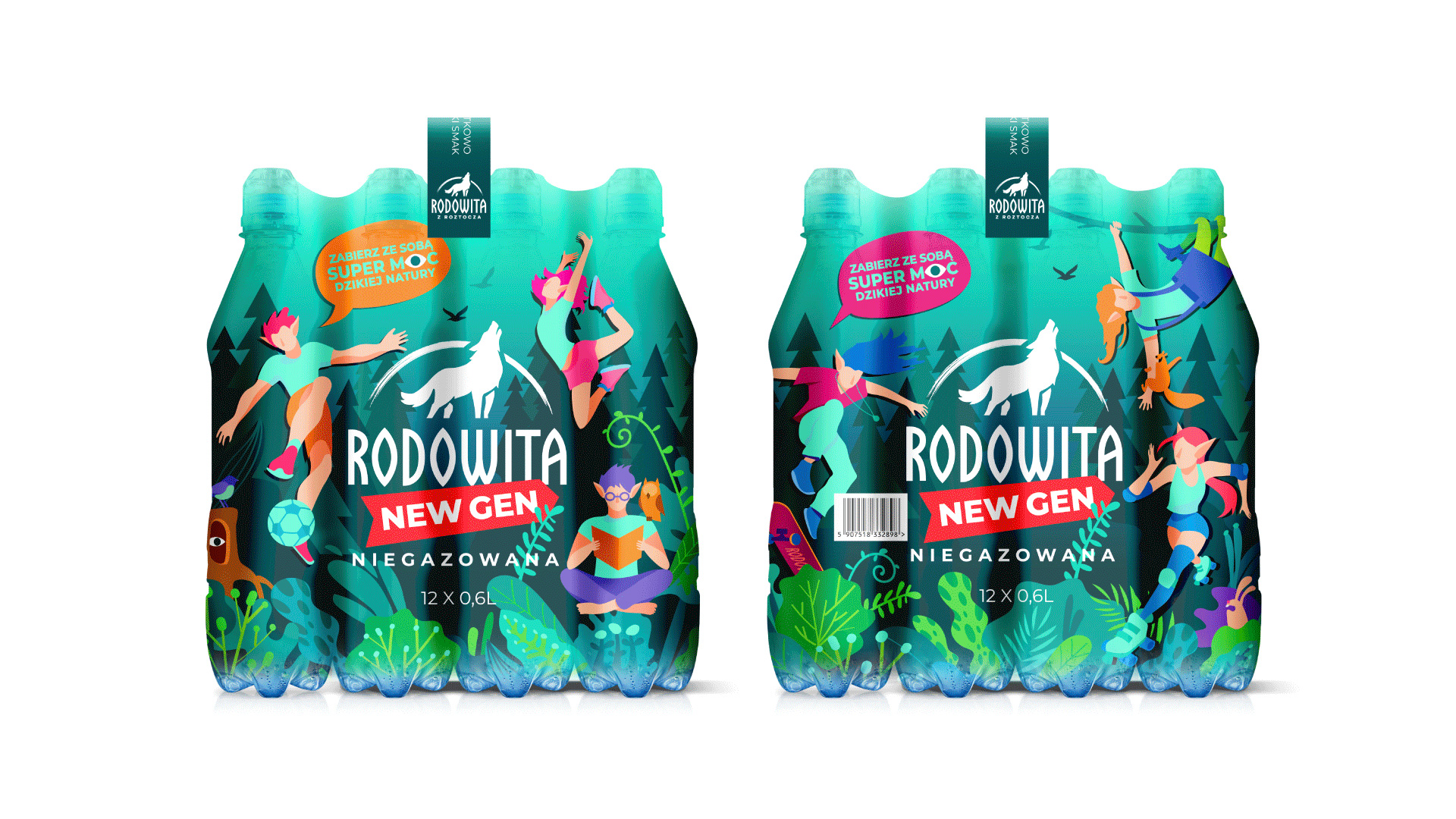
The forest became not just a place but the central character and the brand’s environment. We made a point of distancing ourselves from the typical imagery of rivers, lakes, and other bodies of water, as Rodowita is taken from an underground mineral water spring at the heart of the forest. Therefore, our water translates in another, truly natural way—through the dew on the grass, mountain mists, and such. Our forest is also full of animals and birds fondly interacting with city teenagers. We took all these stories and put them on a large print spanning 12 bottles.
Which Superpower do you want? Freedom or wisdom? Strength or beauty? Pick yours. Or, better yet, choose something new. We talk to consumers about it with teenager merch and digital advertising.

CREDIT
- Agency/Creative: Dozen Agency
- Article Title: Rodowita Z Roztocza Natural Mineral Spring Water Brand and Packaging Design by Dozen Agency
- Organisation/Entity: Agency
- Project Type: Packaging
- Project Status: Published
- Agency/Creative Country: Poland
- Agency/Creative City: Warsaw, Kyiv
- Market Region: Europe
- Project Deliverables: Character Design, Illustration, Logo Design, Packaging Design
- Format: Bottle
- Substrate: Fabric
- Industry: Food/Beverage
- Keywords: design, water, packaging, Poland, Ukraine, illustration
-
Credits:
Art director: Elena Tverdokhlib


