


Summer is here in the UK and it’s the perfect time to announce that Family (and friends) have been helping Rocks Squash create a strong brand refresh, built around the proposition of ‘Refreshingly Liberating’ Drinks.
A simple combination of whole fruit, natural sugar and imagination is all that goes into Rocks squash- liberated from rubbish and liberating for consumers looking for honest family refreshment, who see the direct relationship between what they put into their bodies and how they feel.
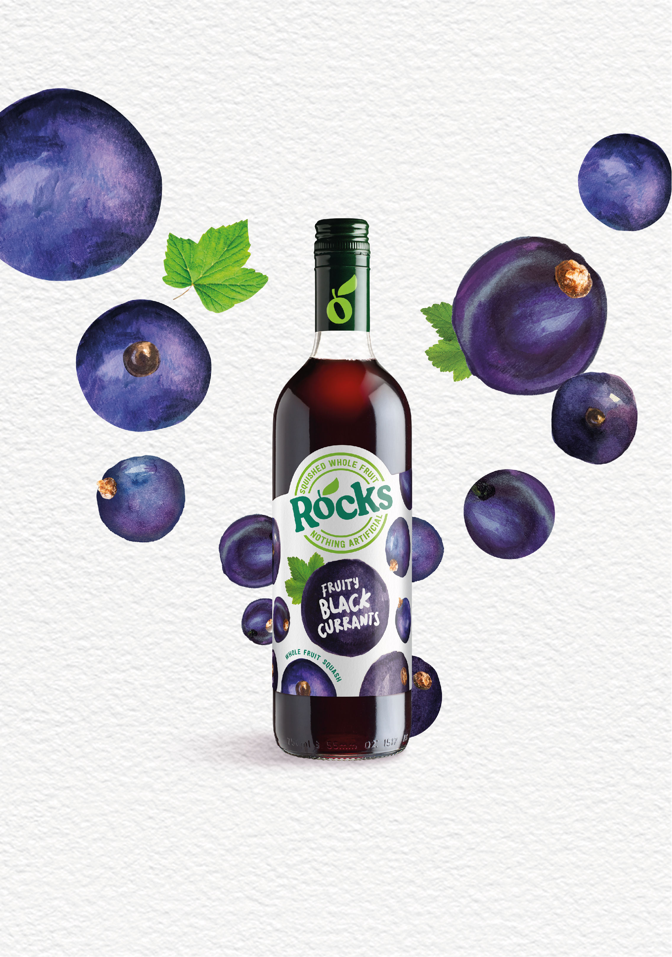
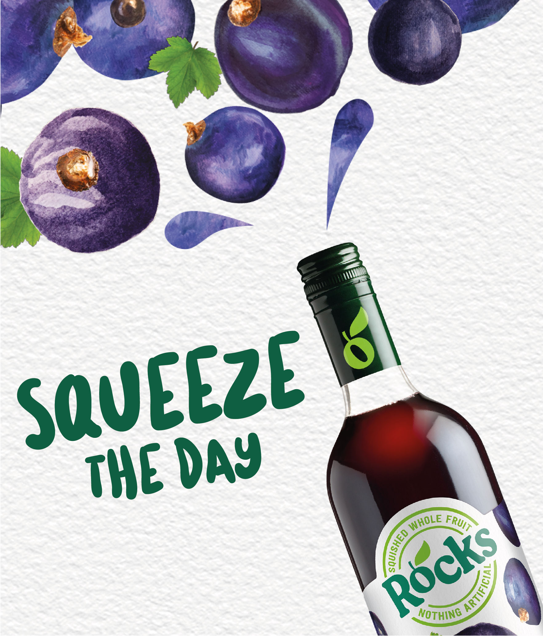
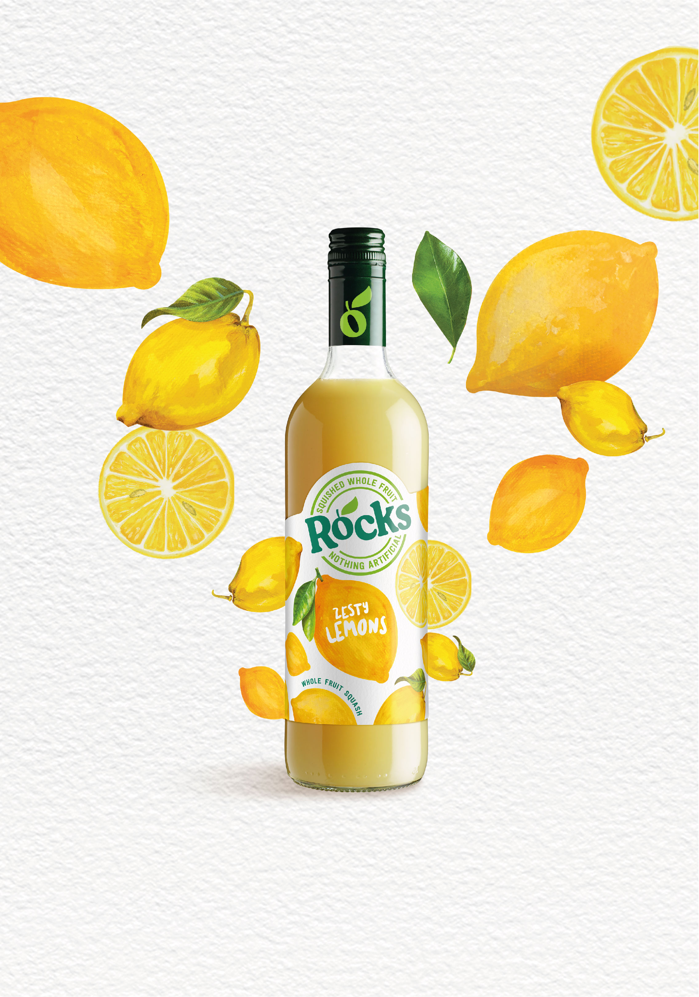
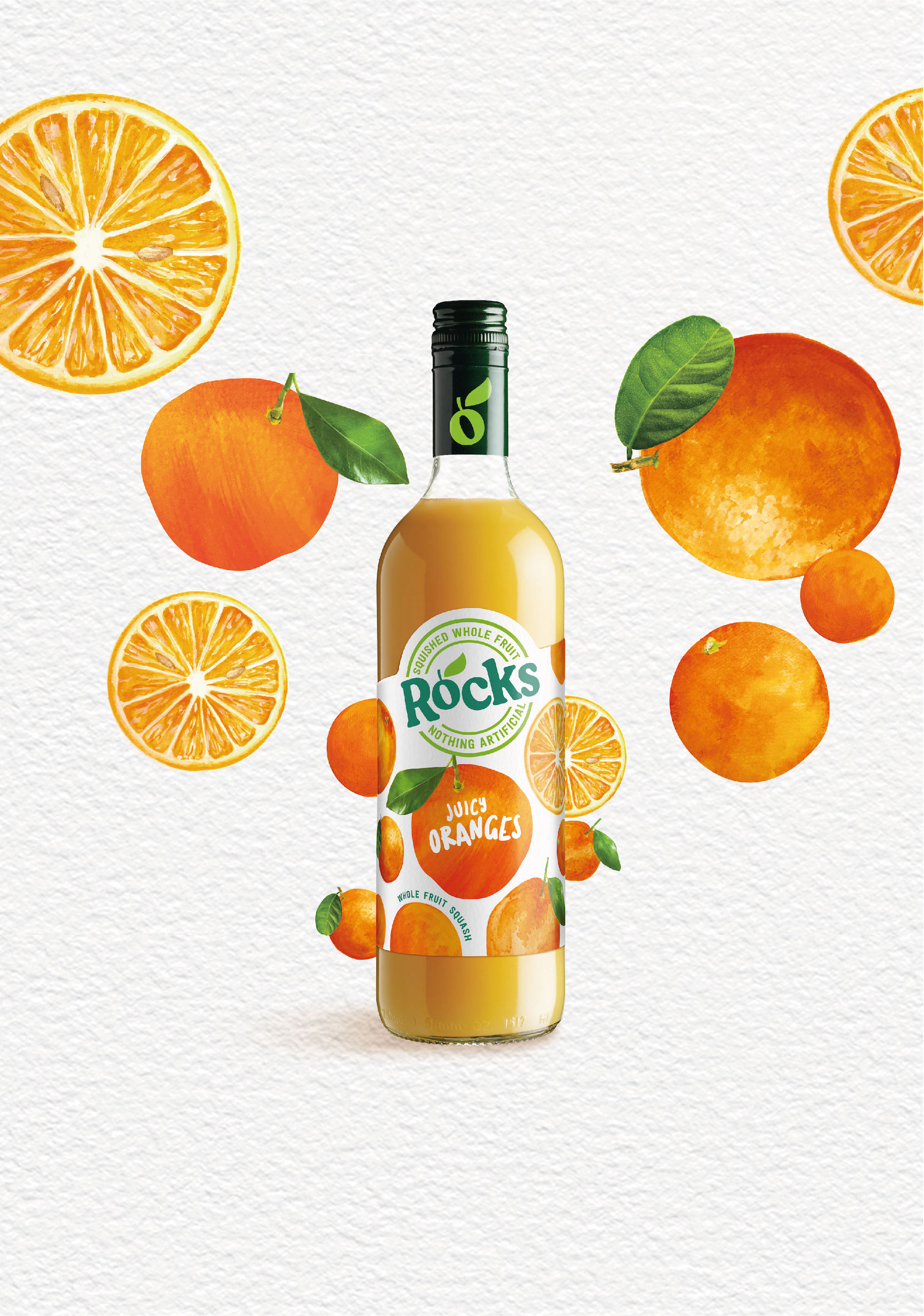
Rocks squashes use a blend of just three totally natural ingredients; whole fruit, real cane sugar and Devonshire spring water. Authentic, simple squash – and always bottled in glass.
Hugh Rock developed the first Rocks squashes & cordials back in 1981 in the family farm. The aim was to produce drinks that everyone could enjoy in response to consumer concerns about the quality of soft drinks, avoiding the long list of chemicals found in many other brands. A brand ahead of its time, in fact.
Now part of the SHS Group, Rocks wanted to reinforce their natural credentials and emphasise its all-family appeal. Family (and friends) have helped the brand re-craft its visual identity, packaging, brand tone of voice and messaging carried across social media and web.
At point of purchase, the refresh aims to bring to life the simplicity of ingredients and the boldness of flavour; with naturally styled fruit illustrations bursting out of the label, whilst avoiding all the slick photoshopping typically found in the soft drinks aisle.
The range comes in 3 varieties- blackcurrant, orange and lemon- and is available in retailers including Sainsbury’s, Waitrose and online via Ocado, but is also very popular with independent delis and cafes.
“An important part of the brand refresh meant looking and feeling like a premium, natural, wholesome family option, not positioned as a ‘kiddie’ squash brand” says Derek Johnston, head of strategy at Family and friends.
“This refresh comes at a good time – the cost-of-living crisis is leading less footfall in bars and cafes, so more people are seeking a posher, premium drinks experience at home and at summer BBQs etc”.
The marketing team at Rocks said this of the project:
“Rocks is a special brand that stands very strongly for delicious taste from natural, whole fruits that are free from any artificial ingredients – and this is really important to our consumers, too. We wanted the packaging to reflect this and provide that strong, natural reassurance, so we’ve brought all the fruits front and centre of pack and cleaned up the design to make it look simple and delicious.”
About Family and friends. Creating Healthy and Happy Brands™
We specialise in food, beverage, and lifestyle branding, creating and transforming ethically driven and sustainable brands for commercial success. Healthier and happier brands for business, consumers, and our planet.
CREDIT
- Agency/Creative: Family (and friends)
- Article Title: Rocks Squash Refreshingly Liberating Drinks
- Organisation/Entity: Agency
- Project Type: Packaging
- Project Status: Published
- Agency/Creative Country: United Kingdom
- Agency/Creative City: London
- Market Region: Europe
- Project Deliverables: Brand Identity, Brand Tone of Voice, Packaging Design
- Format: Bottle
- Substrate: Glass Bottle
- Industry: Food/Beverage
- Keywords: Natural, Fruit Squash, Family drinks, brand refresh, bottle design, beverage
-
Credits:
Strategy Director: Derek Johnston
Creative Director: Alex Durbridge
Senior Designer: Dina Hassan
Illustrator: Harriet Stansall


