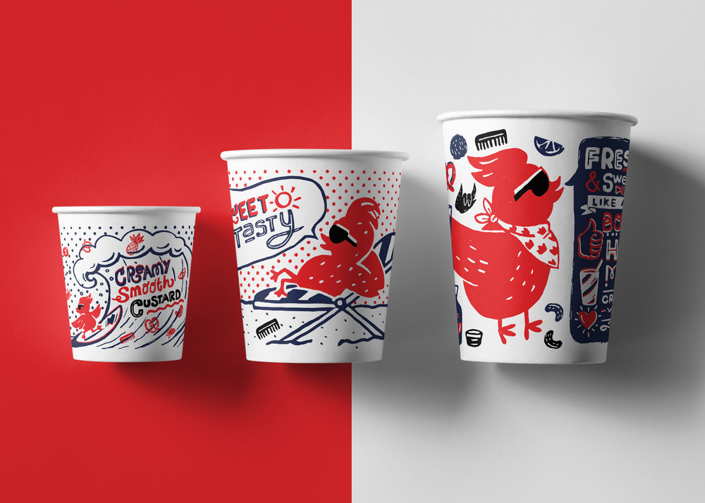
Eme Design Studio – Boss Chicken
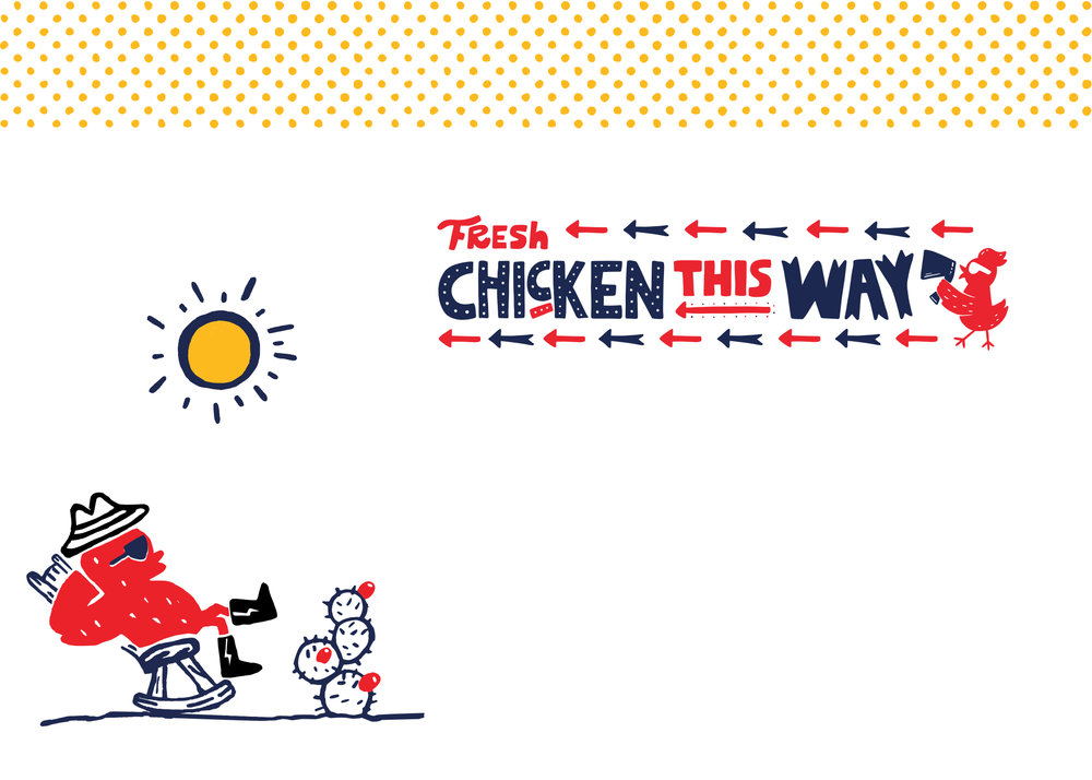
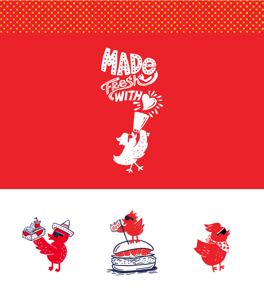
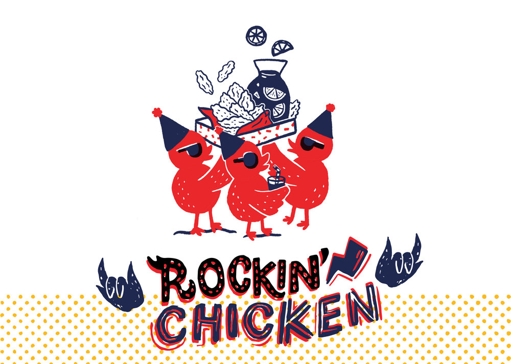
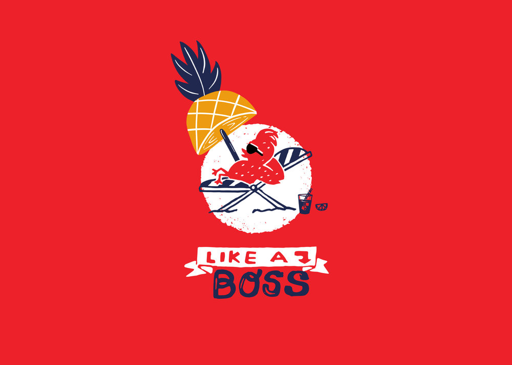
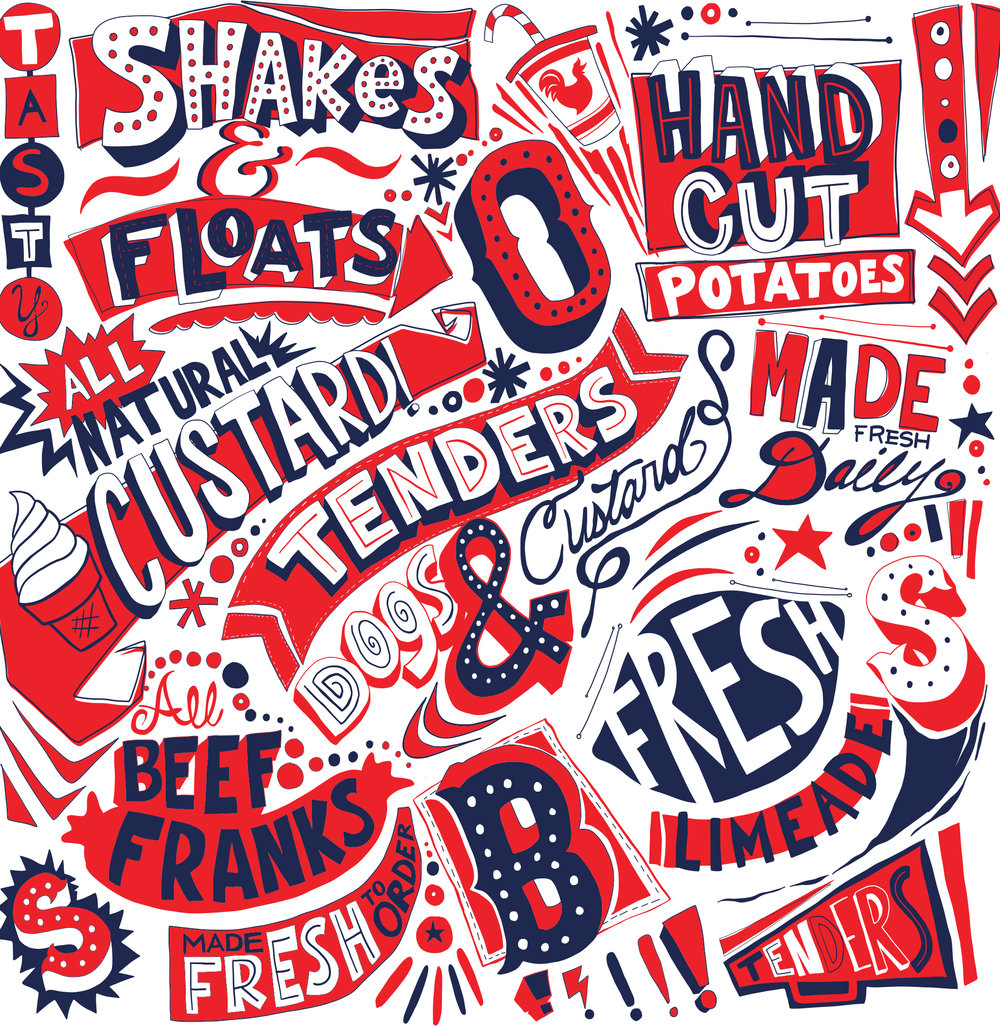
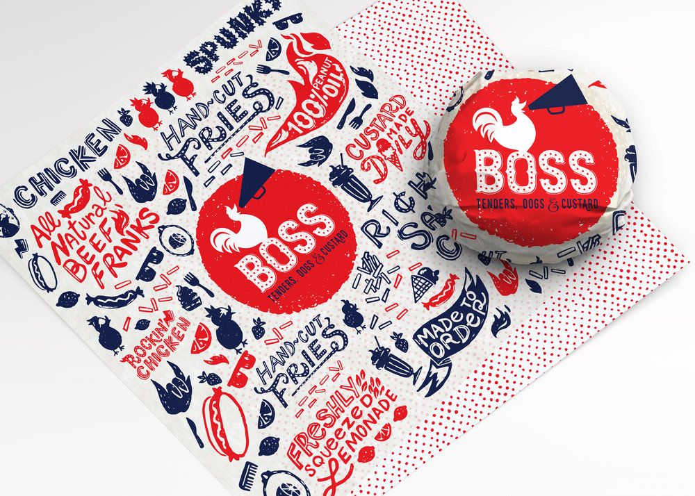
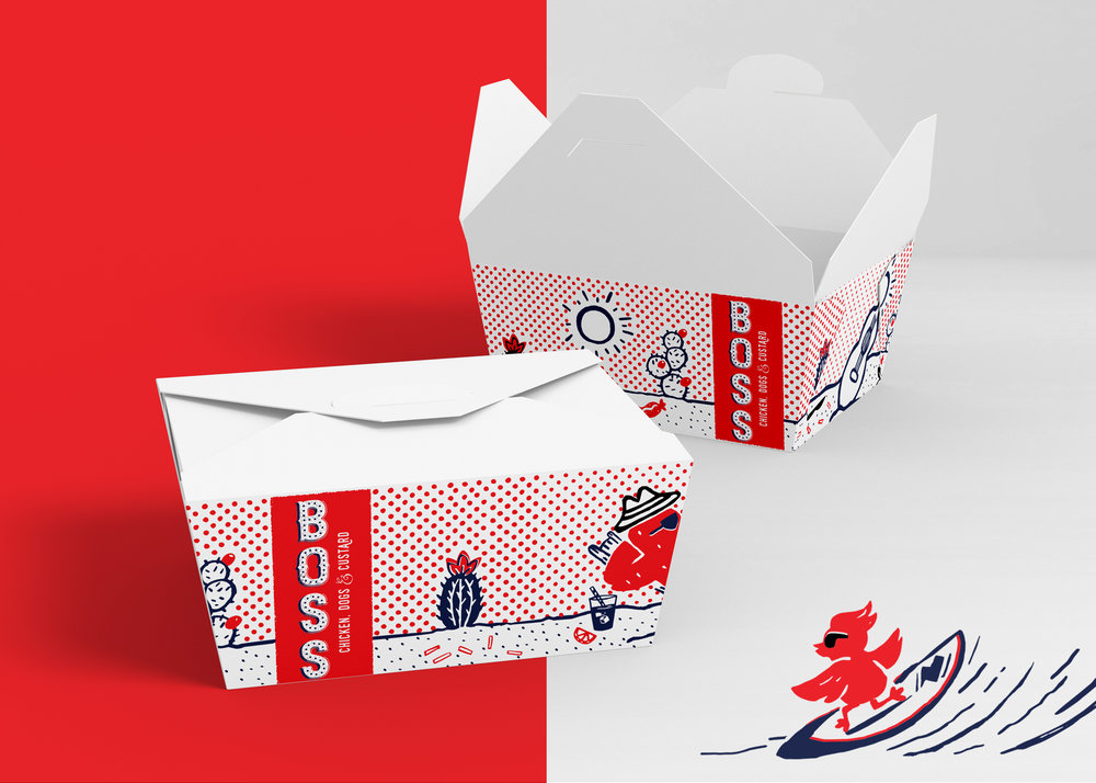
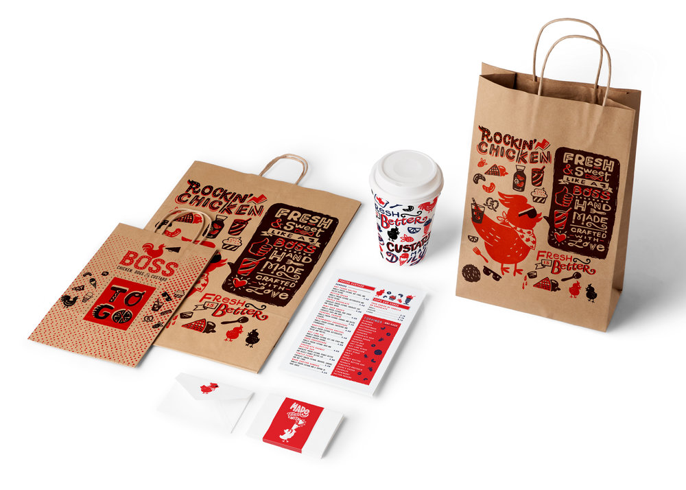
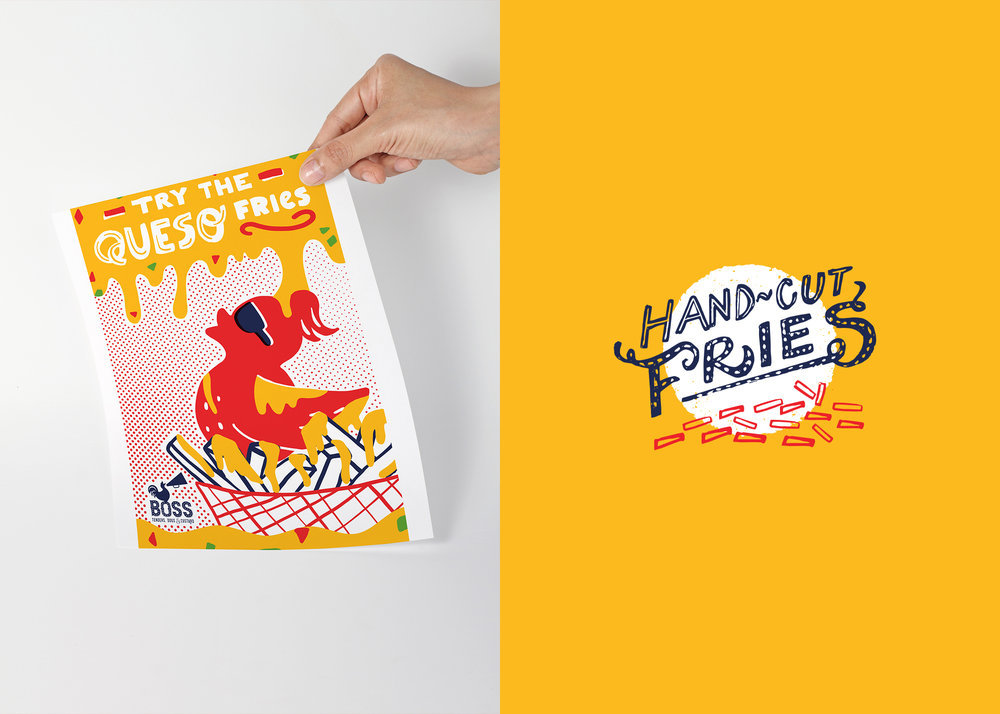
“ When thinking of chicken, the words rockin’ and sassy don’t often come to mind. That all changes when you see the branding for Boss Chicken. This branding emulates everything that was missing from the chicken game with spunky chickens that dance and surf through paper cups, liners, and t-shirts. The gritty, hand-drawn illustrations of chickens with pompadour hairdos, sunglasses, and styling combs give Boss Chicken an edgy and fun vibe, while the accompanying phrases and food icons remind you of the fresh, home-made food that Boss Chicken has to offer. All in all, this brand, like its chicken, is truly boss.”

CREDIT
- Agency/Creative: Eme Design Studio
- Article Title: Rockin’ and Sassy Branding for Chicken Take Away in the US
- Organisation/Entity: Agency Commercial, Published
- Project Type: Packaging
- Agency/Creative Country: United States America
- Market Region: North America
- Format: Bag, Box, Cup, Wrap
- Substrate: Pulp Carton, Pulp Paper
- Industry: Food/Beverage
FEEDBACK
Relevance: Solution/idea in relation to brand, product or service
Implementation: Attention, detailing and finishing of final solution
Presentation: Text, visualisation and quality of the presentation


