


Task: The task was to create a line of packaging design based on a music style. Аny product category that requires packaging could be chosen to design a packaging line in the task.
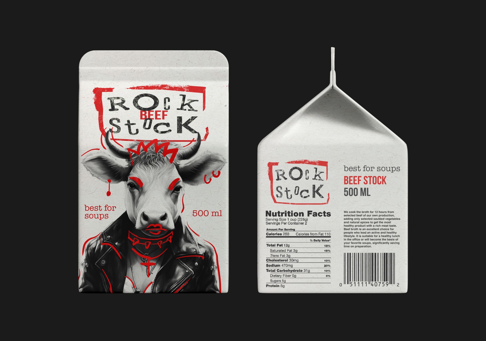
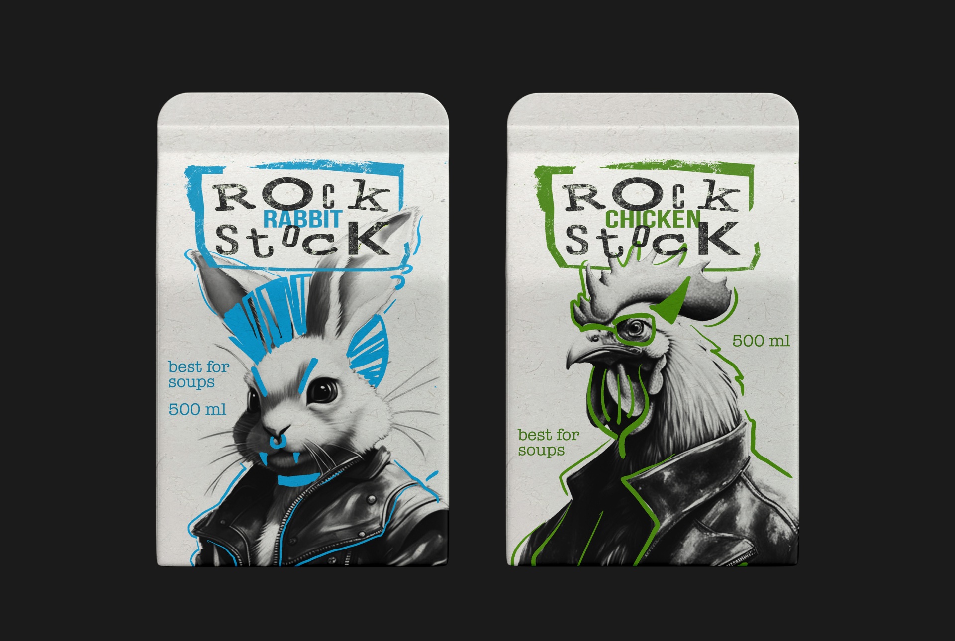
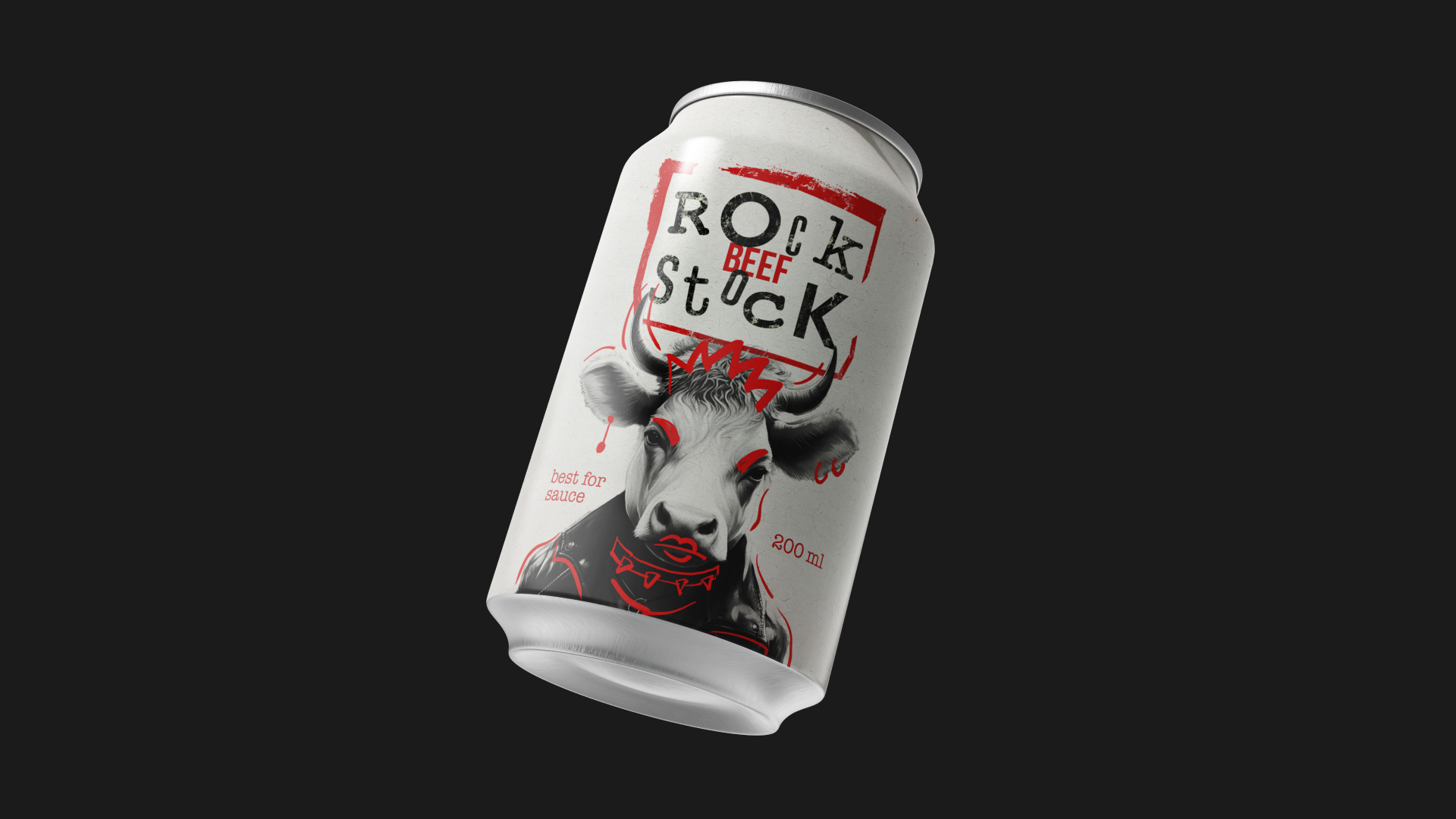
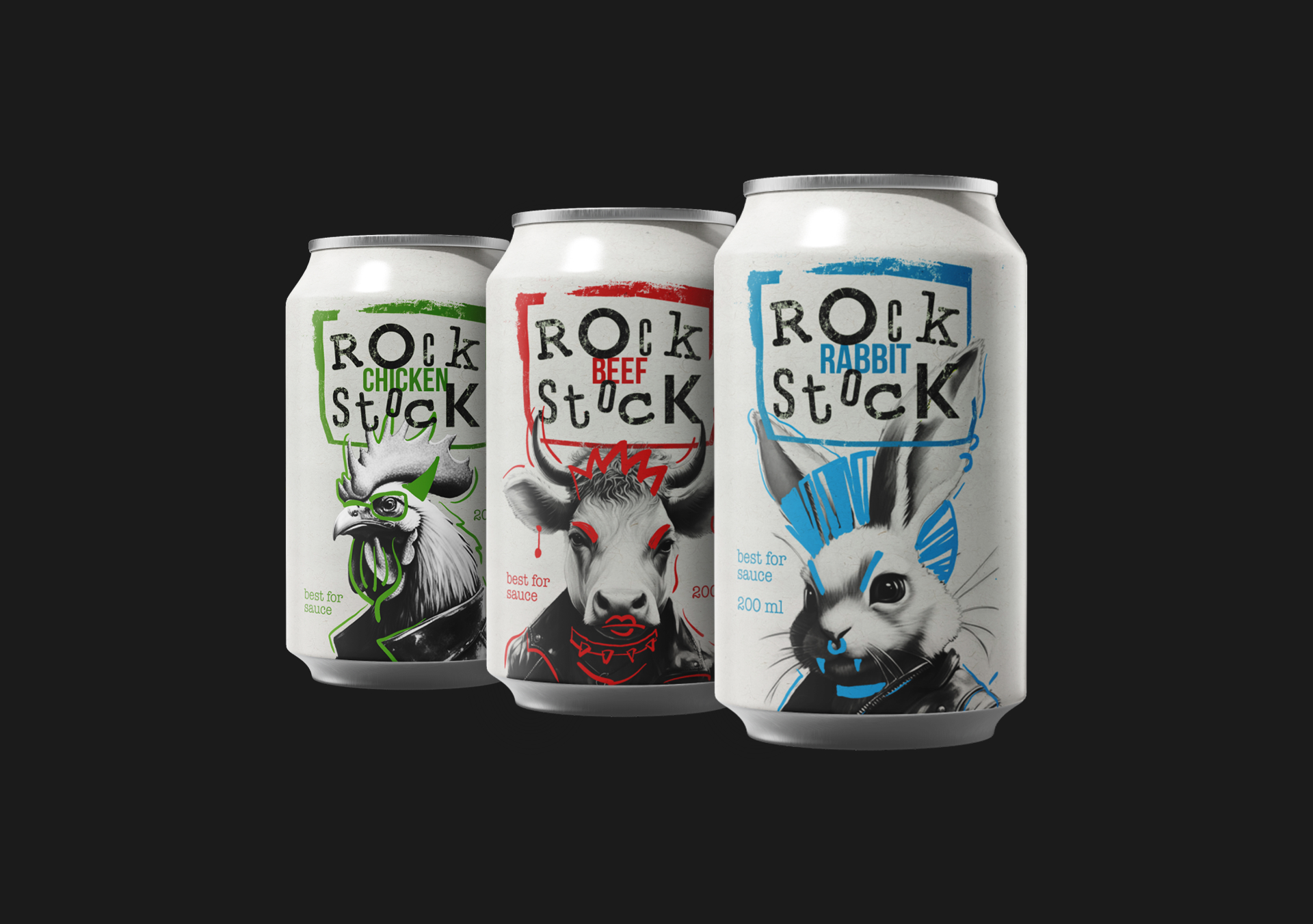
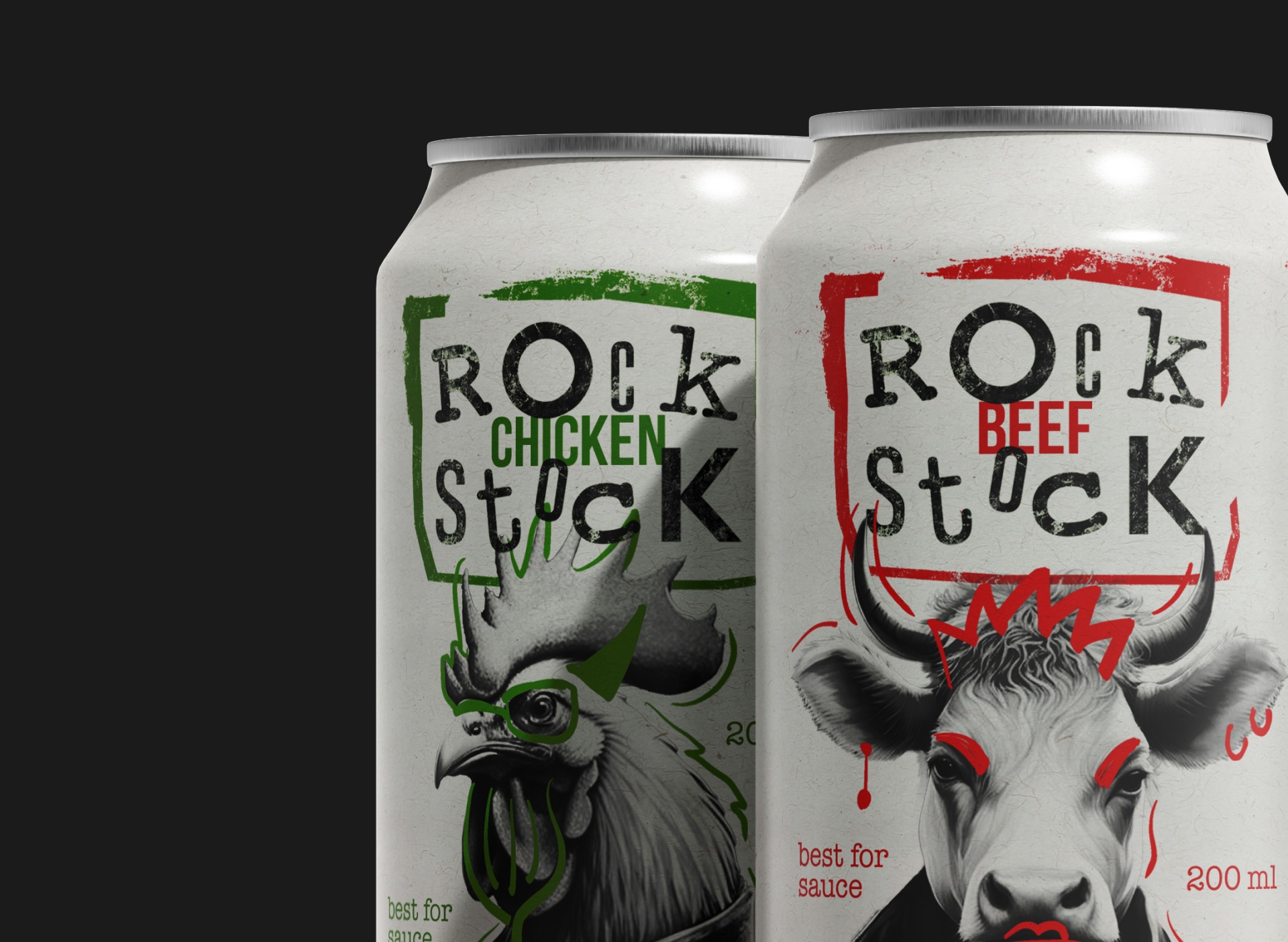
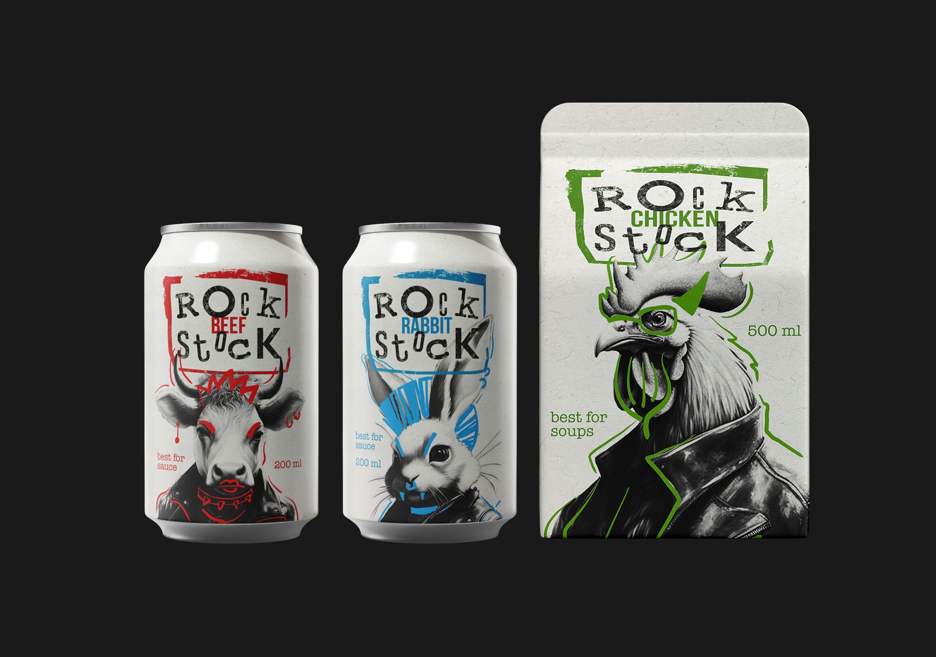
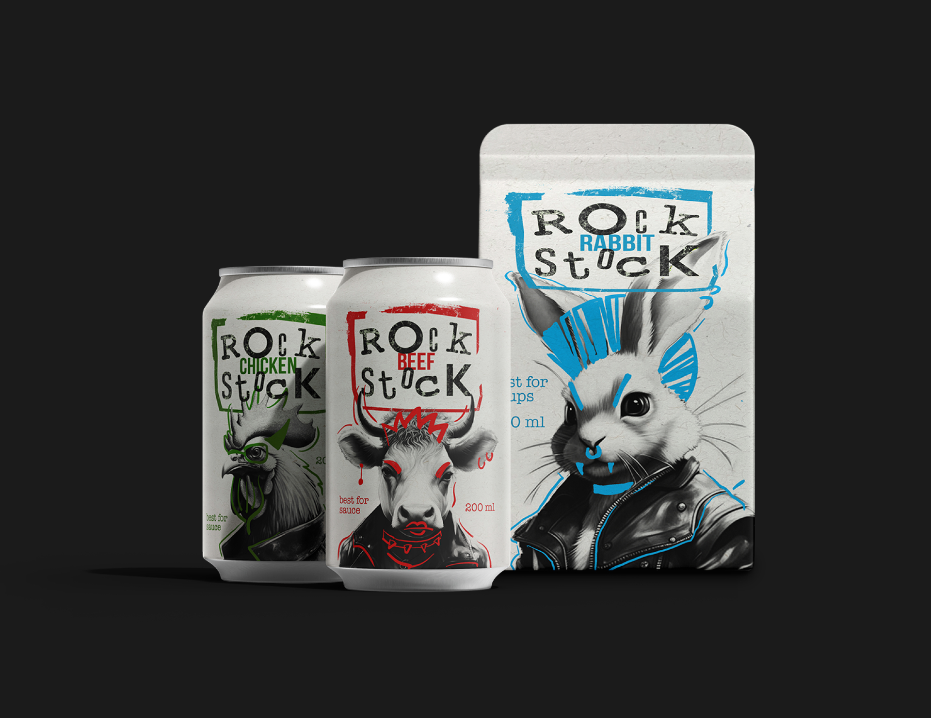
Logo and design Process: A rock theme and animals in leather jackets were chosen as a thinking direction. Then the animals were accurately generated by the Kandinsky 3.0 AI and further hand-drawn. After that the name came to mind completely by accident, since “rock” rhymes very well with the word “stock”. This is how the name Rock Stock appeared, and the logo turned out to be grunge styled. It once can be a perfect part of “Rock Stock” brand identity.
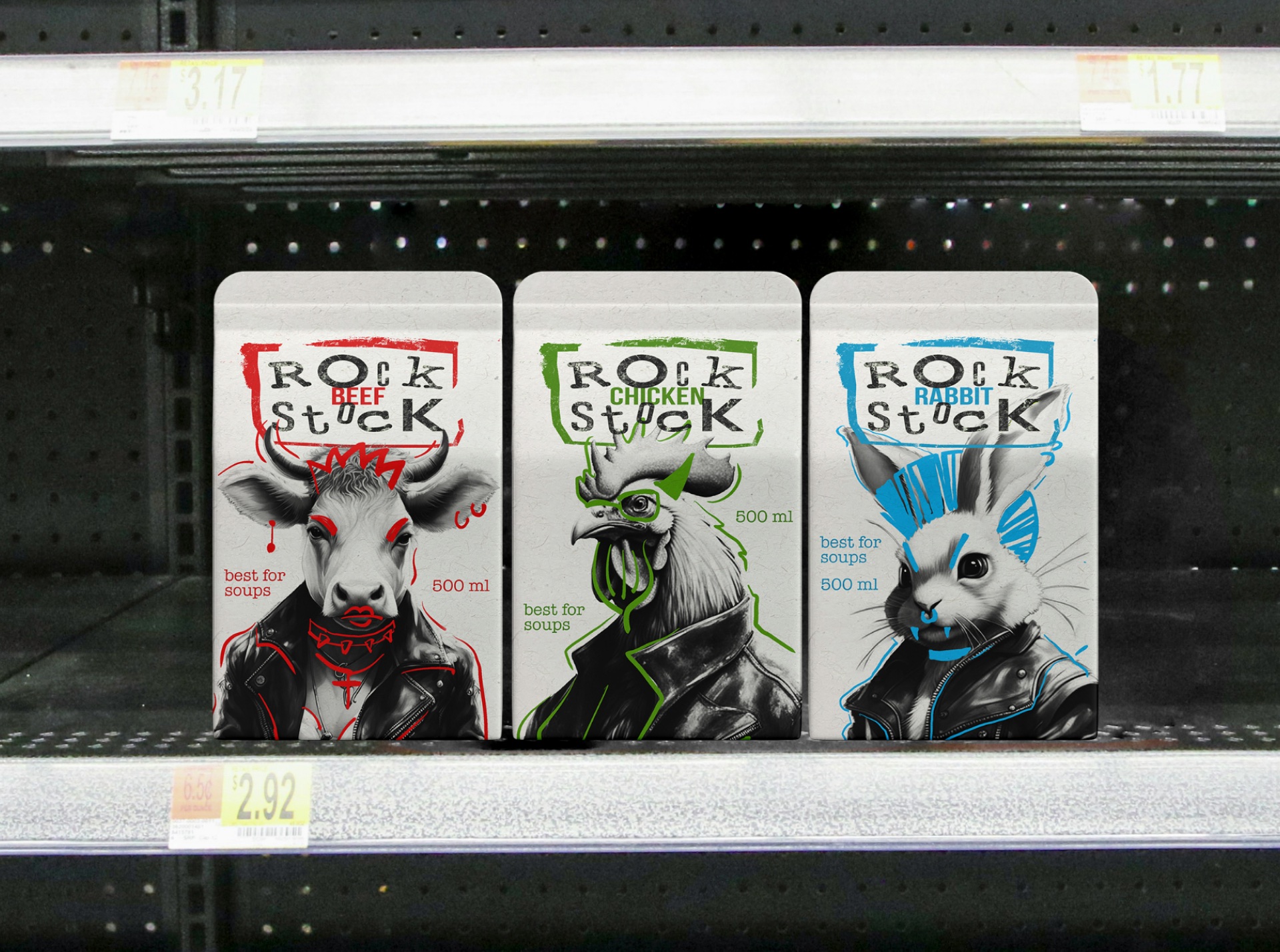
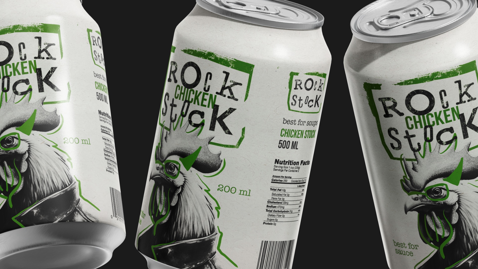
A line of natural meat stock was created in two types of packaging – a bag and an aluminium can. The formats were not chosen by chance – as it turned out, they would in reality be the most convenient for users. There are three types of stock in the packaging line – beef, chicken and rabbit. First two tastes are most requirable among culinary products, but the rabbit taste is very unusual and intends to be a part of dietary dishes. The colours were selected to make the obvious difference between tastes, but according to common habits (chicken flavoured products are usually green and beef products are usually red).
Conclusion: As a result, the characters and the logo interact perfectly with each other, and the product itself makes the design solution even more catchy, unusual and harmonious. It definitely can stand out on a market shelf and be quite competitive with other stock design solutions.
CREDIT
- Agency/Creative: Liana Bubnova
- Article Title: Rock Stock Packaging Design by Student Liana Bubnova, a Harmonious Blend of Rock Music and Culinary Delight
- Organisation/Entity: Student
- Project Type: Packaging
- Project Status: Non Published
- Agency/Creative Country: Russia
- Agency/Creative City: Moscow
- Market Region: Global
- Project Deliverables: Art, Art Direction, Brand Design, Brand Naming, Digital Art, Logo Design, Music, Packaging Design
- Format: Can
- Industry: Food/Beverage
- Keywords: broth, food supplies, rabbit, cow, hen, chicken, tetra pak, can design, carton design, stock, rock, rock music, digital art, AI art, logotype, music, logo design, logo
-
Credits:
Tutor: Leonid Slavin


