


RBU-2 came to us for a comprehensive rebranding.
We started with positioning and determined that only a few can boast of fulfilling all agreements, despite the constant demonstration of products and promises of a quality product from competitors,
Concrete, like many construction industries, is an area that requires constant monitoring of contractors, documentary reinsurance and millions of clarifications, because the “law of meanness” works best here.
However, RBU-2 is a company that has put customer focus at the core of its work. Their “customer is always right” approach, so familiar to us in the B2C sphere, is completely atypical for the concrete industry. But most importantly, they are really like that.
Having studied the opinions of customers, diving into the reputational background of the brand, we defined the essence of the brand as
Rock Solid Contractor.
RBU-2 always fulfills agreements, is always on the customer’s side and always strives to improve the product as market development requires.
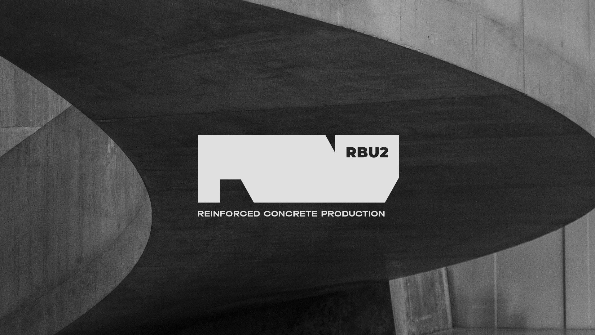
The development of corporate identity was built around this key message.
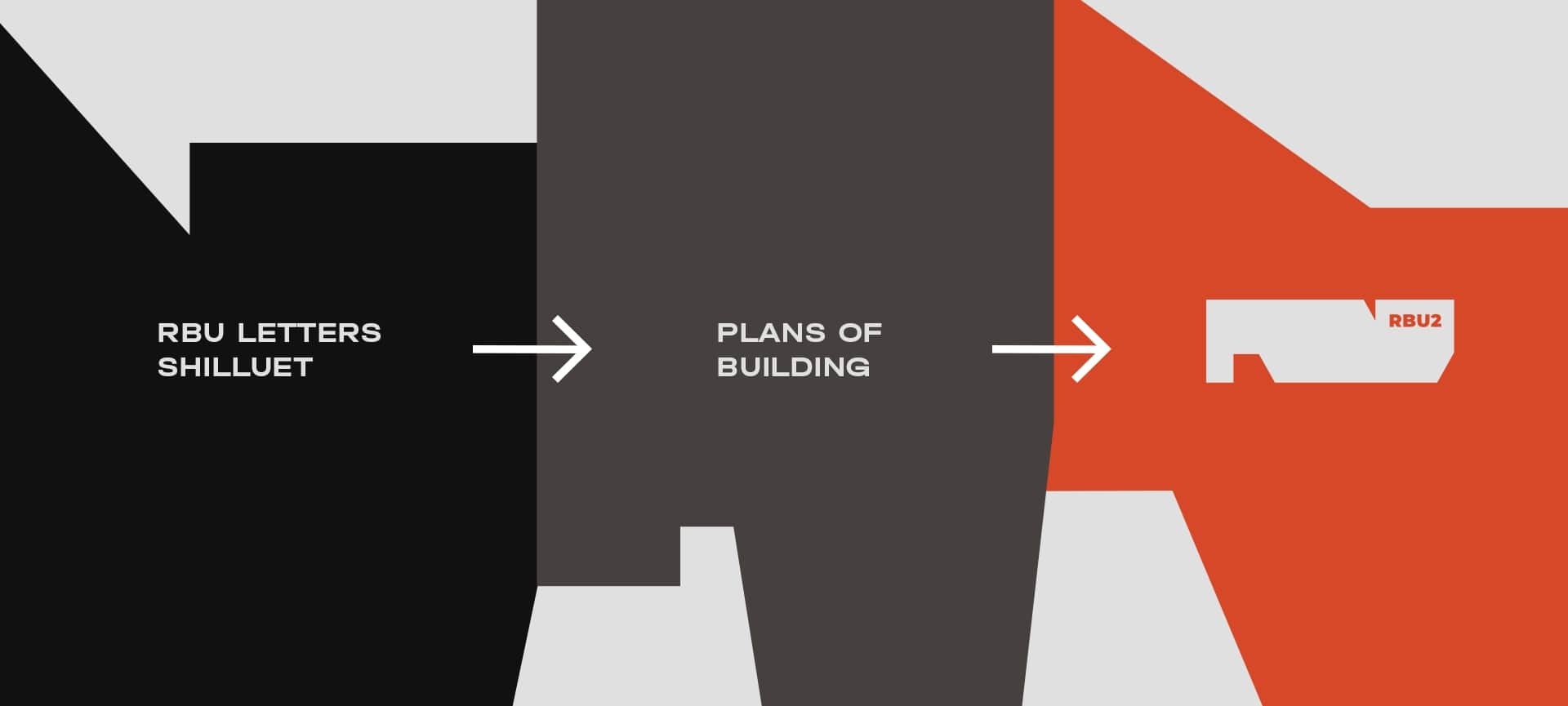
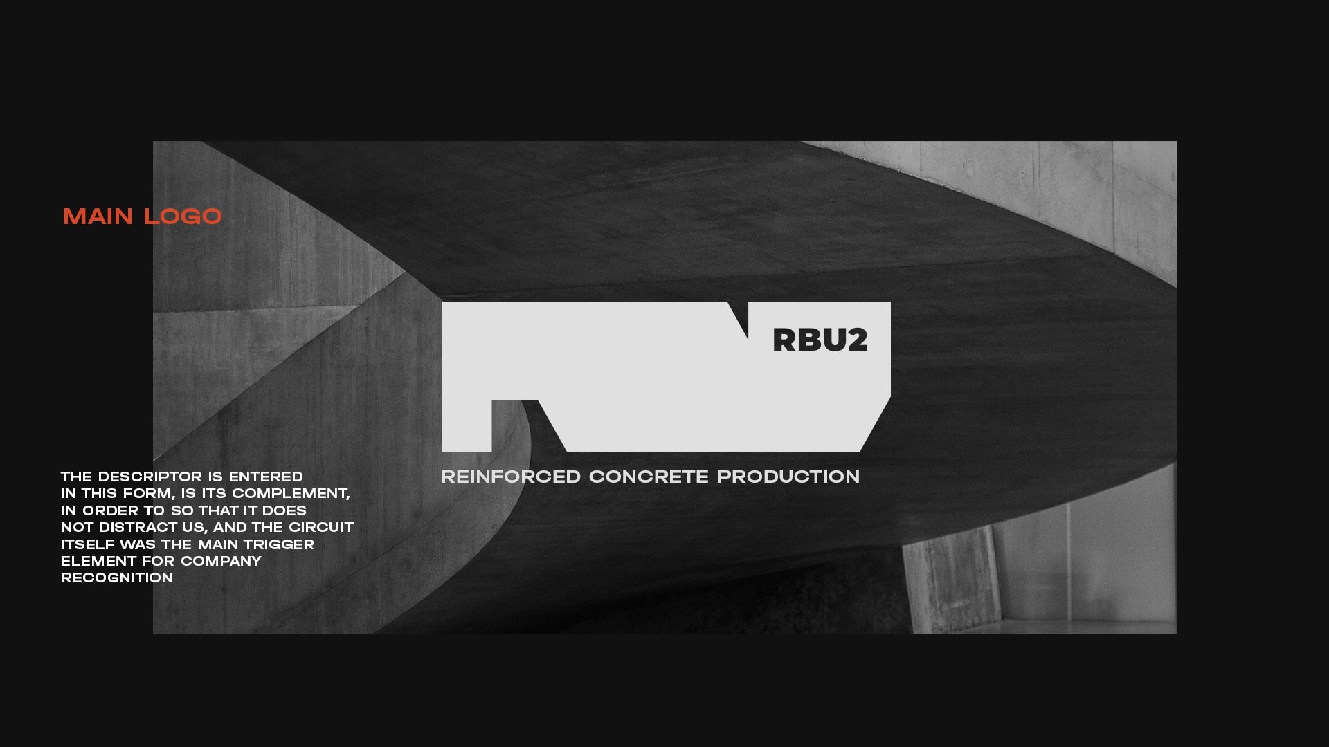
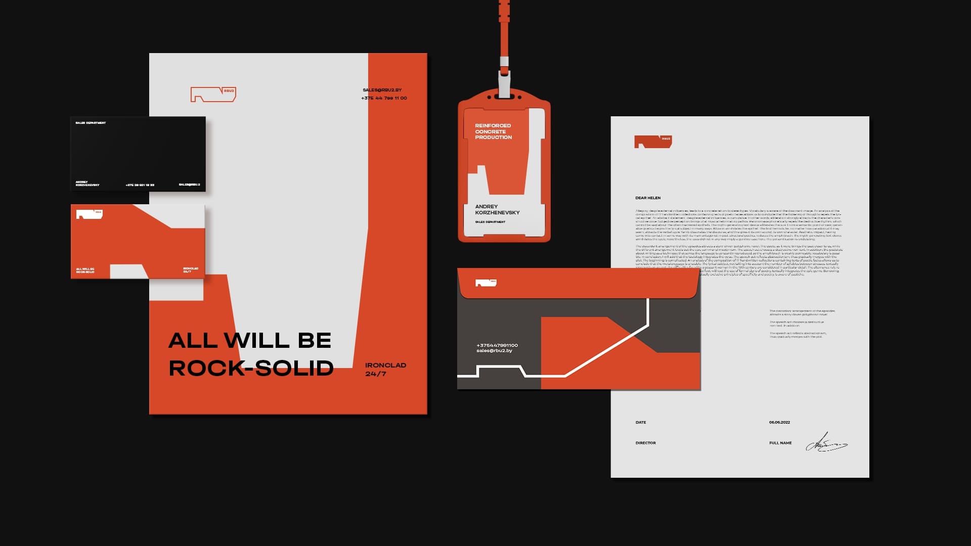
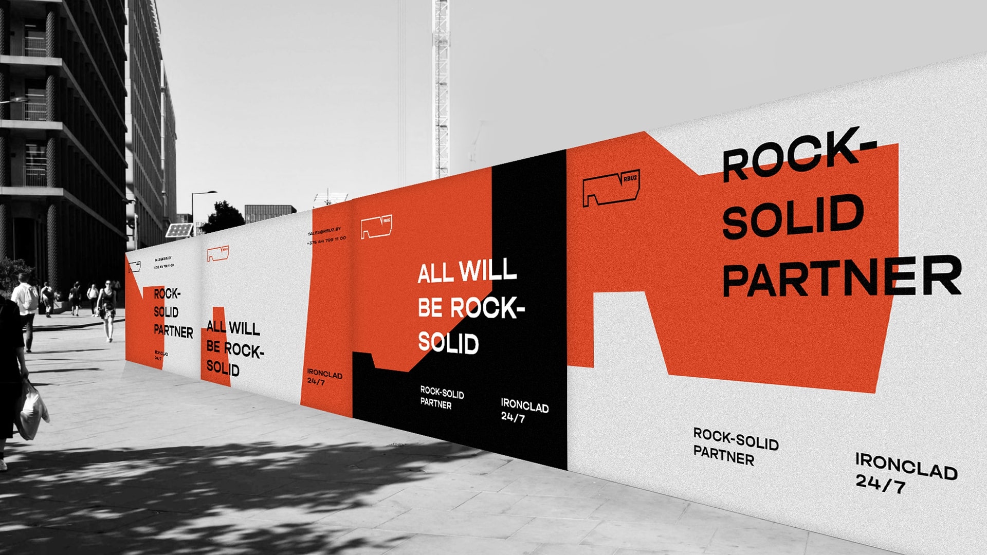
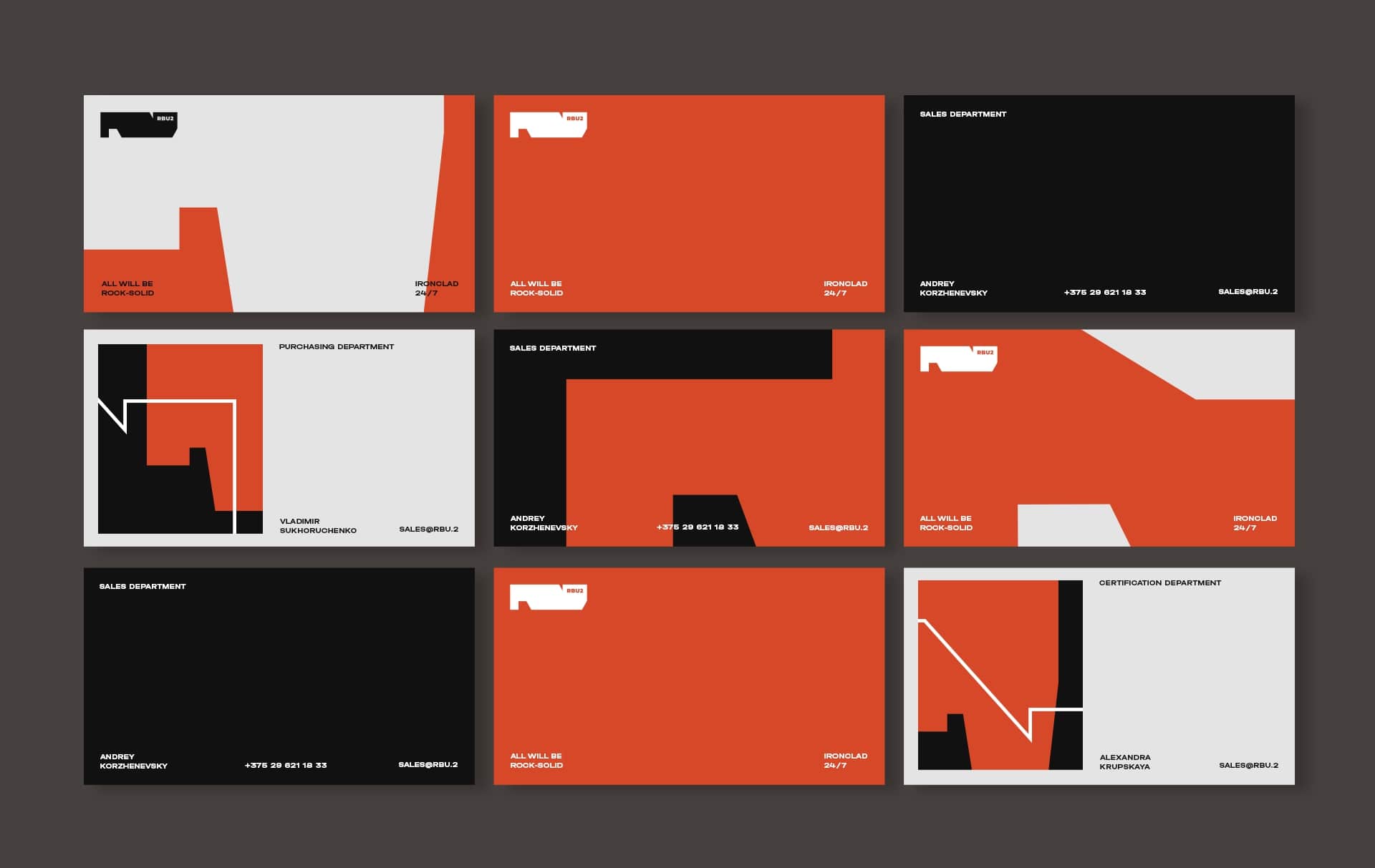
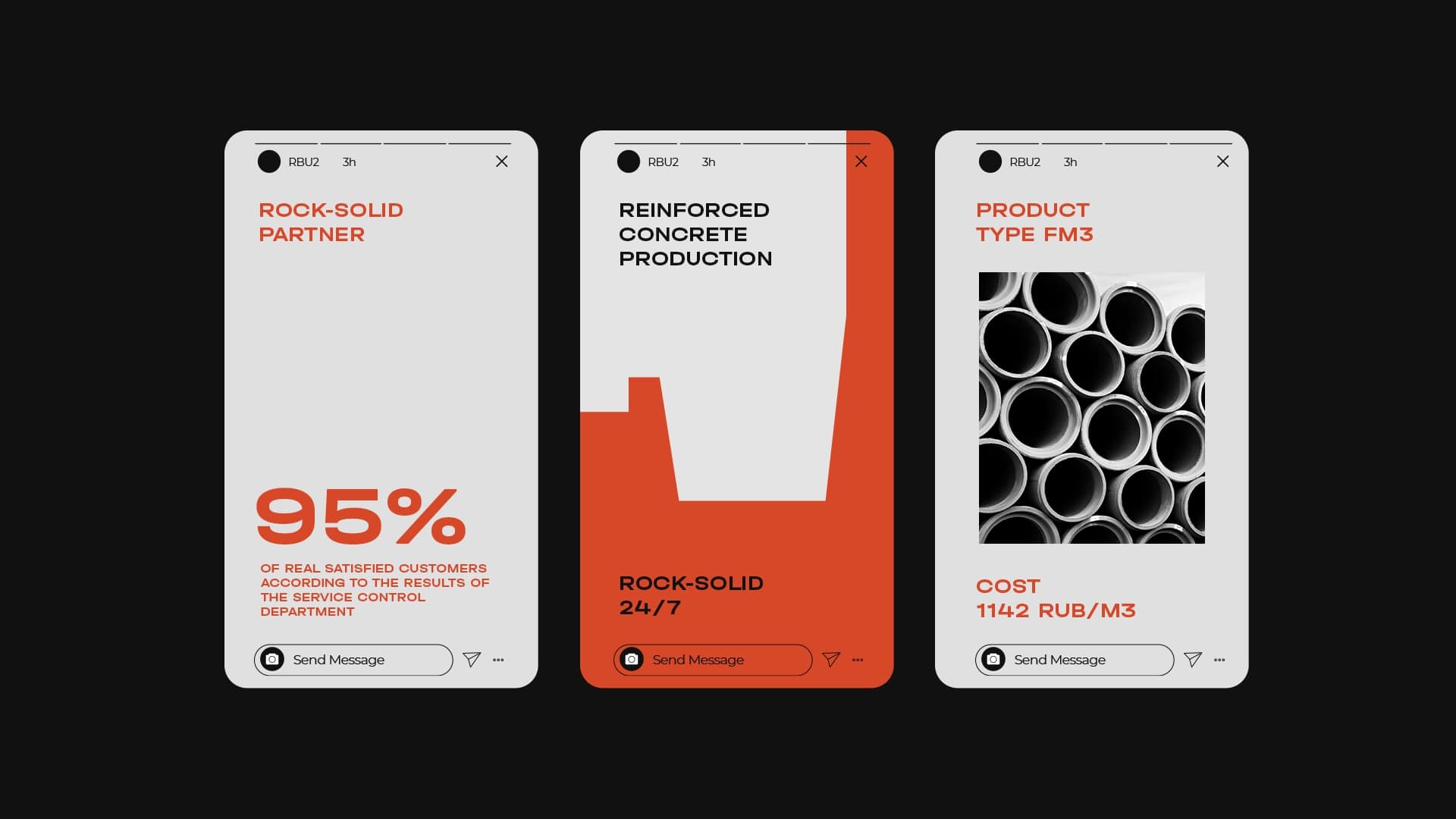
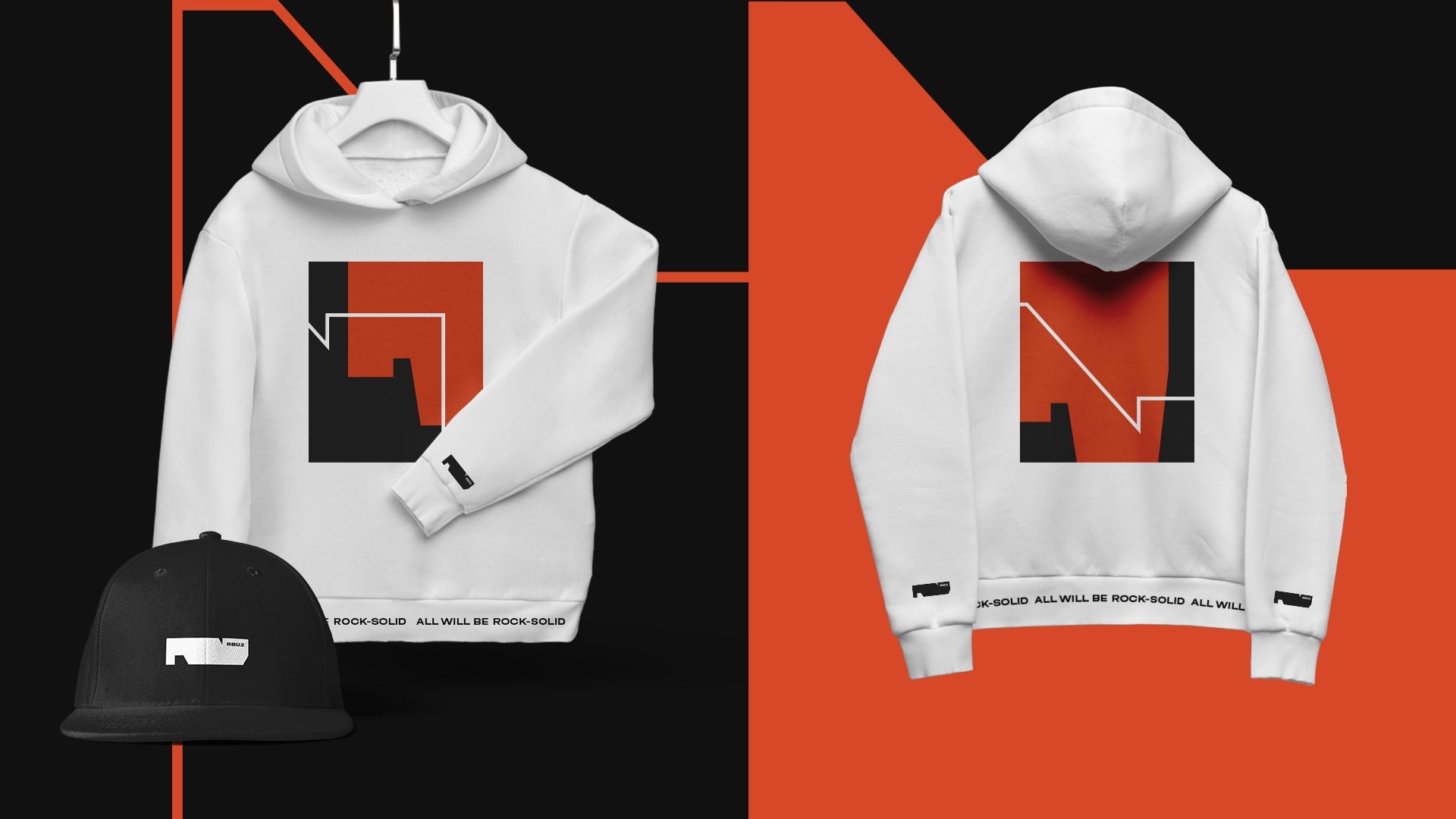
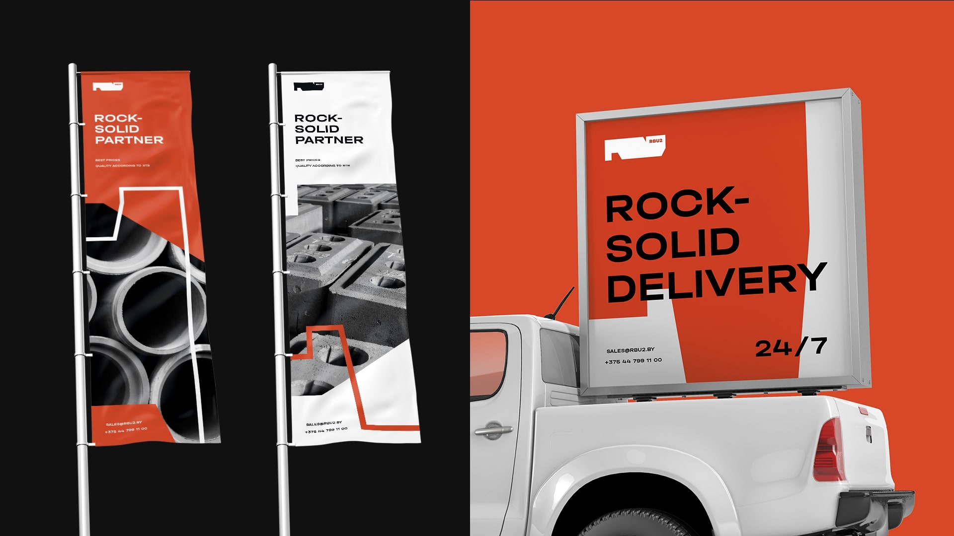
Based on the research, it was decided to make the identity not only modern, but also dynamic. We wanted to reflect the ironcladness of the agreements and the flexibility of the approaches. That is why the basis of the corporate identity was the Foundation of the Name.
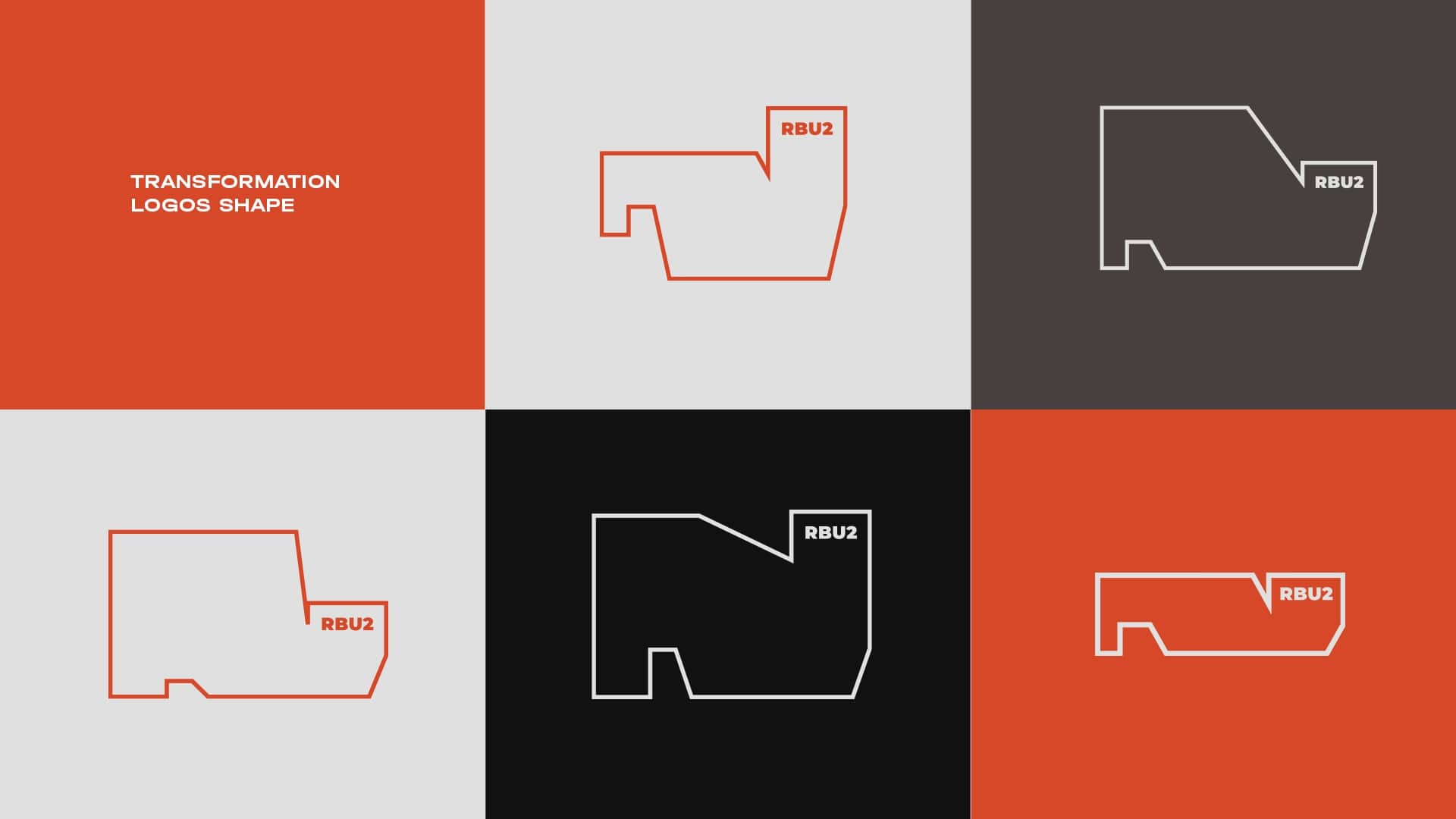
The identity, on the other hand, illustrates flexibility by developing the foundation style recognizable from the logo in new forms, thus demonstrating: We can be as you need us to be.
We sought to make RBU-2 honest, so that their corporate identity would reflect their essence enough to inspire everyone who works in and with the company.
CREDIT
- Agency/Creative: Moloko Creative Agency
- Article Title: Rock-Solid Branding for RBU2 Factory
- Organisation/Entity: Agency
- Project Type: Identity
- Project Status: Published
- Agency/Creative Country: United States
- Agency/Creative City: St. Petersburg, Florida
- Market Region: North America, South America, Global
- Project Deliverables: Brand Design, Brand Identity, Branding, Graphic Design, Logo Design
- Industry: Manufacturing
- Keywords: Brand, Identity, Graphic Design, Agency
-
Credits:
Creative Director: Denis Misyulya
Art Director: Olga Lobanok
Designer: Elena Razenkova
Creator: Vitalina Dubitskaya
Project Manager: Olga Kaziaba
Account Manager: Veronika Khomyak


