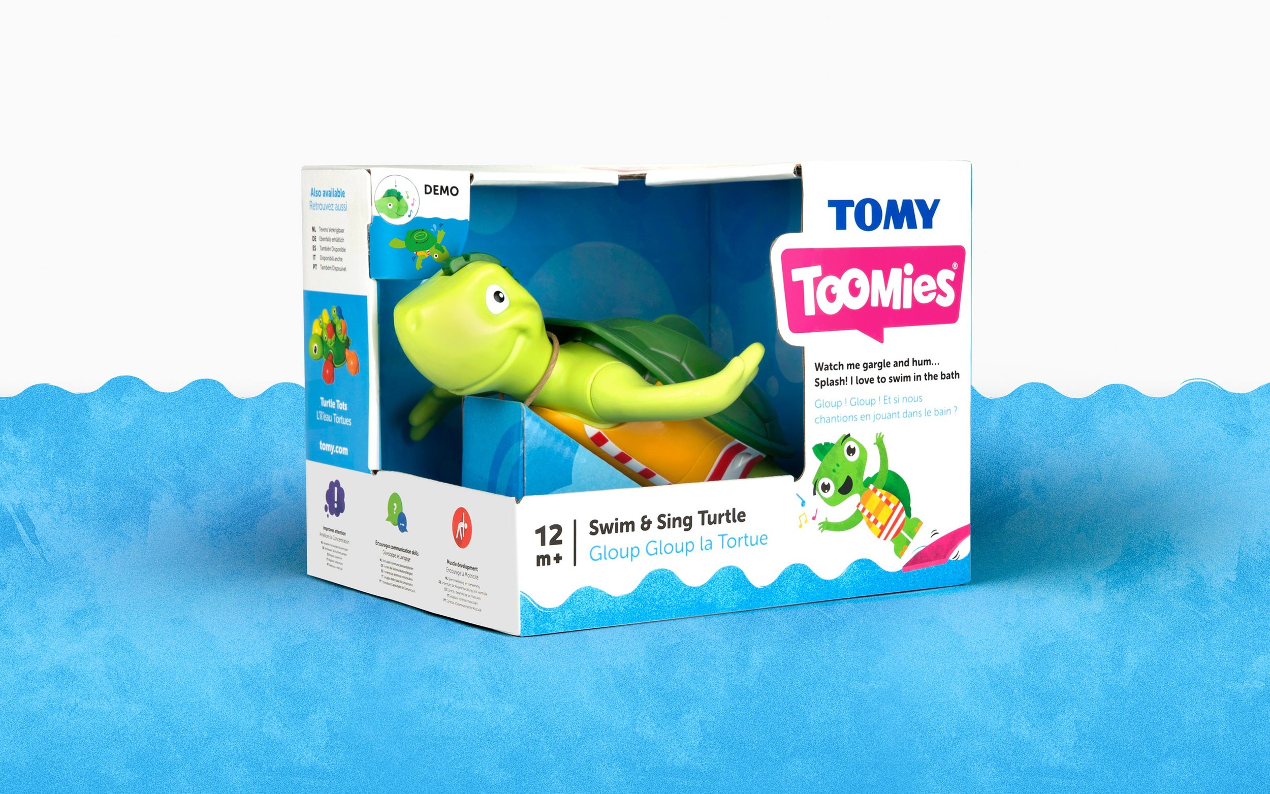
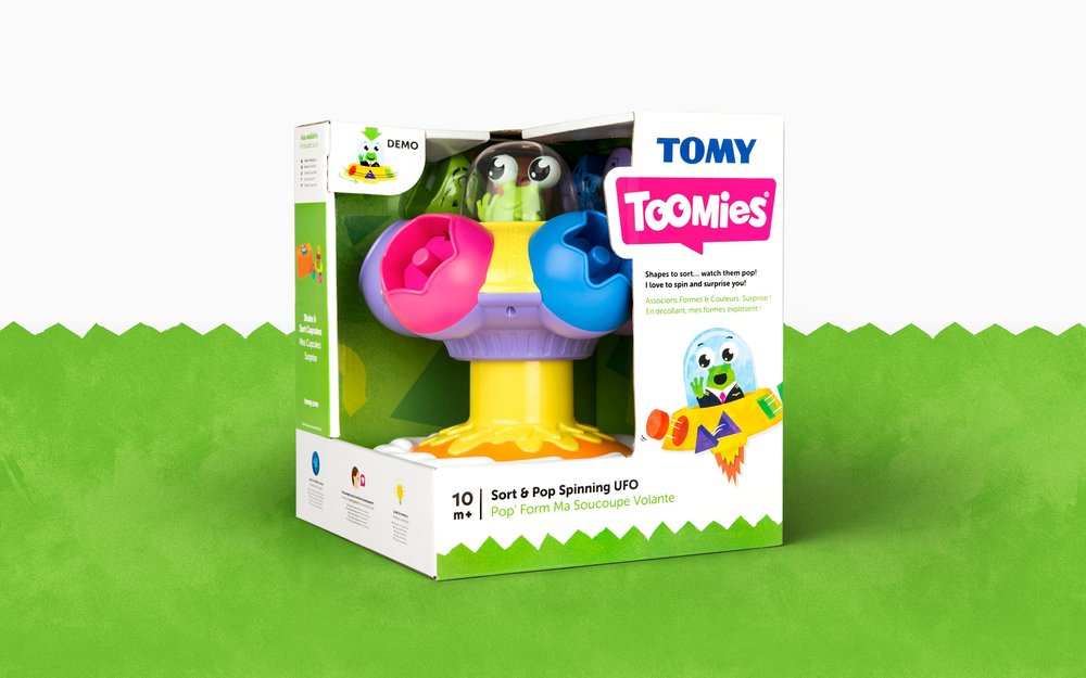
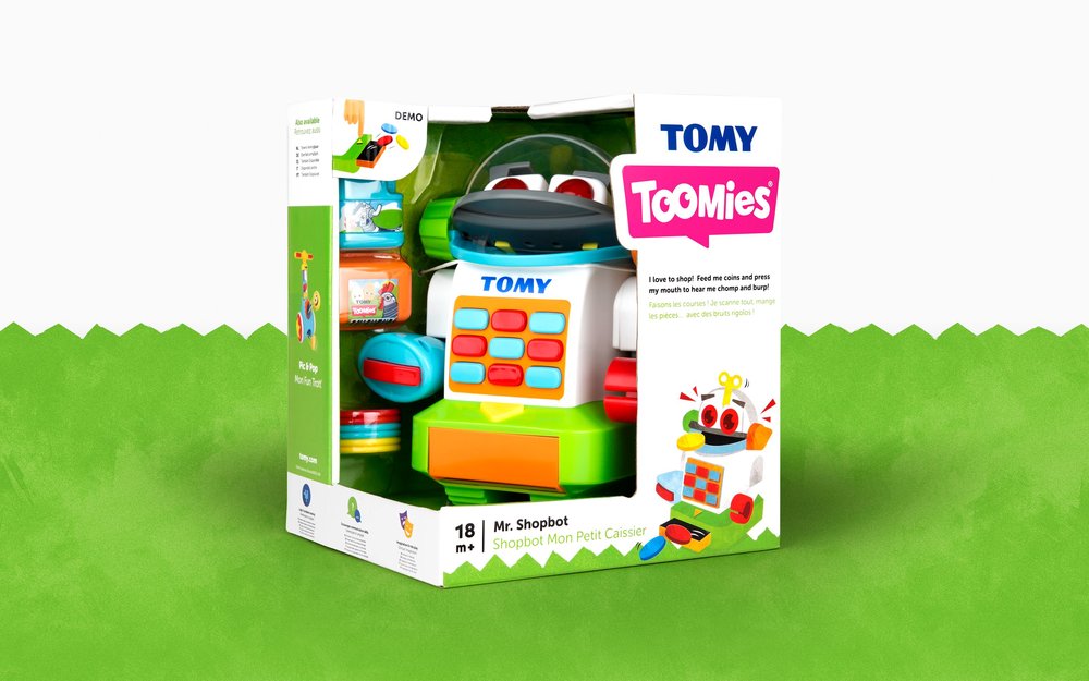
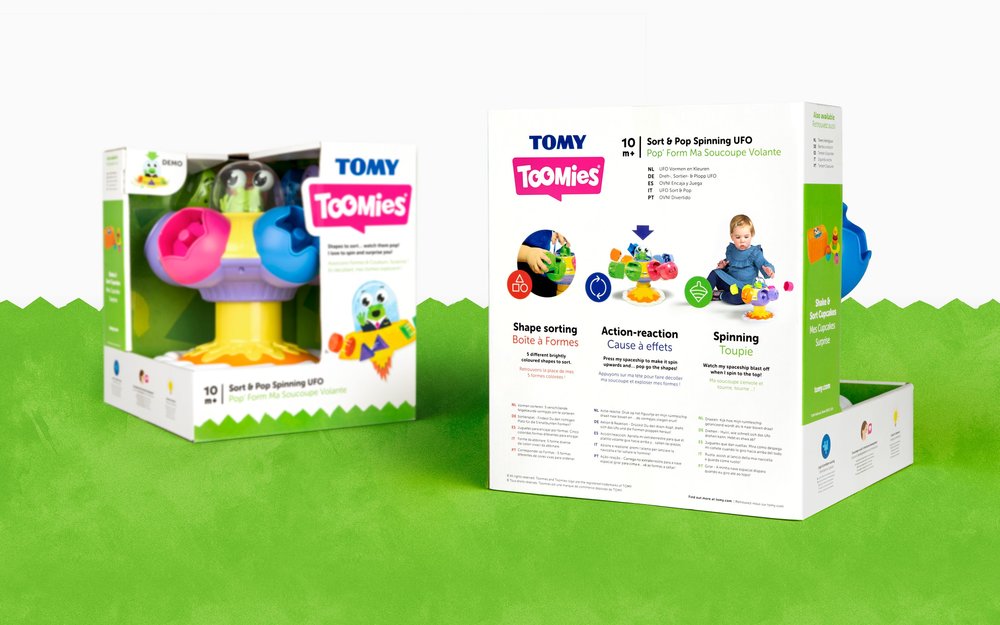
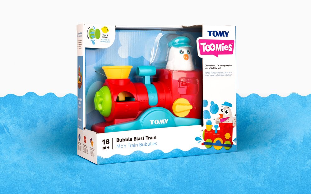
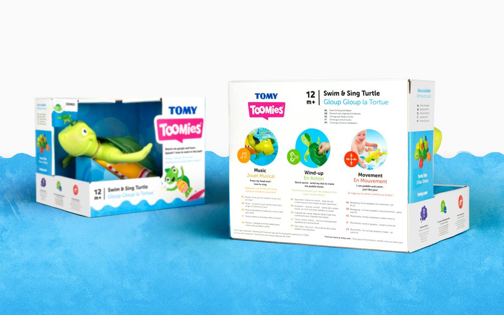
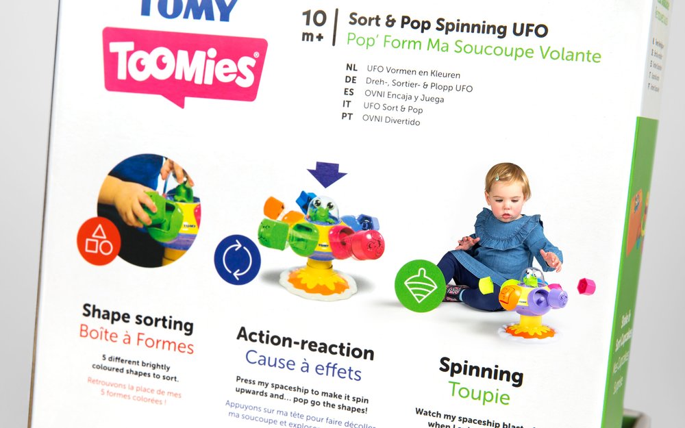
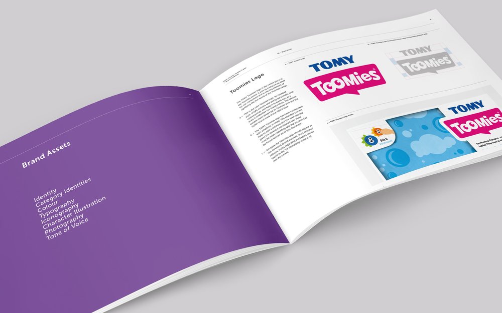
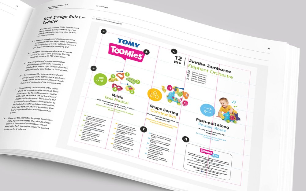
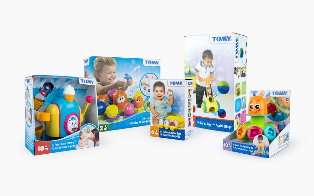
” Tomy team up with Robot Food to re-imagine their infant and toddler toy ranges for global millennial parents90 years of experience and a reputation for quality makes TOMY one of the world’s favourite toy brands. But following a review of their infant and toddler ranges, TOMY saw opportunity to stand out and communicate the fun and joy of their products to a new millennial audience.TOMY asked Robot Food to carry out a full reposition and rebrand across the 40+ SKUS, including bath and everyday play. The brief was to encourage reappraisal from modern parents (and their little ones) and get to the heart of what makes TOMY, TOMY.Robot Food hosted a brand workshop involving TOMY’s global team, including key territory representatives and toy designers. The group uncovered that while most competitors were moving into digital, many new parents (the vast majority of whom are millennial) still held value in analogue toys. Encouraging play between child and parent and happily passed on to new siblings, TOMY’s timeless, genderless and well-crafted toys had a clear point of difference for those looking to instil traditional values in a new generation.The team defined a new strategy and positioning for the brand founded on the strapline ‘Hands on Fun’, and established infant and toddler as a sub-brand in its own right by unifying the ranges under the name ‘Toomies’. With a new name came a new, more uniform pack structure, developed in collaboration with TOMY’s in-house packaging team. Robot Food chose to strip the design right back and establish a clear and ownable architecture that could be applied across the entire range and have universal appeal.”
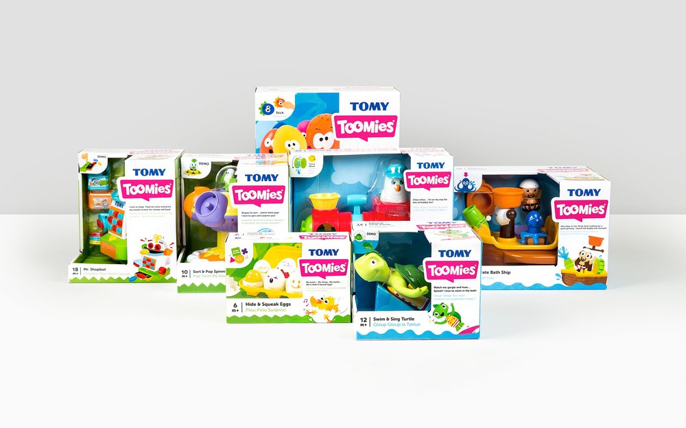
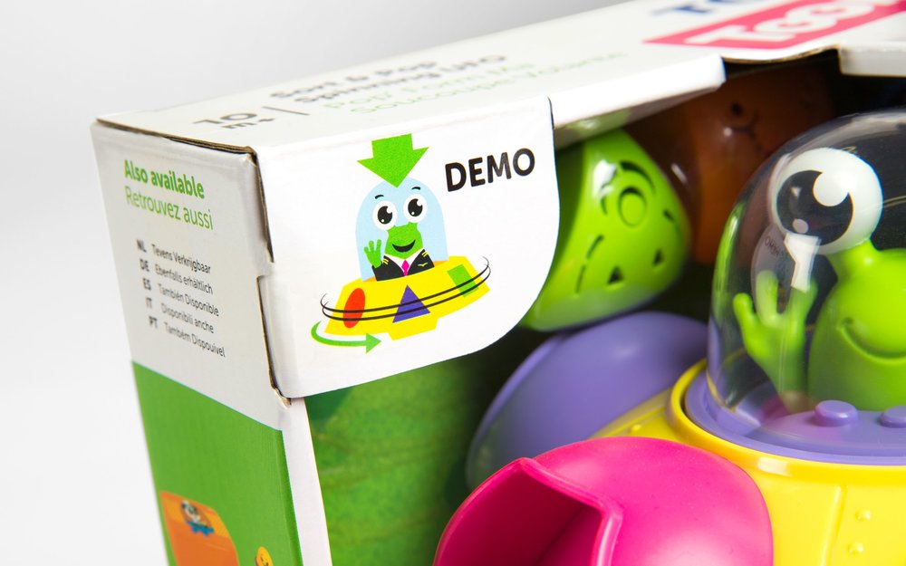
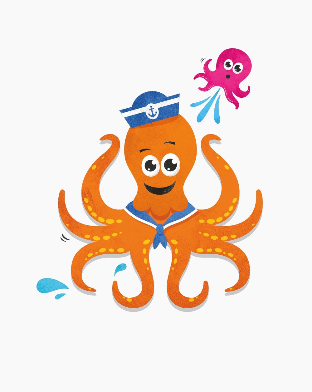
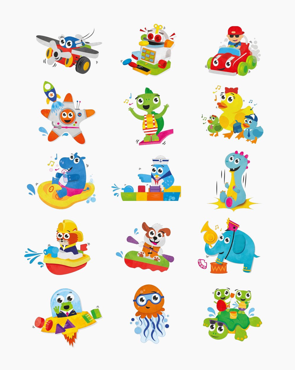
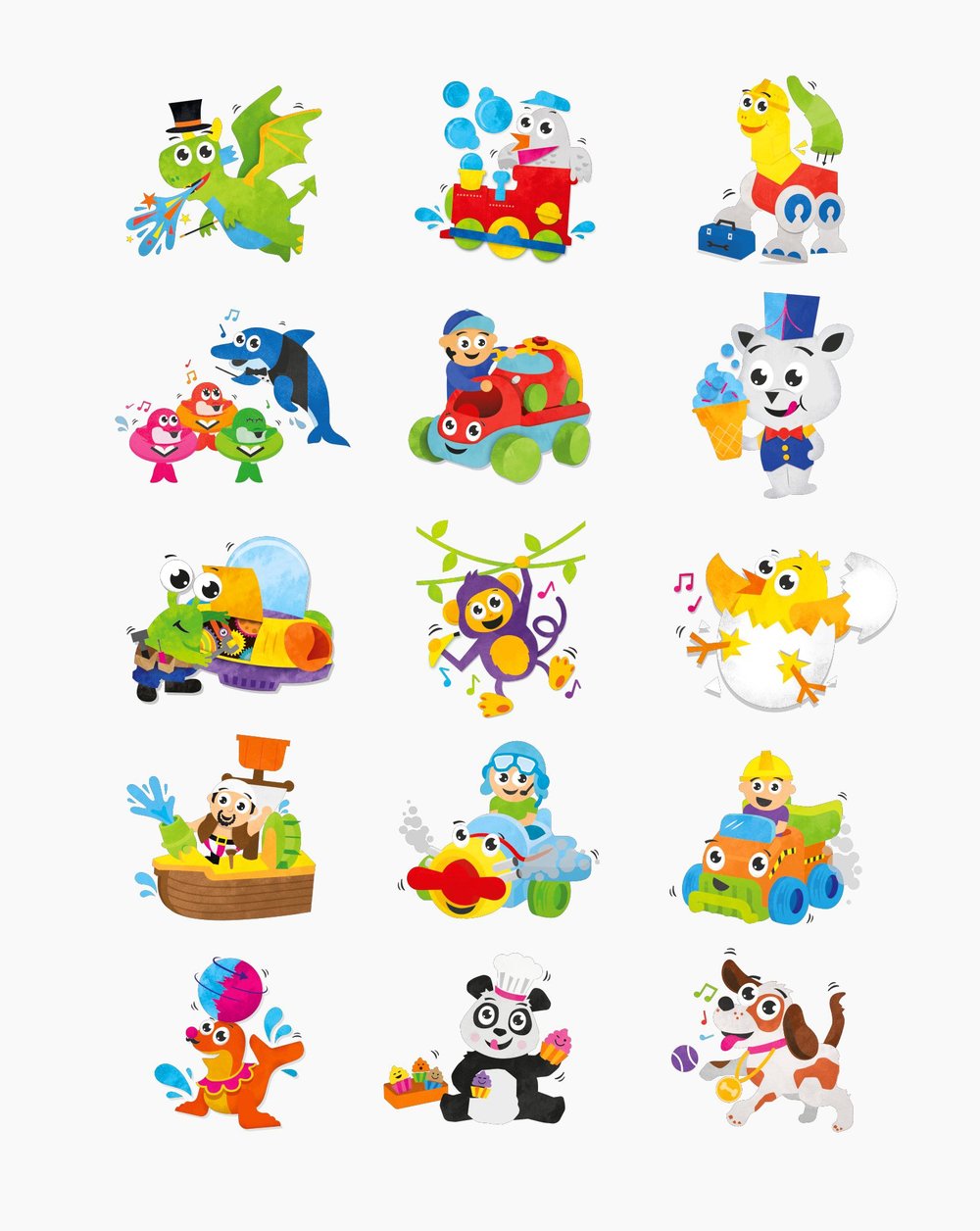
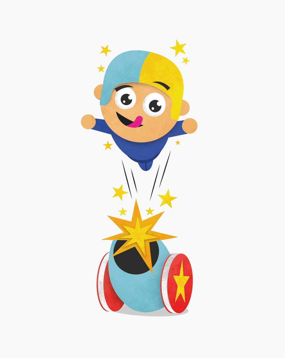
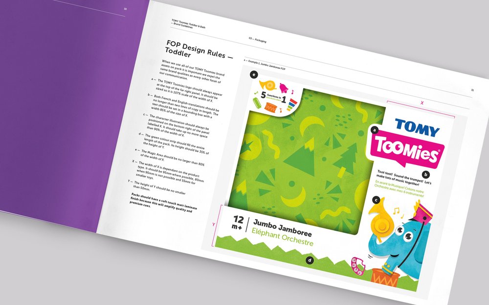
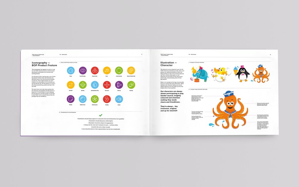
“Following this less-is-more approach, the creative team focused on simplifying and amplifying TOMY’s on-pack messaging. A stroll down the toy aisle found shelves packed with cluttered design, filled with claims and call-outs. Robot Food wanted to create a moment of calm for busy parents, choosing to instead hero the product as the main point of focus together with one primary product USP, for front of pack, consistently shown in the top-left corner. On-pack product descriptors were paired back too, opting for a simple and child-friendly tone of voice that speaks from a ‘first-toy’ perspective.Characterisation of the product was important and so illustration was key to the final design. The team introduced backdrops of spikey grass and flowing waves for easier range navigation, clearly segmenting ‘those’ who were bath and ‘those’ who weren’t. Across the entire ‘Toomies’ range, each toy’s character has been brought to life through Robot Food’s fun and engaging illustrations. Beautifully textured and natural in feel, the illustrative style works in tandem with a clearly defined pack hierarchy and format to pull the whole brand together.Sunita Rajkanwar, Senior Brand Manager at TOMY, said, “We chose Robot Food for their strategic design and track record for successfully challenging the norm, particularly when it comes to millennial audiences. Their fresh thinking and creativity have helped us to clarify and own our brand truths. We can see clear space between ourselves and the competition and an exciting path for the future.”Dave Timothy, Client Director at Robot Food, said, “The toddler and infant toy category had become very me-too and nobody was standing out or doing anything different. We had a great time giving TOMY a confident, fresh direction. Our work sets a new benchmark for toys in this age range and puts TOMY back in favour with new generations on a global scale.””

CREDIT
- Agency/Creative: Robot Food
- Article Title: Robot Food – Tomy Infant and Toddler
- Project Type: Packaging
- Format: Box
- Substrate: Pulp Board


