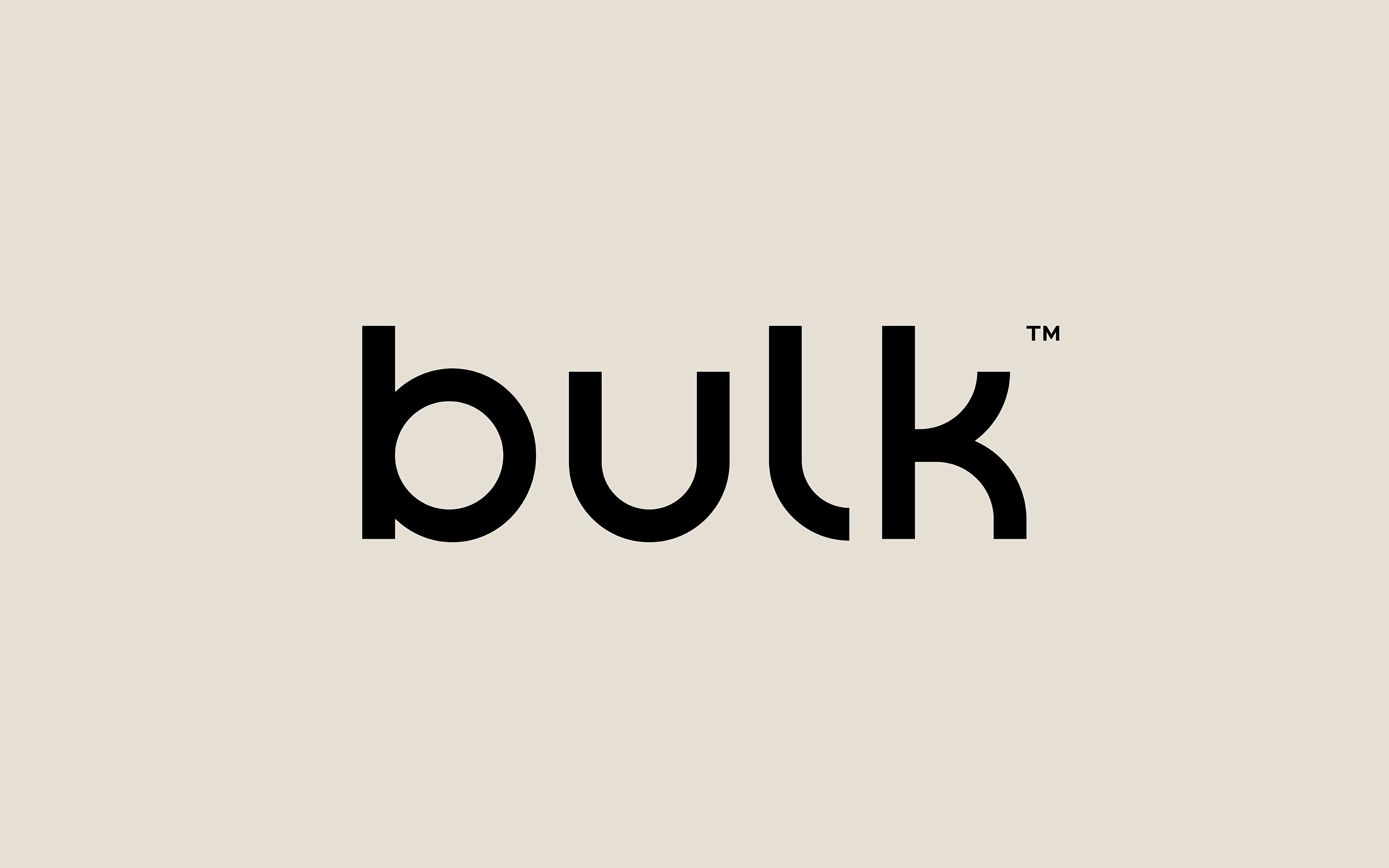
Leeds-based creative agency Robot Food have rebranded the online sports and active nutrition company bulk™ for the third time. With the business on track to break £100m revenue in 2021, the strategic reposition and rebrand signals a progressive shift in direction – with the aim of broadening appeal beyond the brand’s current heartland of avid gym-goers to create a more inclusive experience for all. This includes the decision to drop ‘Powders’ from the name.
As more people recognise the significant role fitness and, more importantly, nutrition plays in their daily lives, the extensive range of products offered by bulk™ means that it is perfectly placed to answer the needs of many.
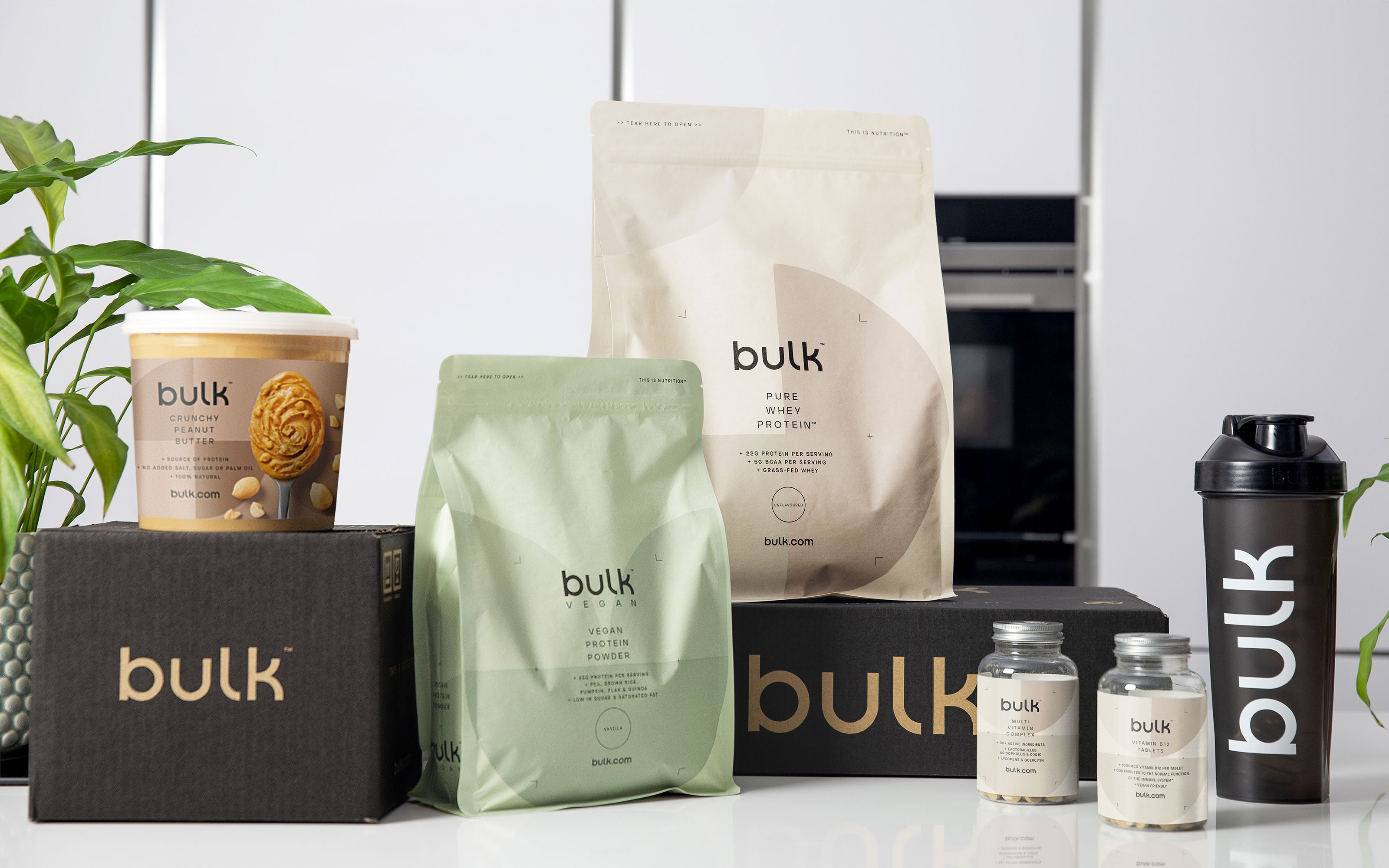
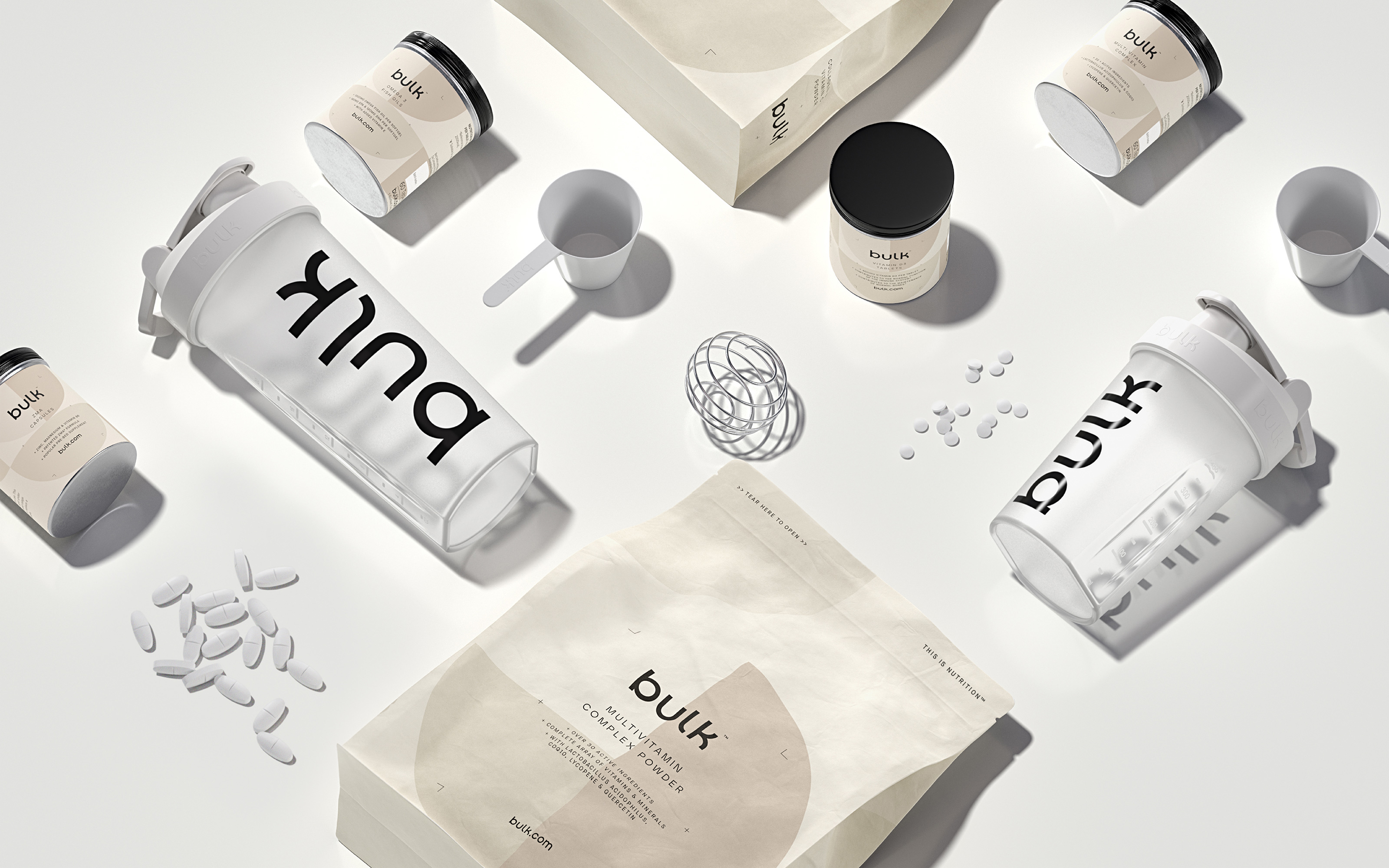
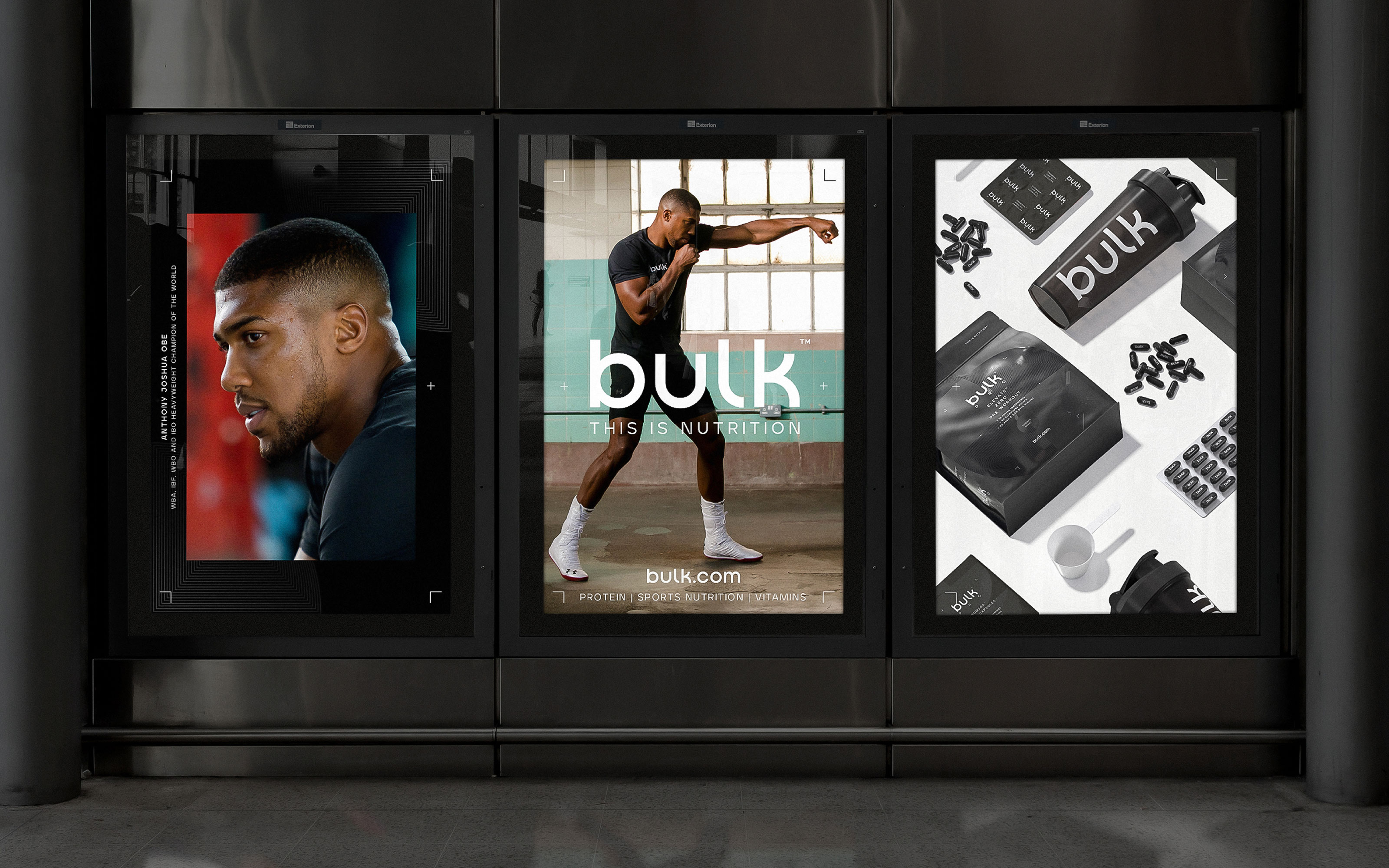
To elevate bulk™ from perceived commodity to an aspirational lifestyle brand, Robot Food chose to break away from the confines of the category and instead create a clean, confident and consistent identity, inspired more by lifestyle fashion and contemporary health and beauty brands.
The challenge was to strike the balance between the needs of both existing and potential bulk™ customers. Through exploration, the Robot Food team found that a common theme between the two audiences was the importance of the fitness ‘journey’. From this came a strong reason to believe; that no matter who you are, if you have a goal, bulk™ can help you achieve it.
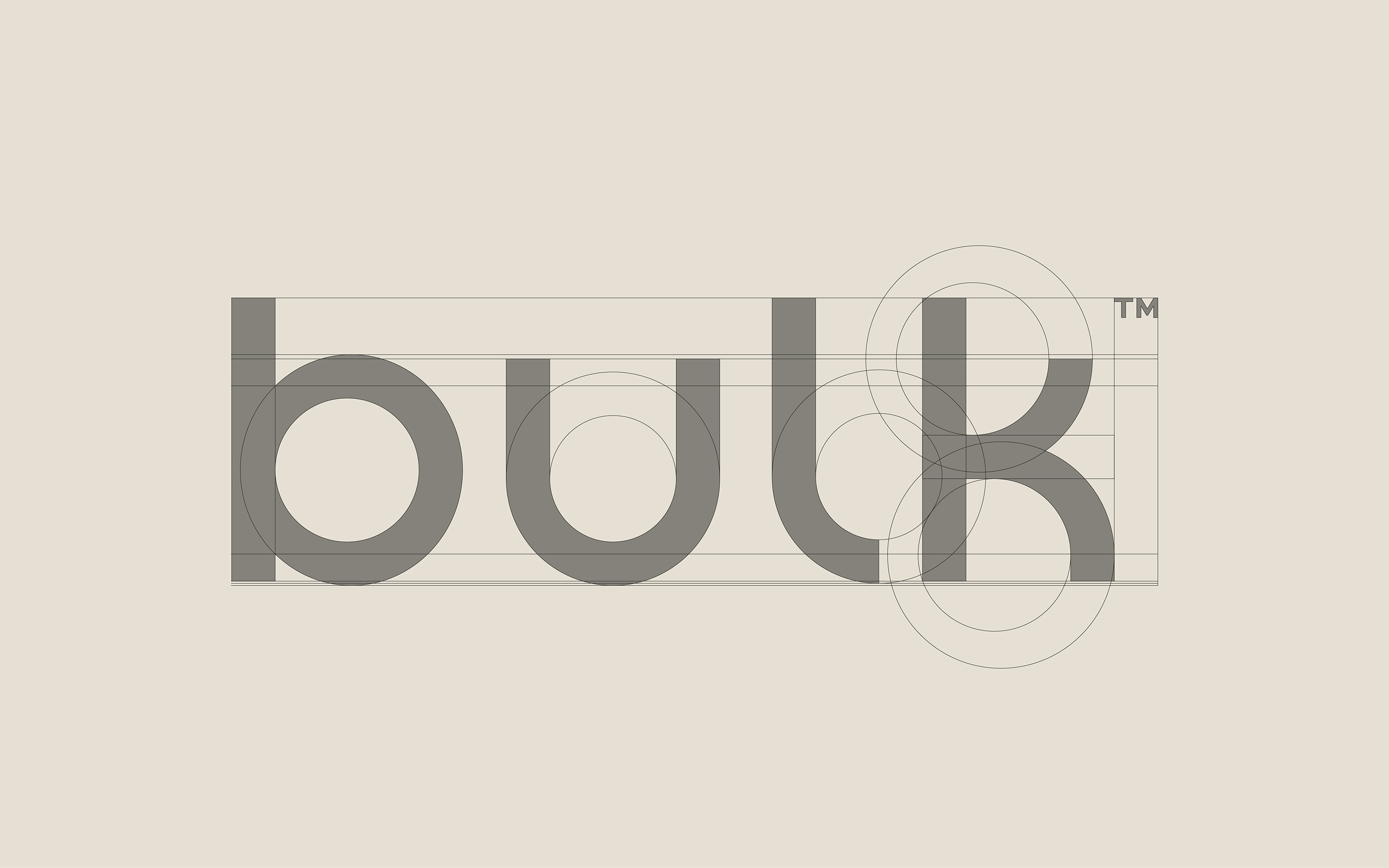
For the visual identity Robot Food chose to soften the connotations of the word ‘bulk’ with a timeless new lowercase wordmark, designed in-house and refined by Paul Hutchison of Hype Type, LA.
Alongside the wordmark, the identity also includes the bespoke font suite ‘Bulk Sans’, a custom variation of ‘Aventa’ created with the help from Ellen Luff Type Foundry. The technical cuts and visual variances of the font add an ownable, technical edge to the identity and act as the lead choice for brand messaging to bolster a newly defined, confident and motivational tone of voice.
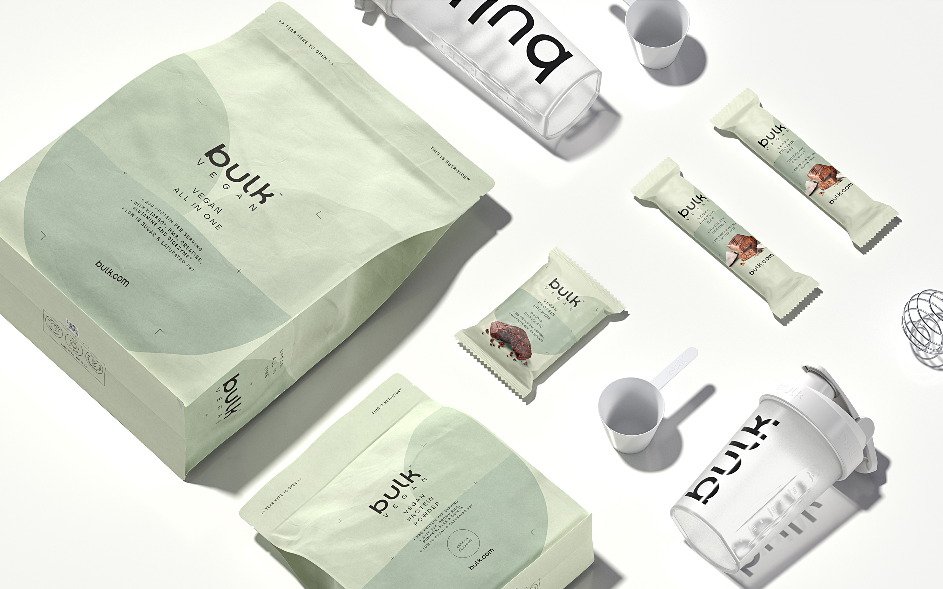
As part of the rebrand strategy, bulk™ wanted to feel more inclusive and accessible, helping to alleviate the intimidation associated with the category. This involved consolidating its extensive range of products to make the shopping experience easier and reflect the changing needs of consumers in an evolving fitness and nutrition landscape.
Ben Brears, Strategic Design Director at Robot Food said:
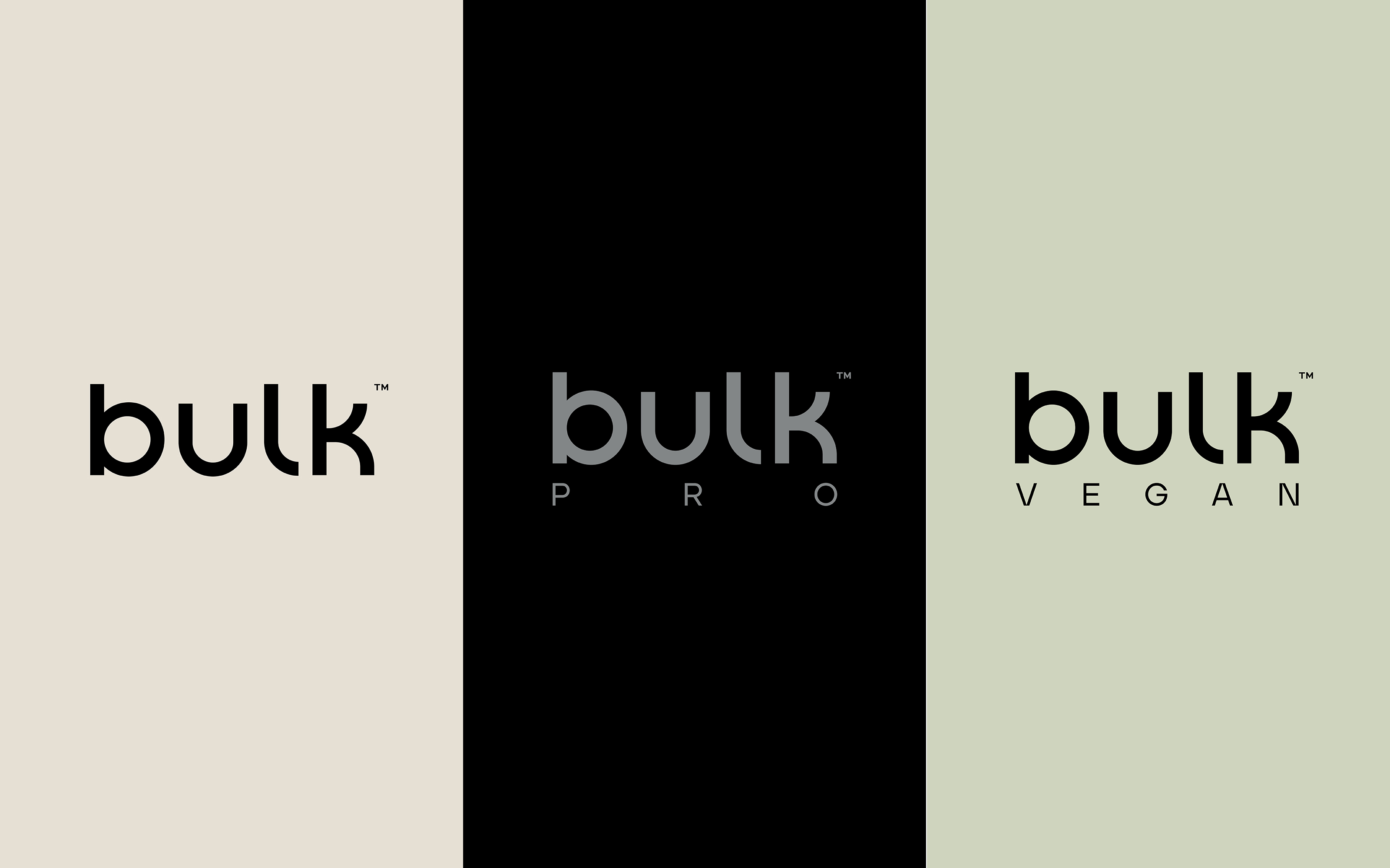
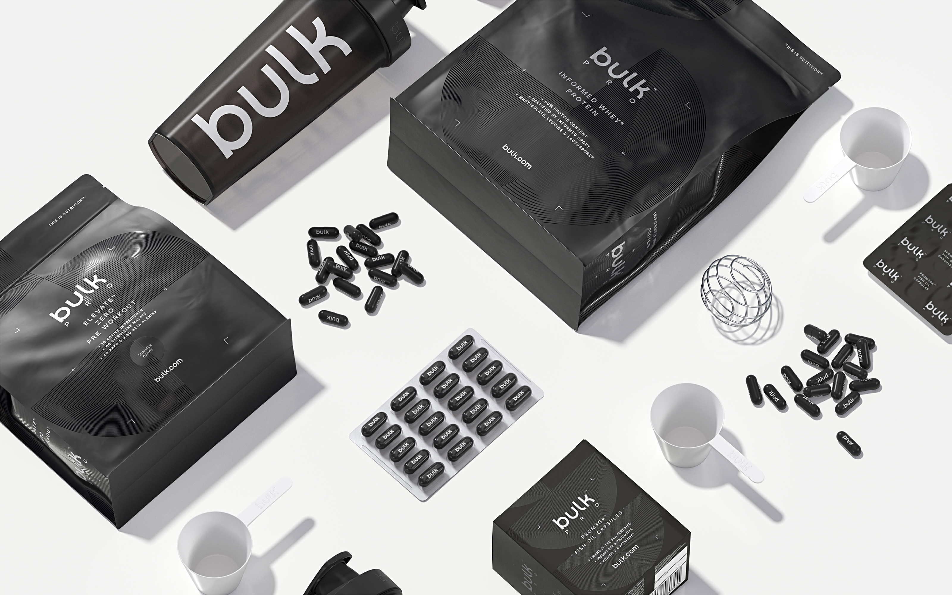
“To pull bulk™ apart from other active nutrition brands, we needed to adopt a ‘less is more’ approach in a category where more is usually more – whilst allowing for enough flex in the design to clearly differentiate the ranges.
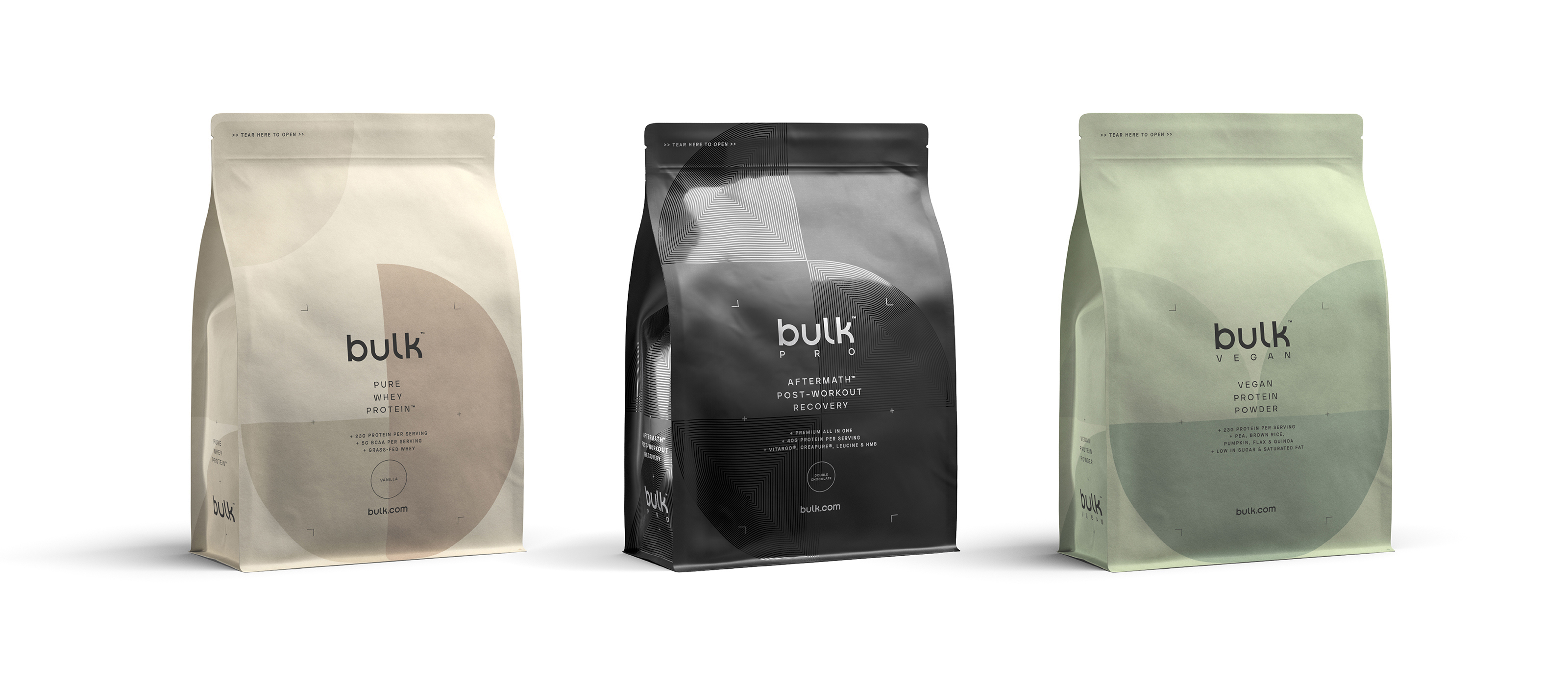
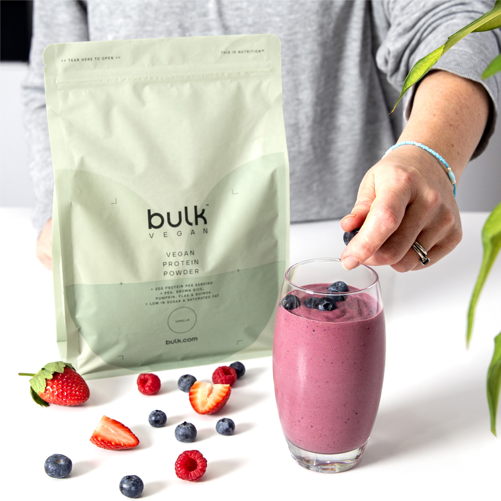
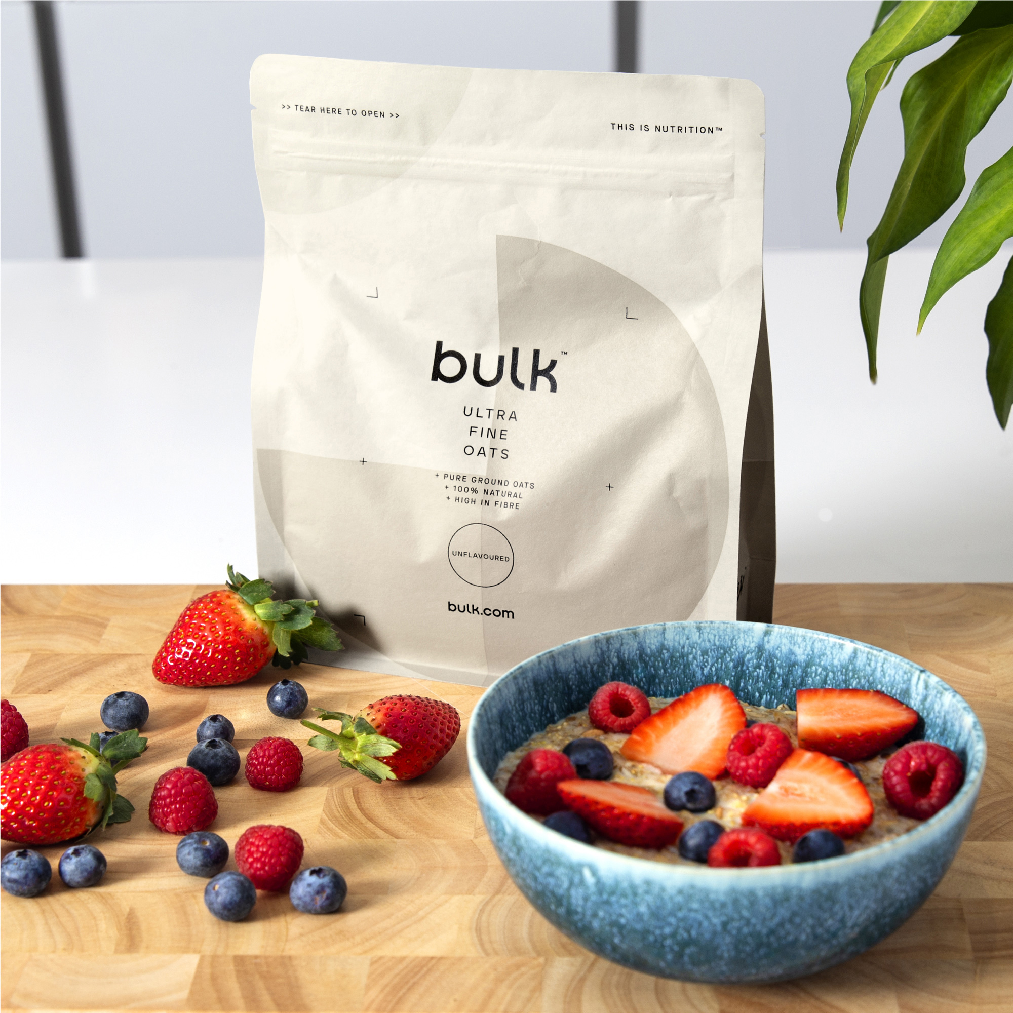
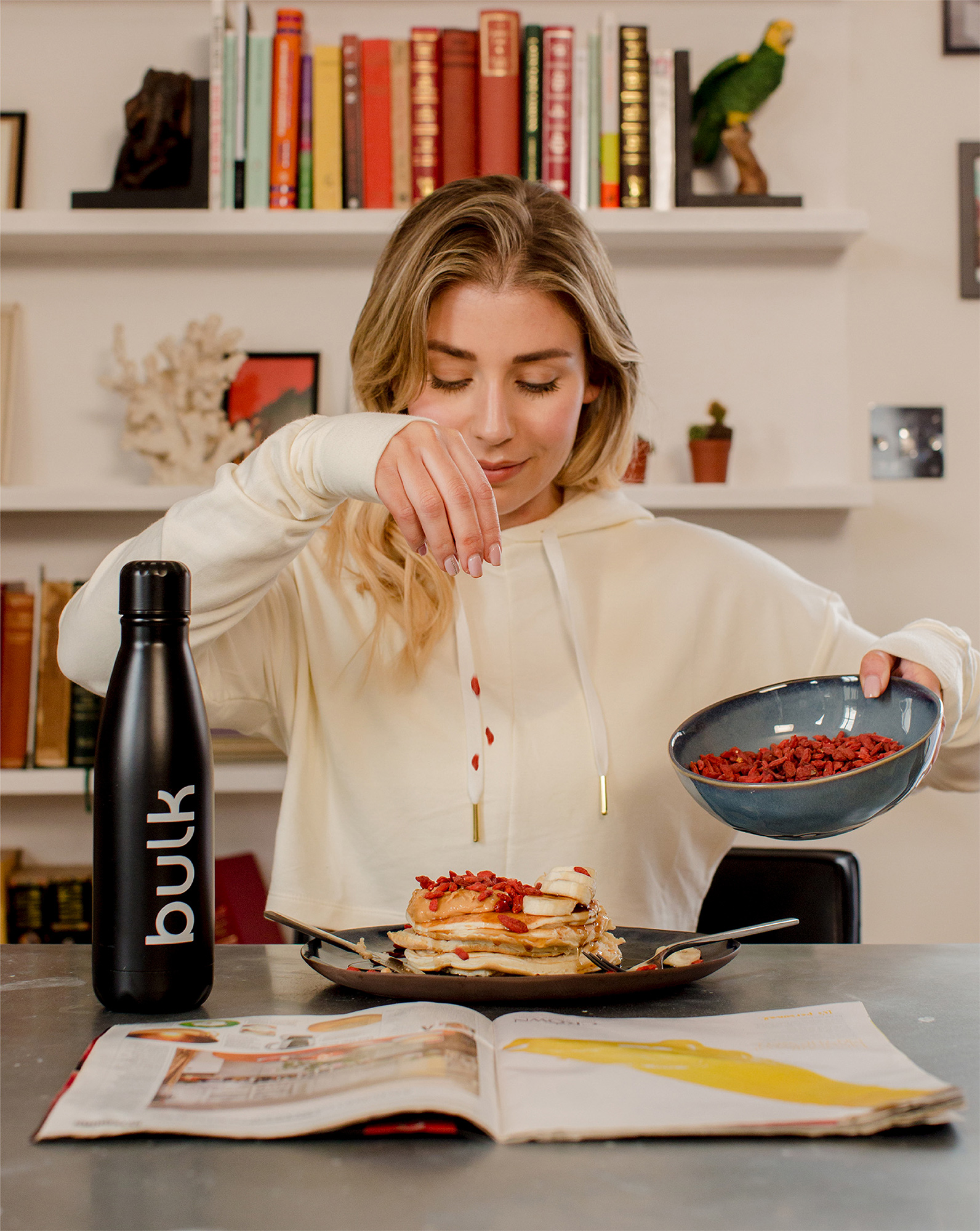
To achieve this, we created a number of circular patterns, reminiscent of nutritional charts, that would be unique to each range, and chose different colours and finishes to add a depth and ownability to the identity. For bulk™ PRO we opted for tactile print finishes and textures to signify its premium positioning. Whilst the former ‘Active Foods’ now includes photography for a much foodier feel.”
Adam Rossiter, Co-Founder at bulk™ said:
“Having worked on our previous two rebrands, we’ve built a strong relationship with Robot Food and watched over the years as their team and ambitions have grown in line with ours. So when we set out to embark on our biggest challenge yet, to reposition and evolve our brand in-line with changing consumer needs, we knew they’d be the perfect fit for the job. The team have pushed the brand far beyond what’s expected from the category, equipping us with a distinct identity to set us up for the future.”
Another integral part of the brand’s repositioning is a renewed focus on sustainability. 95% of capsule and tablet packaging is now plastic-free, along with 93% of product pouches, which are also home-compostable. These decisions are part of the company’s wider pledge to become a completely plastic-free business.
bulk™ Co-Founder, Elliot Dawes said:
“With a complete change in appearance, comes a renewed energy and focus on creating a more inclusive experience for our customers, as well as a more sustainable brand for our planet. Health is more than protein shakes and vitamins, so we needed to take a more holistic approach – enabling our customers feel good and live well. We are incredibly excited to usher in the new bulkTM era and look forward to switching even more people on to the benefits of sports and active nutrition.”

CREDIT
- Agency/Creative: Robot Food
- Article Title: Robot Food Reposition Bulk as an Aspirational Active Nutrition Brand
- Organisation/Entity: Agency, Published Commercial Design
- Project Type: Packaging
- Agency/Creative Country: United Kingdom
- Market Region: Global
- Project Deliverables: Brand Advertising, Brand Architecture, Brand Creation, Brand Experience, Brand Guidelines, Brand Identity, Brand Redesign, Brand Strategy, Brand World, Branding, Graphic Design, Packaging Design, Photography, Product Architecture, Rebranding, Research, Tone of Voice
- Format: Blister-Pack, Bottle, Box, Pot, Pouch
- Substrate: Metal, Plastic


