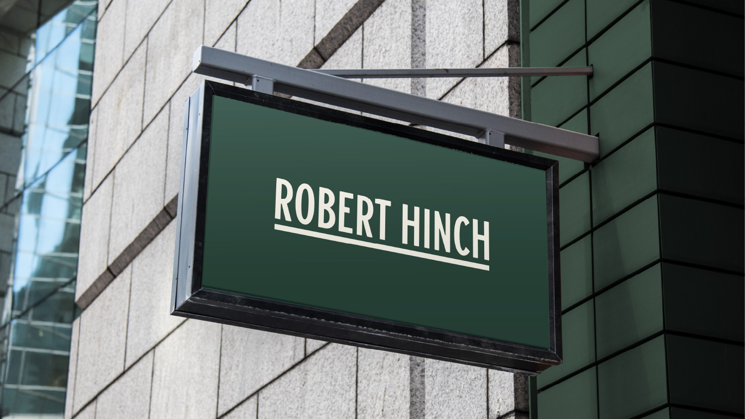
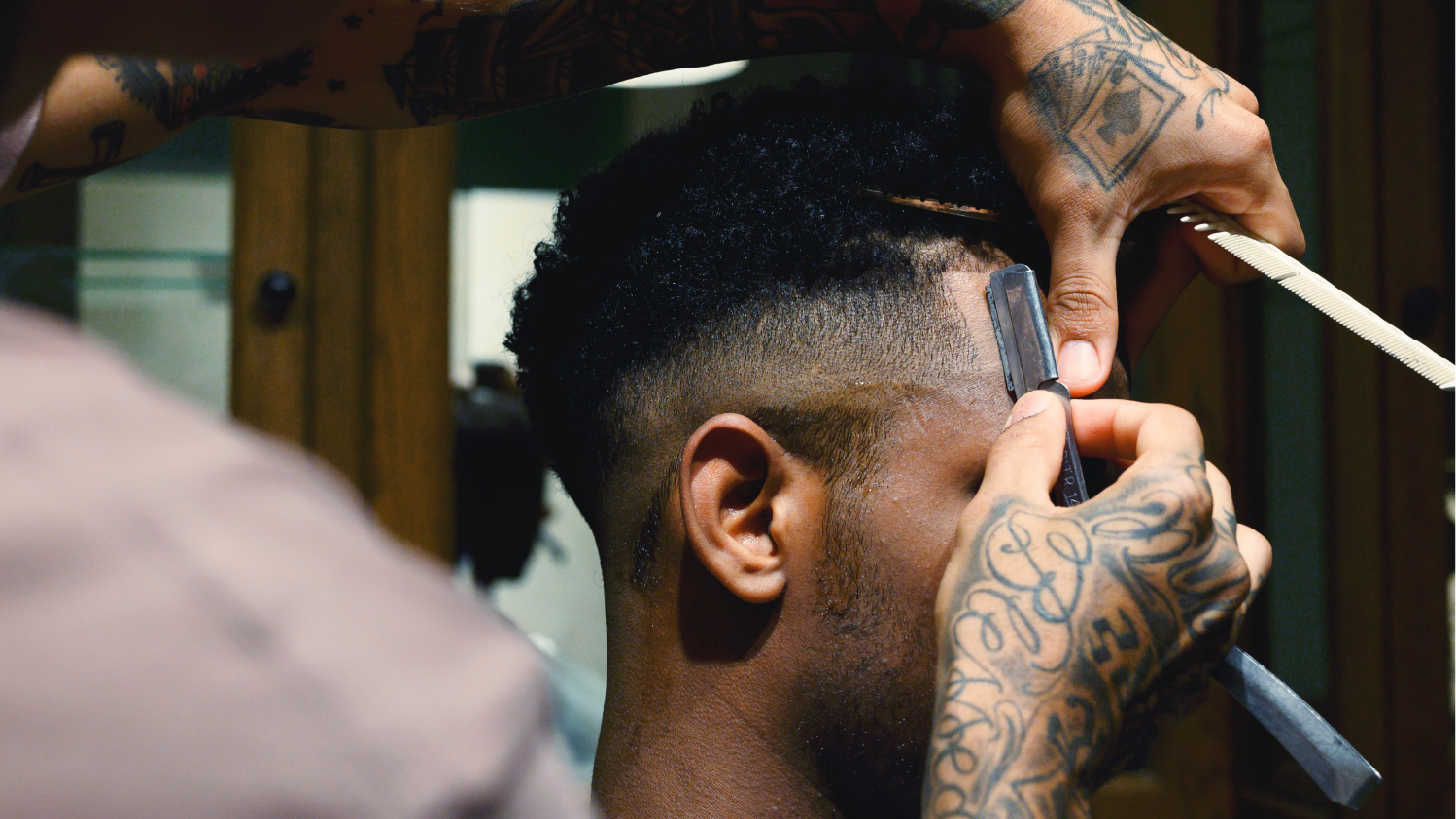
Robert Hinch, the barber shop in Saudi Arabia, asked us to do the redesign of their over all store, logo, and packaging. They are one of the first one to open up the western barber shop in Saudi Arabia. First when they approached us, they didn’t have a backbone in their branding. It had a mix of the classic barber with street brand tastes to it. Also every graphic was vintage in the not genuine way.
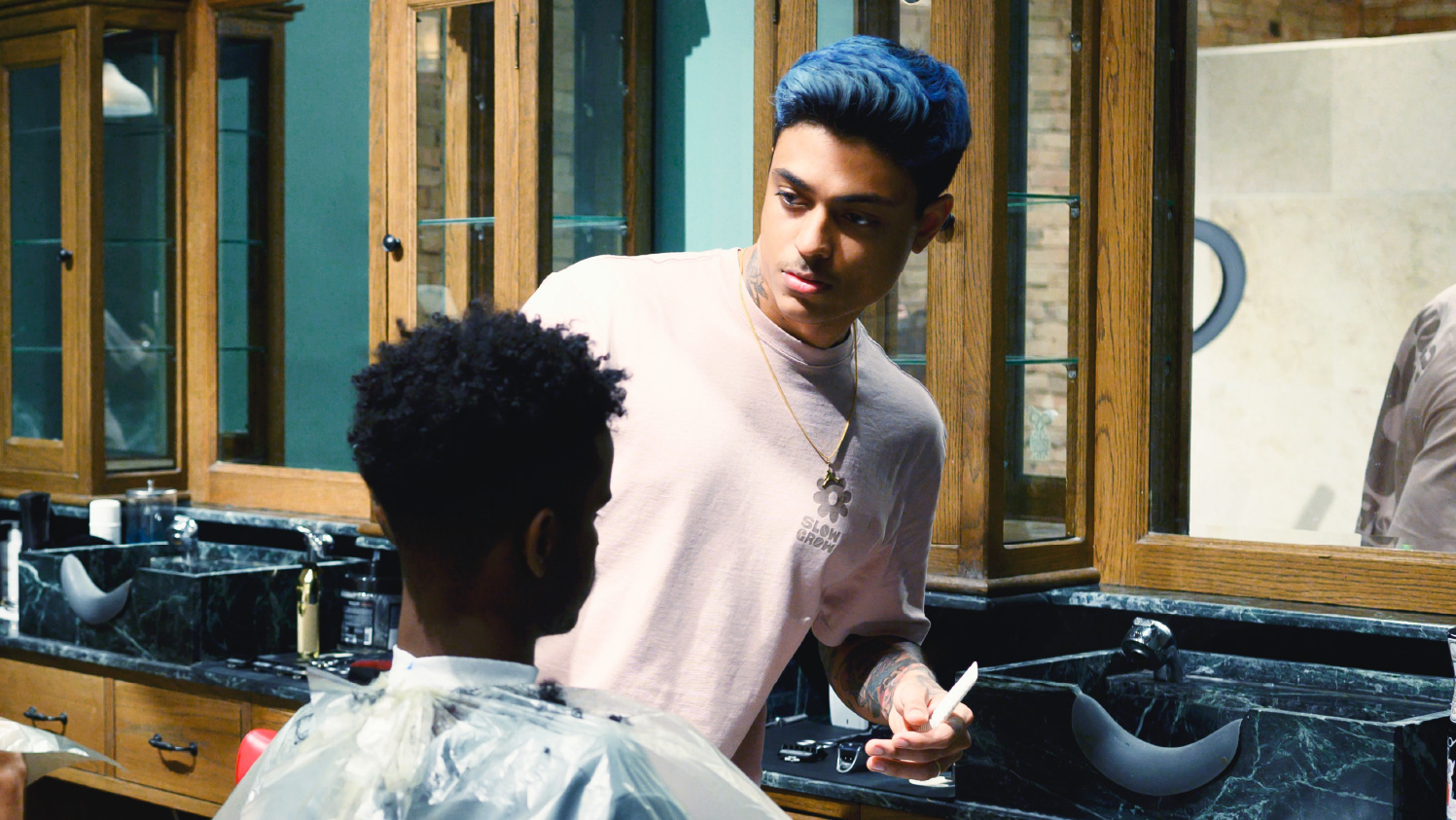
We wanted to revamp this up coming barber shop to be more genuine and reflects on their core values. When we started doing workshop, we found out that they had a great respect to the classic barber shop spirit where it was local, and approachable. the place that everybody is welcome and relax. The barbers who work there has extreme attention to the details to make their customers hair beautiful. we wanted to reflect on this classic craftsmanship in the design. In addition, their price point is quite high compare to the other competitors. So they also wanted to make the brand a bit more premium.
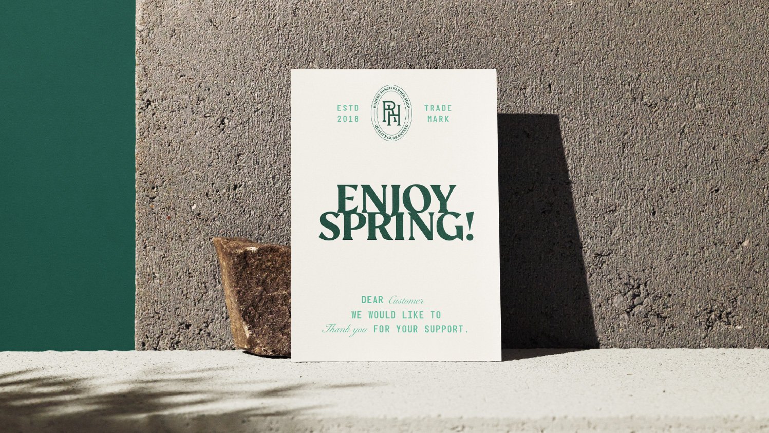
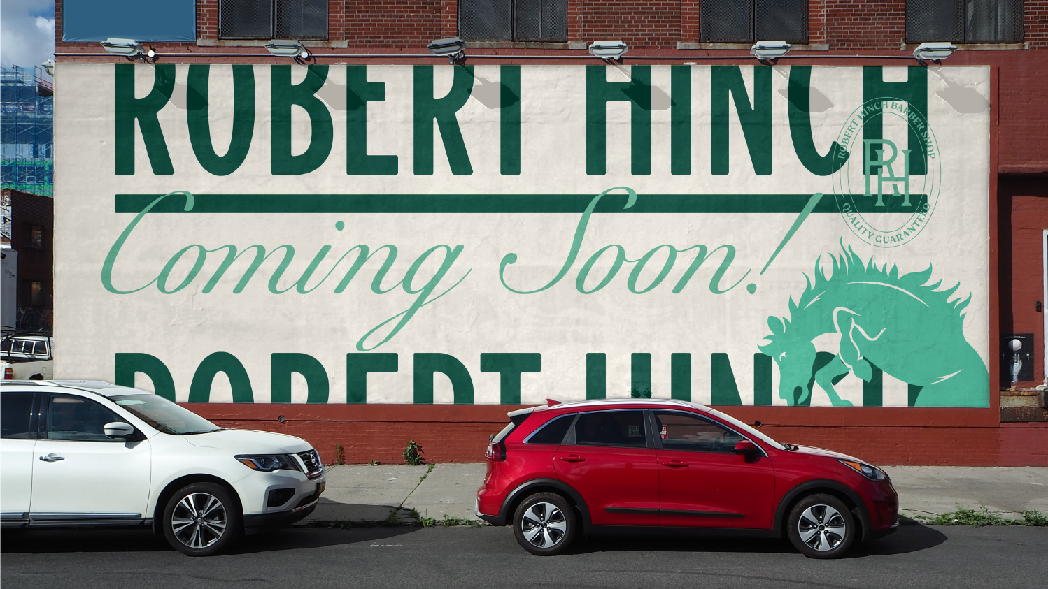
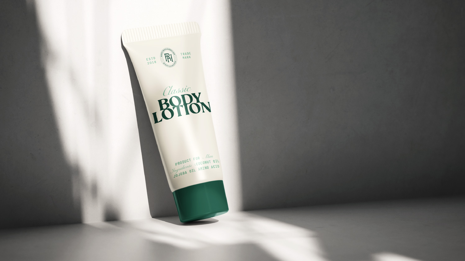
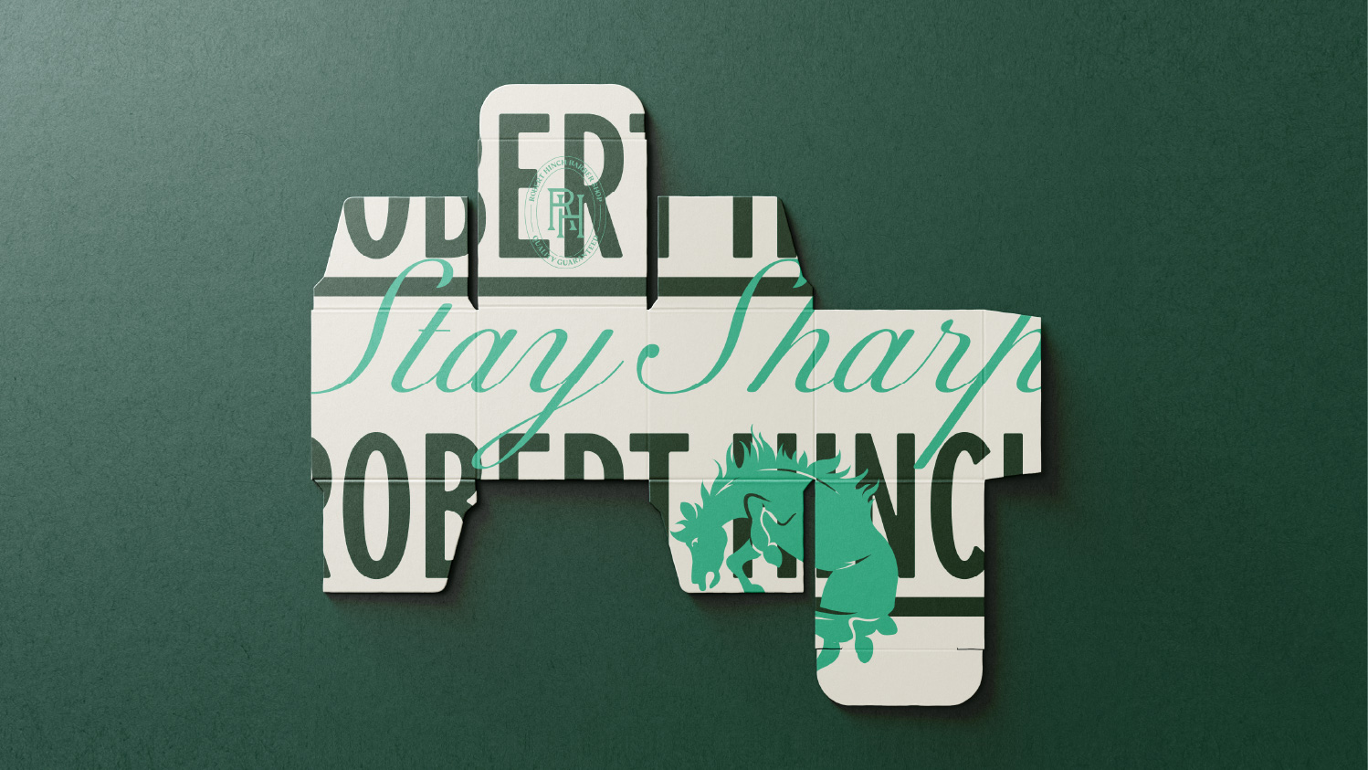
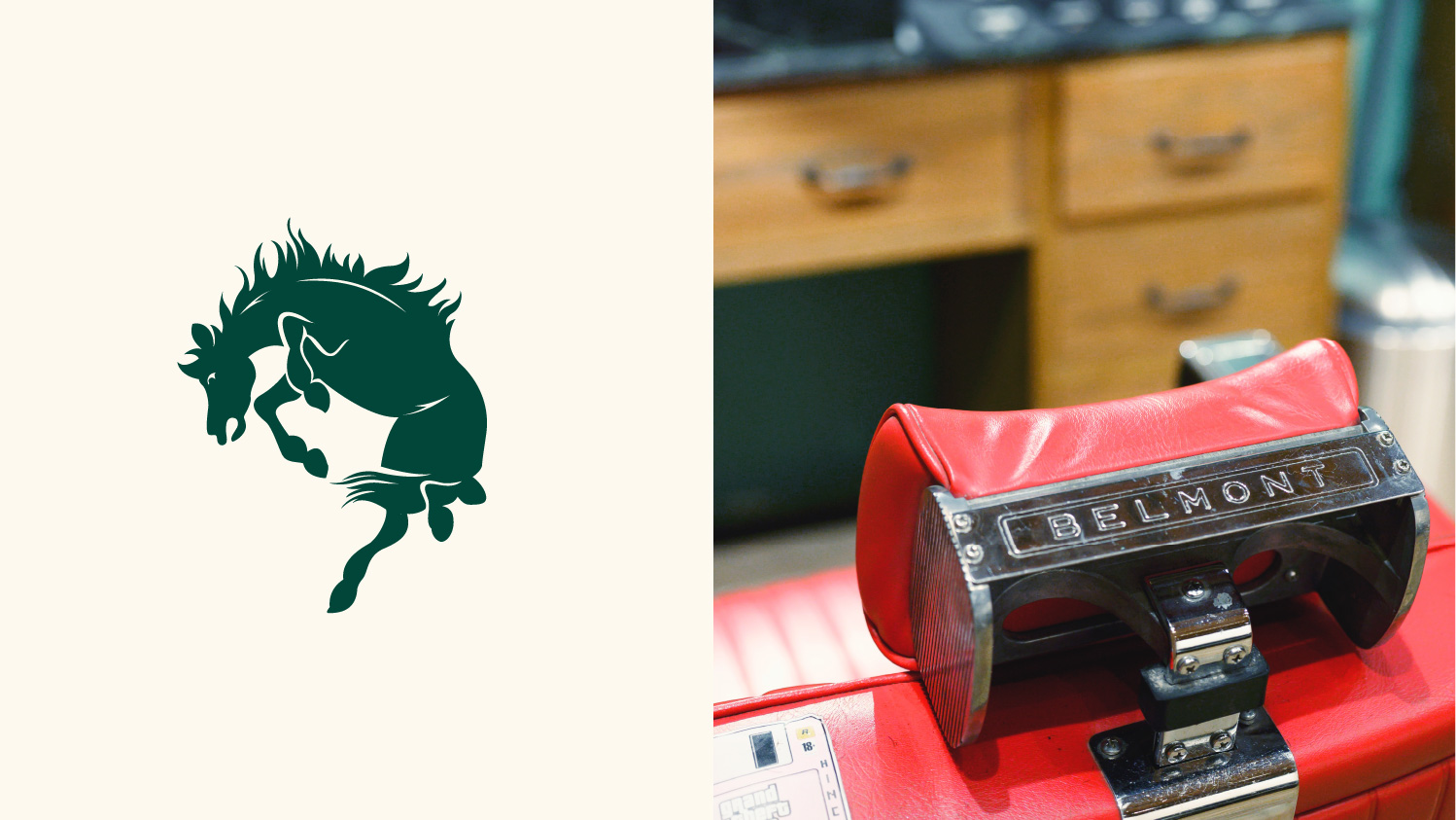
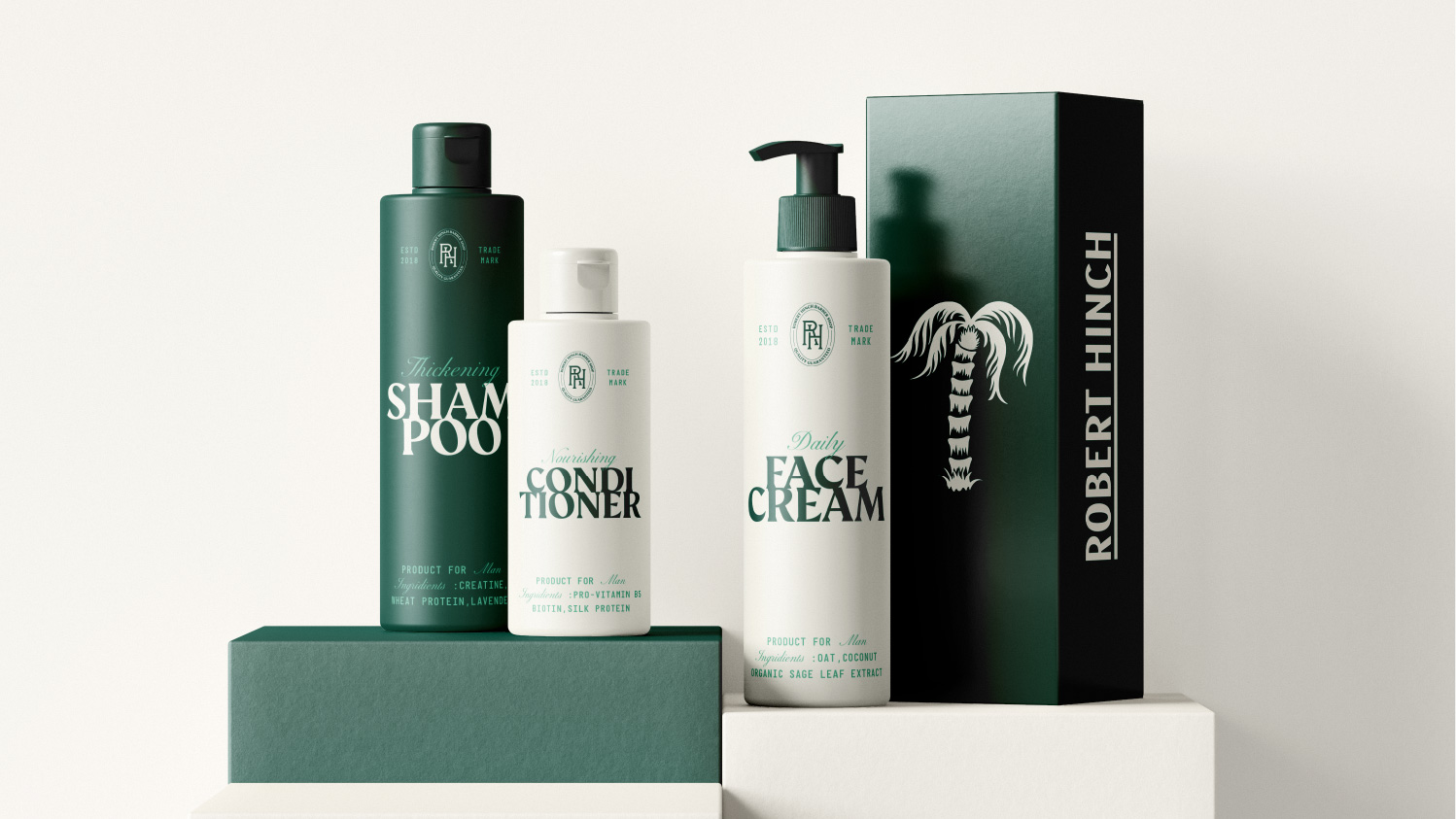
In order to solve their problem, we used typography solution that are classic, stylish yet contemporary. we wanted to tighten up the leading so that each letters are touching each other. We thought that it could be iconic way of showing the type. We also used symbolism to show some of their value. For example, we illustrated the horses to show the beauty spirits in the man and palm tree to reflect the mood of the barber where it’s very cozy to be in. Also made a collage as one of their graphic tool to create more dynamic and modern approach to men’s cosmetic products.
CREDIT
- Agency/Creative: Stamp Works
- Article Title: Robert Hinch Barber Shop Branding by Stamp Works
- Organisation/Entity: Agency
- Project Type: Graphic
- Project Status: Published
- Agency/Creative Country: Japan
- Agency/Creative City: Okayama
- Market Region: Middle East
- Project Deliverables: 2D Design, Advertising, Brand Design, Packaging Design
- Industry: Fashion
- Keywords: baber shop
-
Credits:
Graphic Designer: Jin Fujiwara


