


The Brief: Robee Honey is a family-owned business that produces raw and natural honey directly from bee hives. With over two decades of history, the brand presents a passion for beekeeping, producing high-quality honey that is both delicious and healthy. The branding was built around the idea of Robee’s authenticity and the unique story behind its name.
The Creative Concept: We wanted to capture the story of Robee Honey in a visual identity that would communicate the brand’s uniqueness and high-quality product. Our concept was to add personality to the brand by evoking a sense of nature, passion, and warmth. We wanted to create a connection between the consumer and the product by showcasing the story of Robee Honey and highlighting its natural ingredients.
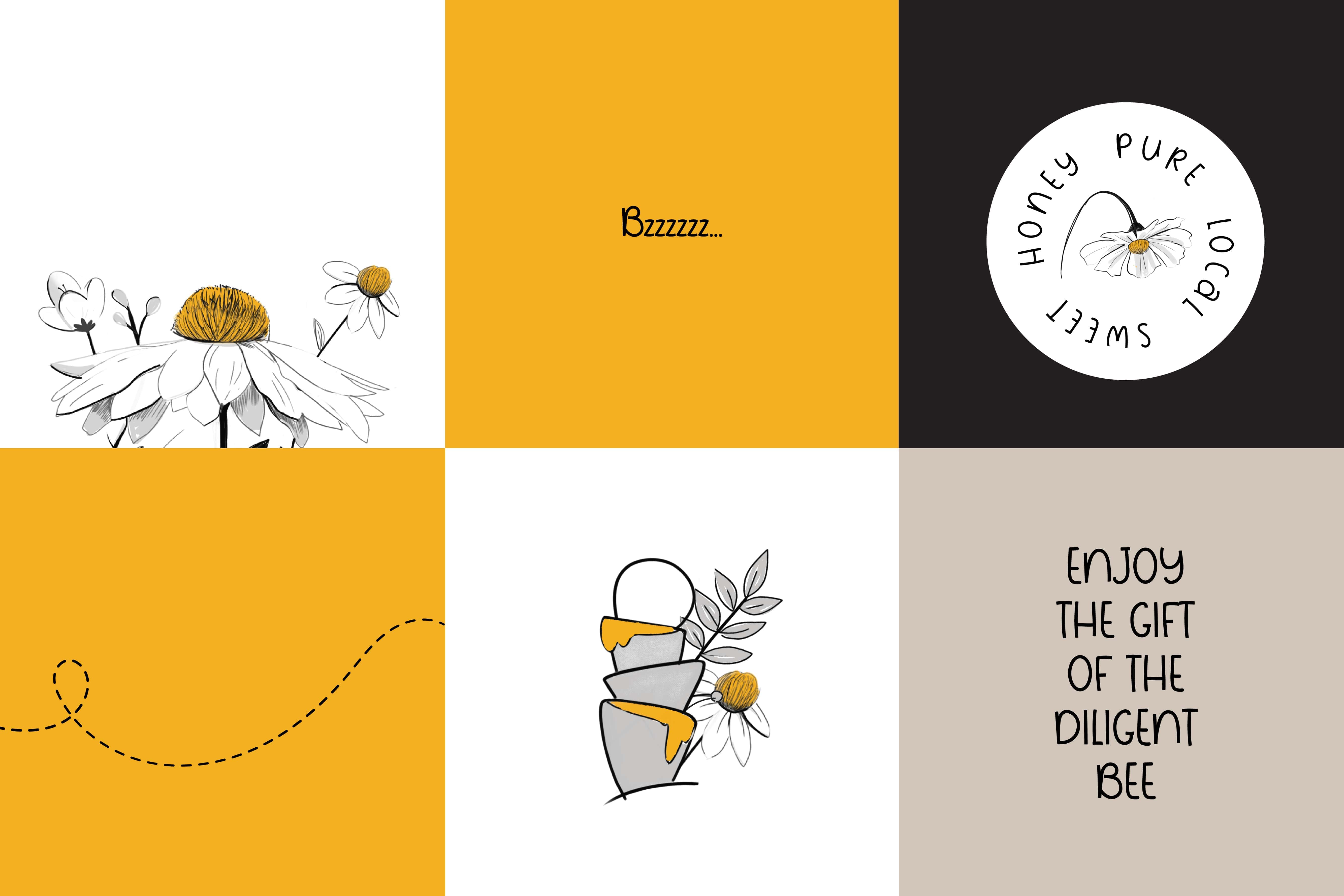
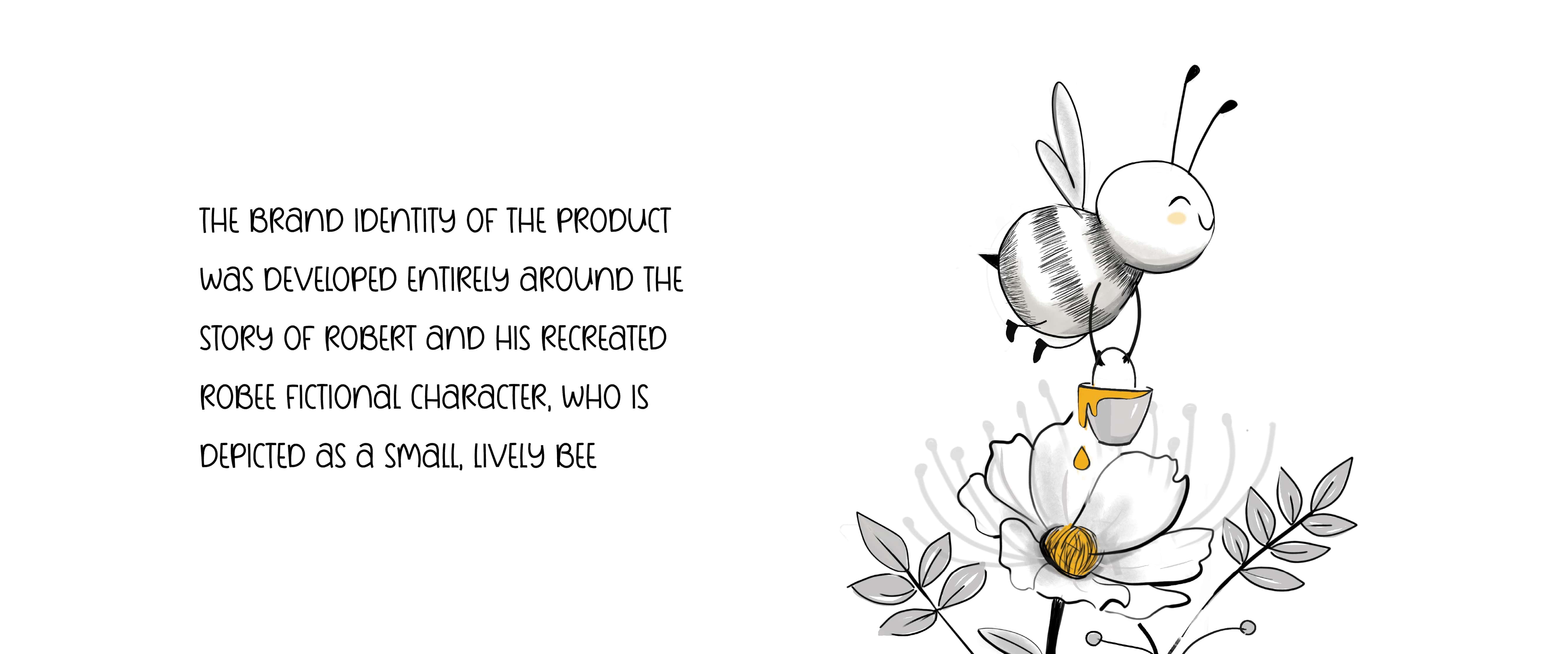
Naming: Inspired by the story of its founder and beekeeper, Grandpa Norik, the name Robee was created from the combination of his beloved grandson’s name, Robert, and ‘Bee’. An adorable tiny bee representing the little boy was added to the brand to make it more relatable and personable, adding a personal touch to this memorable name and making it stand out in the market.
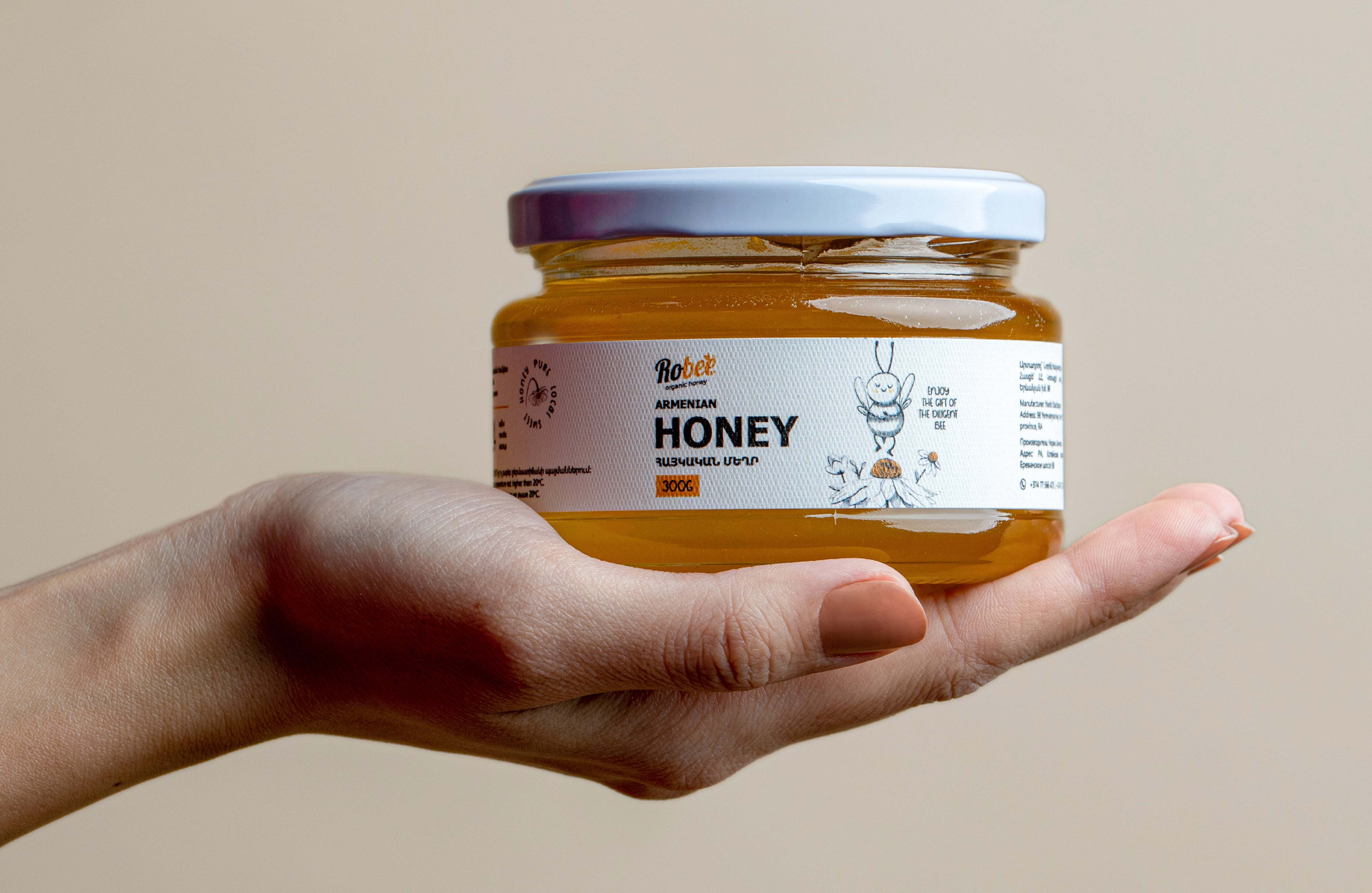
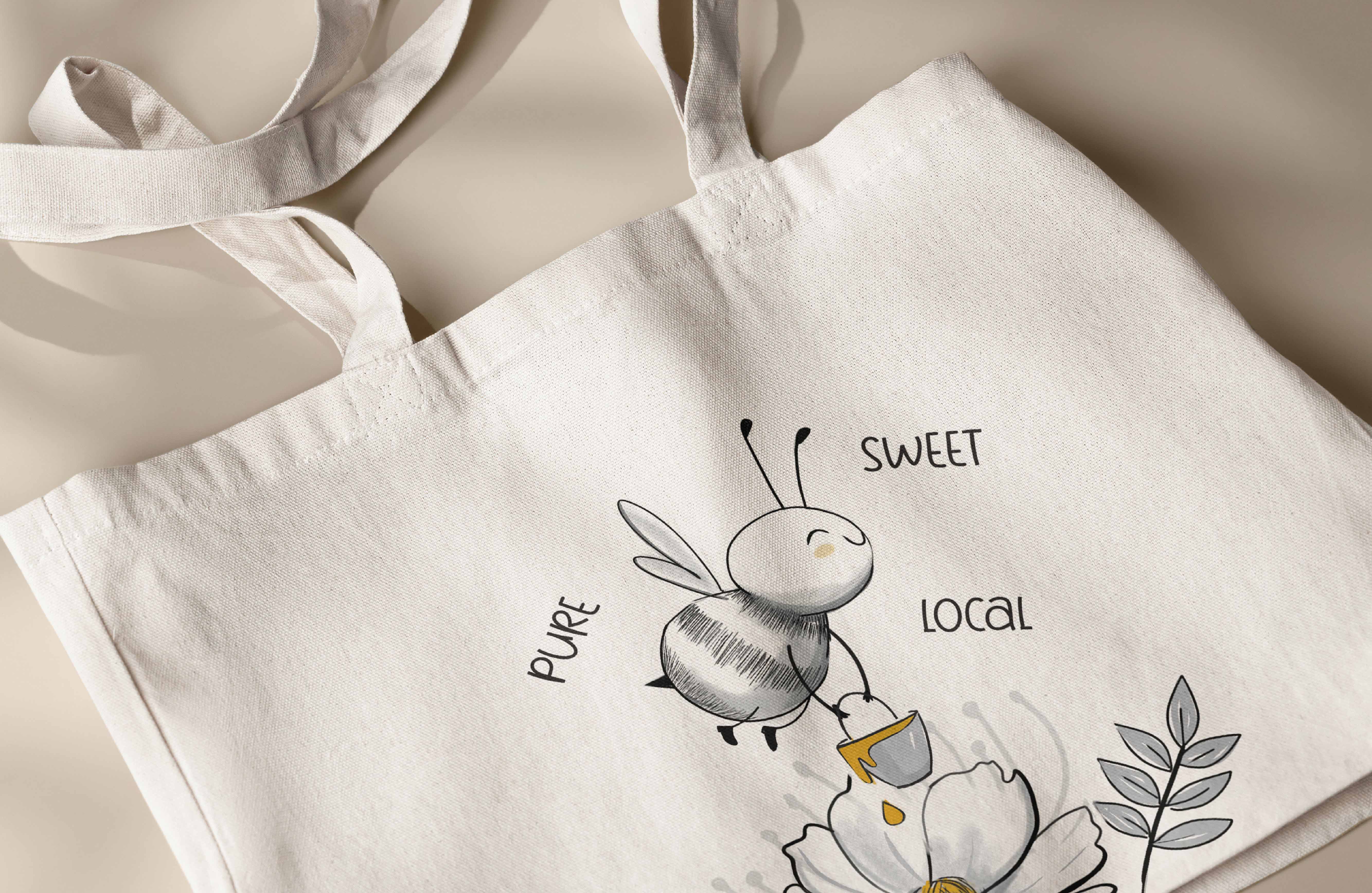
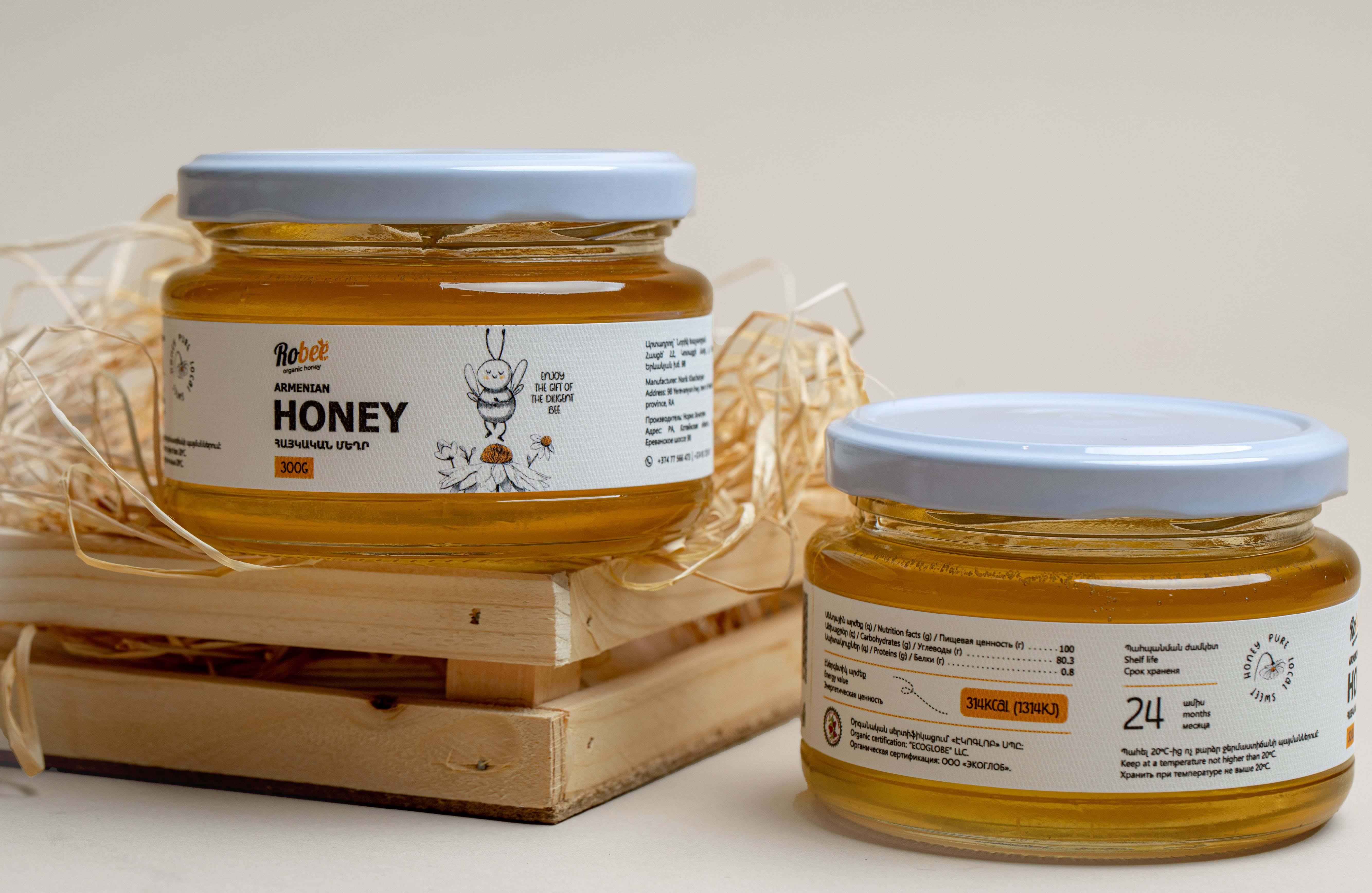
Logo Design: The logo was designed to represent the passion and dedication that went into creating Robee Honey. The logo features a hand-drawn illustration of a naughty and playful bee, perfectly symbolizing the hardworking nature of the bees and the beekeepers. The golden color added more depth to the logo and sketch, highlighting the rich and sweet taste of Robee Honey.
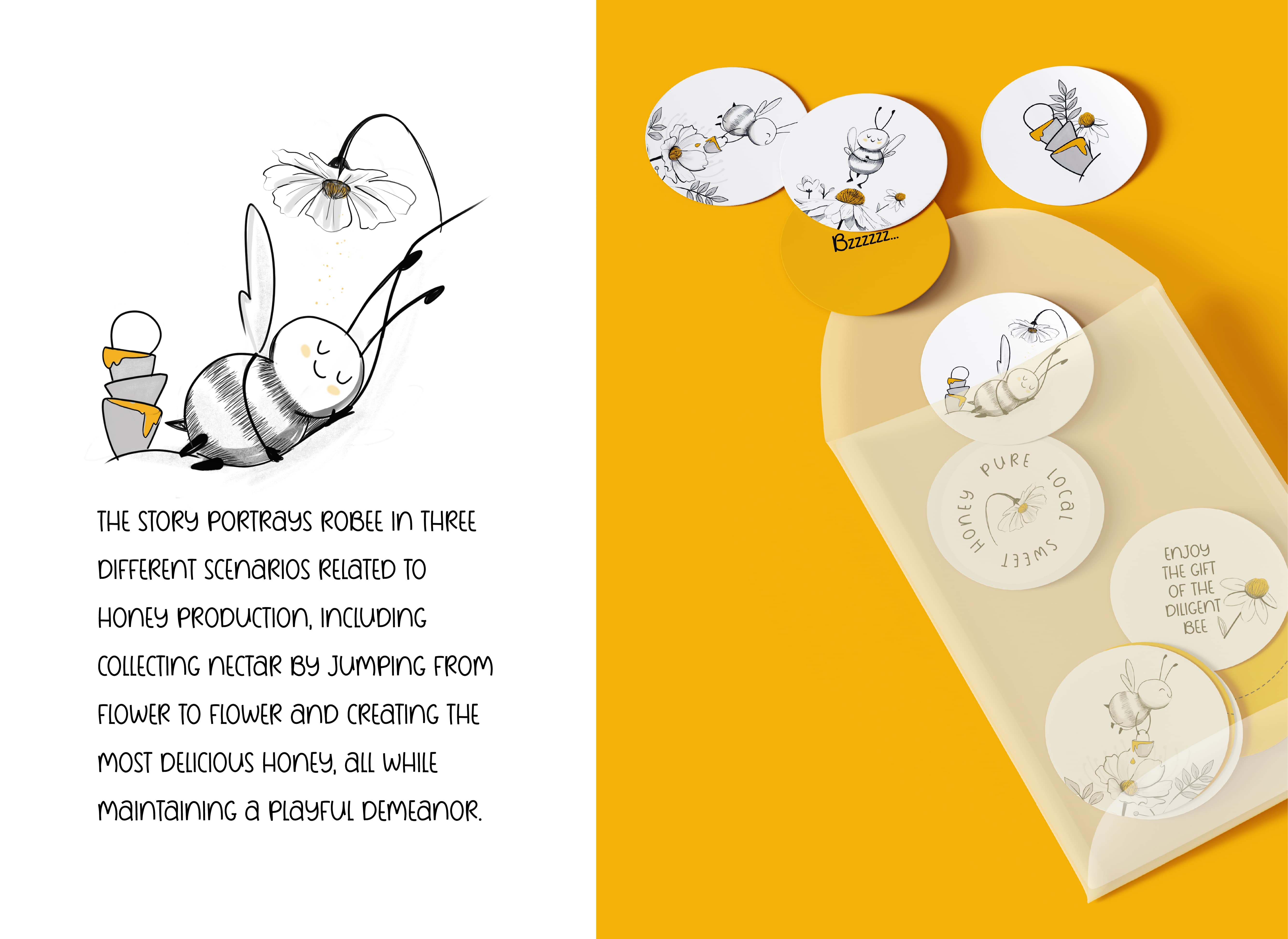
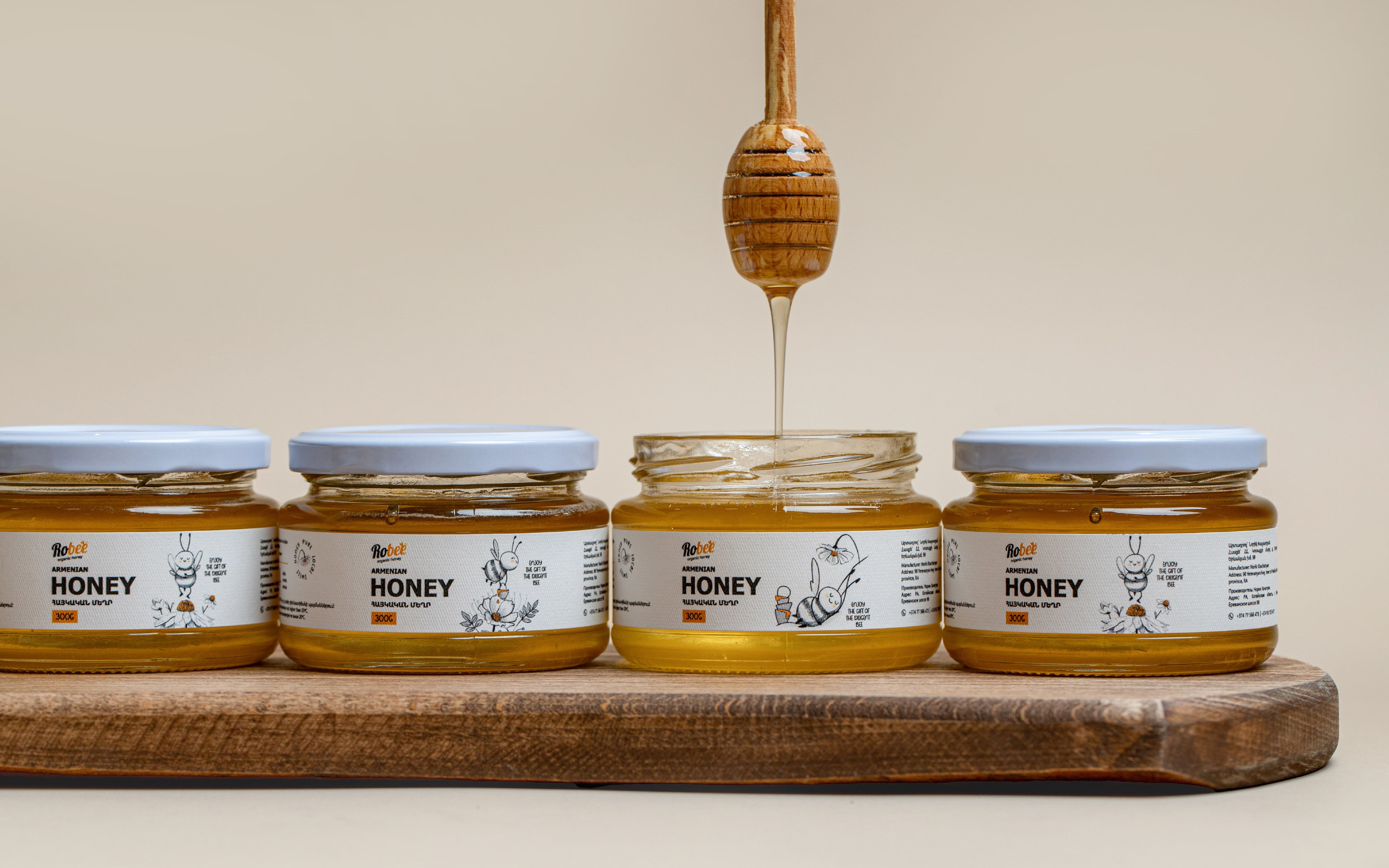
The Result: The brand identity of the product was developed entirely around the story of Robert and his recreated Robee fictional character, who is depicted as a small, lively bee. The story portrays Robee in three different scenarios related to honey production, including collecting nectar by jumping from flower to flower and creating the most delicious honey, all while maintaining a playful demeanor. This narrative is expertly conveyed through the product’s design and name, resulting in a cohesive and compelling brand identity.
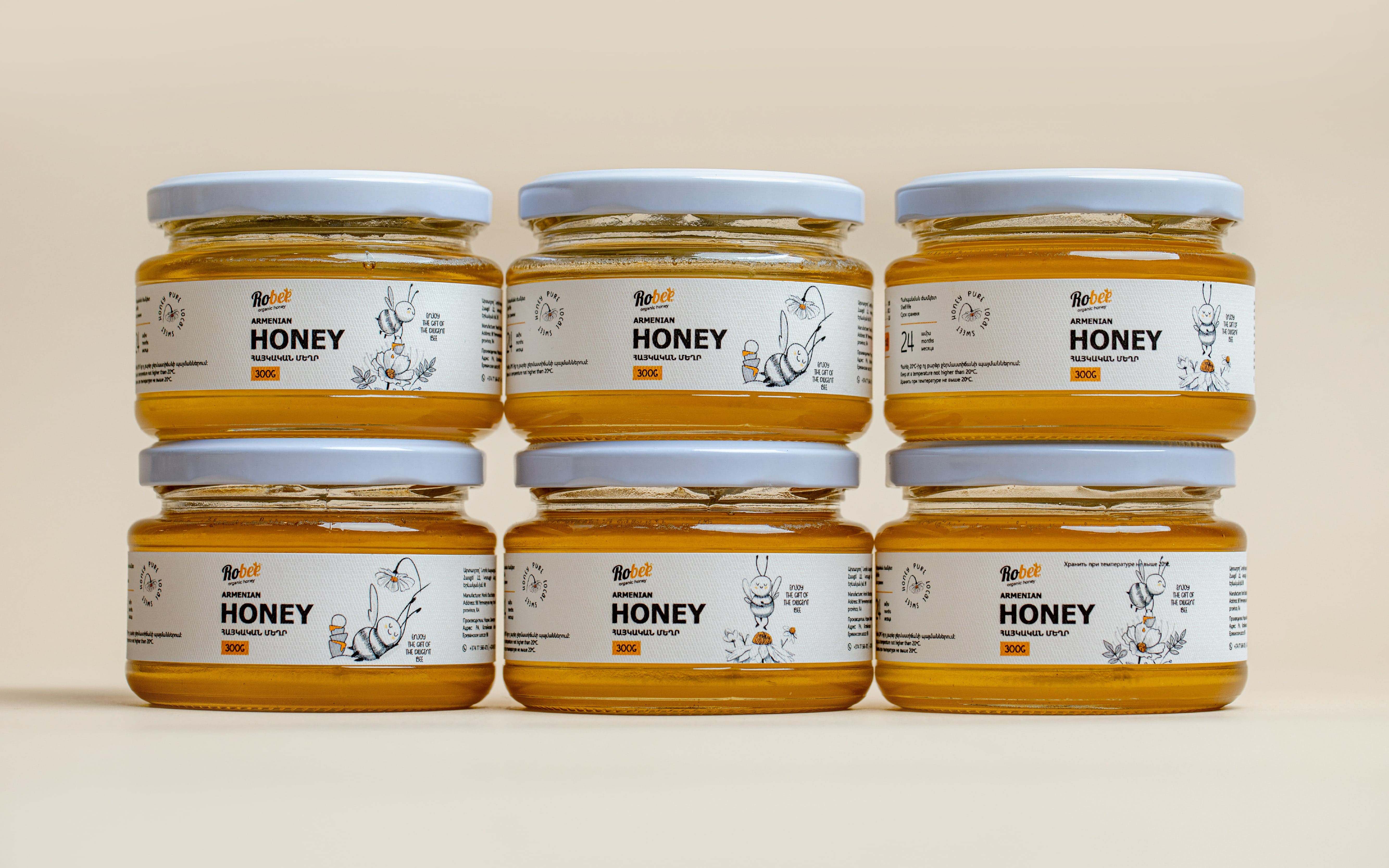
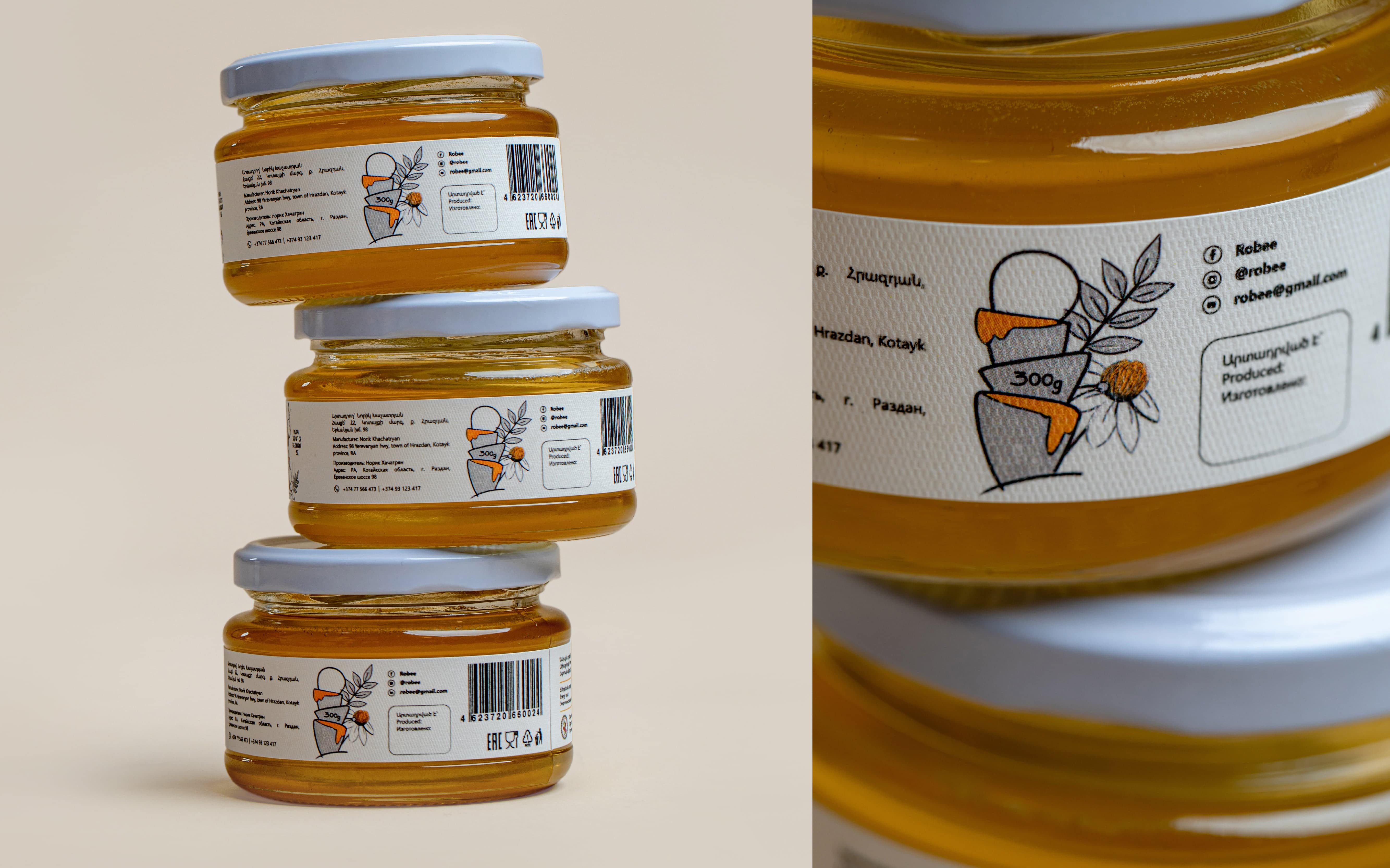
The packaging is designed to stand out on the shelves, with a personalized symbol and color scheme immediately grabbing the consumer’s attention. The brand identity is consistent across all touchpoints, with the story of Robee Honey being reflected in the product design. The result is a brand that is unique, authentic, and memorable, representing the passion and dedication of Robee.
CREDIT
- Agency/Creative: Non Gravity
- Article Title: Robee: Branding and Packaging Design by Non Gravity
- Organisation/Entity: Agency
- Project Type: Packaging
- Project Status: Published
- Agency/Creative Country: Armenia
- Agency/Creative City: Yerevan
- Market Region: Global
- Project Deliverables: Brand Design, Brand Naming, Branding, Character Design, Design, Food Photography, Graphic Design, Illustration, Label Design, Logo Design, Packaging Design, Photography, Product Design, Product Naming, Product Photography
- Format: Jar
- Substrate: Glass, Glass Jar
- Industry: Food/Beverage
- Keywords: Branding, Packaging Design, Logo Design, Product Design, Brand Naming, Illustration, Character Design, Product Photography
-
Credits:
Brand Strategist: Karen Vardanyan
Creative Director: Diana Nerkararyan
Art Director: Arusik Ghazaryan
Designer: Sergey Adamyan
Illustrator: Maria Ghulyan
Content Writer: Anush Bichakhchyan
Project Manager: Mariana Madoyan
Photographer: Samvel Poghosyan


