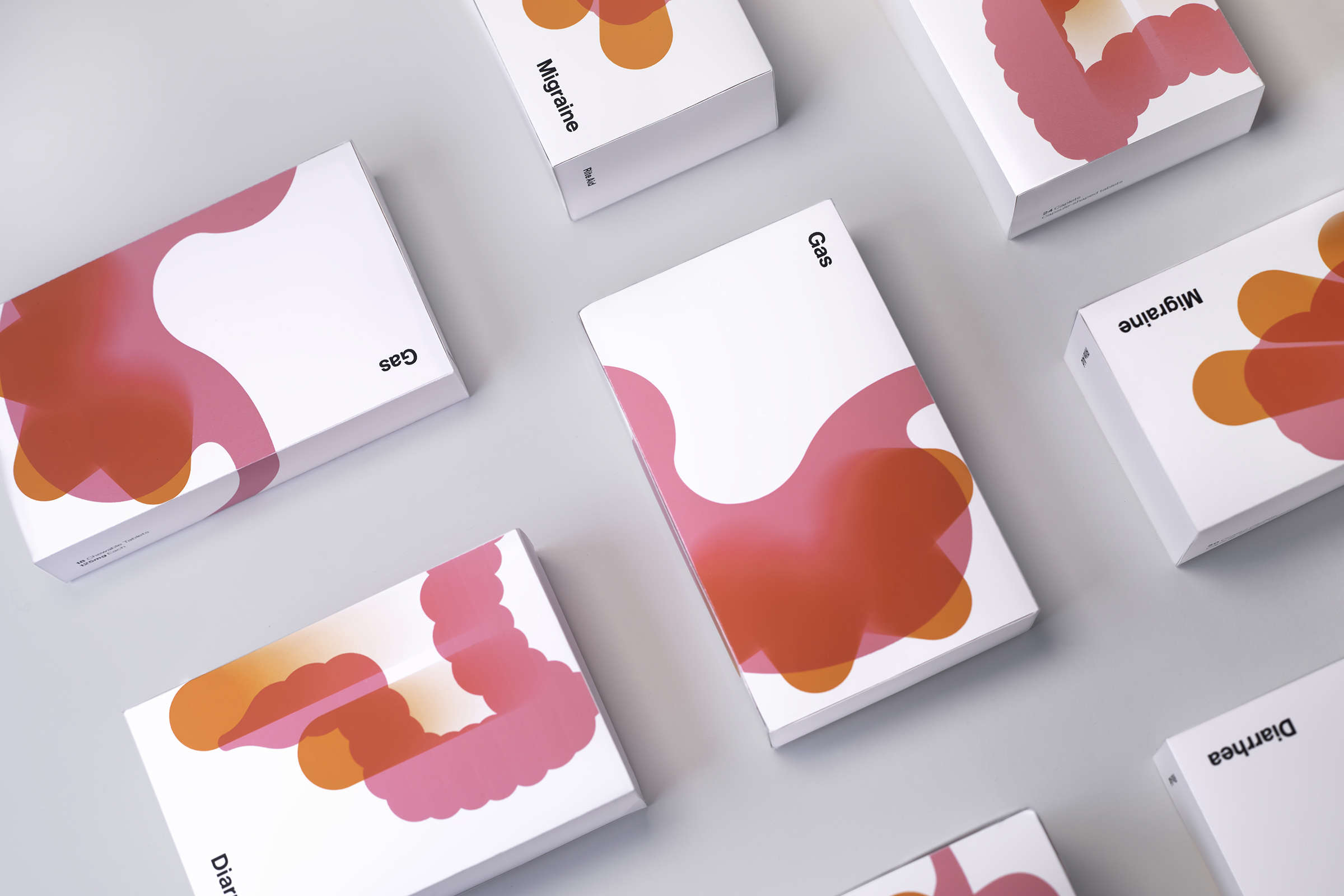
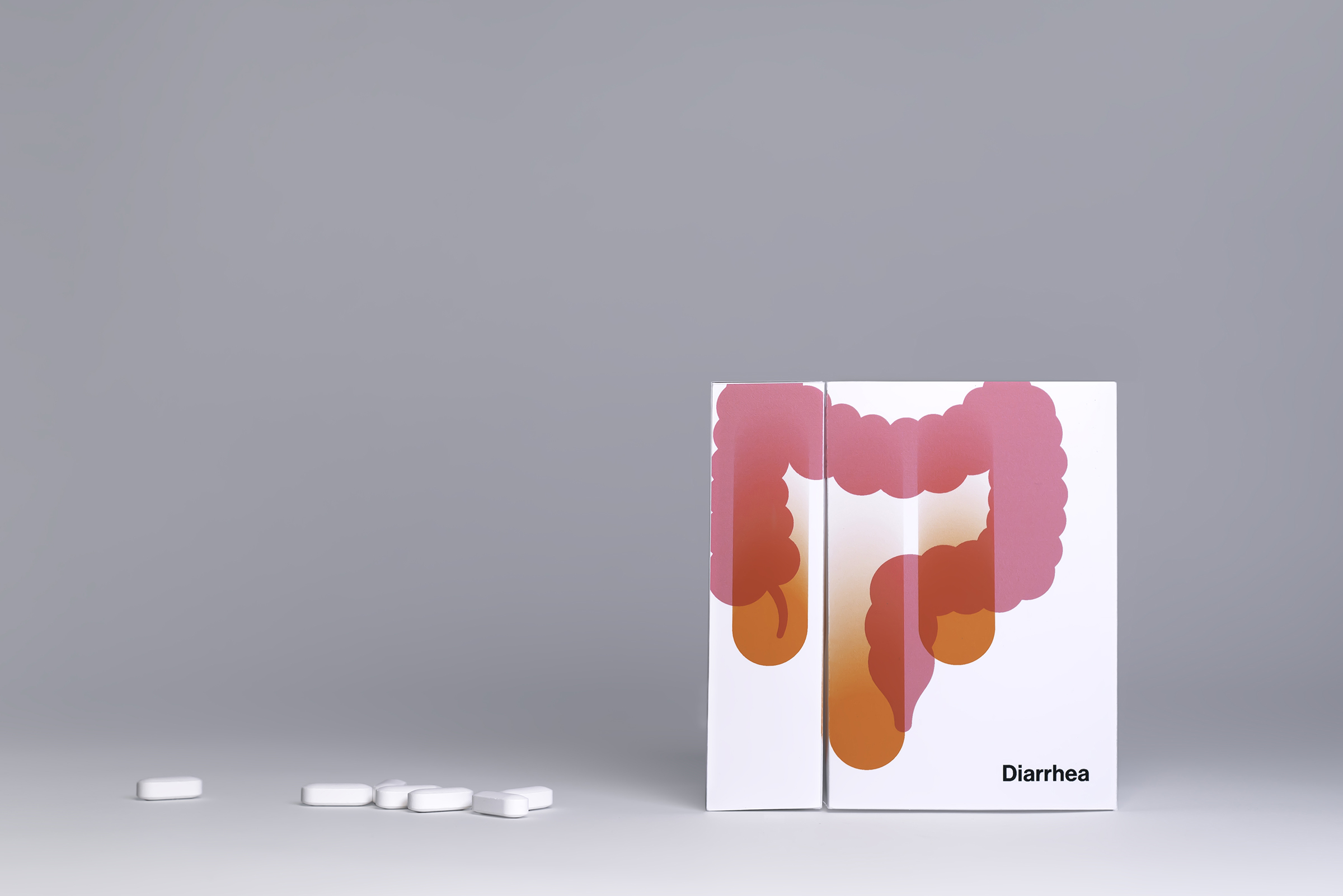
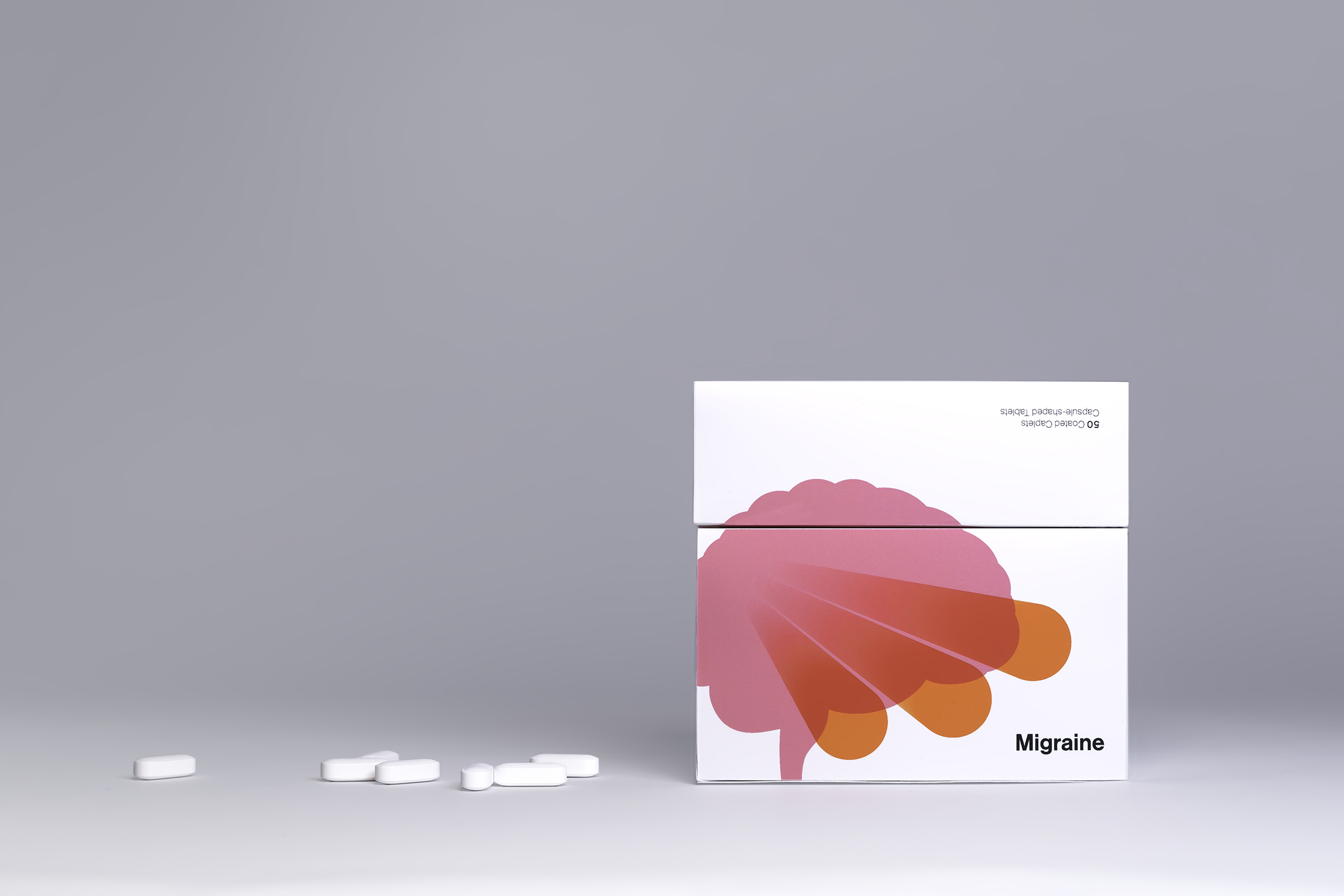
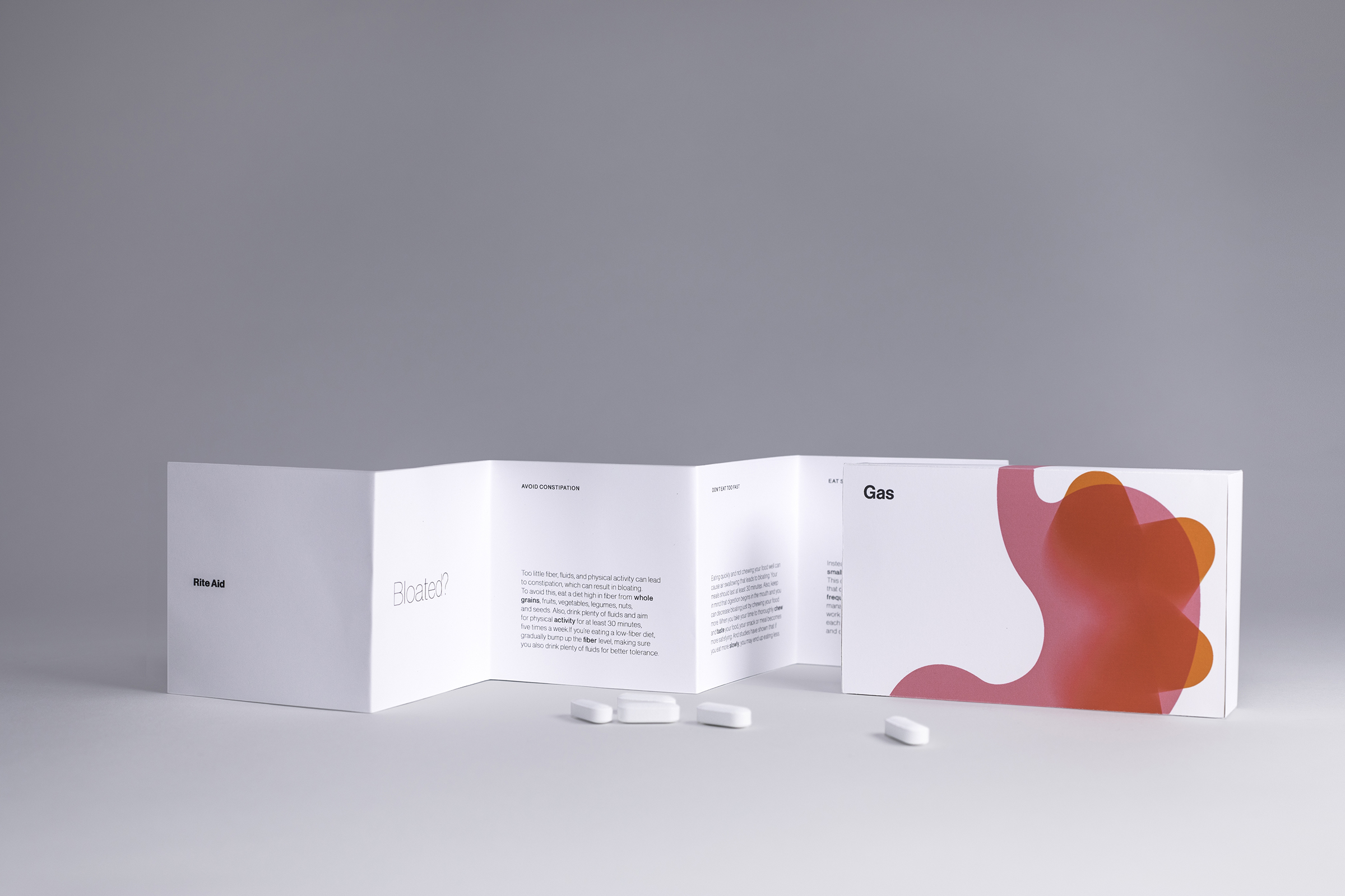
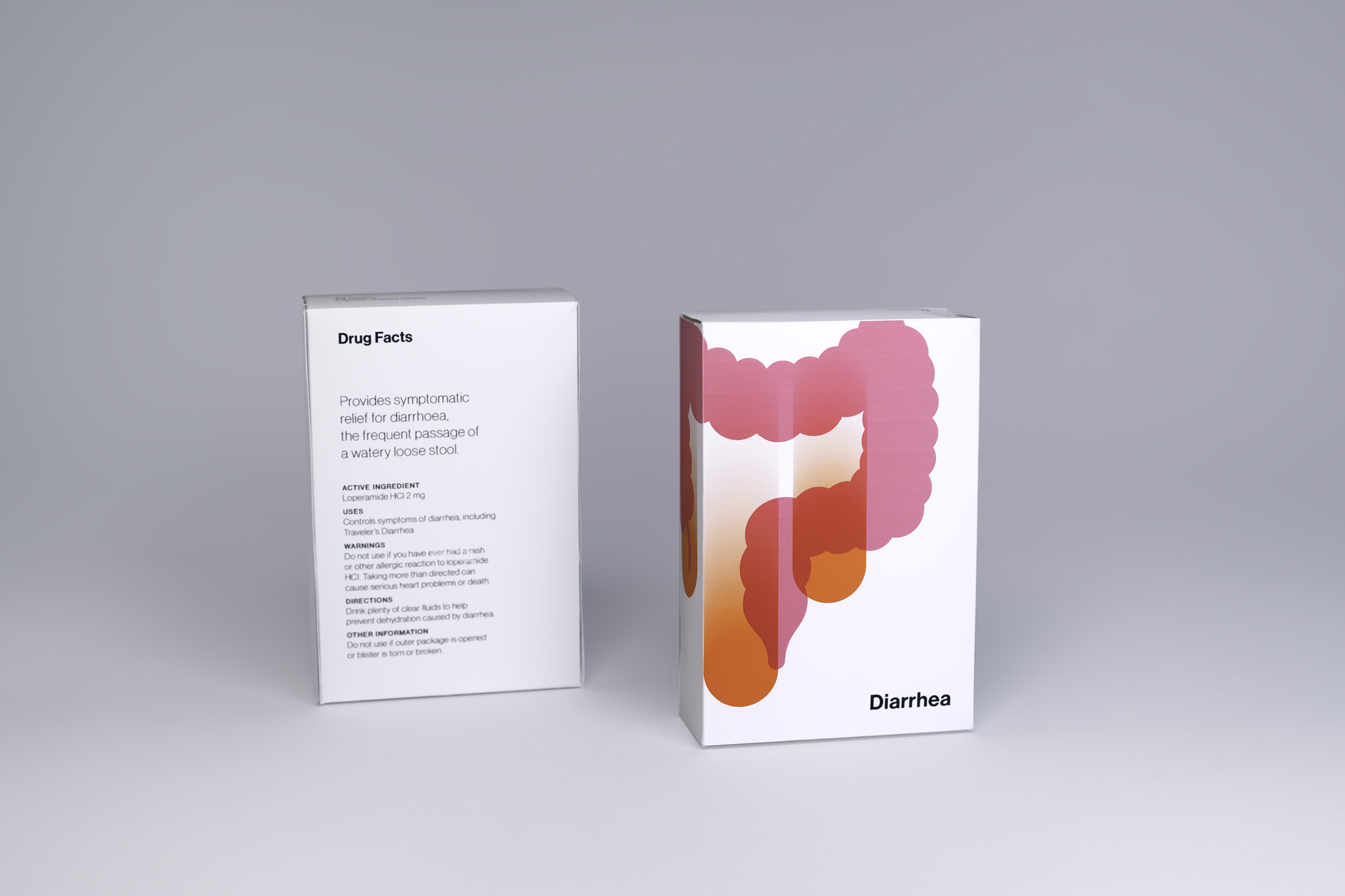
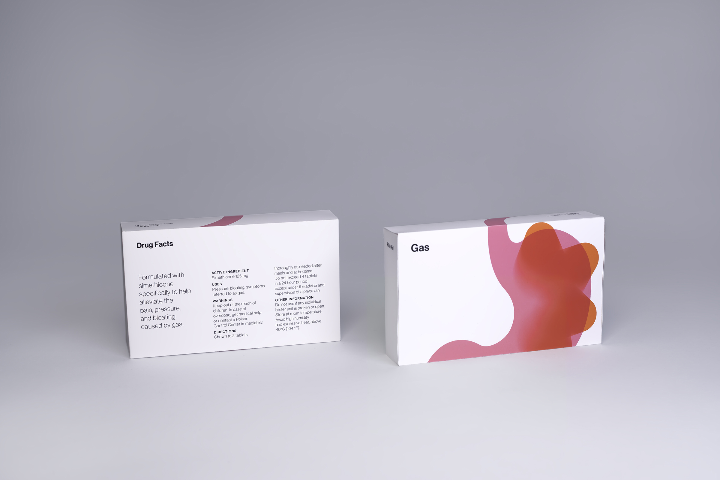
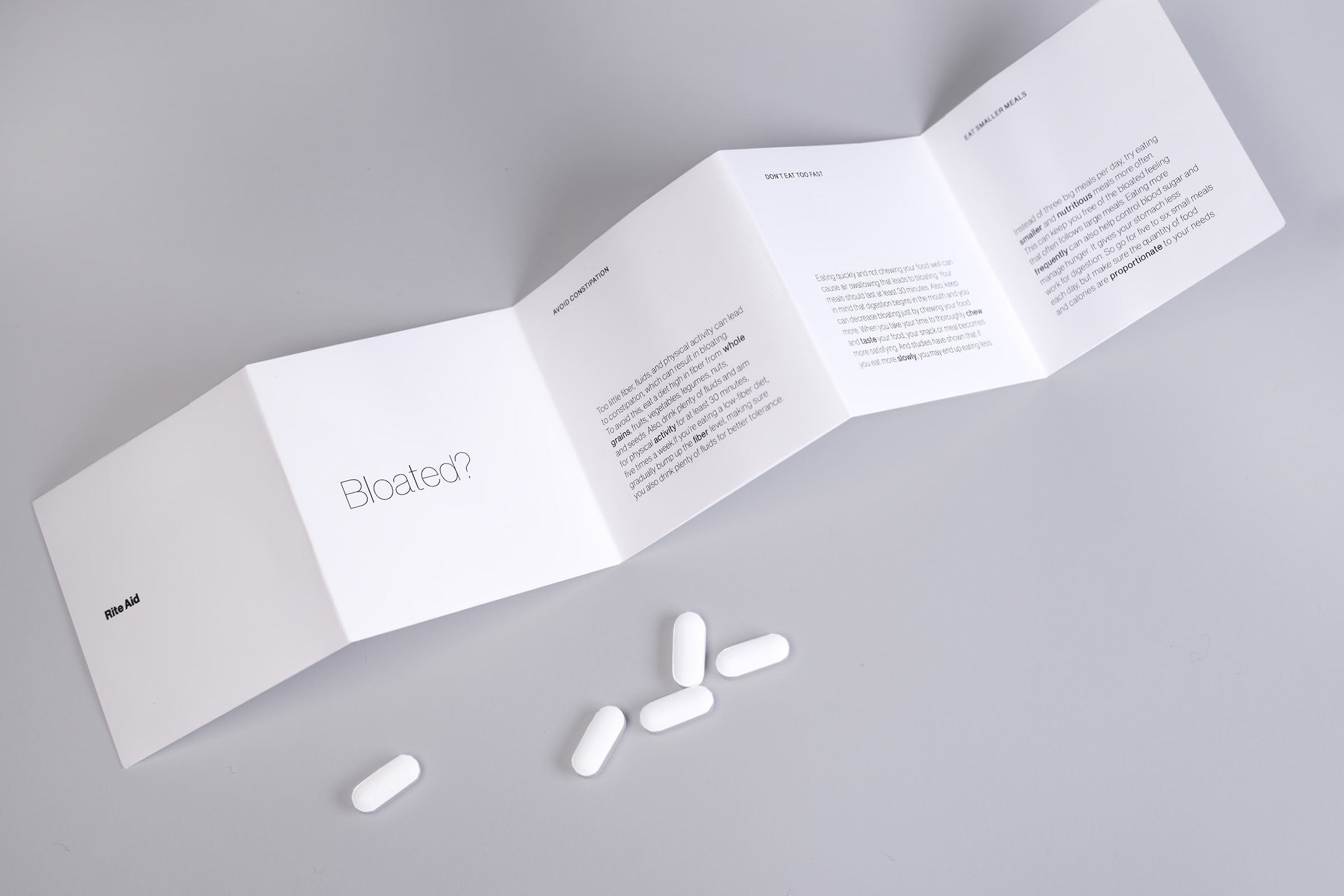
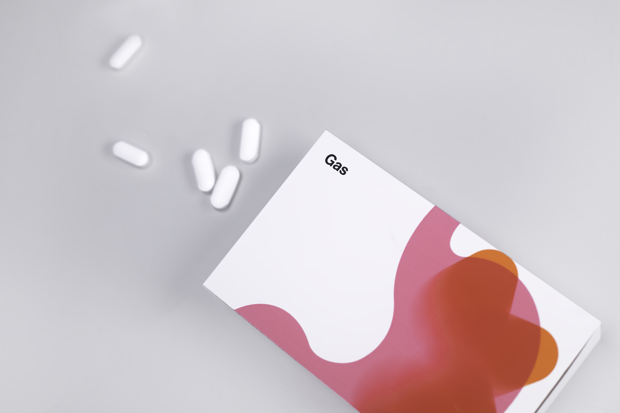
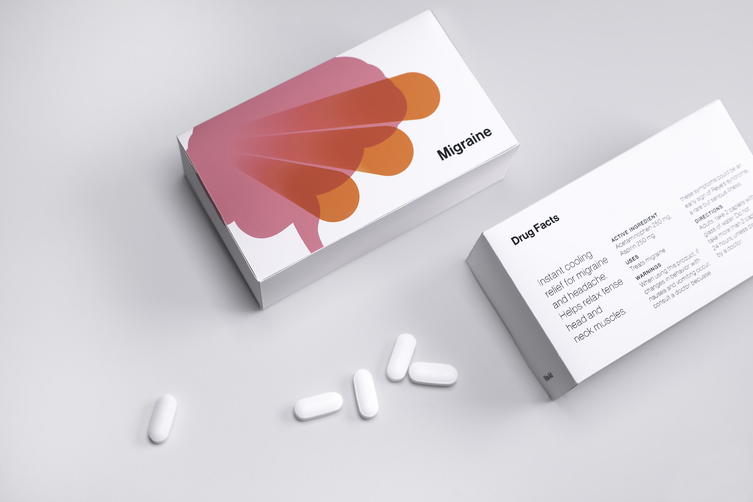
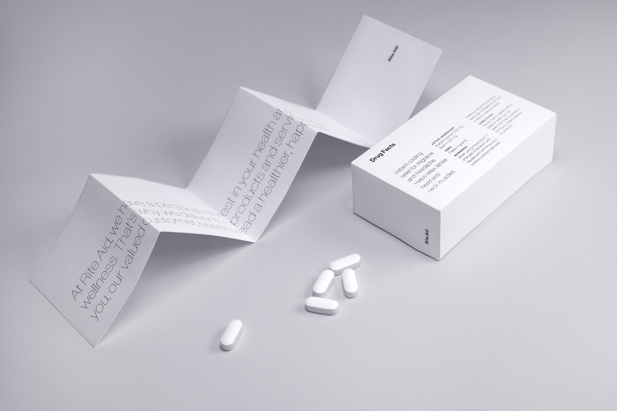
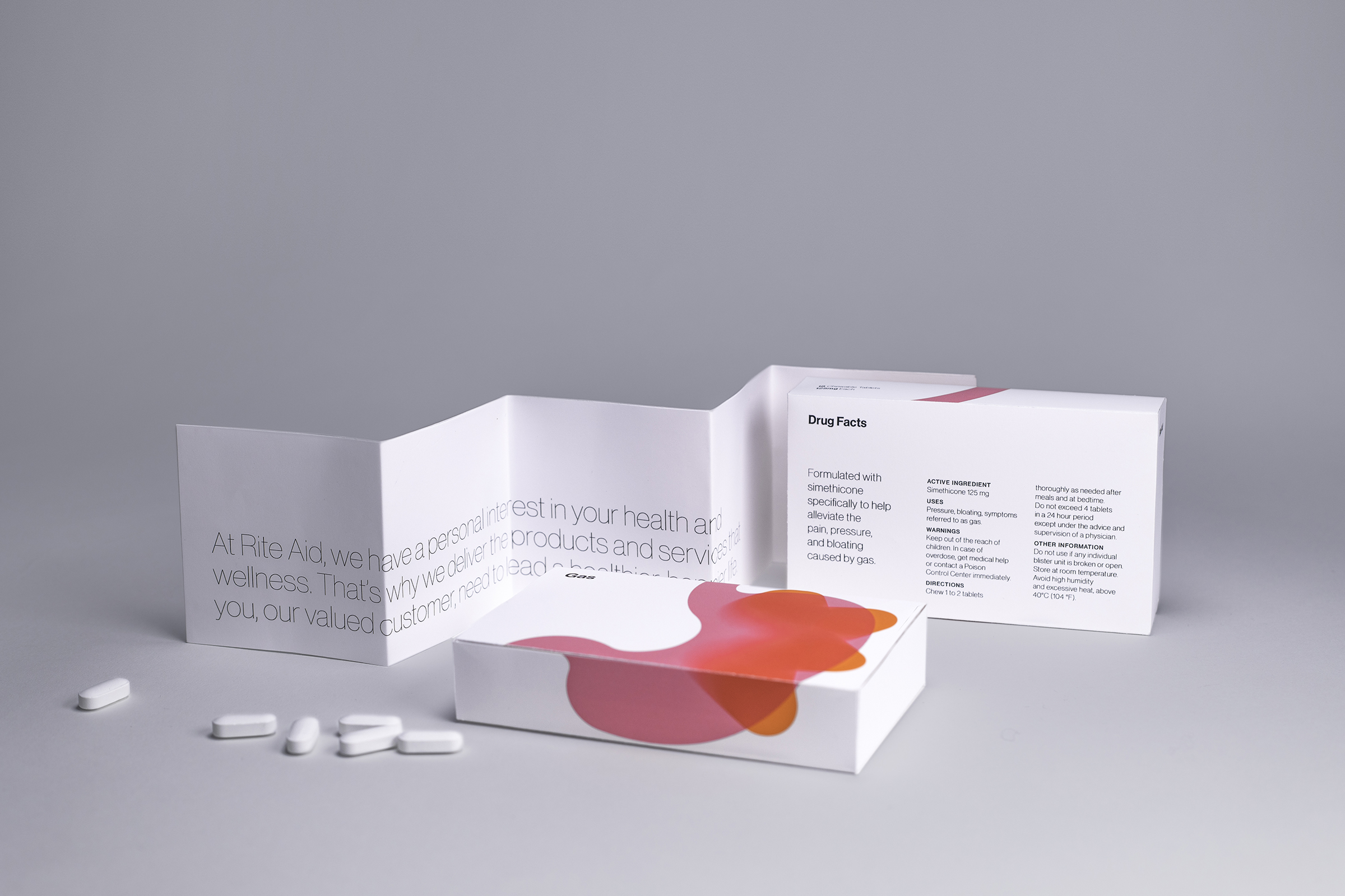
This branding system targets the pharmaceutical arm of Rite Aid, where complex, visually chaotic language and graphics often confuse the buyer.
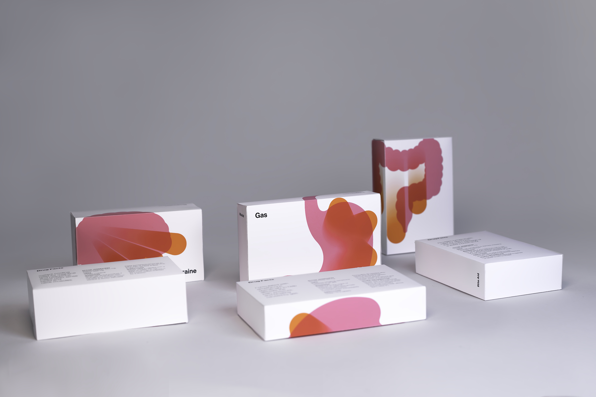
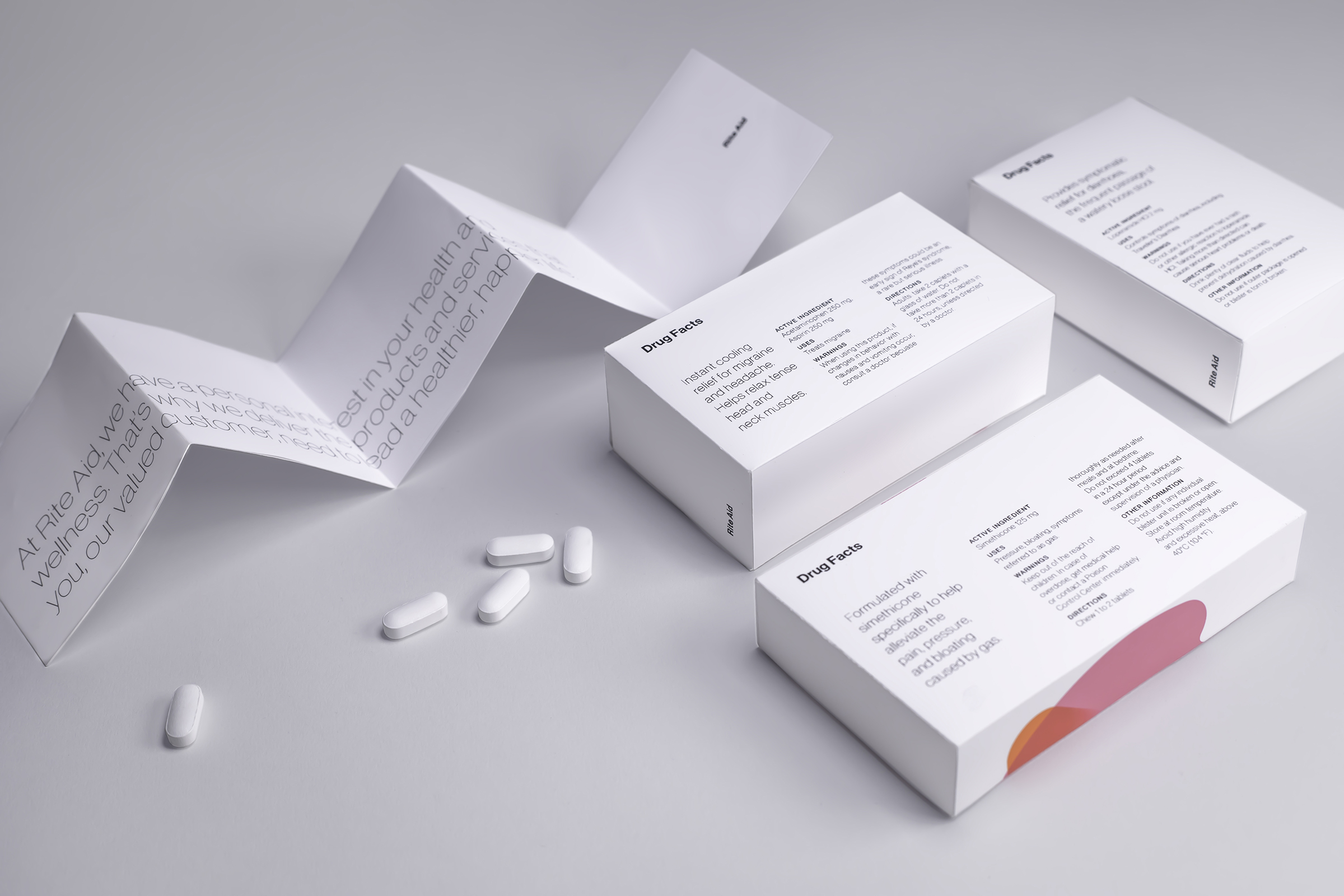
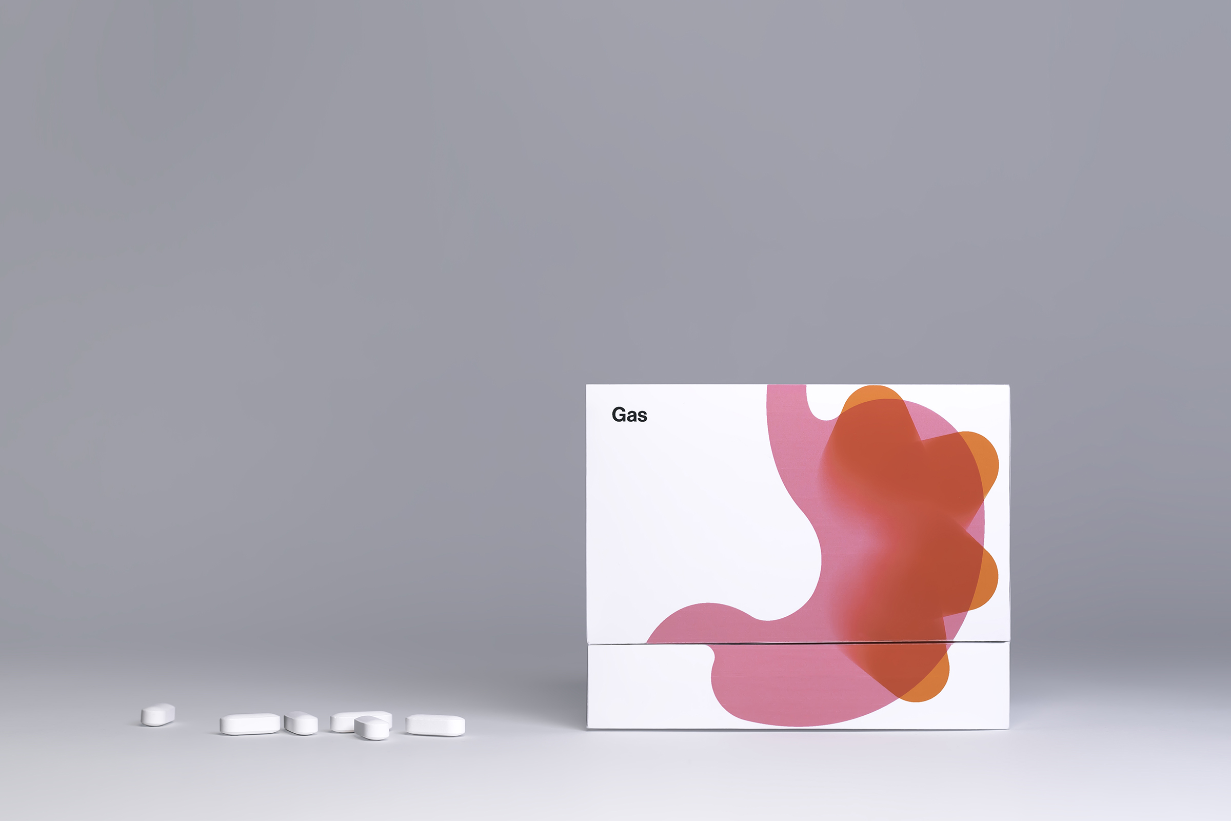
Employing visceral translations of physical symptoms and illnesses, this series of packaging aims to deliver clear, simple, and intuitive visualizations of gas, migraines, and diarrhea through distilled illustration and typography.
CREDIT
- Agency/Creative: Janny Ji
- Article Title: Rite Aid Pharmacy Rebranding
- Organisation/Entity: Agency, Non Published Concept Design
- Project Type: Packaging
- Agency/Creative Country: United States
- Market Region: North America
- Project Deliverables: Brand Identity, Branding, Packaging Design, Research, Tone of Voice
- Format: Box
- Substrate: Pulp Paper
FEEDBACK
Relevance: Solution/idea in relation to brand, product or service
Implementation: Attention, detailing and finishing of final solution
Presentation: Text, visualisation and quality of the presentation


