


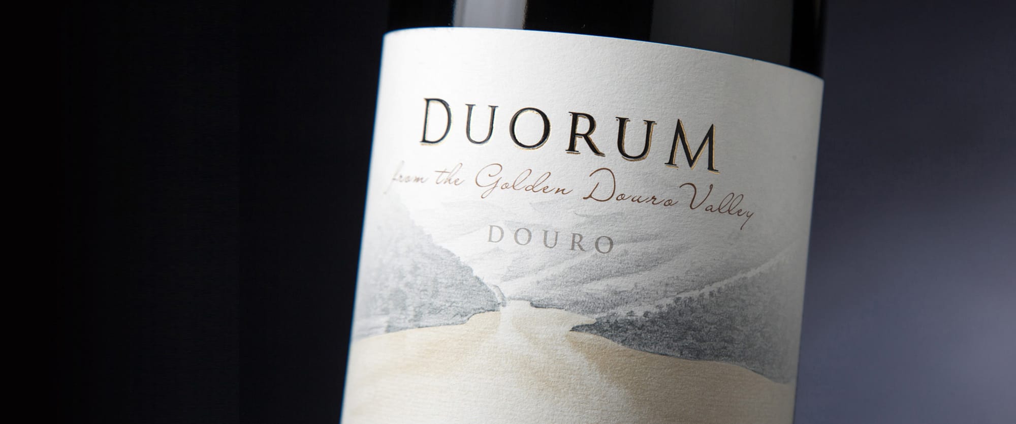
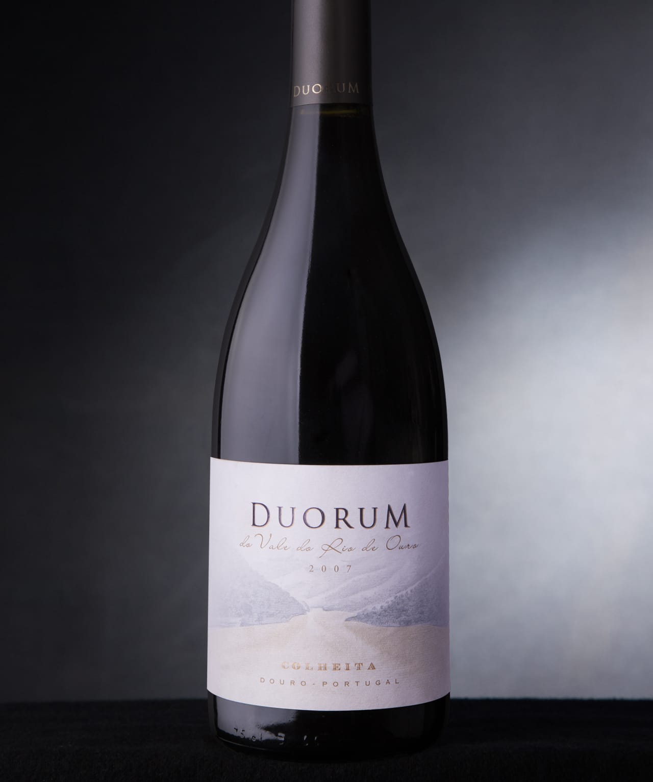
The name Duorum has a deeper meaning than at first glance. It not only reminds us of “Douro”, this wine’s cradle that naturally defines it, but it also means “two” in Latin, since its story is based on several dualities: the work of two highly regarded winemakers, from two different wine regions, using grapes from two different altitudes, in two sub-regions of the Douro.
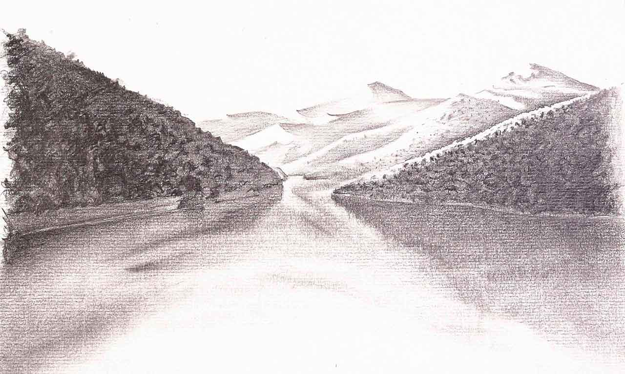
A third perspective brings to light a legend: it is told that small shiny stones rolled along the riverbanks and were discovered to be gold. Add to this the yellow colour the clay soil sometimes gives these waters, and we have the Golden River recreated in a charcoal illustration on the Duorum labels. This triple meaning defines the concept of Duorum wines, presenting a strong image and a story to tell.
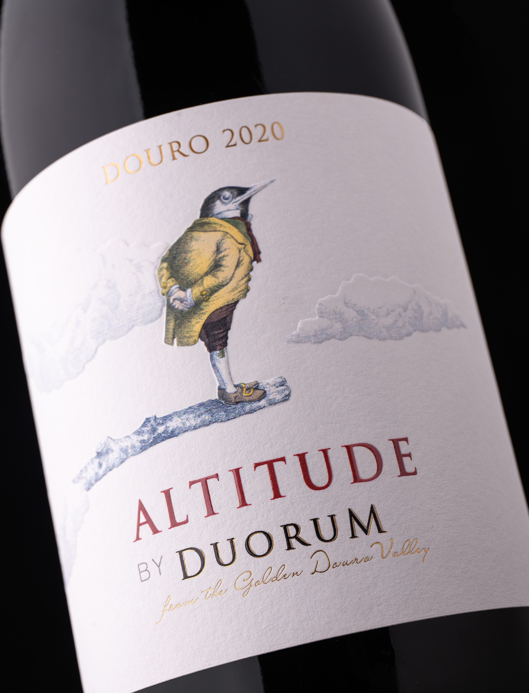
From up here you can feel the freshness! A marked Mediterranean climate together with steep valleys formed by the Douro River originate a unique habitat, inhabited by peculiar wildlife. The rupiculous bird species, birds nesting on rocks, stand out, and its protection has been a main priority for Duorum. This brand has vineyards in the regions of Cima Corgo and Douro Superior, two protected terroirs in the Douro region of northern Portugal. The vineyards are built on terraces at different altitudes, ranging from 150 to 500 meters. The higher elevations provide ideal conditions for producing fresh, fruity, and vibrant wines. The location offers a panoramic view of the region’s valleys, showcasing a rich diversity of species and a strong commitment to preserving the national heritage. Altitute by Duorum is a wine that embodies this unique setting, with its label featuring a bird perched on a branch amidst the clouds. The choice of a bird on the label also symbolizes the commitment to protecting the rare and threatened species that have found refuge on the Estate.
Duorum reuses 100% of the subproducts that result from the grapes’ vinification (stems), as well as the organic substance resulting from pruning, to fertilize the soils. All the group´s vineyards are certified for Integrated or Biological production, which means restricting as much as possible the use of pesticide treatments to control pests or diseases. The Group also uses 420g light glass bottles in 61% of its production, thus reducing the waste of material and natural resources from the bottle production, while helping to diminish carbon footprint associated with the transportation of wines.
CREDIT
- Agency/Creative: RitaRivotti®
- Article Title: RitaRivotti Designed the Brand and Packaging Design For Duorum Wines
- Organisation/Entity: Agency
- Project Type: Packaging
- Project Status: Published
- Agency/Creative Country: Portugal
- Agency/Creative City: Lisboa
- Market Region: Europe
- Project Deliverables: Packaging Design
- Format: Bottle
- Industry: Food/Beverage
- Keywords: #branding #identity #packagingdesign #winedesign #design #wine #packaging
-
Credits:
CEO & Creative Director: Rita Rivotti
Creative Director: Pedro Roque


