


Organic Wines are increasingly popular. This is undoubtedly due to the growing popularity of organic products at large. Although still considered niche, there is an increasing demand for organic food and wine.
Consumers are increasingly aware of what they consume and the impact it has on the environment. And, to meet the needs of a changing market, more brands in the food and beverage space are starting to produce out organic products, and the wine industry is no exception.
Differentiating Organic Wines from their Conventional Counterparts
In the wine industry, there is a wide, and often overwhelming range of options available. It is therefore essential that the packaging of organic wines is differentiated.
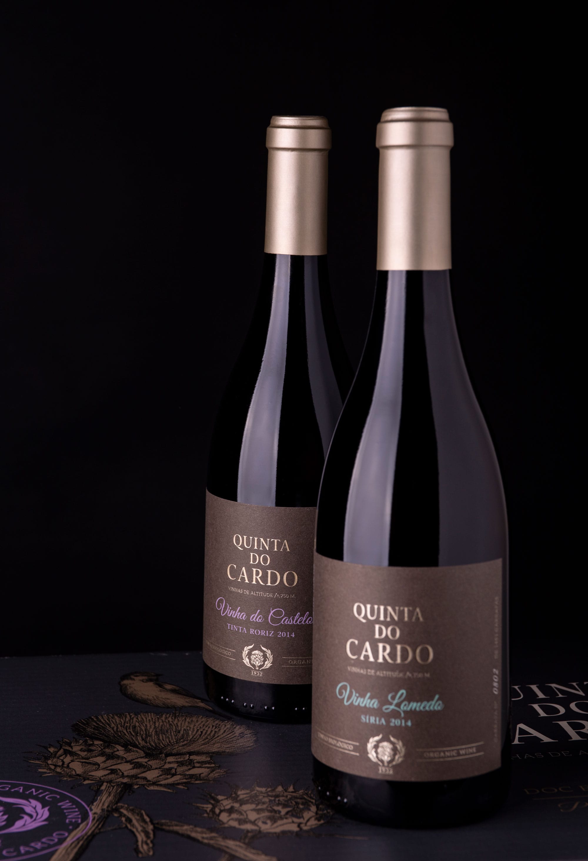
The bottle should always reflect the brand uncompromising dedication to quality. As organic products are generally more expensive, it is crucial that the design elements speak directly to the values of the consumer. This way we can guarantee that, through packaging, we will be communicating directly and correctly with the target audience.
Organic products have unique needs in comparison to their conventional counterparts. For example, the fact that the ingredients are all-natural will affect the shelf life and sensitivity of the product. These nuances are critical to communicate in the package design of organic products
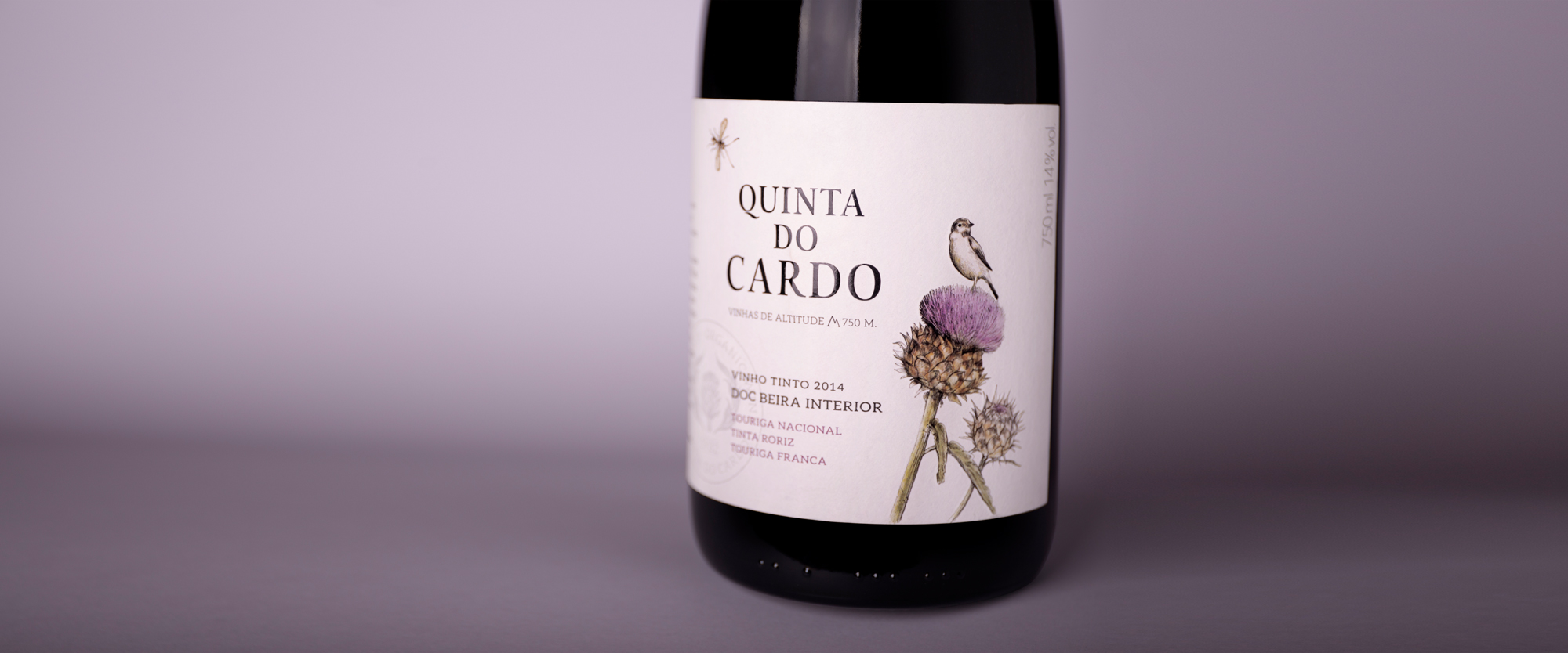
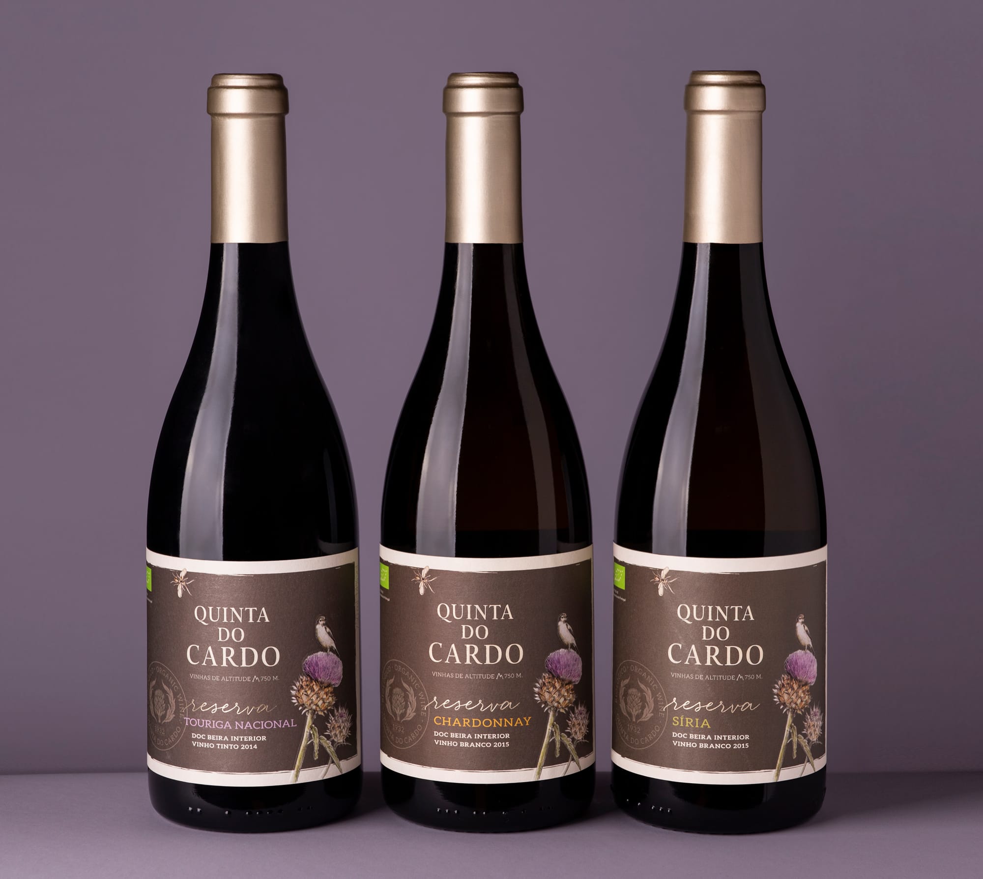
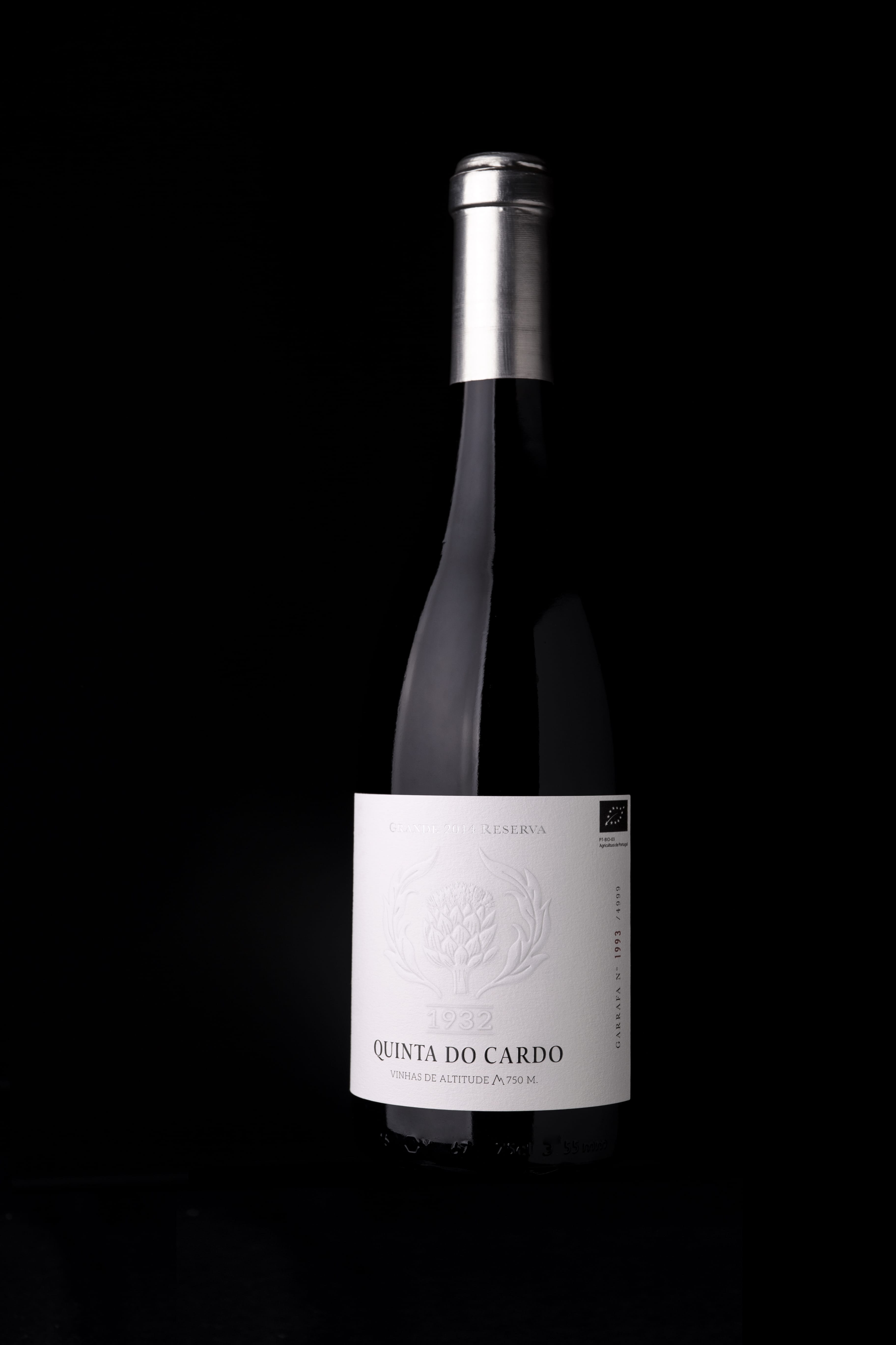
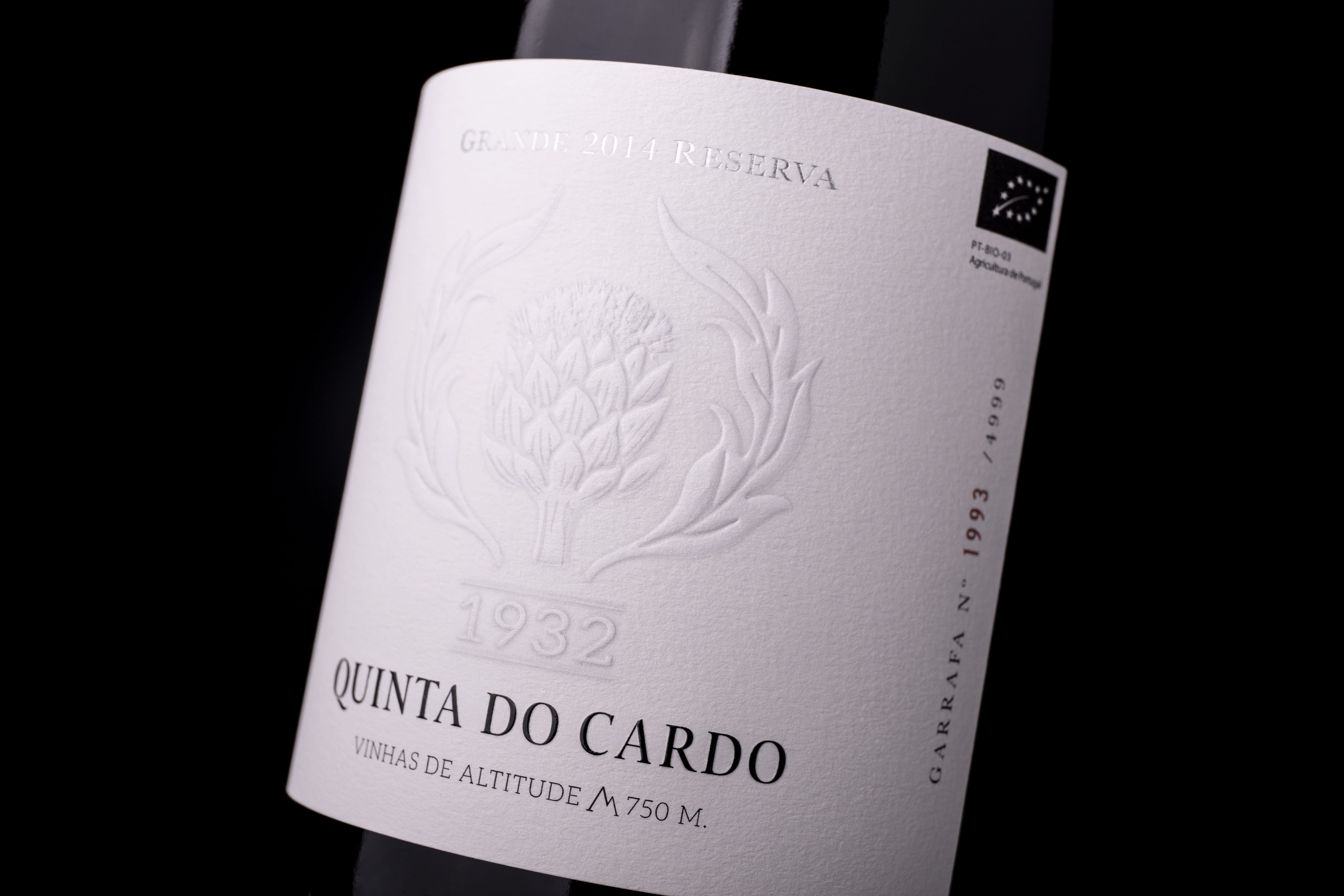
Our team was asked to develop their new identity, including a slogan that defines the brand’s new positioning: “High altitude vineyards, 750 cm.”
In the wine industry, production is relatively homogeneous, making it difficult to achieve differentiation. Clear positioning has become very important for the brand, particularly within the world of organic wines.
By positioning the brand as the tallest organic vineyard in Portugal, we were able to create a Unique Selling Proposition. Due to the high altitude, the thermal amplitudes are constant (hot days and cold nights). This factor gives rise to fresh, mineral wines with great potential for evolution.
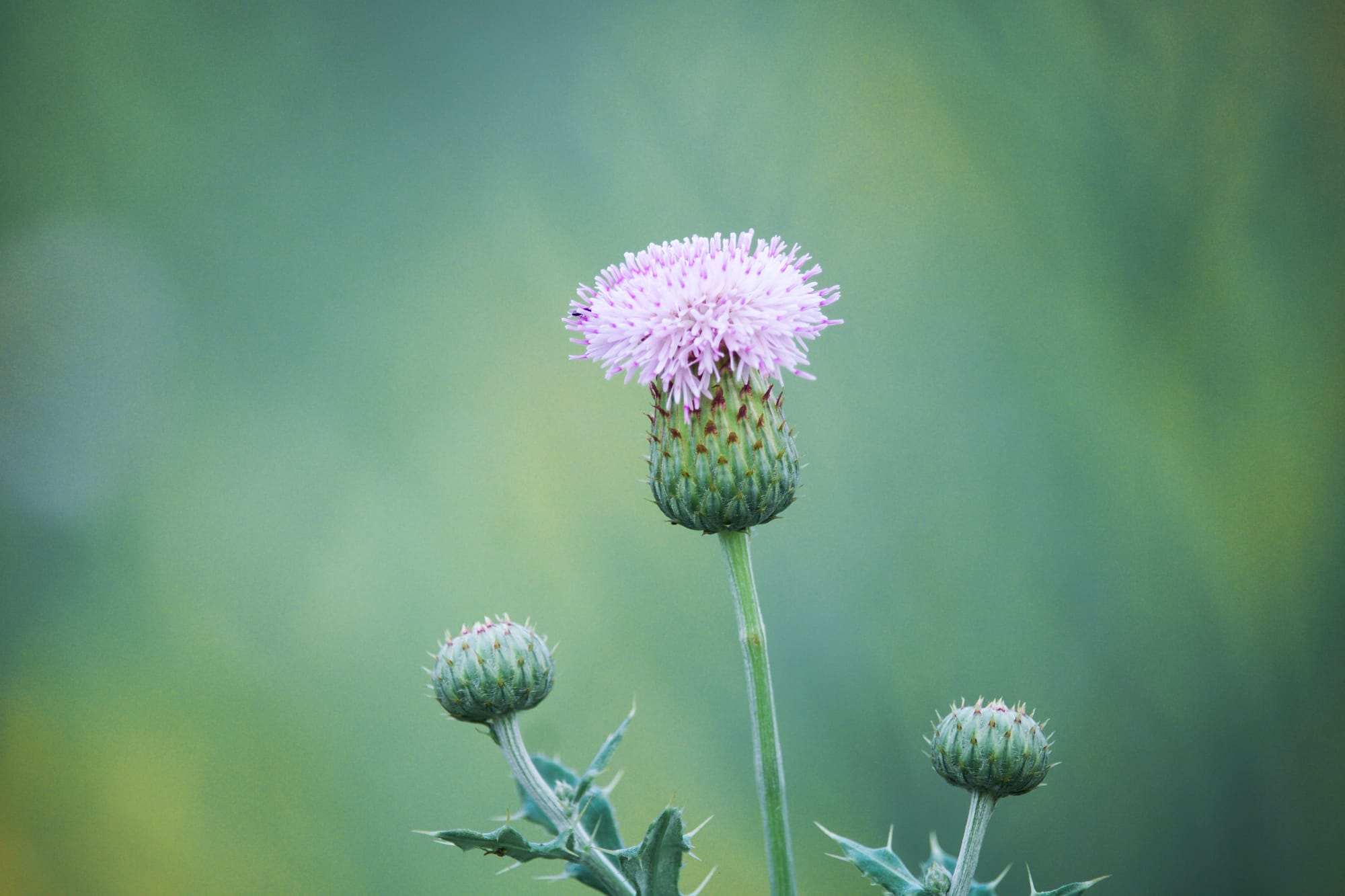
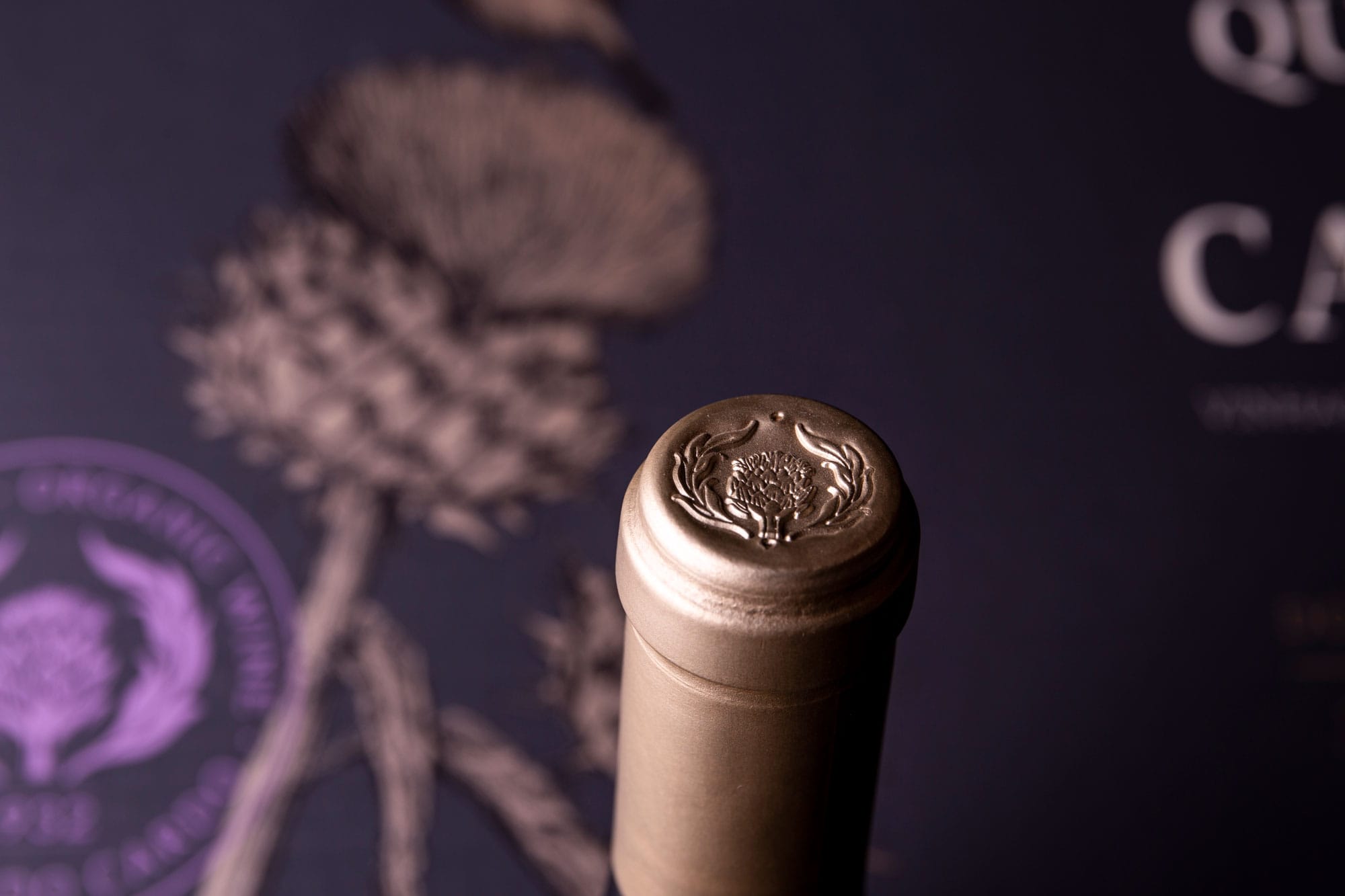
To build the visual identity of Quinta do Cardo, we designed a thistle flower. This flower is a typical species of the region and gives the name to the brand. After all, nothing is better than an obvious and memorable symbol to represent a great brand.
Around the thistle, a bird and an insect bring the label to life and help build the narrative. Given that biodiversity plays a vital role in organic farming, the message of harmony and sustainability is conveyed through this image.
CREDIT
- Agency/Creative: RitaRivotti® Premium Packaging Design
- Article Title: Rita Rivotti Designs The Identity And Packaging for Quinta do Cardo
- Organisation/Entity: Agency, Published Commercial Design
- Project Type: Packaging
- Agency/Creative Country: Portugal
- Market Region: Europe
- Project Deliverables: Brand Identity, Packaging Design, Rebranding, Research
- Format: Bottle, Box
- Substrate: Pulp Paper


