As a way to satisfy her cravings without the guilt, the founder of Alice’s Sweet Tooth got to the kitchen and created a new kind of meringue cookie made with just a few simple ingredients you can read and pronounce, but bursting with flavor.
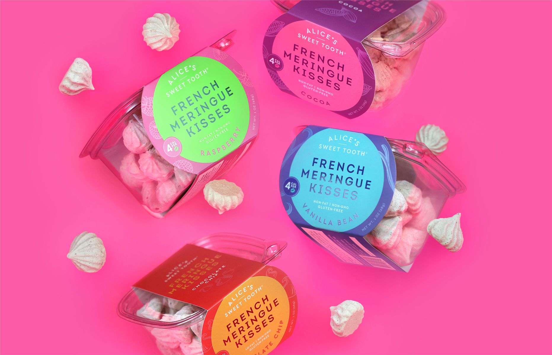
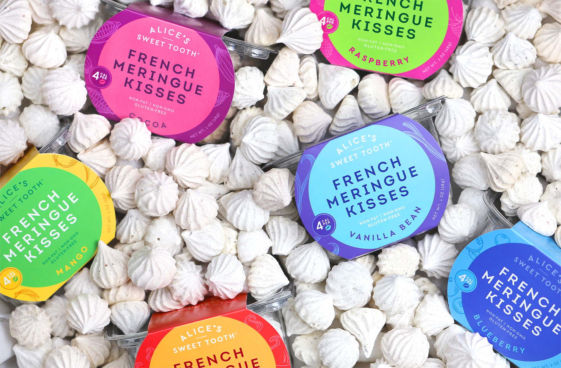
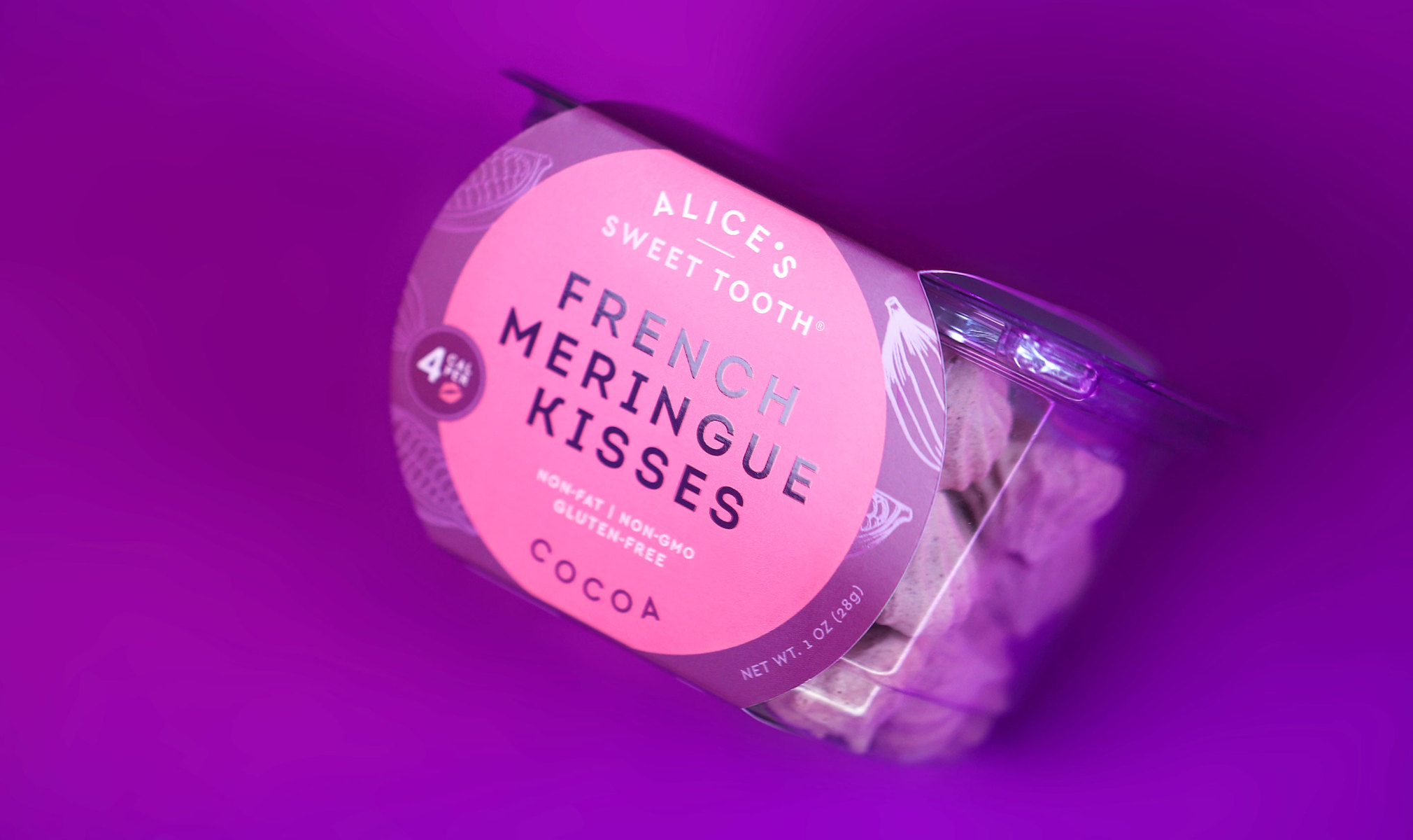
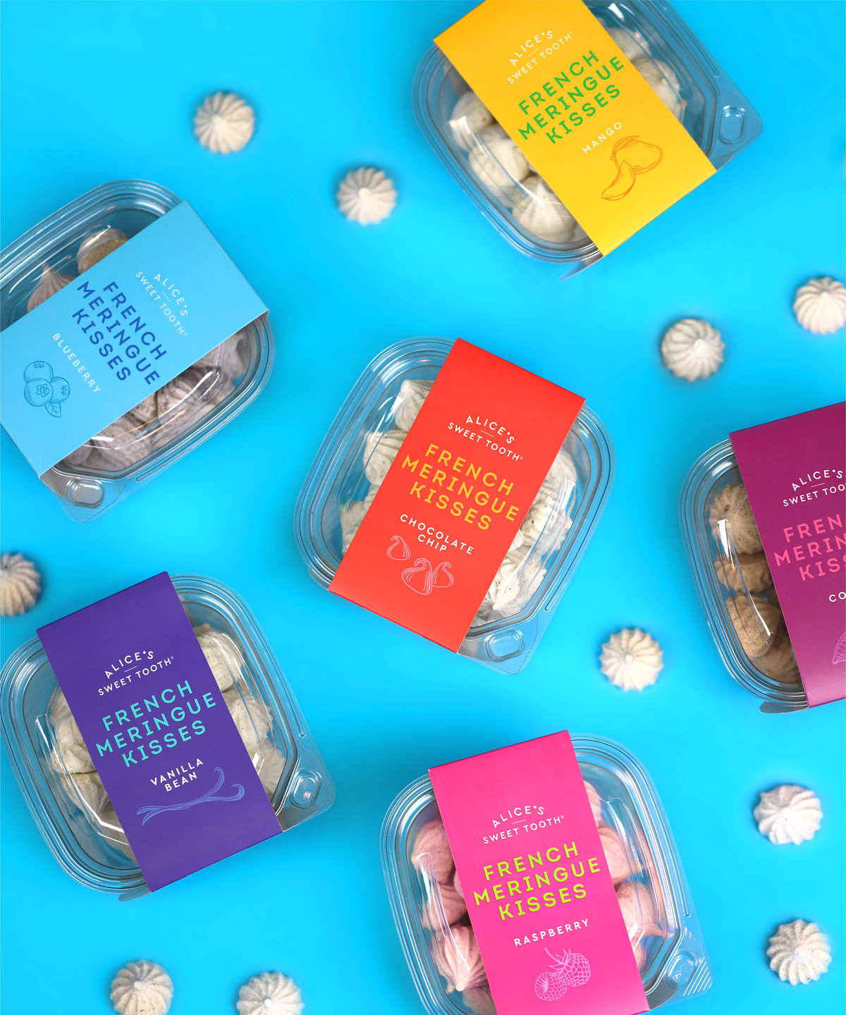
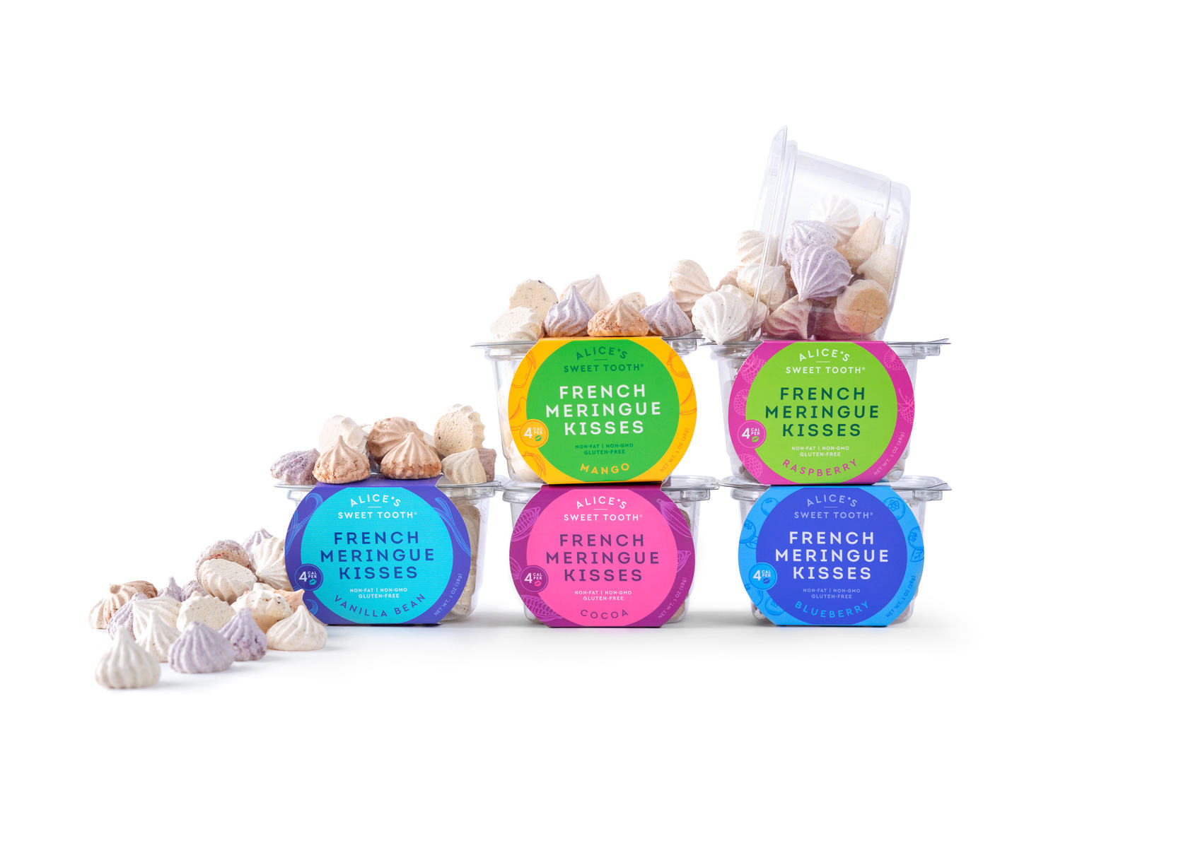
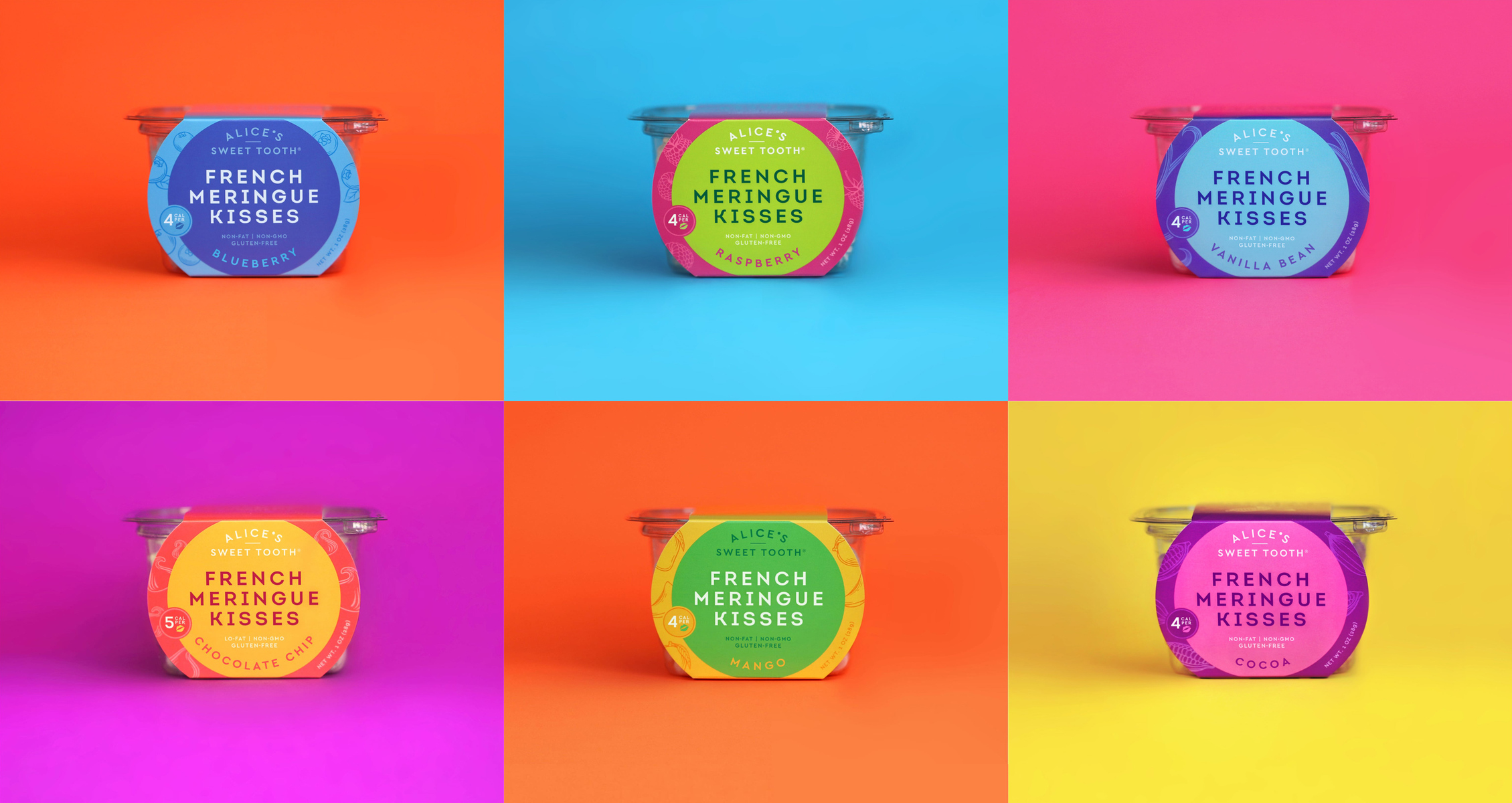
She wanted to stand apart from the soft, pastel look in the category, so we chose bold color pairs to represent flavor intensity and grab attention. We combined this with simple yet sophisticated fonts and ingredient illustrations for a look that expresses high-end indulgence.
The result is a design that’s simple like the product itself, sophisticated like its premium ingredients, and bold like its pop of flavor.
CREDIT
- Agency/Creative: Riser
- Article Title: Riser Creates Brand and Packaging Design for Alice’s Sweet Tooth
- Organisation/Entity: Agency, Published Commercial Design
- Project Type: Packaging
- Agency/Creative Country: United States
- Market Region: North America
- Project Deliverables: Brand Creation, Brand Identity, Brand Strategy, Branding, Graphic Design, Packaging Design, Research
- Format: Sleeve
- Substrate: Plastic, Pulp Paper
FEEDBACK
Relevance: Solution/idea in relation to brand, product or service
Implementation: Attention, detailing and finishing of final solution
Presentation: Text, visualisation and quality of the presentation


