


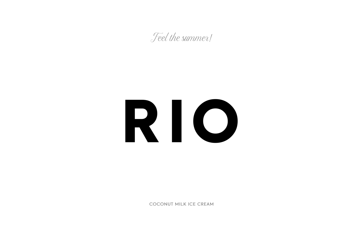
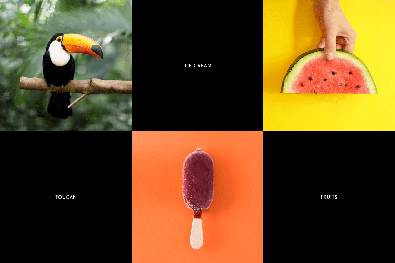
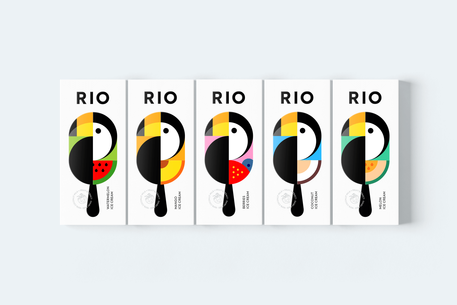
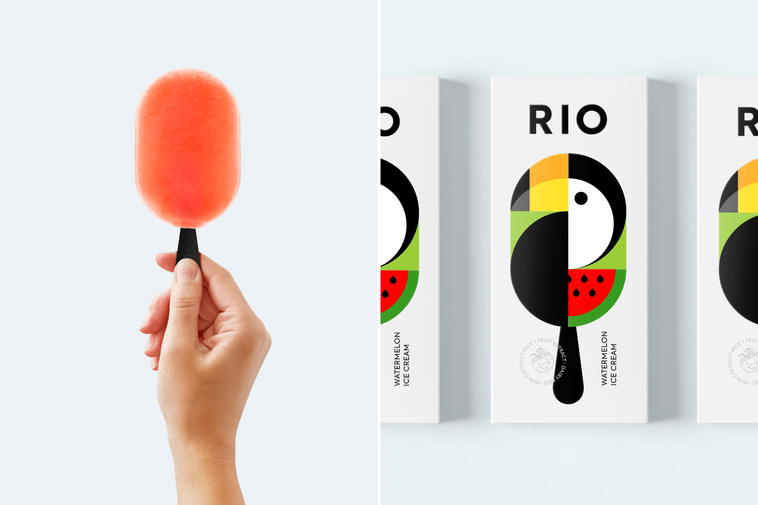
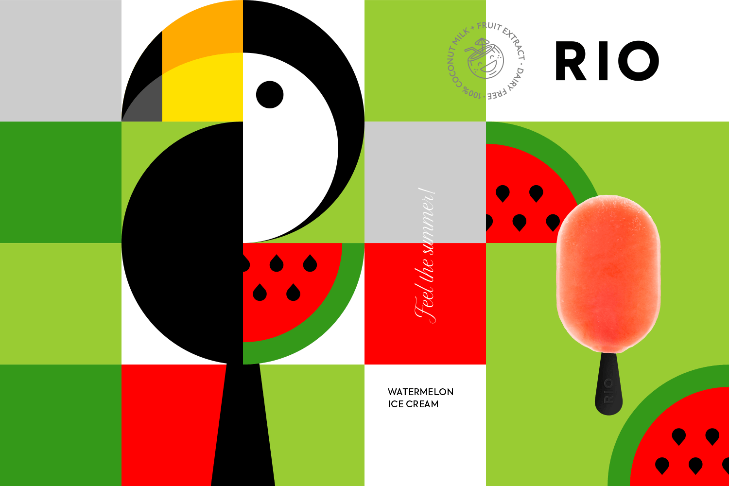
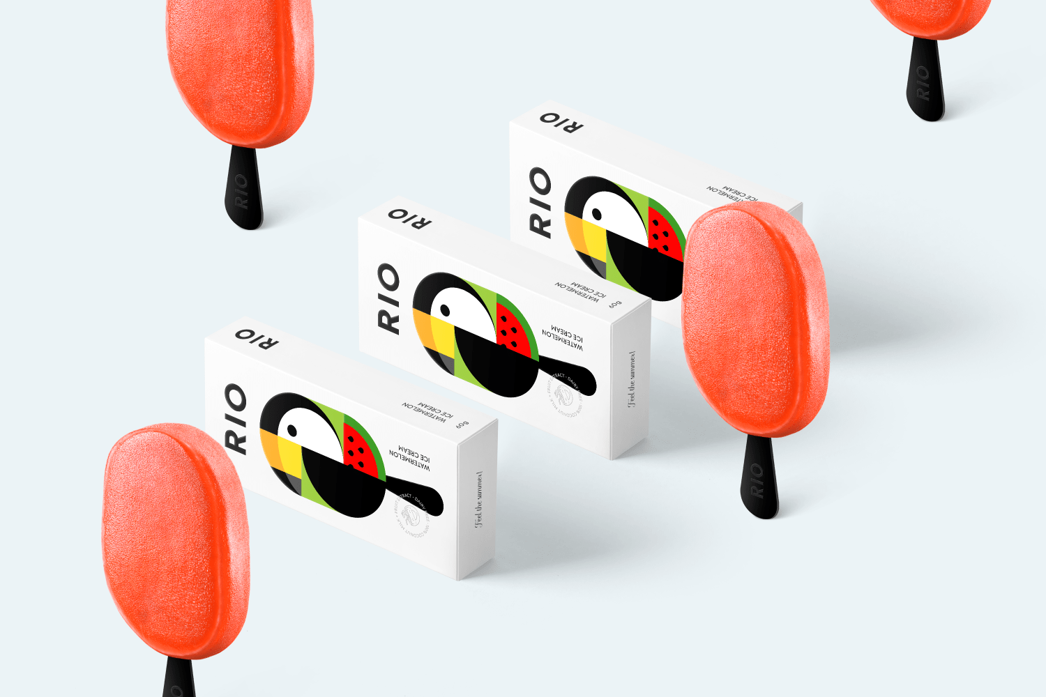
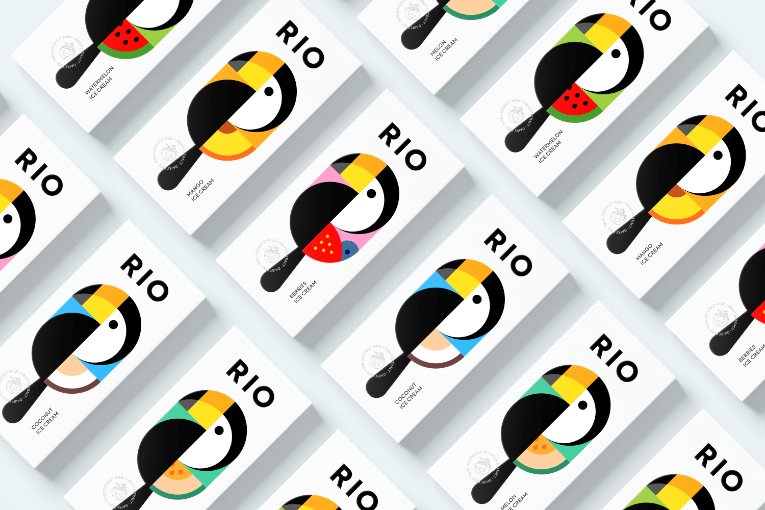
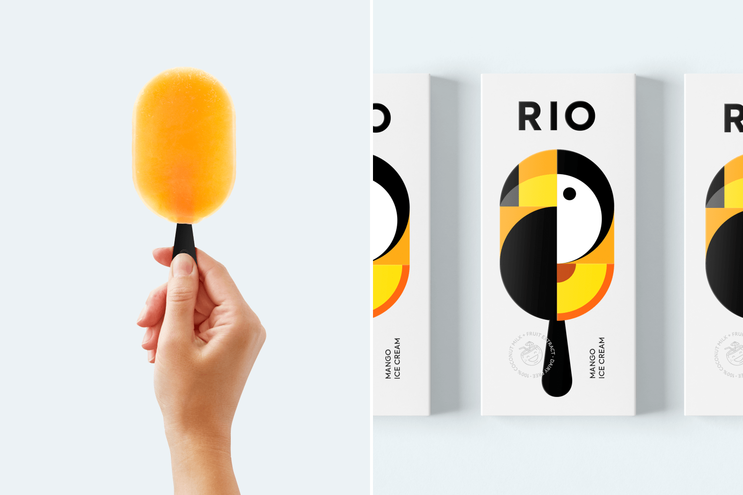
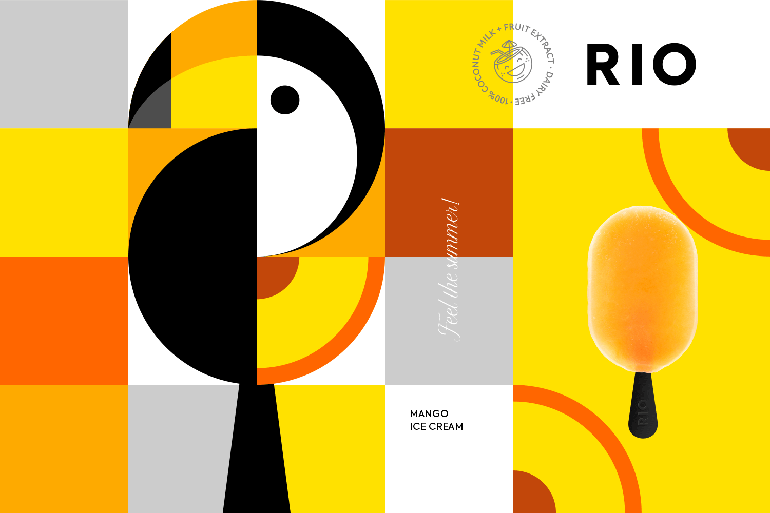
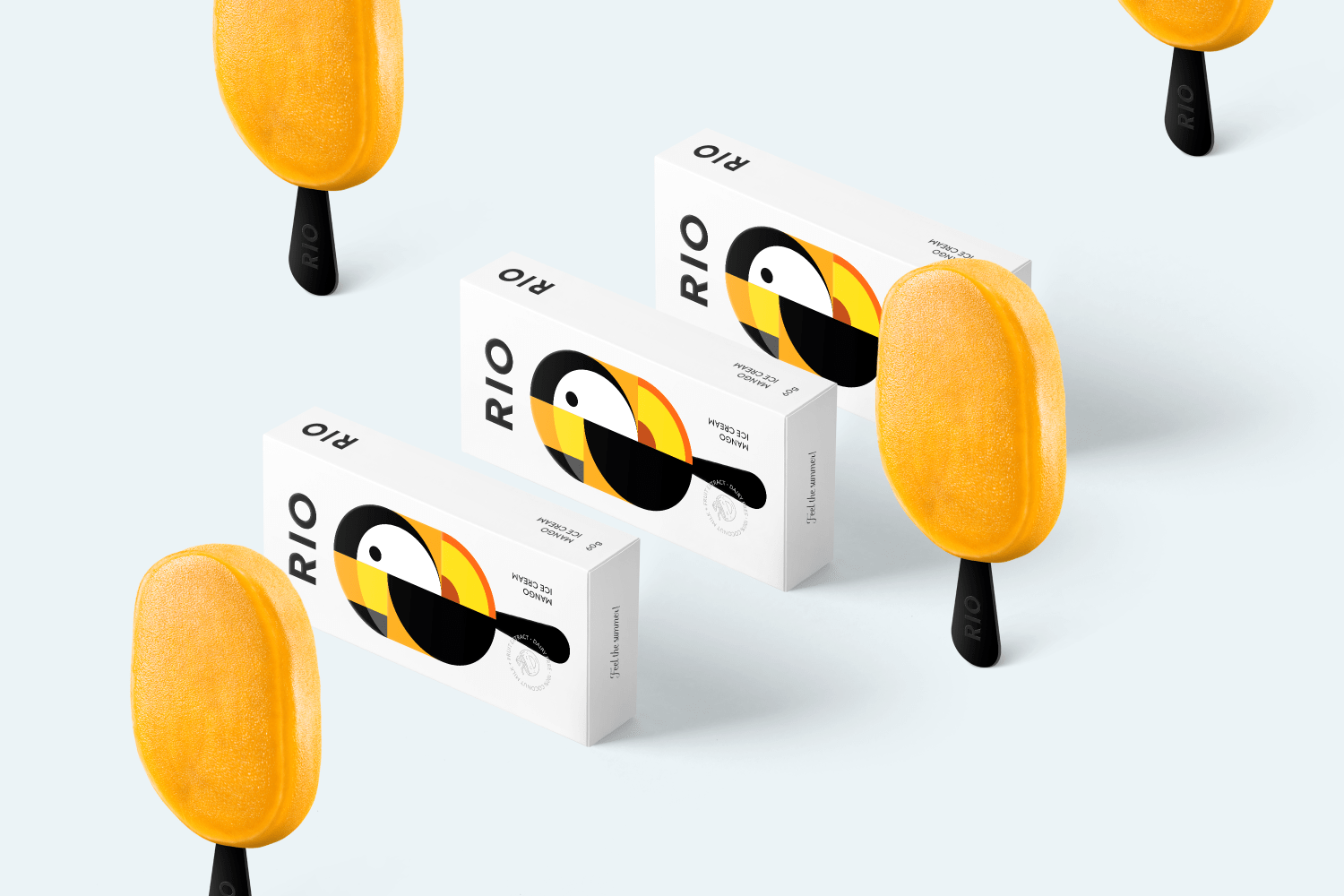
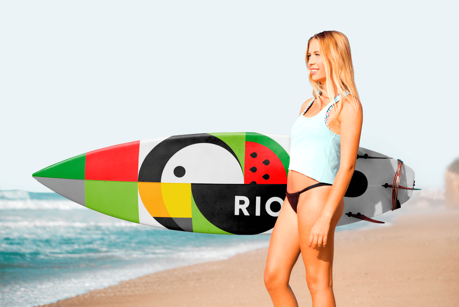
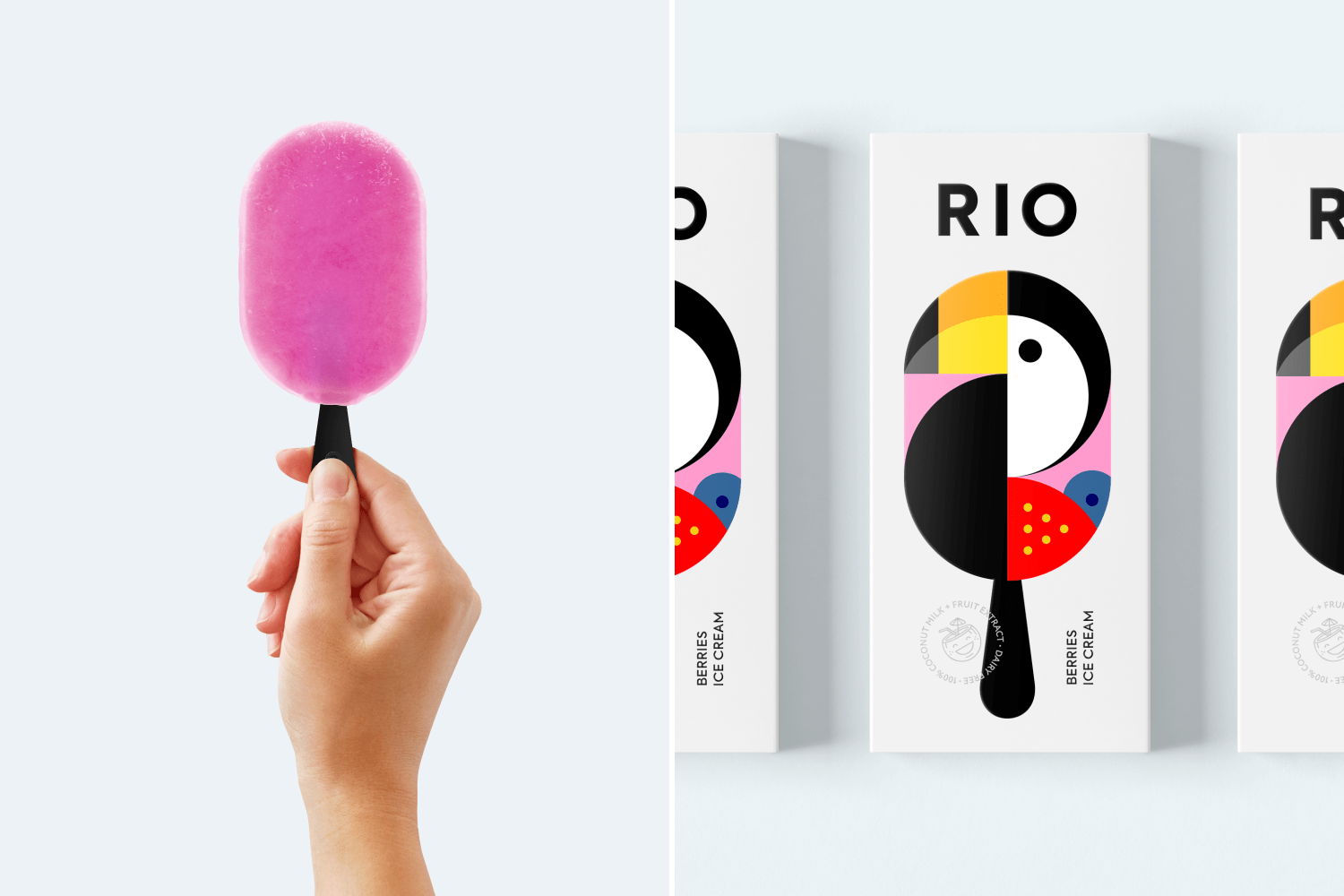
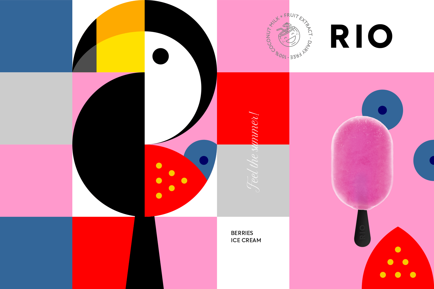
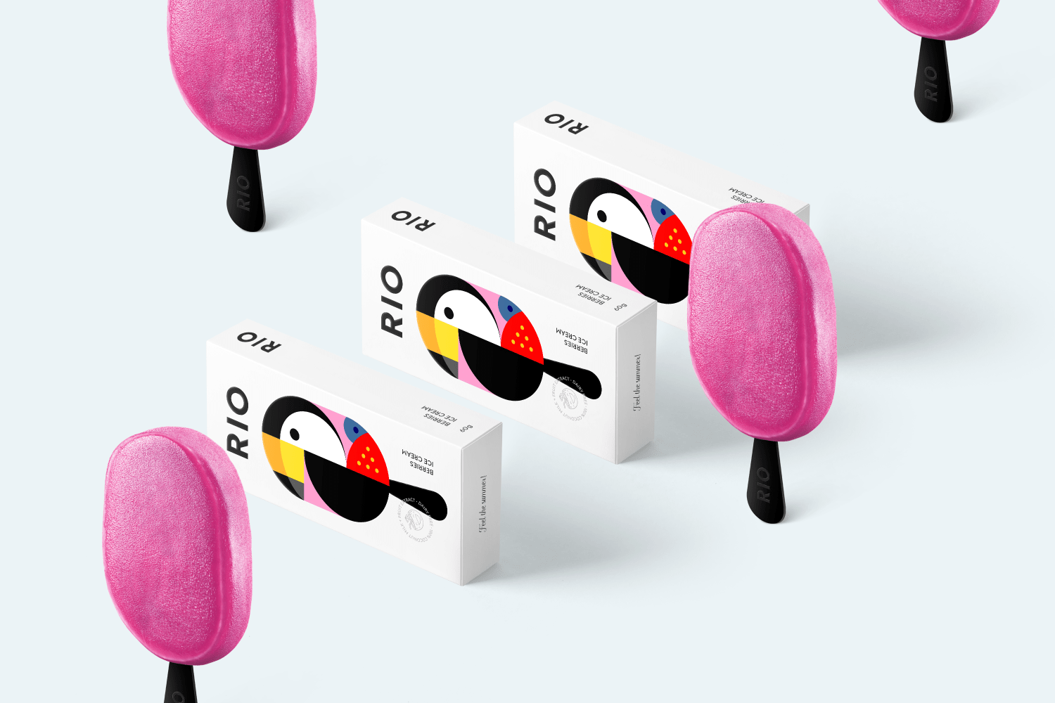
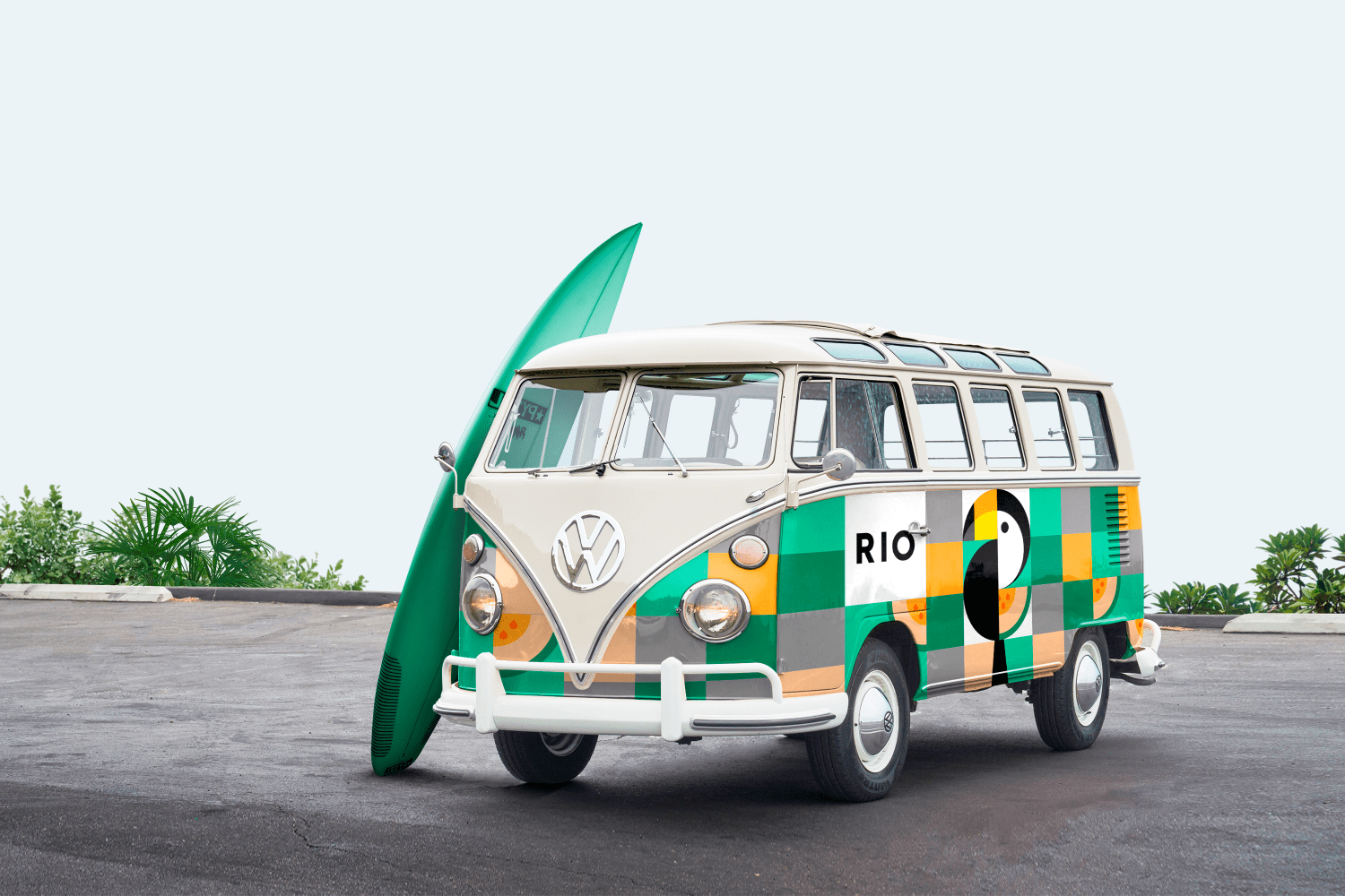
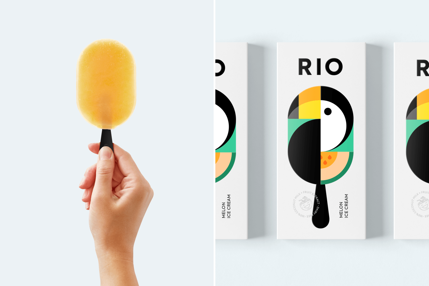
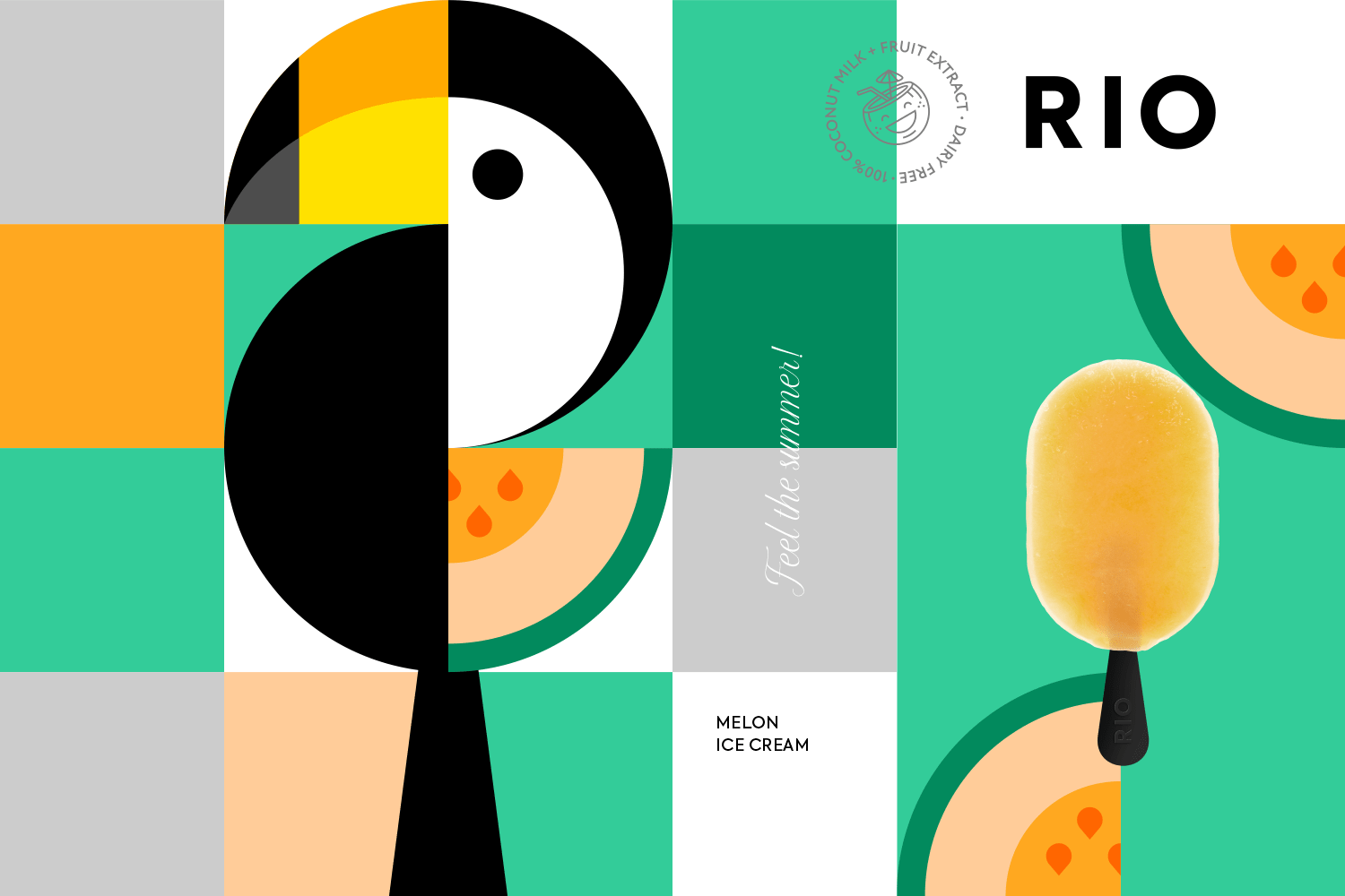
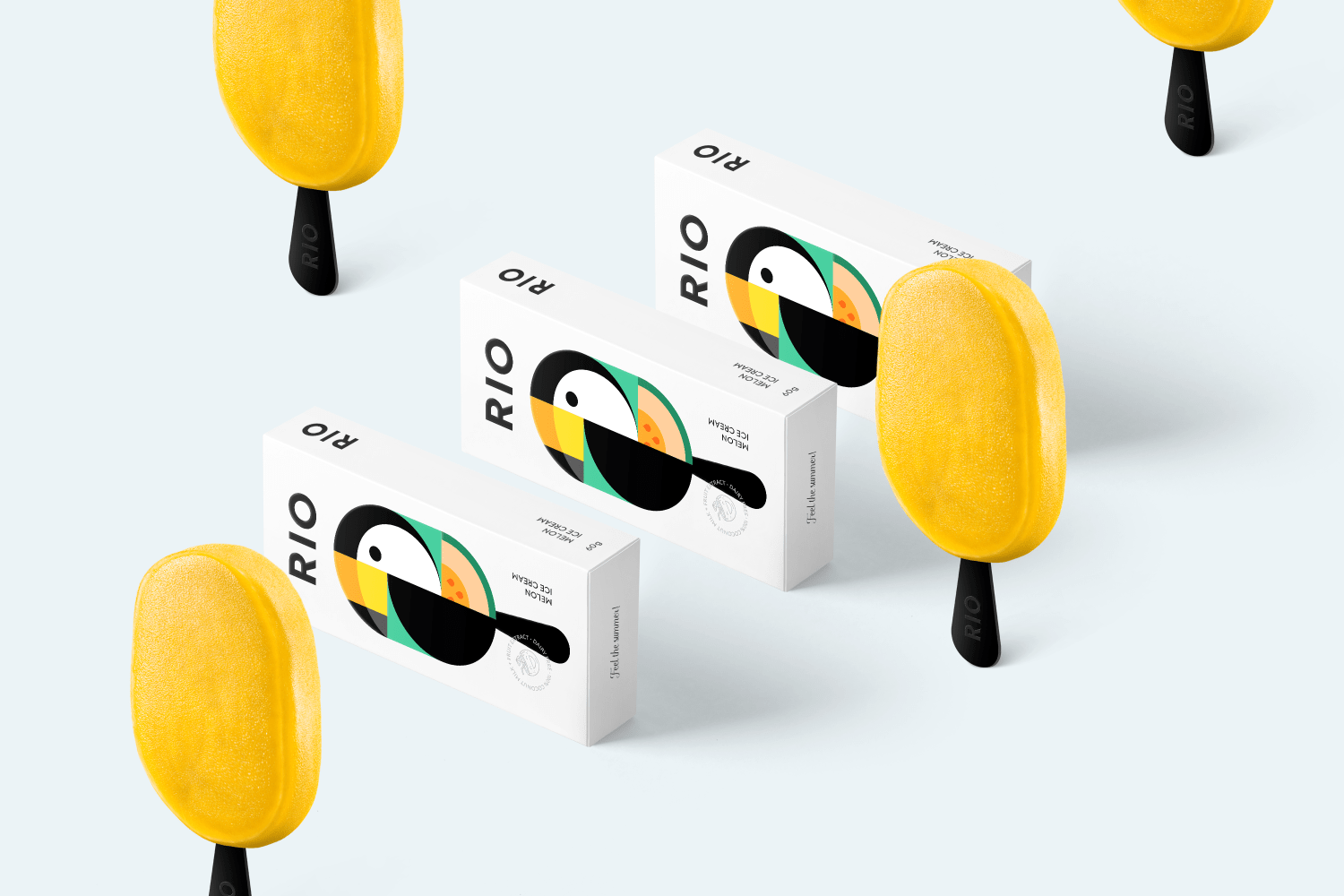
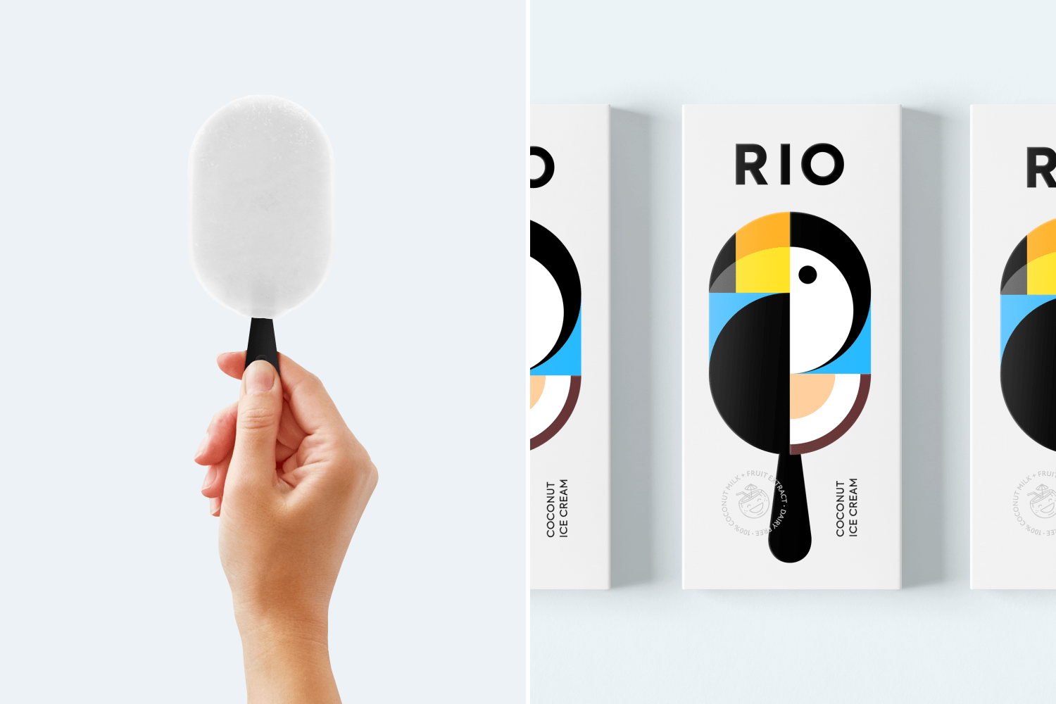
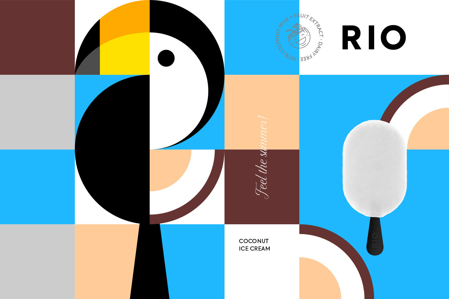
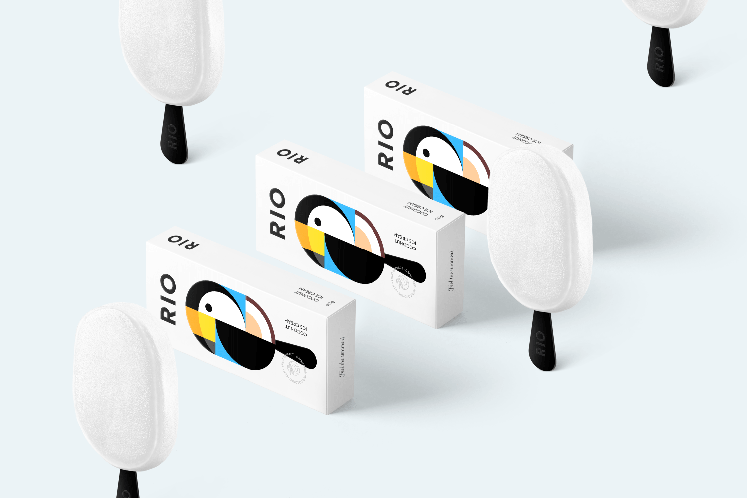
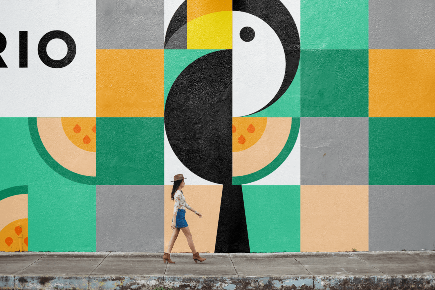
Concept of an ice cream was inspired by one of the most colorful cities in the world – Rio de Janeiro. RIO ice cream reflects the main associations of this city – bright, yummy and sunny. Beautiful toucan bird which also reminds us of city Rio was chosen as the main mascot any symbol. The main idea for the packaging is to convey the bright taste and its natural ingredients, simple graphics says it all.
Ice cream’s main flavors are mango, watermelon, berries, melon and coconut. It is supposed that an ice cream will be made based on the coconut milk. It has no gluten, soy, eggs and refined sugar. This ice cream is perfect for people who take care of their health and enjoy the taste of tropical fruits.

CREDIT
- Agency/Creative: Made by Berik
- Article Title: RIO Packaging Design Concept
- Organisation/Entity: Agency, Non Published Concept Design
- Project Type: Packaging
- Agency/Creative Country: Kazakhstan
- Market Region: Global
- Project Deliverables: Brand Creation, Brand Naming, Branding, Illustration, Packaging Design, Research
- Format: Box
- Substrate: Plastic, Pulp Carton, Pulp Paper
FEEDBACK
Relevance: Solution/idea in relation to brand, product or service
Implementation: Attention, detailing and finishing of final solution
Presentation: Text, visualisation and quality of the presentation


