


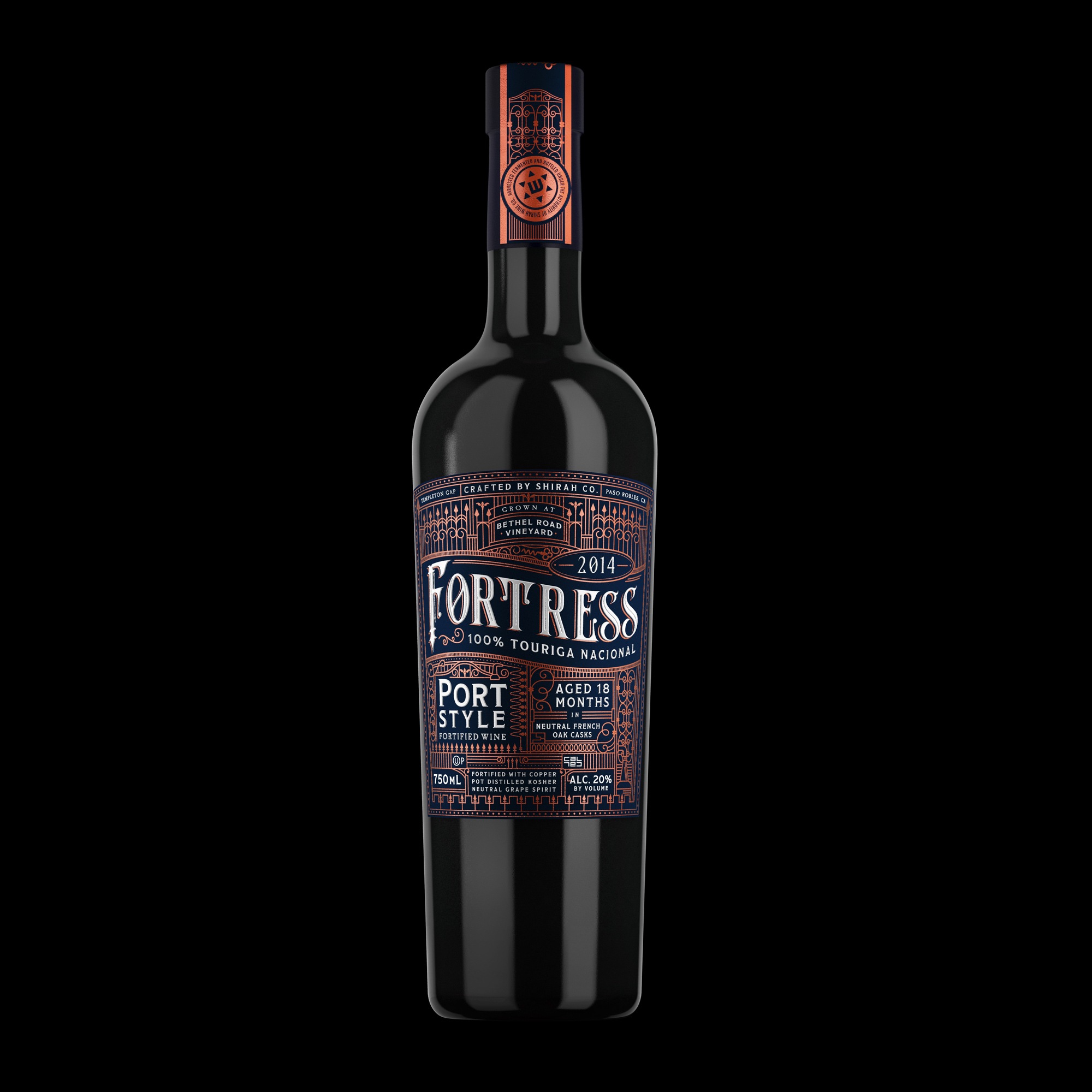
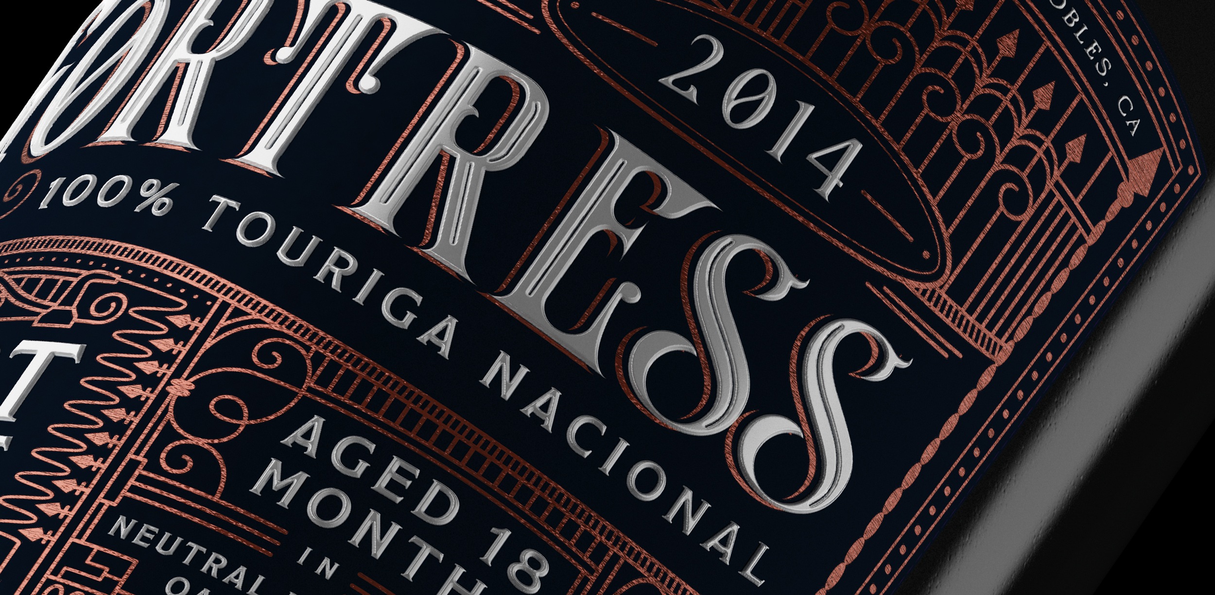
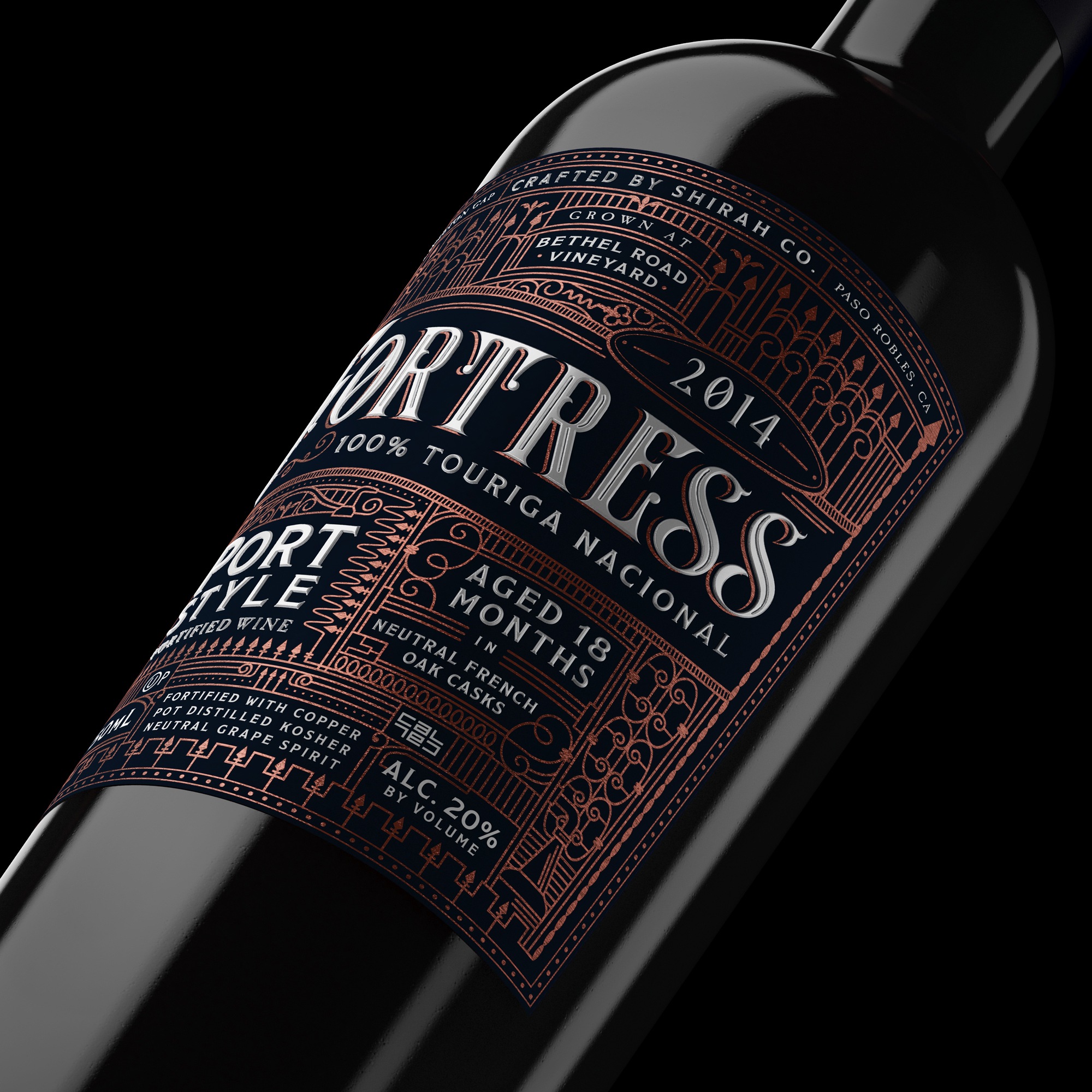
Fortress port wine is an intricately-rendered expression of the rich port wine inside the bottle. This foil-and-raised-ink port wine label feature tightly detailed elements add interest and whimsy, like the copper still, wrought iron scrollwork detailing and miniature corkscrews.
The port wine label printing is enhanced with copper foil stamping throughout, with raised gloss white lettering, offset by an inky blue matte wine label surface.
The top of the port wine bottle is finished with a copper foil stamped paper band which covers over a wax-sealed cork.
This limited-edition small run port sold out to collectors within a few months of release.
CREDIT
- Agency/Creative: Miller
- Article Title: Rich Port Wine Deserves Rich Package Design
- Organisation/Entity: Agency, Published Commercial Design
- Project Type: Packaging
- Agency/Creative Country: United States
- Market Region: North America
- Project Deliverables: Brand Identity, Brand Strategy, Branding, Graphic Design, Identity System, Illustration, Packaging Design, Tone of Voice
- Format: Bottle
- Substrate: Glass Bottle, Pulp Paper
FEEDBACK
Relevance: Solution/idea in relation to brand, product or service
Implementation: Attention, detailing and finishing of final solution
Presentation: Text, visualisation and quality of the presentation


