Intro: End-to-end solutions to live well & invest with efficiency. Based on this purpose, Rhoden Arq + Imob seeks to support its clients in their search for solutions to transform and add value to properties and places. Located in Brasília, the company is managed by partners Andressa and Roseli Rhoden, mother and daughter who work together in the branch of architecture and real estate, offering highly personalized and innovative services.
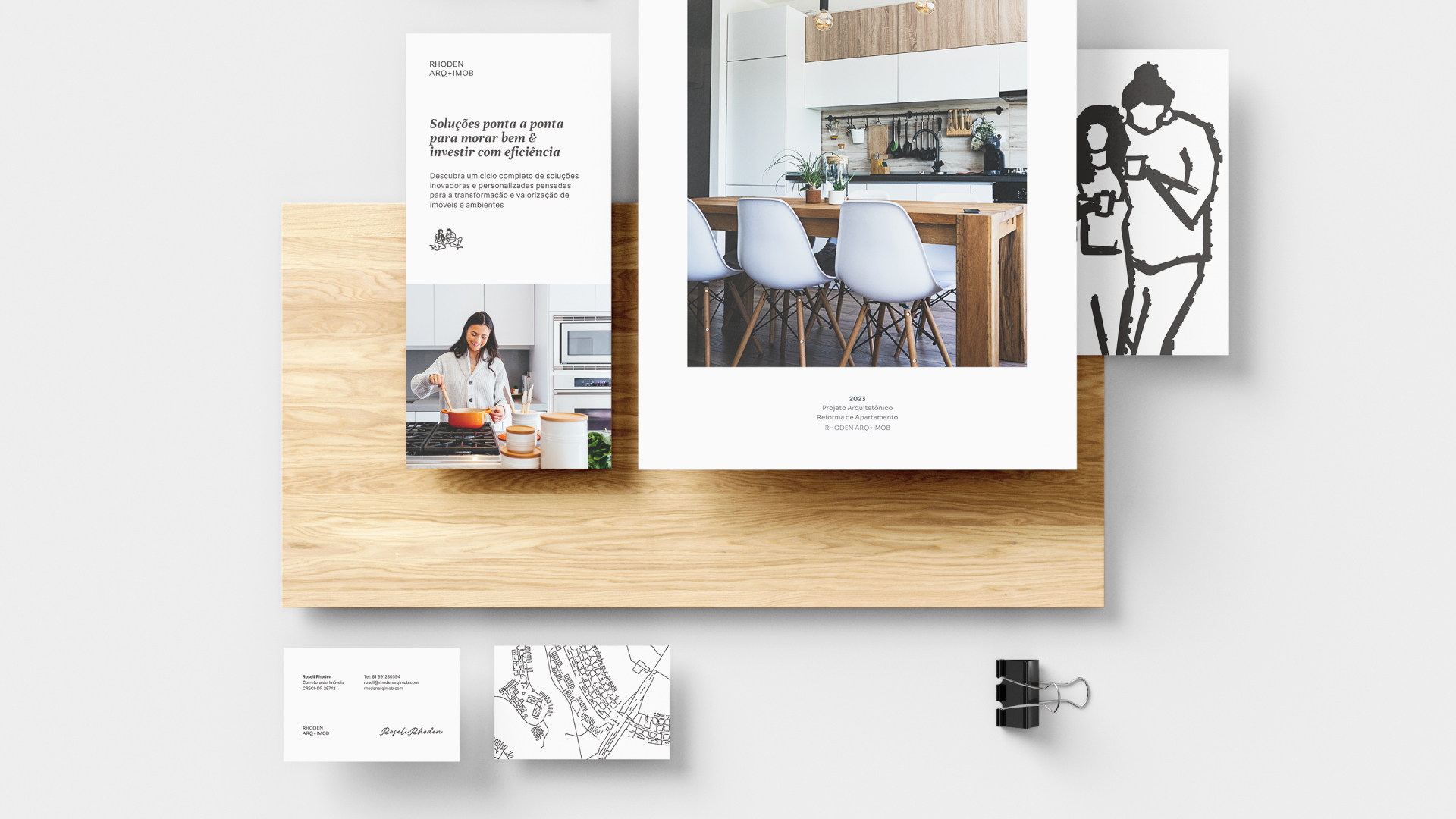
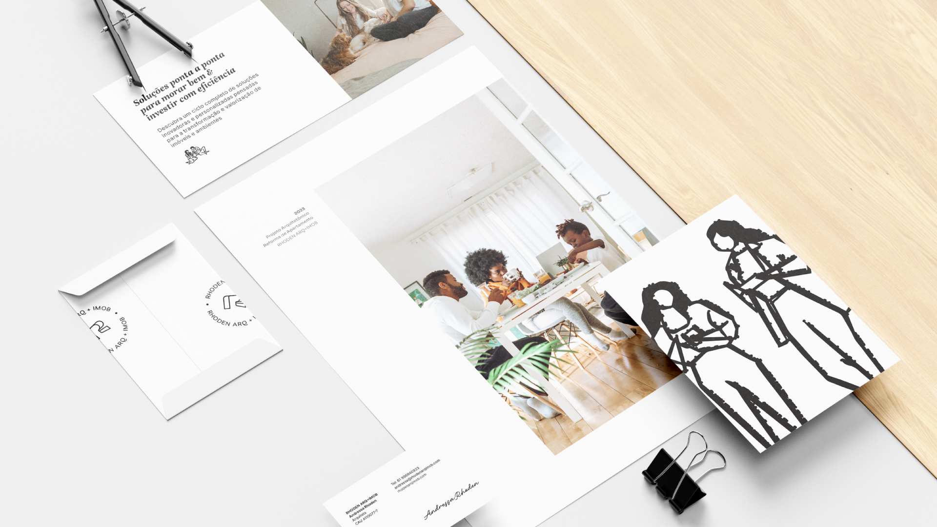
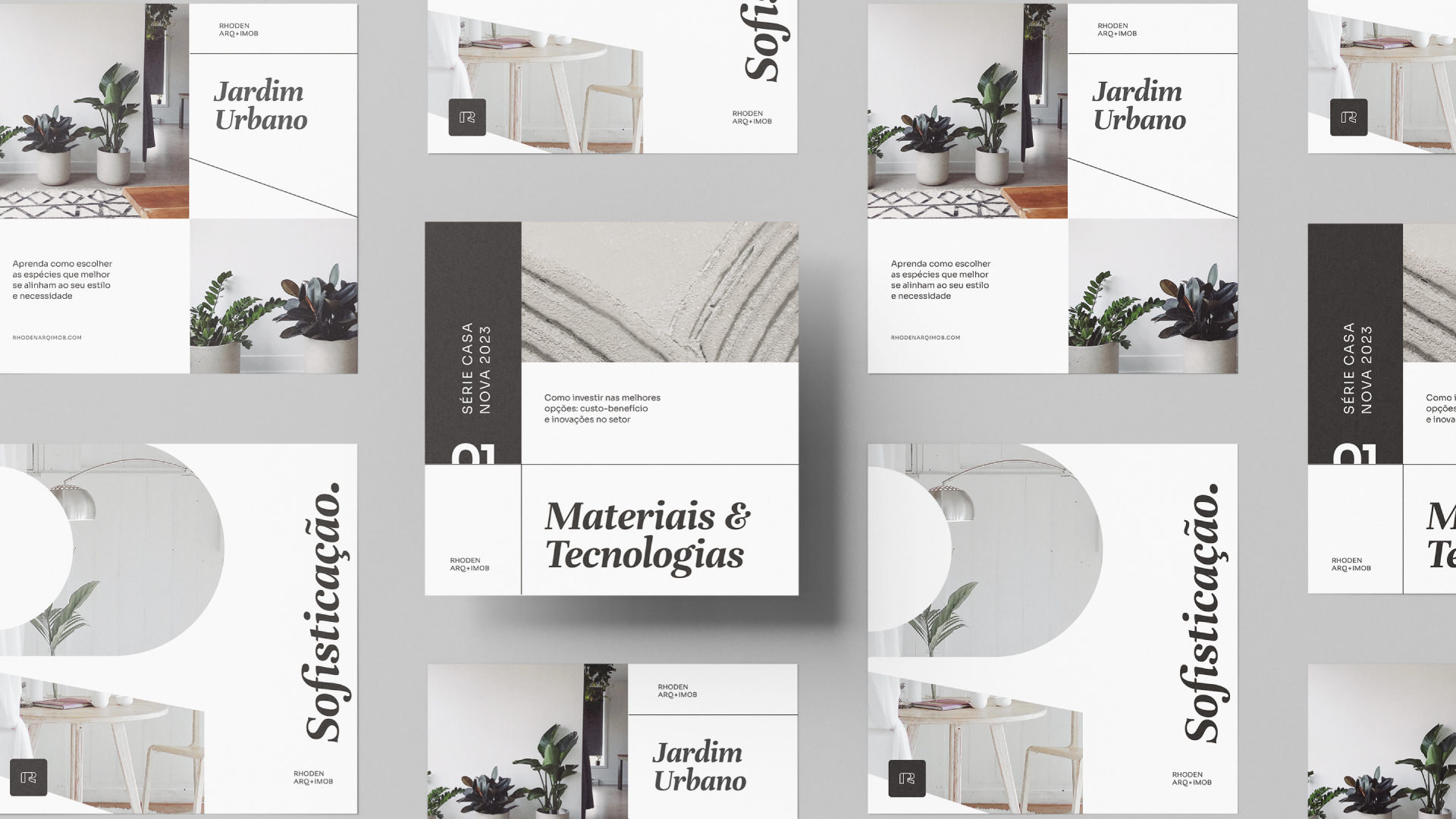
Challenge: The challenge of this visual identity project was to communicate the company’s message while reinforcing its contemporary nature and other strong brand attributes, such as sophistication, efficiency, organization, boldness, creativity, experience, and solidity. The brand’s visual identity was conceptualized in a modern and clean way, including a handmade touch through the use of textures and digital illustrations, made in art line style with a charcoal brush.
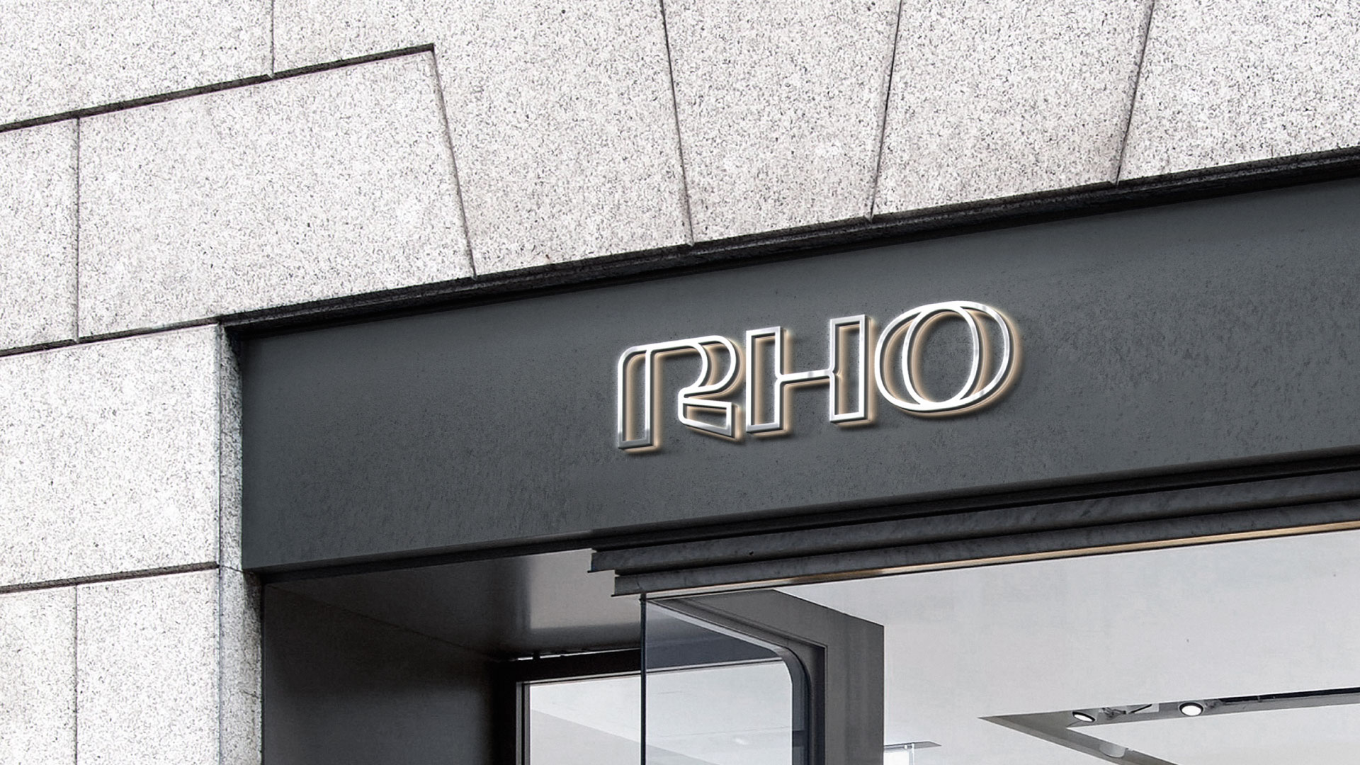
Logotype: Built with geometric lines, Rhoden’s logo connects to the city’s architectural universe, as the shapes of the letters bring a reference to famous architectural landmarks, such as the JK Memorial and Bridge, the Caxias Fort, the Metropolitan Cathedral, and the National Congress. The initials Rho were chosen to represent the brand’s logo instead of using its full name, “Rhoden,” as a strategy for a more intimate approach to its customers. The unfilled letters, drawn only with the outline lines, express transparency and lightness, essential characteristics of the brand’s personality.
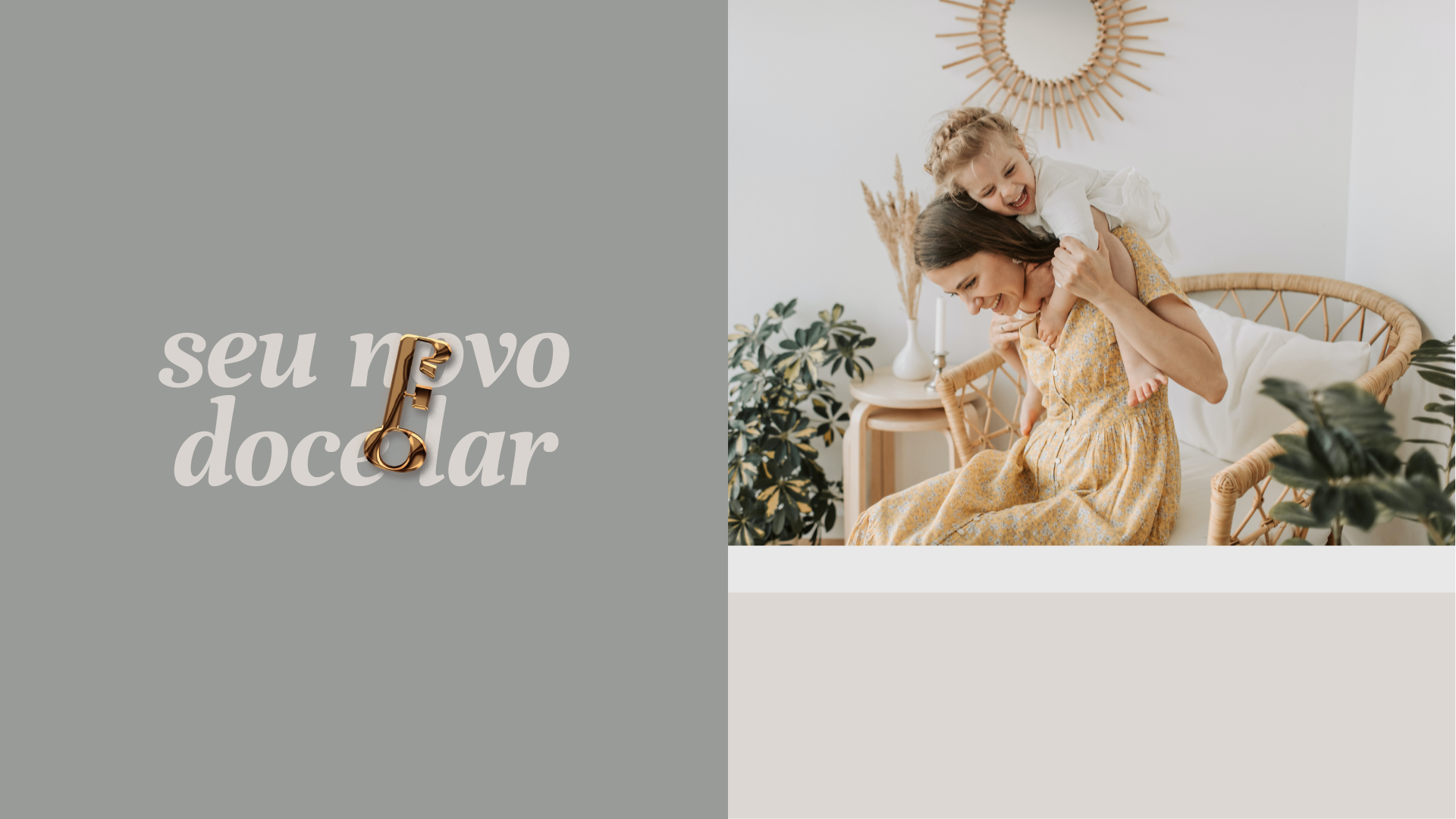
Colors: To emphasize lightness, simplicity and transparency, light and neutral colors were adopted, as well as warm tones that reinforce the idea of coziness and comfort and the search for closeness. The chosen colors were inspired by the materials used in civil construction, such as plaster, sand, clay, metal, cement, and marble.
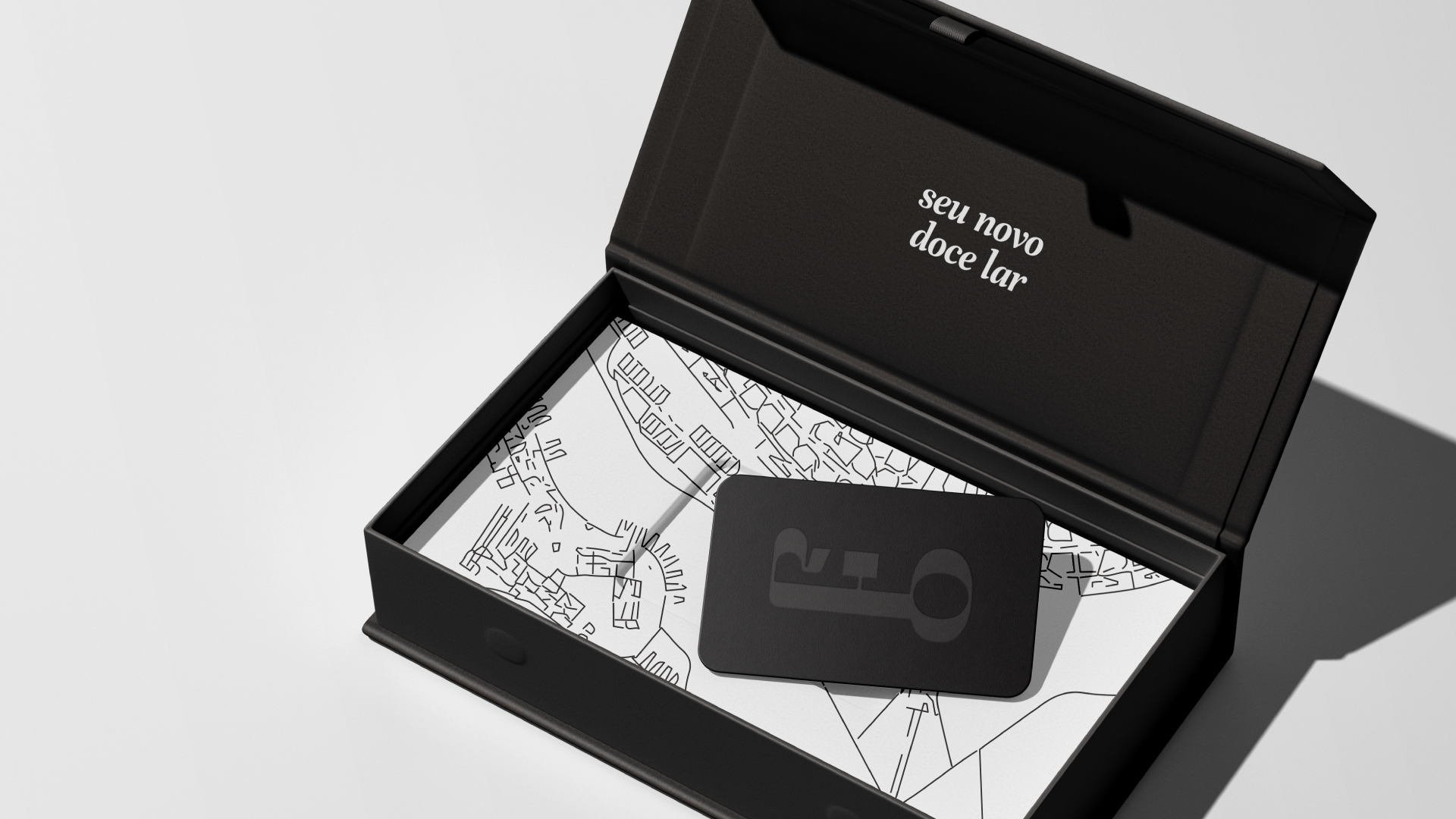
Icons: From the design of the letters RHO, were also created the brand icons: the H becomes a house, the O is worked into a cycle symbol (which represents the end-to-end solutions cycle), and the 3 letters combined form a custom key for Rhoden.
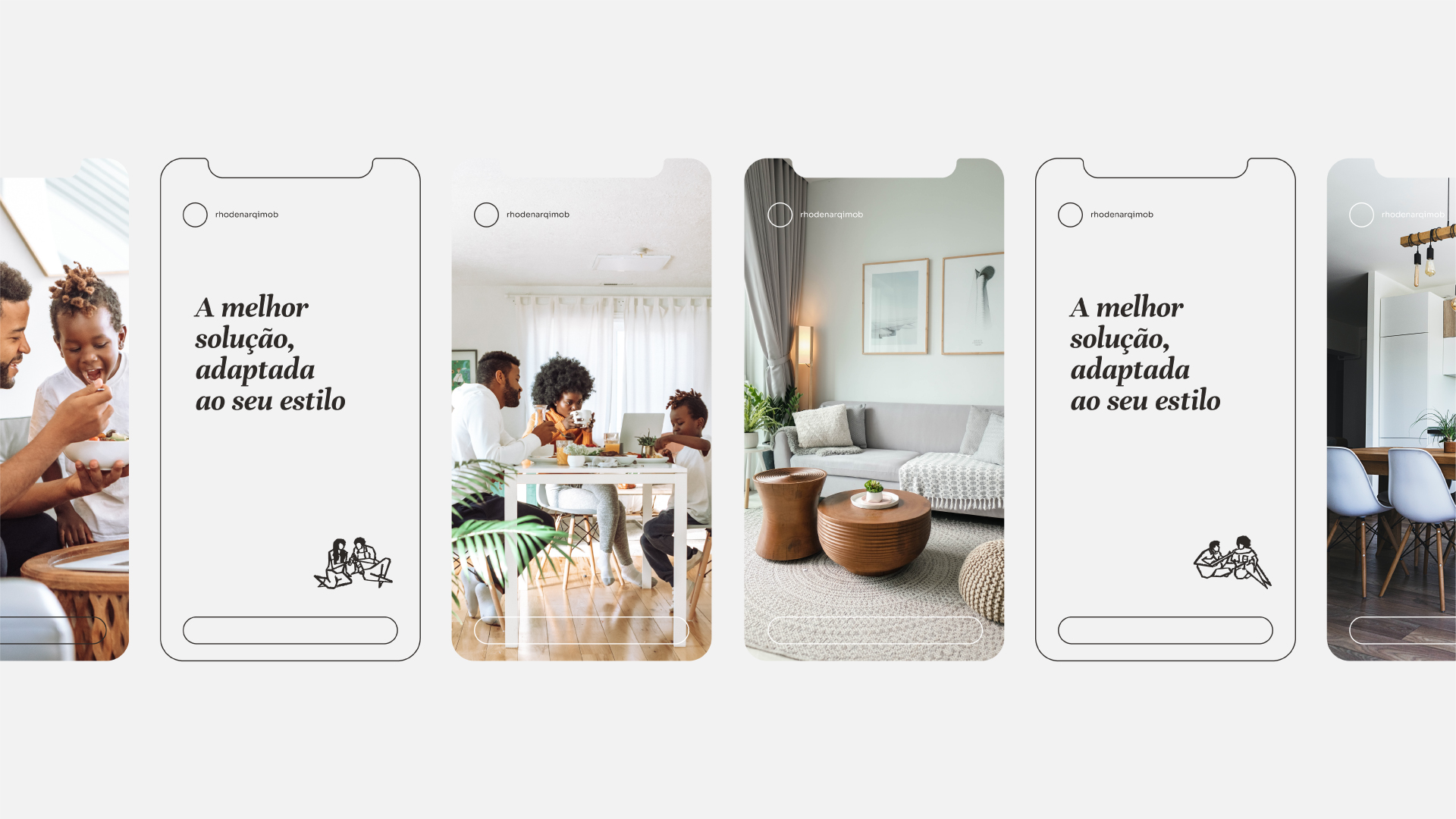
Illustrations: The creation of an exclusive collection of illustrations – called calungas – is a differential strategy adopted by Rhoden to highlight its human, affective, and artistic side and generate identification as it represents its ideal clients.
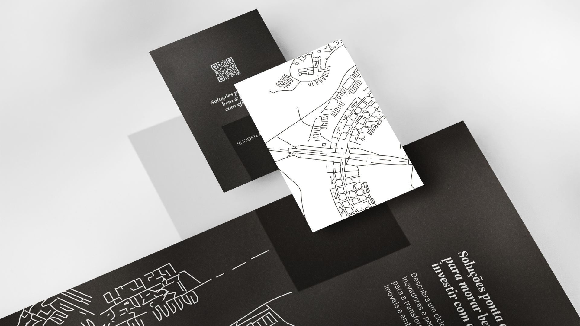
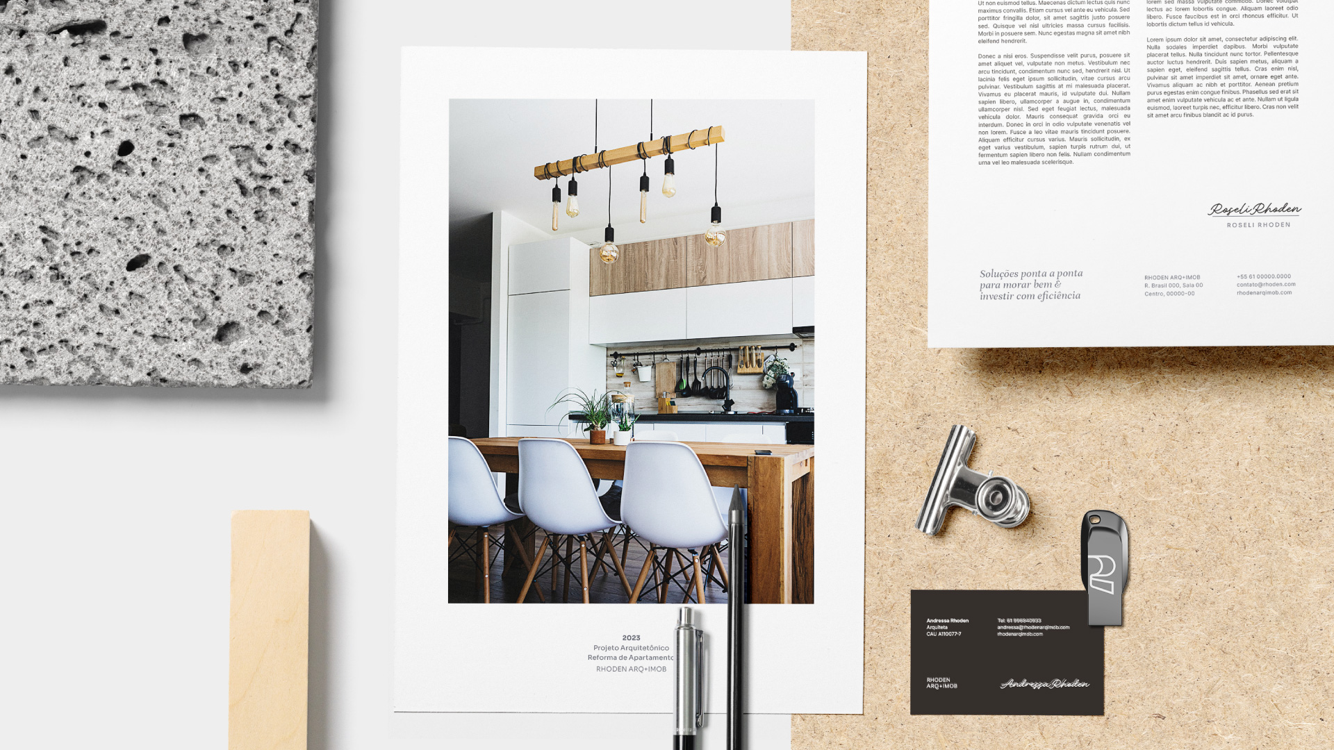
Card Design: The texture used on the business card cover was created from a map of Brasilia, the city where the company is based. The lines of the map were vectorized in Illustrator software, through the Image Trace command, using the Art Line preset.

CREDIT
- Agency/Creative: Nicole Gröff Design
- Article Title: Rhoden Arq + Imob Logo and Brand Design
- Organisation/Entity: Freelance
- Project Type: Identity
- Project Status: Published
- Agency/Creative Country: Brazil
- Agency/Creative City: Novo Hamburgo
- Market Region: South America
- Project Deliverables: Brand Design, Brand Strategy, Branding, Editorial Design, Icon Design, Identity System, Illustration, Logo Design
- Industry: Construction
- Keywords: real state, architecture, brasilia, decoration project, valuation of property
-
Credits:
Brand Designer: Nicole Gröff Design


