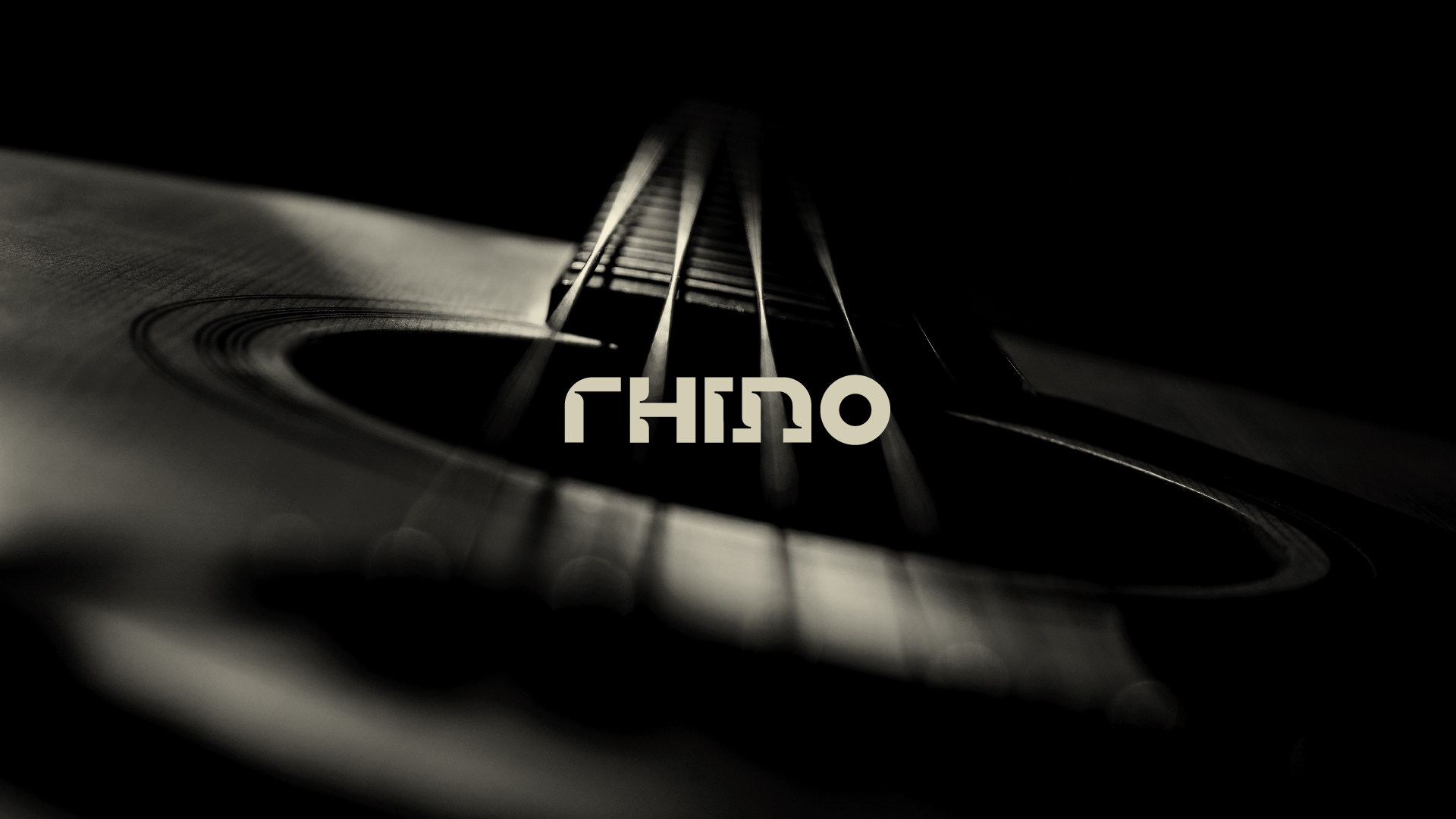
Rhino is a musical accessories and equipment company that seeks to expand its sales through e-commerce. Its mission is to deliver quality and robust products to people, with durability beyond what is offered by other brands and exclusive products (which are usually imported).
Based on the pillars, attributes and positioning of the brand, the concept addressed for the Rhino logo and visual identity was robustness, which directly reflects on the quality and durability of the products sold, an extremely important point for musicians and producers when making a purchase decision.
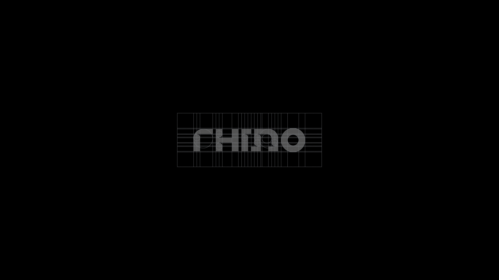
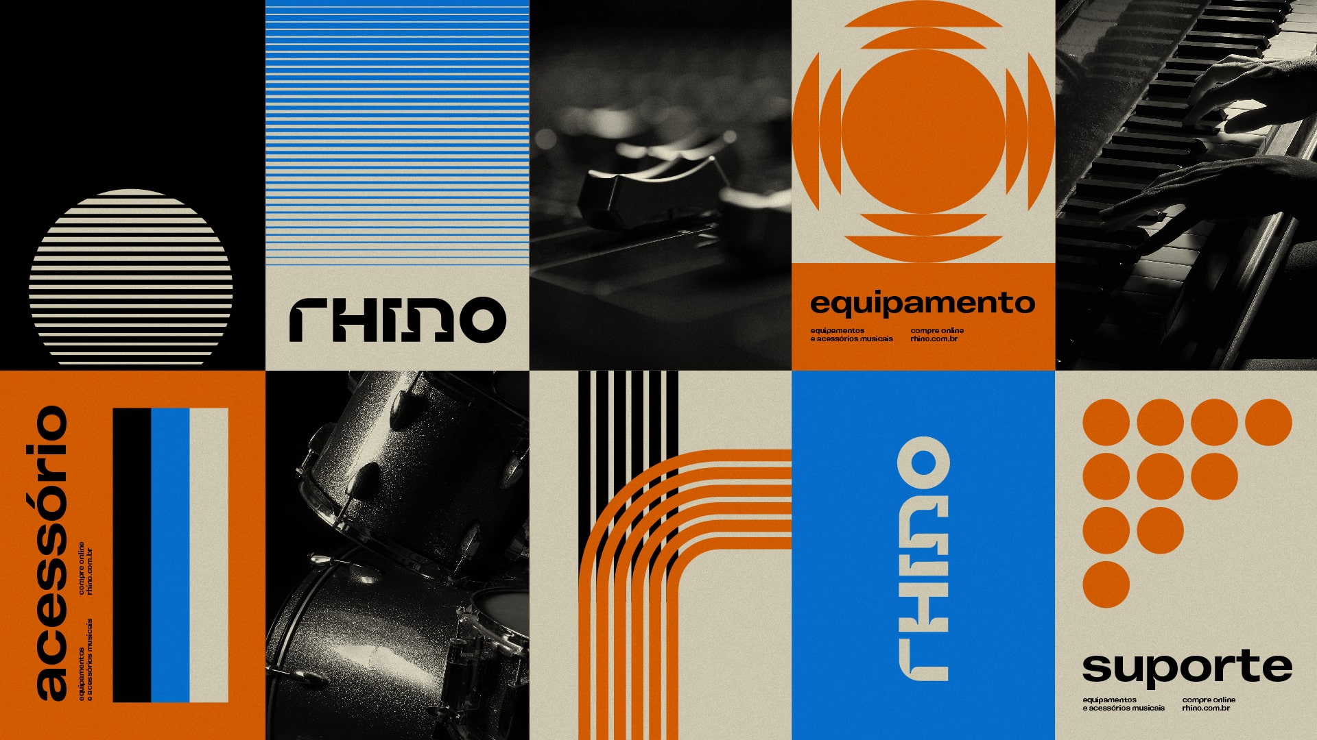
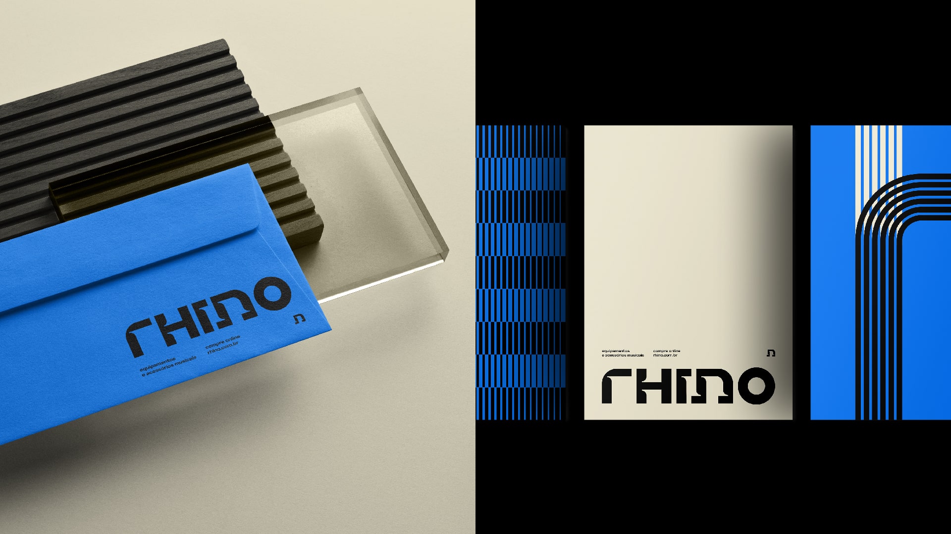
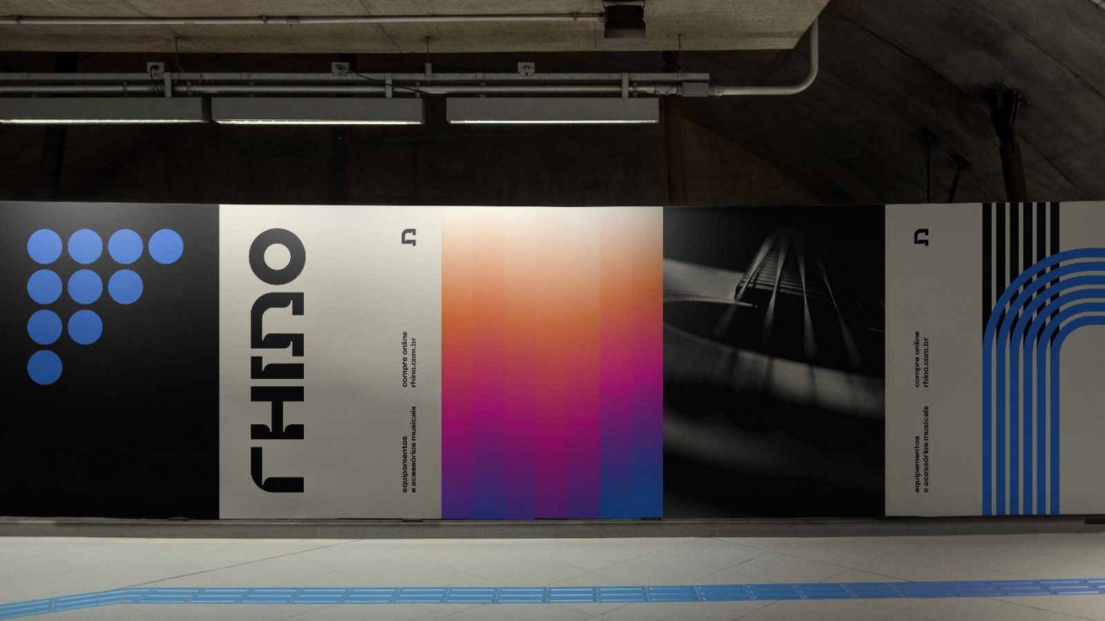
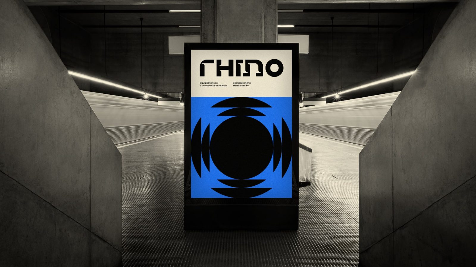
To reflect the robustness of the brand’s products, an exclusive typography was developed. With very thick lines, the type brings not only the necessary weight to convey the durability and quality of the products, but also authenticity by incorporating small cuts in the ligatures (which refer to various rhino horns, the brand’s translated name) in the characters (very formerly used by typographers so that there would be no stains on these ligatures due to “excess” or “accumulation” of ink). These characteristics make the Rhino logo unique.
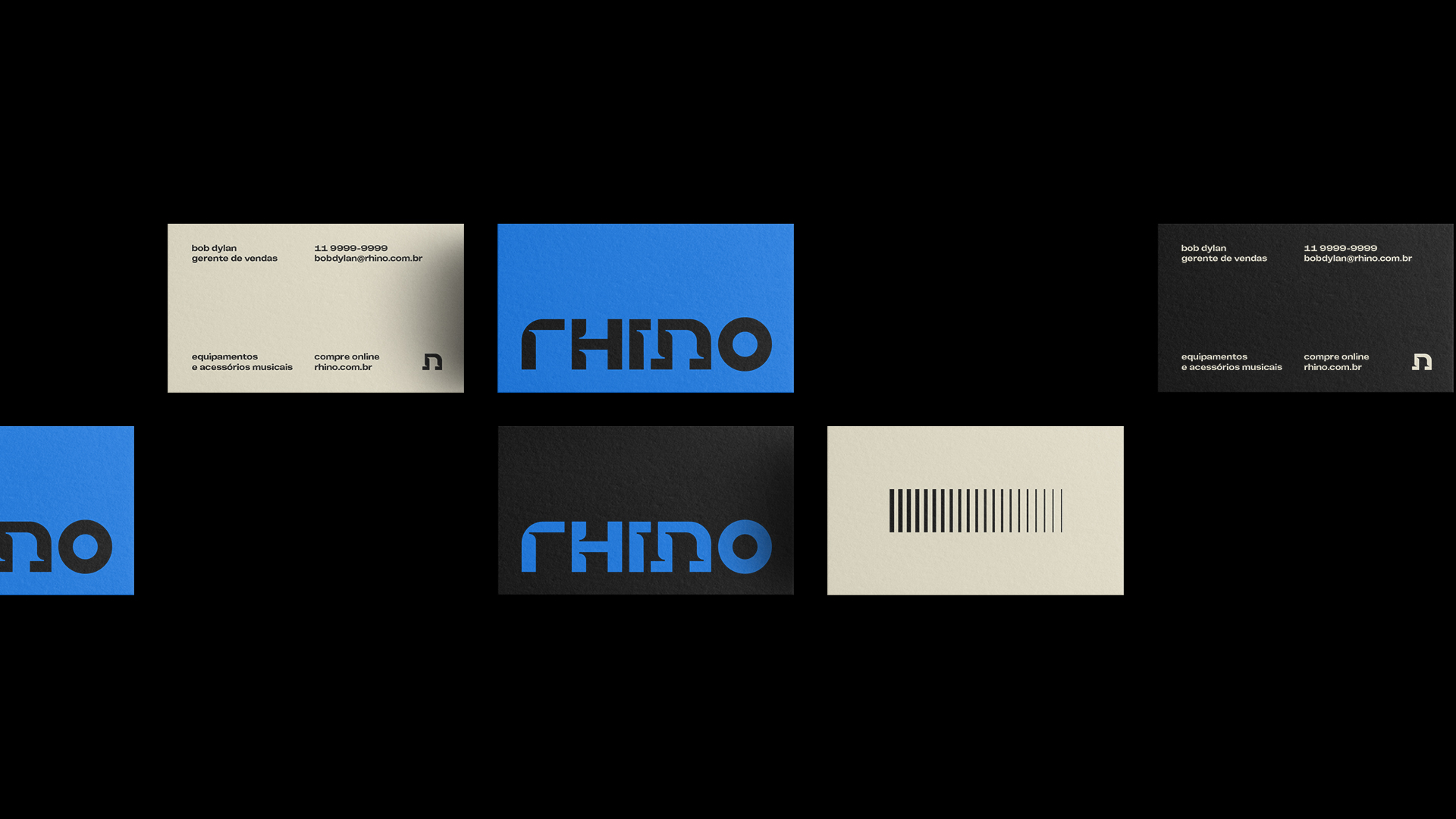
The symbol, included in the letter “n” of the typographic logo (a musical note), brings harmony to the whole, and embodies an extremely important part of the company, the music.
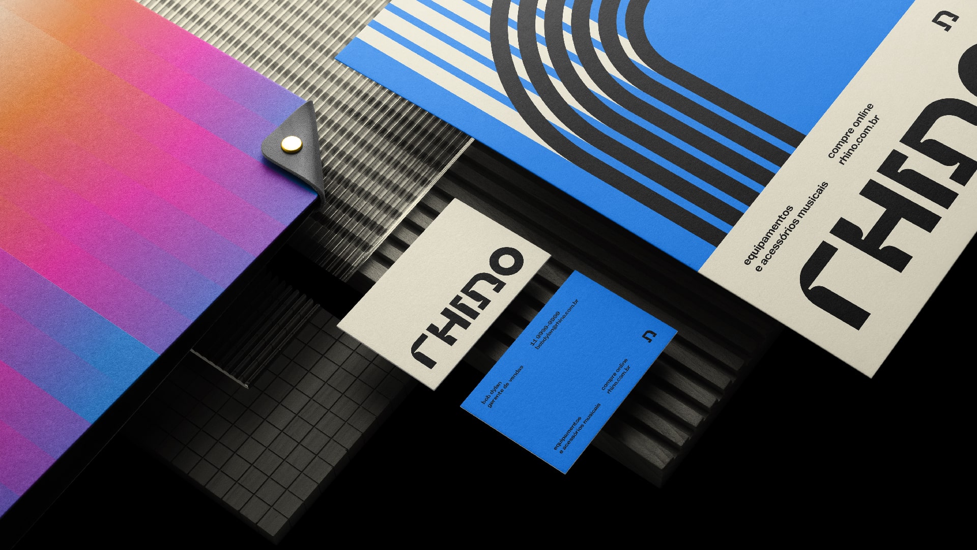
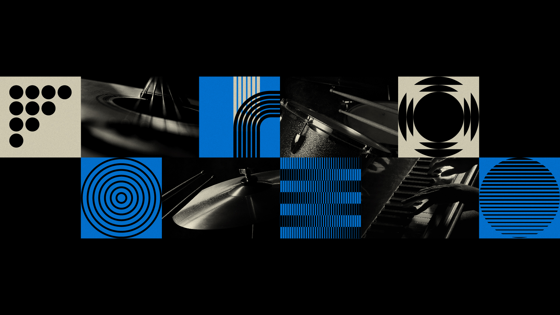
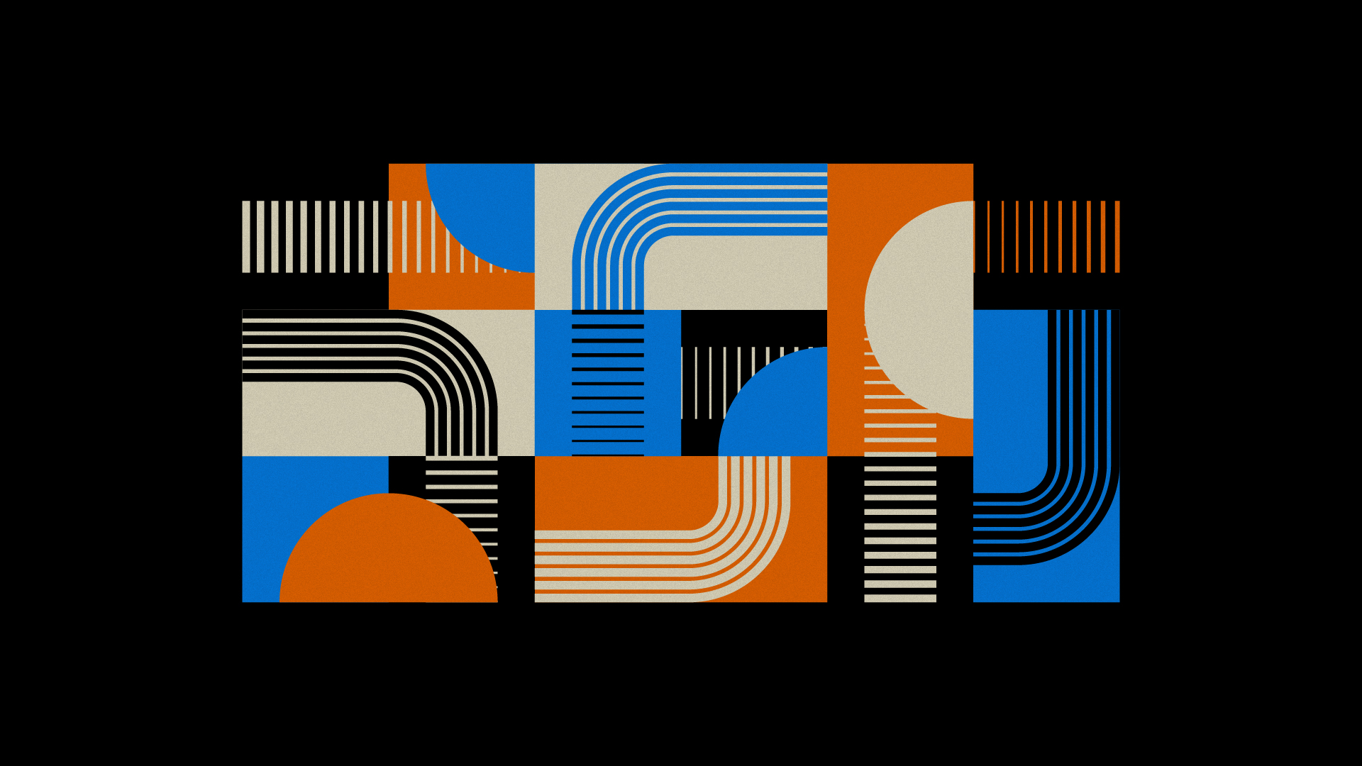
The visual identity, created from the classic graphic representation of sound volume (thick and thin lines, in progression), as well as continuous lines and ellipses (which refer to stringed musical instruments), the elements created to compose the look of Rhino mixes a modern and contemporary aesthetic that rescues part of the look of the packaging of music-related products from past decades.
Part of the elaboration of the identity elements also sought to convey the idea of “connection” and “fit”, also essential attributes of Rhino’s products. Another detail is that some lines form the initial of the brand name, the “r”.
The end result is a timeless visual identity, which combines the musical universe with the durability and robustness of the brand’s products.
CREDIT
- Agency/Creative: Matheus Ferreira
- Article Title: Rhino Brand and Visual Identity by Matheus Ferreira
- Organisation/Entity: Freelance
- Project Type: Identity
- Project Status: Published
- Agency/Creative Country: Brazil
- Agency/Creative City: Lençóis Paulista
- Market Region: South America
- Project Deliverables: Art Direction, Brand Design, Brand Mark, Branding, Design, Graphic Design, Poster Design
- Industry: Technology
- Keywords: Brand, Branding, Visual Identity, Music, Logo
-
Credits:
Art Director: Matheus Ferreira


