


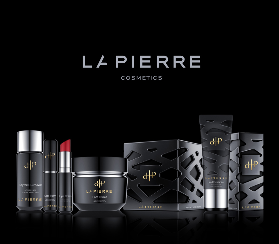

“Nail polish brand from New Orleans, the USA
LaPierre Cosmetics company got its name after J.M. LaPierre, who was the founder’s mother. She died in 2014 from cancer and since that day the brand regularly donates $1 from each bottle of nail polish sold to support people who fight with this disease.”
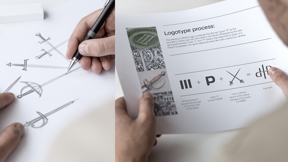
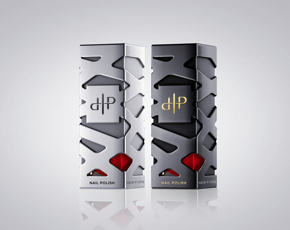
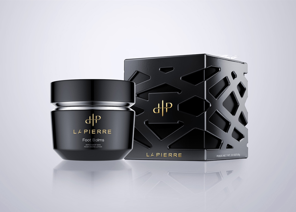
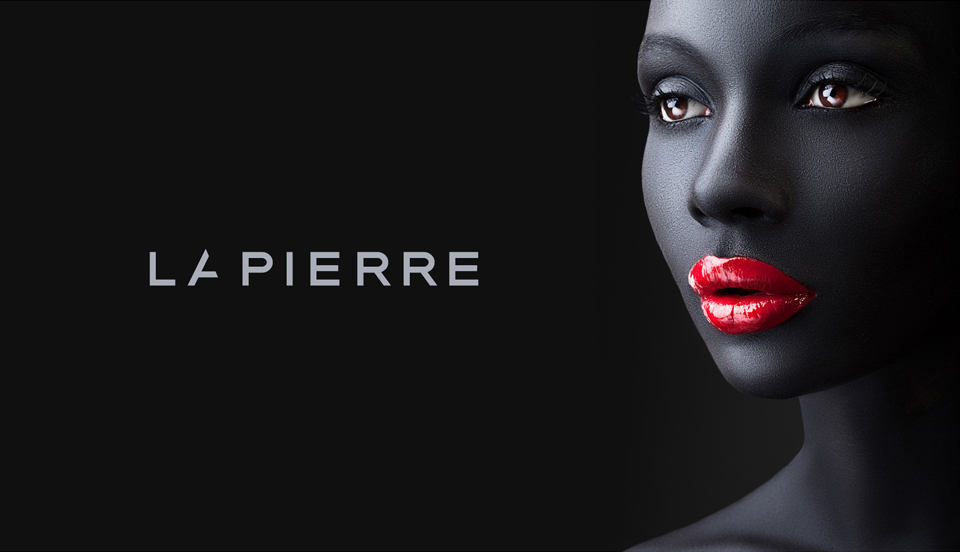
“The previous LaPierre logo contained the Roman figure “III” as the founder’s mother was the third child in the family. Redesigning the idea we supplemented it with “L” and “P” letters that resemble an epee of a French musketeer, the same ideal and sharp like nails covered by LaPierre.
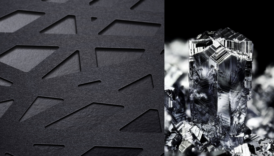
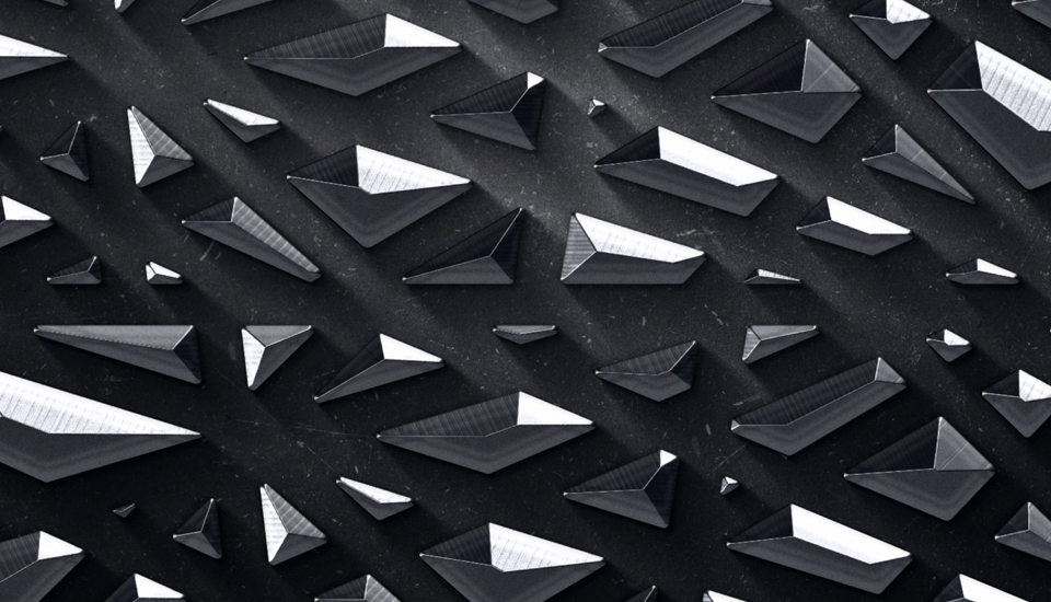
The word “la pierre” originates from French and means “a rock” which pushed to integrate the idea of split rocks into the corporate pattern to emphasize and discover the sense hidden in this name.”


CREDIT
- Agency/Creative: Reynolds & Reyner
- Article Title: Reynolds & Reyner – LaPierre
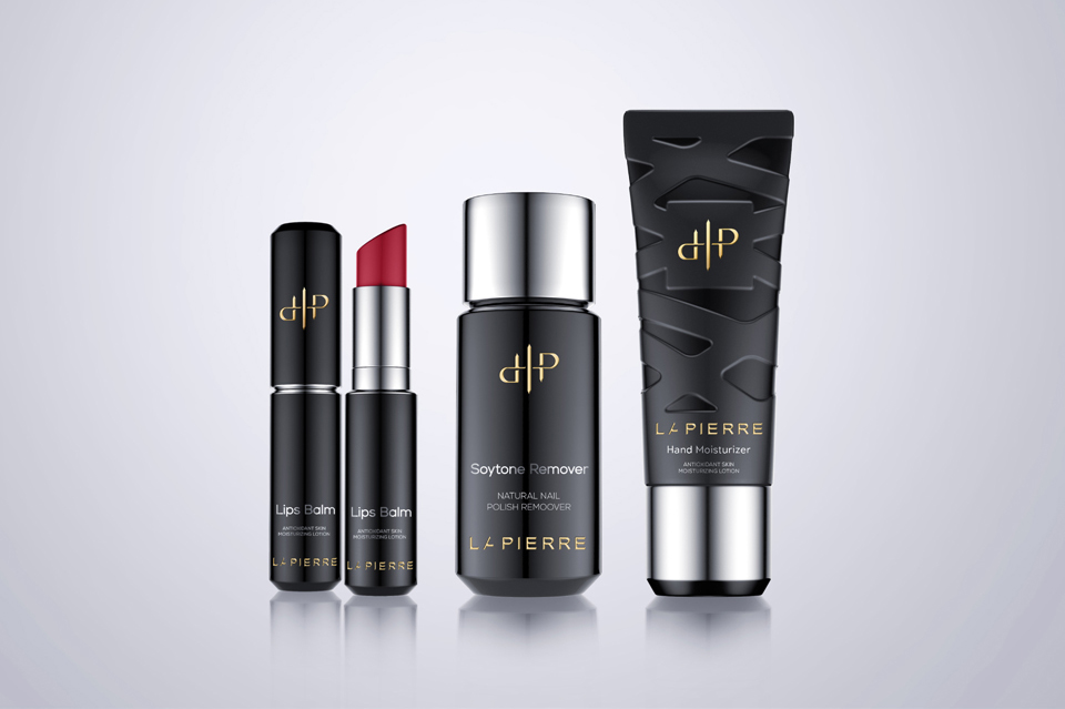
- Project Type: Packaging
- Format: Bottle
- Substrate: Glass


