


Reynolds and Reyner – Ukrainian Wine with big letter ”O”
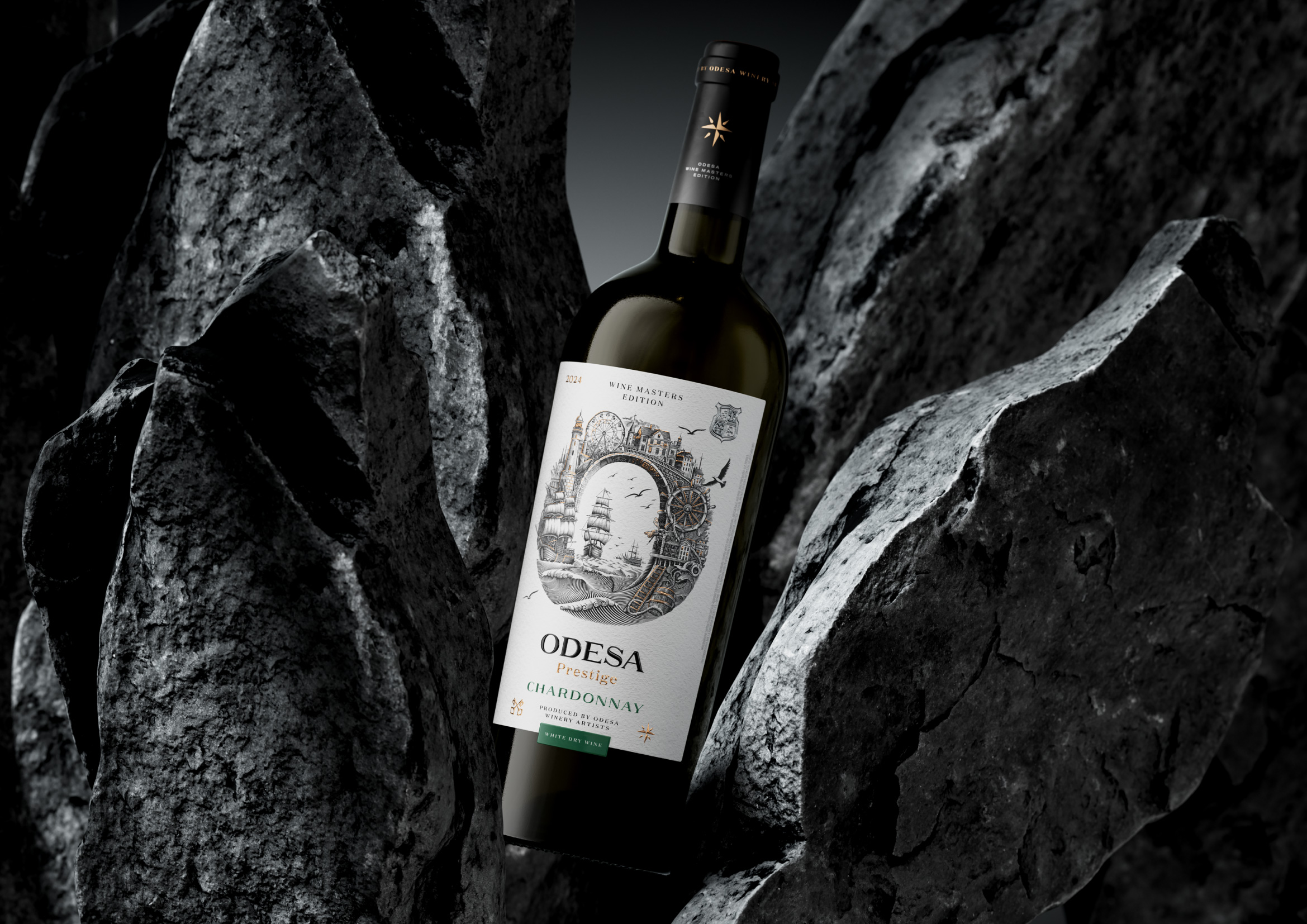
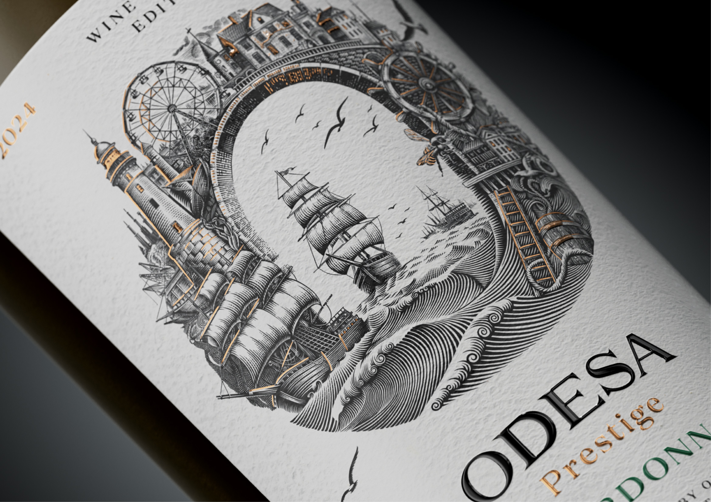
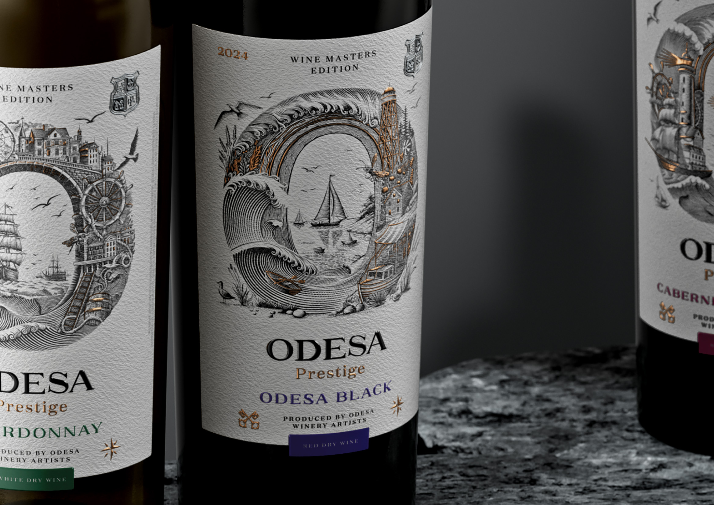
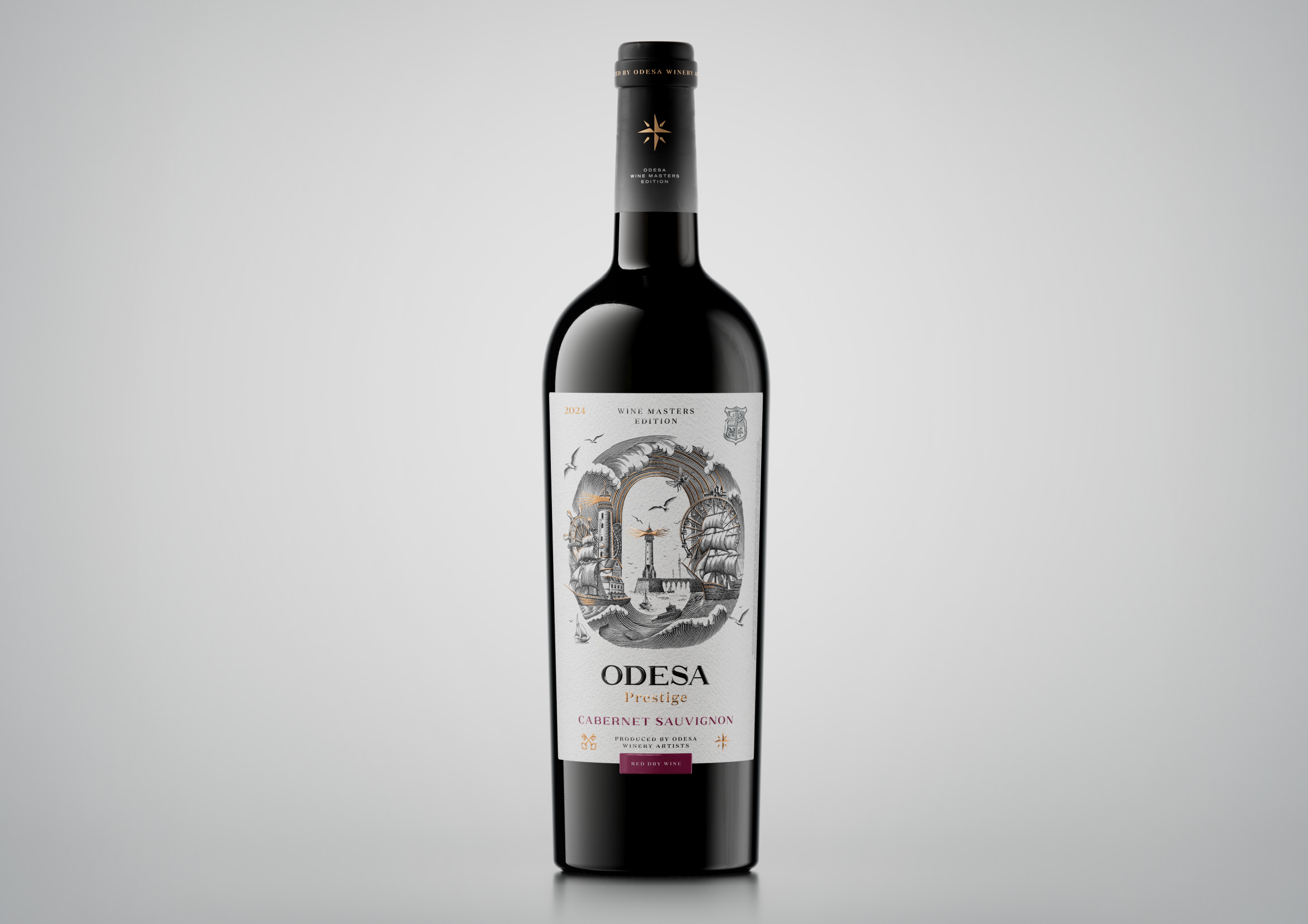
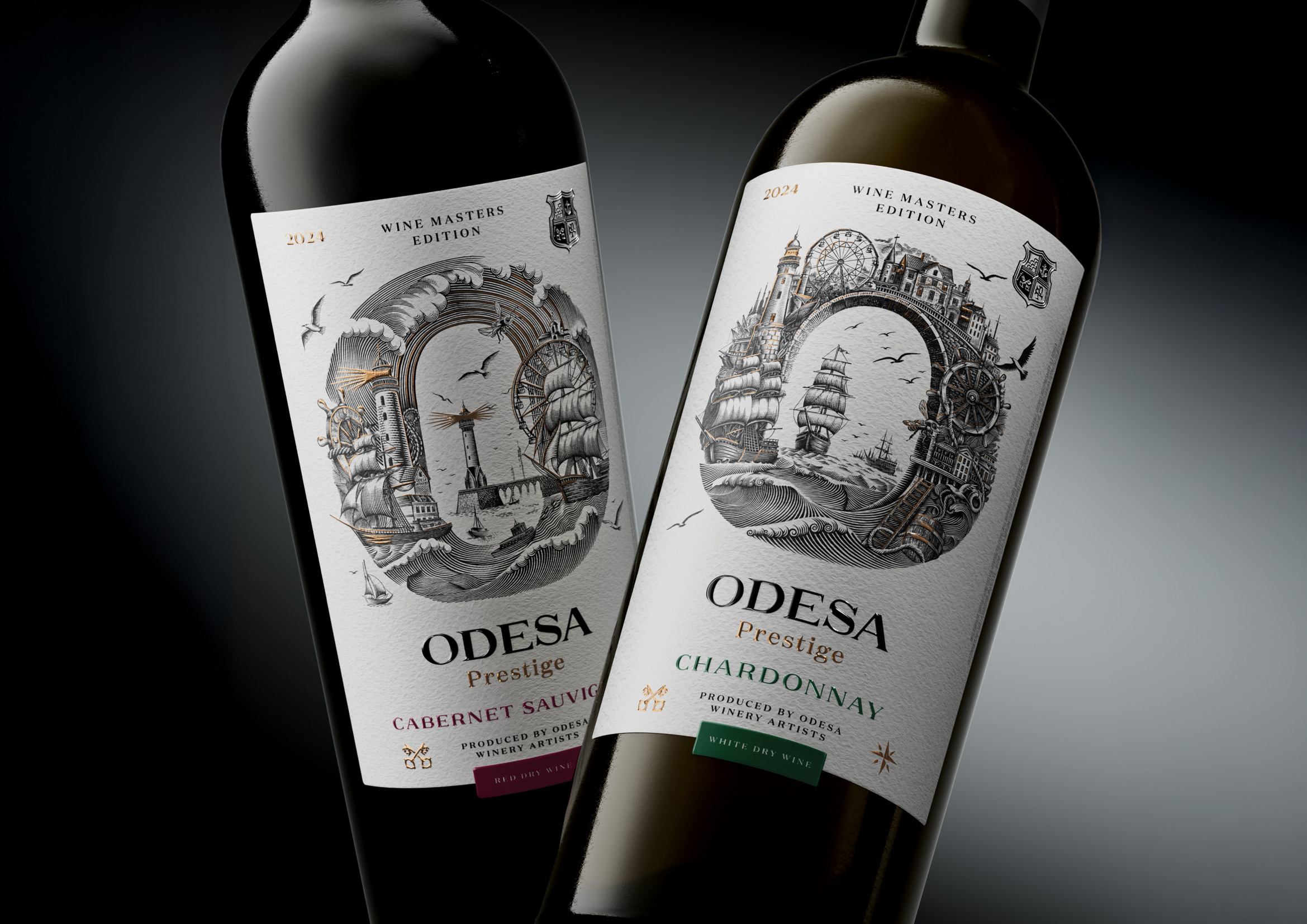
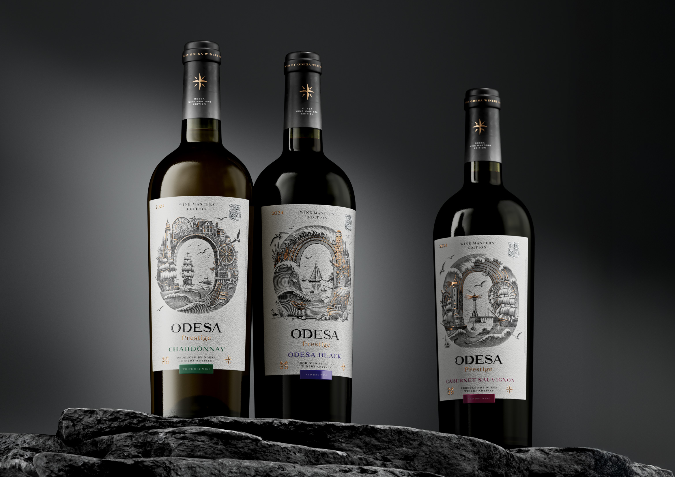
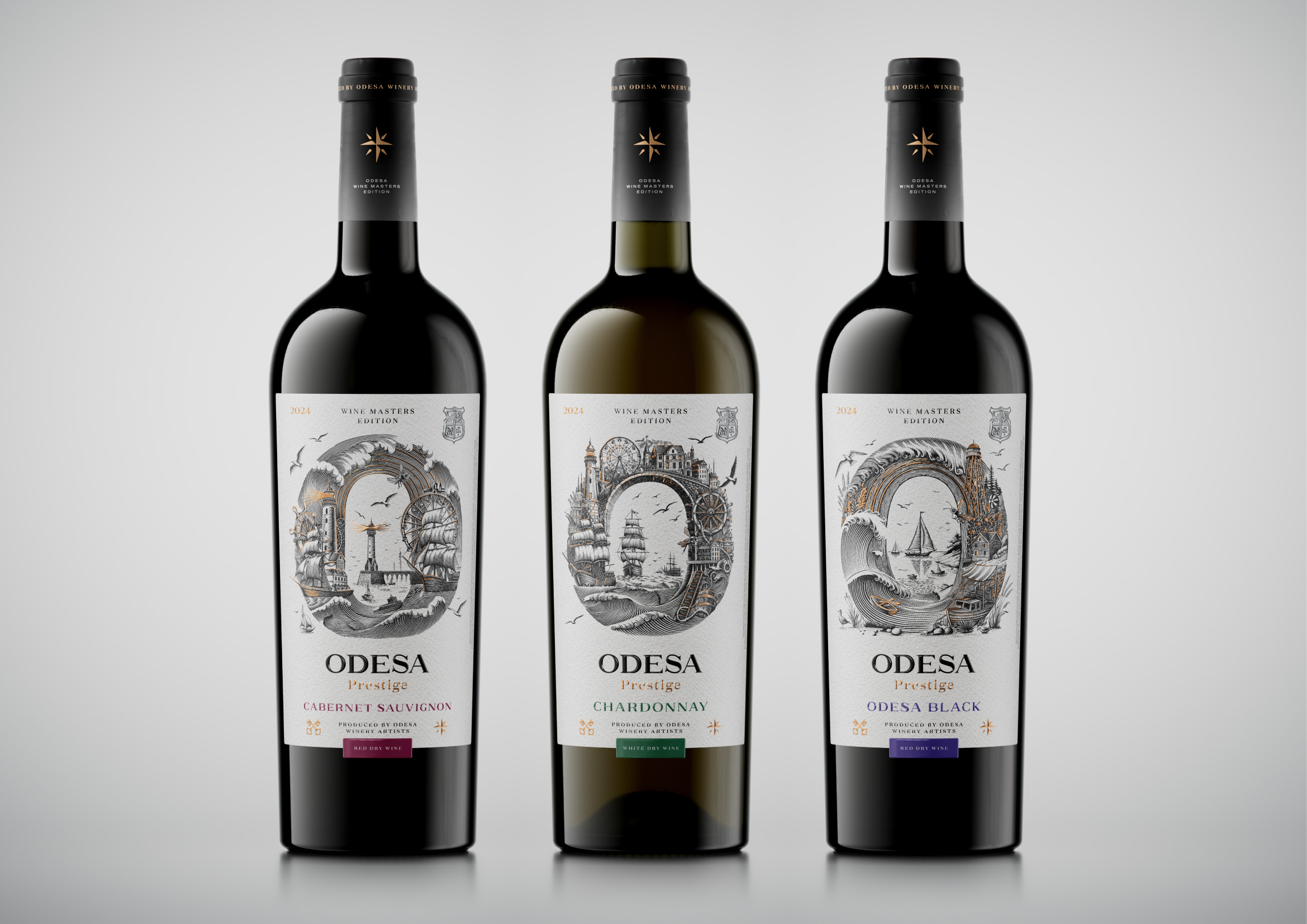
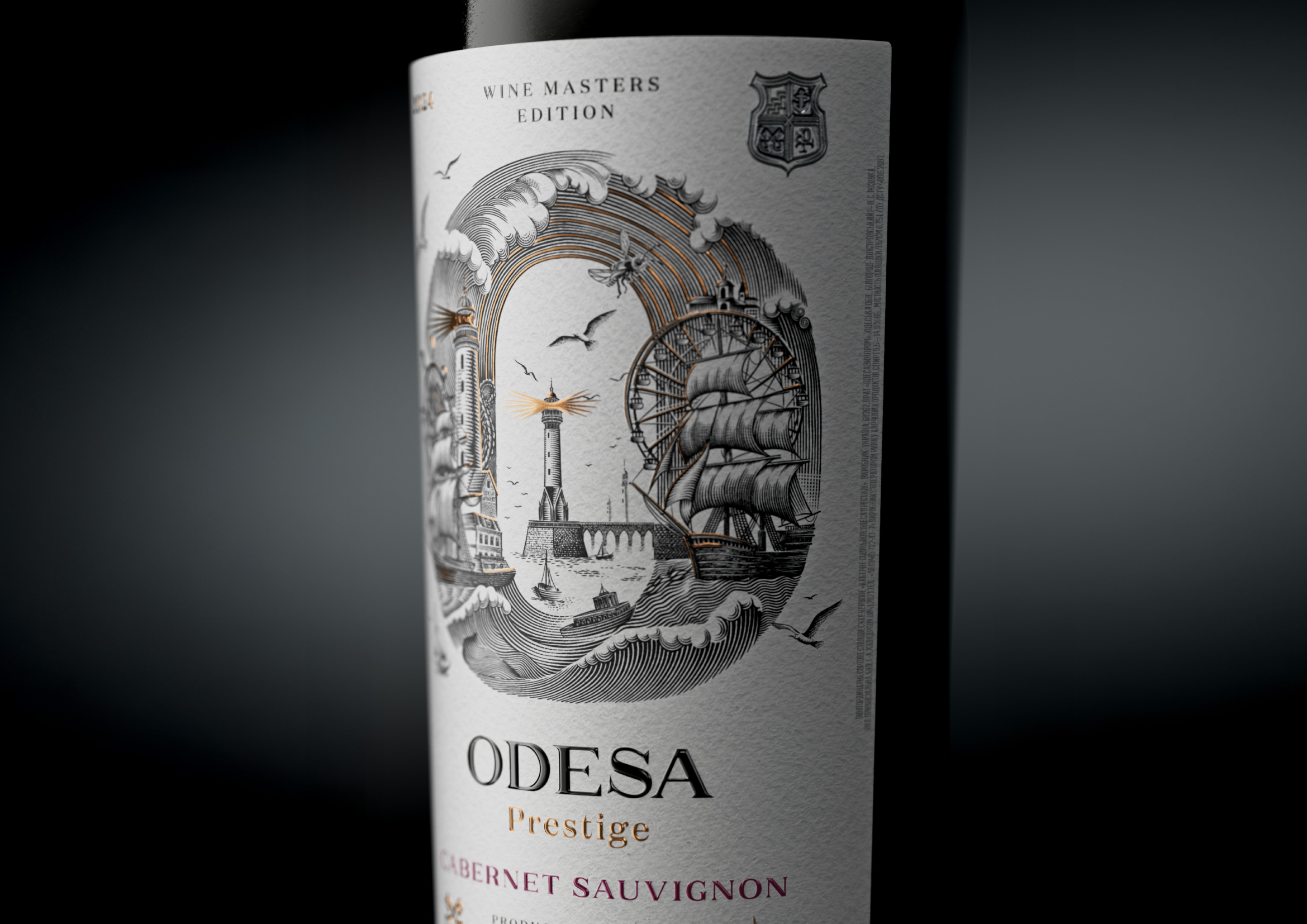
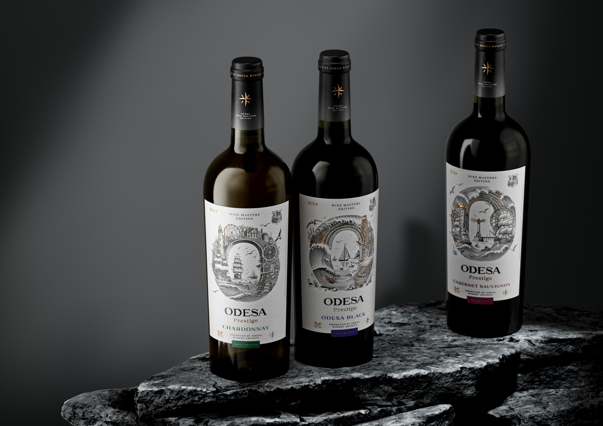
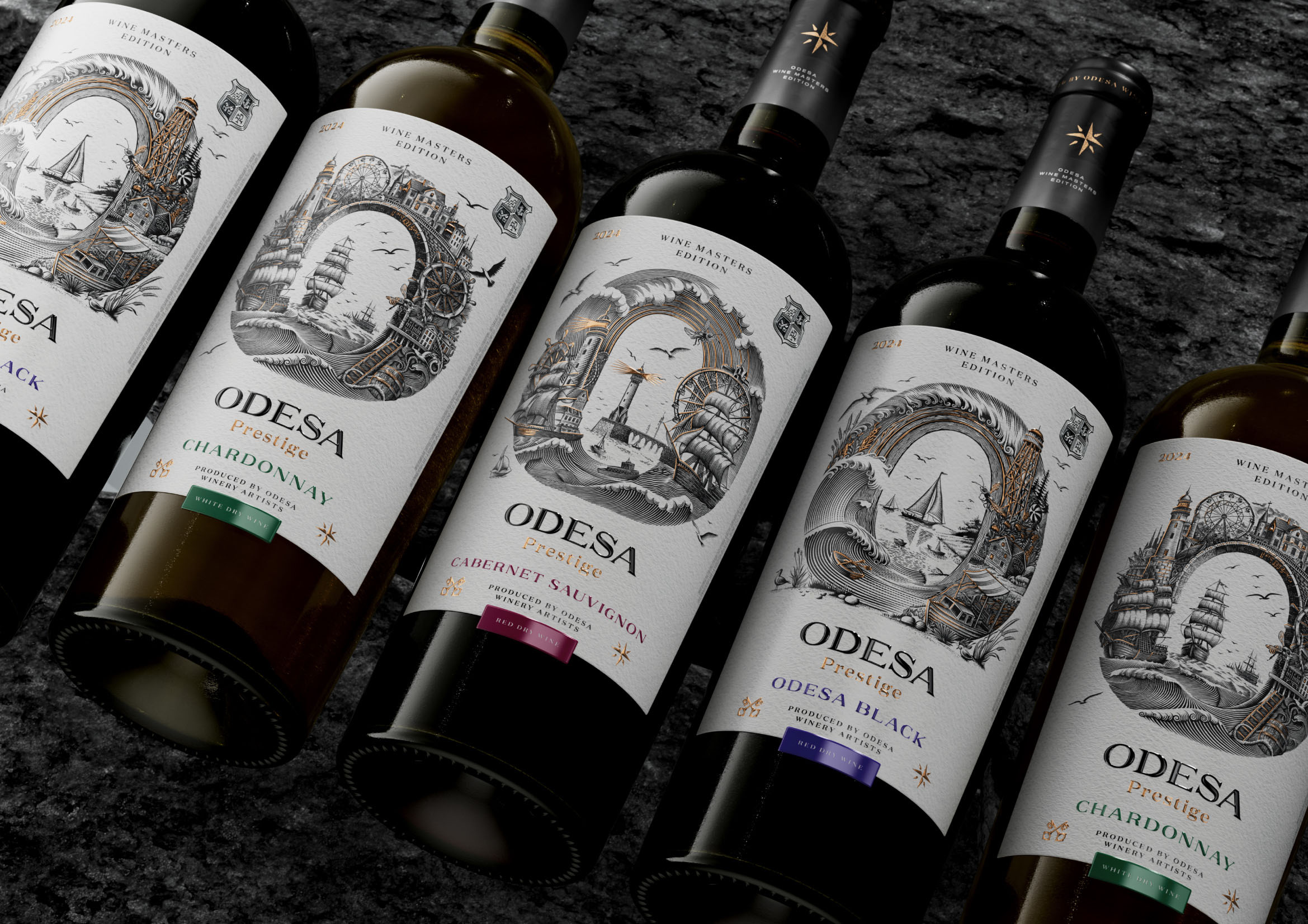
The design of Odesa “Prestige” dry wines is deeply inspired by maritime symbolism and coastal aesthetics, forming an immediate and emotionally charged connection between the consumer, the city of Odesa, and the brand itself. This concept aims to capture the spirit of the region, drawing on its rich seafaring heritage and recognizable cultural imagery. At the center of the visual identity stands the stylized letter “O,” which serves not only as the first letter of the name but also as a powerful visual anchor. Its bold and elegant shape instantly attracts attention, helps the bottle stand out on a crowded shelf, and enhances long-term brand memorability.
The label harmoniously blends traditional engraving-style elements with a contemporary graphic approach, creating a design that feels both timeless and modern. Intricate illustrations featuring waves, lighthouses, sailing ships, and other maritime motifs add depth and narrative richness to the composition. These details do more than simply decorate the label — they construct a vivid visual story that immerses the consumer in the atmosphere of the Black Sea coast, strengthening associations with the region’s history, culture, and romantic coastal landscapes.
This combination of artistry and symbolic storytelling highlights the brand’s focus on regional identity and craftsmanship. Through thoughtful composition and carefully balanced visual elements, the design communicates the value and character of the wine long before the bottle is opened. The color palette, dominated by deep blacks, refined gold accents, and subtle contrasting tones, intensifies the perception of exclusivity and sets an elegant tone that aligns with the expectations of premium still wines. Gold detailing, used sparingly yet strategically, reinforces the sense of prestige and sophistication, while the overall aesthetic coherence enhances the product’s attractiveness and credibility.
Together, these visual choices create a compelling and memorable identity for Odesa “Prestige,” positioning the wines as products that embody both artistic expression and a deep connection to their coastal origins.
CREDIT
- Agency/Creative: Reynolds and Reyner
- Article Title: Reynolds and Reyner Revitalizes Odesa Prestige With a Graphic System That Celebrates Regional Character
- Organisation/Entity: Agency
- Project Type: Packaging
- Project Status: Published
- Agency/Creative Country: Ukraine
- Agency/Creative City: Kyiv
- Market Region: Europe
- Project Deliverables: Label Design
- Format: Bottle
- Industry: Food/Beverage
- Keywords: ukraine, odesa, wine
-
Credits:
Creative Director: oleksandr andreiev


