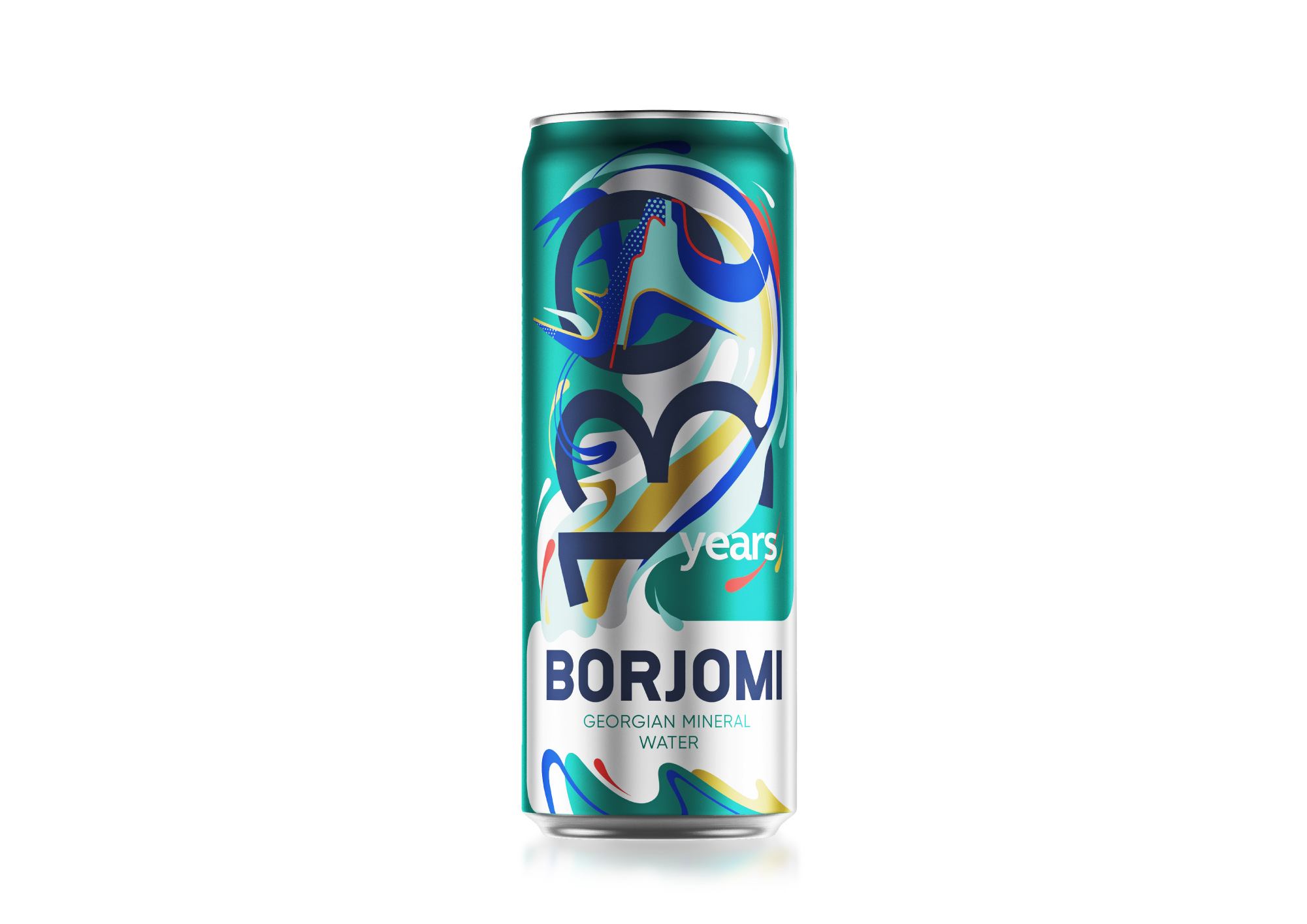
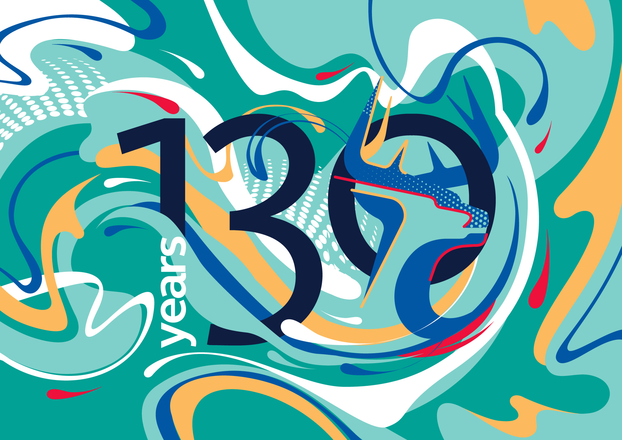
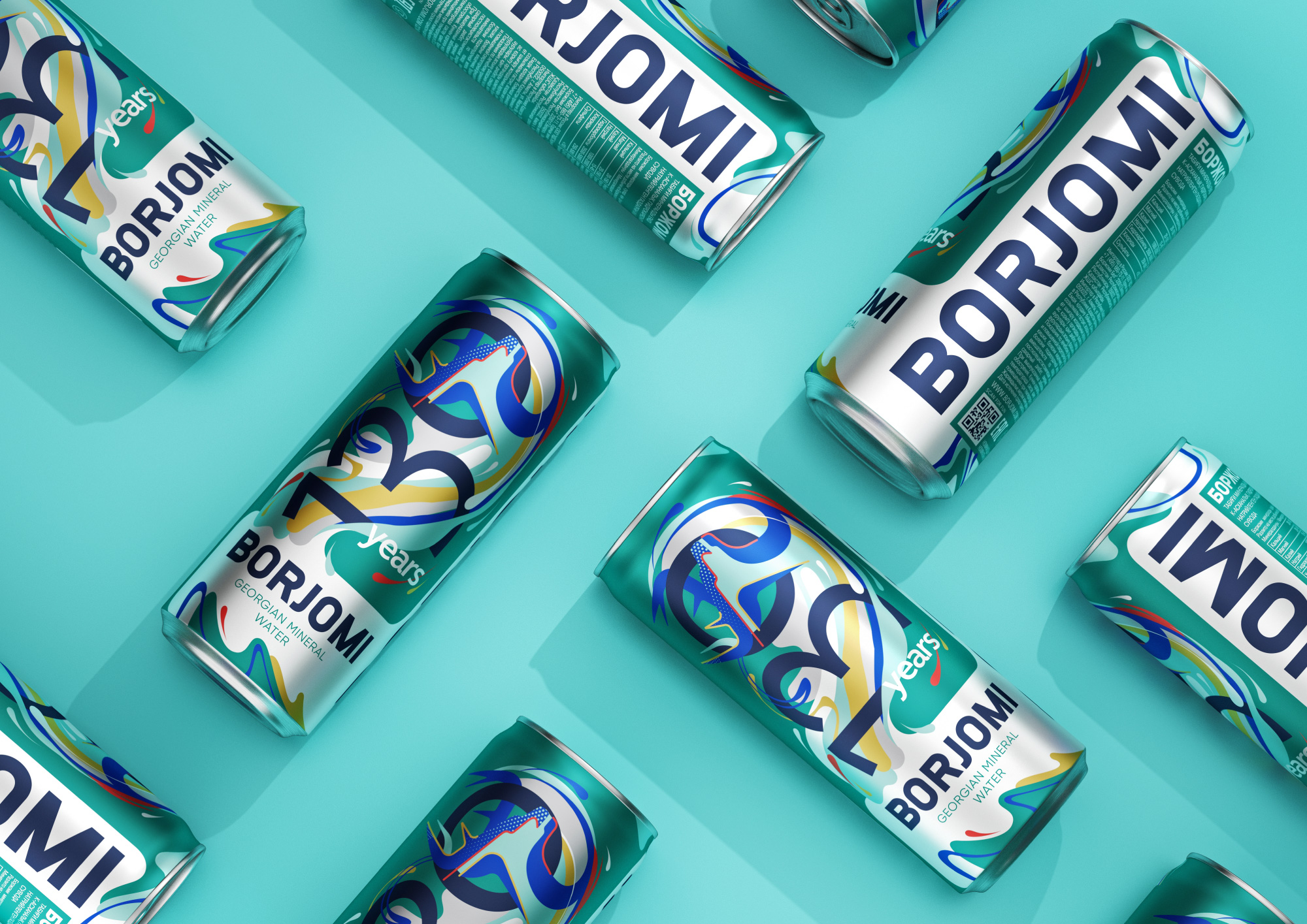
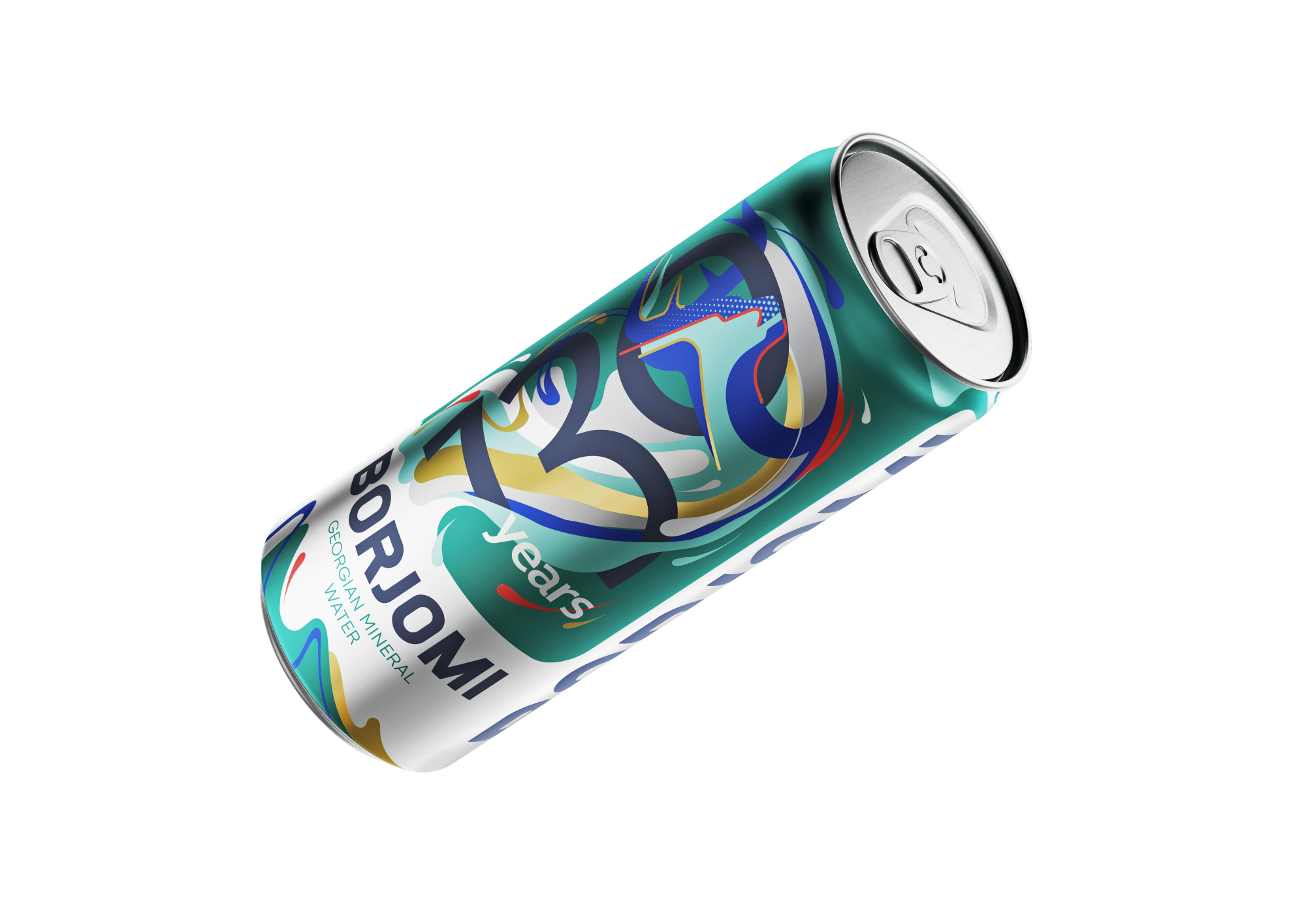
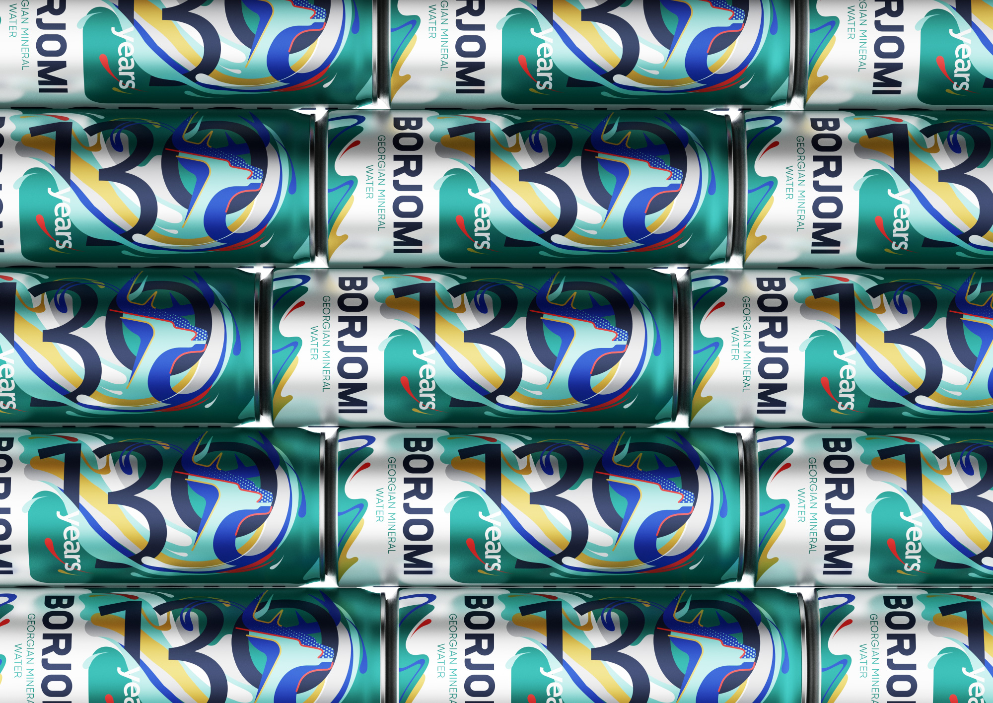
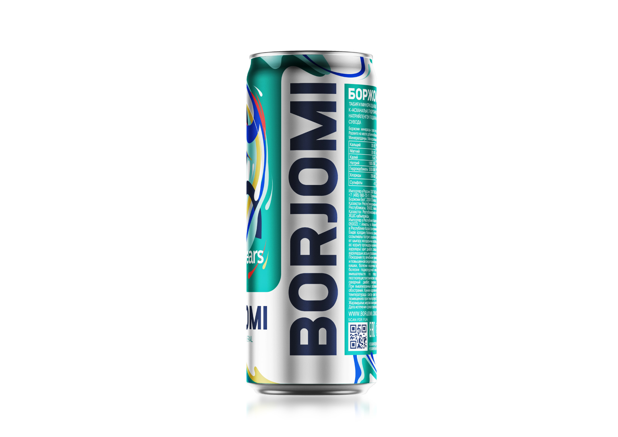
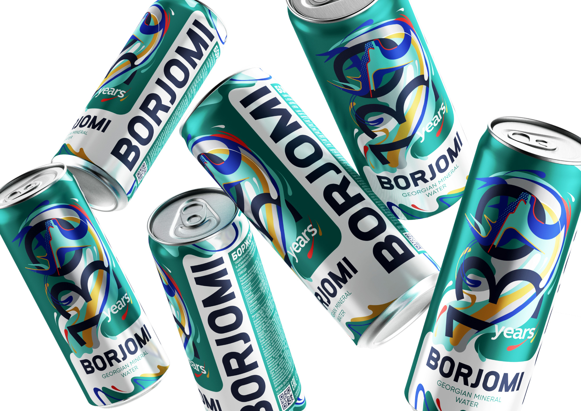
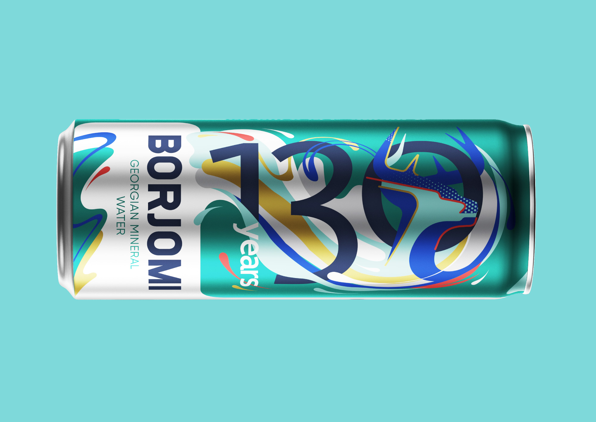
In 2020, Borjomi’s anniversary is the 130th anniversary of production. In honor of this event, the brand decided to upgrade on the shelves, as if dressed up for the holiday. And despite the fact that the “anniversary” sounds old-fashioned, the new limited collection looks fresh and modern. Based on the “And you with character” communication platform, a design was developed for bottles and cans, taking into account the emotions of consumers, global trends and maintaining brand awareness.
The Georgian Green logo, deer and color familiar to consumers are gradually becoming icons of modern culture. In the new collection, the deer coexists with the numbers 130 in the dynamic composition, which meets the current trends in graphic design. In addition, this composition conveys the meaning of the continuous development of Borjomi throughout all 130 years. The cold color palette preserves youthfulness and freshness of the package, and interspersed with warm colors bring the whole composition to life.
Borjomi is a brand with a long history, which can keep interest in itself, constantly updating and self-improvement. Like his target audience, he is very active and young, despite his 130th birthday – this is what the limited collection conveys. No one knows how else the brand will be surprised, but one thing is for sure – this collection was a success, because for Borjomi the 130th anniversary is only the beginning.
CREDIT
- Agency/Creative: Reynolds and Reyner
- Article Title: Reynolds and Reyner Create Borjomi Georgian Mineral Water 130th Anniversary Collection
- Organisation/Entity: Agency, Published Commercial Design
- Project Type: Packaging
- Agency/Creative Country: Ukraine
- Market Region: Europe
- Project Deliverables: Brand Redesign, Branding, Graphic Design, Illustration, Packaging Design, Research
- Format: Can, Sleeve
- Substrate: Glass, Glass Bottle


