


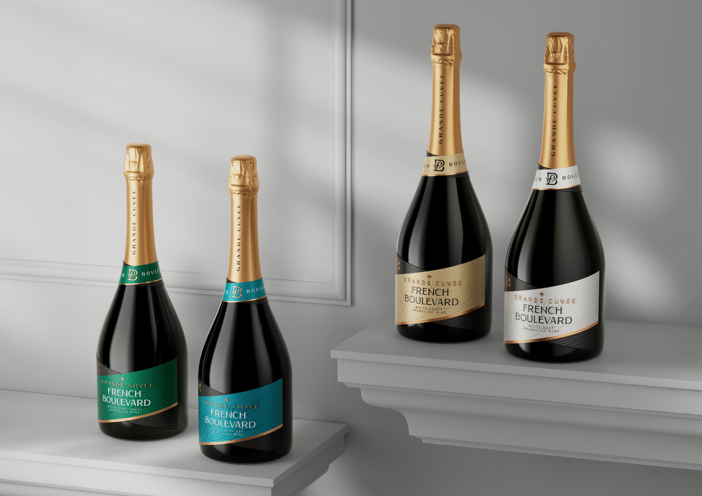
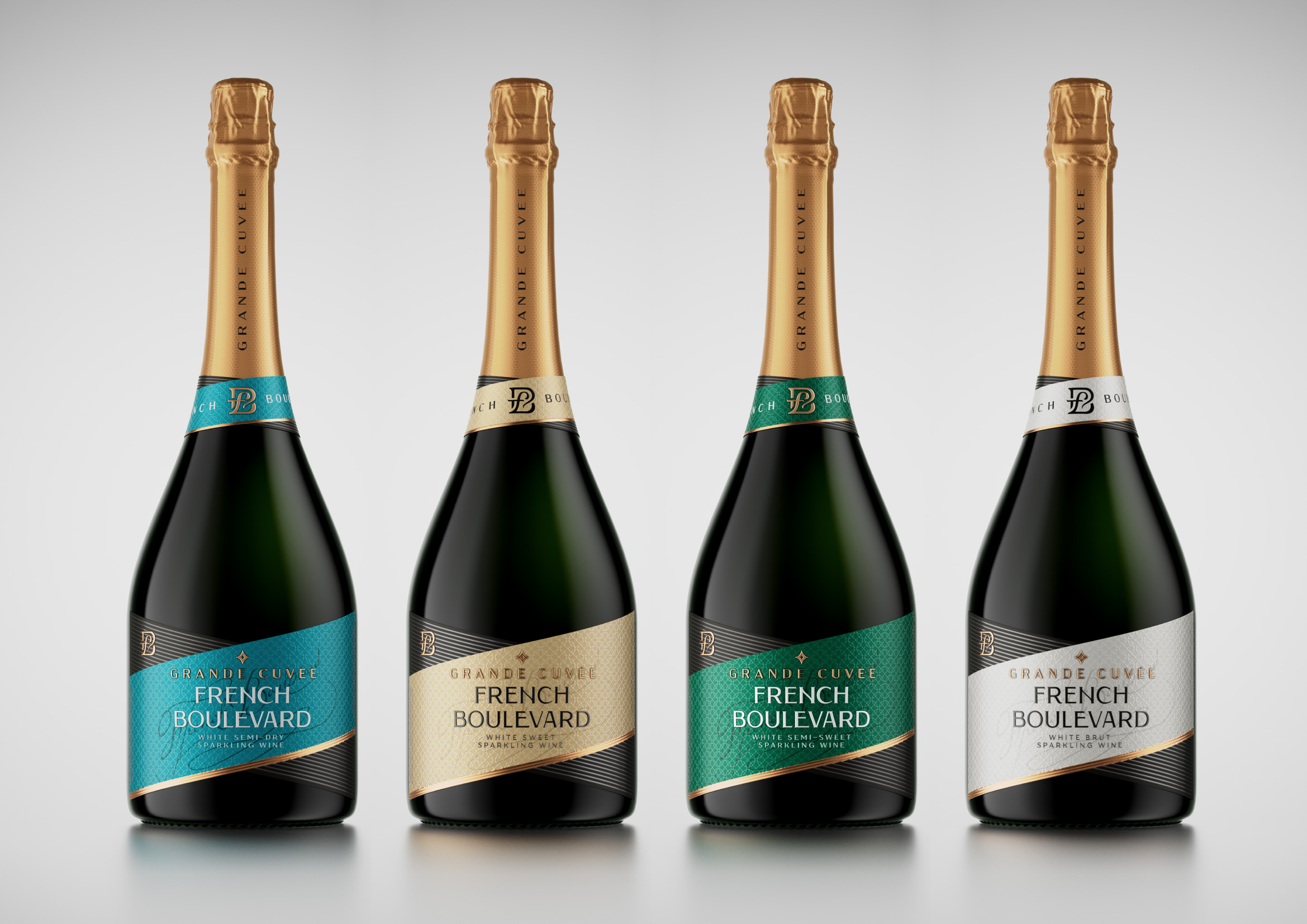
French Boulevard «Grand Cuvee»
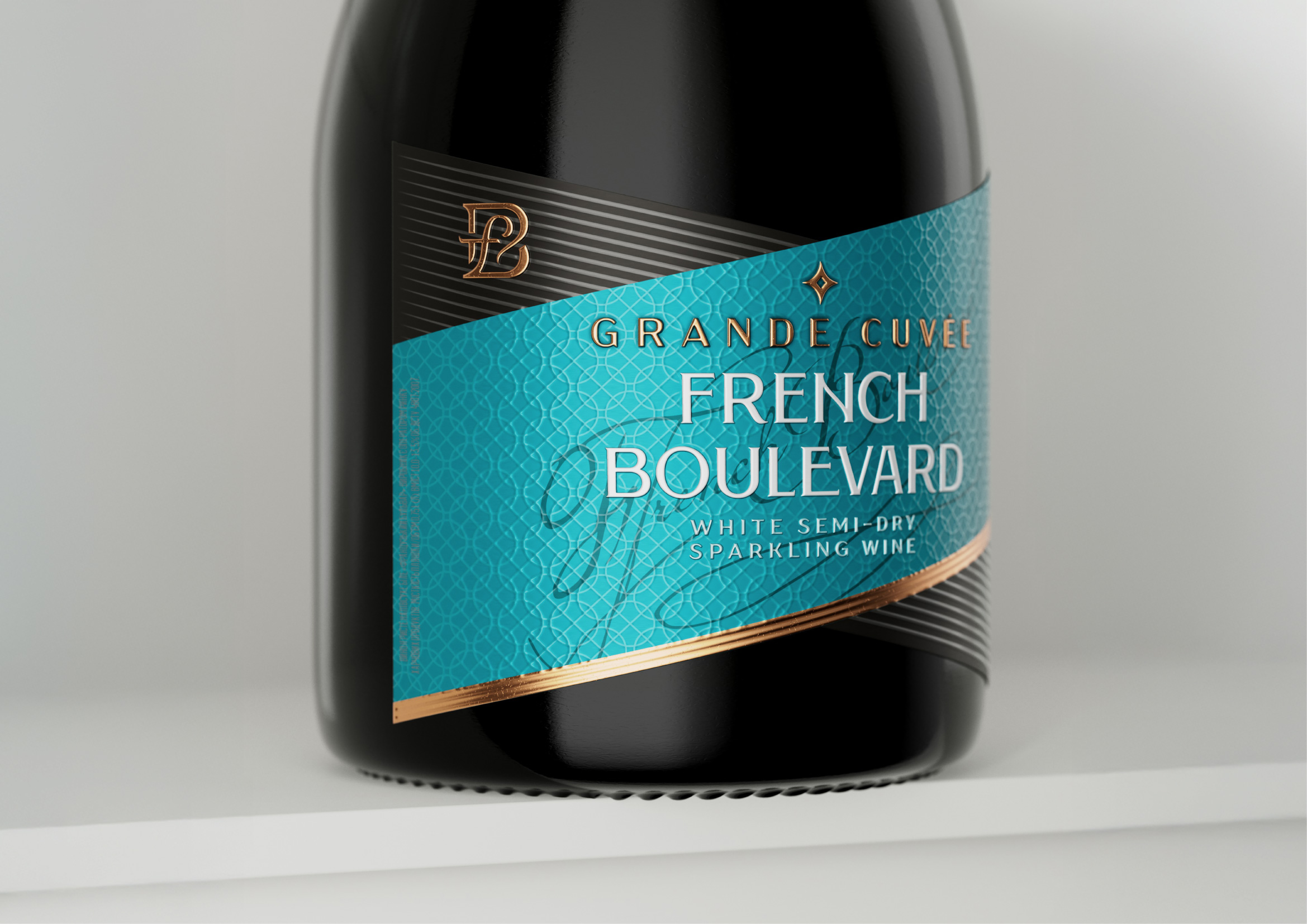
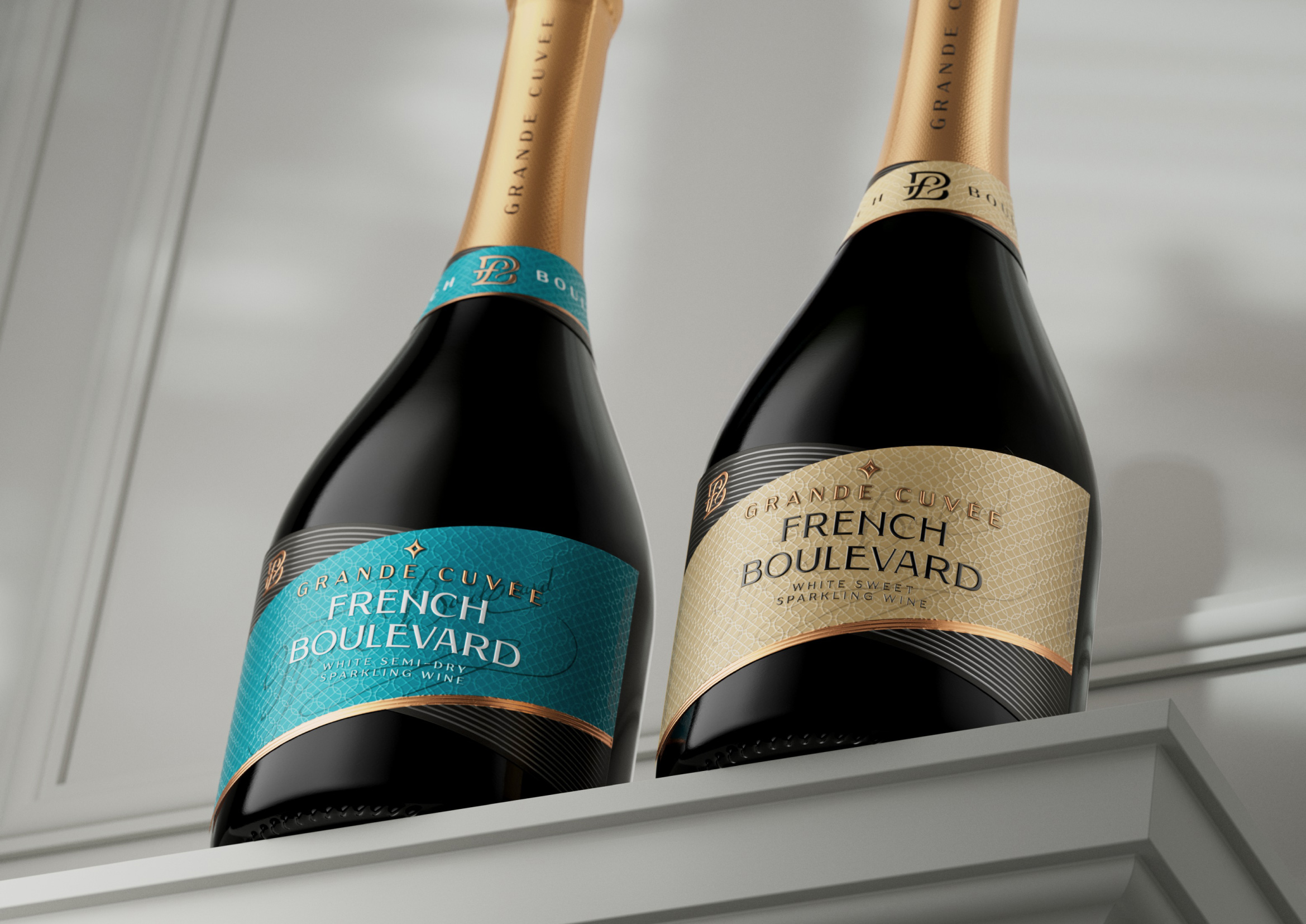
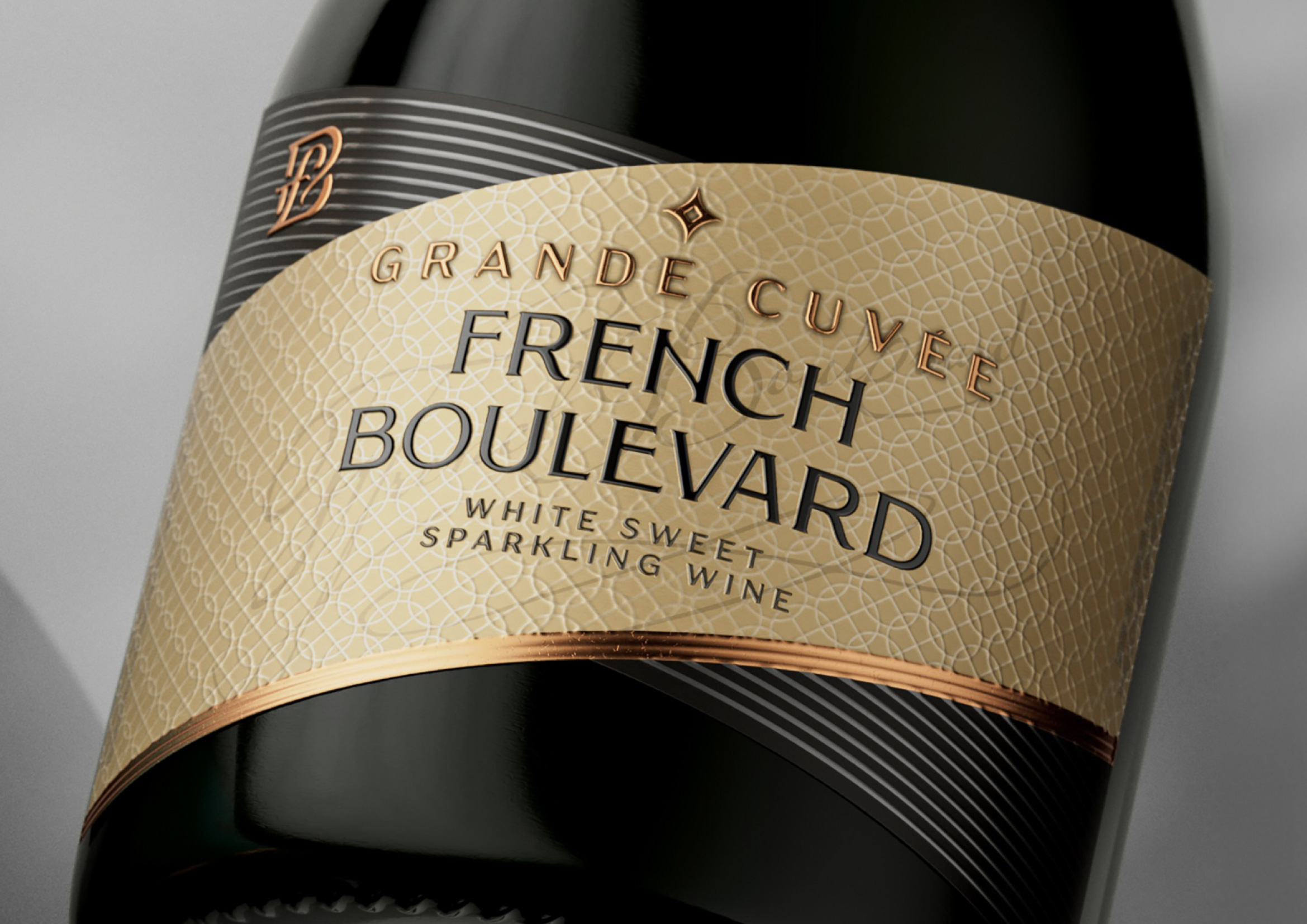
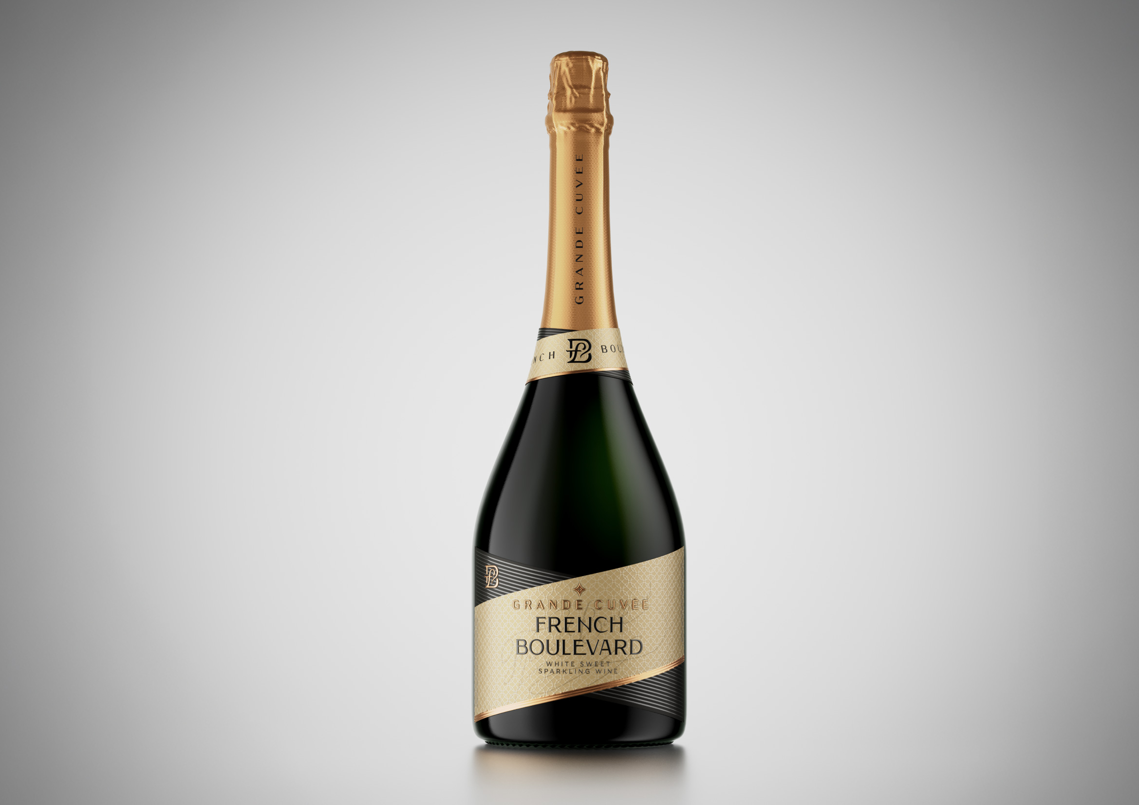
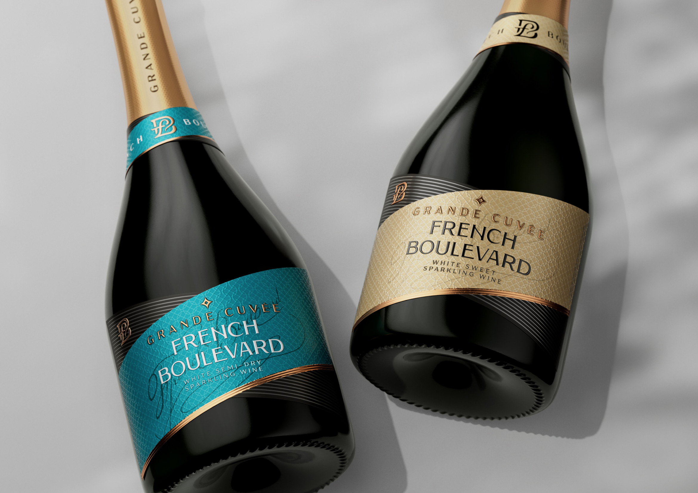
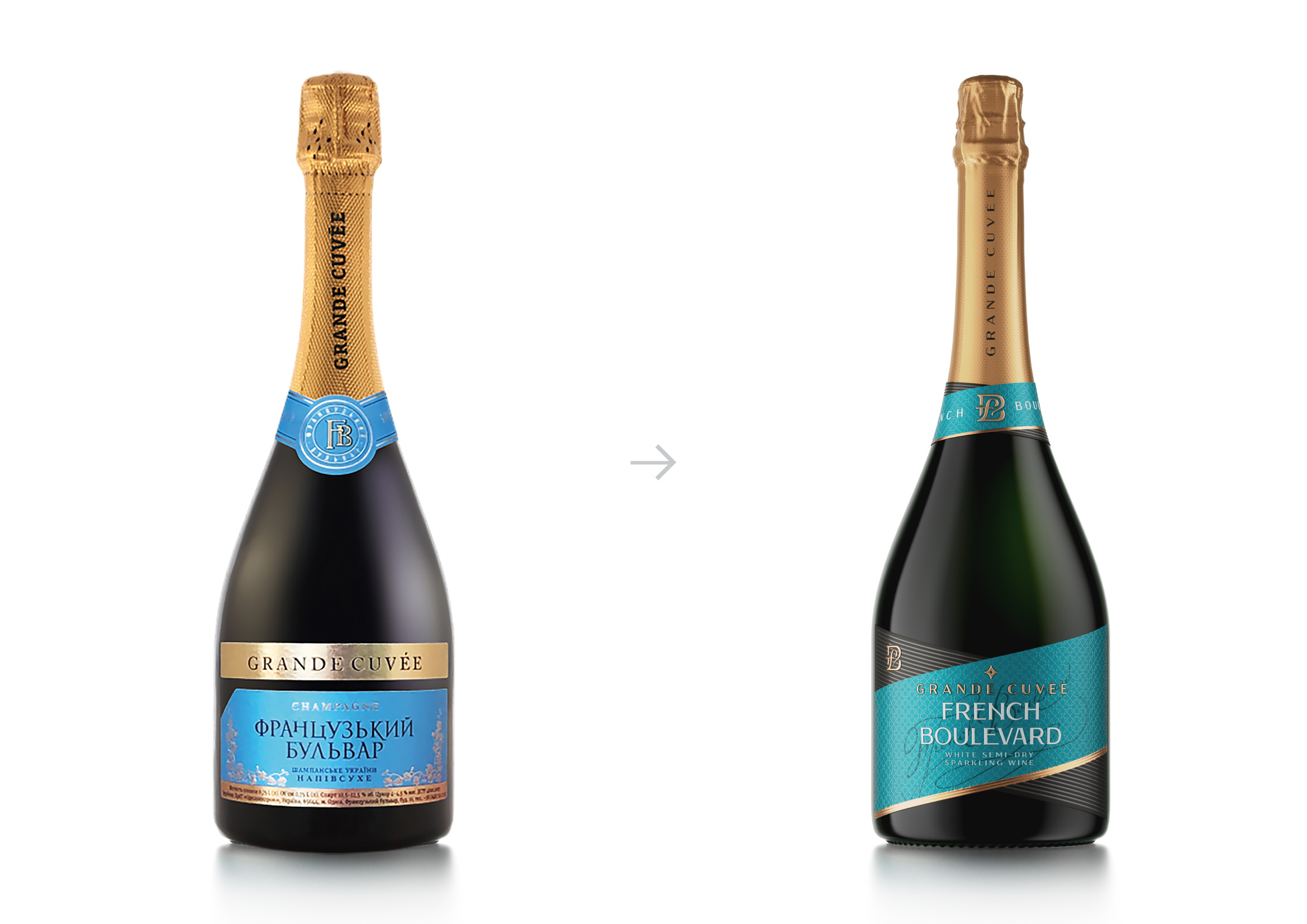
The centerpiece of the updated visual identity of French Boulevard is the refined FB monogram — a timeless emblem that captures the elegance and sophistication synonymous with French aesthetics. Crafted with meticulous attention to detail, the monogram evokes the spirit of Parisian style and a commitment to exceptional quality. Seamlessly integrated into the packaging, it features prominently on both the neck label and the main front label, serving not only as a key visual anchor but also as a powerful symbol of brand recognition and prestige. Its versatility and balance reflect the duality of tradition and modernity — hallmarks of the French Boulevard brand.
In support of international expansion and cross-cultural accessibility, the new wordmark has been thoughtfully designed in two script systems — Latin and Cyrillic. This duality ensures brand consistency across diverse markets while maintaining a unified and cohesive visual identity. Whether on shelves in Western Europe or Eastern Europe, the brand speaks the same refined language of quality and style.
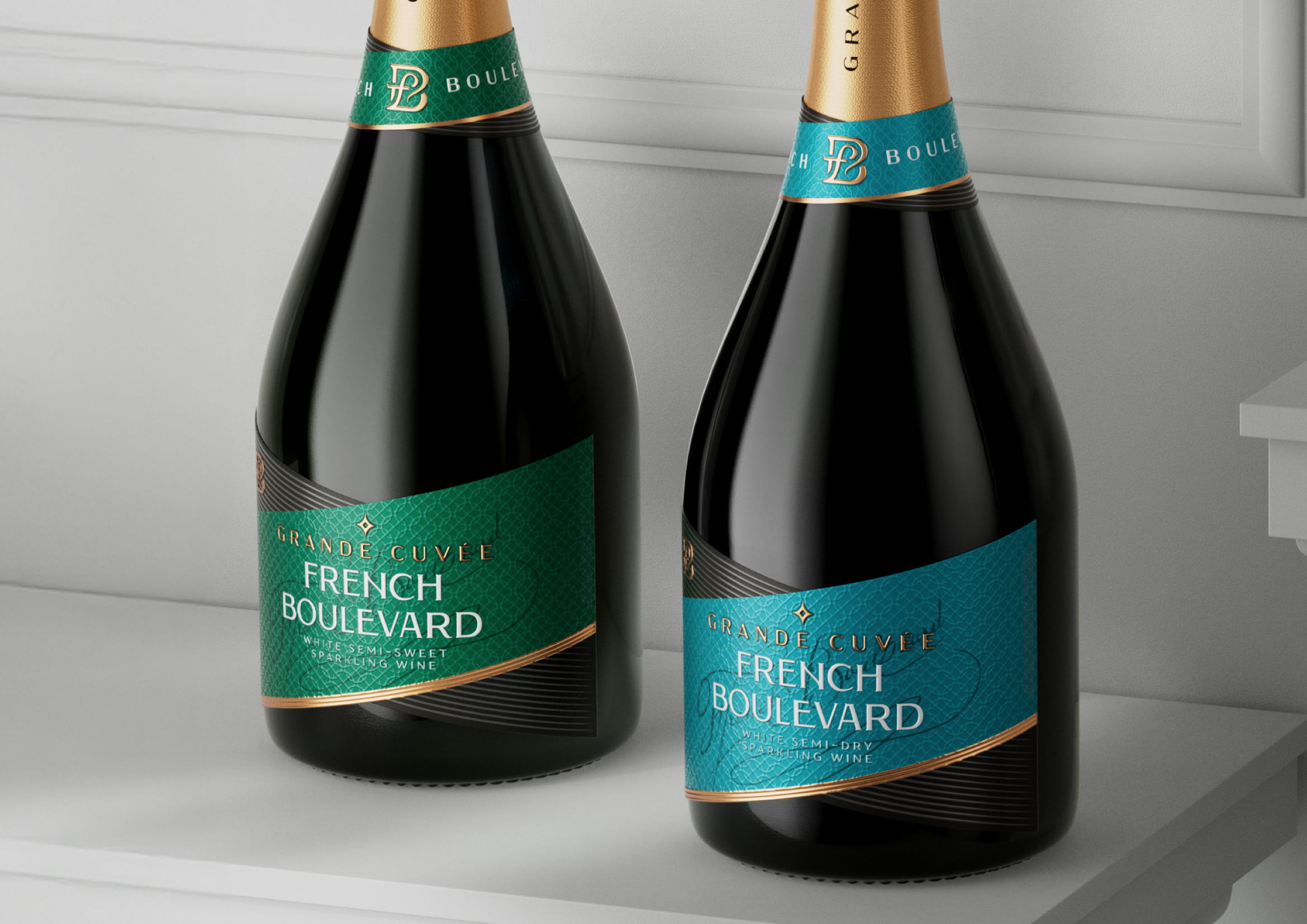
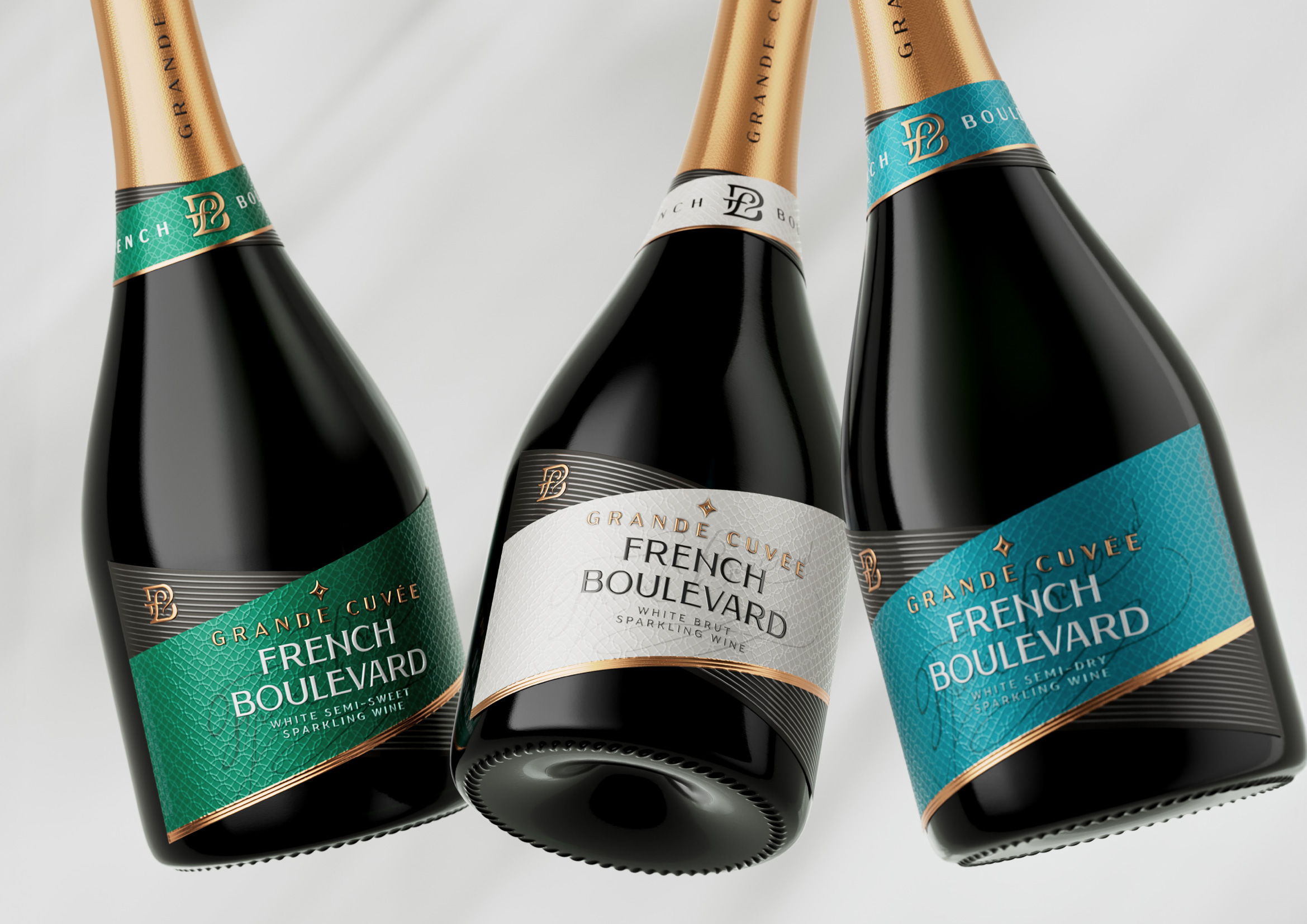
The packaging’s contemporary design is brought to life through its modern geometry, defined by a sophisticated play of dynamic diagonal lines. These lines introduce a sense of movement and energy, enhancing shelf impact and giving the product a visually distinctive character. Complementing this structure is a carefully curated palette of deep, complex colors, with each flavor in the range marked by its own unique tone. These rich, layered hues communicate premium quality, while adding individuality and personality to each bottle in the collection.
Adding a tactile, emotional dimension, a subtle background pattern is woven into the label’s design. This element, paired with a delicate handwritten French Boulevard signature, introduces an artisanal, human touch. It suggests craftsmanship, care, and authenticity — reinforcing the idea that every bottle is the result of thoughtful creation and a deep respect for quality. These handcrafted cues deepen the emotional bond with the consumer, making the experience feel personal and elevated.
Altogether, the updated identity of French Boulevard represents more than just a visual refresh — it is a strategic evolution. It conveys a brand that is elegant yet accessible, modern yet rooted in heritage, and distinctive in its attention to detail. From first glance to first sip, French Boulevard now delivers a cohesive, luxurious experience that resonates with discerning audiences and adds value long before the bottle is opened.
CREDIT
- Agency/Creative: Reynolds and Reyner
- Article Title: Reynolds and Reyner Brings Parisian Spirit to Life in the New Design for French Boulevard Grand Cuvee
- Organisation/Entity: Agency
- Project Type: Packaging
- Project Status: Published
- Agency/Creative Country: Ukraine
- Agency/Creative City: Kyiv
- Market Region: Europe
- Project Deliverables: Brand Redesign
- Format: Bottle
- Industry: Food/Beverage
- Keywords: wine, ukraine, france
-
Credits:
Creative Director: Oleksandr Andreiev


