


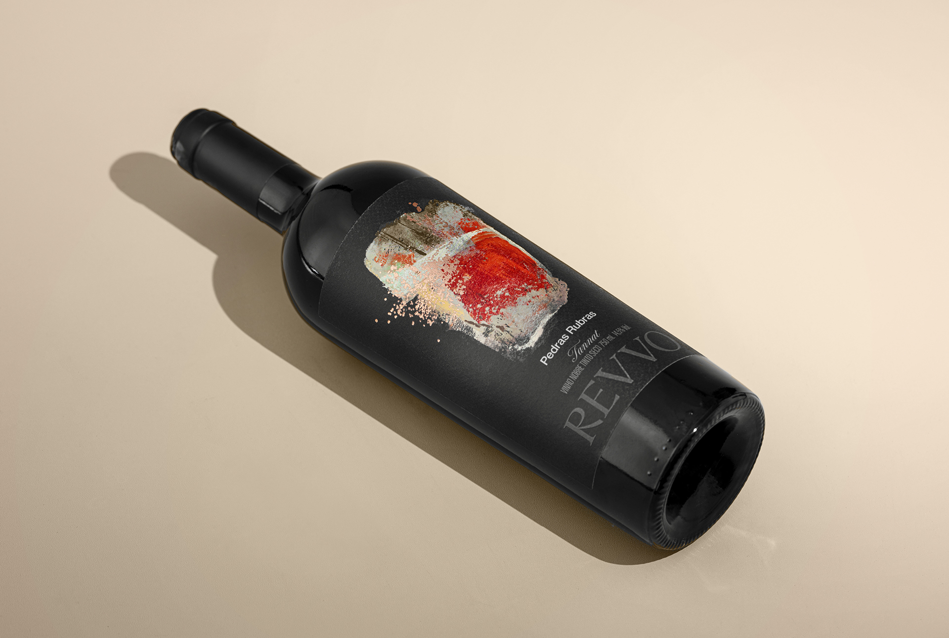
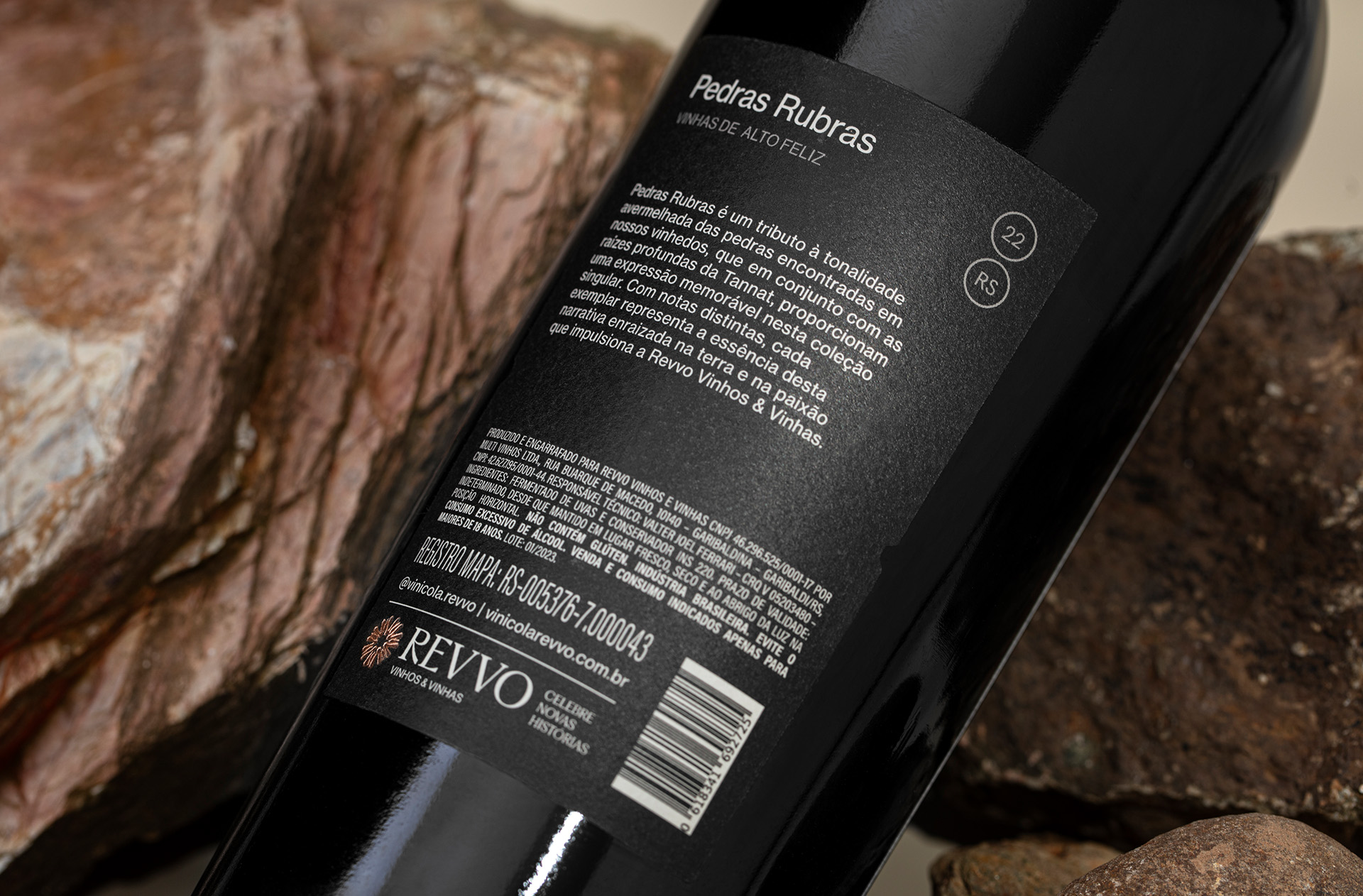
Pedras Rubras was born from a profound encounter between land, art, and memory, where nature and human sensibility meet in quiet harmony. Walking through the vineyards is an immersive experience. The red soil, marked by time and pressure, reveals itself through dense, rugged stones that rest beneath the surface like silent witnesses. These stones carry the strength of the land, shaping the roots of the vines and influencing every stage of their growth. In this terrain, nothing is accidental. The soil’s intense hue, the resistance it offers, and the patience it demands all contribute to a landscape that speaks without words, telling stories of endurance, transformation, and devotion.
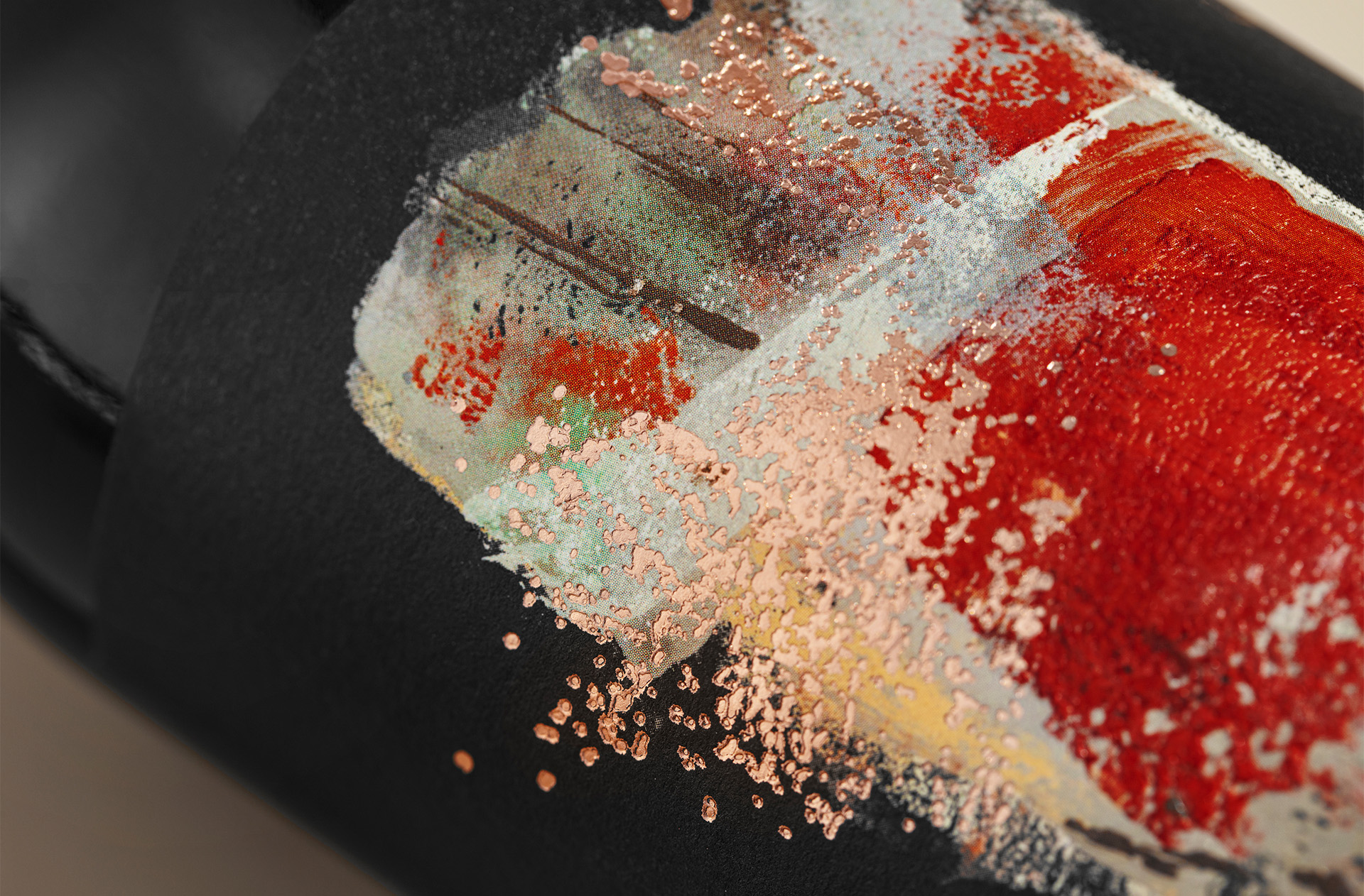
From this environment emerged the inspiration for Pedras Rubras, not merely as a visual or chromatic reference, but as an emotional translation of place. The wine seeks to express more than the color of the earth. It captures its depth, its weight, and its quiet intensity. There is a subtle dialogue between nature and human care, between what is offered by the land and what is shaped by attentive hands. This relationship unfolds slowly, much like the maturation of the vines themselves, honoring time as an essential creative force and reinforcing the bond between territory and expression.
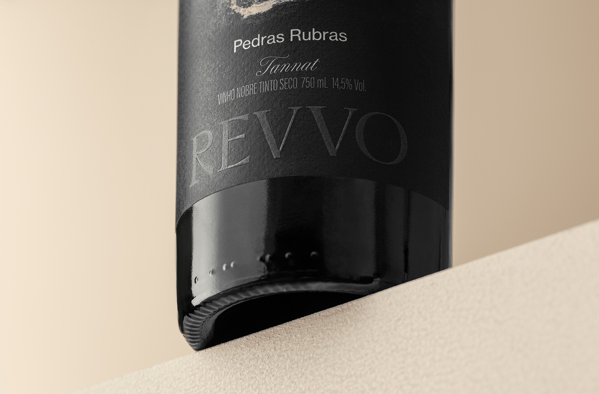
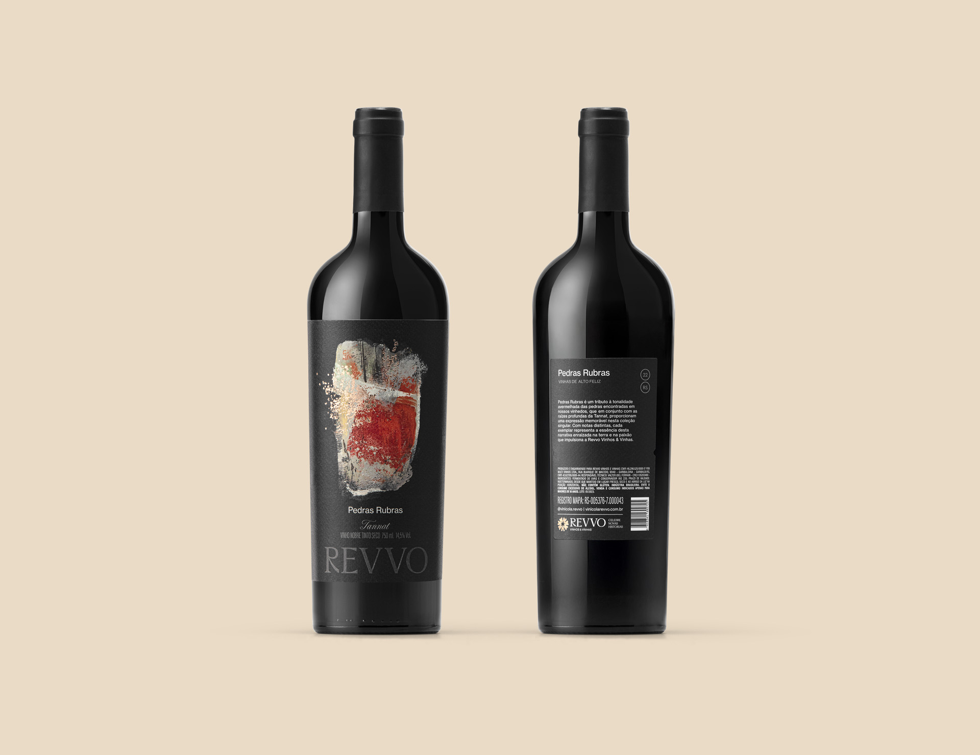
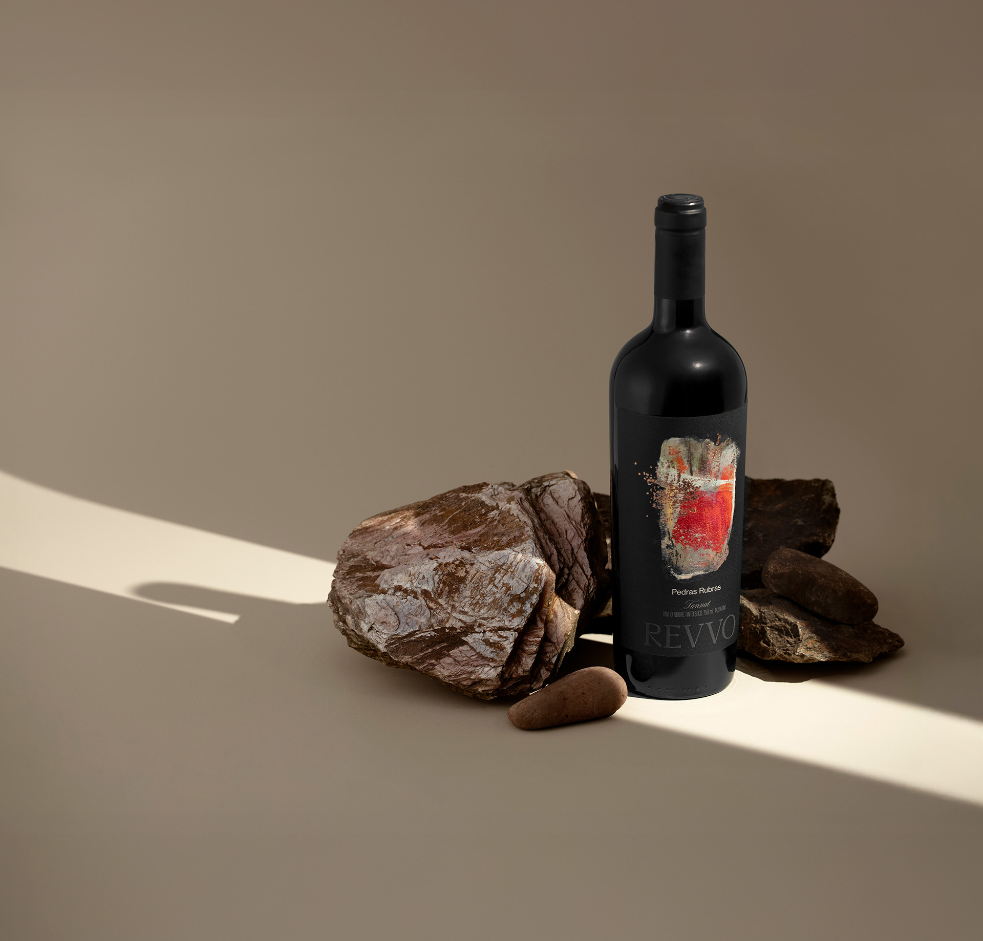
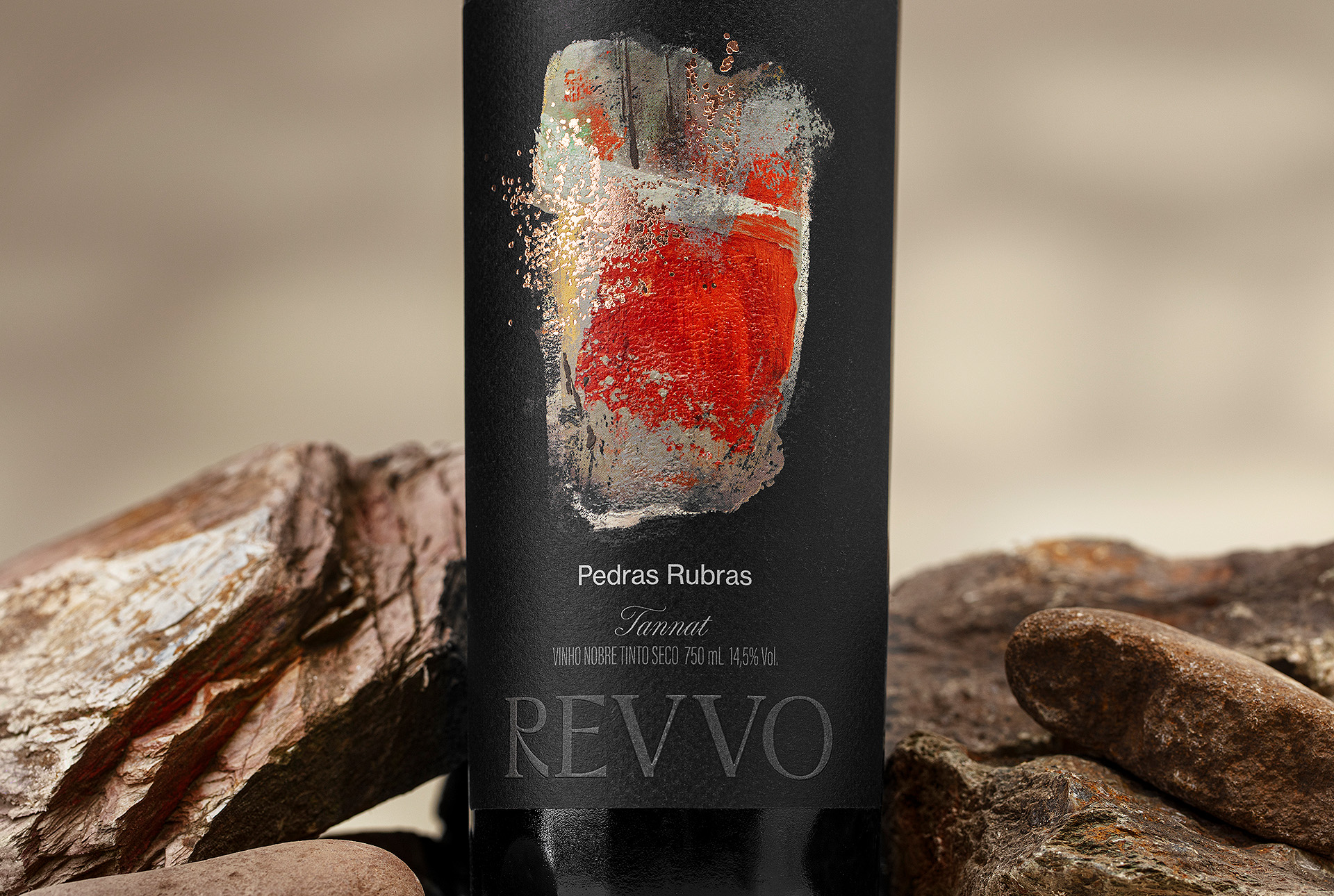
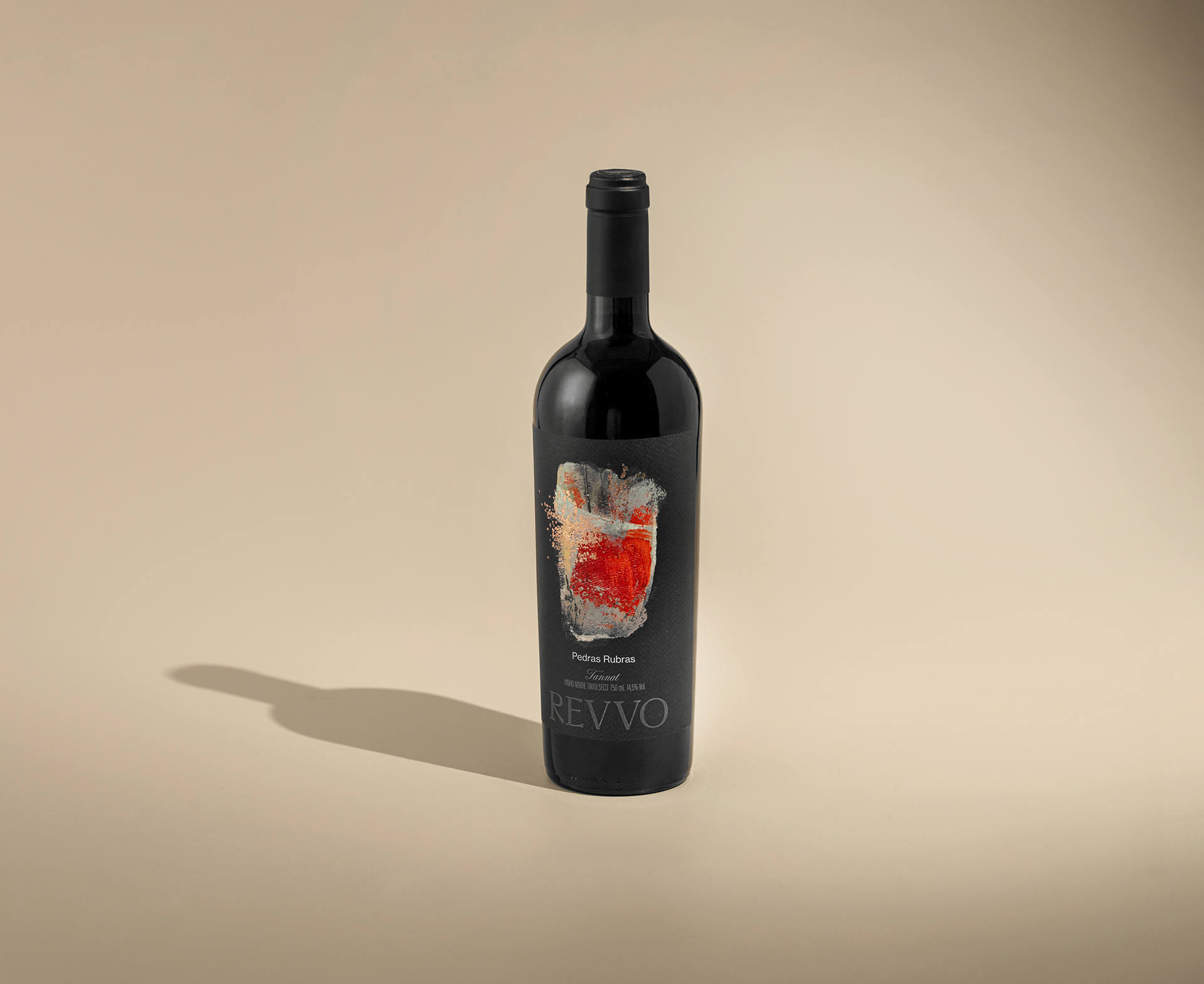
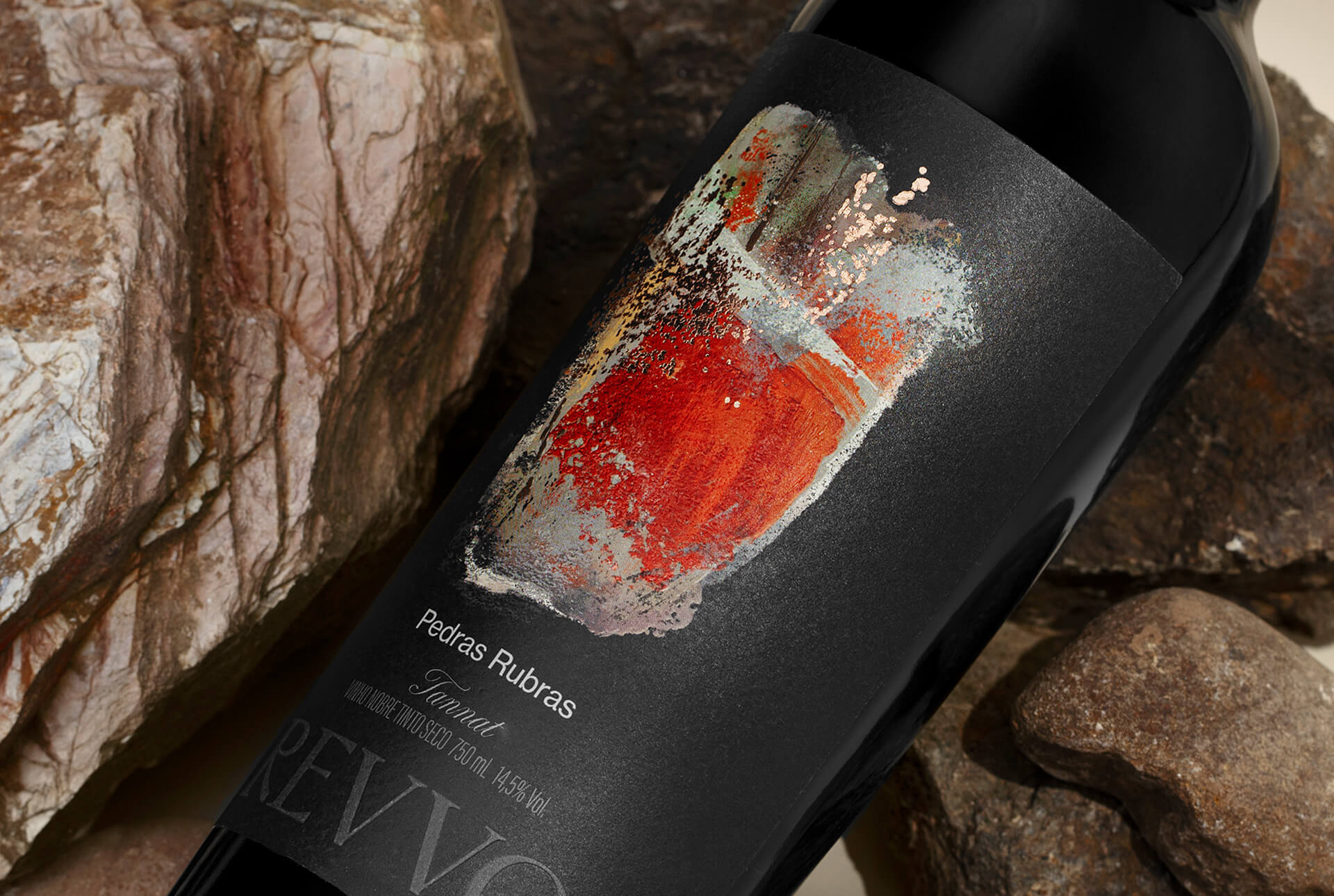
Revvo positions itself beyond conventional definitions by placing art at the core of its identity. Each label is conceived as an extension of the wine itself, not simply as packaging, but as an artistic expression that invites contemplation. Every bottle becomes a canvas, designed to awaken the senses and reconnect the observer with memory. By rejecting traditional visual codes, the brand transforms each wine into a sensory narrative that speaks of place, time, texture, and emotion. Light, balance, and materiality guide every composition, reflecting the same principles that shape the winemaking process from vineyard to cellar.
Pedras Rubras ultimately embodies the soul of Tannat. It is vibrant, grounded, and deeply expressive of its origin. The wine reflects Revvo’s conviction that true identity emerges where creativity and nature converge. Every great wine begins long before it reaches the glass. It is born in the landscape that inspires it, shaped by the soil, the stones, and the silent devotion that gives meaning to every detail.
CREDIT
- Agency/Creative: Holy Design Studio
- Article Title: Revvo Pedras Rubras Label Design by Holy Design Studio
- Organisation/Entity: Agency
- Project Type: Packaging
- Project Status: Published
- Agency/Creative Country: Brazil
- Agency/Creative City: Porto Alegre
- Market Region: South America
- Project Deliverables: Brand Design, Brand Naming, Branding, Design, Illustration, Label Design, Packaging Design, Packaging Guidelines
- Format: Bottle
- Industry: Food/Beverage
- Keywords: bottle; wine; packaging; label; wine label; packaging design; alcohol; beverage; drink
-
Credits:
Creative Direction & design: Erik Marchetti
Creative Direction & design: Luís Felippe Cavalcanti
Creative Direction & design: José Luiz De Lazzari
Printing Production: CCL brasil
Photography: Moropolo Studio
Photography Retouch: Patricia Thiesen


