Name: Bounce, a name inspired by the concept of dynamic movement and boundless exploration in the metaverse, perfectly encapsulates the brand’s essence. It represents the ability to seamlessly navigate various digital platforms with energy and enthusiasm.
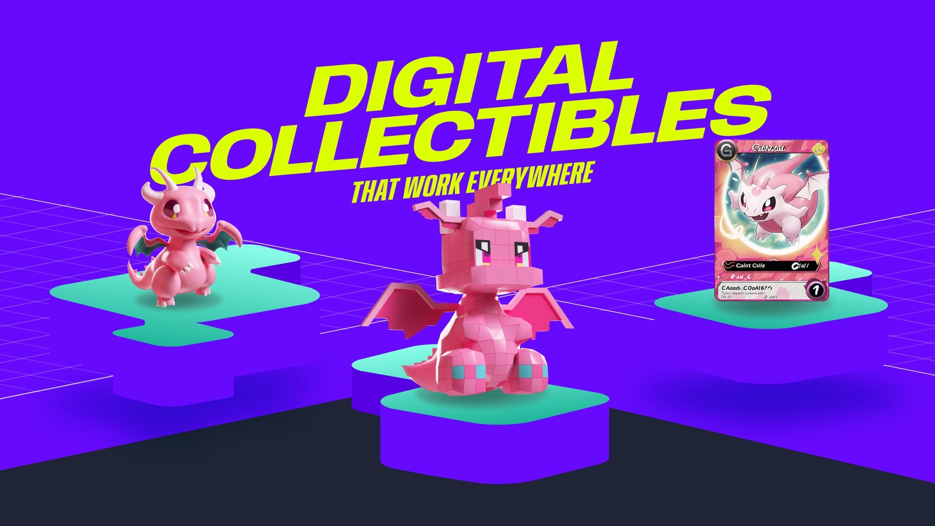
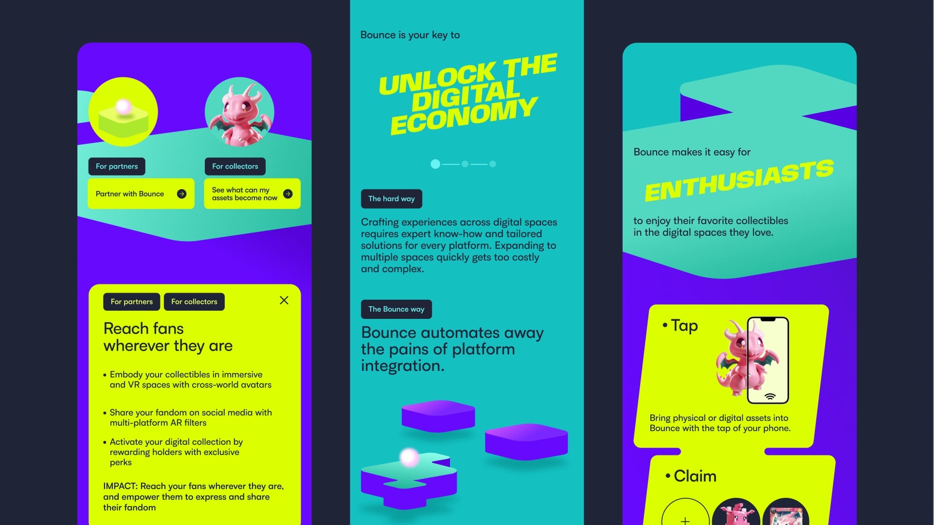
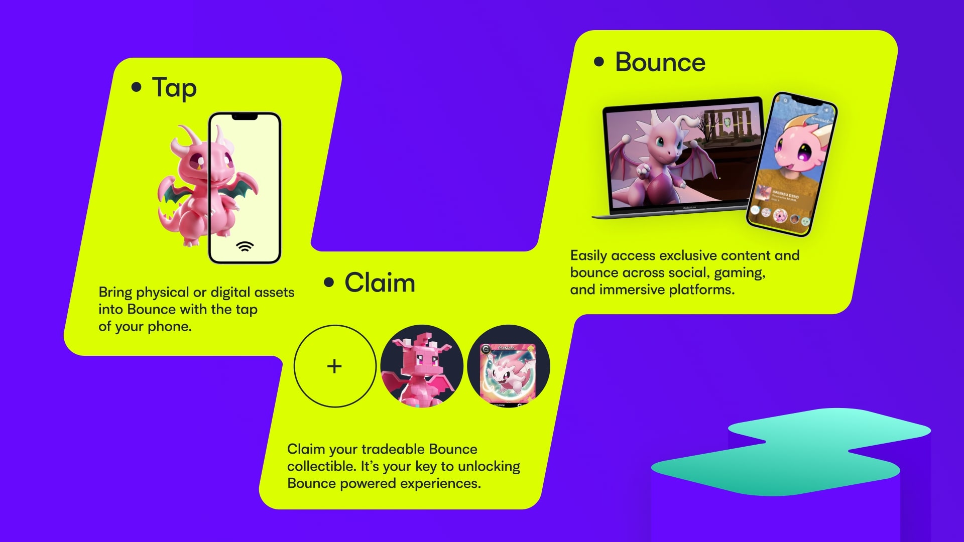
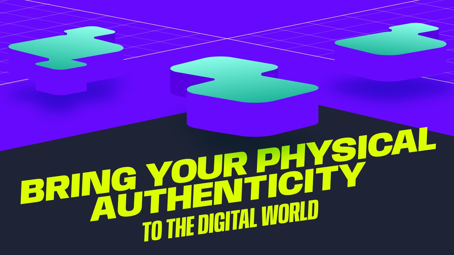
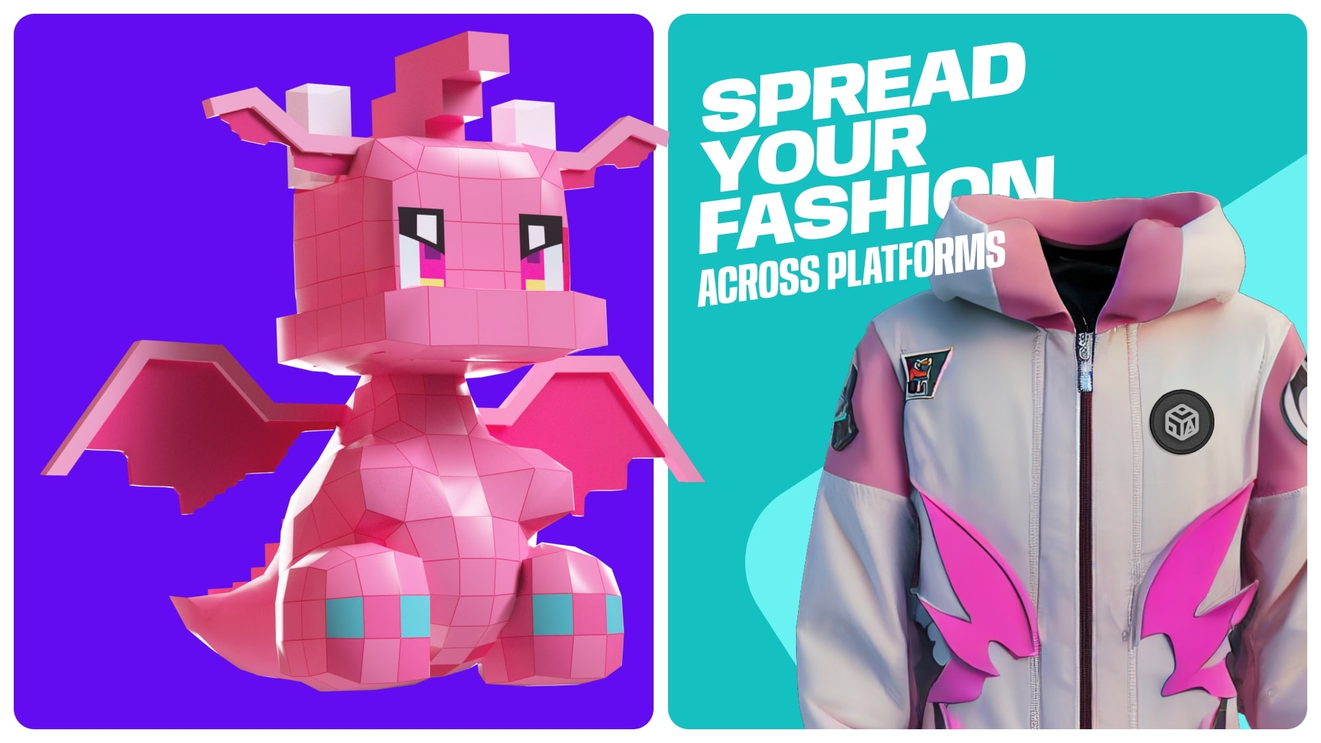
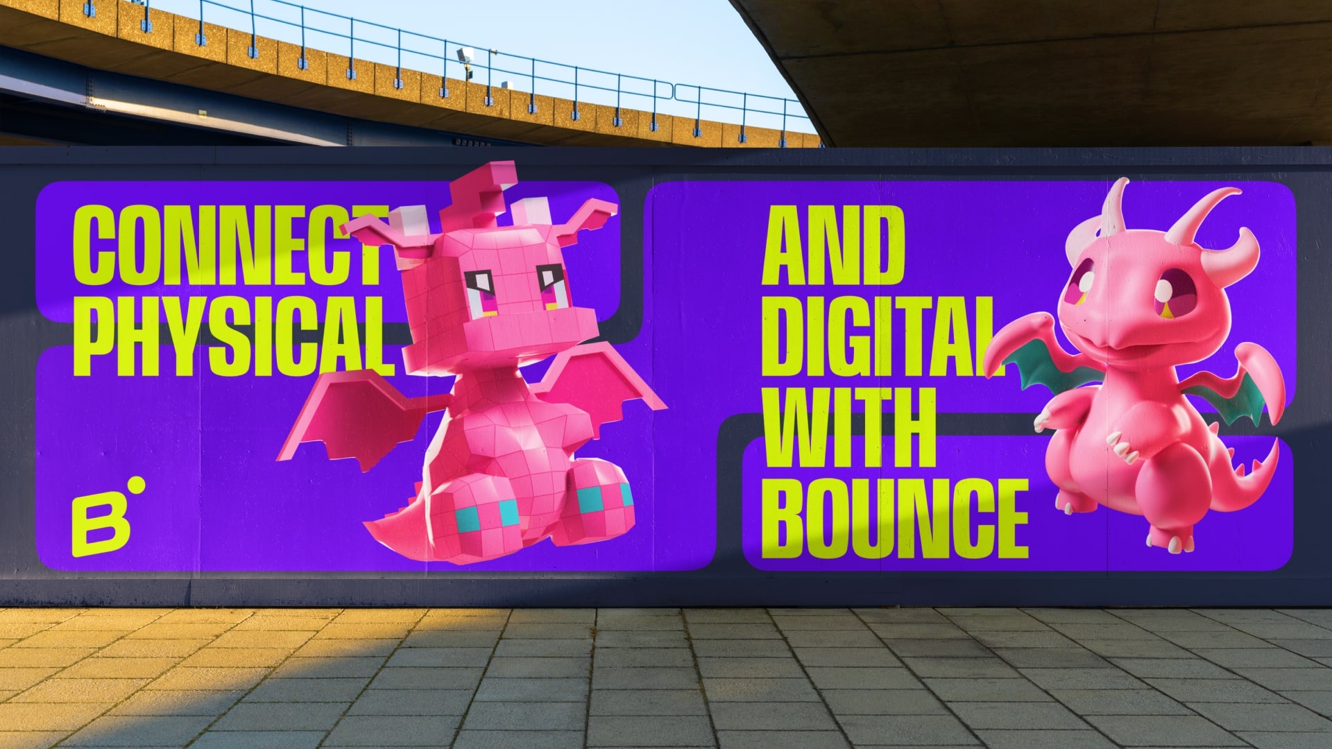
The Concept – “All is connected”: This concept symbolises the fusion of physical and digital assets, transforming them into diverse digital versions. Through vibrant graphics and dynamic motion, we illustrate a world where everything is interlinked, fostering a sense of exploration and unity. “All is connected” isn’t merely an idea; it’s a visual and emotional journey that showcases the profound relationships between your assets and the limitless possibilities they unlock.
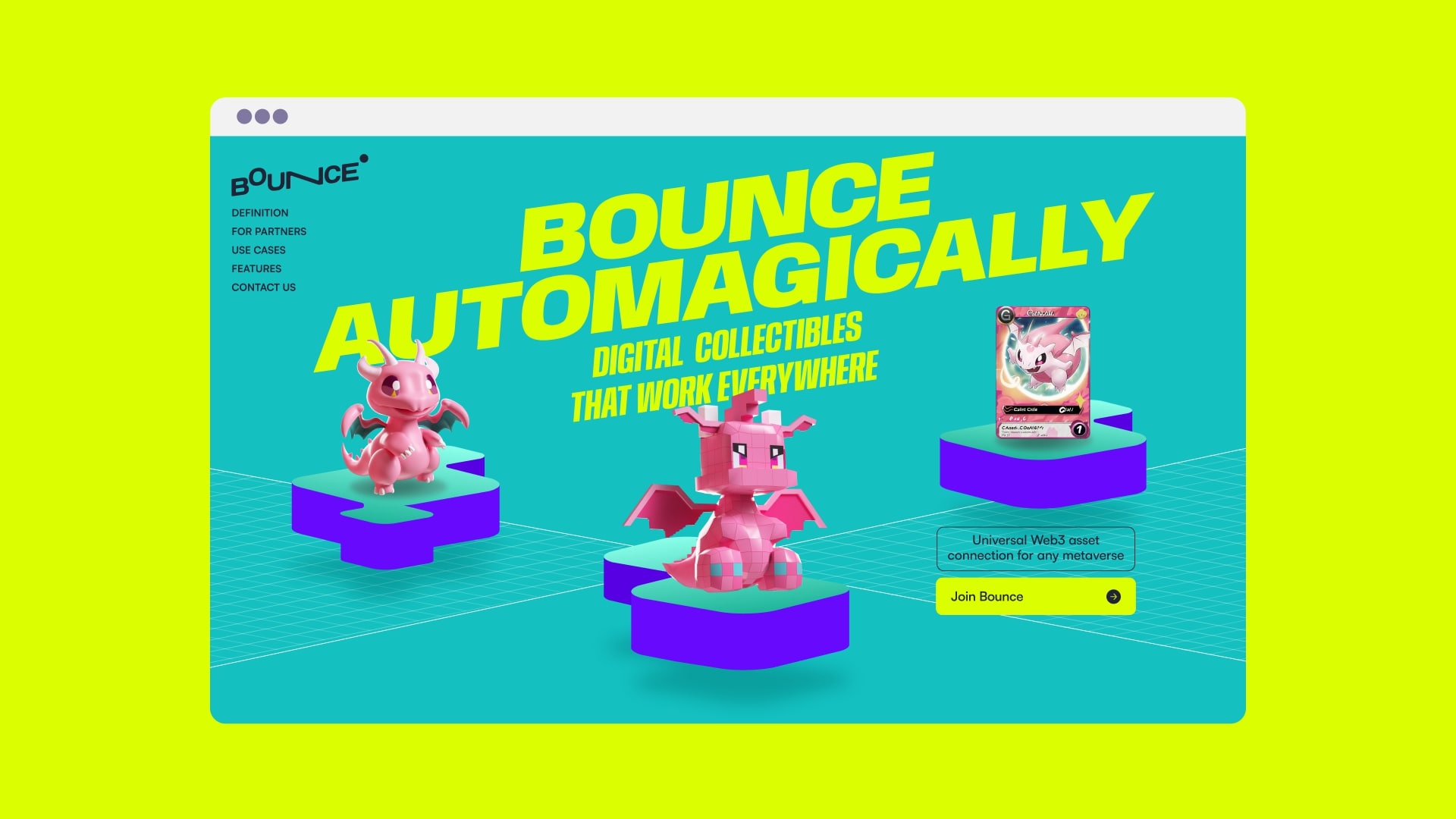
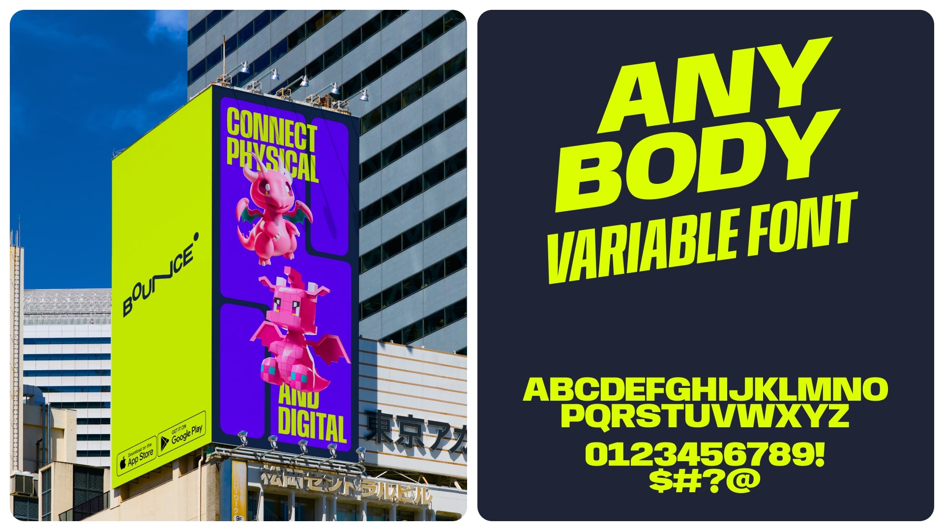
Logo: The Bounce logo, written in the Velodrama font, conveys a sense of dynamism, jumping, and forward motion. The slanted letters and stretched “N” evoke the brand’s message of active exploration. The rounded logo letters emphasize brand friendliness. To reinforce the concept of jumping and maintain consistency with the corporate identity, the elevated “O” is incorporated, along with a ball-shaped graphic element.
CREDIT
- Agency/Creative: Embacy
- Article Title: Revolutionising Collectibles: Bounce’s Innovative Design Transforms Brand Engagement
- Organisation/Entity: Agency
- Project Type: Digital
- Project Status: Published
- Agency/Creative Country: Japan
- Agency/Creative City: Tokyo
- Market Region: Asia, Global
- Project Deliverables: Branding, Web Design
- Industry: Technology
- Keywords: #crypto #nft #webdesign #ui/ux #brandidentity #japan #website #bright #colorful #3d
-
Credits:
Design Agency: Embacy


