


Revoir is a brand crafted for the ambitious and confident individuals who view skincare not just as a routine but as a preventive and empowering ritual. For those who prioritize their health and appearance, Revoir offers a line of high-performance skincare products made from clean, ethical ingredients that are backed by scientific research. In a market where advanced skincare solutions are often imported, Revoir proudly formulates and manufactures its products in India, delivering international quality while celebrating local innovation. This commitment to excellence and authenticity sets Revoir apart as a leader in the Indian skincare industry, catering to the needs of modern consumers who seek both efficacy and ethical standards.
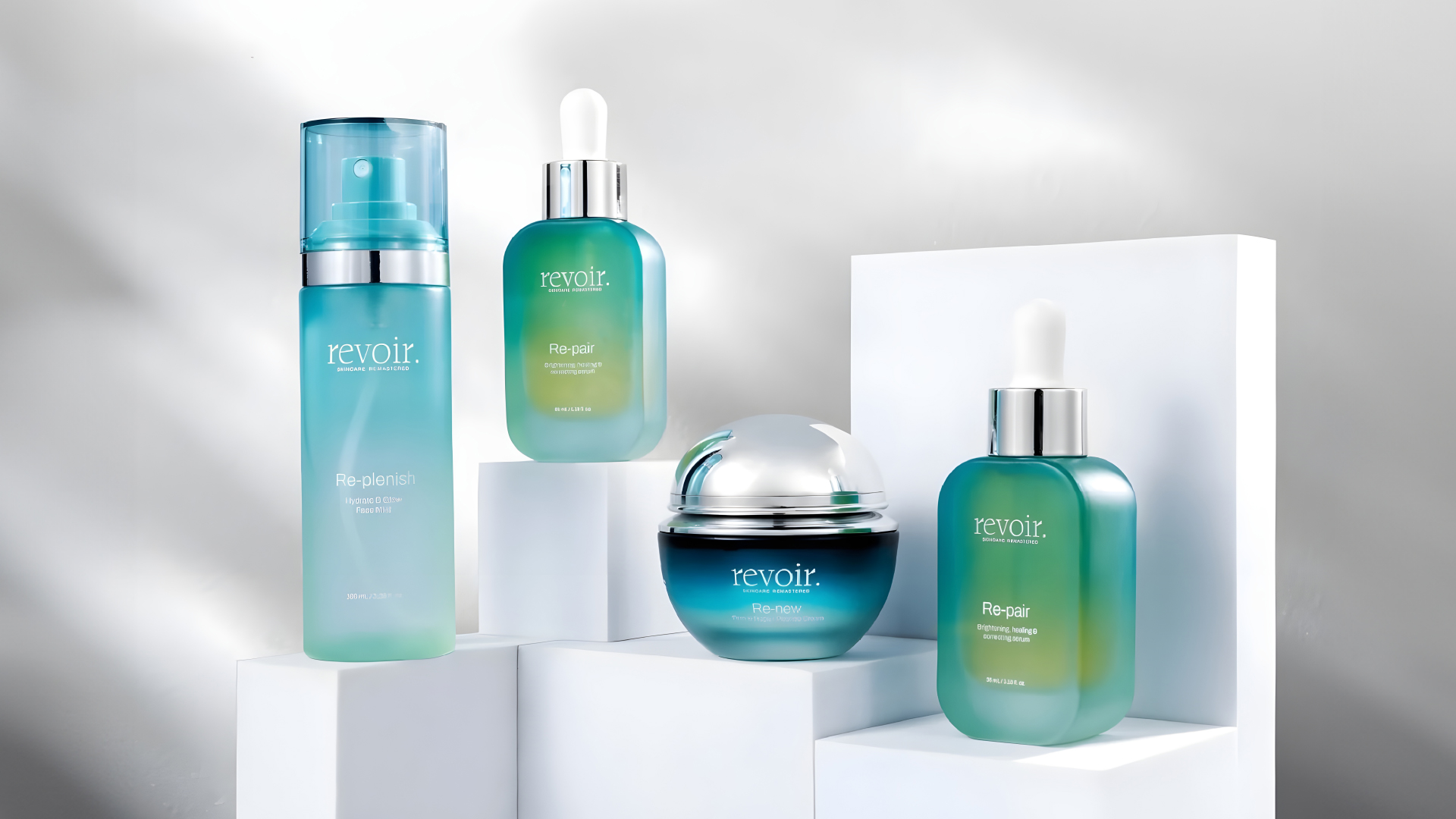
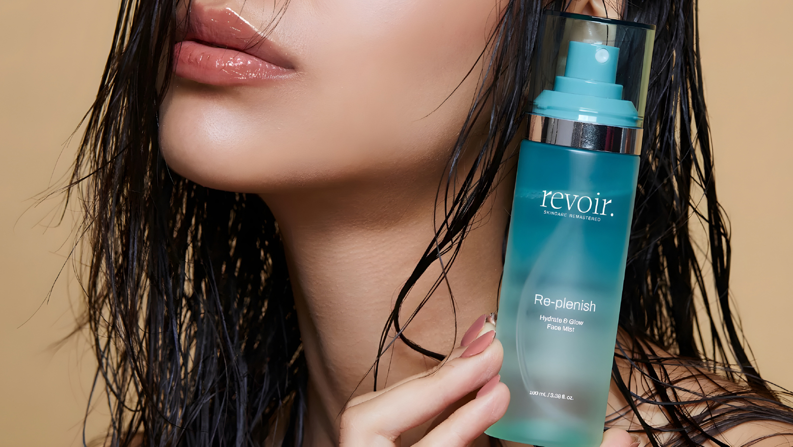
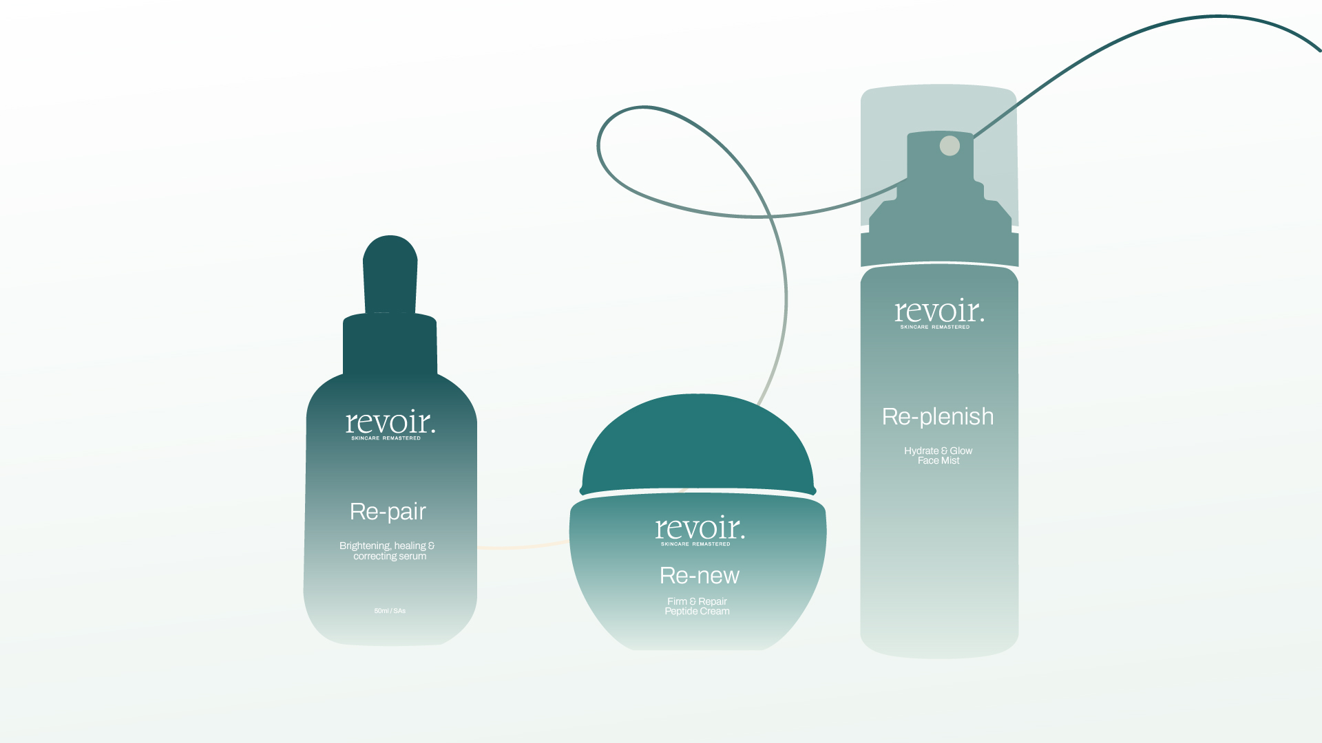
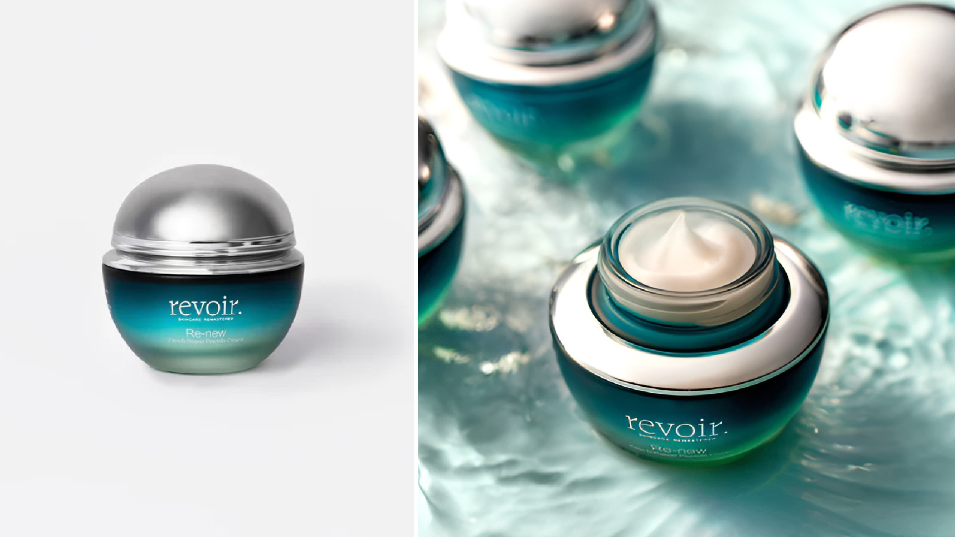
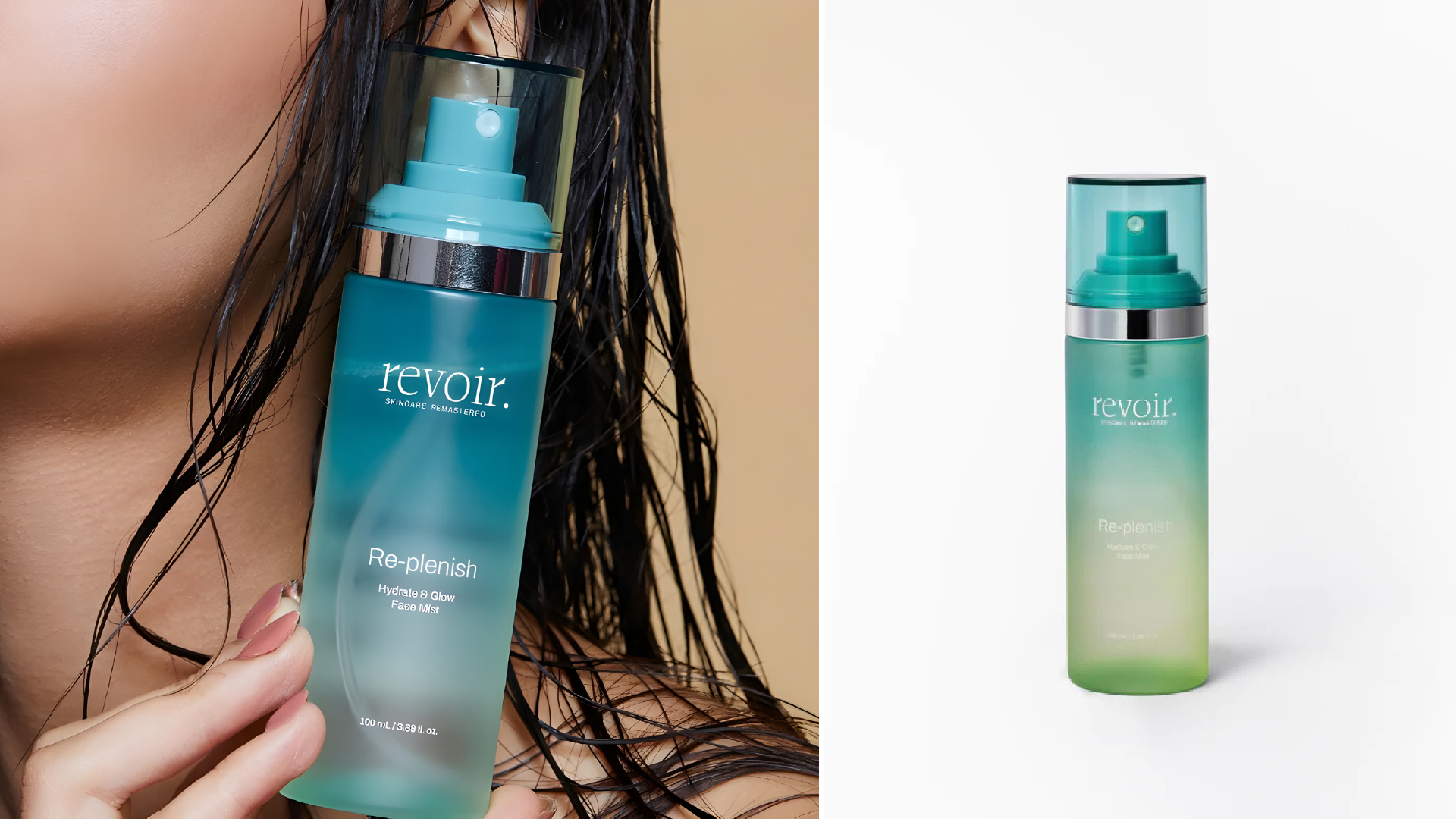
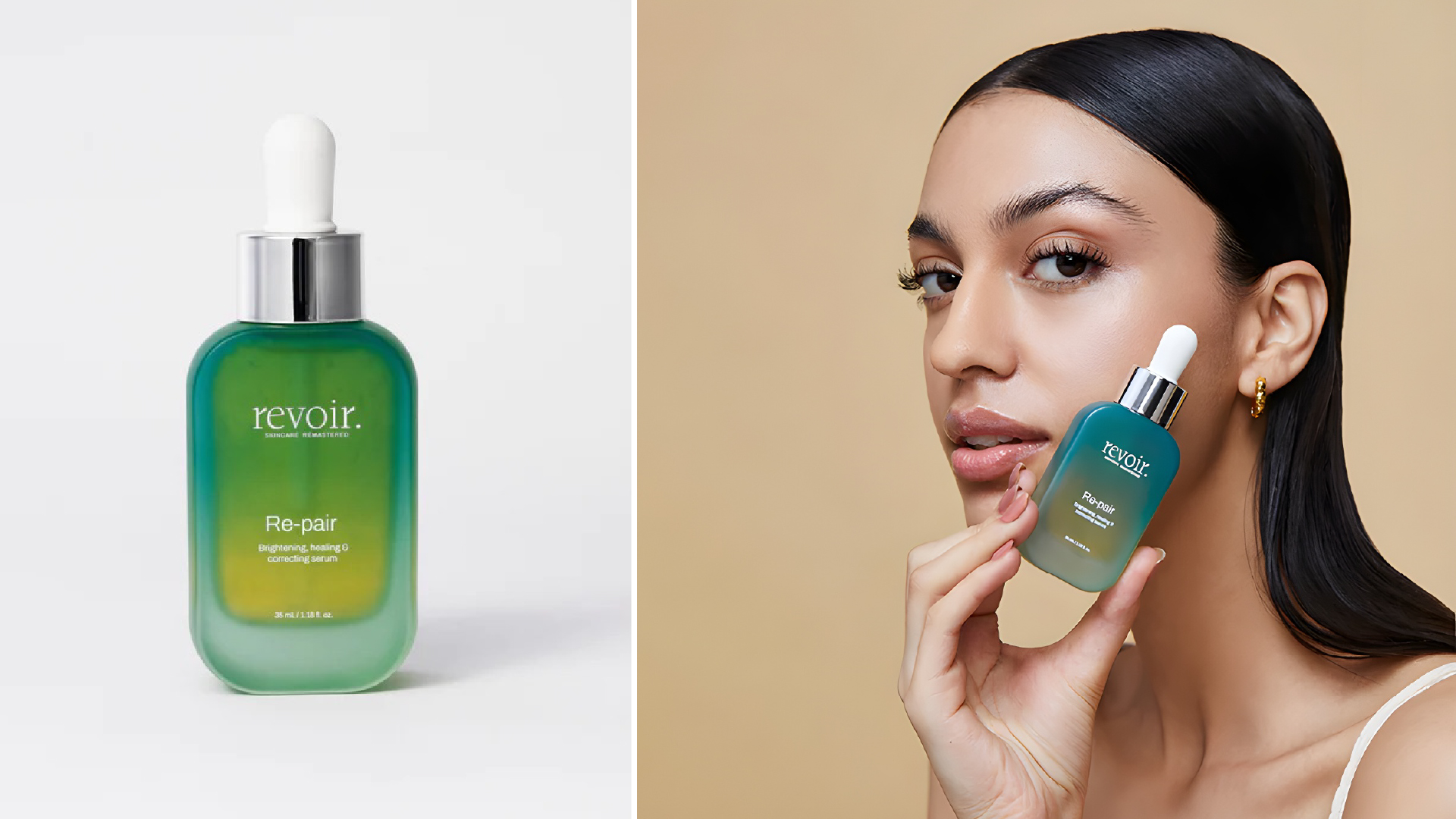
The brand’s product range—Repair, Replenish, and Renew—captures the essence of Revoir’s philosophy. Each product is meticulously formulated to target specific skincare needs, creating a comprehensive regimen that addresses various skin concerns. The “Repair” line focuses on healing and rejuvenating the skin, tackling damage caused by environmental factors and aging. The “Replenish” range is all about nourishing and hydrating the skin, restoring its natural balance and glow. Finally, “Renew” is designed to enhance skin texture and tone, encouraging cell turnover for a fresher, more radiant complexion. Together, these products embody the brand’s promise of transformative skincare that empowers individuals to take control of their skin health.
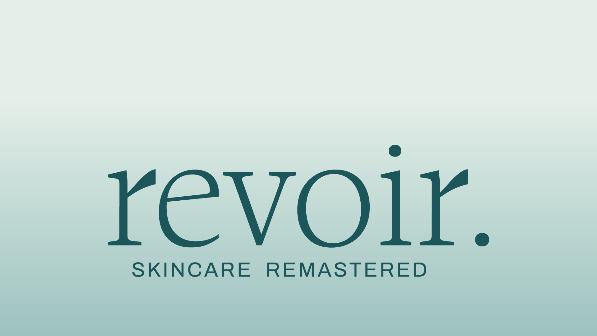
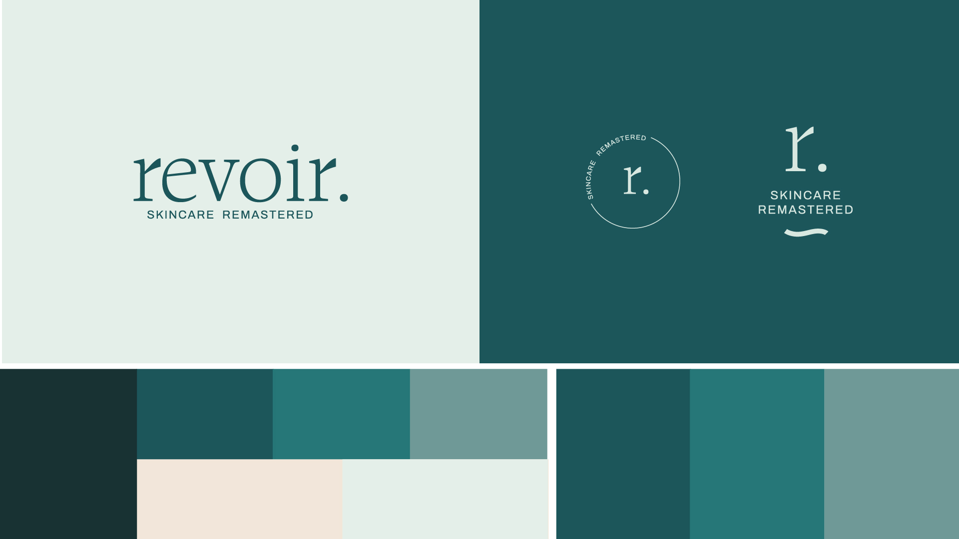
To visually express this philosophy of empowerment and transformation, we crafted a bespoke serif font for Revoir. This custom typeface exudes sophistication and timeless elegance, perfectly aligning with the brand’s luxurious appeal. The elegance of the serif font adds a sense of refinement, signaling a commitment to quality and attention to detail. This is complemented by a thoughtfully chosen color palette featuring gradient blue bottles that symbolize the gradual and transformative journey of effective skincare. The gradients represent the patience required for optimal results, emphasizing that real beauty is achieved over time with consistent care.
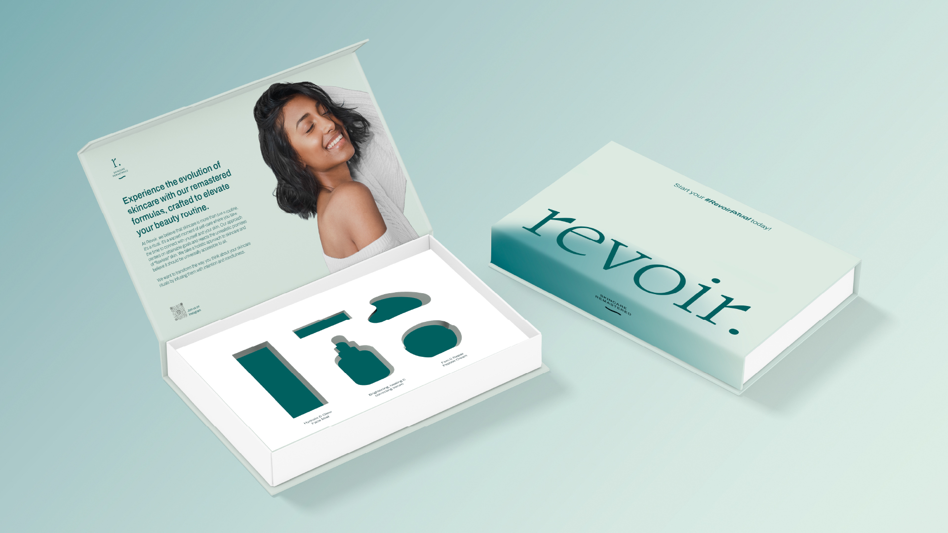
Revoir’s packaging is a masterclass in elegance and simplicity. Each product comes in an elegant white box that creates a striking contrast against the gradient blue bottles within. This combination not only enhances visual appeal but also speaks to the brand’s identity—a balance between purity and depth. The minimalist yet luxurious design language sets Revoir apart from other skincare brands, making it instantly recognizable on the shelves and appealing to consumers who appreciate understated sophistication.
The cohesive and refined aesthetic is more than just a visual treat; it’s a reflection of the brand’s values. Every element, from the bespoke serif font to the gradient bottles and clean packaging, is carefully curated to provide a premium experience. This approach ensures that every touchpoint, whether it’s the product in hand or the visuals on social media, aligns with the brand’s mission of providing effective, ethical, and luxurious skincare solutions.
Revoir isn’t just about skincare; it’s about creating a holistic experience that resonates with individuals who are conscious of what they put on their skin. It’s about inspiring confidence through clean, science-backed products that deliver real results. By merging sophisticated design with advanced skincare technology, Revoir invites its audience to embark on a journey of self-care that is as much about looking good as it is about feeling empowered. With Revoir, skincare becomes more than a routine—it transforms into a powerful act of self-love and care, making it a brand that truly stands out in the high-performance skincare market.
CREDIT
- Agency/Creative: Bifrost Studios
- Article Title: Revoir Skincare Brand Design by Bifrost Studios
- Organisation/Entity: Agency
- Project Type: Packaging
- Project Status: Published
- Agency/Creative Country: India
- Agency/Creative City: New Delhi
- Market Region: Asia
- Project Deliverables: Brand Identity, Packaging Design, Packaging Guidelines
- Format: Bottle, Box
- Industry: Beauty/Cosmetics
- Keywords: packaging, brand identity
-
Credits:
Creative Director: Tejal Tunge
Art Director: Rishabh Pahuja


