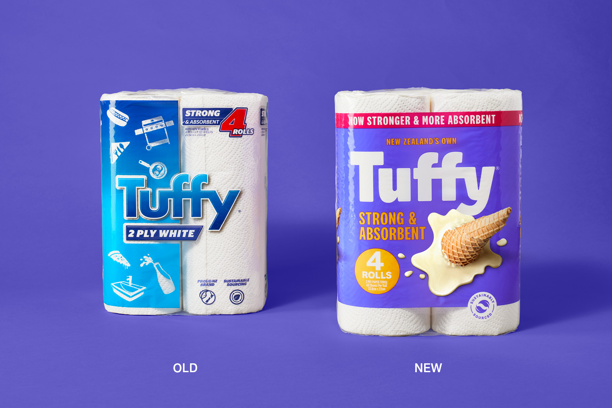
The paper towel category can be considered one of the last supermarket areas that has lacked any branded effort to inject personality and relevance into the proposition. Instead, it is an example of brands following a bland, commoditised norm.
The team behind Tuffy were aware of several issues with the current brand and was open to a reinvention of the brand and, in doing so, challenging expectations.
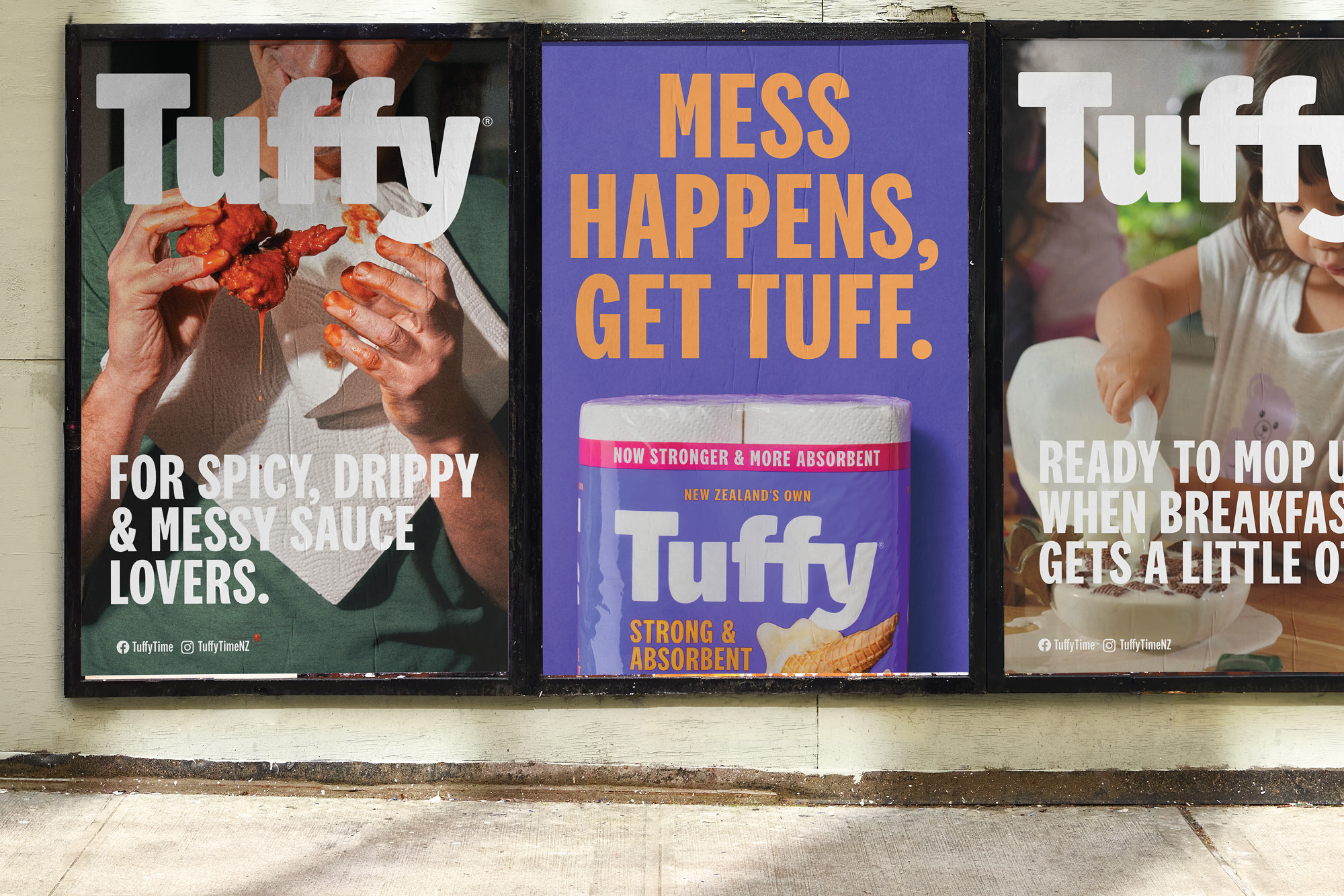
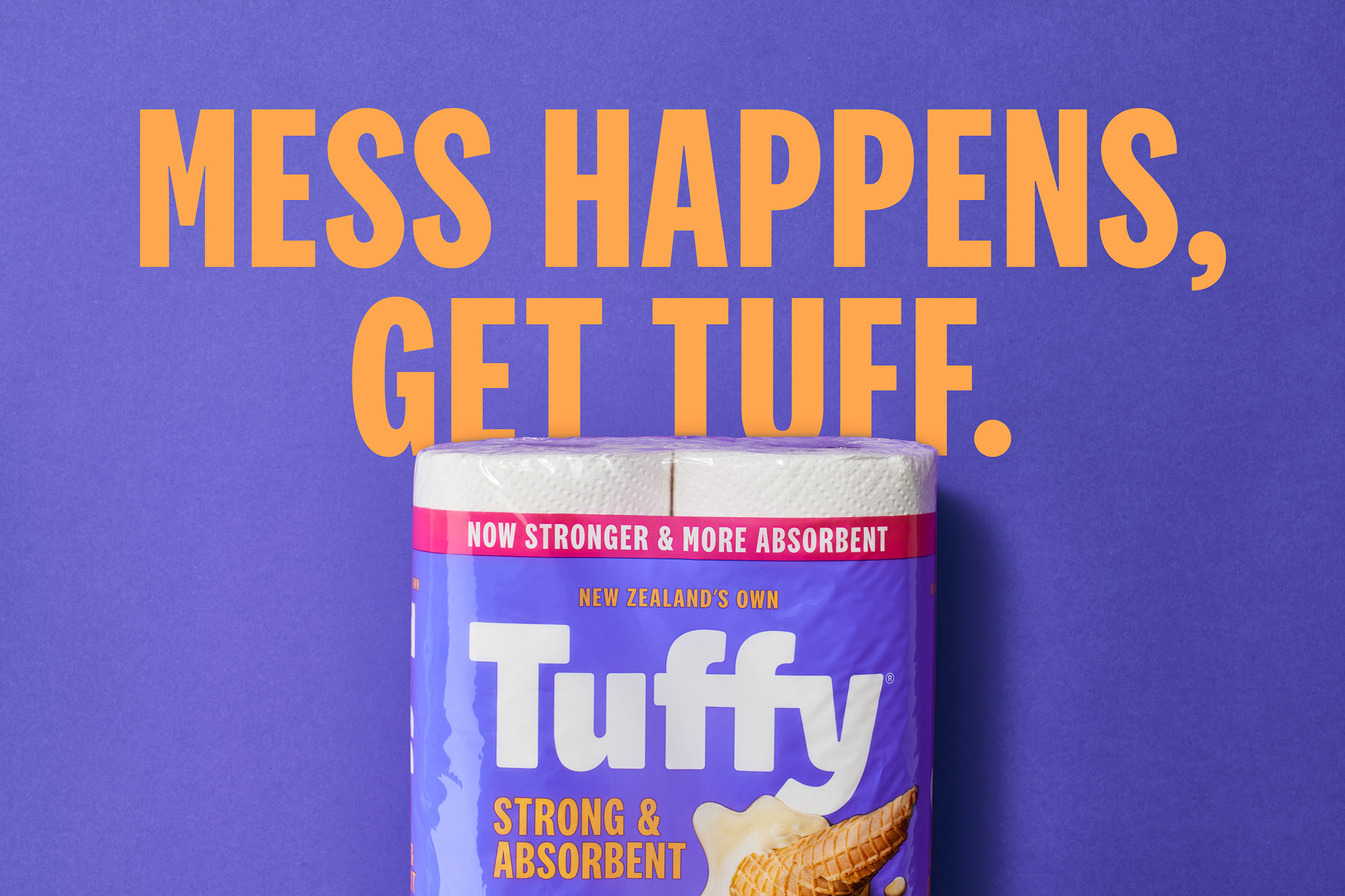
Our response was to reframe what a Tuffy towel is used for in a modern New Zealand family home – the small messes that happen every day. Our new positioning of ‘Mess Happens, Get Tuff!’ is a simple proposition…these things happen, and Tuffy is there to help out. It is a universal, democratic idea with positivity and a Kiwi ‘can-do’ attitude.
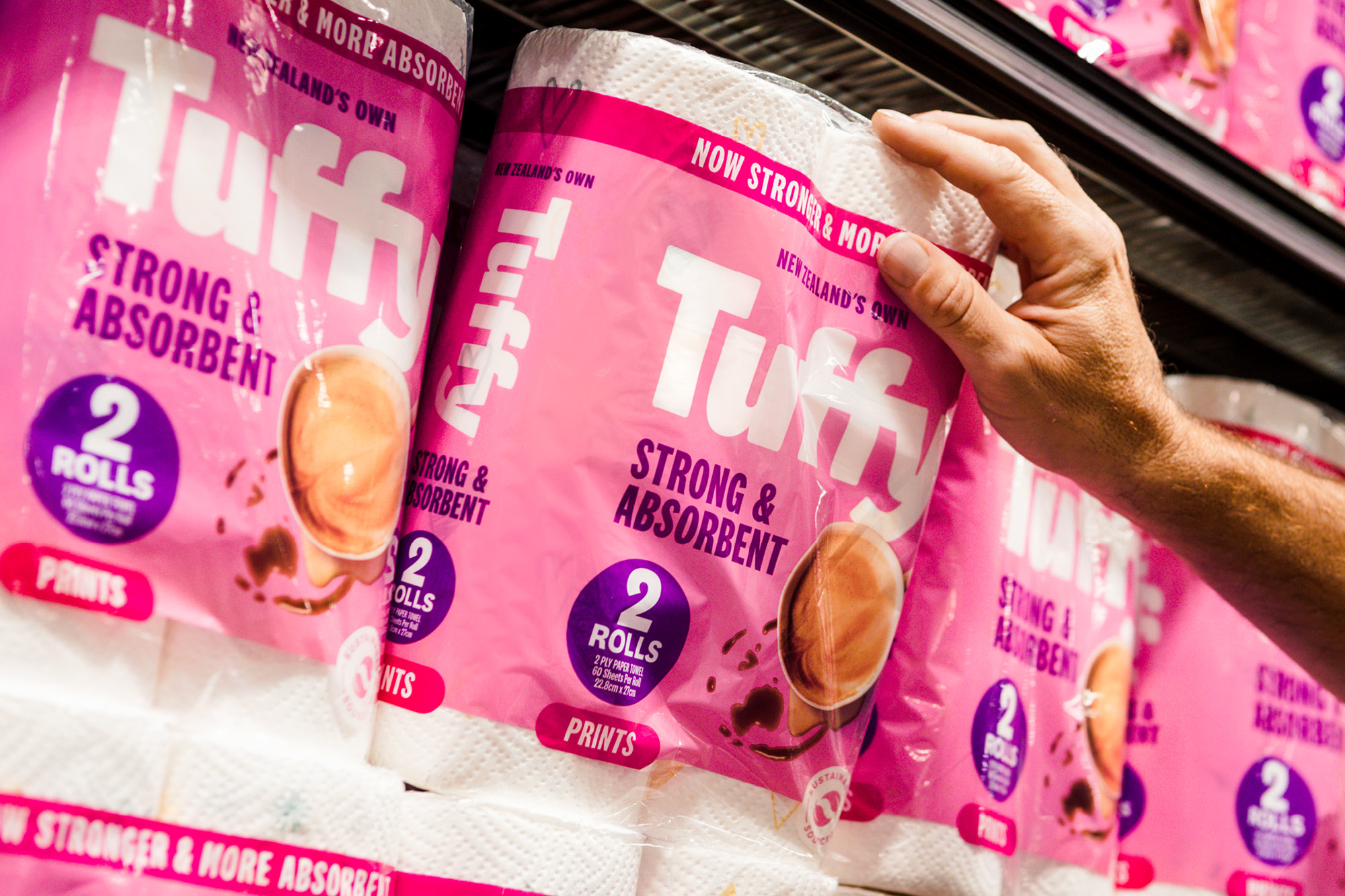
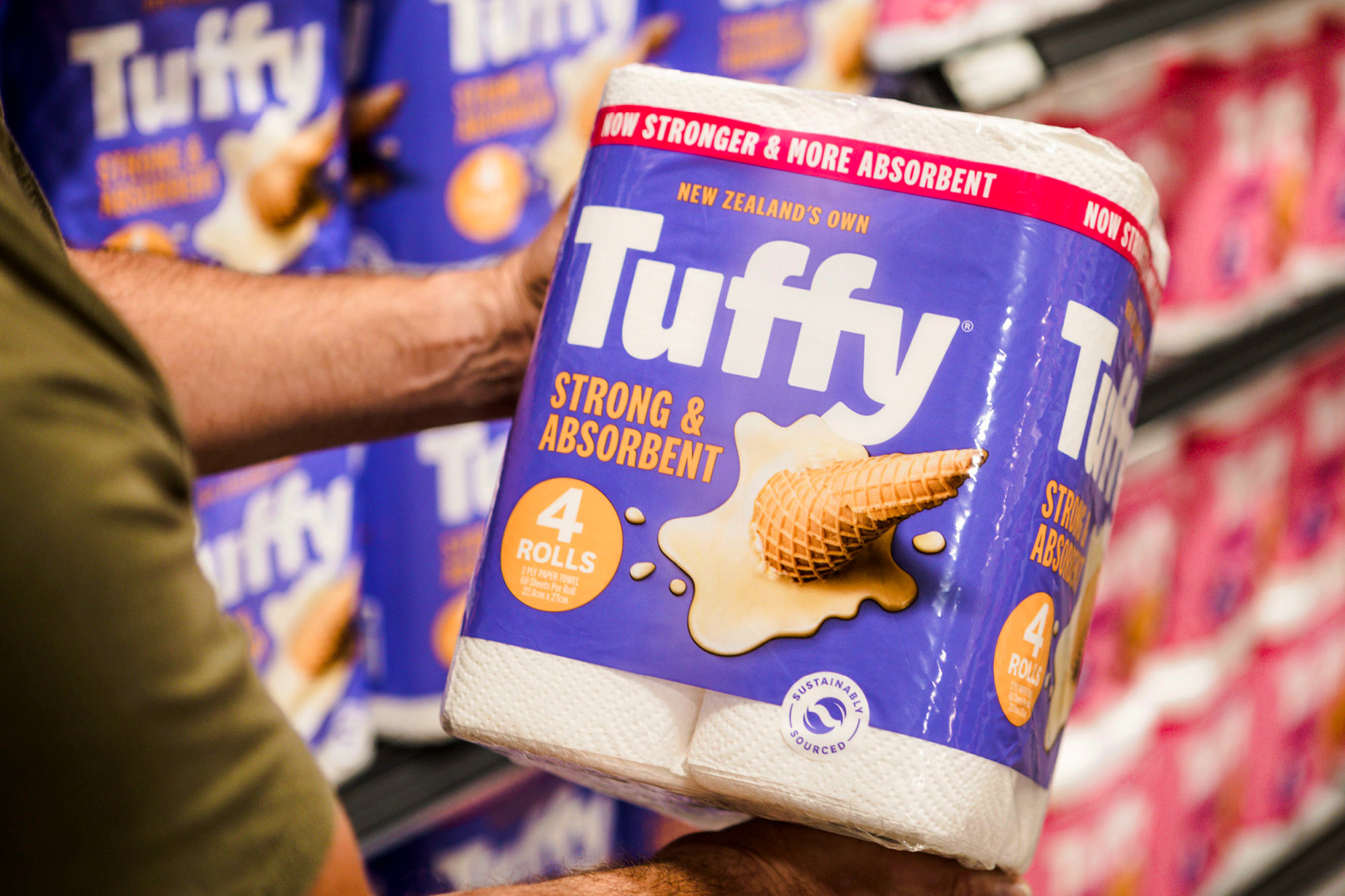
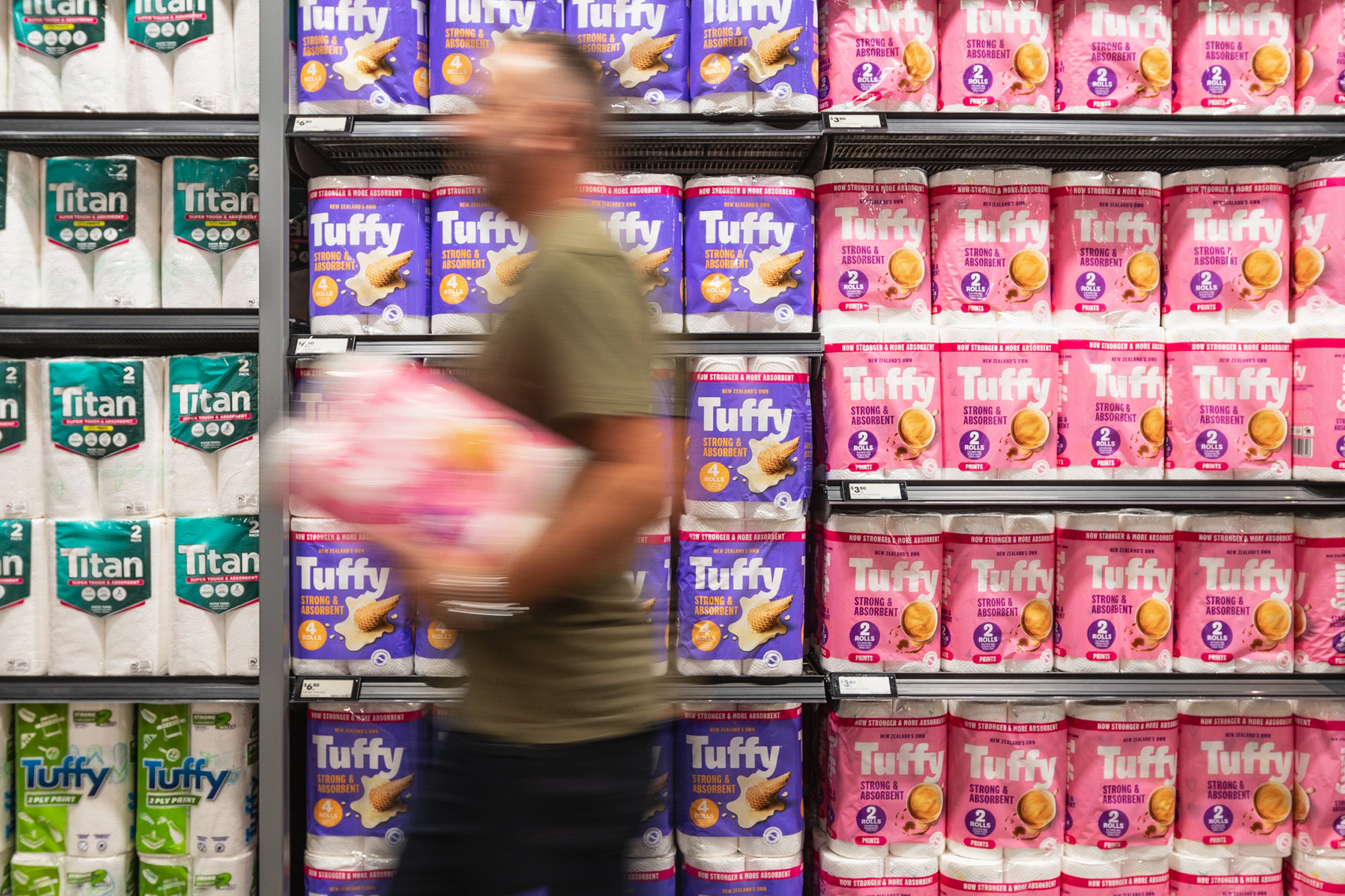
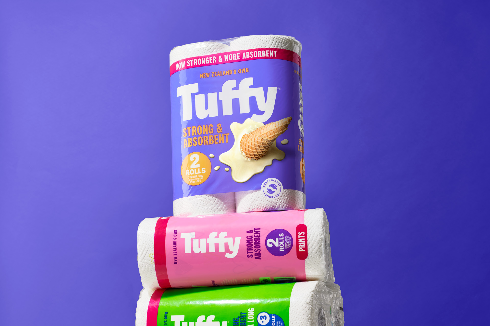
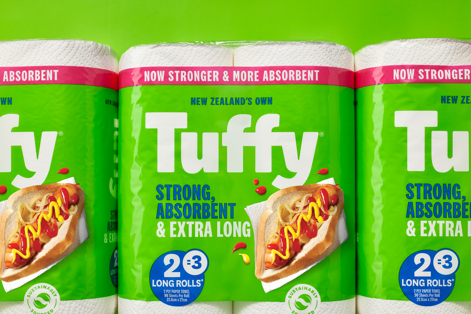
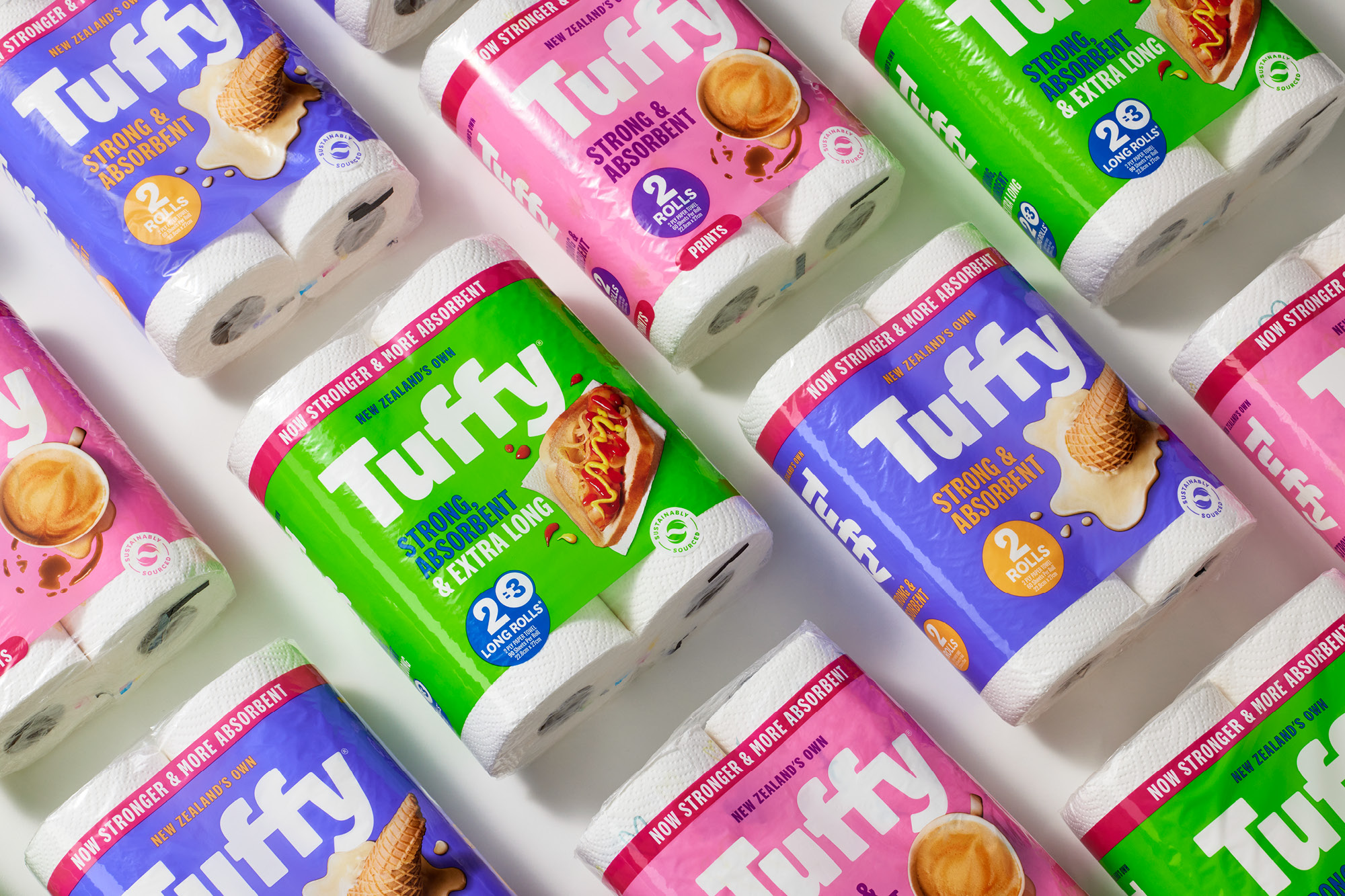
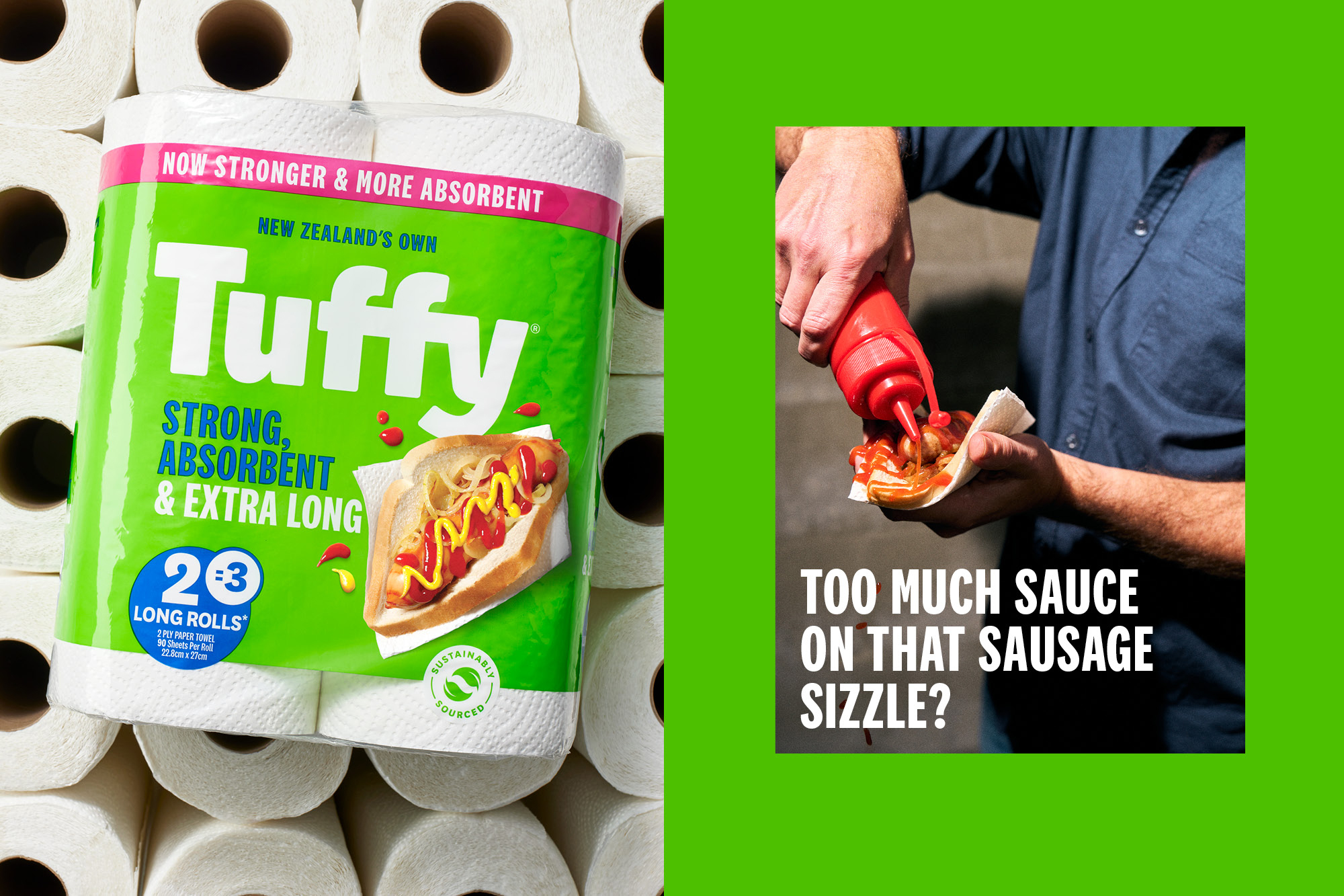
This allowed us to relook at the packaging from a different angle. Rather than bland utilitarian sameness, we created a brand toolbox loaded with positivity. The use of colour sets the tone for the brand; vivid full-colour imagery leaps off packs and brings well-known small messes and usages to life. Background colour palette positions the brand as bright, modern and optimistic. With the big and bold Tuffy wordmark with an all-important New Zealand-made callout as the cohesive graphic element, the rich background colours help to navigate the range while also bringing life and sparky energy to the aisle. Rich purple, bright pink and green – all radical colours in an otherwise category of blue.
Tuffy is now positioned as the paper towel for modern New Zealand families living their busy lives — boring no more.
CREDIT
- Agency/Creative: Onfire Design
- Article Title: Revitalizing Tuffy Towels, Injecting Personality and Positivity for Modern New Zealand Families
- Organisation/Entity: Agency
- Project Type: Packaging
- Project Status: Published
- Agency/Creative Country: New Zealand
- Agency/Creative City: Onfire Design / Auckland
- Market Region: Oceania
- Project Deliverables: Brand Experience, Brand Mark, Brand Redesign, Brand Strategy, Brand Tone of Voice, Graphic Design, Packaging Design, Tone of Voice
- Format: Wrap
- Substrate: Plastic
- Industry: Hospitality
- Keywords: WBDS Agency Design Awards 2023/24
-
Credits:
Creative Director: Matt Grantham
Design: Natasha Alimova
Design: Curtis Walker


