The Belgian craft beer scene witnessed a remarkable brand transformation with Gertrude Beers, a Nivelles-based brewery that beautifully marries historical heritage with contemporary design. This fascinating rebranding project, led by Studio Blackthorns, showcases how traditional brewing heritage can be preserved while creating a modern brand identity.
The Origins
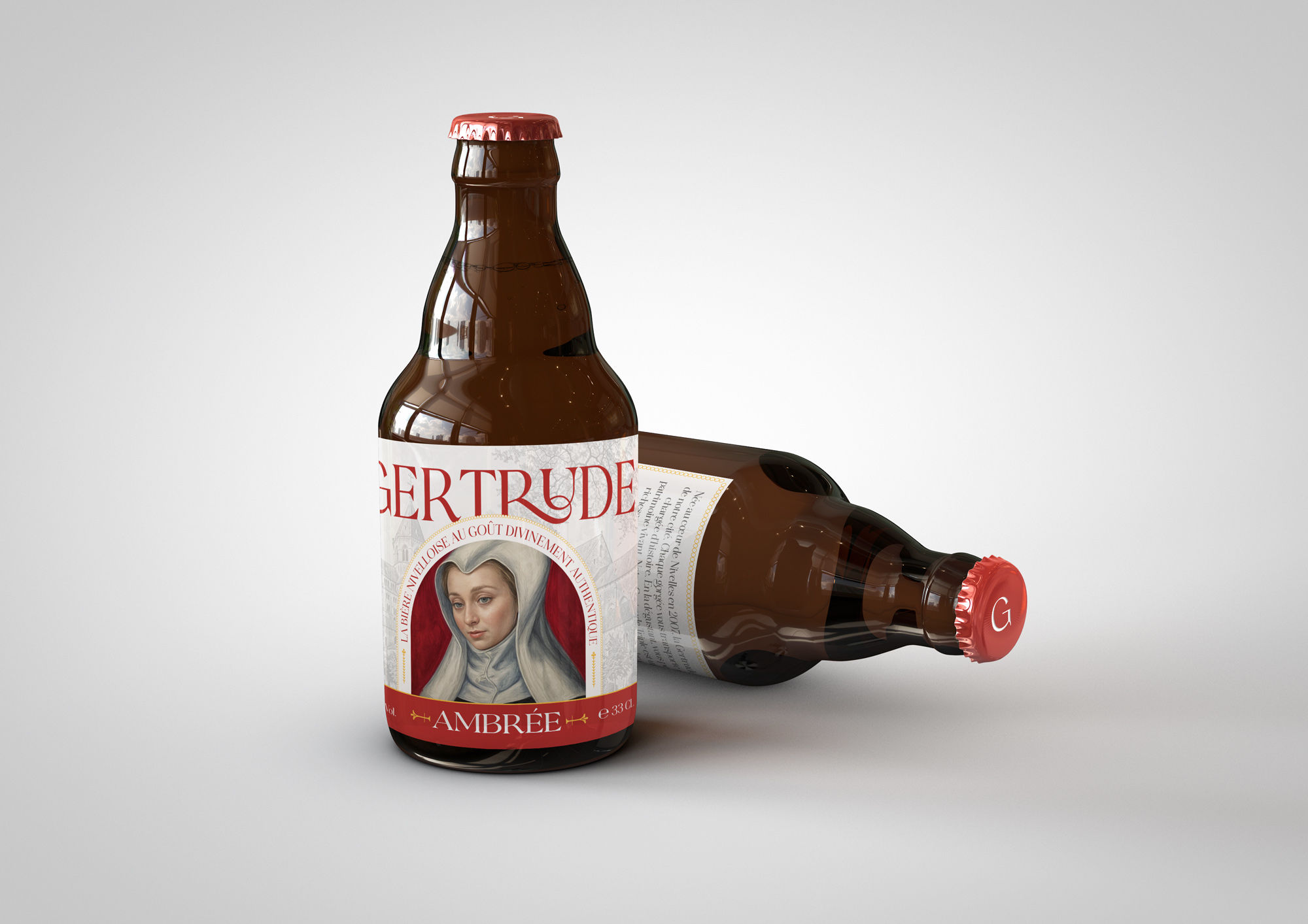
Founded in 2007, Gertrude Beers set out with a clear vision: to create unique, history-rich beers paying homage to Saint Gertrude of Nivelles. The brewery’s core offerings – Gertrude Triple, Amber, and “Secret” – each carry deep connections to this protective figure, known as the guardian of fields and vulnerable souls.
The Challenge
The project presented an exciting strategic opportunity to revitalize a Belgian artisanal beer brand deeply rooted in Nivelles’ local history and cultural identity. The main objectives included:
– Understanding and incorporating the Nivelles territory and regional heritage
– Clarifying the brand DNA and positioning
– Differentiating the product offering
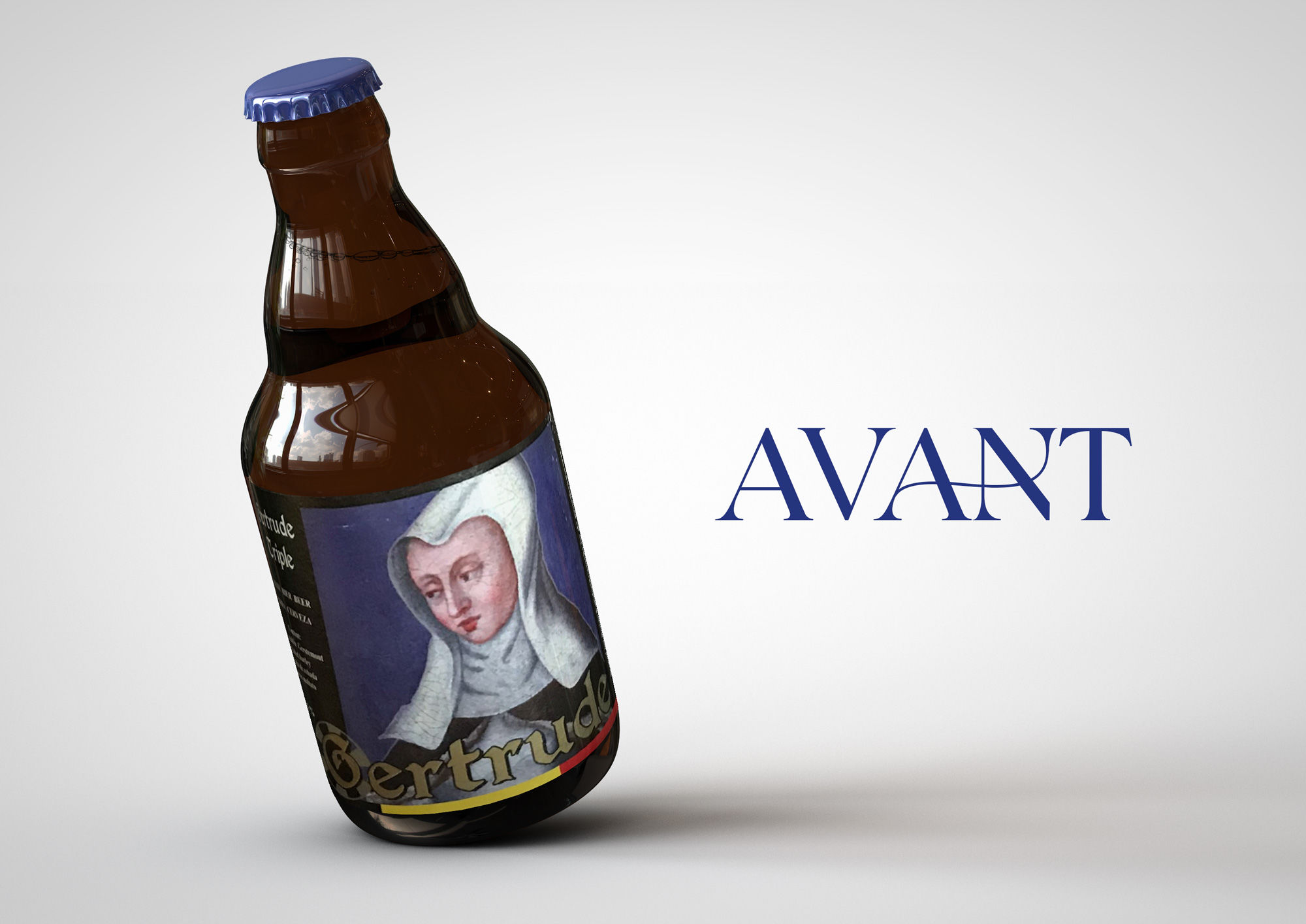
– Modernizing the image while maintaining traditional roots
– Developing a strong, versatile brand identity
The Innovation
One of the most intriguing aspects of this rebranding project was the innovative use of generative AI technology to bridge historical authenticity with contemporary design. Two key visual elements underwent this transformation:
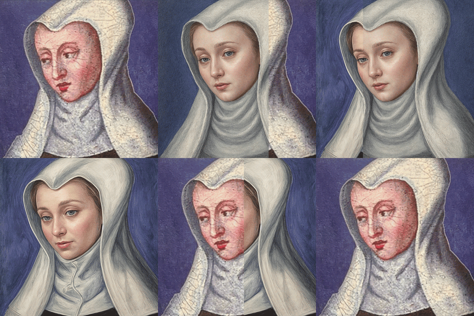
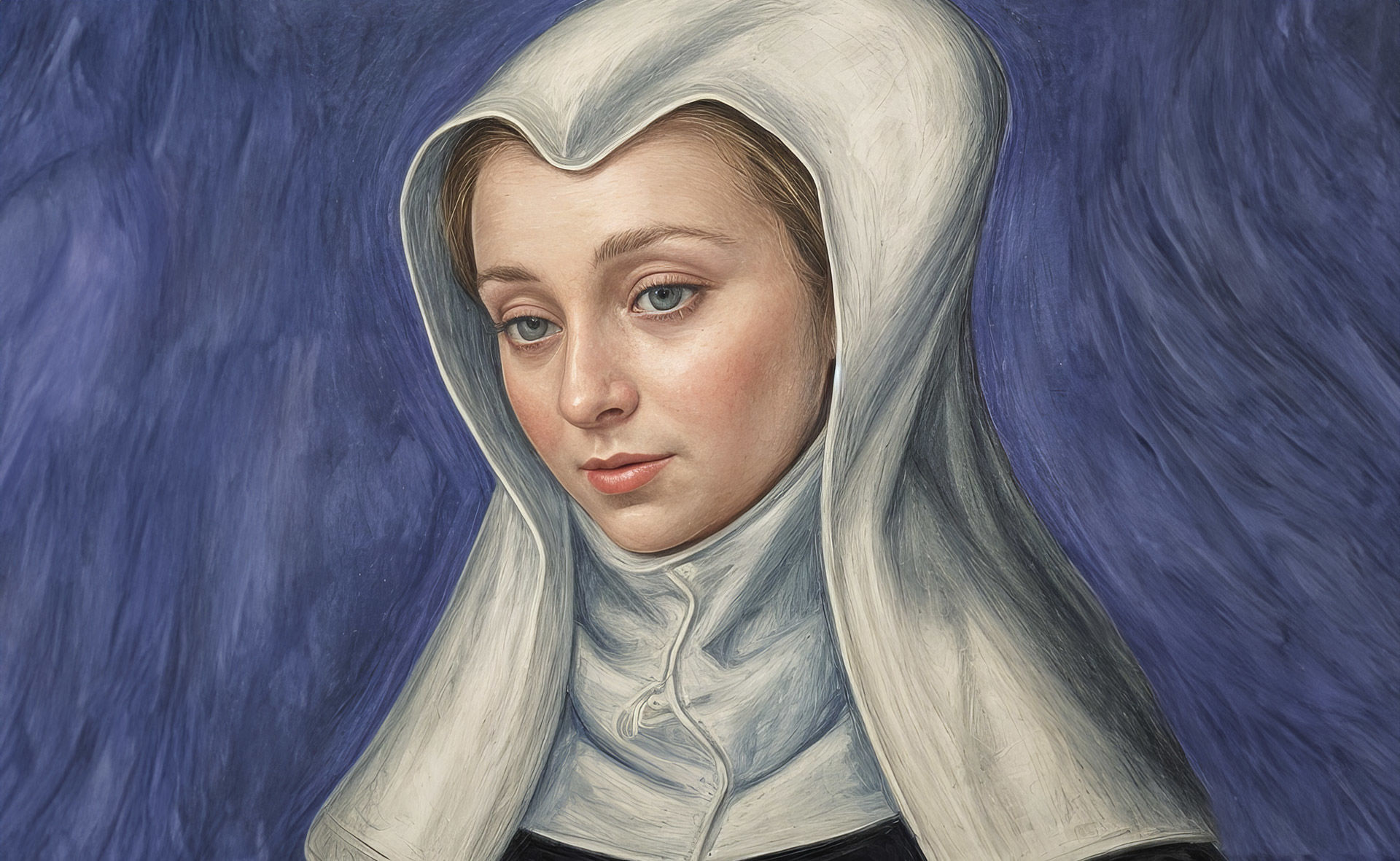
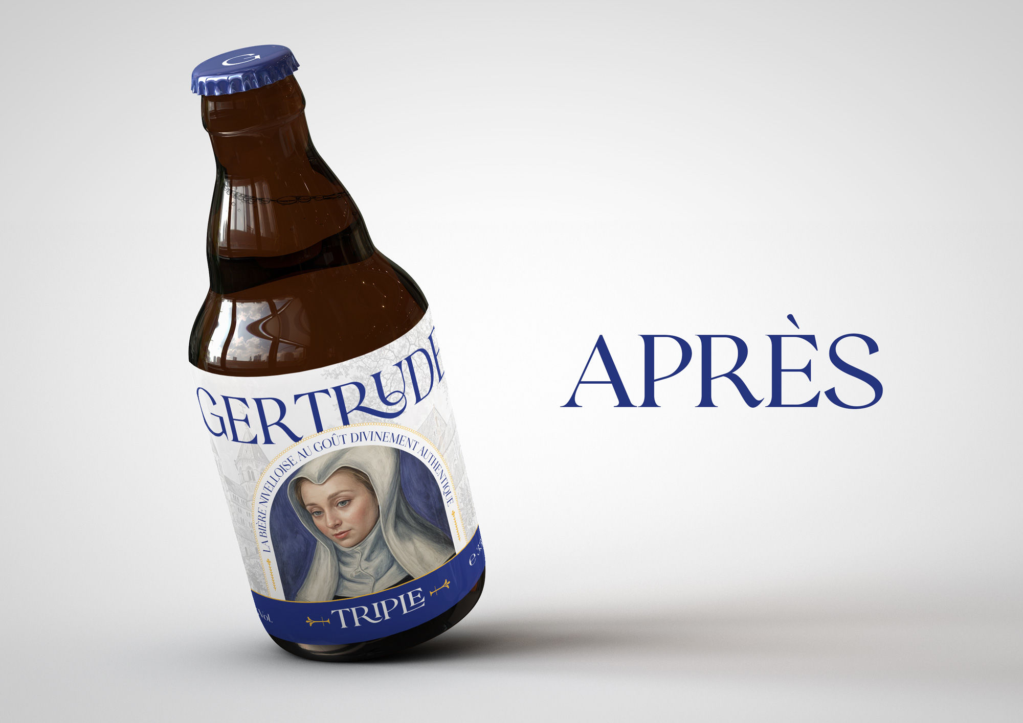
– Saint Gertrude’s Portrait: Using AI tools, the team carefully reimagined Saint Gertrude at age 33 (her age at death), maintaining historical accuracy while introducing modern visual elements.
– The Collegiate Church: The iconic Sainte-Gertrude Collegiate Church was digitally redesigned from a photograph into a stylized engraving, serving as a watermark for the label design. This transformation preserved crucial architectural details while creating a unique heritage element.
The Design System
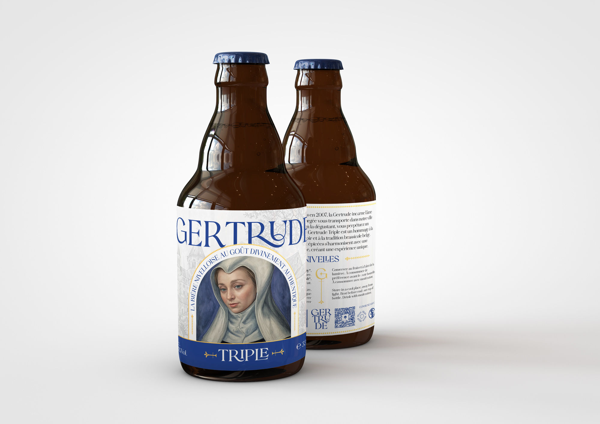
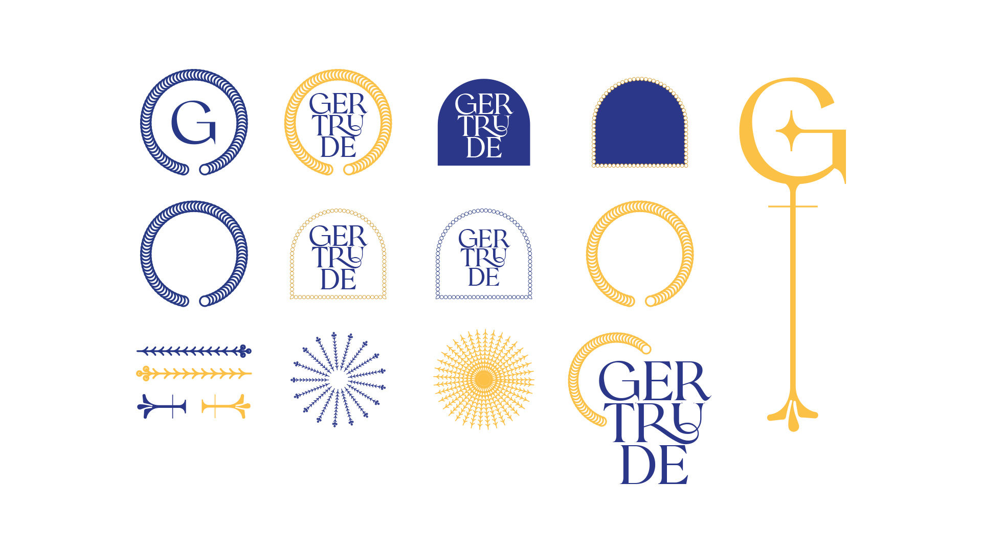
The new visual identity system strikes a delicate balance between luxury and authenticity. Key elements include:
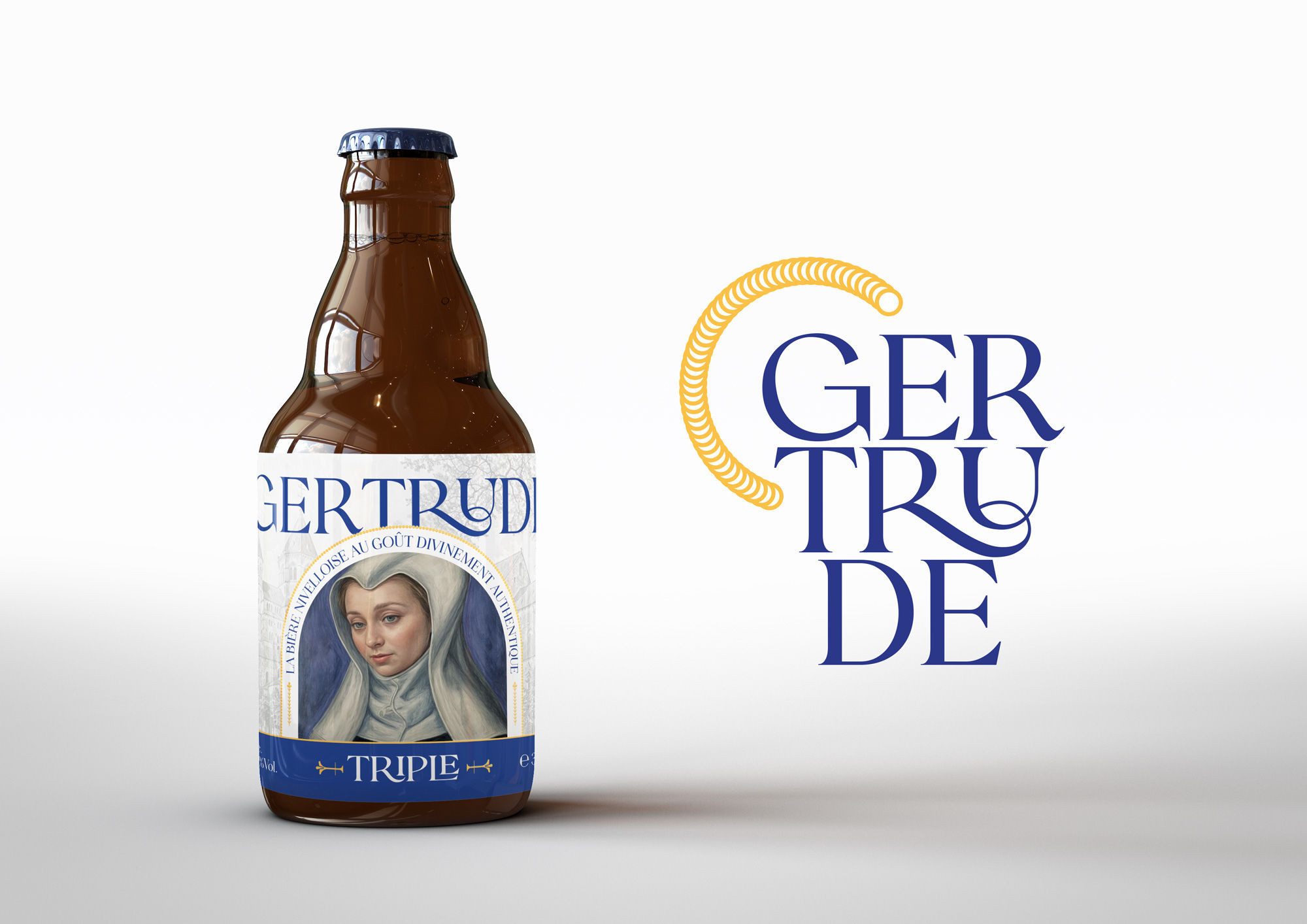
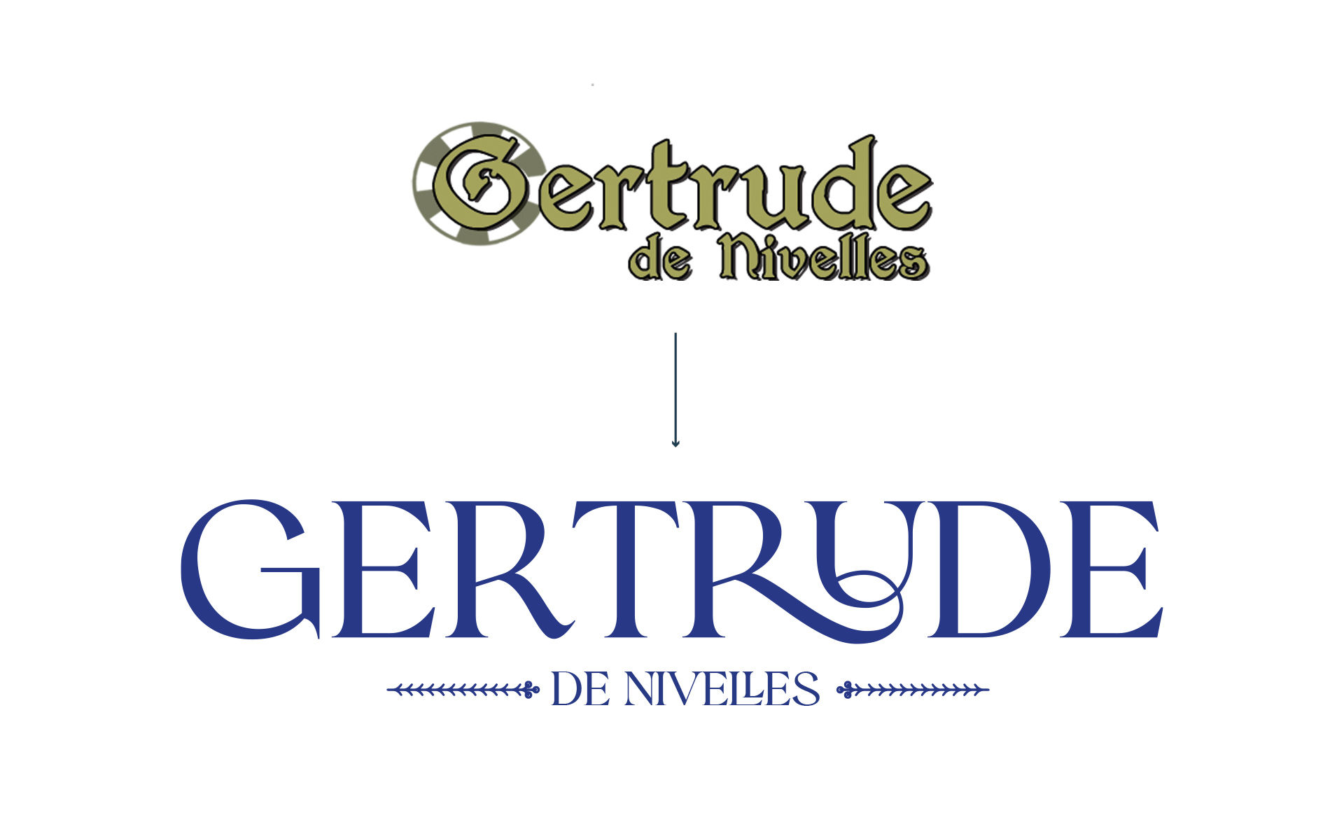
– Custom typography for the Gertrude wordmark
– Gold foil accents adding premium touch points
– Subtle references to Nivelles’ heritage integrated throughout the design
– Clear, modern label layouts improving product recognition
– A cohesive design system allowing for future brand extensions
Market Reception
The rebranding has been met with overwhelming positive feedback from both stakeholders and consumers. Laura, Co-Manager of Gertrude, reported that customers particularly appreciate the modern design approach and clearer label hierarchy. The luxury aspects, including the custom typography and gold foiling, received special praise, as did the cleverly integrated local references that reward closer inspection.
Strategic Implementation
The project went beyond mere visual updates, encompassing:
– Brand architecture development
– Positioning strategy
– Core messaging framework
– Monthly consulting services
– Comprehensive artistic direction
– Integration of generative AI technologies
The Impact
This rebranding exercise demonstrates how traditional brands can evolve while maintaining their cultural significance. The project successfully modernized Gertrude Beers’ market presence while deepening its connection to local heritage, proving that innovation and tradition can coexist harmoniously in brand design.
The transformation showcases the potential of combining advanced technology with traditional brand elements, creating a bridge between historical authenticity and contemporary market demands. It stands as a testament to thoughtful brand evolution in the craft beer industry, where heritage and innovation must often walk hand in hand.
This case study exemplifies how strategic design thinking can revitalize traditional brands for modern markets while preserving their essential character and historical significance.
CREDIT
- Agency/Creative: Studio Blackthorns
- Article Title: Revitalizing Tradition: The Brand Evolution of Gertrude Beers with AI by Studio Blackthorns
- Organisation/Entity: Agency
- Project Type: Packaging
- Project Status: Published
- Agency/Creative Country: France
- Agency/Creative City: Lyon
- Market Region: Europe
- Project Deliverables: 2D Design, Art Direction, Brand Identity, Brand Mark, Brand Redesign, Brand Rejuvenation, Brand Strategy, Graphic Design, Identity System, Label Design, Packaging Design
- Format: Bottle
- Industry: Food/Beverage
- Keywords: Belgian craft beer, brand revitalization, heritage design, AI-powered branding, religious iconography, artisanal brewing, cultural preservation, luxury packaging, traditional modernization, beverage branding
-
Credits:
Creative Director: Ludovic Mornand


