NC Electrical & Communications (NCE) are an electrical contractor operating in Western Australia. Like many businesses, their focus is providing the best possible service in their industry while the communication of their brand took a backseat. As the business evolved, the brand couldn’t keep up. The existing assets (or lack thereof) didn’t communicate the quality and reputation NCE had begun building.
NCE contacted Neighbourhood with the hypothesis that they needed a website redesign. They had completed multiple 6-figure projects with no clear knowledge of how best to promote their work. As with many established brands, there was a heavy investment in the existing logo. They had vehicle signage, stationery, and uniforms already, so this was off-limits. However, outside of the logo and some non-accessible colours, there wasn’t much to work with. The task became compounded; how can we redesign a website without a brand? Thankfully, NCE were open to a brand extension.
Before concept ideation, Neighbourhood needed to uncover insights. Who are NCE, and what makes them different? Who are their clients, and what do they care about? What does this landscape look like, and what’s NCE’s point of difference? A visit to the NCE site uncovered much more than we anticipated. The team was welcoming, young, vibrant, and passionate about technology. The Directors reiterated, “We’re always playing with tech… it’s such a rapidly shifting world and our clients’ don’t have the time to keep up. We keep up for them, and we bring a genuine interest in this industry”.
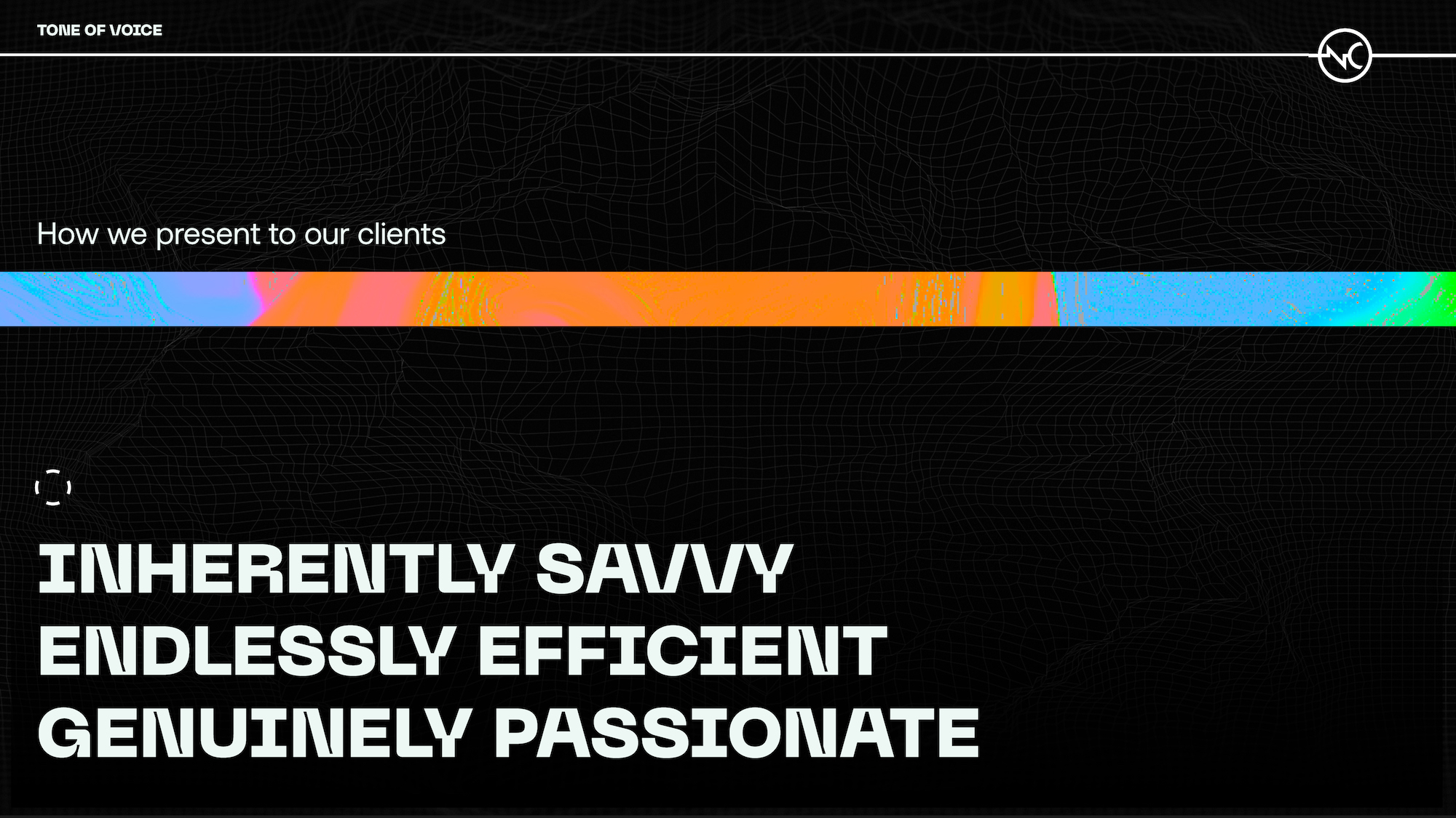
With this seemingly small insight, it became clear that this was a modern and technologically focused business. With this alone, the tone of voice for NCE was developed; genuinely passionate, inherently savvy, and endlessly efficient.
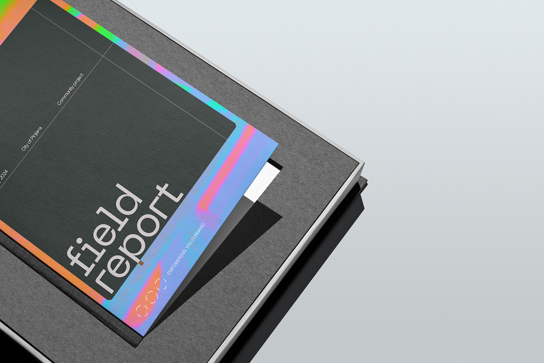
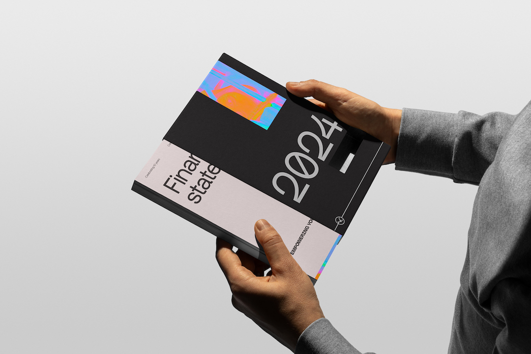
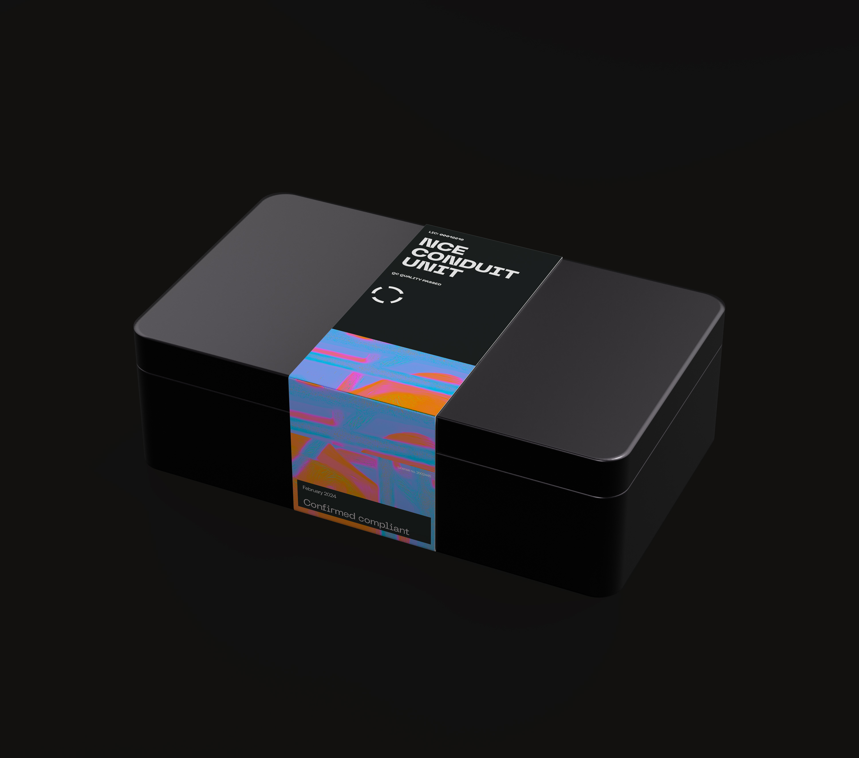
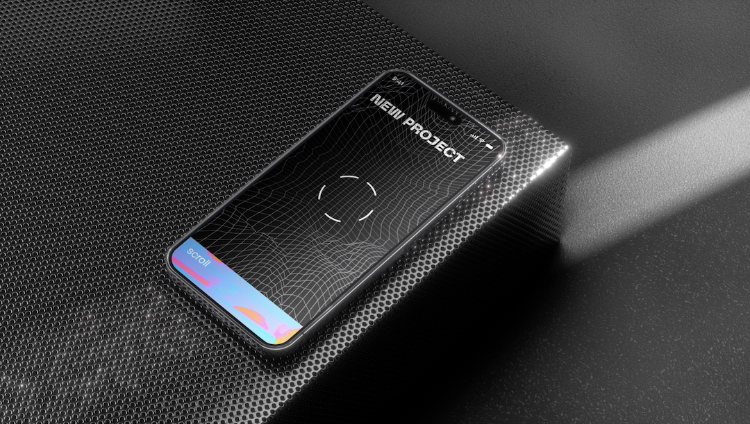
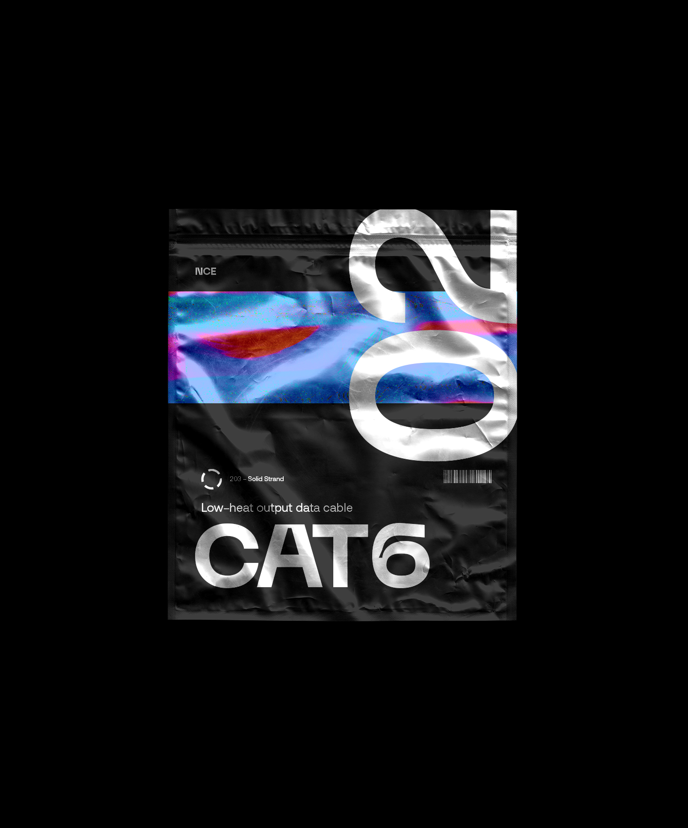
Inspired by new electrical technology, such as thermal imaging to detect “hot-spots” (or, excessive energy consumption) the brand graphic depicts an almost “infrared-like” effect. Though seemingly complex, the graphic effect is achieved by combining brand photography and a custom Photoshop action, making it entirely original to the client. Although technologically minded, it’s important to not become polarising with excessive design. One of the guiding values of NCE is to simplify complexity, therefore, the brand graphic is used sparingly as a point of contrast.
With the tone of voice and primary brand graphic designed, it was a matter of finding the right typographic combination for communications. Shay Fletcher, Creative Director at Neighbourhood found this the most rewarding part of the project. “As we know, typography is a critical part of Graphic Design. A typographer has meticulously crafted a typeface with a vision, and as Designers we need to respect that, ensuring we’re presenting their work in way it was intended” says Shay. It’s the opinion of Shay and the Neighbourhood team that the right typography is critical in communications, and the combination of Pangram Pangram’s “Neue Machina” and CoType Foundary’s “Aeonik Pro” was the perfect pairing. Neue Machina was inspired by the aesthetics of robotics and machines, and is a font suited to the future of technology (according to Pangram Pangram). Pairing this with the incredibly modern and ultra-refined Aeonik Pro results in the prefect blend of contrast, character, refinement, and originality.
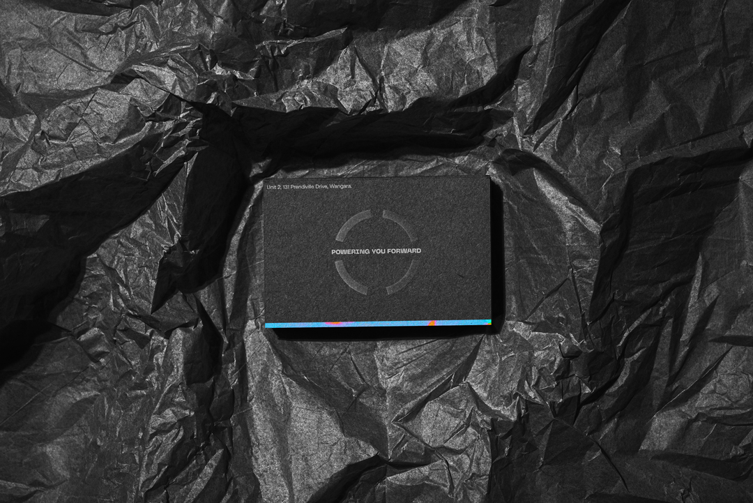
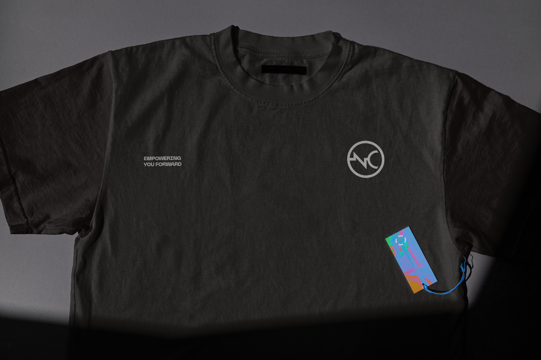
Lastly, the brand extension needs “something” to bring everything together. The existing logo didn’t come with variations and wasn’t effective across different scales and applications. With the idea of agile solutions, evolving technology and an ever-shifting landscape, Neighbourhood took the simplest shape possible- a circle- and doused it with an animative treatment. The circle icon (secondary logo) mimics the primary logo in its core shape but brings a subtle stroke animation for use in digital applications, or static for printed applications. Very slight, almost non-existent “touch-ups” were made to the primary logo for the brand to feel cohesive.
As a result, NCE now boasts hundreds of genuine social media followers that recognise them as the only electrical and communications business in our city to take pride in their appearance. The communication across social media in the form of styled and templated posts, and vibrant stationery is consistent and well-articulated. The brand extension has position NCE as the leader in quality, technology, and service in their field.
CREDIT
- Agency/Creative: Neighbourhood Studio
- Article Title: Revitalising NCE, a Modern Brand Extension Journey by Neighbourhood Studio
- Organisation/Entity: Agency
- Project Type: Identity
- Project Status: Published
- Agency/Creative Country: Australia
- Agency/Creative City: Perth
- Market Region: Oceania
- Project Deliverables: Brand Design, Brand Guidelines, Brand Identity, Brand Refinement, Brand Rejuvenation, Brand Tone of Voice
- Industry: Technology
- Keywords: WBDS Creative Design Awards 2023/24
- Keywords: Electrical technology brand refresh
-
Credits:
Creative: Shay Fletcher
Creative: Miranda Brady


