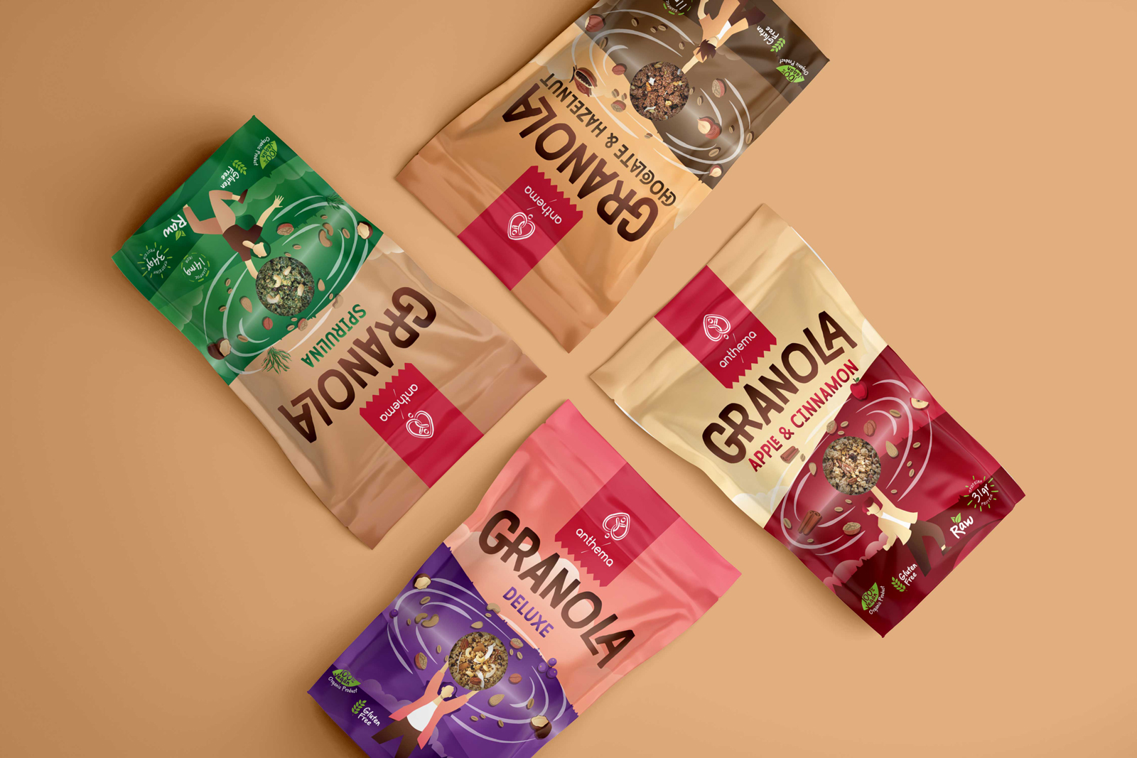
Anthema S.A. is a pioneering food product company dedicated to the exclusive use of bio products, offering a 100% vegan, non-dairy, and sugar-free range of items. The company’s guiding philosophy is deeply rooted in the age-old wisdom that “food can be thy medicine,” all while showing profound respect for the bountiful offerings of Mother Nature. Their impressive portfolio includes much-loved products like almond milk and a variety of nut butters, all of which have been received with great acclaim. Building on this success, Anthema S.A. embarked on an exciting journey to introduce a new line of granola, with four delectable flavors.
The challenge at hand was to conceptualize and craft packaging designs that would not only distinguish each unique granola flavor but also bear a cohesive and inviting aesthetic. This approach aimed to entice consumers to explore the range, savor the flavors, and experience a surge of revitalizing energy that this wholesome granola promises.
In delving into the historical roots of granola, we uncovered its origins as a favorite among hikers and mountain climbers. This beloved food, typically composed of rolled oats, nuts, seeds, honey, or other sweeteners like brown sugar, combined with puffed rice, was cherished for its nourishing qualities and portability. It provided the perfect on-the-go sustenance for those in need of a quick, energy-boosting snack.
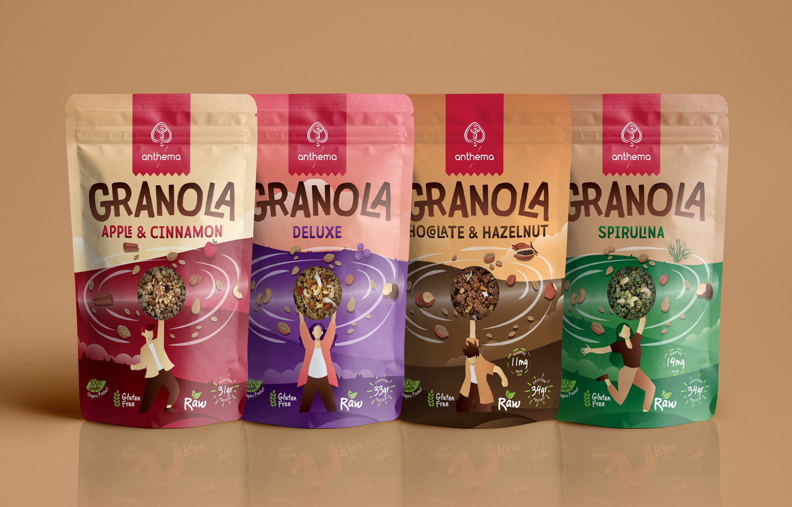
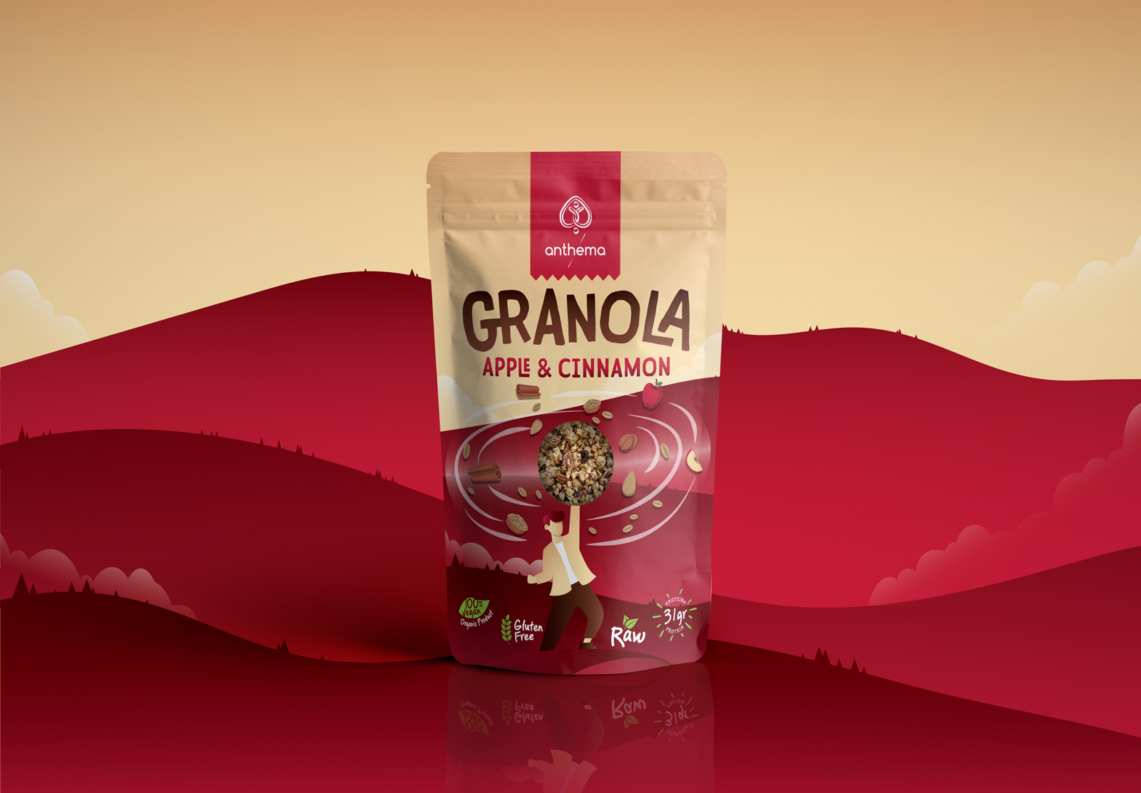
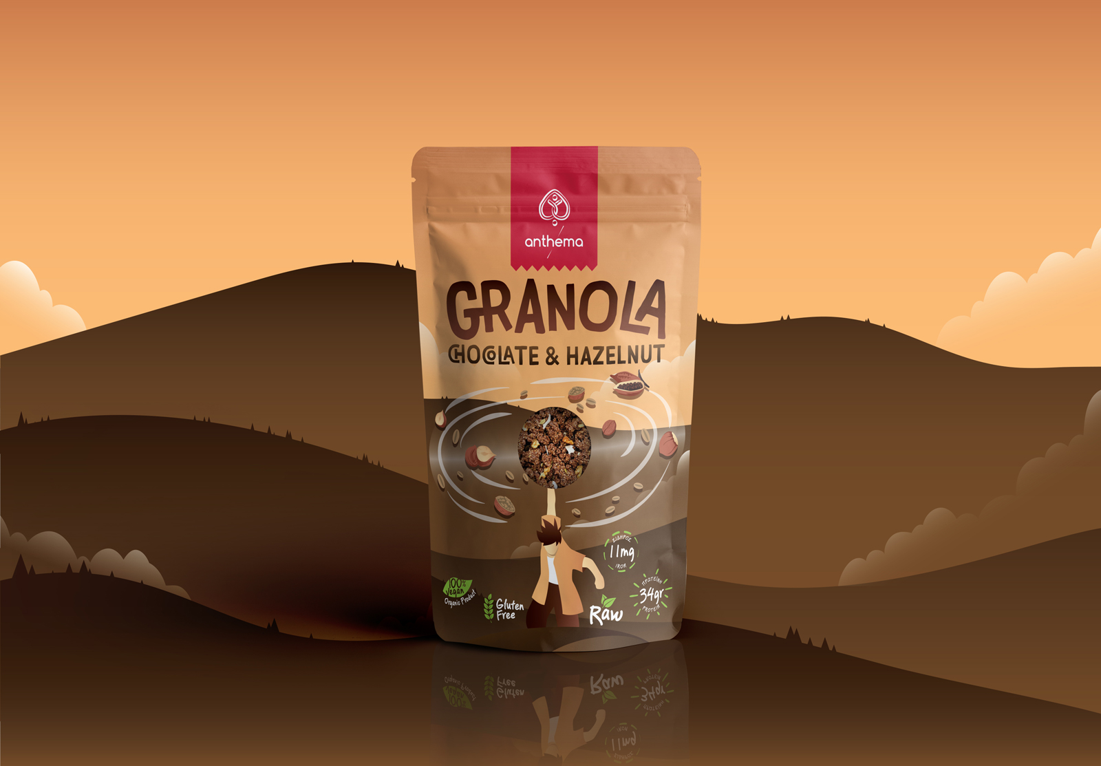
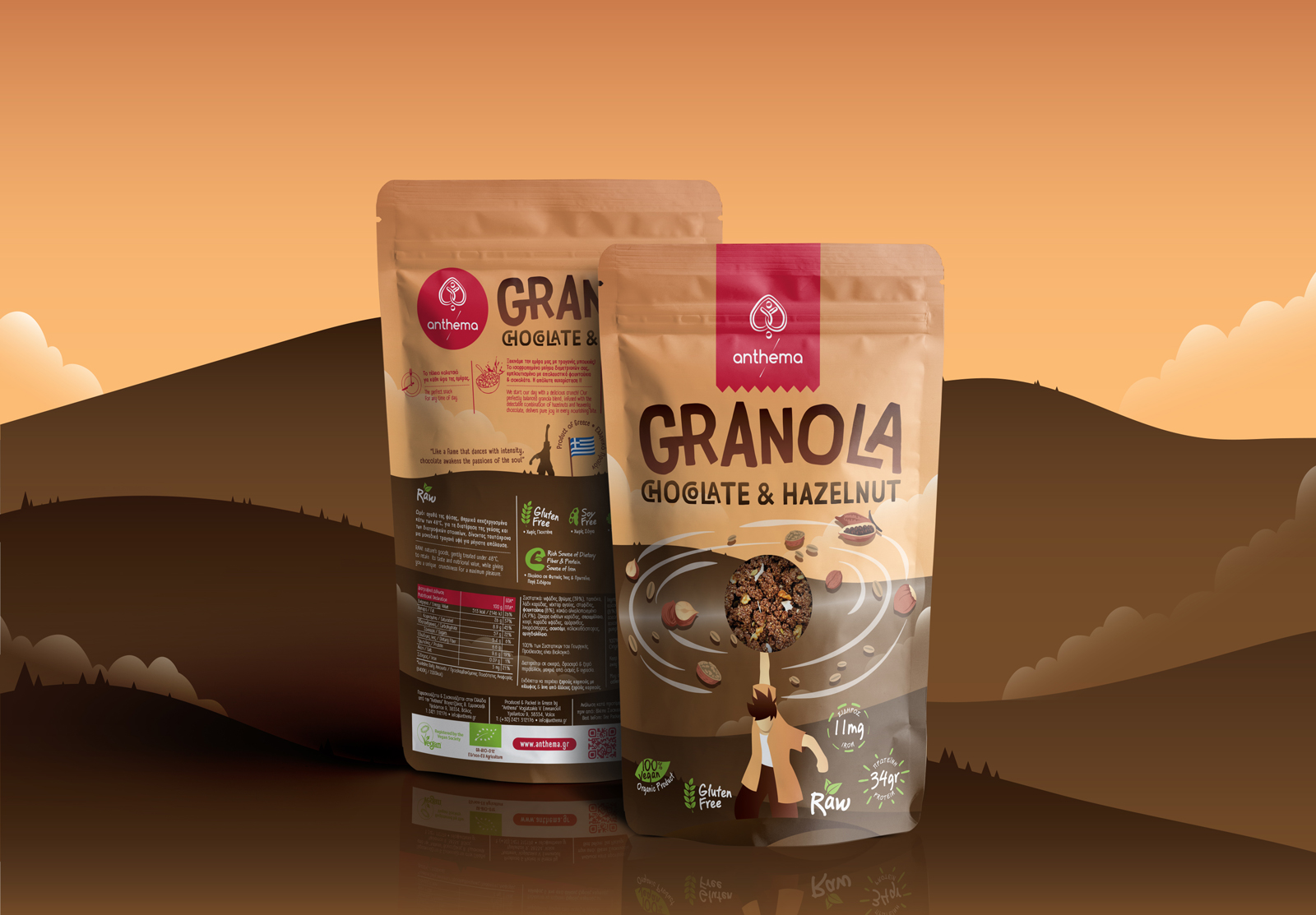
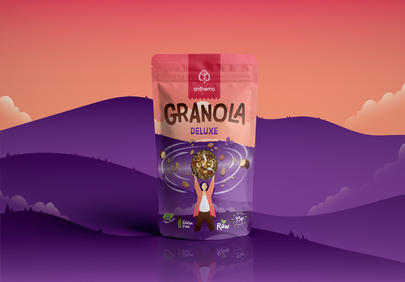
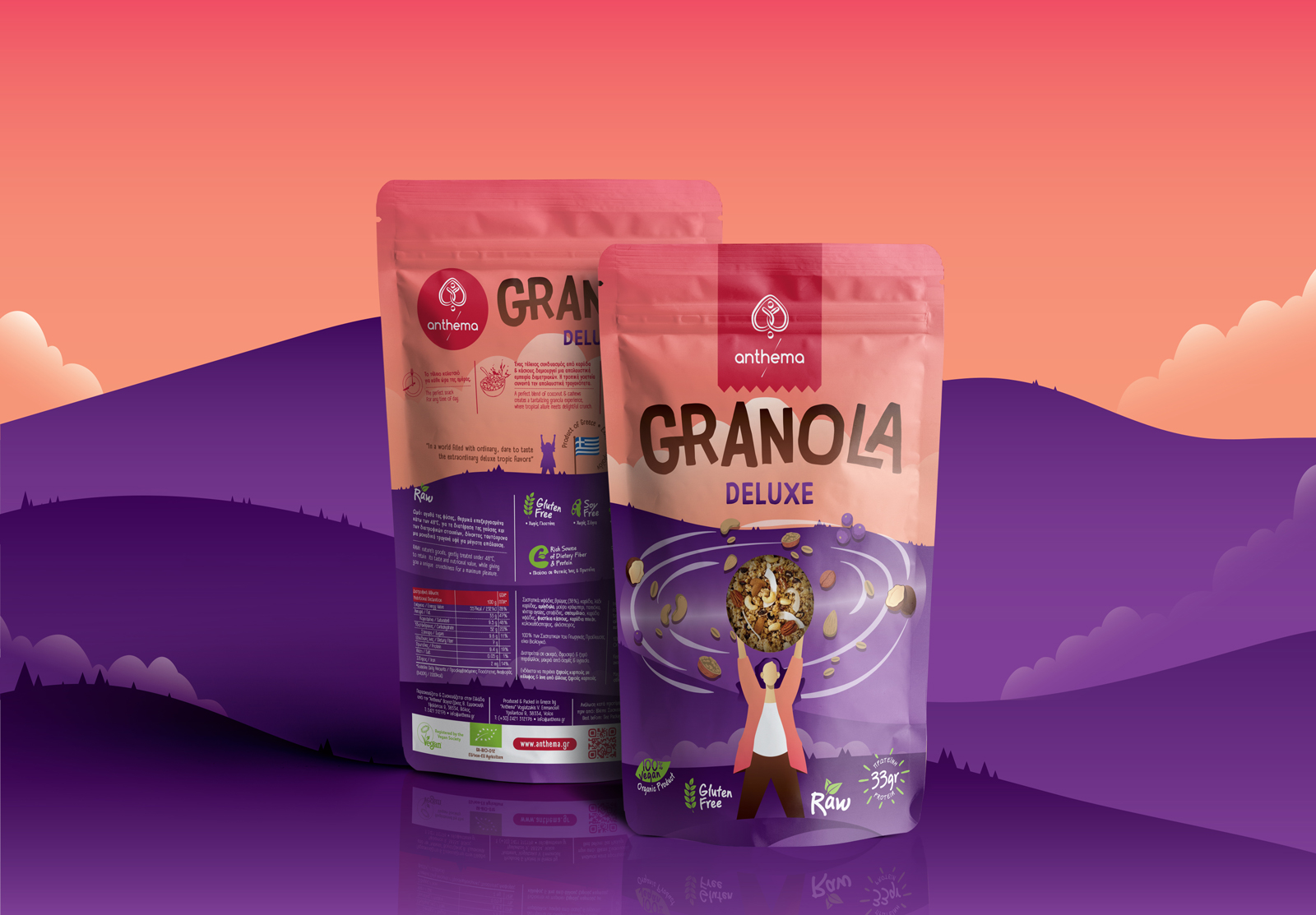
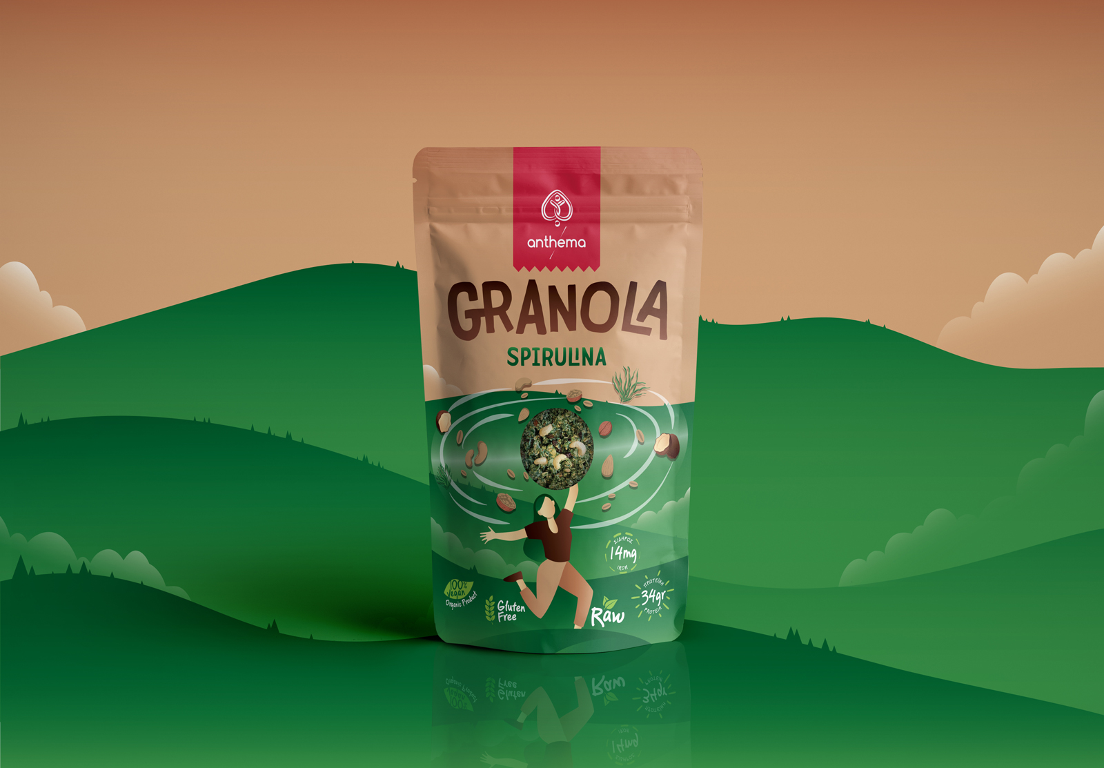
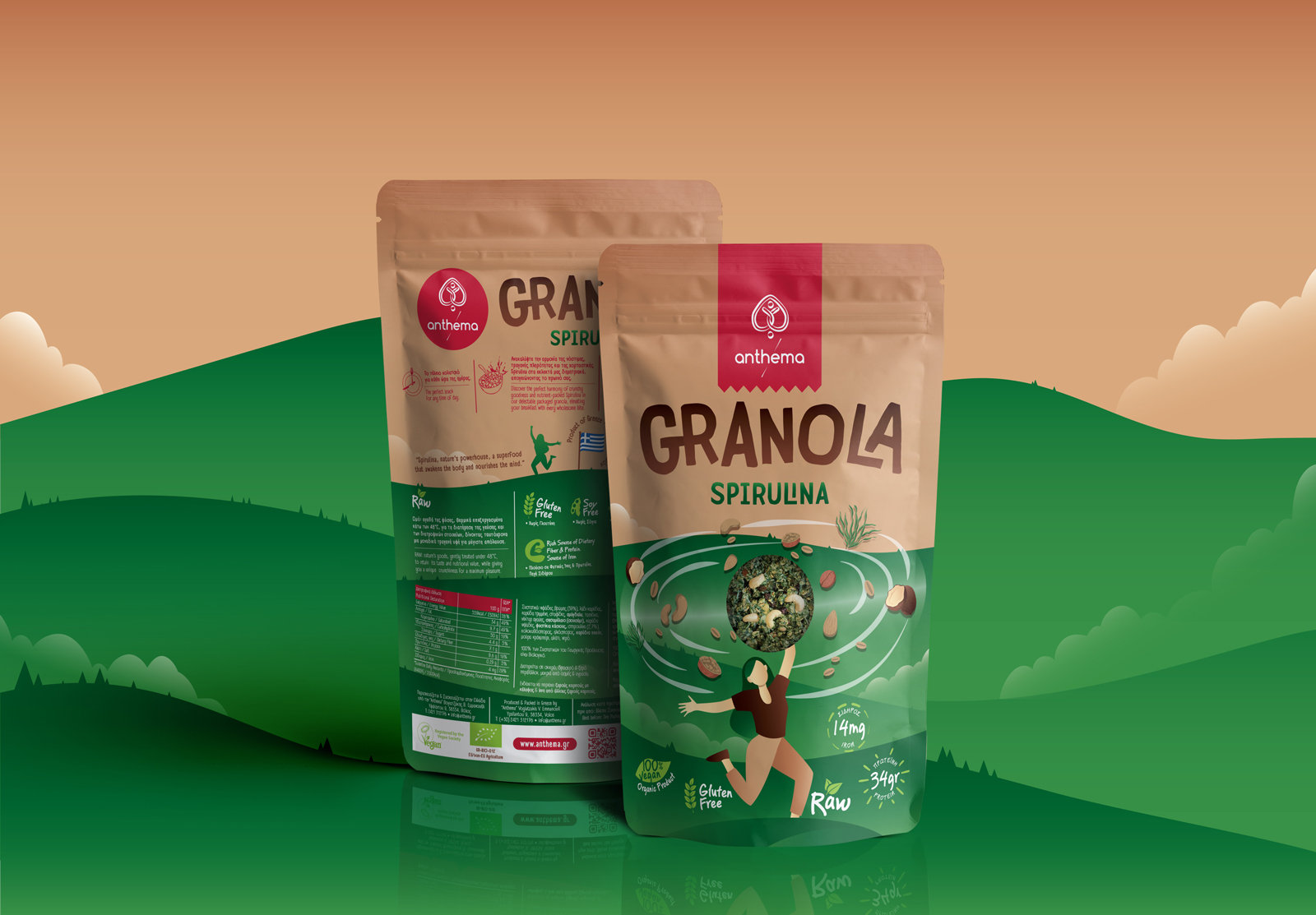
Drawing from this rich history and aiming to create packaging that would resonate with a diverse audience, the design team at Anthema S.A. conceived an innovative and engaging solution. The central idea was to depict everyday individuals as heroes, conquering hilltops and harnessing the superpower of granola and its natural ingredients. These heroes are portrayed with swirling tornadoes of granola ingredients emerging from their outstretched hands, symbolizing the energy and vitality that these products promise to deliver.
Each granola flavor is assigned a distinct color, drawn from the primary ingredient that characterizes its taste profile. For instance, the “apple and cinnamon” flavor is represented by warm and inviting shades, while the “deluxe with blueberries” variety showcases a color palette that reflects the essence of its ingredients. “Chocolate and hazelnut” granola embraces a rich, decadent color scheme, and the “spirulina-infused” version draws on vibrant, earthy tones.
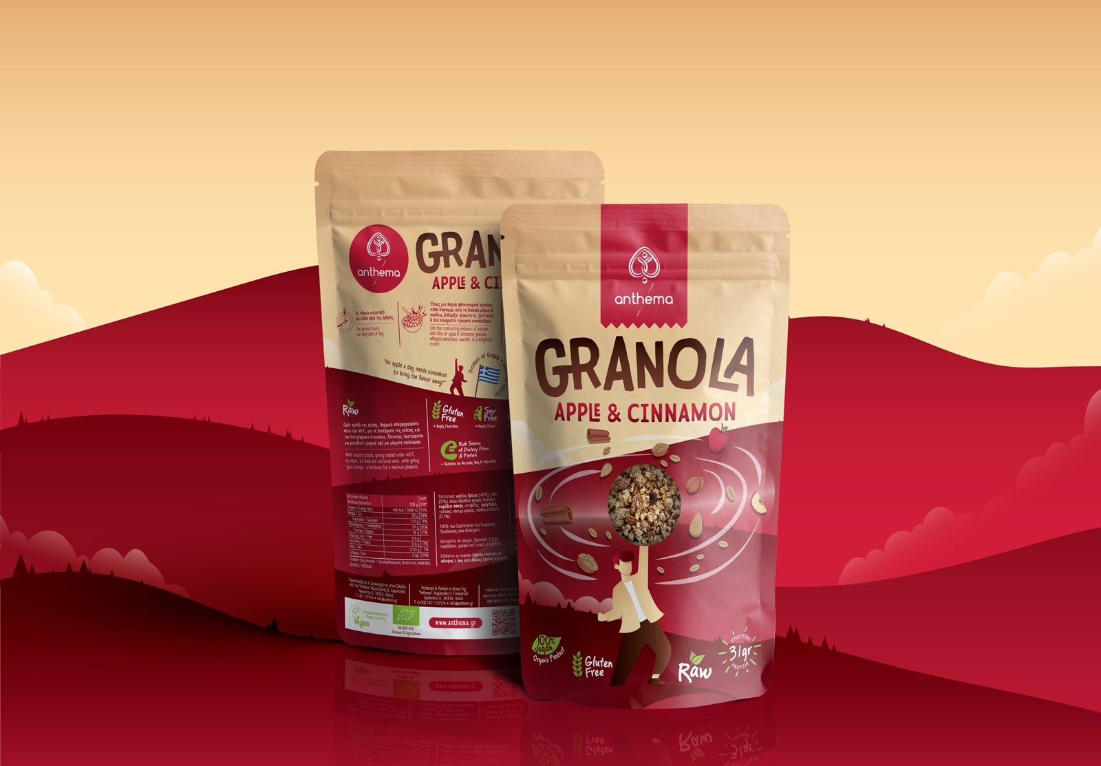
The back of each granola package offers a wealth of information, combining the imagery of the heroic figures with comprehensive details about the ingredients, certifications, and flavor-specific information. This comprehensive approach not only appeals to the visual senses but also provides valuable insights to the consumers about the product they are about to enjoy.
CREDIT
- Agency/Creative: Circus Design Studio
- Article Title: Revitalising Granola Delights: Anthema S.A.’s Heroic Packaging Journey Crafted by Circus Design Studio
- Organisation/Entity: Agency
- Project Type: Packaging
- Project Status: Published
- Agency/Creative Country: Greece
- Agency/Creative City: Volos
- Market Region: Asia, Europe, North America
- Project Deliverables: Art Direction, Branding, Character Design, Concept Art, Design, Graphic Design, Illustration, Packaging Design
- Format: Bag, Pouch
- Industry: Food/Beverage
- Keywords: granola, food, apple, cinnamon, chocolate, hazelnut, deluxe, berries, spirulina
-
Credits:
Illustrator: Dimitris Chatzelas


