


Embarking on a rebranding journey is akin to treading a tightrope; a step too far could lead into an abyss of identity loss, while a step short could keep a brand tethered to outdated aesthetics. When Halored approached us with the delicate task of rebranding, we knew the essence of their existing logo was precious and needed to remain untouched. However, every other facet of their visual identity beckoned for rejuvenation, for a fresh breath of modernity.
Our objective was not merely to meet contemporary design benchmarks but to transcend them, to set a precedent of professionalism intertwined with visual magnetism. The collaborative synergy between our teams was nothing short of electric. It propelled us through numerous brainstorming sessions, sketches, and revisions, all in the quest for that perfect blend of old and new.
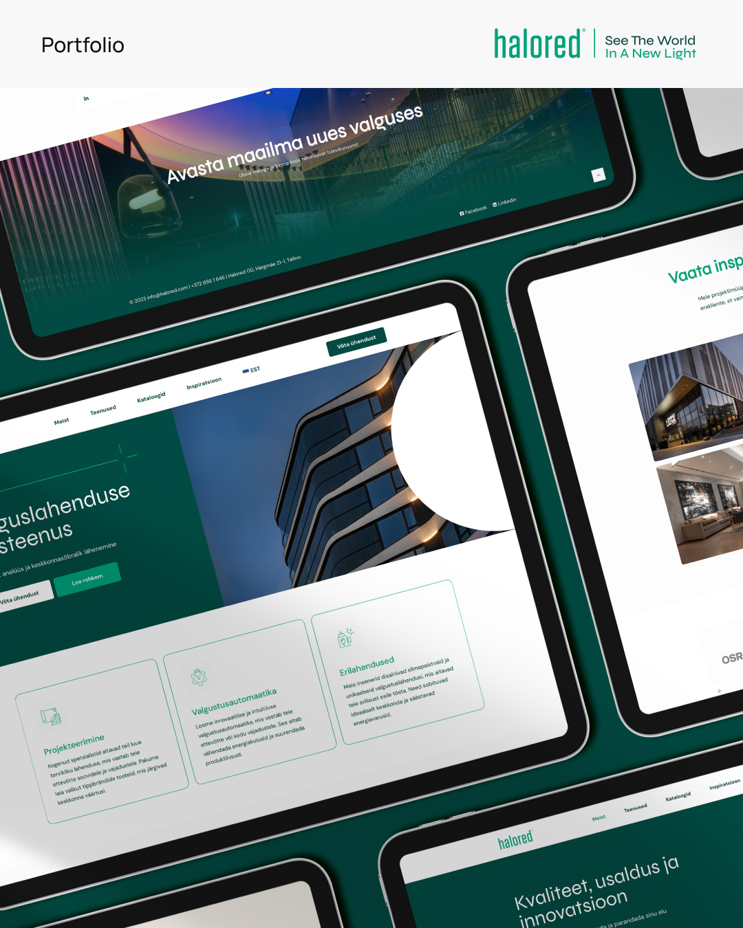
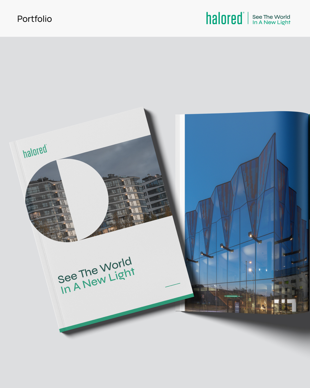
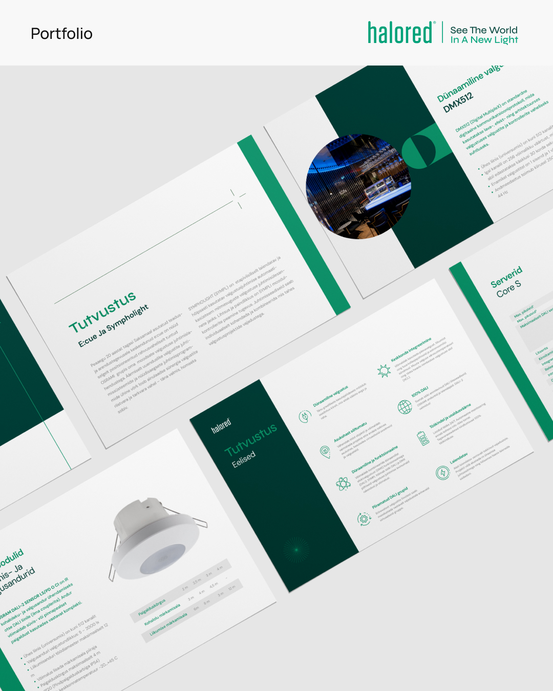
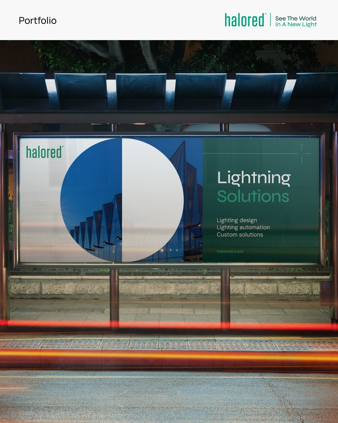
The revelation of a refined color palette was the first sign of dawn in Halored’s rebranding horizon. It was followed by the meticulous carving of versatile brand elements that now enable Halored to shine seamlessly across all platforms, be it digital or print. The transformation is not just skin deep; it’s a reflection of evolved ethos, of a brand that’s ready to meet the future with a robust and elegant visual identity.
Now, as we step back and witness the transformative journey of Halored, the sense of pride enveloping us is immeasurable. The fresh, contemporary brand that stands before us not only meets but exceedingly surpasses expectations in professionalism and visual allure. We invite you to delve into Halored’s new look, to explore their enriched portfolio, and to discover the innovative solutions that now lie at the core of their brand. Their work is a testament to the power of a well-thought-out rebrand, and we couldn’t be happier to have played a part in this pivotal transition.
The narrative of Halored’s brand has been rewritten, yet its soul remains untouched. This endeavor was not just about aesthetic alteration but about ushering in a new era where Halored’s brand could thrive amidst modern market dynamics. Each hue, each design element, and each strategy employed in this rebrand is a stitch in the fabric of Halored’s renewed promise to their clientele and their unyielding resolve to remain relevant and revered in a competitive landscape.

CREDIT
- Agency/Creative: Codenot
- Article Title: Revitalising Brand and Design: Halored’s Rebranding Journey to Modernity
- Organisation/Entity: Agency
- Project Type: Identity
- Project Status: Published
- Agency/Creative Country: Estonia
- Agency/Creative City: Tartu
- Market Region: Europe
- Project Deliverables: Brand Design, Brand Identity, Logo Design, Web Design
- Industry: Technology
- Keywords: lighting
-
Credits:
Web developer: Endrik Koverjalg
Irina Spu00f6rk: Designer
Project manager: Endrik Koverjalg


