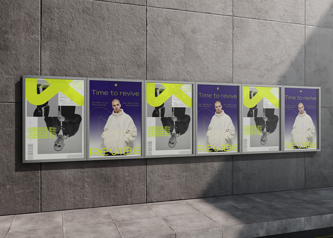
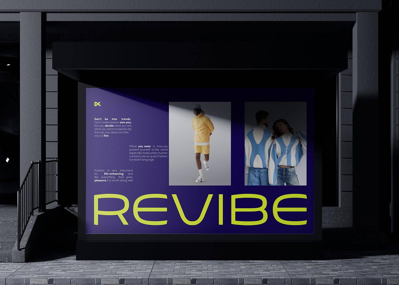
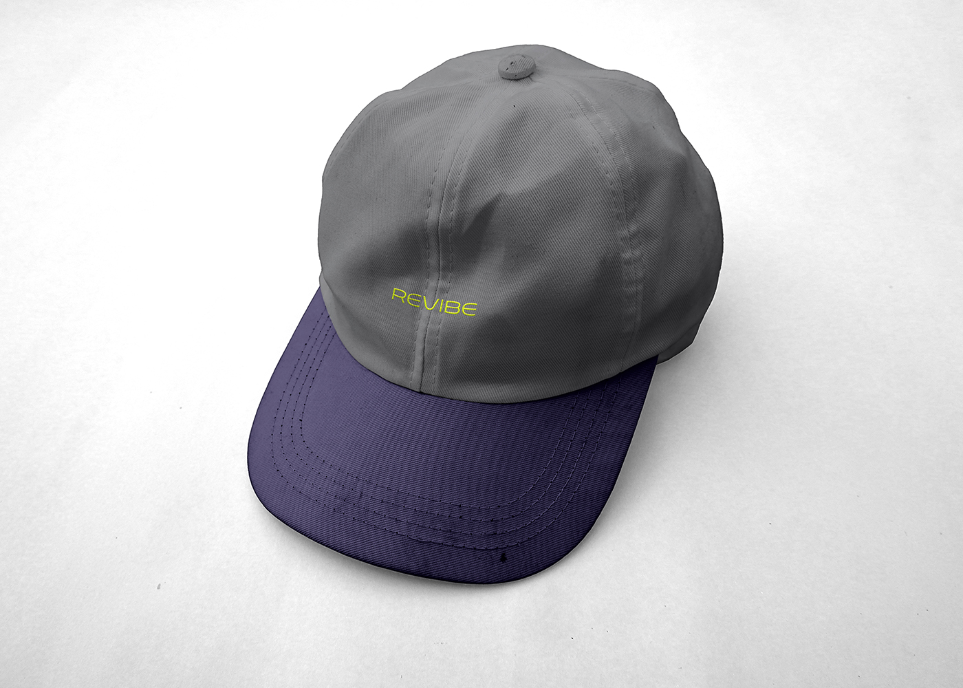
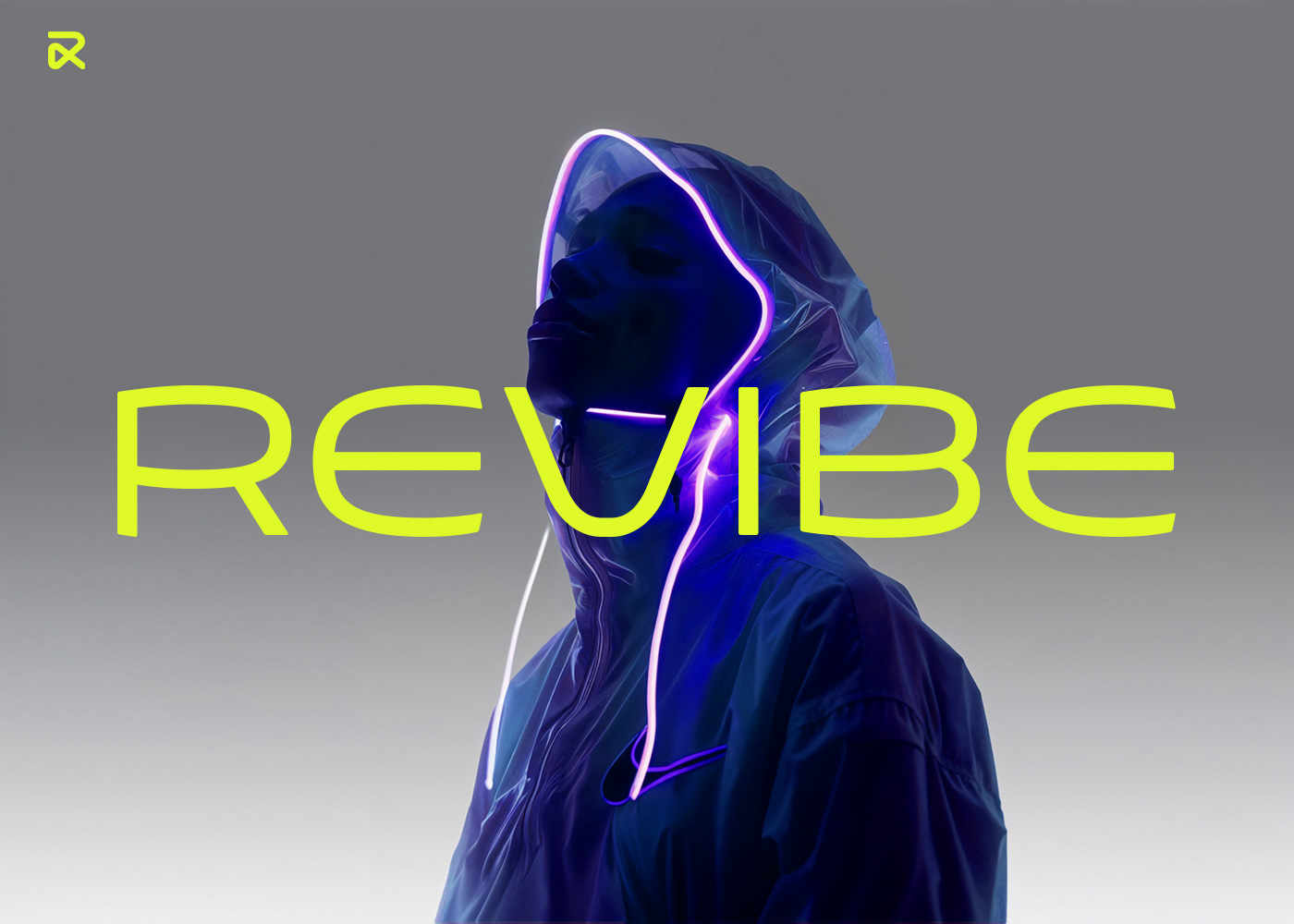
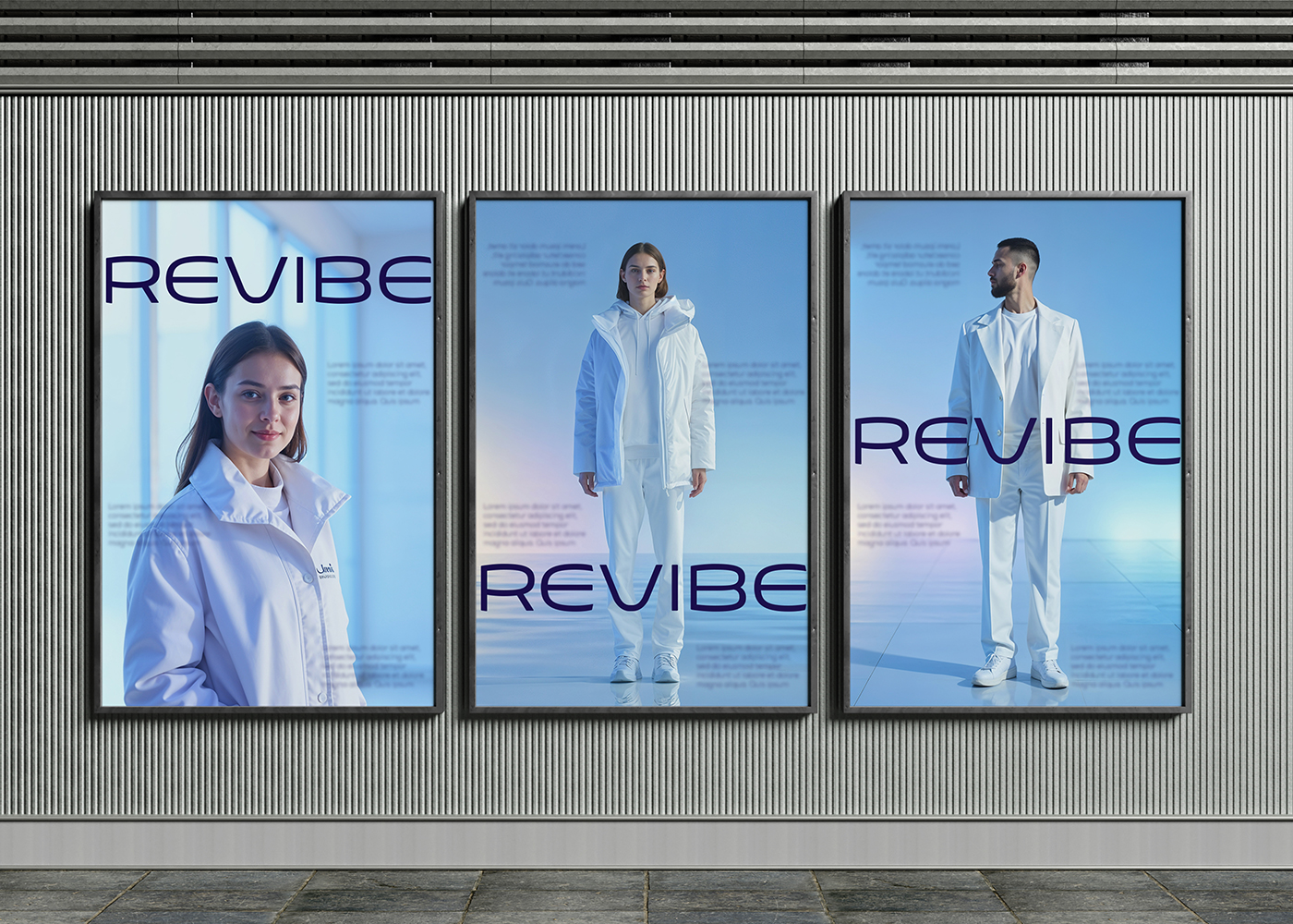
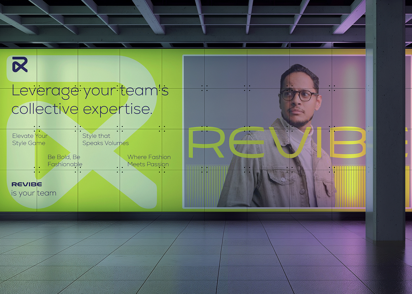
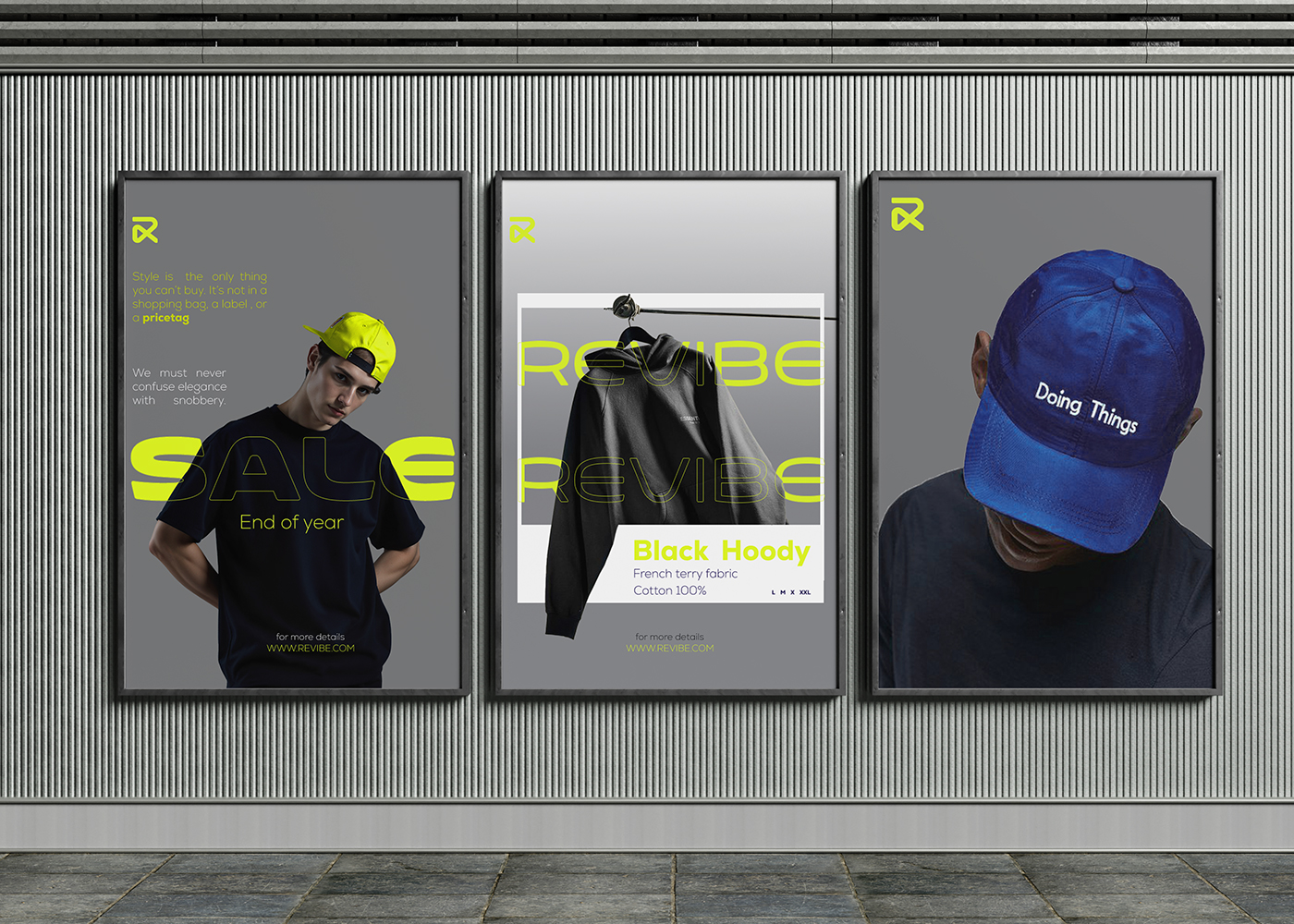
Revibe is a youthful clothing brand aimed at the new generation, featuring the Mark logo and the word “revibe.” The colors should be bold to enhance the brand’s appeal. Considering future competitions, the brand must also be adaptable to include formal clothing options for those who appreciate a more sophisticated style.
Based on my understanding of the client, the logo needs to be simple and versatile to appeal to both target audiences: Gen Z and a formal category. It should effectively represent both groups without being too distant from their preferences, and the colors must be suitable for each audience
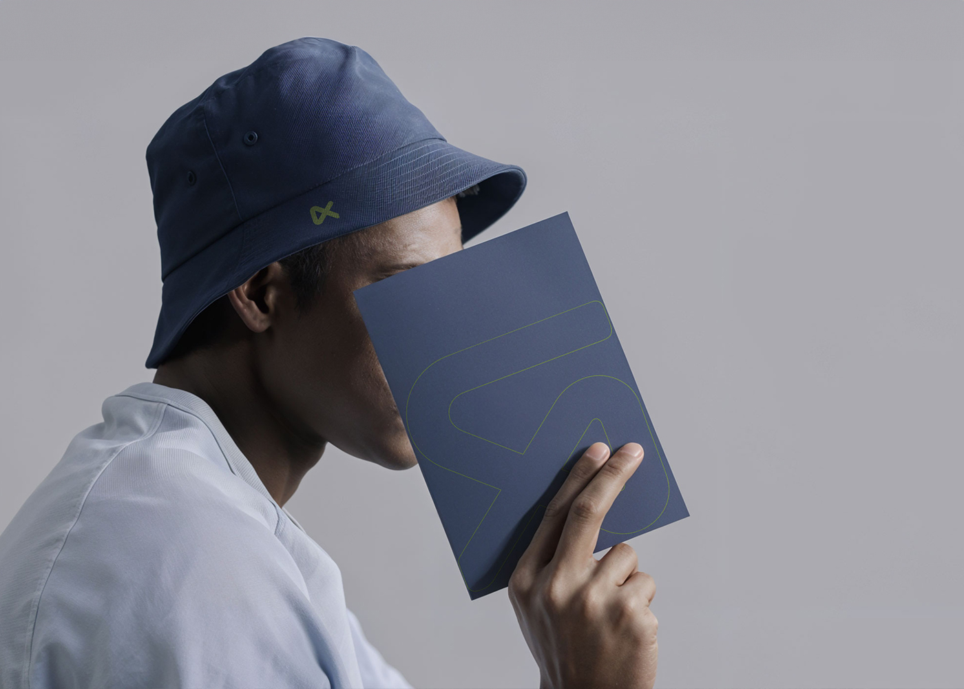
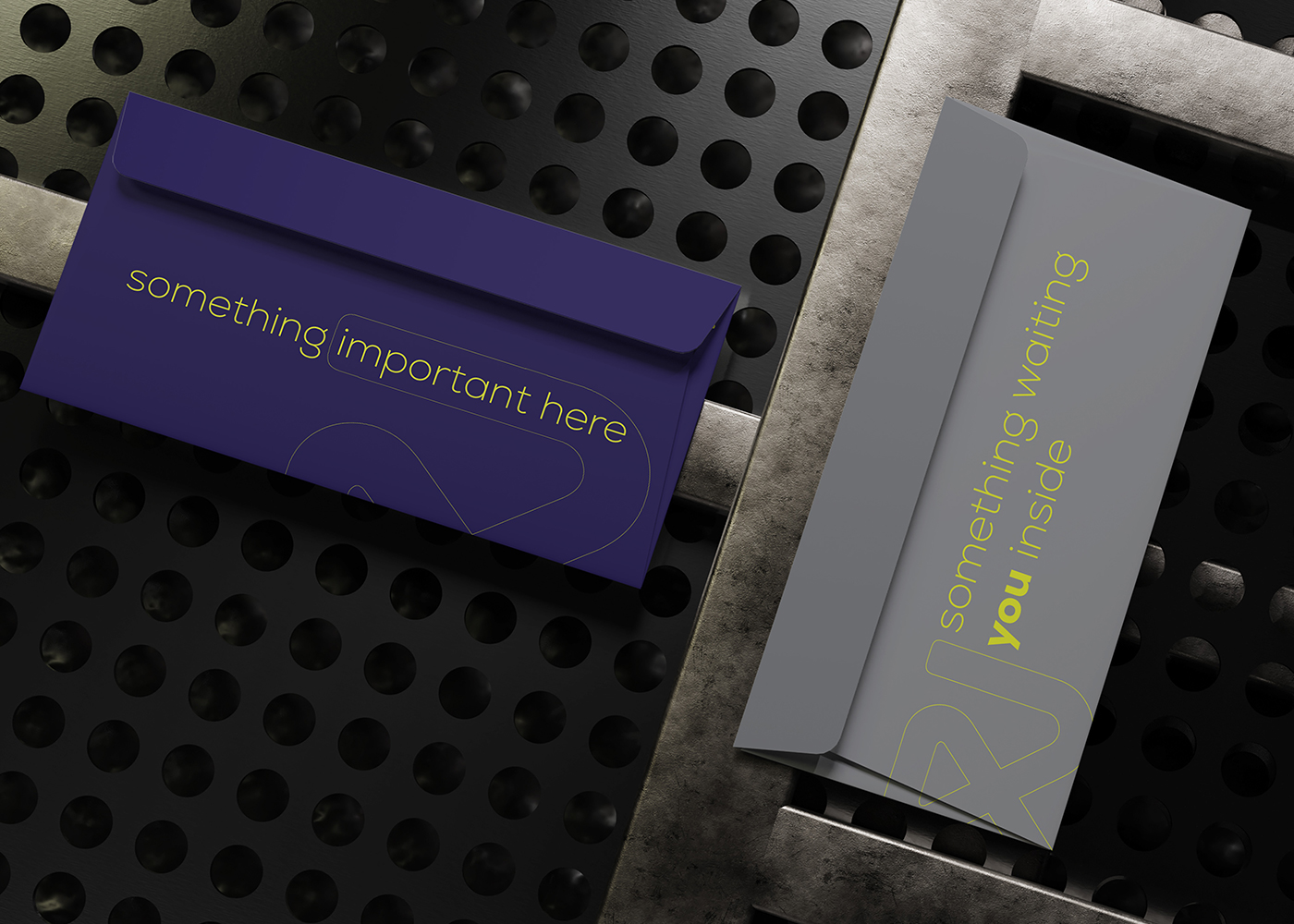
The concept for our logo combines the letters “V” and “B” with an infinity symbol. This design represents continuity, strength, and ongoing modernization. In certain contexts, it also conveys a sense of calm and stability that can be reassuring to our audience..
The brand’s primary goal was to be visually appealing without being off-putting or unusual enough to warrant changing the viewing platform. Thus, selecting colors was crucial.
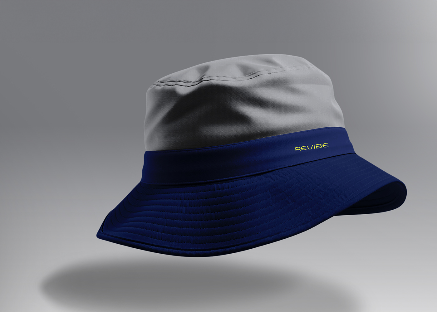
I opted for a calming gray, which conveys tranquility and comfort.
The standout color is yellow, valued for its versatility and compatibility with any brand palette.
The project goes beyond being just a brand. It was a significant challenge for me to create something distinct from the multitude of clothing brands out there, many of which have vibrant colors. My primary goal is to seamlessly and clearly connect the two target groups. I hope you enjoy the brand.
CREDIT
- Agency/Creative: Hossam Mohamed
- Article Title: Revibe Brand Design by Hossam Mohamed Fuses Bold Style with Timeless Appeal
- Organisation/Entity: Freelance
- Project Type: Identity
- Project Status: Published
- Agency/Creative Country: Egypt
- Agency/Creative City: Egypt
- Market Region: Africa, Middle East
- Project Deliverables: Brand Identity
- Industry: Fashion
- Keywords: Branding - clothing - clothes - identity - genz
-
Credits:
Brand designer: Hossam Mohamed


