


How do you rebrand a company that doesn’t need to start over, just catch up with itself?
When Obliant came to us, the challenge wasn’t about building from scratch. The company already had the substance: five verticals, a mature operation, a growing portfolio of mid-to-large enterprise clients navigating complex transformations. What it didn’t have was a brand that reflected any of that. The identity still carried the tone of an earlier chapter, warm and approachable, but structurally undersized for what the company had become. We needed to close that gap and build a brand system with enough weight, clarity, and architecture to sustain long-term growth.
Sun couldn’t carry what came next.
Previously known as Sun Consultech, the company had already outgrown its original name. It didn’t scale across verticals, didn’t hold institutional weight, and didn’t sound like a system. On top of that, it carried unresolved trademark and registration issues, making a clean break not just strategic, but necessary. The naming process was driven by a clear set of criteria: the new name had to feel solid and established without sounding dated, carry structural authority without rigidity, and adapt across a multi-vertical architecture. Obliant was the answer. A name with direction, discipline, and gravity, built to expand alongside the business, not behind it.
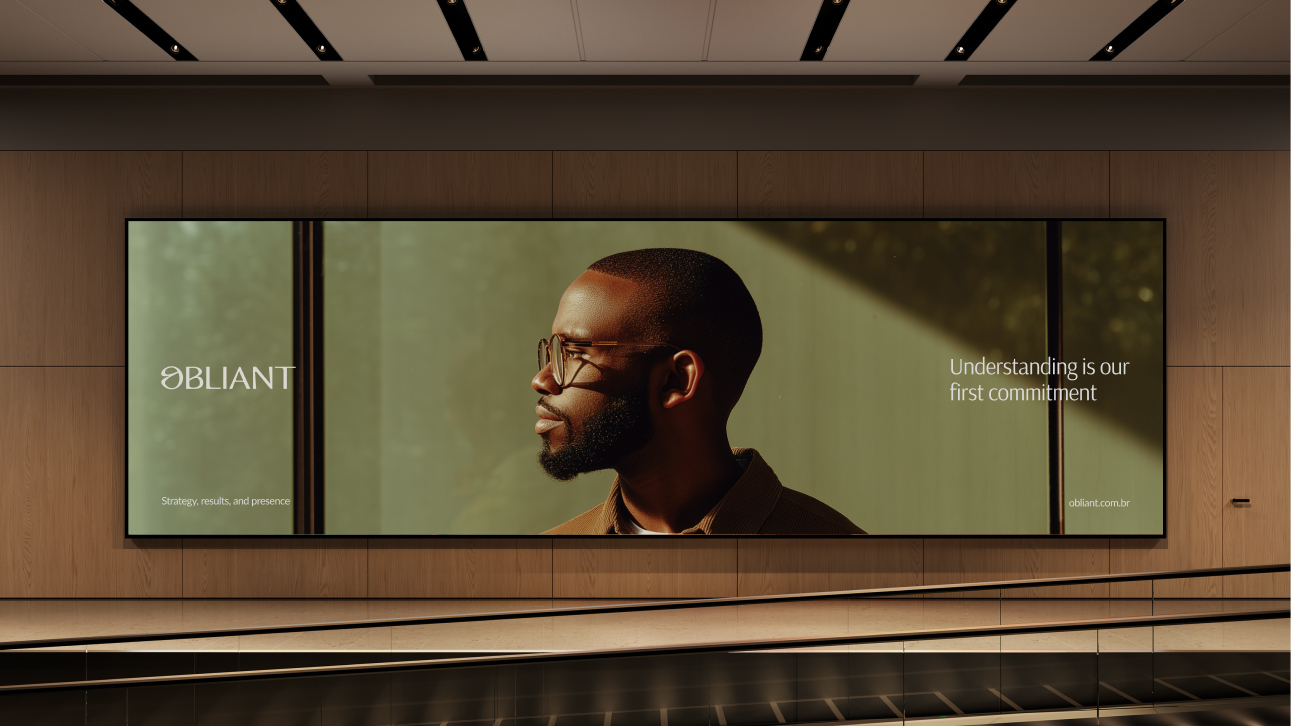
In a market full of noise, we built a voice that earns attention through precision.
The diagnosis revealed a clear disconnect: the company delivered highly structured, sophisticated solutions, but its communication lacked hierarchy, focus, and strategic clarity. We rebuilt the positioning around robustness, governance, and organizational maturity. The messaging framework was designed to sharpen the value proposition, strengthen perceived authority, and cut through the overcomplexity that plagues the consulting market. The verbal identity found its tone: confident, intentional, and grounded in the way the company actually operates. Obliant stopped talking about isolated services and started communicating an integrated vision of transformation and long-term partnership.
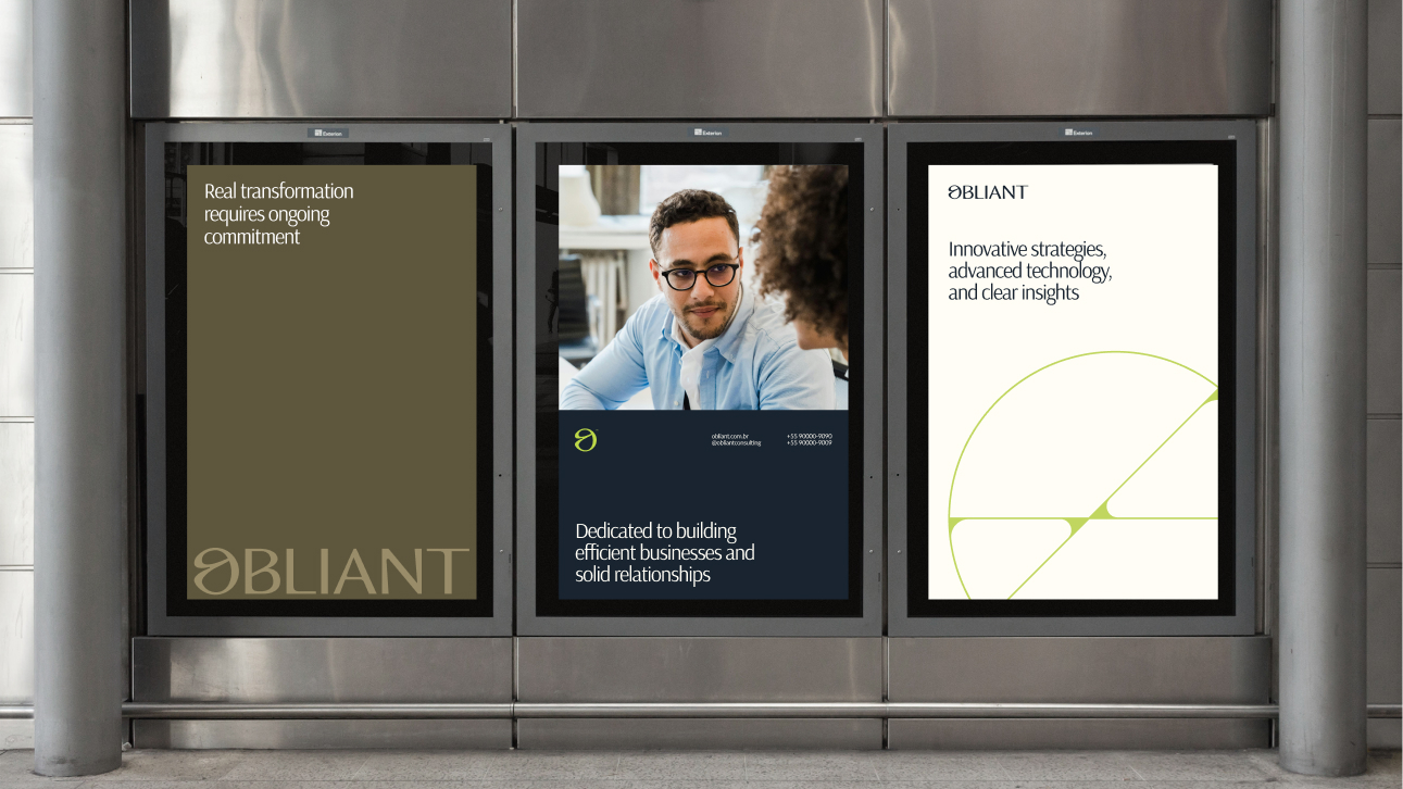
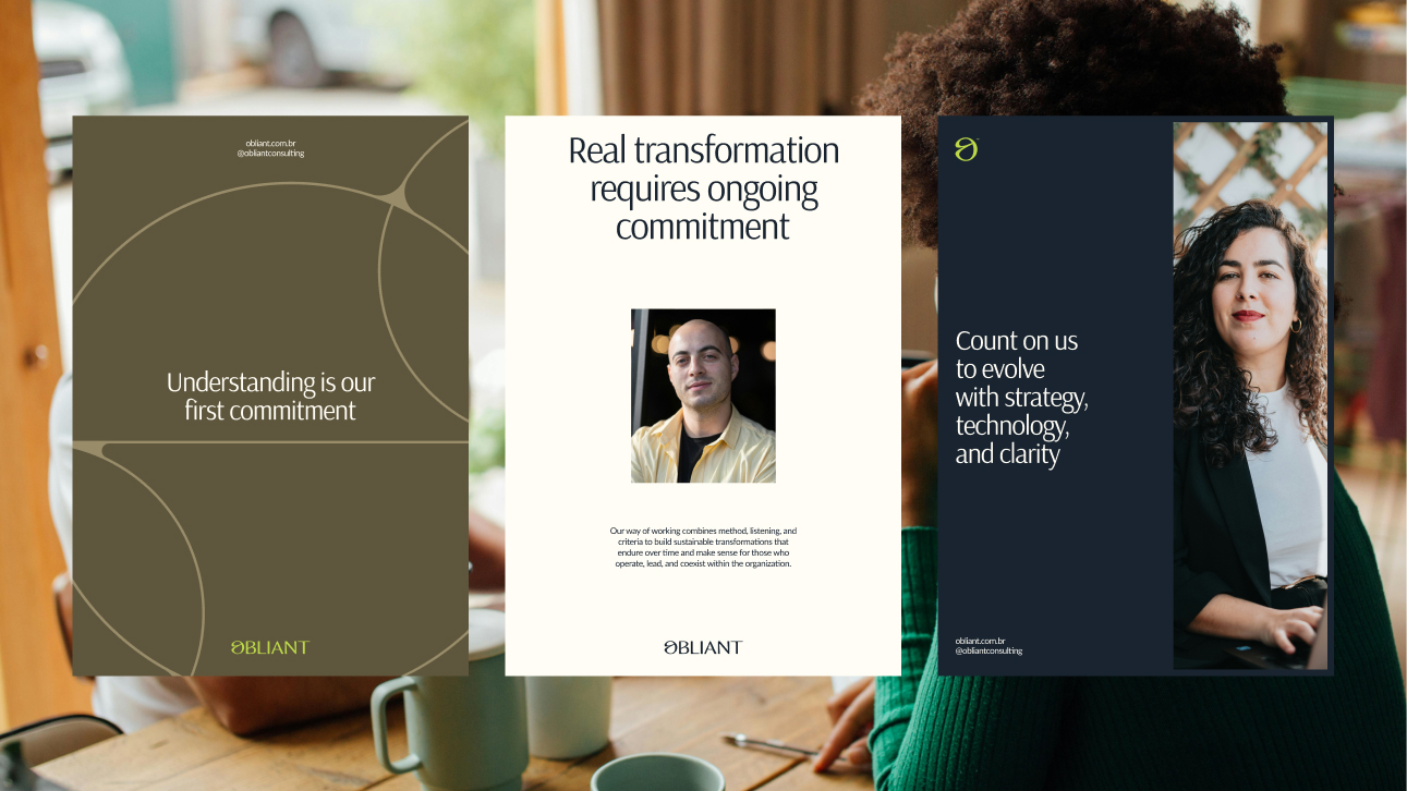
Mature without being rigid. Confident without excess.
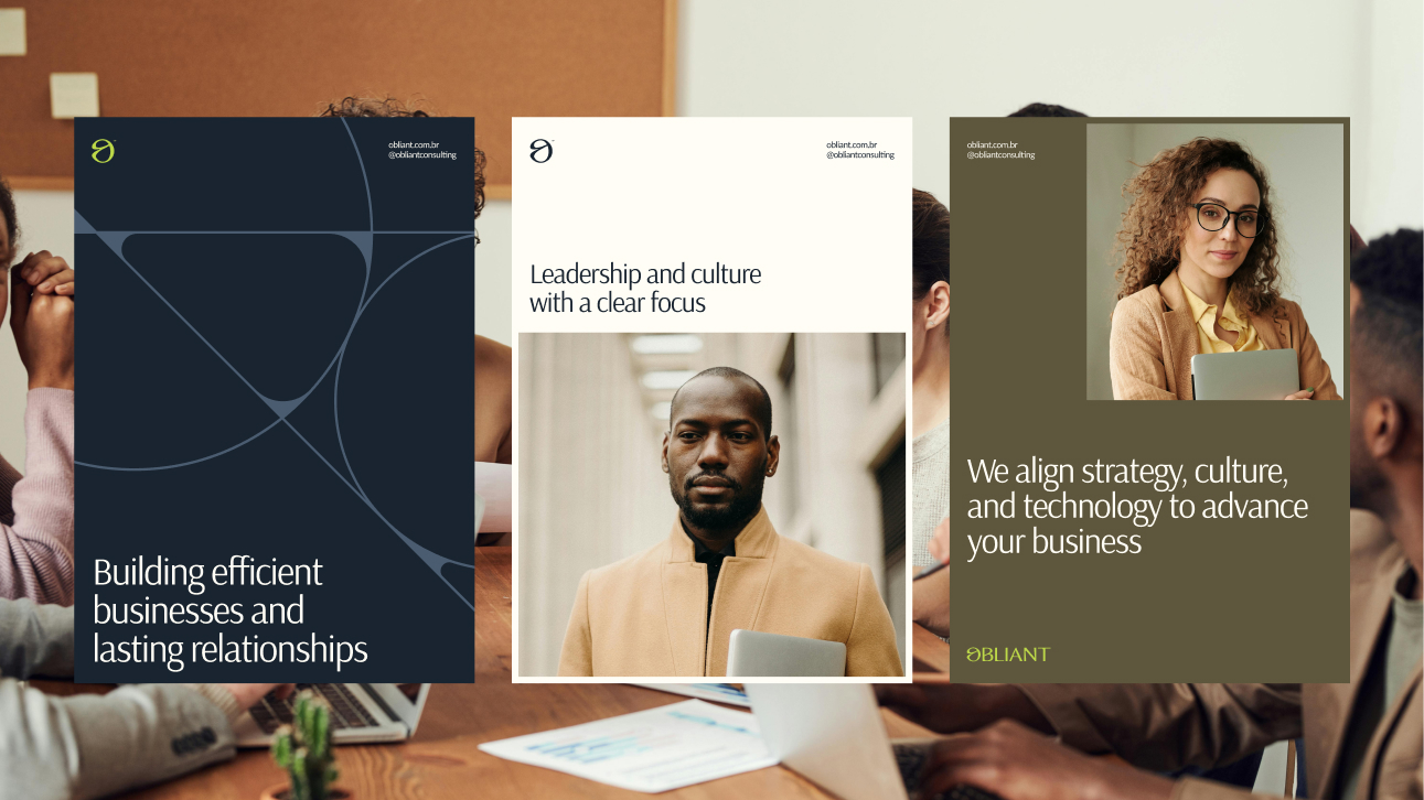
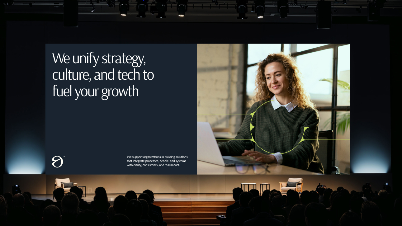
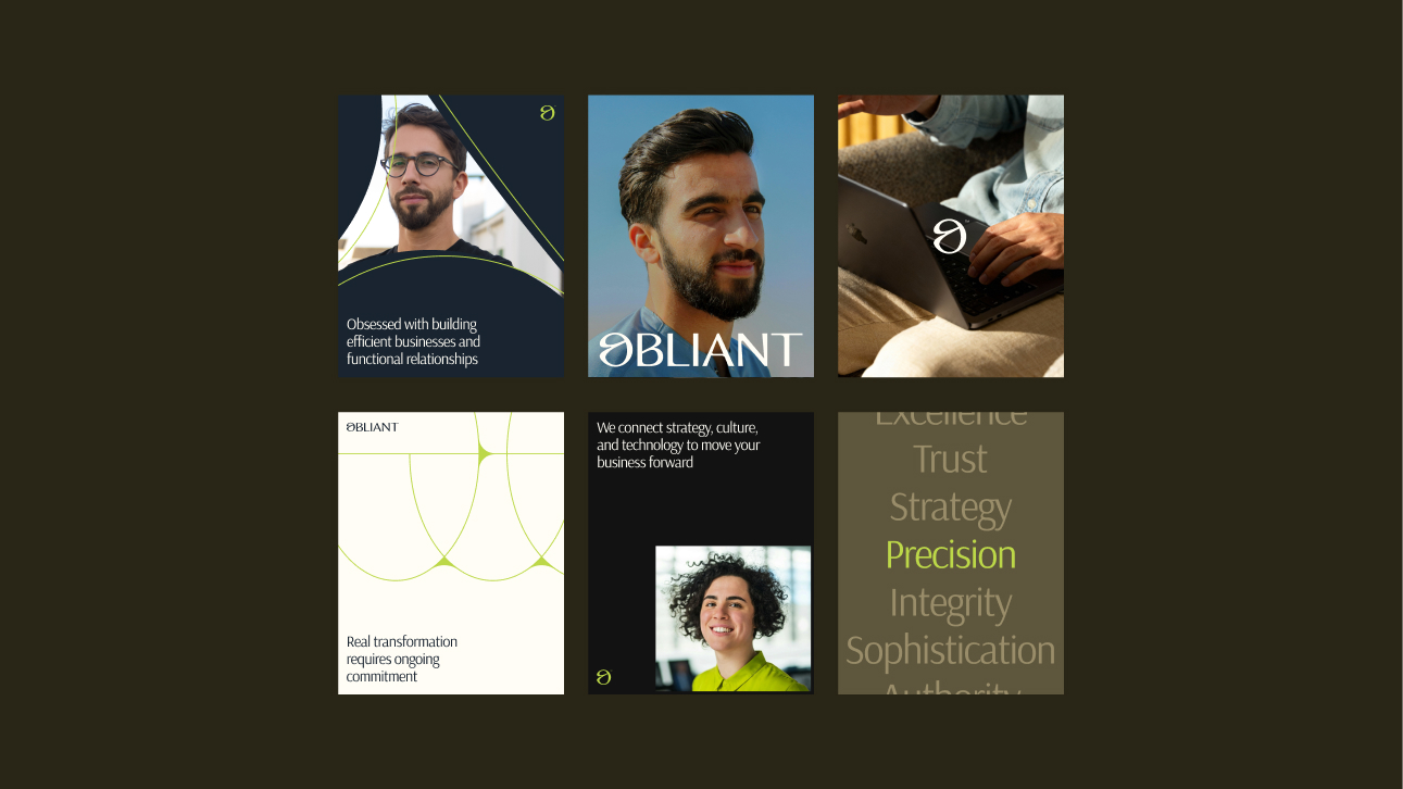
The visual identity was designed to express structural intelligence. Typographic hierarchy, a controlled color palette, modular layouts that reinforce clarity and institutional presence. The goal was precision, not decoration. Spacing, grid systems, and compositional balance were carefully calibrated to eliminate fragmentation and elevate the brand’s authority across every format, from strategic presentations to digital interfaces.
Five verticals. One system. Zero confusion.
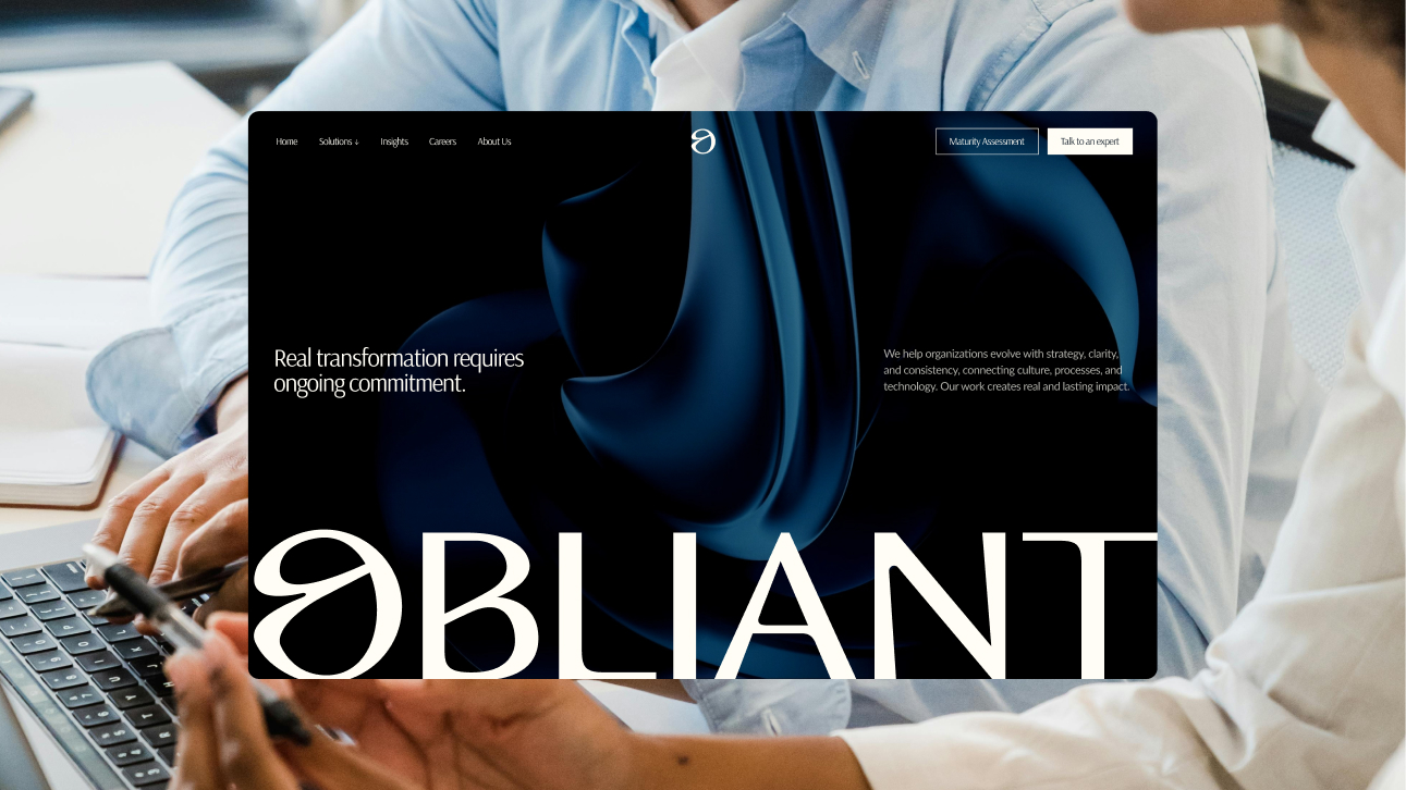
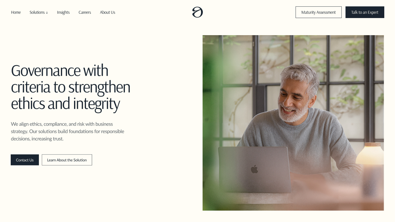
The website became the most tangible expression of this transformation. The previous structure had weak hierarchy, visual inconsistency, and limited conversion logic. We rebuilt it from the architecture level: clear sitemap, defined service verticals, stronger hero positioning, improved content hierarchy, and a modular system built for scalability. The experience is now cleaner, more intuitive, and fully aligned with the brand’s positioning. It guides the visitor, communicates with structure, and gets out of the way.
CREDIT
- Agency/Creative: Revelatio Studio
- Article Title: Revelatio Studio Repositions Obliant with a Brand Identity Built for Structural Clarity and Growth
- Organisation/Entity: Agency
- Project Type: Identity
- Project Status: Published
- Agency/Creative Country: Brazil
- Agency/Creative City: Recife
- Market Region: Europe, Middle East, North America, South America
- Project Deliverables: Brand Creation, Brand Design, Brand Guidelines, Brand Identity, Brand Naming, Brand Strategy, Brand Tone of Voice, Branding, Design, Graphic Design, Identity System, Motion Graphics, User Experience, Web Design
- Industry: Technology
- Keywords: Consultancy, Business, Technology
-
Credits:
Account Lead & Creative Direction: Arthur Galvão
Research & Strategy: Arthur Galvão, Kaê Leone
Positioning & Messaging: Arthur Galvão, Kaê Leone
Brand Design: Arthur Galvão, Kaê Leone
Web Design: Arthur Galvão, Caio Rossatto
Web Development: Ícaro de Souza, Lucas Lavor
Motion Graphics: Rafael Abranches
Case Study: Arthur Galvão


