Immersy is an English school that offers delivery-format classes, where teachers visit students at their homes, either individually or in groups. Beyond teaching English, Immersy fosters personal and intellectual growth by stimulating curiosity and developing essential skills. Learning English with Immersy means opening up to a world of new experiences and opportunities.
Brand Positioning: The first step was to build the brand strategy and define market positioning. As Giovanna transitioned from freelance work to founding Immersy, she needed a robust strategy to establish her new identity. Through various workshops, we co-created the fundamental elements for the Immersy brand, including the golden circle, functional and emotional benefits, brand personality and archetype, target audiences, and tone of voice. With these elements defined, we structured a clear communication strategy to ensure Immersy positioned itself distinctly and consistently in the market.
Brand Naming: The main creative guide for the brand name was the school’s teaching approach. Recognizing that true language mastery comes from genuine immersion rather than rote memorization, we aimed to capture the full sensory experience of learning a language. Learning at Immersy is a journey of immersive discovery. From the word “immersion,” we simplified the term to create a friendly and memorable name. The “y” ending symbolizes youthfulness, modernity, and approachability, making the brand more inviting. Thus, Immersy was born, encapsulating our vision of teaching as a deep and transformative experience. We want our students to experience English authentically and meaningfully, perfectly reflecting our innovative and immersive teaching philosophy.
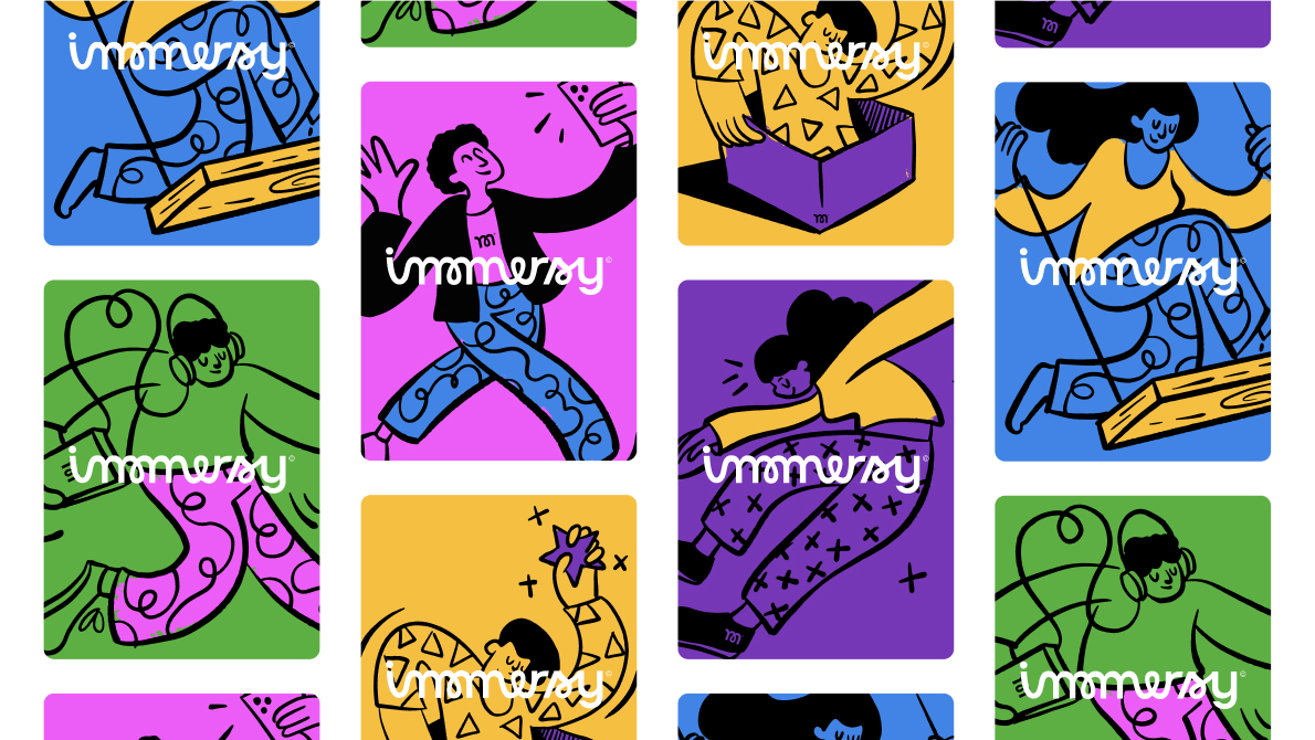
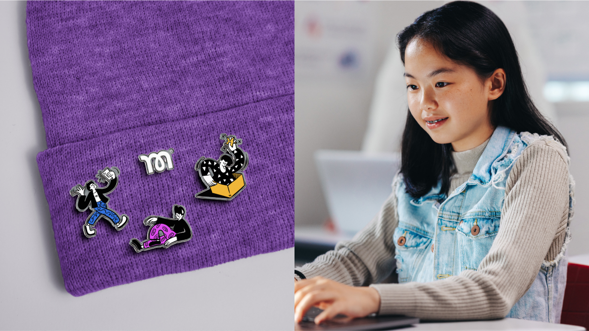
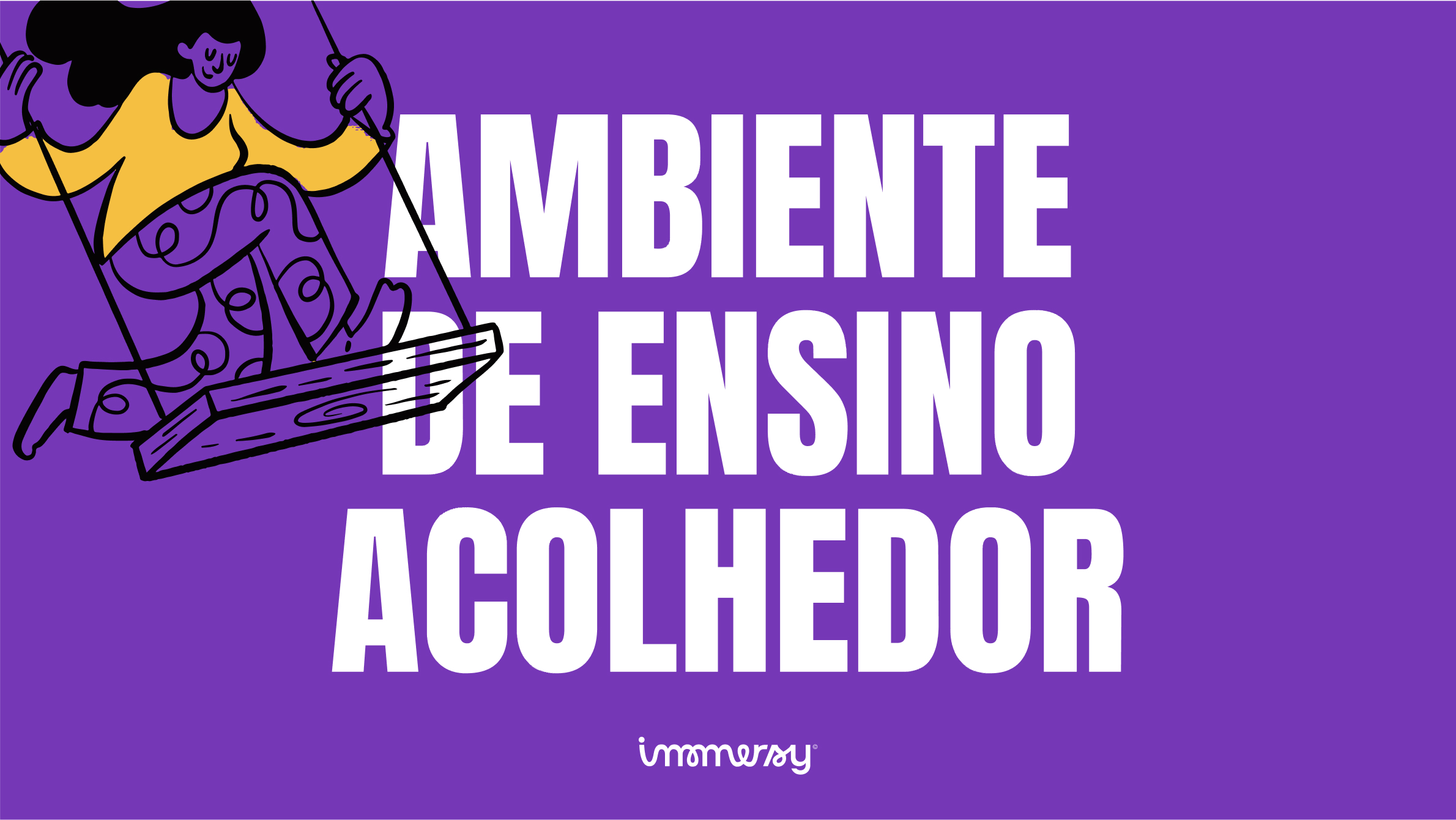
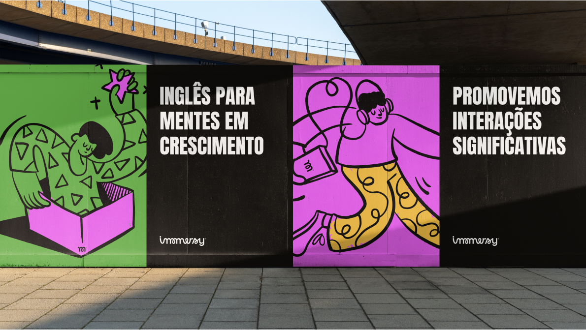
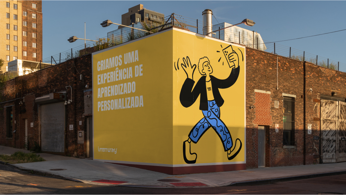
Visual Expression: For the visual identity, we focused on creating a typogram to emphasize and strengthen our name. We built a custom typography that reflects the friendliness, dynamism, and innovation of our teaching approach, ensuring fluid and consistent representation. The symbol features a distinctive “m,” characterized by its curves and fluidity, reinforcing Immersy’s unique identity. Our color palette includes vibrant, youthful colors that convey fun and innovation, reflecting the engaging atmosphere we aim to provide. For typography, we chose Anton for impactful headlines and Plus Jakarta Sans for readable body text, complementing the visual identity. The final touch was a set of illustrations that enhance visual communication, adding personality and life to the brand, and helping to tell Immersy’s story in a captivating way.



CREDIT
- Agency/Creative: Revelatio Studio
- Article Title: Revelatio Studio Develops Immersy’s Brand Identity and Visuals for English School Immersy
- Organisation/Entity: Agency
- Project Type: Identity
- Project Status: Published
- Agency/Creative Country: Brazil
- Agency/Creative City: Recife, Pernambuco
- Market Region: South America
- Project Deliverables: Animation, Art Direction, Brand Creation, Brand Design, Brand Guidelines, Brand Identity, Brand Mark, Brand Naming, Brand Strategy, Branding, Graphic Design, Identity System, Illustration, Motion Graphics, Type Design
- Industry: Education
- Keywords: Education, English School, Funny, Digital, Young, Colorful
-
Credits:
Creative Direction: Arthur Galvão
Research, Strategy & Verbal Identity: Arthur Galvão
Brand Naming: Arthur Galvão & Mateus Ritter
Brand Design: Arthur Galvão & Thiago Ildefonso
Illustrations: Pablo Stanley & Luana Miotelli
Motion Graphics: Klayton Fadul
Case Study Finalist: Xico Libório


