


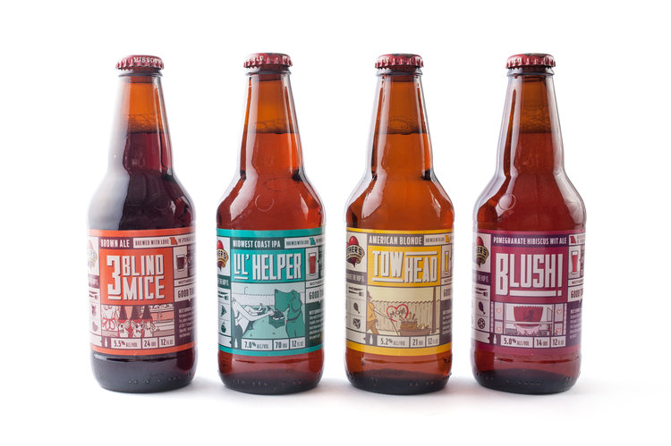

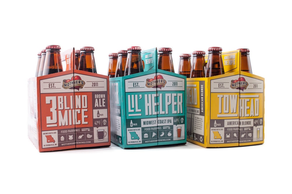
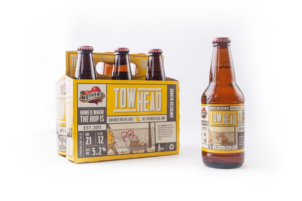
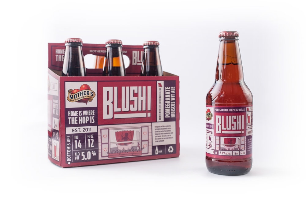
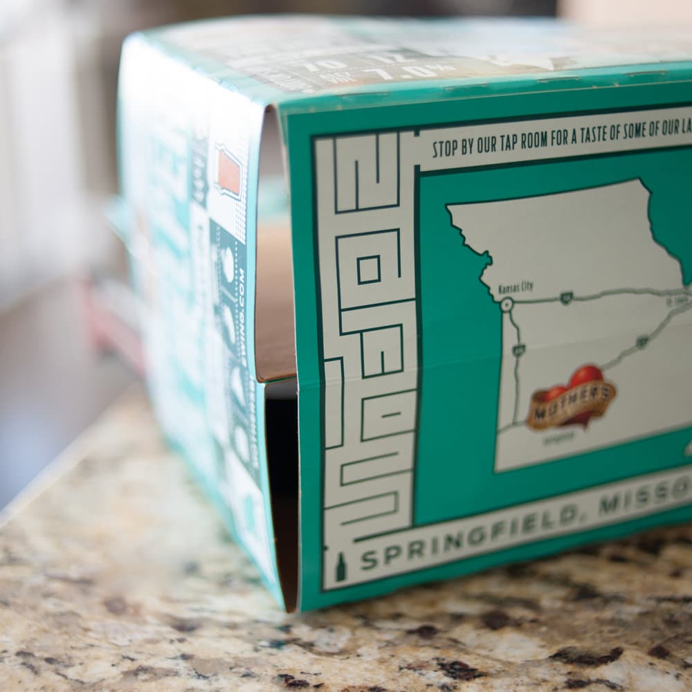
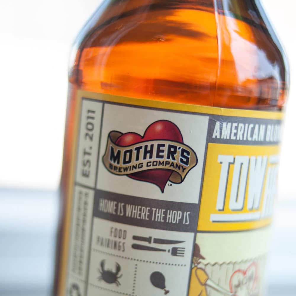
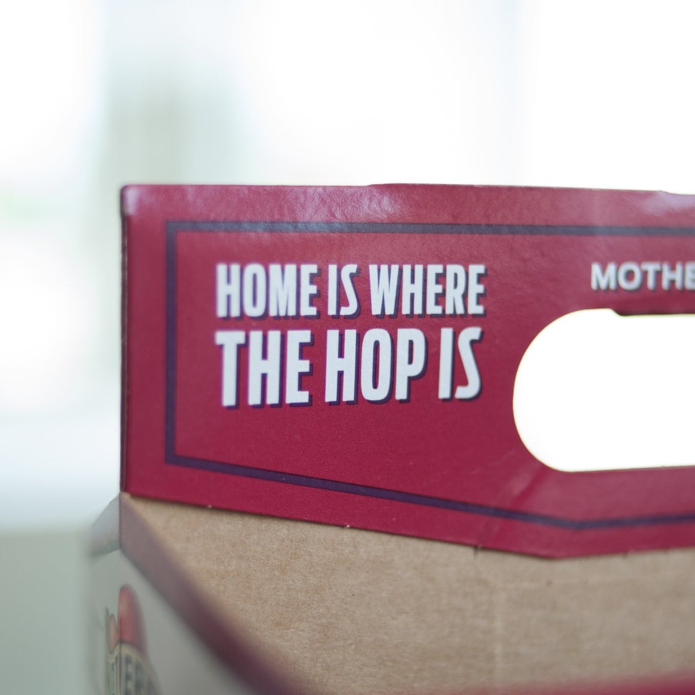
” Mother’s Brewing Company is known throughout Springfield for their eccentric personality and great beer. So when we received the proposal request to help them refresh their labels and packaging, we knew that our team of Revelers was just weird enough to step up and accept the challenge.In order to be able to design a whole new packaging system for a company, especially a company as beloved as Mother’s, we had to get to know who they are, at their core. Mother’s gave us this statement that perfectly sums up who they are.”We are playful, fun, clever, quirky people who are serious about the business of beer. We strive to bring others together to share our passion for an authentic experience with quality beer.”Keeping that in mind, we kissed the old labels goodbye and began the process of uncovering a new look for their three flagship beers Lil’ Helper, TowHead, Three Blind Mice, and their new seasonal brew, Blush!”
“Revel Creative Director, Chris Jarratt, told Mother’s Owner, Jeff Schrag, “I feel like the fate of Springfield’s unofficial mascot is in our hands, and that we take this responsibility very seriously.” And we meant it.Our first step was defining the direction. Our design team spent countless hours and late nights researching the brand, the industry and then concepting ideas that could be potential avenues to venture down.Seeing the potential in multiple directions, this provided the toughest decision for Mother’s as they were choosing THE concept that would represent their entire brand moving forward.”
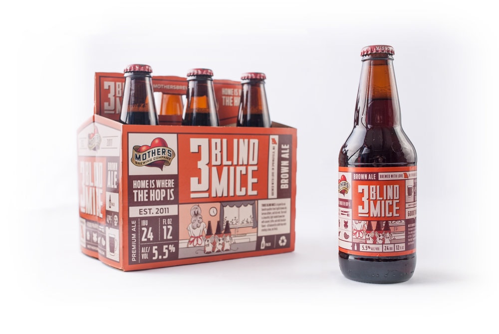
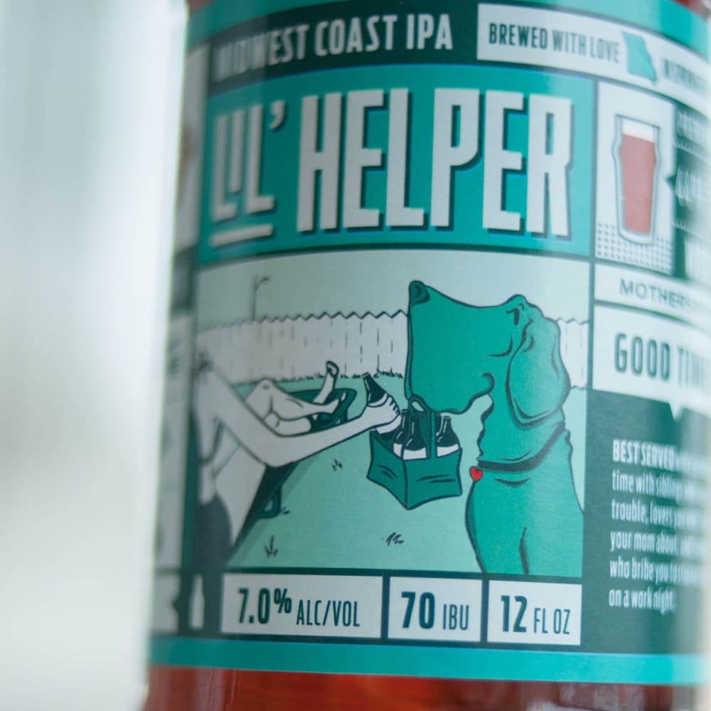
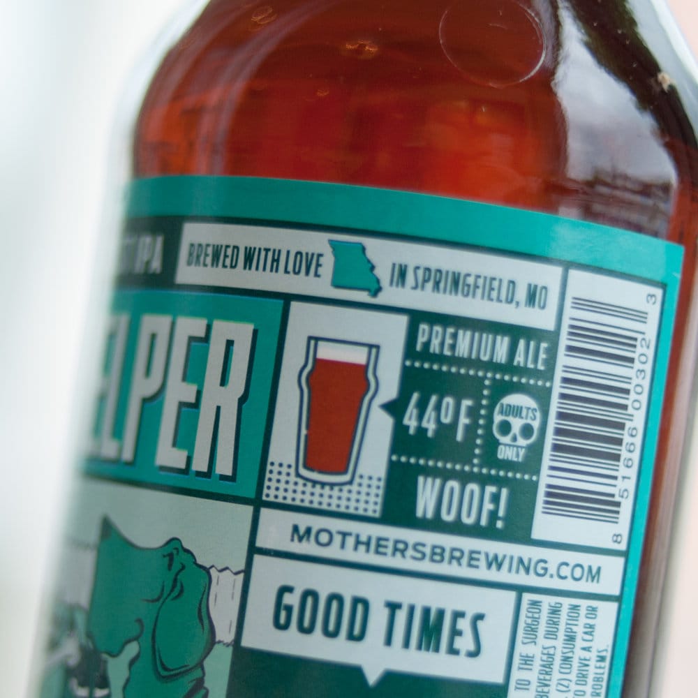
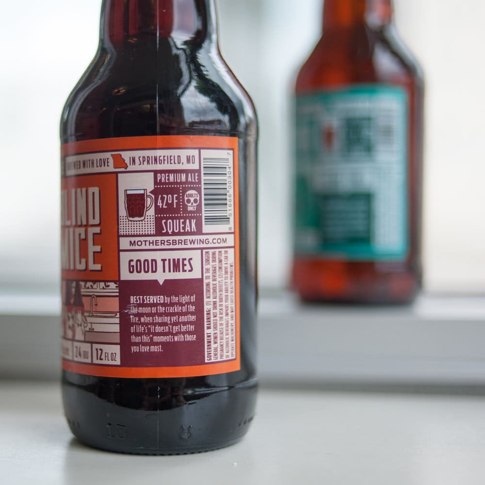
“The final answer was our Grid concept.Defining the grid itself was a very intricate process. Mother’s always made it clear that they were flavor driven, not style driven, they love their community and that each beer provided a story worthy to be told. We used all of these ideas to inspire concepts for the new structure of the grid.Revel designer, Michael Peacock, worked diligently on the grid concept. He said, “What originally drew me to the grid concept was its versatility. We were looking at so many elements that we wanted to fit into the labels and needed a way to organize that content without it becoming overwhelming. Every day working on these was like looking at a puzzle, knowing what components needed to go together, and trying to figure out how to best place them in a way that was adaptable across each beer.””
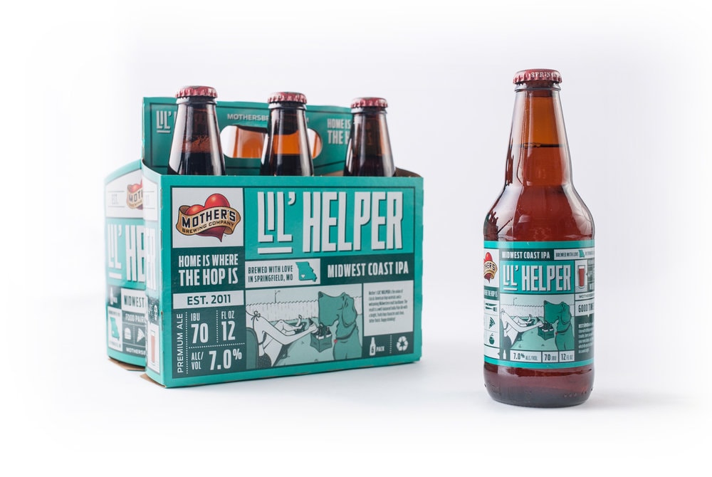
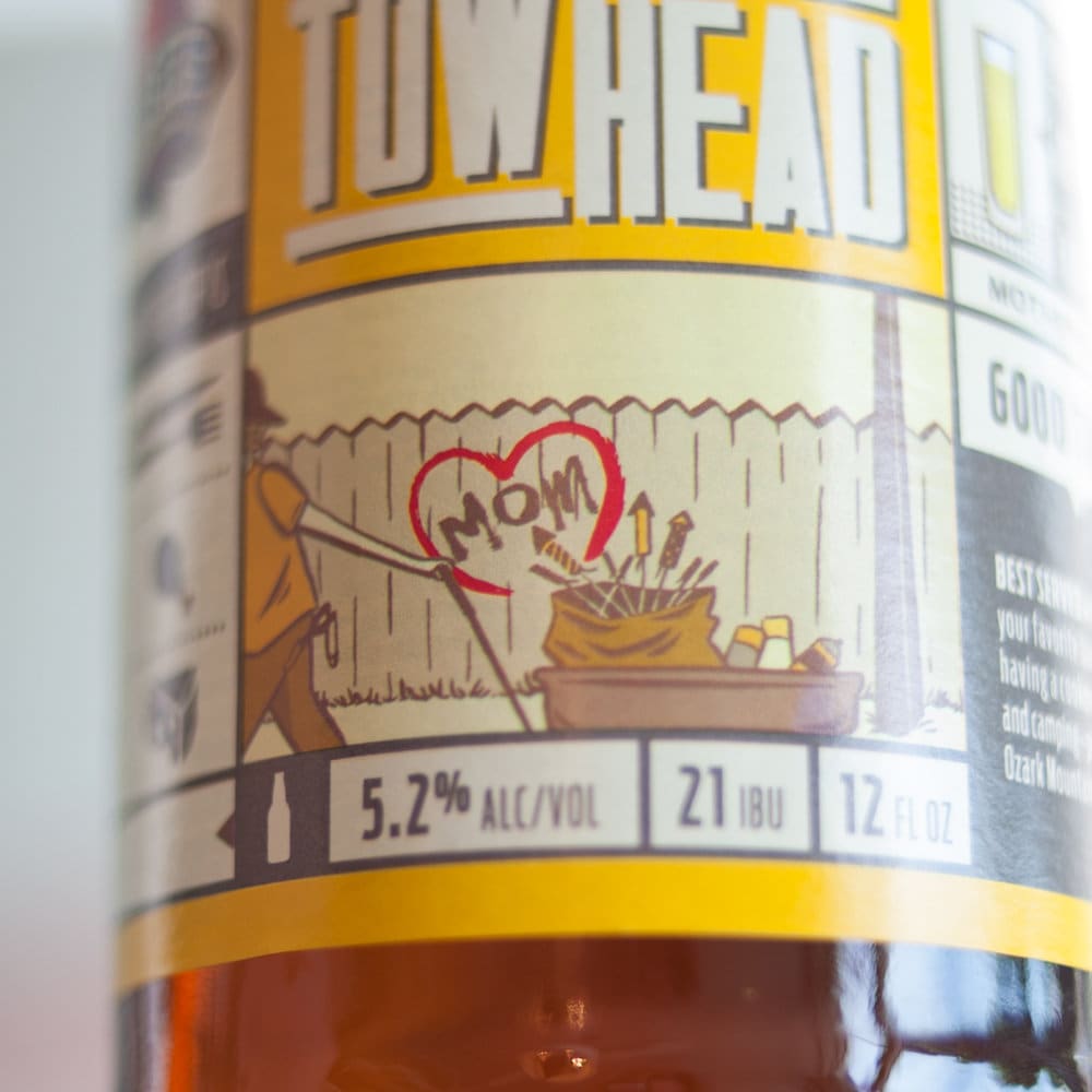
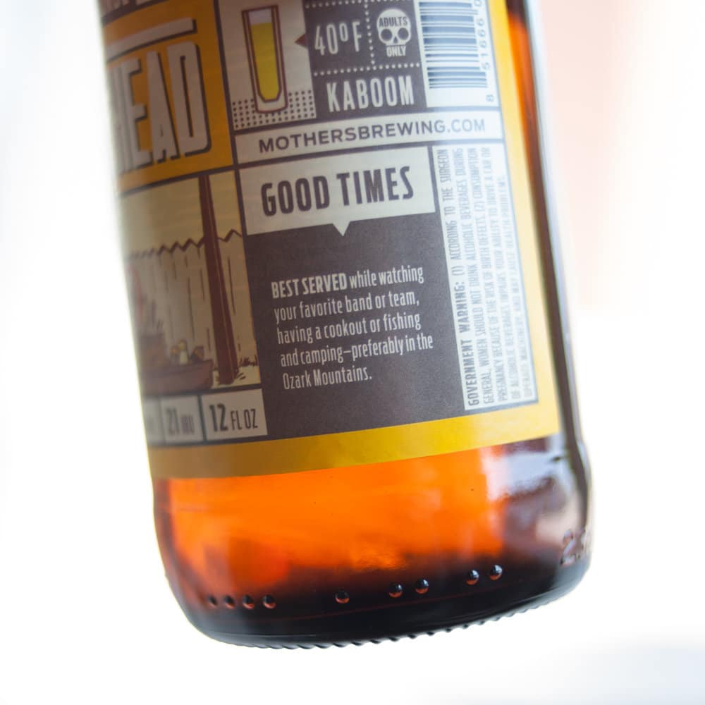
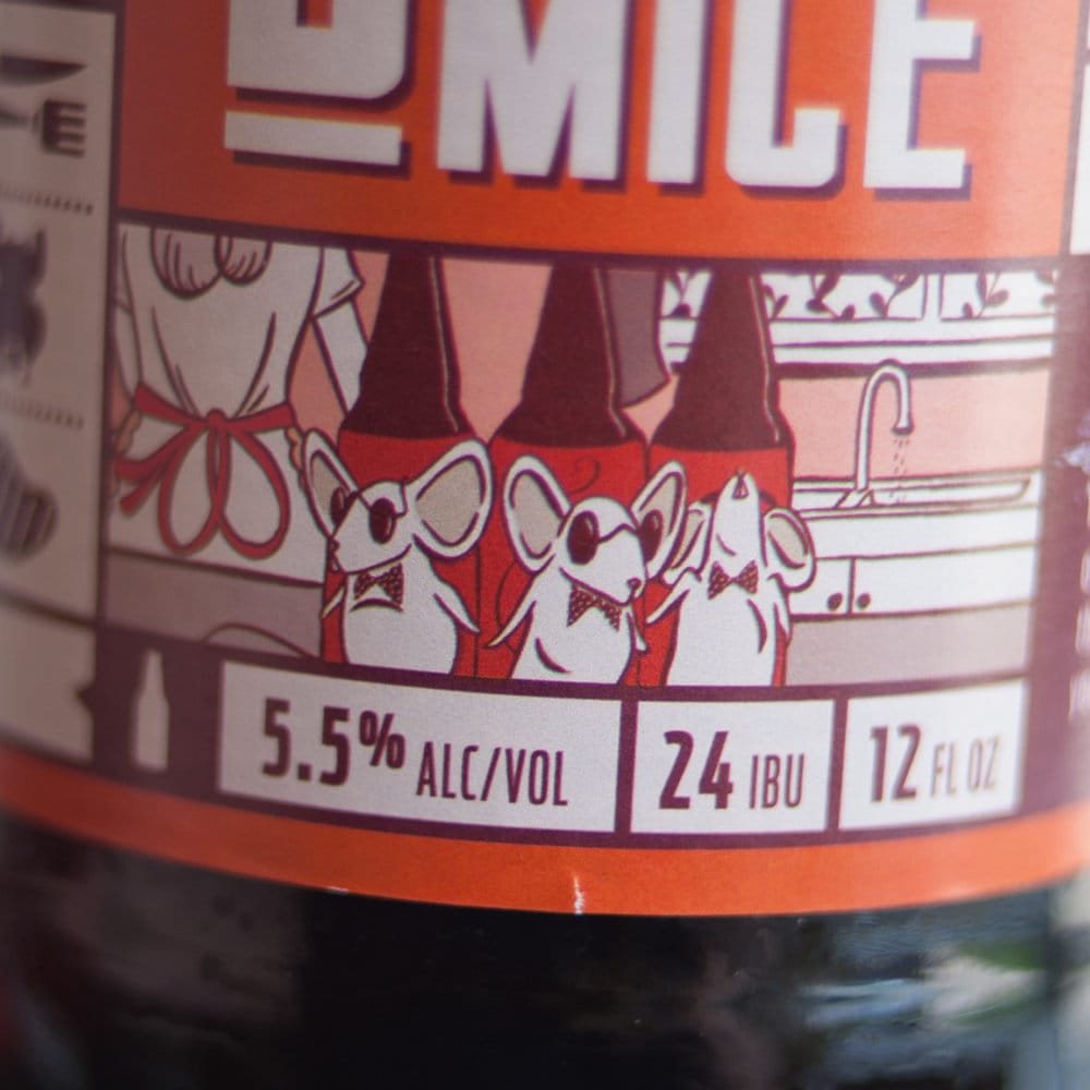
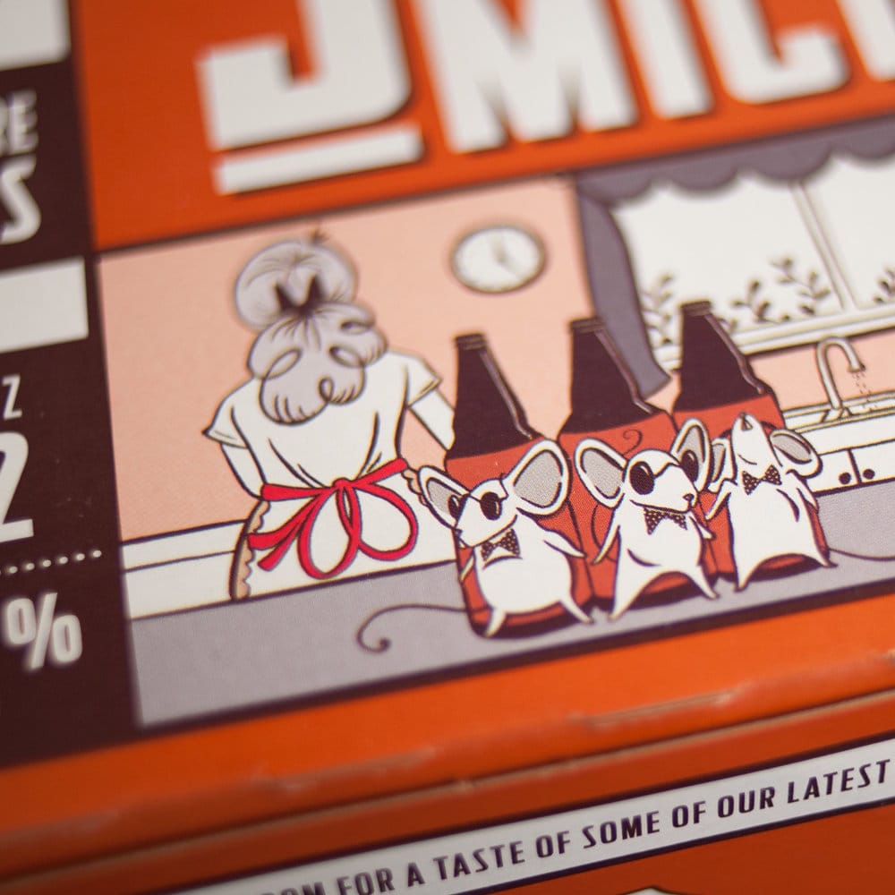
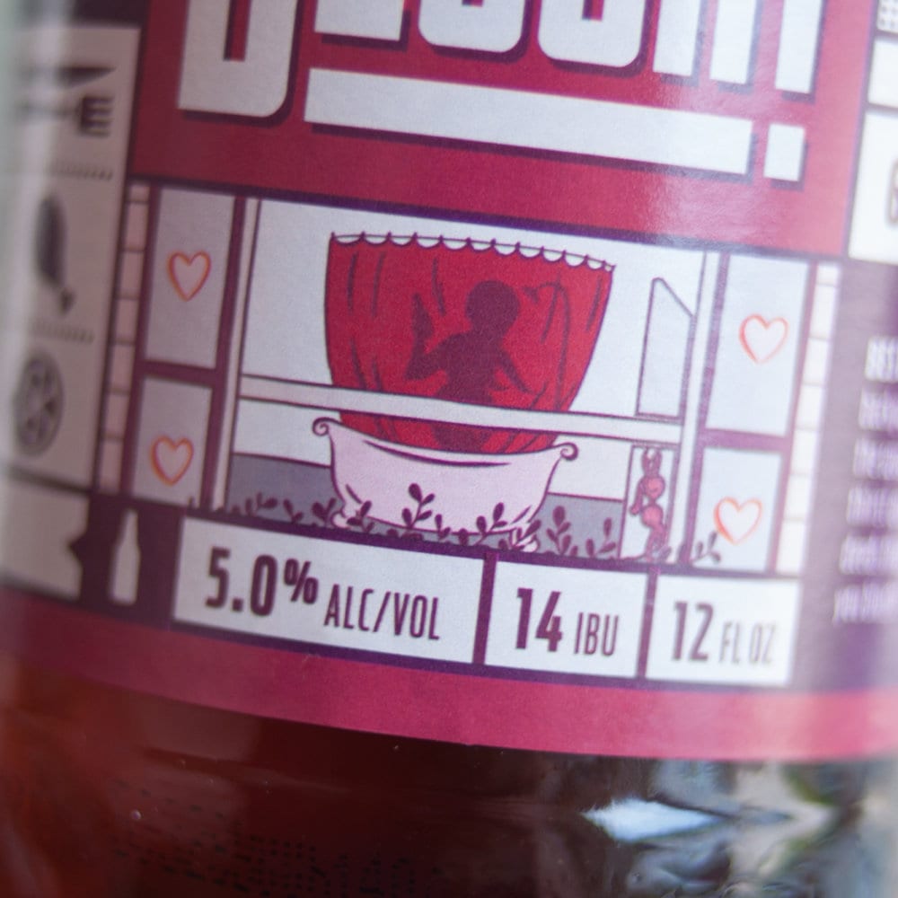
“The purpose behind the grid concept was to tell the whole story behind the beer. From the flavors it included to how it can be best enjoyed, the consumer would be able to divulge that information from the labels and packaging. But we were missing the main focal point of the label. The key to this concept was going to be the illustrated story that tied everything together. This is where we brought inspiration from a previous concept. Knowing Mother’s commitment to the community, we began working with local artist, Kendra Miller to develop unique illustrations for each of the four beers.We needed a quirkier, more organic illustration style to balance out the structure of the grid. Kendra was the perfect illustrator for the look we had in mind. For each label, Revel’s Senior Art Director, Amanda Day, met with Kendra to give her a general direction of what we were thinking of. Then, through many late night chats, brainstorming sessions and meetings with our team, Kendra turned our vision to life, adding in a fresh perspective and unique style that complimented the design and Mother’s personality perfectly.Every image, every color and every word was intentional and thought through. So the next time you grab a Mother’s beer, sit back, relax and take it all in knowing the label was designed, the illustrations were drawn and the beer was brewed with love, in Springfield, Missouri.”
CREDIT
- Agency/Creative: Revel Advertising
- Article Title: Revel Advertising – Mother’s Brewing Company
- Project Type: Packaging
- Substrate: Glass, Pulp Paper


