


Introduction:
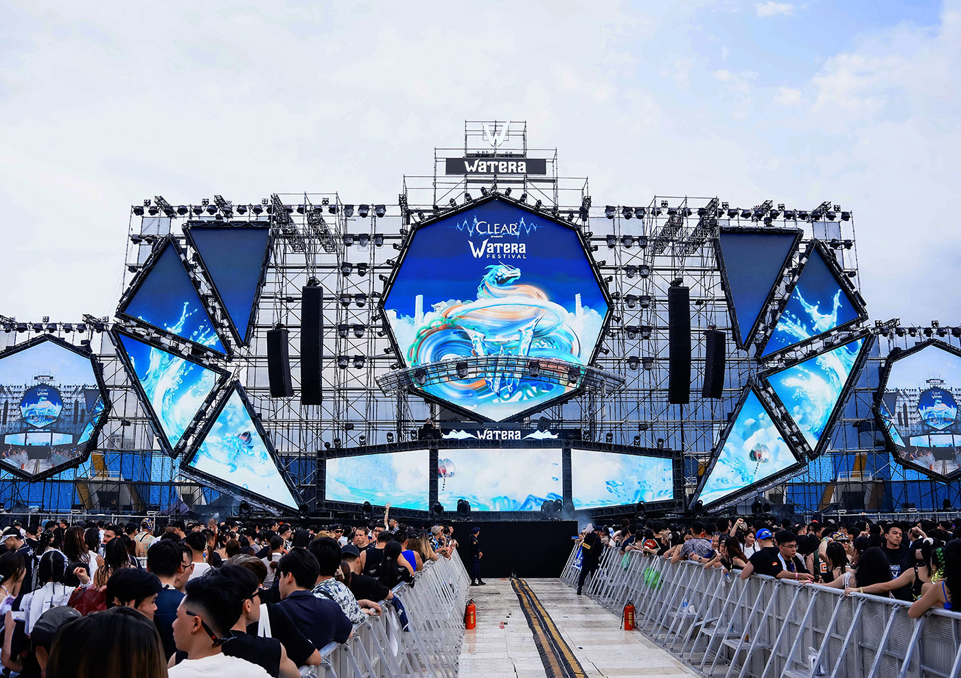
Watera Festival is Vietnam No.1 Water Music Festival, Watera Festival by Ravolution Asia will be held in Hanoi – Vietnam, at My Dinh National Stadium for the first time this summer. The second chapter – the Guardian, will bring out the WET! WILD! WOW! energy and ensuring that you enjoy the biggest and the finest water fights you could ever imagine.
Logo:
Currently, the Watera logo is not consistent across different versions, and its responsive capability is limited due to the complex structure of the typography. The logo system lacks standardized consistency. The design trend for both the brand and the global market is moving towards a simple style, using custom-designed typography to convey design content in a bold, clear, and impactful manner.
Therefore, it is essential to establish a standardized and consistent brand identity system, from the logo to elements such as typography, colors, illustrations, and standard layouts, for a brand aiming for international reach like Watera Festival.
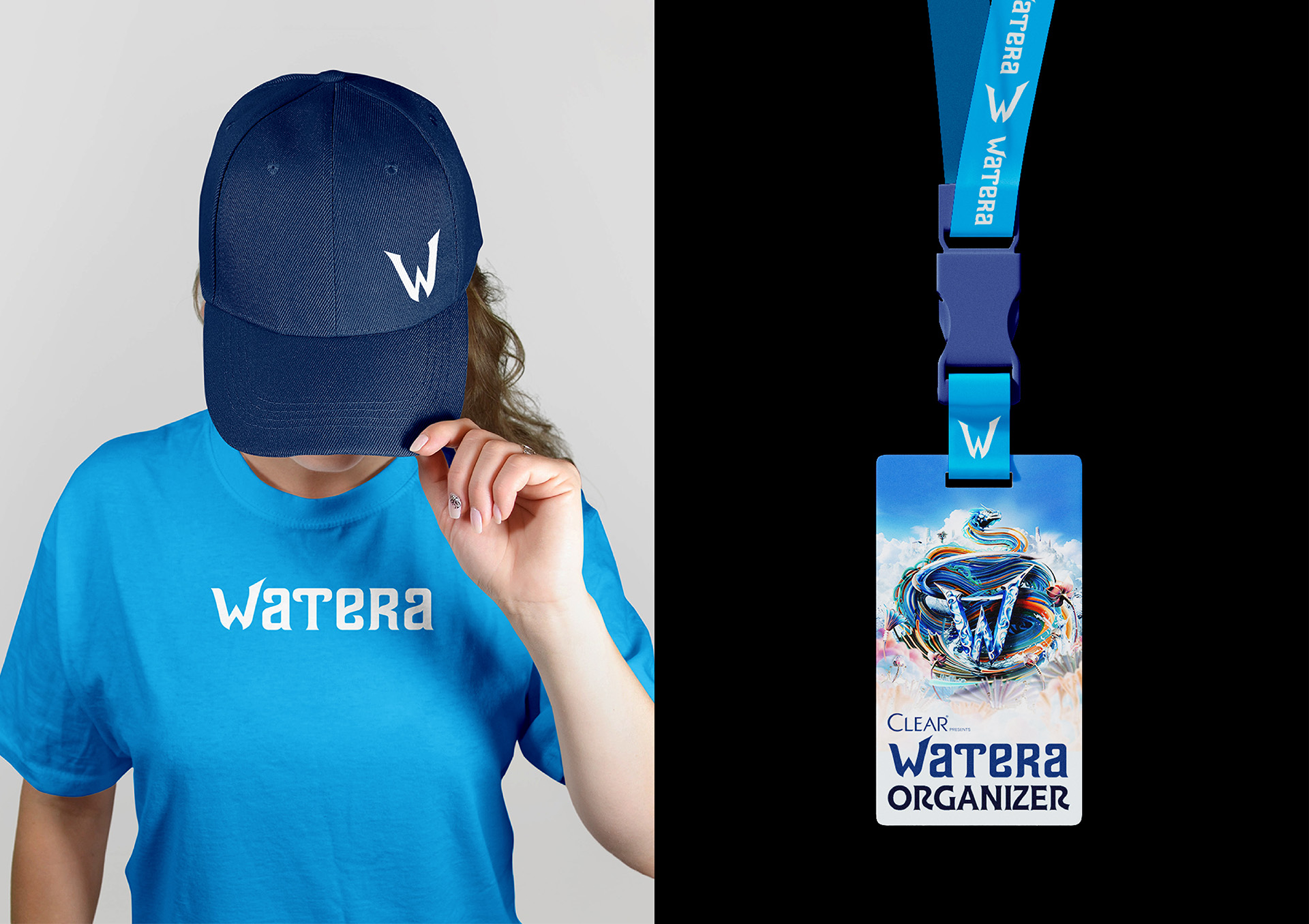
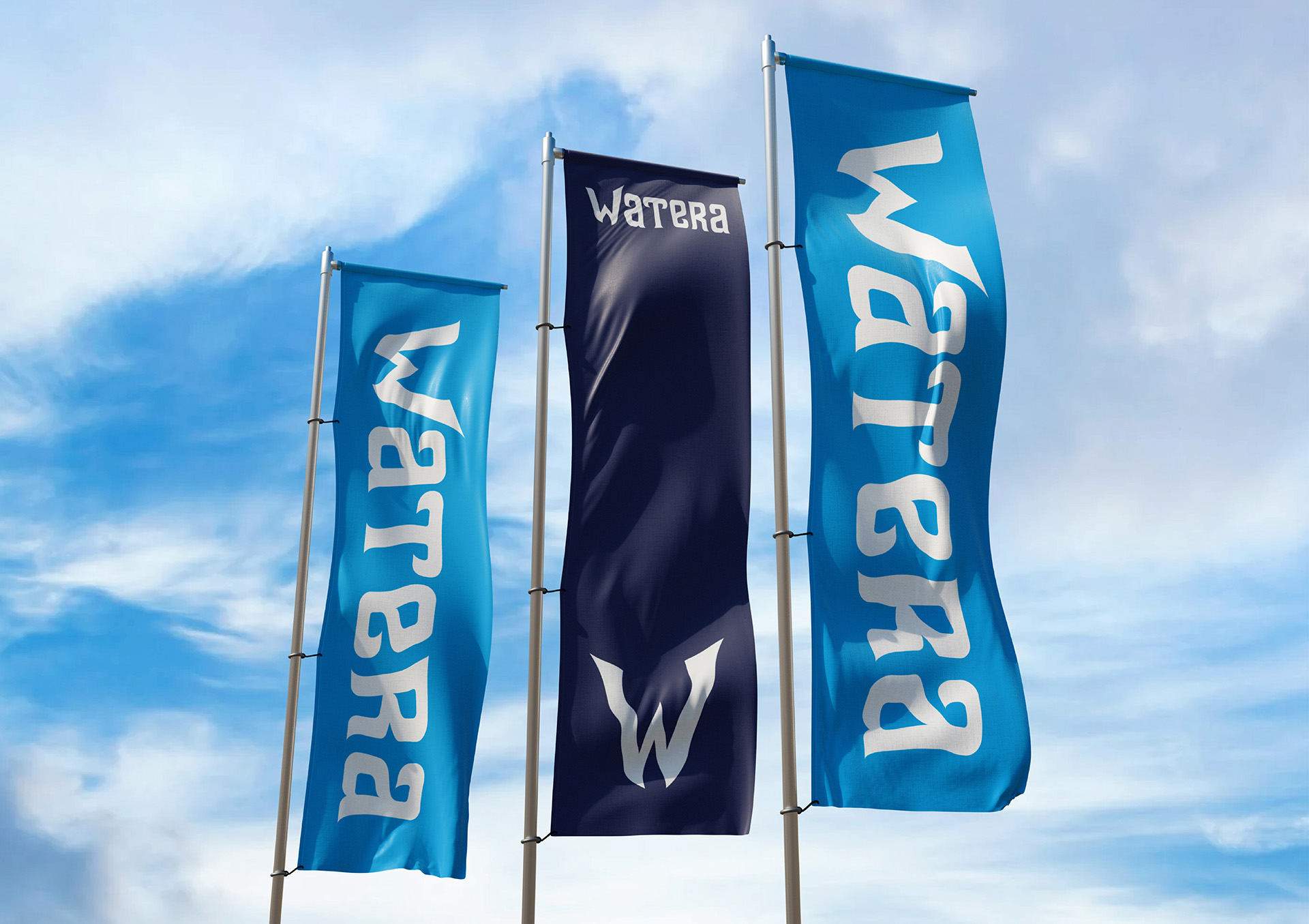
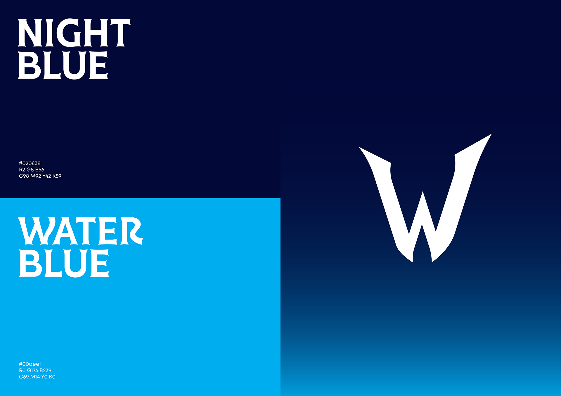
We have proposed upgrading Watera’s brand identity system through the following specific tasks: standardizing the Watera Festival logo system, creating a standardized identity system that includes colors, characteristic typography, standard layouts for brand applications, and applying the new identity system to Key Visuals and communication and printing materials for the Watera Festival 2024 in Hanoi, Vietnam.
Typography:
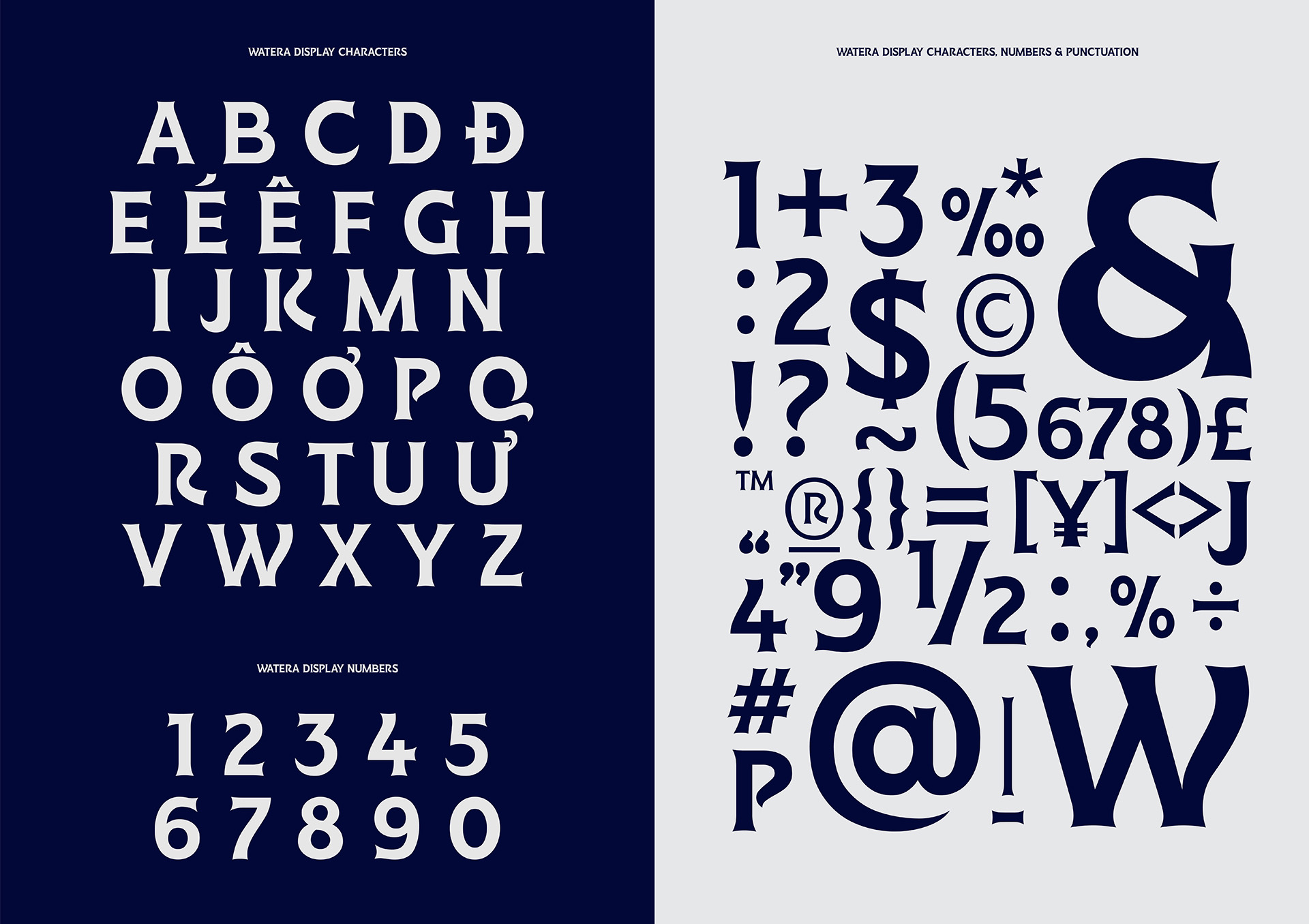
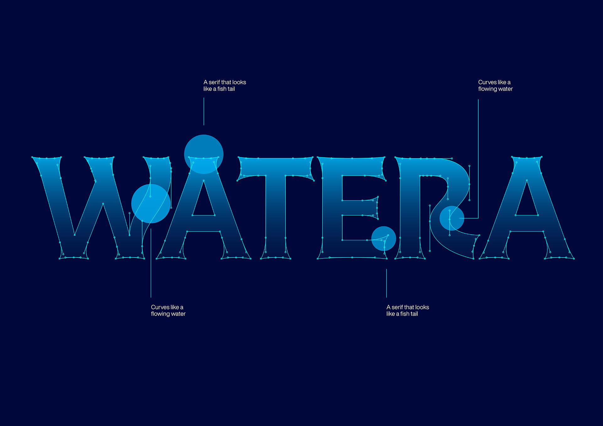
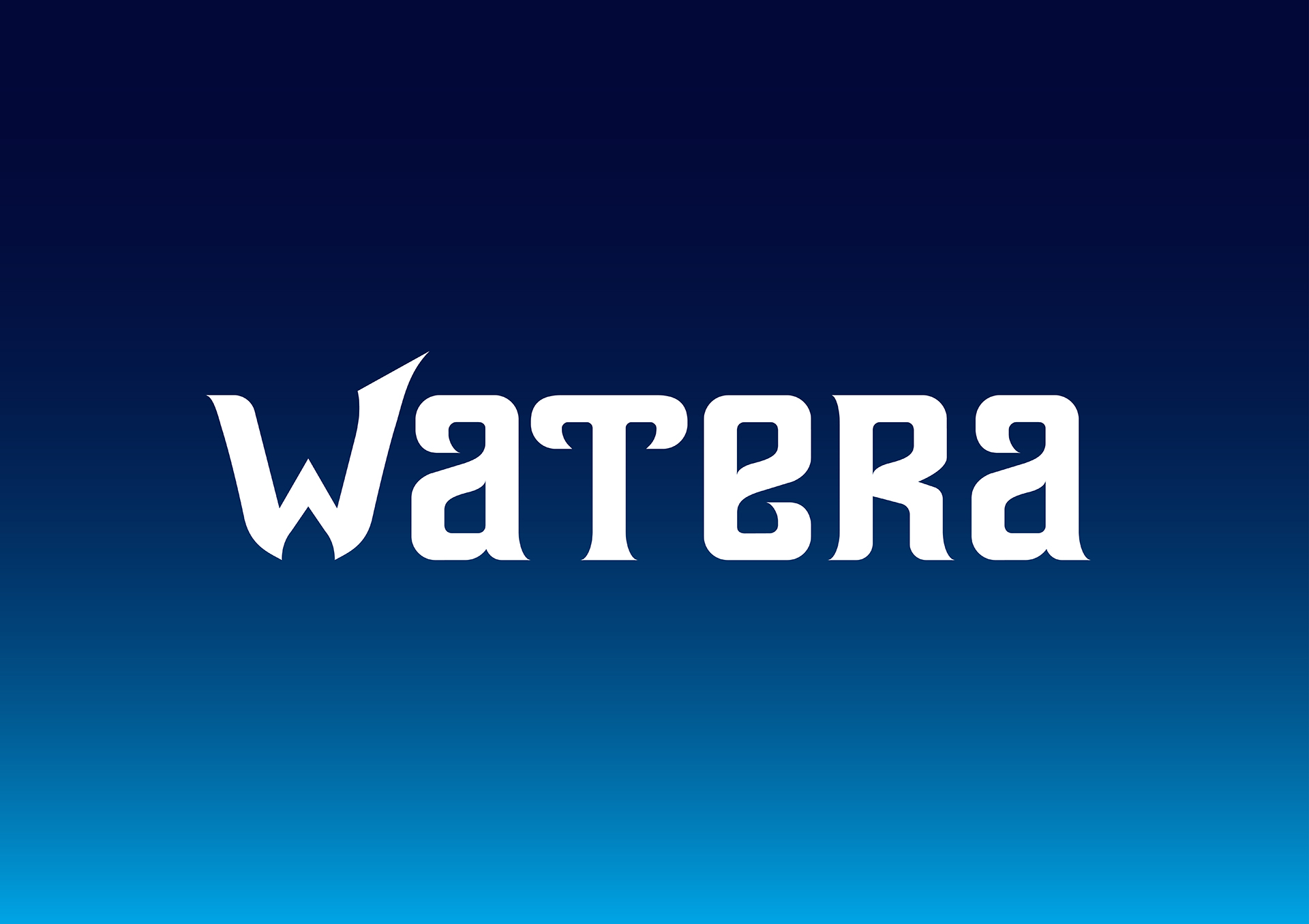
We have designed a unique custom typeface exclusively for Watera Festival, reflecting an epic, futuristic spirit with a mythical touch, while ensuring readability, applicability, and the brand’s international appeal.
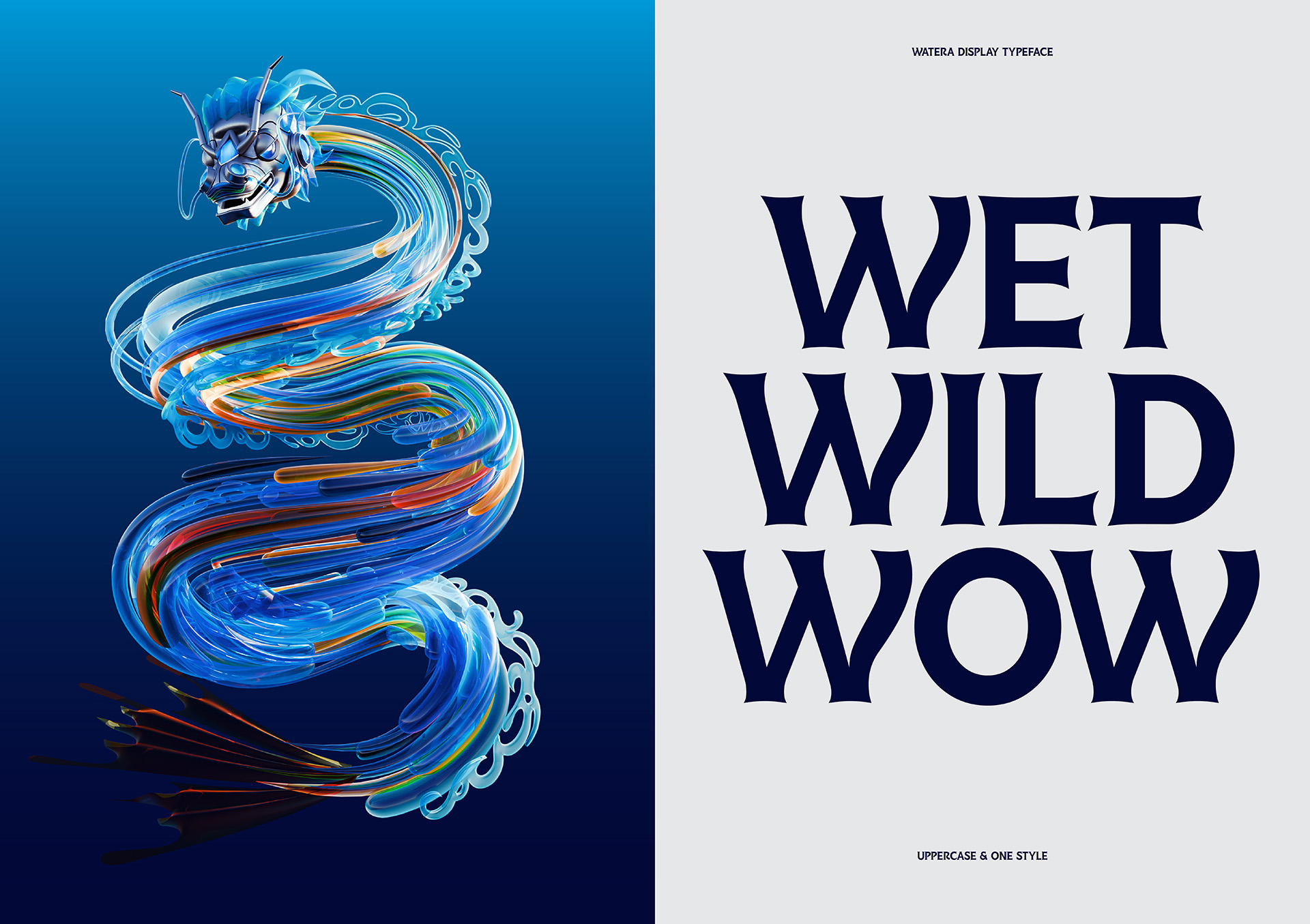
The Watera Display typeface is a modern serif font with custom details inspired by elements of water, such as waves, fins, and fish tails, creating distinctive characteristics for the typeface. The Watera Display Typeface is applied in the main title layouts, for content that needs emphasis or has a bold and prominent display quality.
Key Visual:
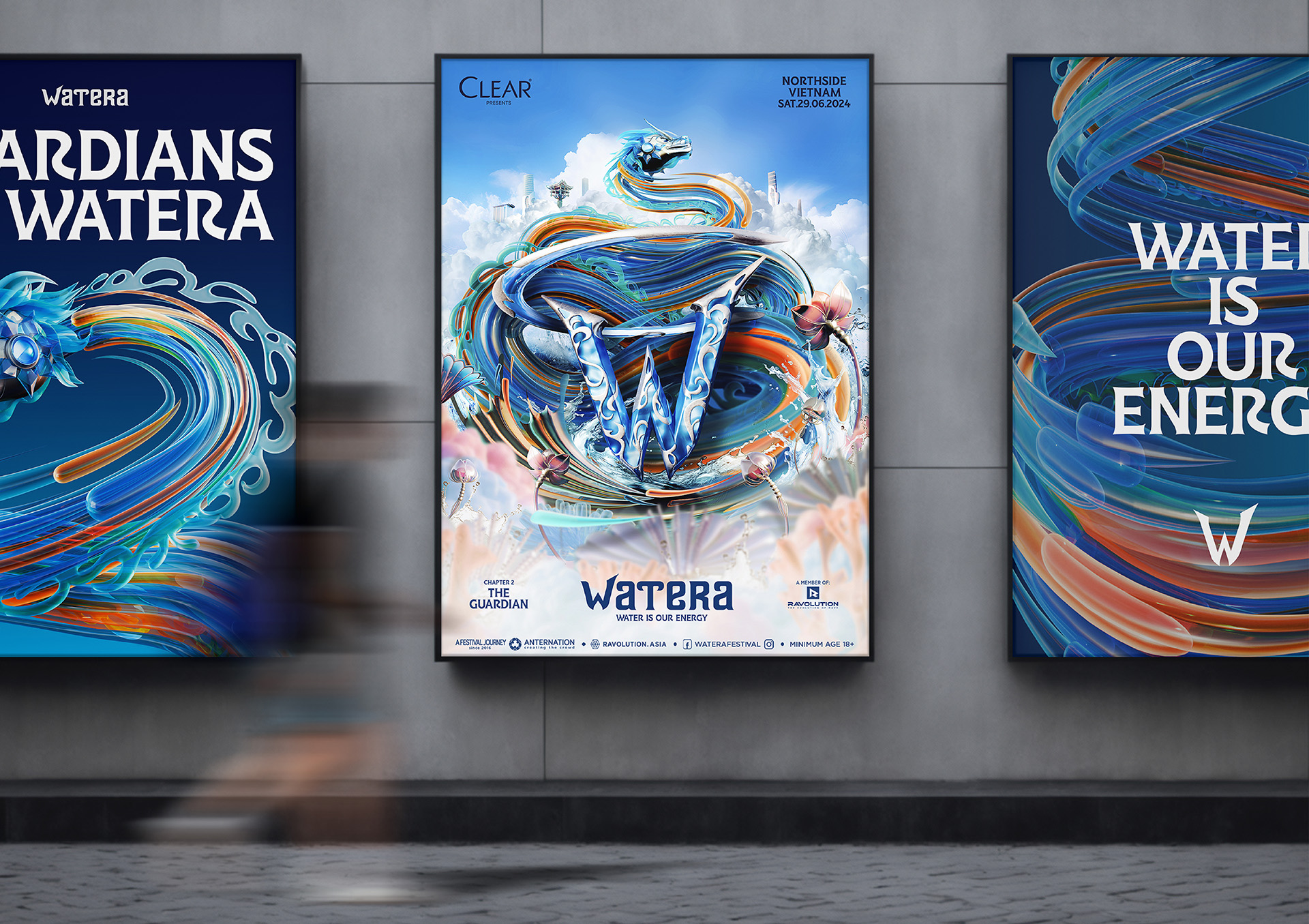
2024 is the Year of the Dragon, and combined with the event location in Hanoi – Thăng Long, a land rich in cultural heritage and exceptional people, as well as being the cultural, political, and economic center of the country, we have chosen the Dragon as the mascot for the main imagery of Chapter 2 – Watera Festival.
To execute this theme, we need to create a dragon mascot that embodies characteristics and elements related to Watera and Vietnamese culture. Rather than adhering closely to any specific historical dragon depiction, we opted to borrow details, synthesize, and develop a unique concept that embodies the spirit of both Watera and Hanoi.
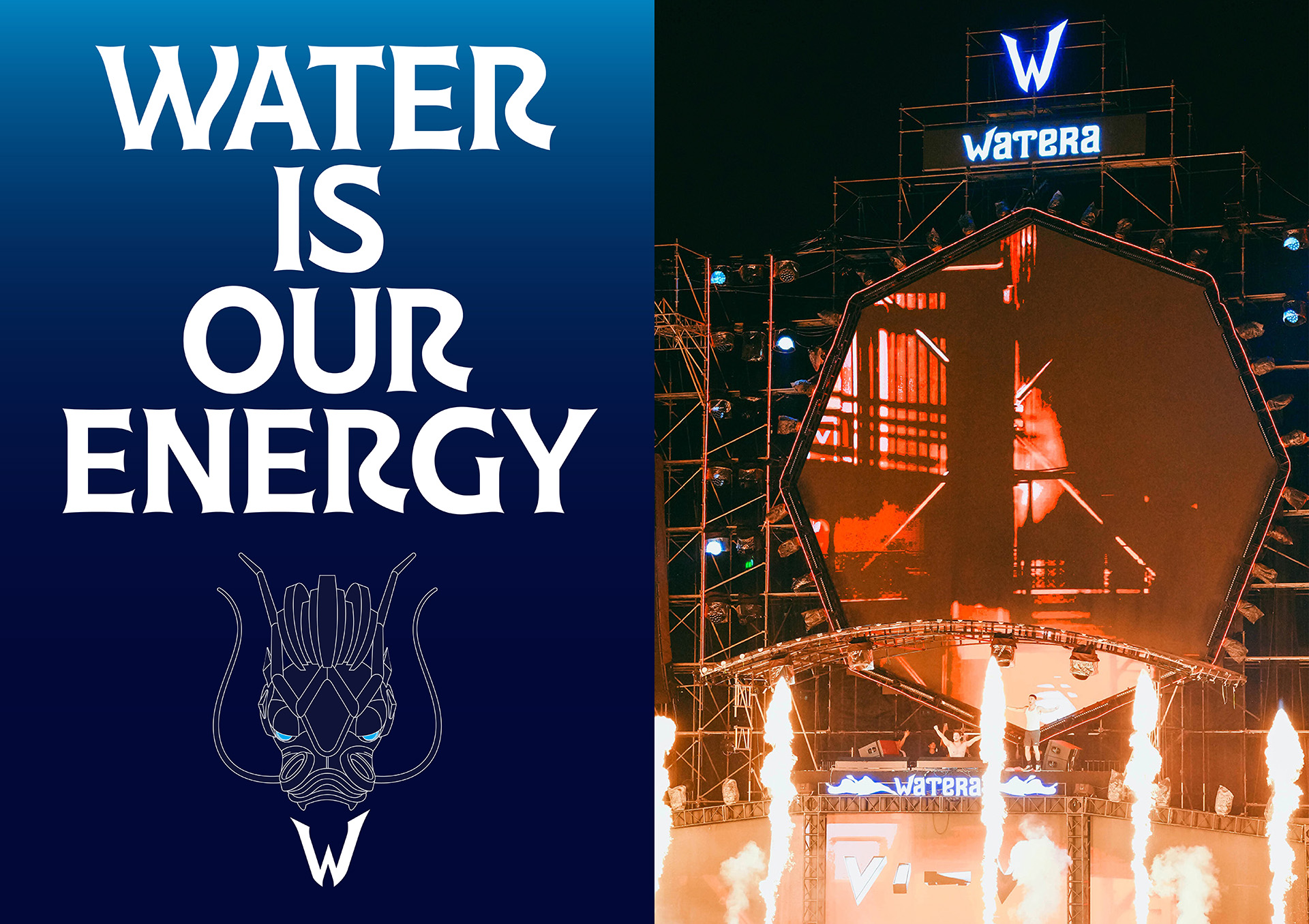
The overall Key Visual depicts the image of a Dragon mascot coiling around the Watera stone (Logo Mark). By choosing an upward perspective rather than a direct frontal view, the Key Visual gains an appealing dynamic that accentuates the Dragon mascot’s form as it soars towards the sky, creating a striking “Thăng Long” impression within the composition. Beyond the focal point of the Dragon mascot, we have incorporated familiar natural elements associated with Hanoi and water, such as lotus flowers, mushrooms, algae, jellyfish, fish, and flowing waves.
These elements are designed in a cohesive 3D style within the Key Visual, conveying a modern, trendy feel while retaining Watera’s unique identity. The Dragon Character will be designed to move gracefully and fluidly, akin to water—the primary identifying element of Watera. This will be combined with Watera’s signature blue color scheme. The design of the Watera Dragon is a fusion of electronic music elements, nature, and modern machinery, all harmonized within a unified design language.
CREDIT
- Agency/Creative: InSpace Creative
- Article Title: Revamping Watera Festival: InSpace Creative’s Bold New Brand Identity
- Organisation/Entity: Agency
- Project Type: Identity
- Project Status: Published
- Agency/Creative Country: Vietnam
- Agency/Creative City: Ho Chi Minh
- Market Region: Asia
- Project Deliverables: 2D Design, 3D Design, Art Direction, Brand Identity, Type Design
- Industry: Entertainment
- Keywords: Branding, Visual Identity, Festival
-
Credits:
Creative Director: Sanh Nguyen
Art Director: Yeni Tuong
3D Designer: Hai Phuong
3D Designer: Zahy
Type Designer: Trung Chau
Type Designer: Vi Le
Animation Design: Duy Trinh


