


The rebranding of YWCA BC was more than a cosmetic update; it was a strategic transformation designed to visually manifest the organization’s core mission: amplifying the collective strength of women and gender-diverse individuals. The challenge lay in creating a visual language that felt both historically grounded and progressively bold, ensuring the YWCA’s legacy of advocacy remained resonant in a modern landscape.
The Power of the Motif
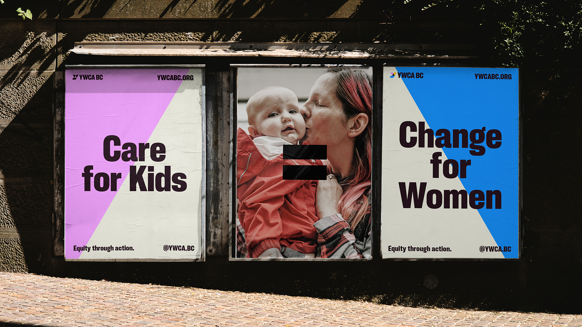
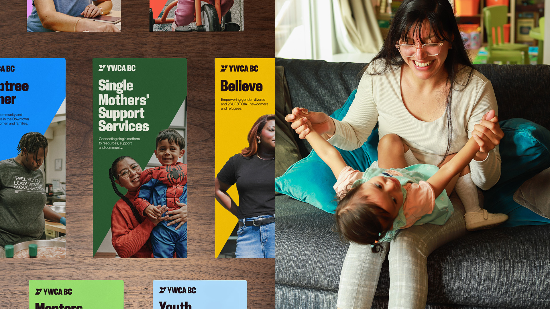
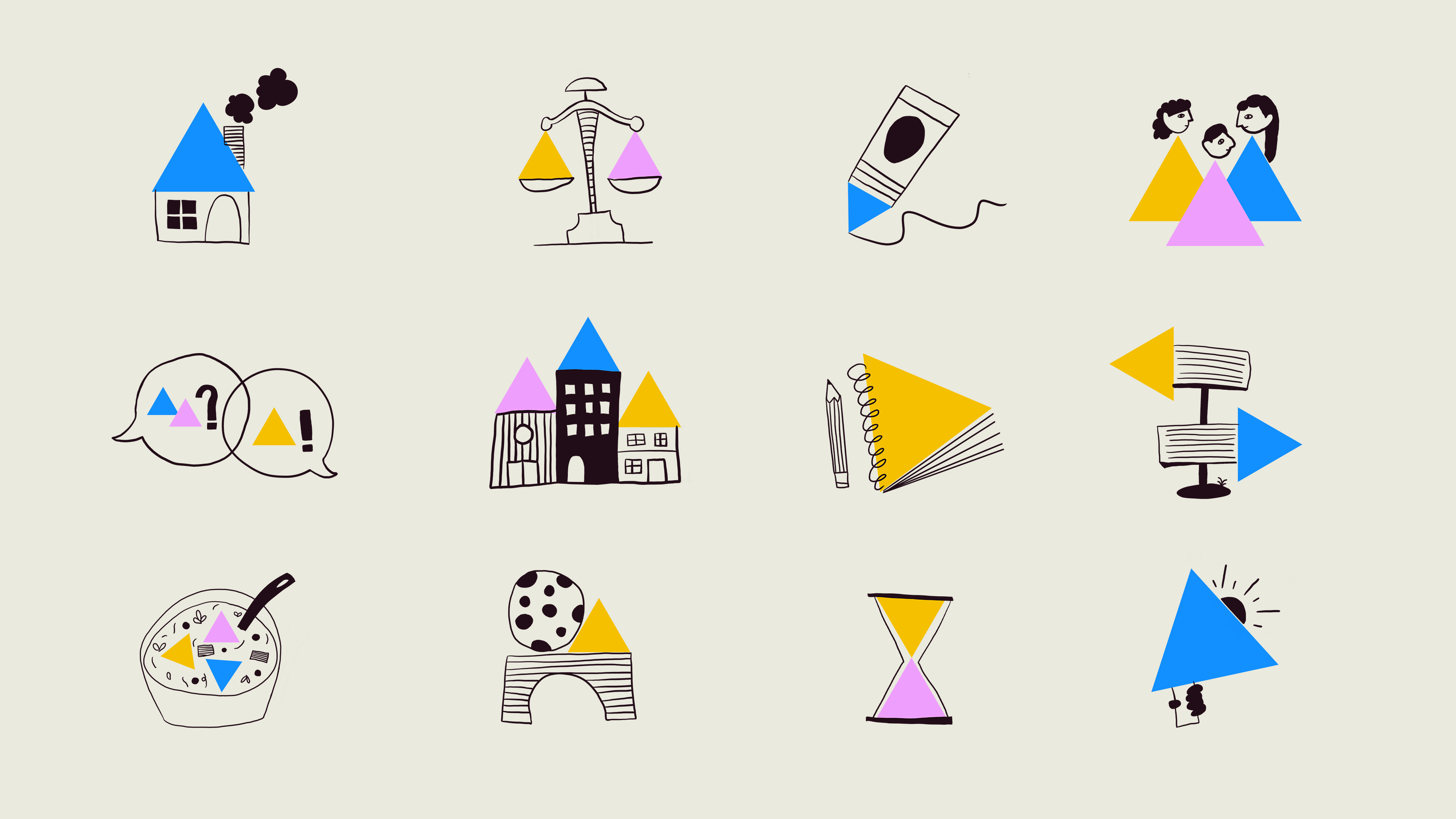
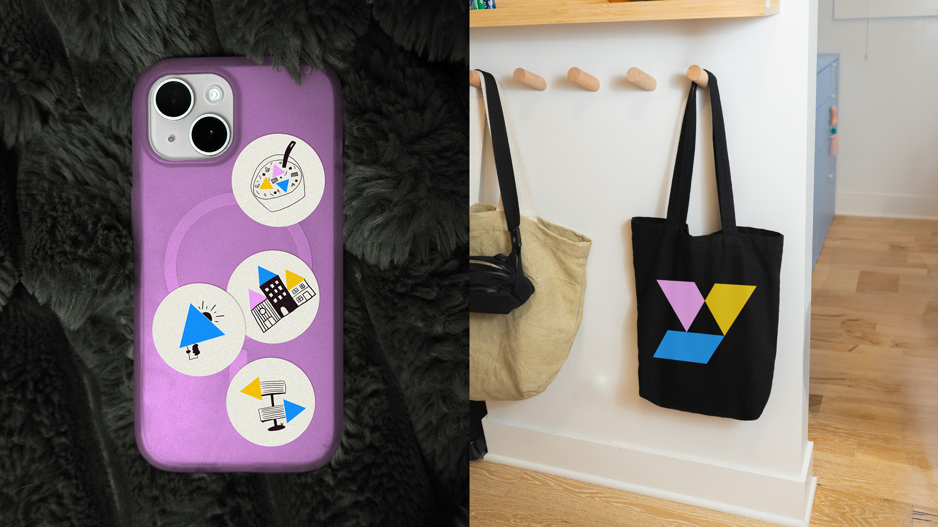
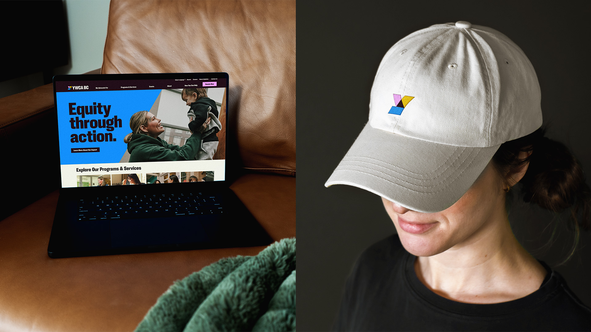
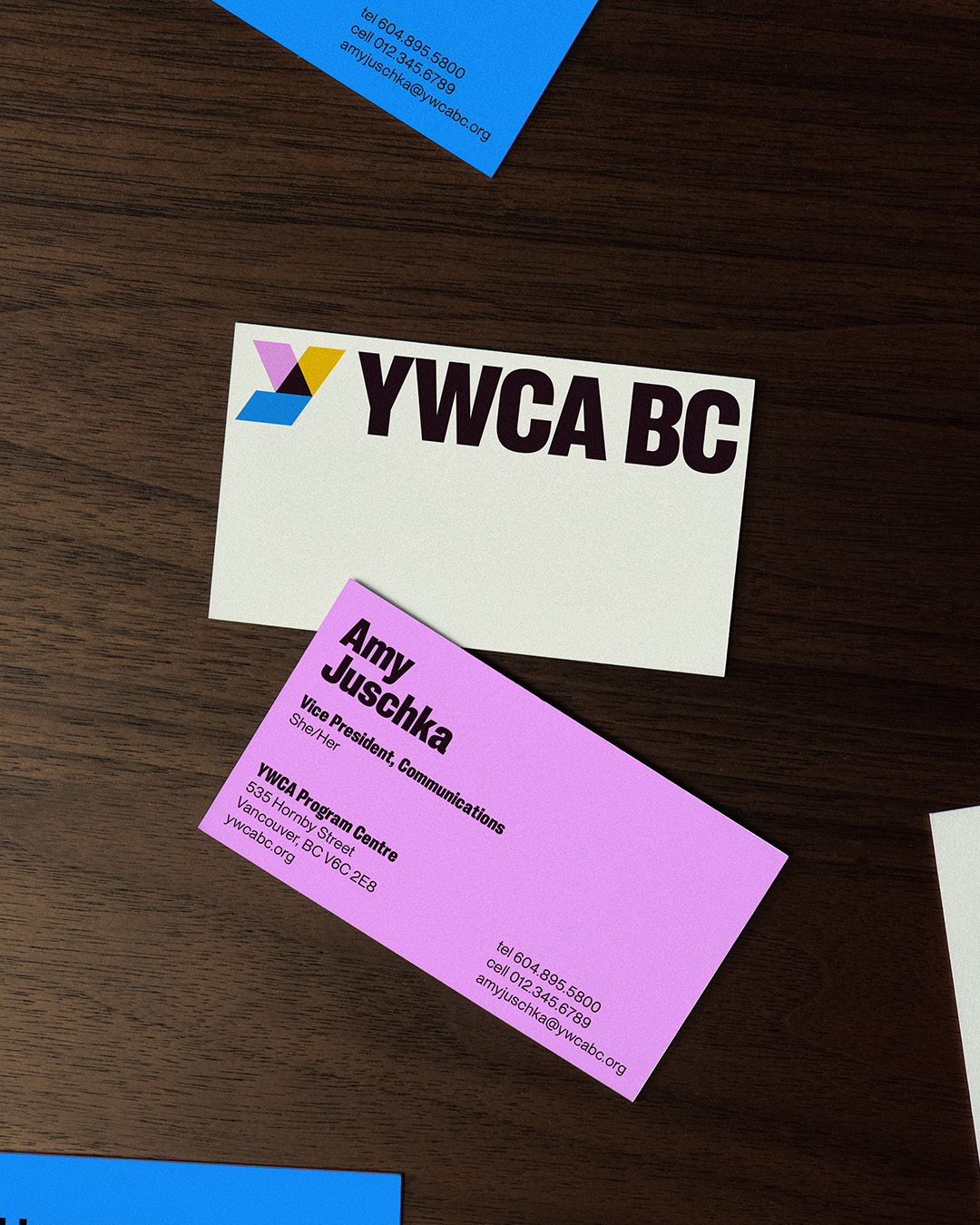
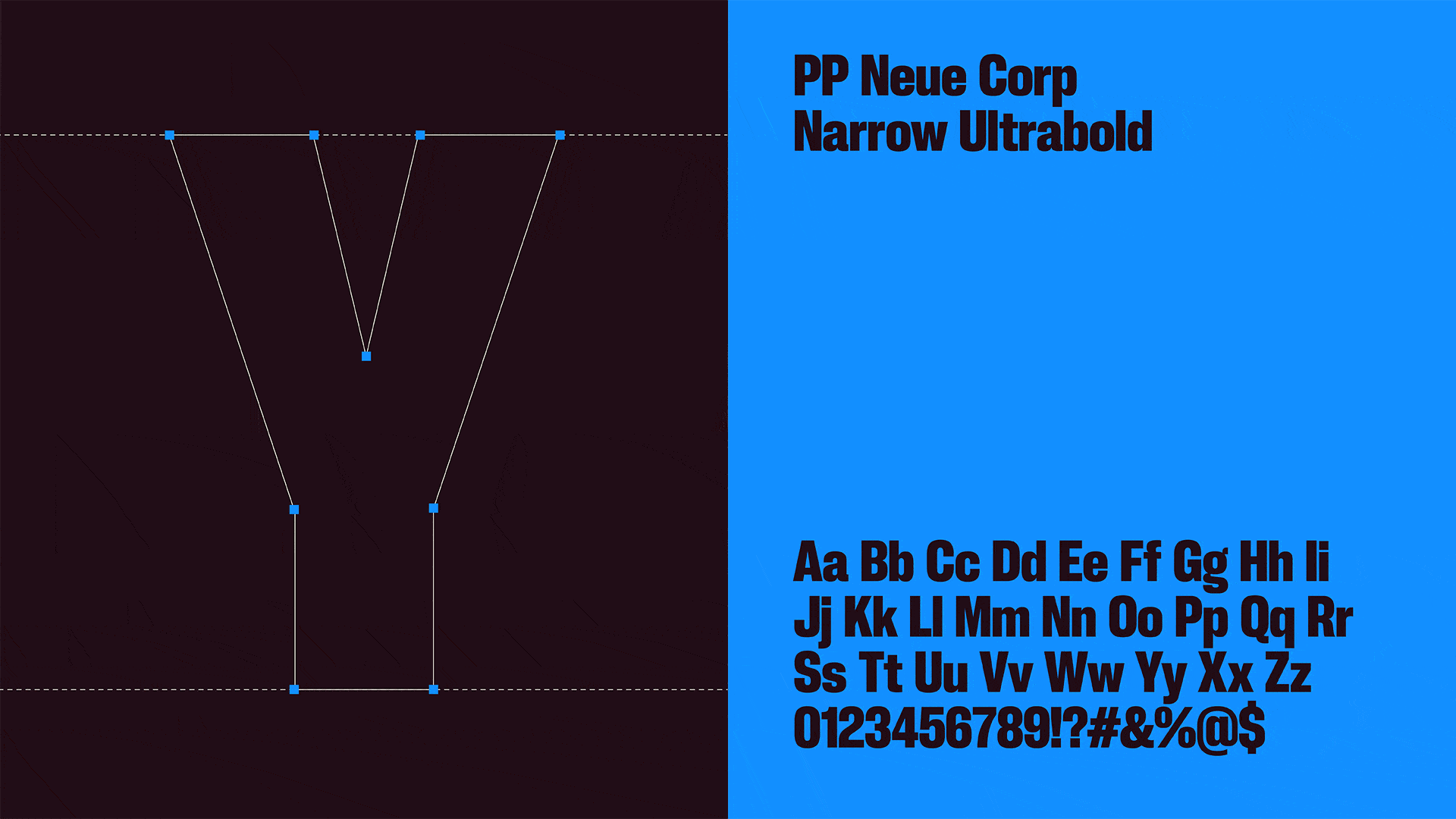
At the heart of this identity is the new “Y” logo. This mark is meticulously constructed from three distinct shapes that converge into a central, dynamic triangle. This isn’t just a letterform; it is a symbol of intersectionality and unity. The triangle motif acts as the foundational “DNA” of the brand, scaling across every touchpoint. It functions as a versatile graphic device—serving as a spotlight to emphasize key messaging, a framing element for photography, and a structural grid for custom illustrations.
A Fearless Aesthetic
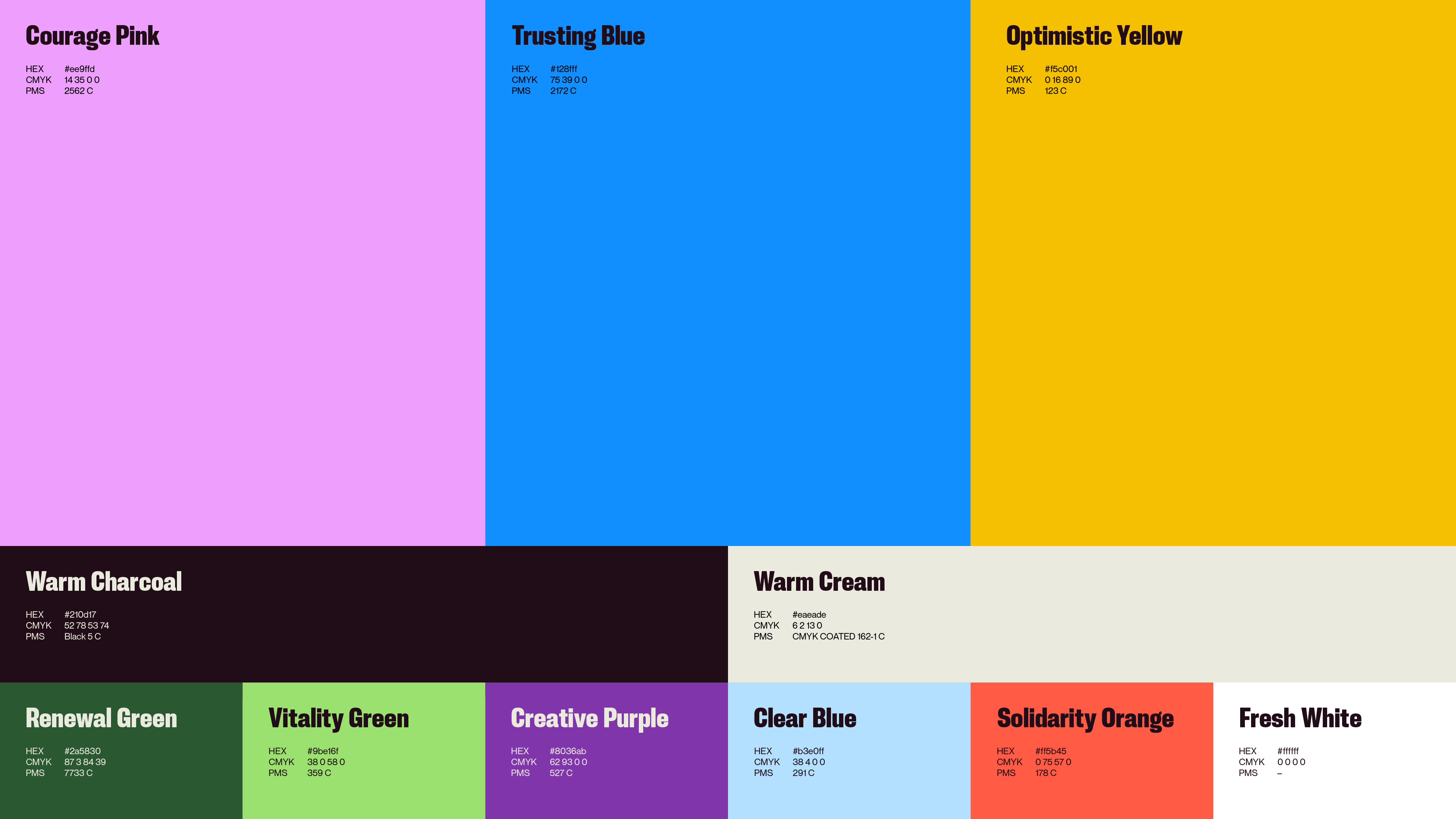
To complement this structural strength, we introduced a high-contrast, bold color palette that moves away from traditional, passive tones. Paired with confident, modern typography, the system commands attention. However, the true soul of the brand is found in its photography. By moving away from stock imagery in favor of authentic portraits, we placed the real women of the YWCA—the staff, the volunteers, and the community members, at the absolute center of the narrative.
Built by Women, for Women
Every design choice was filtered through the lens of empowerment. This visual identity serves as a powerful reminder that when individual voices converge, they create an immovable force. By prioritizing authenticity and architectural boldness, the new YWCA BC brand ensures that collective strength isn’t just an abstract feeling—it is a visible, undeniable presence.

CREDIT
- Agency/Creative: Rethink
- Article Title: Rethink Rebrands YWCA BC With a Powerful Y Mark Built on Unity and Intersectionality
- Organisation/Entity: Agency
- Project Type: Graphic
- Project Status: Published
- Agency/Creative Country: Canada
- Agency/Creative City: Vancouver, BC
- Market Region: North America
- Project Deliverables: Advertising Photography, Brand Design, Illustration, Logo Design, Type Design
- Industry: Non-Profit
- Keywords: YWCA BC, Y logo, Rebrand, branding, identity design
-
Credits:
Associate Design Director: Zoë Boudreau
Group Creative Director: Alex Bakker
Creative Director: Pam Rounis
Junior Designer: Val Sheymardanova


