


Founded in 1832, Scotiabank stands as a cornerstone of the Canadian financial landscape, managing over $1.46 trillion in assets. It is uniquely defined by a strategic focus on seamless trade and capital connectivity across Canada, the U.S., and Mexico. Serving 25 million customers through its four core pillars—Canadian Banking, International Banking, Wealth Management, and Global Markets—the bank has emerged as a 2026 leader in digital innovation and is consistently recognized as a Top 100 Employer. Despite this immense growth and physical presence, Scotiabank required a comprehensive rebrand that could unify its sprawling global identity while appealing to an increasingly affluent and discerning clientele.
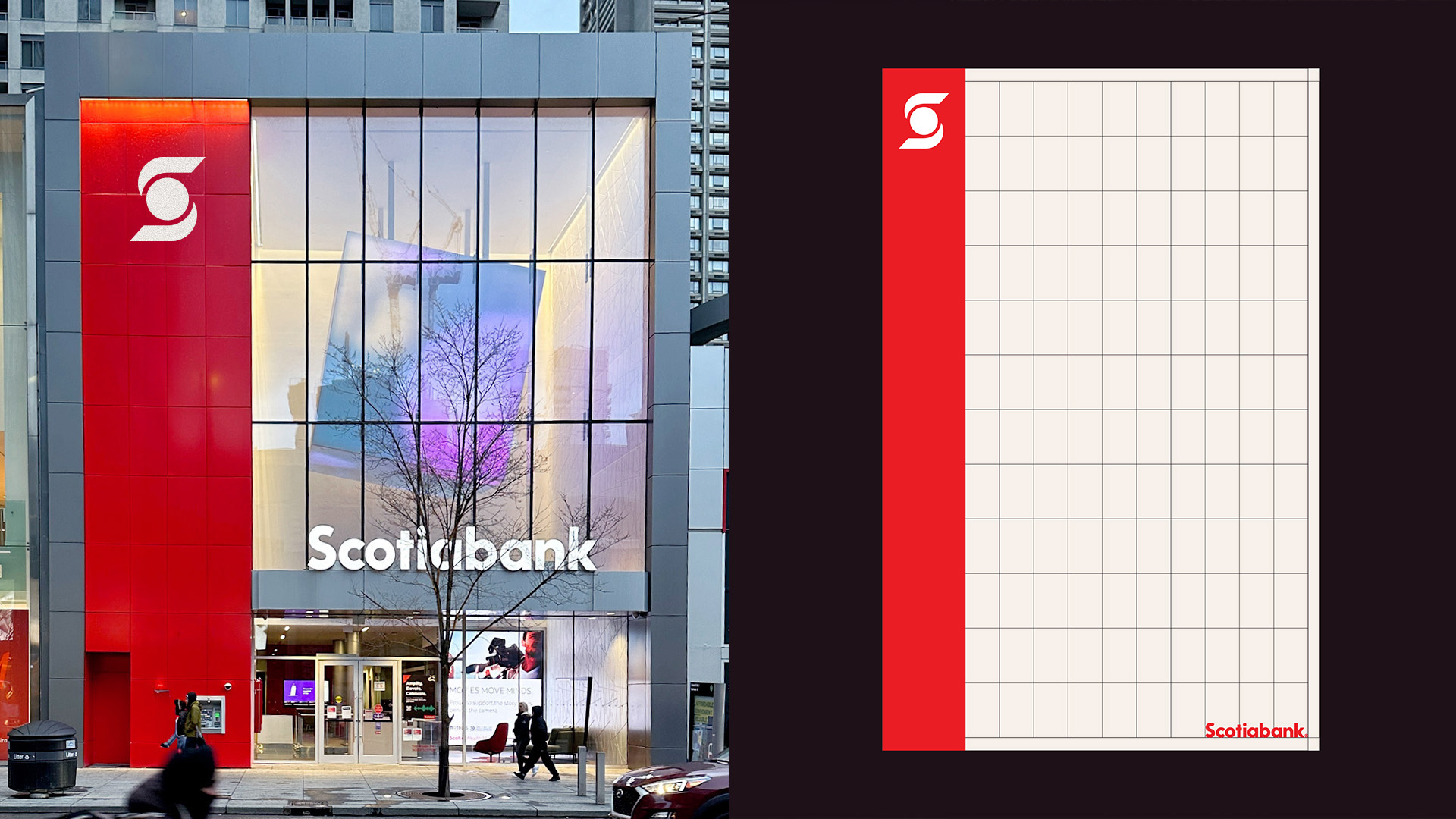
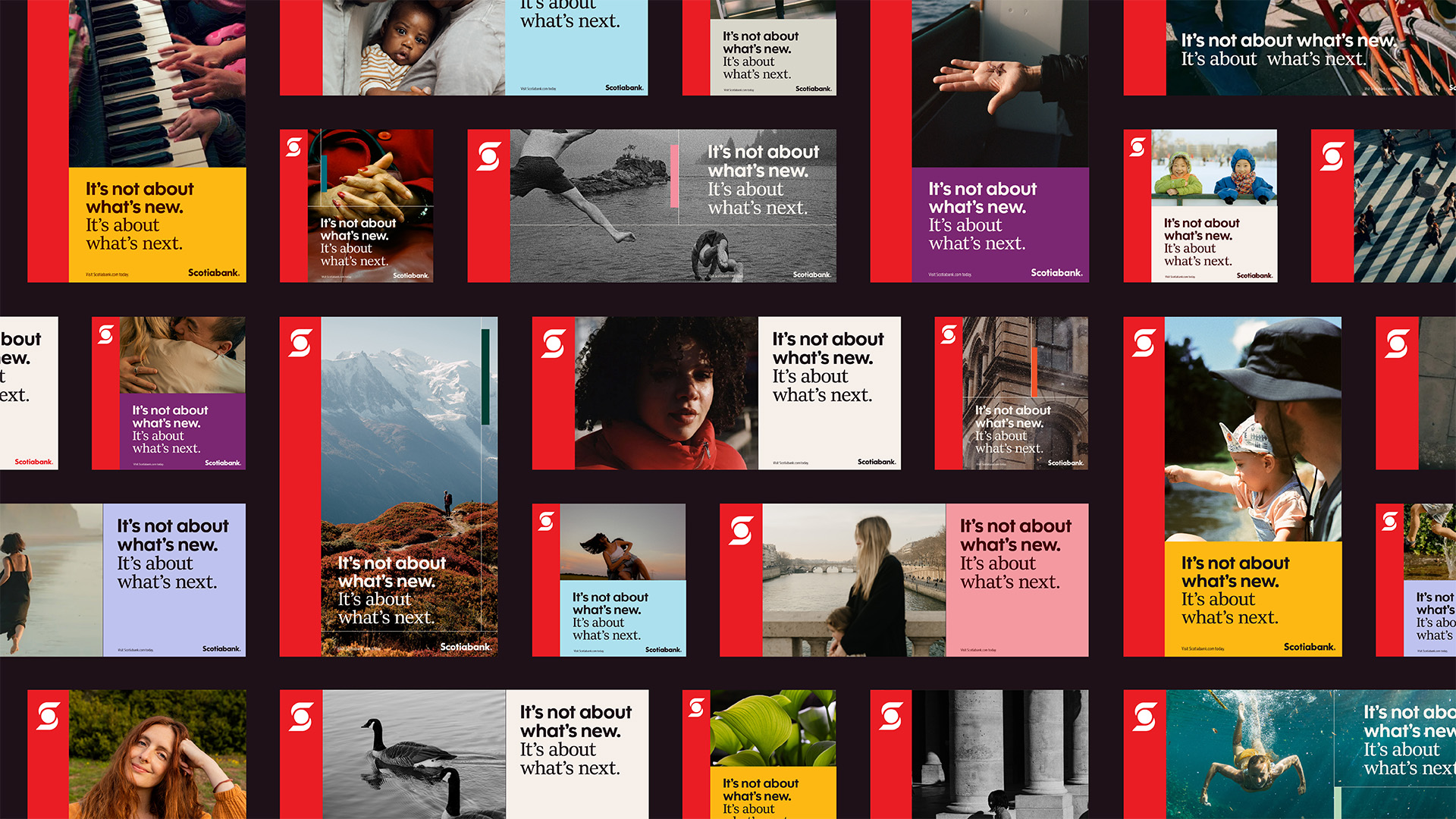
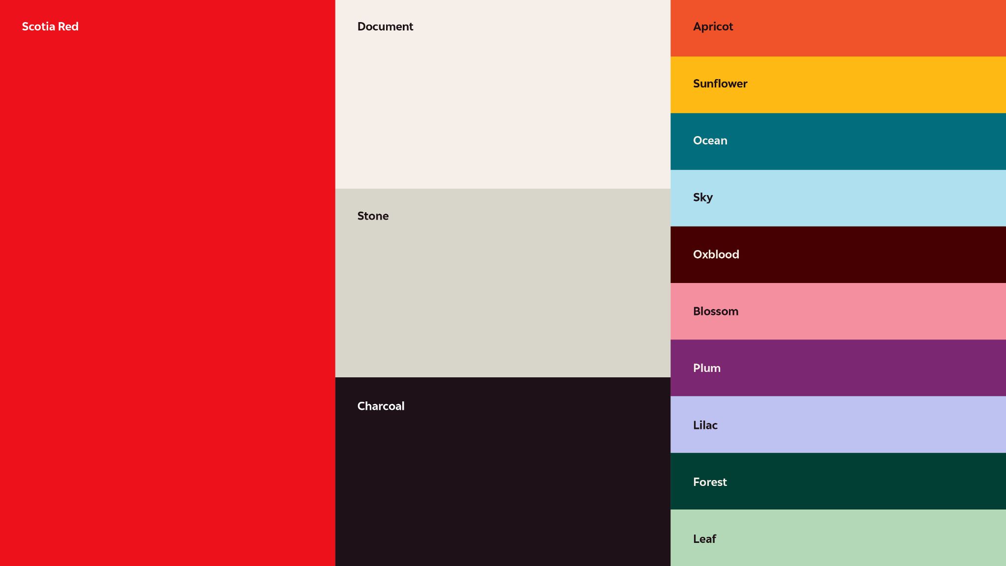
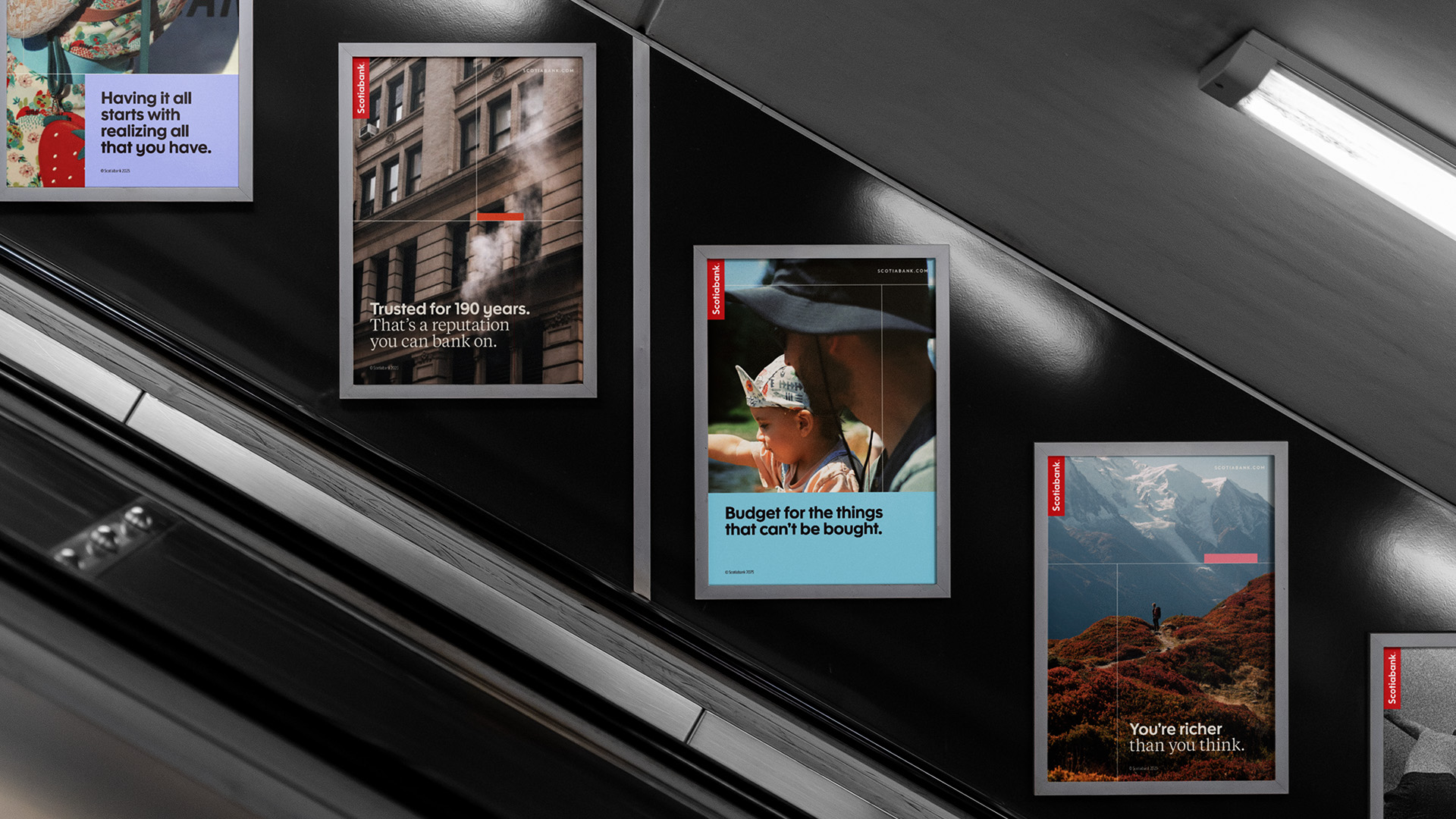
The challenge was to modernize a nearly two-century-old legacy without losing the institutional trust it had built over generations. We began by establishing consistent, grid-based design layouts inspired by their global branch architecture, ensuring a cohesive visual language from Toronto to Mexico City. To elevate the brand’s presence, we crafted an elegant bespoke serif typeface that communicates authority and precision. This was paired with a sophisticated new approach to imagery and a refined color palette that thoughtfully references the bank’s historic red while introducing deeper, premium tones. By balancing modern aesthetics with heritage, we proved that a strategic global rebrand can successfully revitalize even a 193-year-old institution for a new era of elevated banking.


CREDIT
- Agency/Creative: Rethink
- Article Title: Rethink Delivers a Global Brand Evolution for Scotiabank
- Organisation/Entity: Agency
- Project Type: Identity
- Project Status: Published
- Agency/Creative Country: Canada
- Agency/Creative City: Toronto
- Market Region: Global
- Project Deliverables: Brand Identity
- Industry: Financial
- Keywords: Scotiabank, rebrand, red, identity, global, bank, financial
-
Credits:
Lead Designer: Zoë Boudreau
Lead Desginer: Thomas Hadfield
ECD: Hans Thiessen
ECD: Rich Greco
CD: Berkeley Poole
ACD: Mark Mabey
Designer: Erin Maguire
Jr. Designer: Nathan Leung


