
Supreme—DBA – Motoluxe — Branding
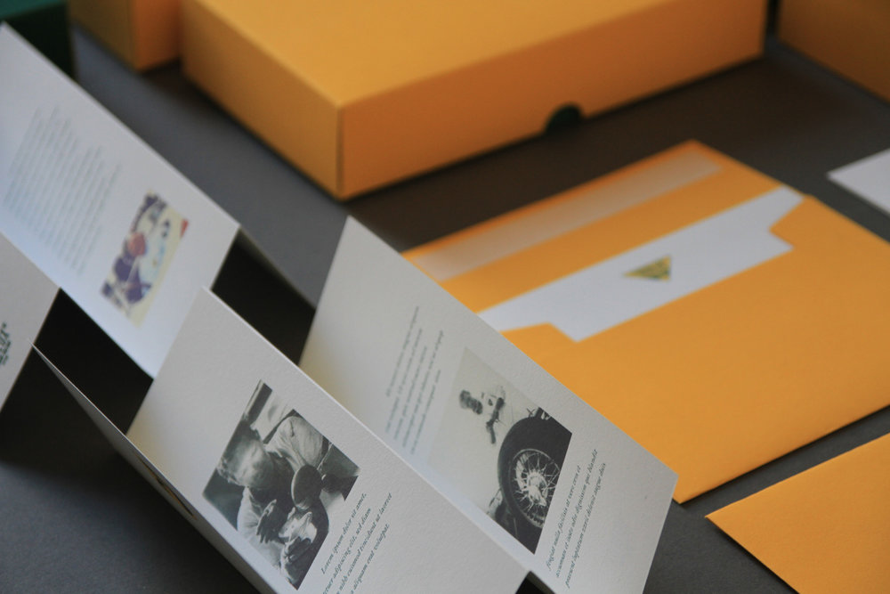
“ We began the project by conducting in-depth research of the 1955’s; invaluable time spent in the beginning of the project designing and developing the brand architecture sourced from the period cars, the food, the fashion, the movies and the tone — days spent immersing ourselves in the culture; listening to 24 hour radio transmissions of endurance racing, sifting through 1000’s of classic photographs and behind the scenes photos from period Hollywood films informed us (along with our participation in the scene) how to position Motoluxe as the epitome of the Hollywood star and the Great British Brand.
With ambassadors including Steve McQueen, James Dean and Paul Newman— these gents were true Americans with an unquenchable addiction to great British brands, motorsport and the gentlemen’s attire worn by the likes of Mike Hawthorn, Jim Clark as well as icons like Salvador Dali, Mick Jagger and Winston Churchill.
Taking a dormant brand and positioning it perfectly into what would have been its zenith became our quest and one that fits perfectly with our ethos of attention to detail, and the understanding of the classic car and gentlemen’s fashion categories.
In the 1950’s there were no brand guidelines for how a logo should appear on a race car, they were hand painted and individual. No two liveries were the same — perhaps not even symmetrical, creating a living organism that champions alignment, not consistency. This ideology evolved to become the basis of our living brand, with the same idiosyncrasies applied to Motorluxe’s new reformed, varied and organic identity.
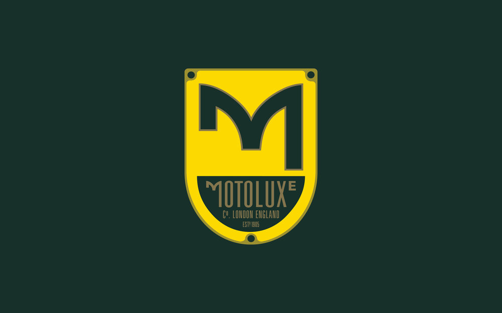
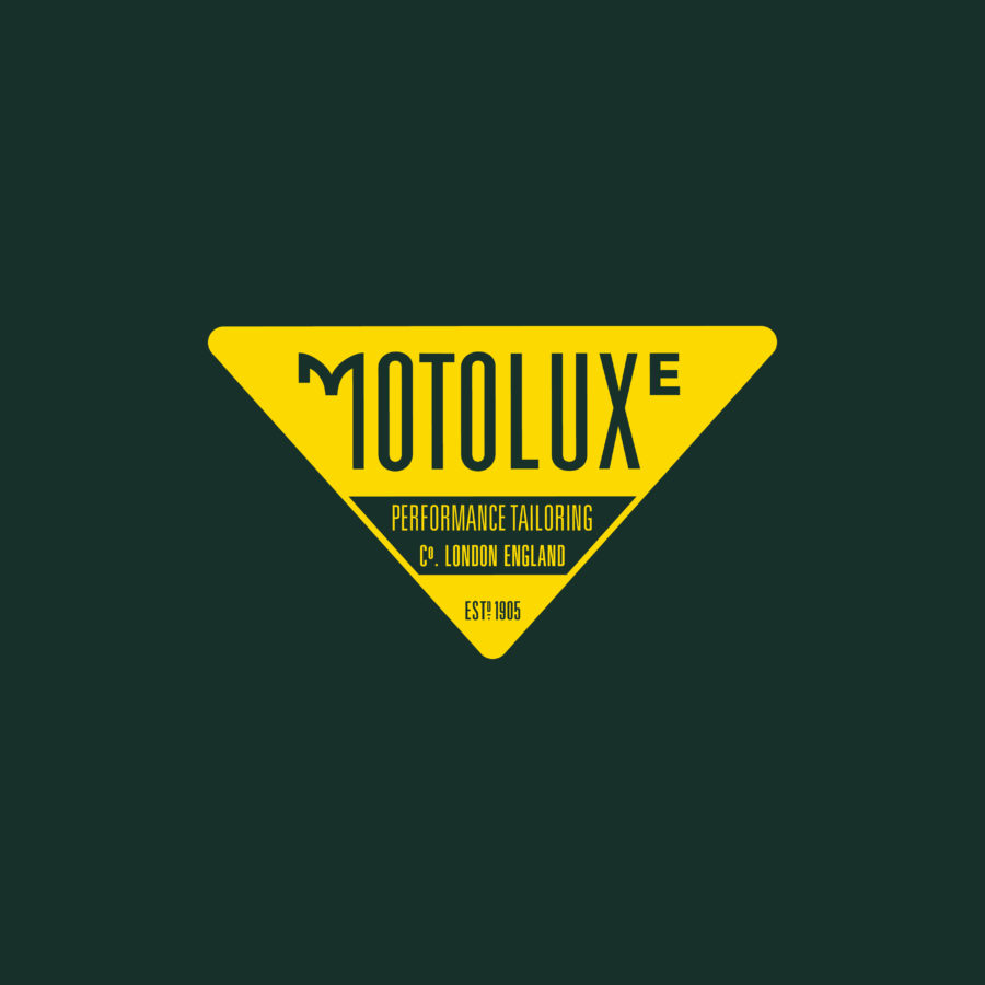
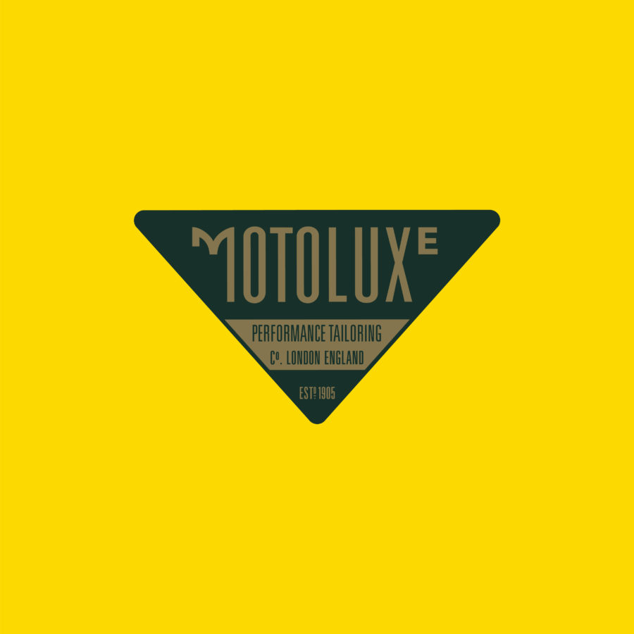
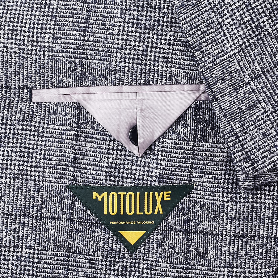
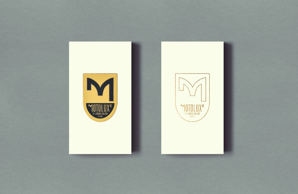
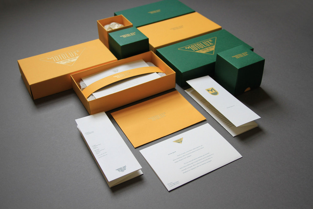
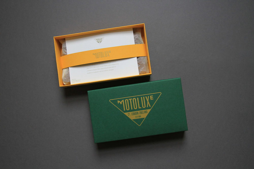
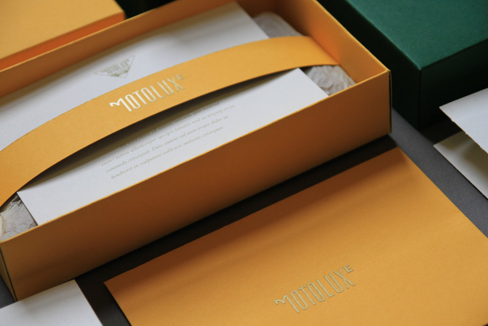
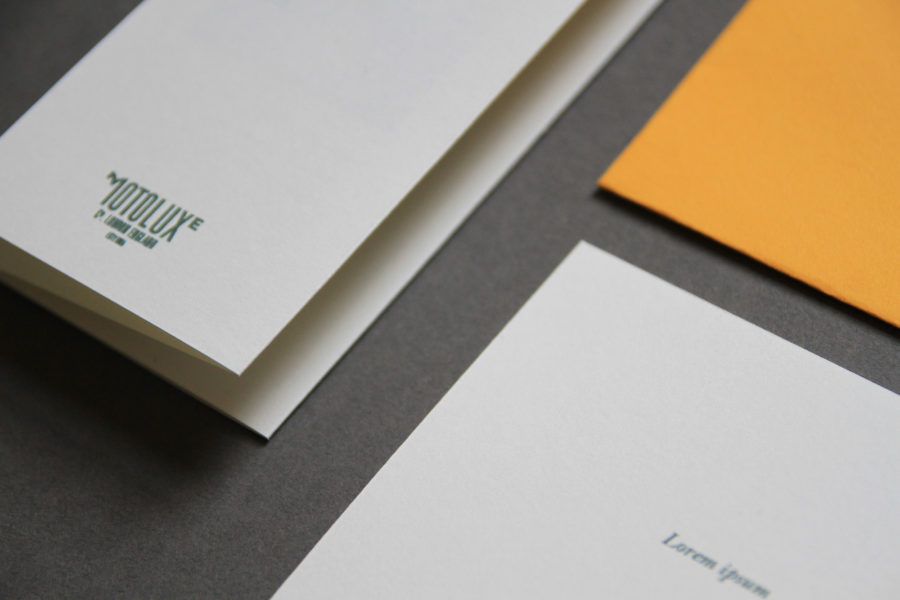
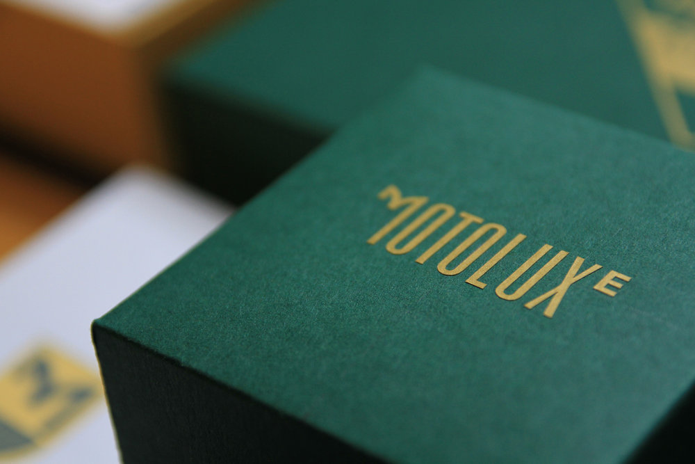
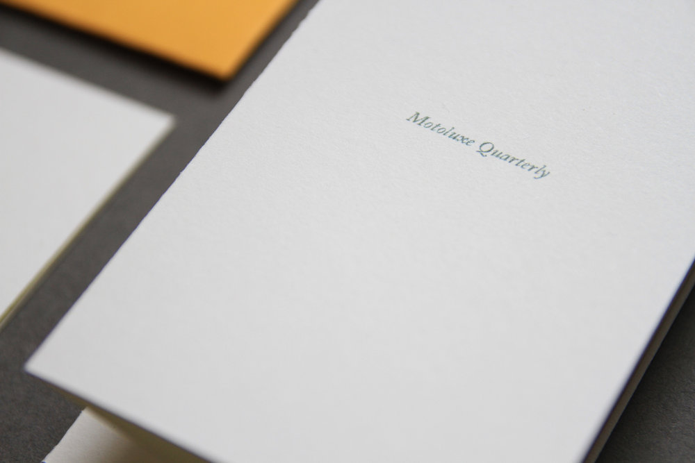
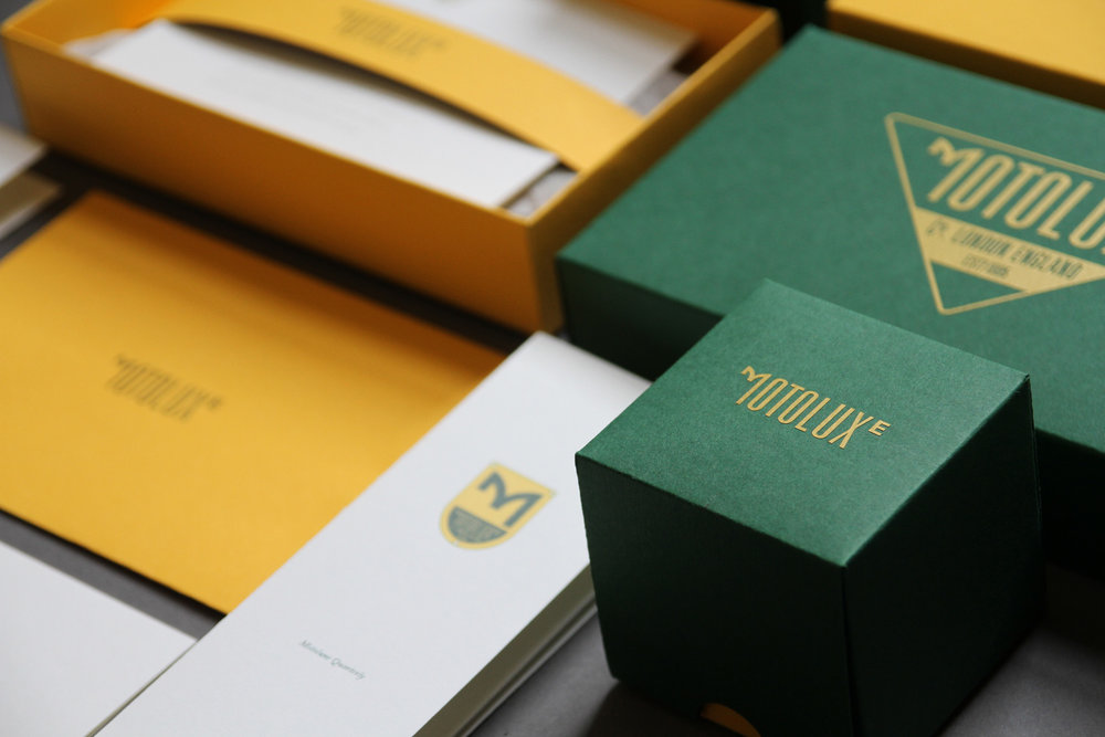
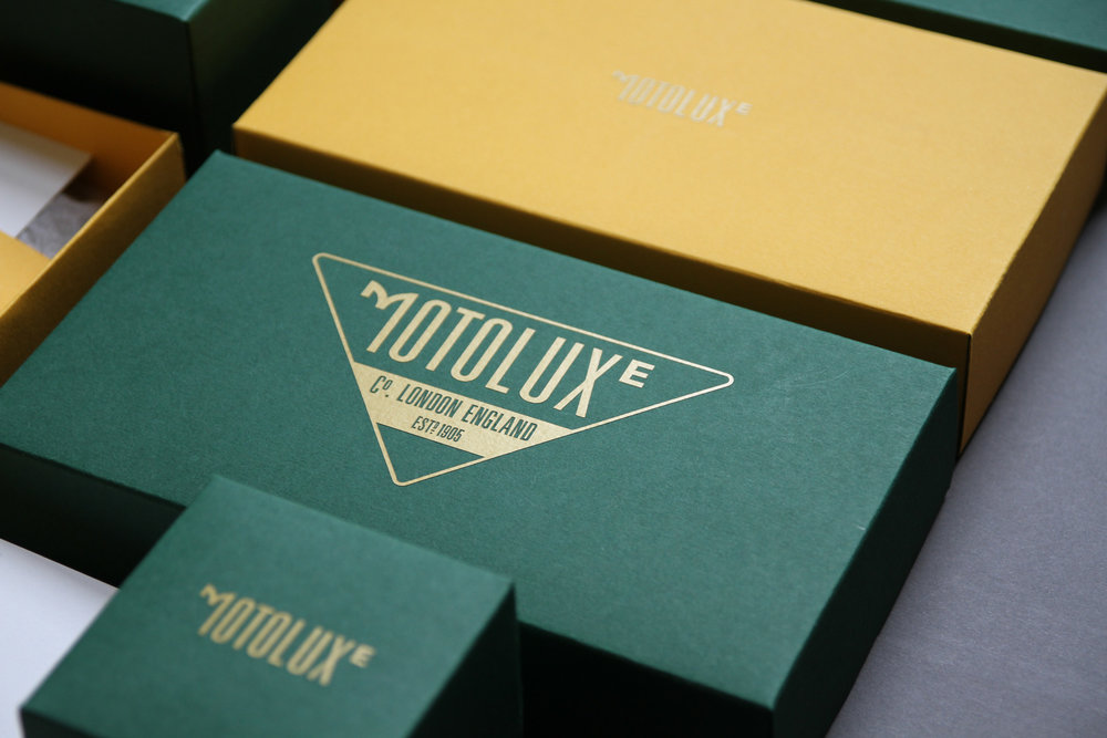
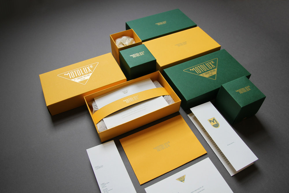
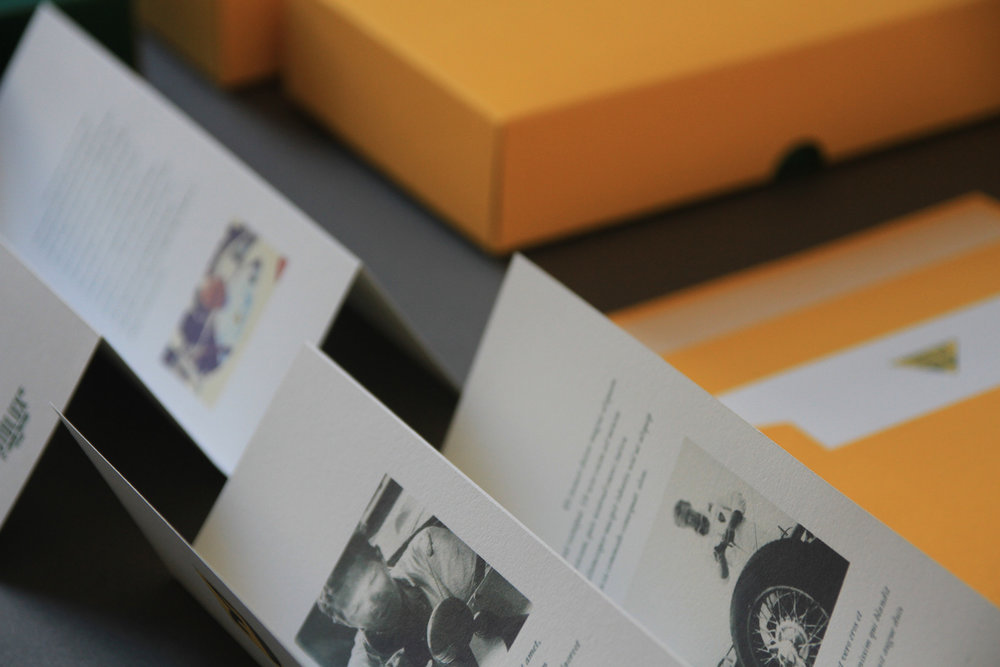
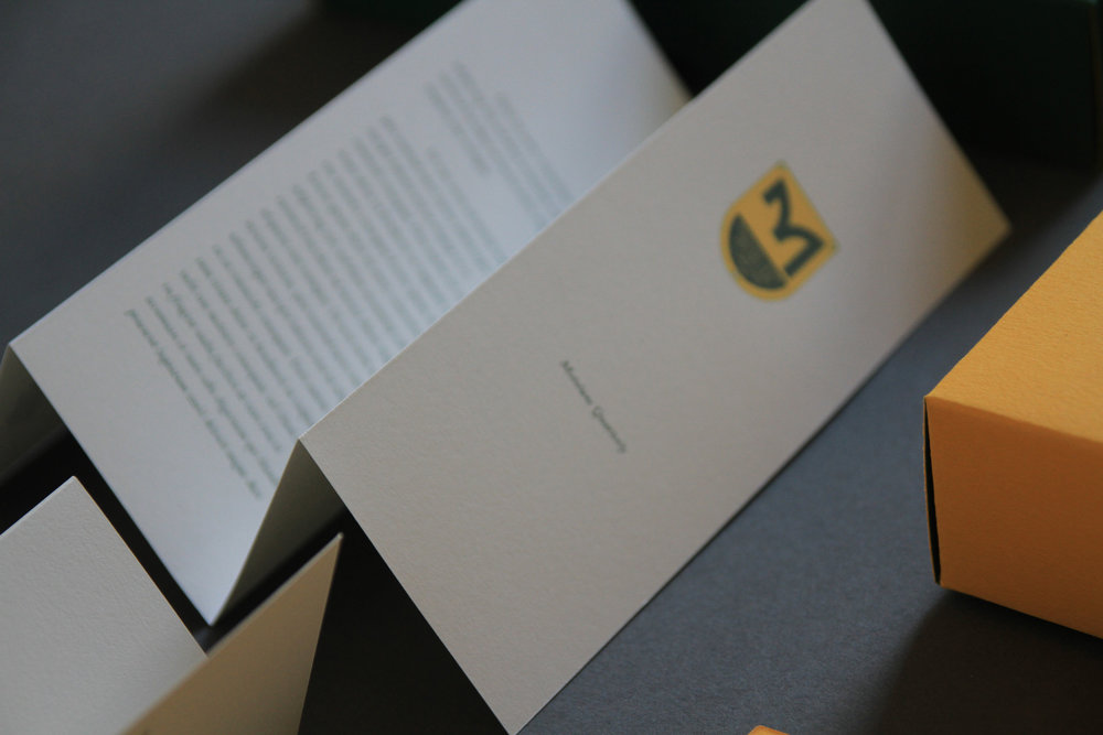
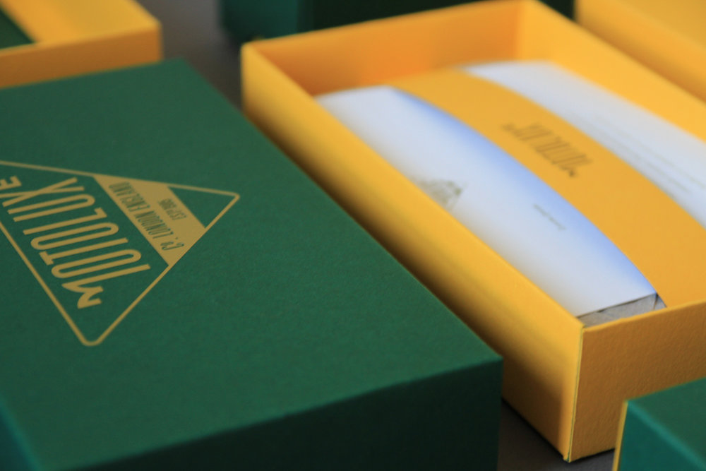
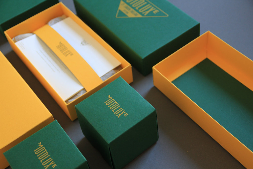
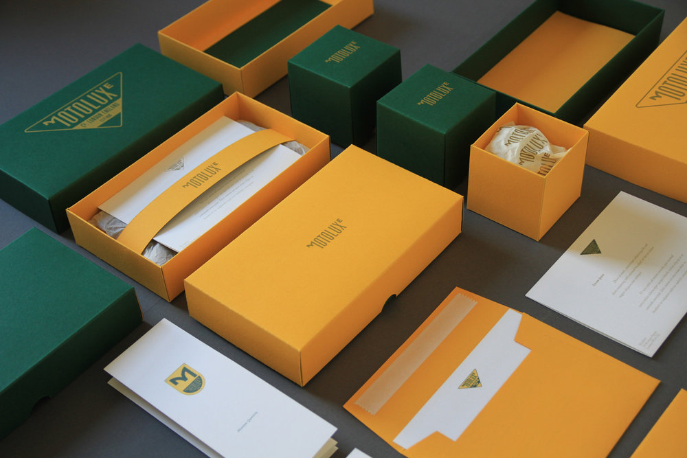
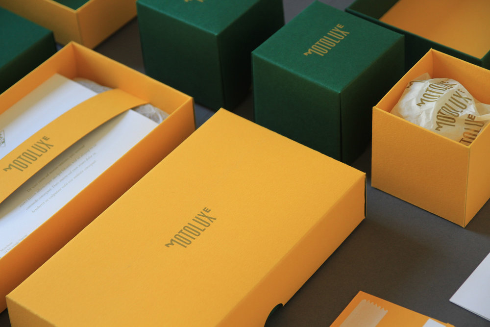
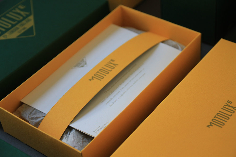
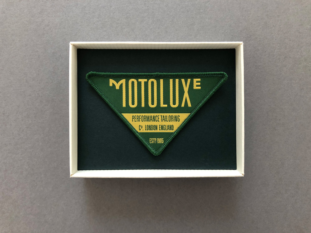
Supreme—DBA created a brand identity consisting of multiple elements; a sophisticated ‘brass cast’ badge and detailed word-mark, along with variations for different applications — All of these epitomising the idiosyncratic and unsymmetrical nature of the period.
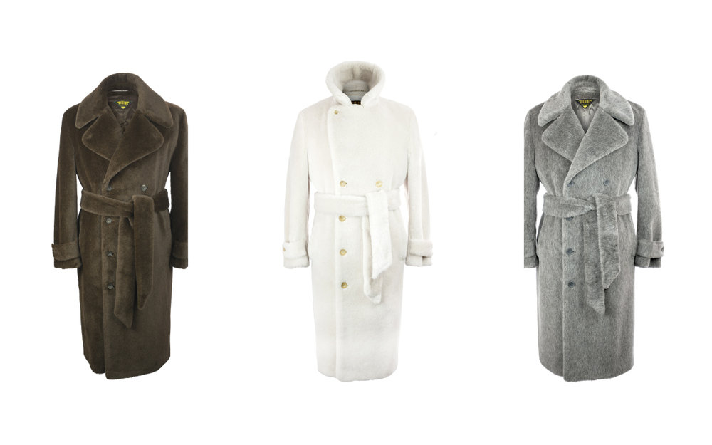
These, together with an extended family of unstructured sports coats, laid the foundations for a modern collection of performance tailoring that breathes heritage, a brand that is perfect for a contemporary lifestyle and, of course, for travel — whether that be on the road, sea, or by air.”






CREDIT
- Agency/Creative: Supreme—DBA
- Article Title: Repositioning, Brand Architecture and Tone Sourced from the Mid 1950’s
- Project Type: Packaging
- Agency/Creative Country: United Kingdom
- Market Region: Global
- Format: Box
- Substrate: Pulp Paper


