


Replant – Redefining the Future of Agriculture Through Design
A New Beginning in Sustainable Branding
In a world grappling with climate change, soil depletion, and food insecurity, the urgency to reimagine agriculture has never been more critical. Enter Replant—a bold new venture that challenges conventional farming by rooting itself in regeneration, sustainability, and connection to nature. Replant is more than just an agriculture brand; it is a cultural shift. It is an invitation to look again at the soil beneath our feet—not as a resource to extract from, but as a living ecosystem to protect, nurture, and celebrate.
This branding project was born from the belief that design can heal. It can inform, empower, and inspire people to make better choices—for their health, for communities, and for the planet. The task was not merely to design a logo or a visual identity, but to build a living, breathing brand that communicates hope, resilience, and environmental intelligence.
The Context: Soil, Soul, and a Global Need for Change
Agriculture sits at the crossroads of some of the world’s most pressing challenges and greatest opportunities. As the backbone of civilization, farming feeds billions—but modern practices have often prioritized short-term gains at the expense of long-term planetary health. Vast monocultures, chemical overuse, and carbon-heavy supply chains have turned fertile lands into barren ground, exacerbating both ecological and human crises.
At the same time, the regenerative agriculture movement is rising. It offers a different vision—one where food production restores the land rather than depleting it. It promotes biodiversity, soil health, water conservation, and carbon sequestration. It aligns perfectly with the world’s growing demand for sustainability.
But here’s the problem: regenerative farming lacks a powerful brand voice. It is often misunderstood, inconsistently presented, or hidden behind jargon. Replant seeks to change that—to give this movement the compelling visual identity it deserves. One that speaks to both hearts and minds.
The Vision: A Regenerative World Begins With Replant
The idea behind Replant is elegantly simple: “What if every time we planted, we healed?” What if agriculture could regenerate ecosystems, empower communities, and inspire conscious consumption?
This is the founding vision of Replant—a company and a cause. It supports farms that work with nature, not against it. It creates food systems that are circular, not linear. And it shares a message that goes beyond products—into values, ethics, and education.
Replant needed an identity that would encapsulate this vision. A brand that is both grounded and elevated. Minimal yet rich in meaning. Modern, but timeless. Visually captivating, and emotionally resonant. A brand that could stand proudly next to any luxury wellness label, yet remain accessible and rooted in integrity.
The Challenge: Designing a Brand With Soil Under Its Fingernails
Creating a brand like Replant meant walking a fine line. It had to feel natural but not rustic. Clean but not sterile. Scientific yet deeply human. The visual language had to reflect the earthy textures of farmland, the elegant curves of nature, and the clarity of purpose-driven business. It also had to appeal to multiple audiences—eco-conscious consumers, progressive chefs, regenerative farmers, policy makers, and sustainability advocates.
The challenge was to make soil feel luxurious. To make green not cliché, but powerful. To create a brand that lives in harmony with nature while thriving in a digital-first, design-savvy marketplace.
This branding project was not simply about surface aesthetics. It demanded deep research into regenerative farming, biomimicry, sustainability frameworks, and food transparency. The storytelling had to be layered—with everything from icon systems to packaging telling a piece of the brand’s ethos. And it had to feel authentic. Every visual element, from the logo to the colors to the type, had to stem from the brand’s roots—its values, its story, its reason for existing.
Inspiration: Nature, Cycles, and the Quiet Power of Design
Replant draws inspiration from the quiet beauty and intelligence of nature. From the spiral of a sunflower seedhead to the branching networks of mycelium beneath the forest floor. From the rhythmic layers of topsoil to the concentric circles formed in tree trunks. These shapes, patterns, and systems served as a foundation for the design process.
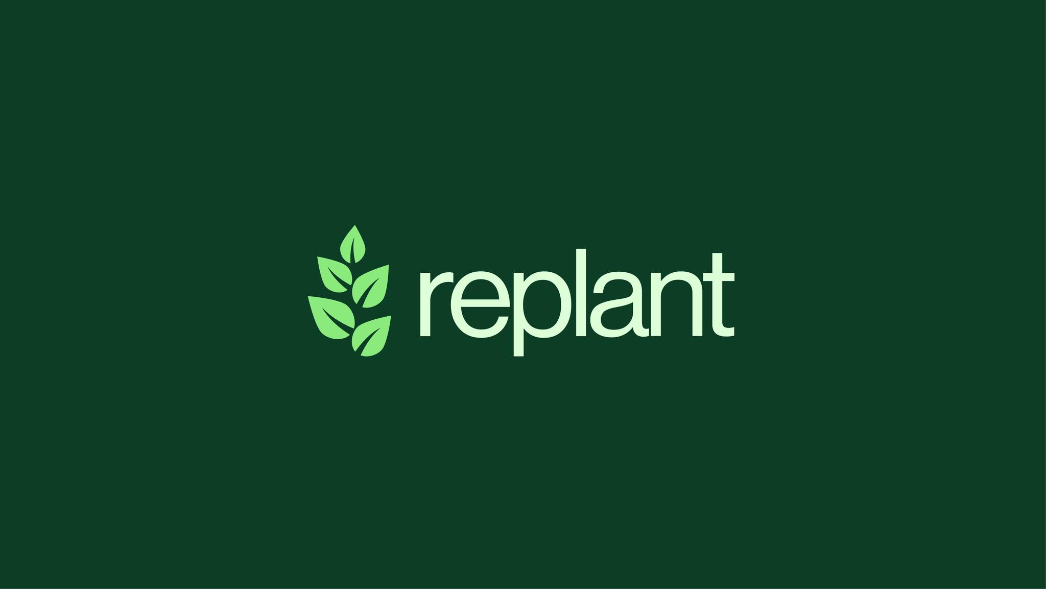
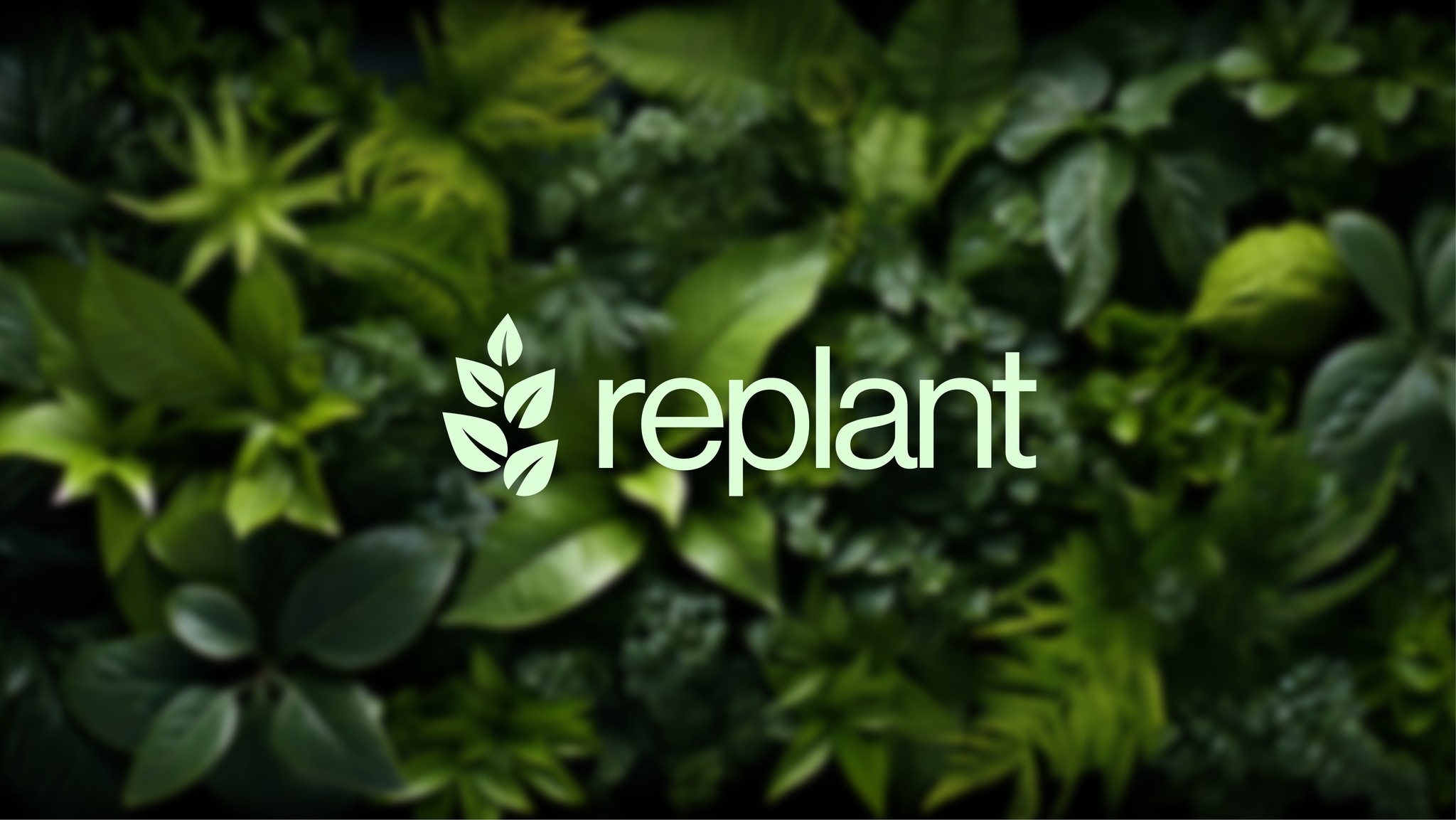
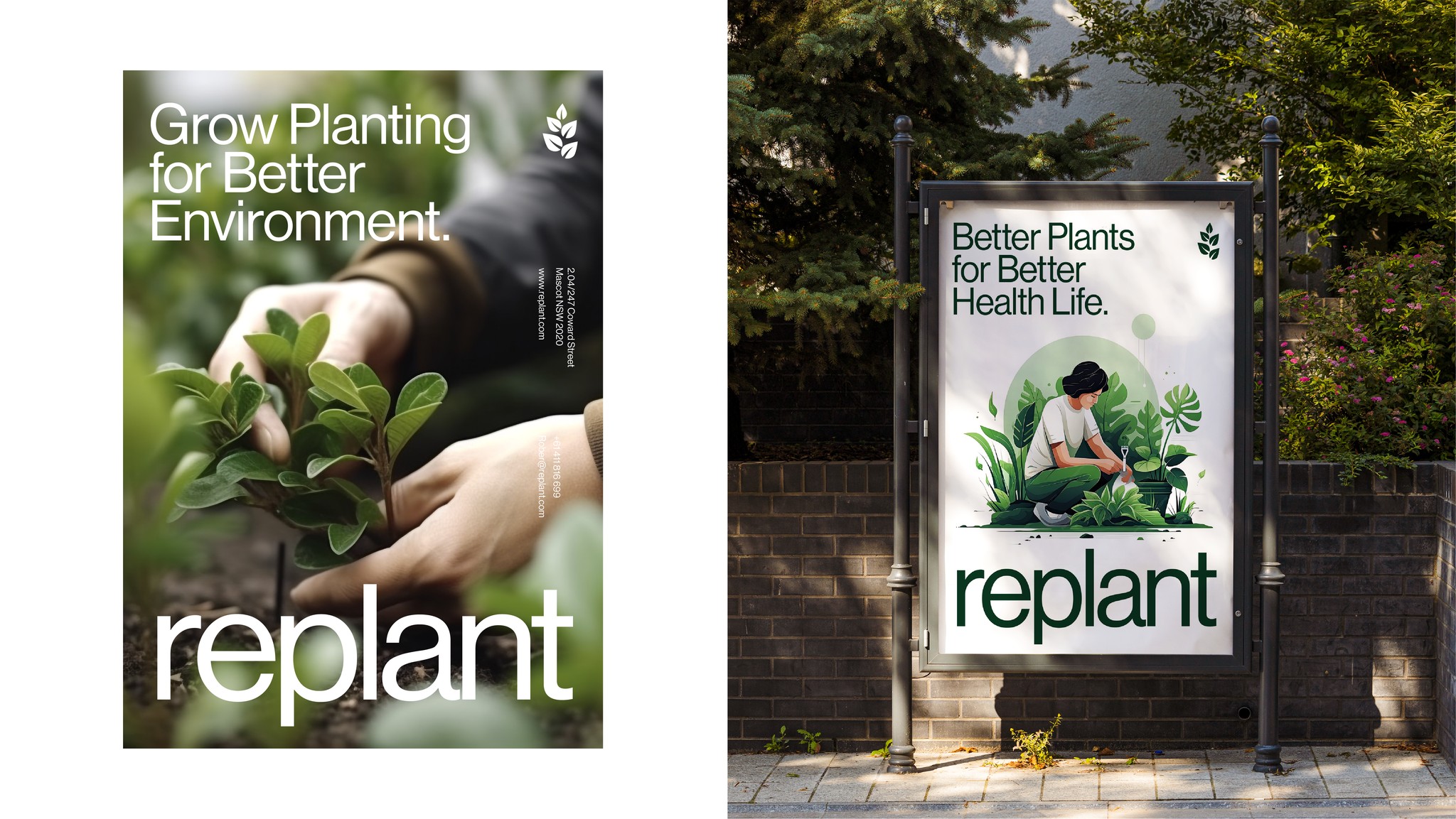
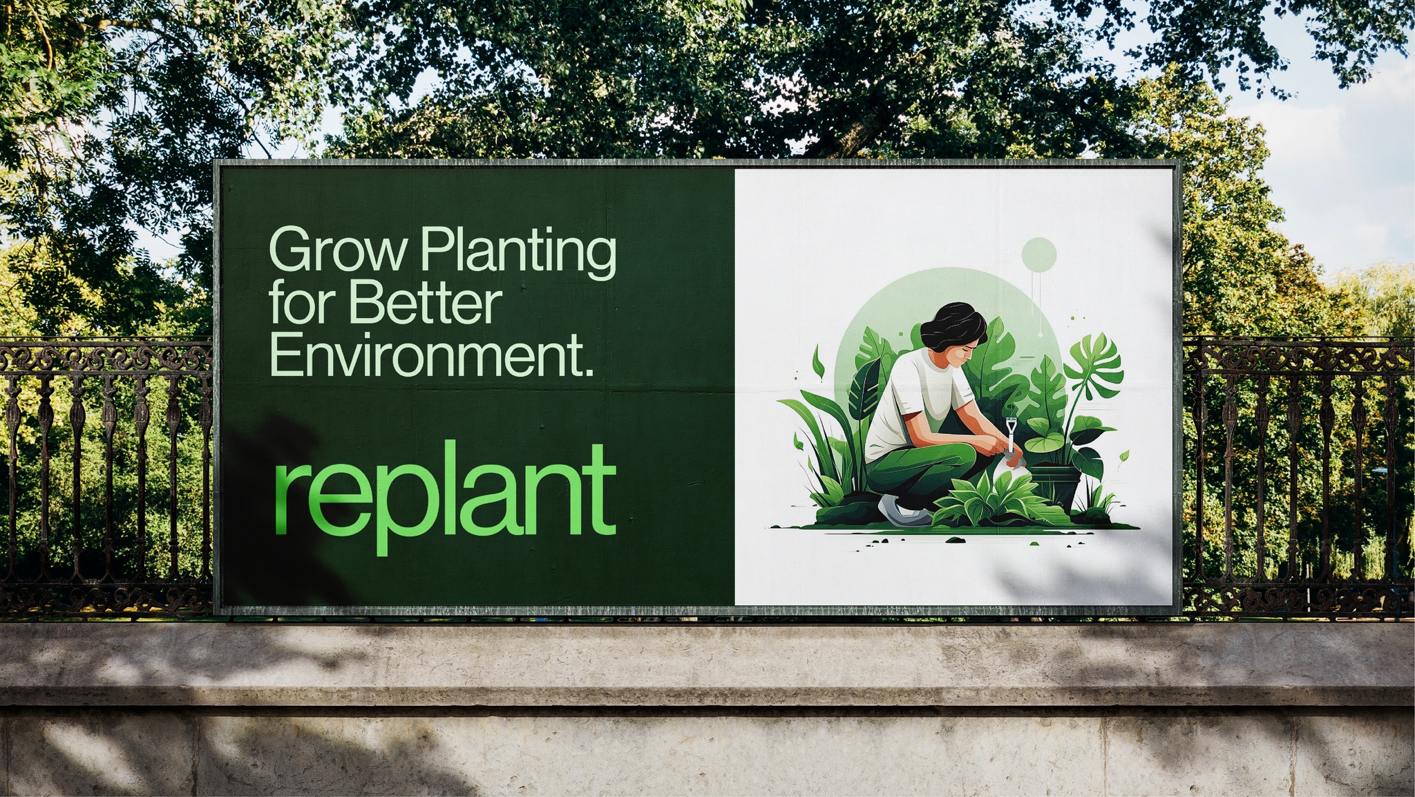
The concept of regeneration was central. Regeneration is not linear—it is circular. It is about returning, rebalancing, and reimagining. This idea was reflected in the logomark: a clean, organic form that merges a sprouting plant with a geometric circle—symbolizing growth, wholeness, and continuity.
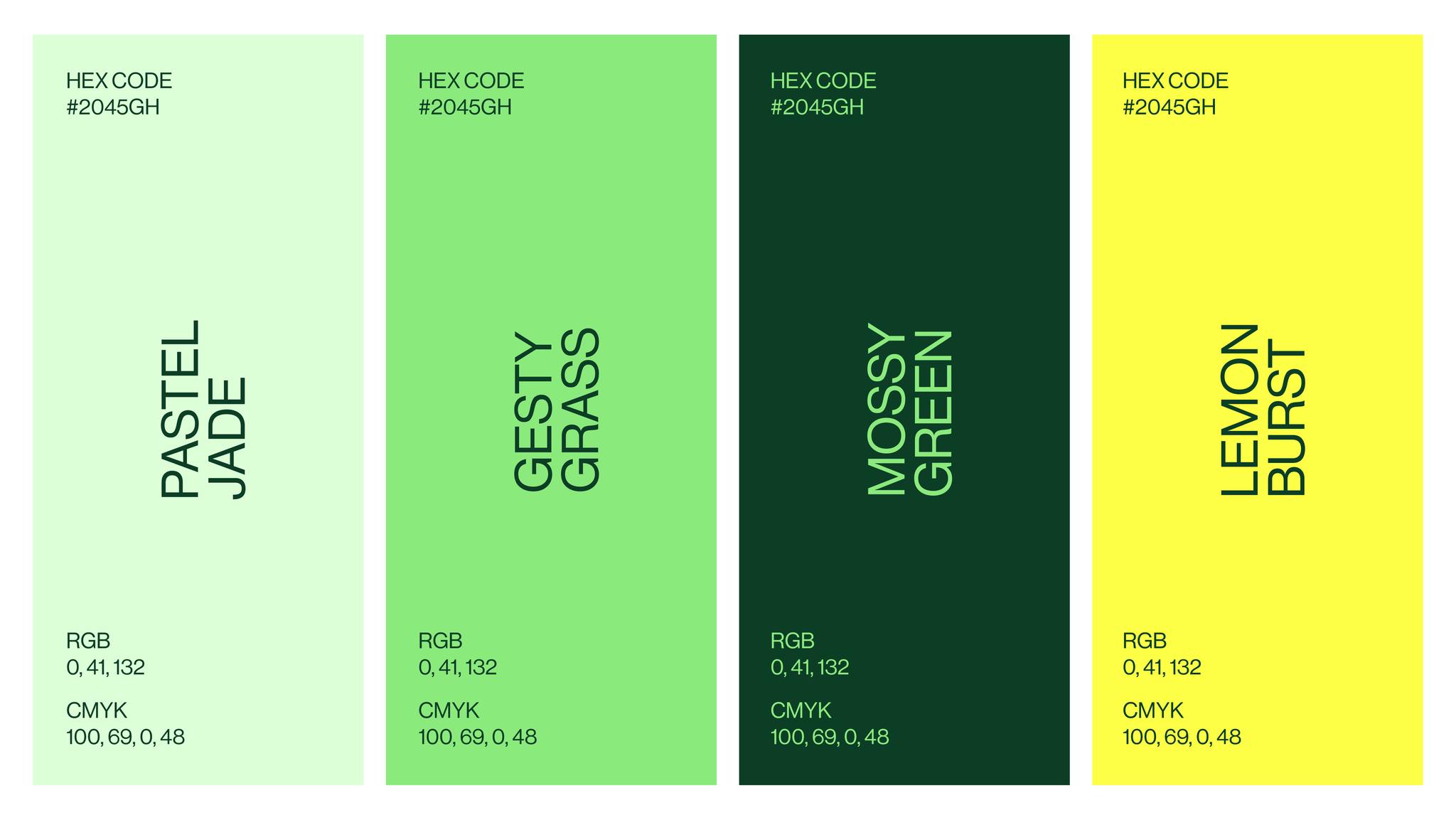
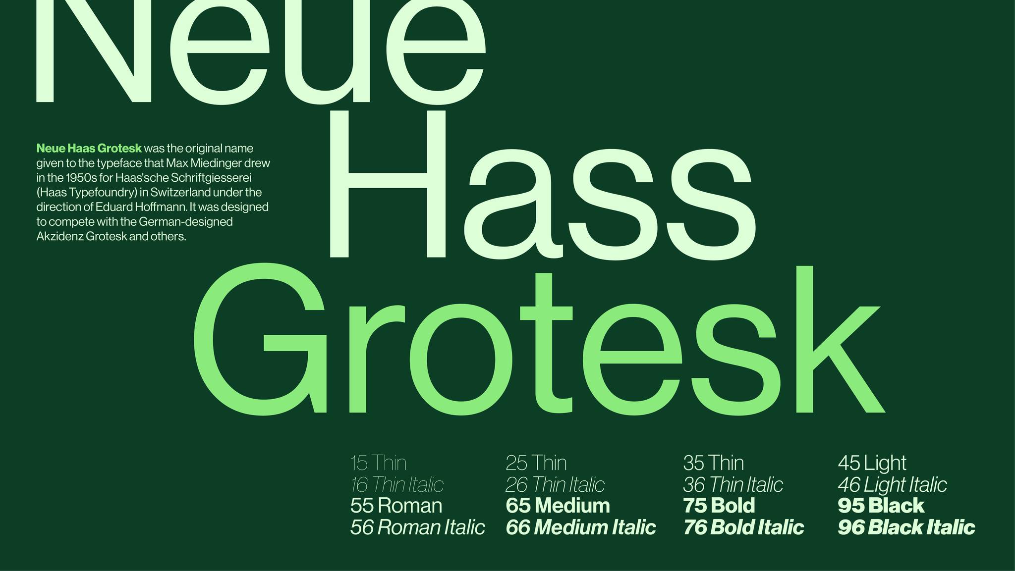
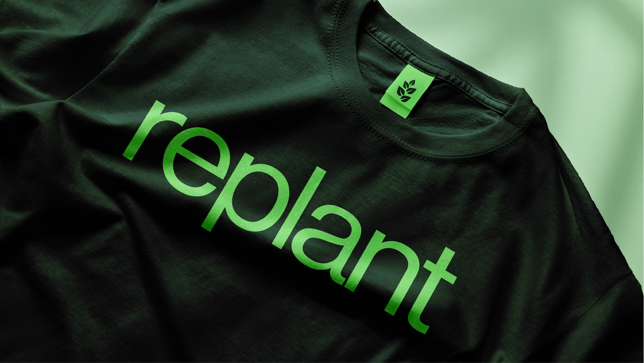
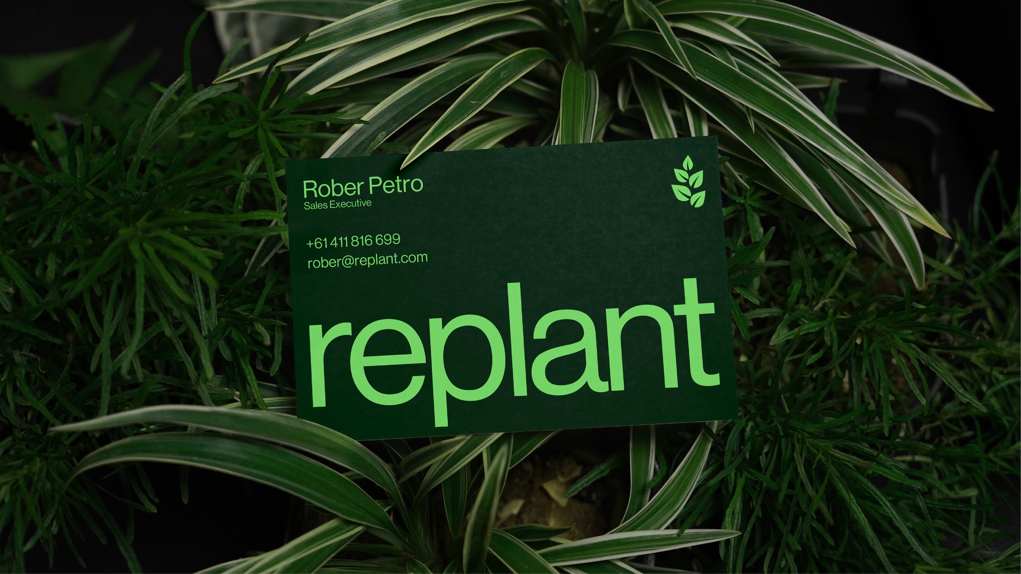
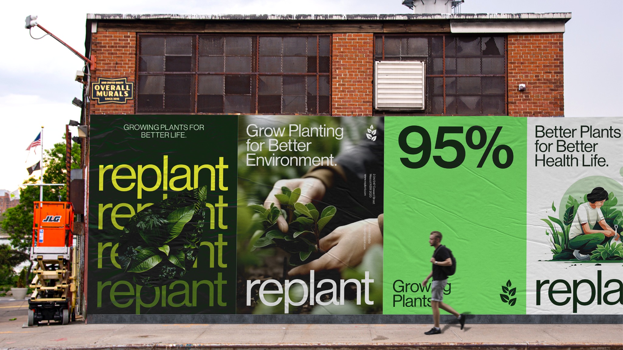
Color palettes were drawn from the earth—shades of forest green, rich clay, oat grain, and sun-warmed gold. Typography was chosen to be soft yet structured, evoking a balance of human warmth and professional clarity.
The tone of voice throughout the brand is calm, confident, and optimistic. It avoids fear-based narratives and instead celebrates progress, connection, and the small steps that lead to great change. Taglines like “From soil to soul” and “One seed closer to a better world” echo the poetic, purpose-filled essence of Replant.
Why This Brand Matters
In an age of greenwashing, empty eco-marketing, and performative sustainability, Replant is refreshingly real. Every aspect of the brand is rooted in purpose—not just aesthetics. The farms are vetted. The supply chains are traceable. The packaging is compostable. The impact is measurable.
But above all, Replant is a brand that respects its audience. It assumes that people care—about quality, about the planet, about truth. And it reflects that care back to them in its design, its transparency, and its storytelling.
This is why design matters. Because it can bring people closer to ideas that matter. It can give form to a movement. It can make sustainable food not just a niche choice, but an irresistible one. Replant shows that branding is not a superficial exercise—it is a tool for education, connection, and transformation.
Replant in the Marketplace: A Category of Its Own
Replant does not fit neatly into existing categories. It’s not a “farmers market” brand. It’s not corporate agriculture. It’s something new—a premium, purpose-first brand that speaks to a generation craving meaning in every purchase.
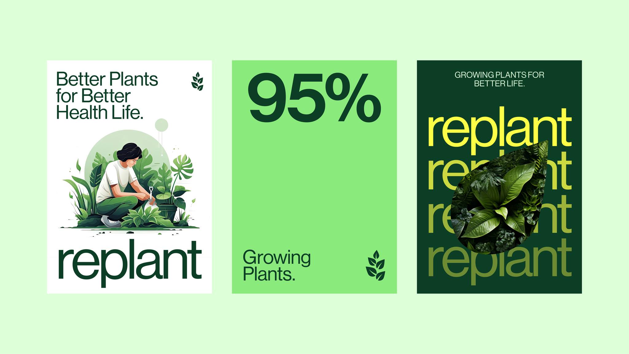
Whether on store shelves or on Instagram, the brand commands attention through calm confidence, visual clarity, and genuine storytelling. Its packaging is tactile and beautiful. Its website is informative and user-friendly. Its tone is consistent across every touchpoint—simple, grounded, and empowering.
Replant positions itself not just as a product line, but as a platform. It invites collaboration, community, and education. It shares resources on regenerative practices. It celebrates the farmers. It invites consumers to become part of the soil-to-soul journey.
A Personal Reflection on the Design Process
As a designer, working on Replant was more than a creative challenge—it was a calling. It pushed me to think deeper, research further, and connect more meaningfully with the message behind the visuals. It taught me that branding can do more than sell—it can serve. It can inspire. It can change minds and habits and, ultimately, the world we live in.
Replant reminded me that the most powerful design doesn’t shout—it grows. Like a seed. Quietly. Steadily. With purpose.
Final Words: Designing the Future, One Brand at a Time
Replant is more than a portfolio project—it’s a proof of concept that ethical, sustainable branding can be beautiful, compelling, and impactful. It represents what’s possible when design is aligned with purpose, when storytelling is rooted in truth, and when every visual decision supports a larger mission.
In a time of overwhelming global challenges, Replant offers something rare: optimism. Not naive optimism, but informed, grounded, regenerative hope. The kind that starts in the soil and grows toward the light.
This is Replant. A brand for the future. A symbol of what’s next in food, in farming, and in design.
CREDIT
- Agency/Creative: Faysal Ahmed
- Article Title: Replant Agriculture Branding by Faysal Ahmed
- Organisation/Entity: Freelance
- Project Type: Identity
- Project Status: Published
- Agency/Creative Country: Bangladesh
- Agency/Creative City: Dhaka
- Market Region: Asia
- Project Deliverables: Brand Design, Brand Identity, Branding, Graphic Design, Illustration, Logo Design
- Industry: Agriculture
- Keywords: Agriculture Branding, Sustainable Farming, Eco Branding, Green Identity Design, Organic Brand Design, Agri-tech Branding, Nature-Inspired Branding, Environmental Design, Farm-to-Table Branding Botanical Identity Minimal Agriculture Branding Regenerative Branding Earth-Tone Palette Natural Packaging Design,Clean & Modern Agriculture Branding
-
Credits:
Brand Designer: Faysal Ahmed


