The rebrand remains loyal to the celebrated school’s 400-year history
The brand overhaul provides complete verbal and visual assets for the independent institution
Free The Birds demonstrates seamless integration of historical features with a fresh, modern influence
Alleyn’s, one of the UK’s most highly regarded independent, co-educational schools founded in 1619, has revealed a refreshed identity with the help of independent brand elevation agency, Free The Birds.
The new positioning brings the institution’s branding firmly into the 21st century, whilst remaining loyal to the core visuals and values established by the school’s founder, Edward Alleyn.
Renowned for being a high achieving, diverse, open and welcoming school, Jane Lunnon – The Head of Alleyn’s – sought Free The Birds’ services in revitalising how the school’s brand looks, feels and talks, after entering into her new role in January 2021. Reflecting her great ambitions for the school, her goal was to better promote Alleyn’s celebration of ‘the spirit of possibility’, a value which the school and its teachers continuously impart upon its pupils to help them achieve outstanding success both academically and creatively.
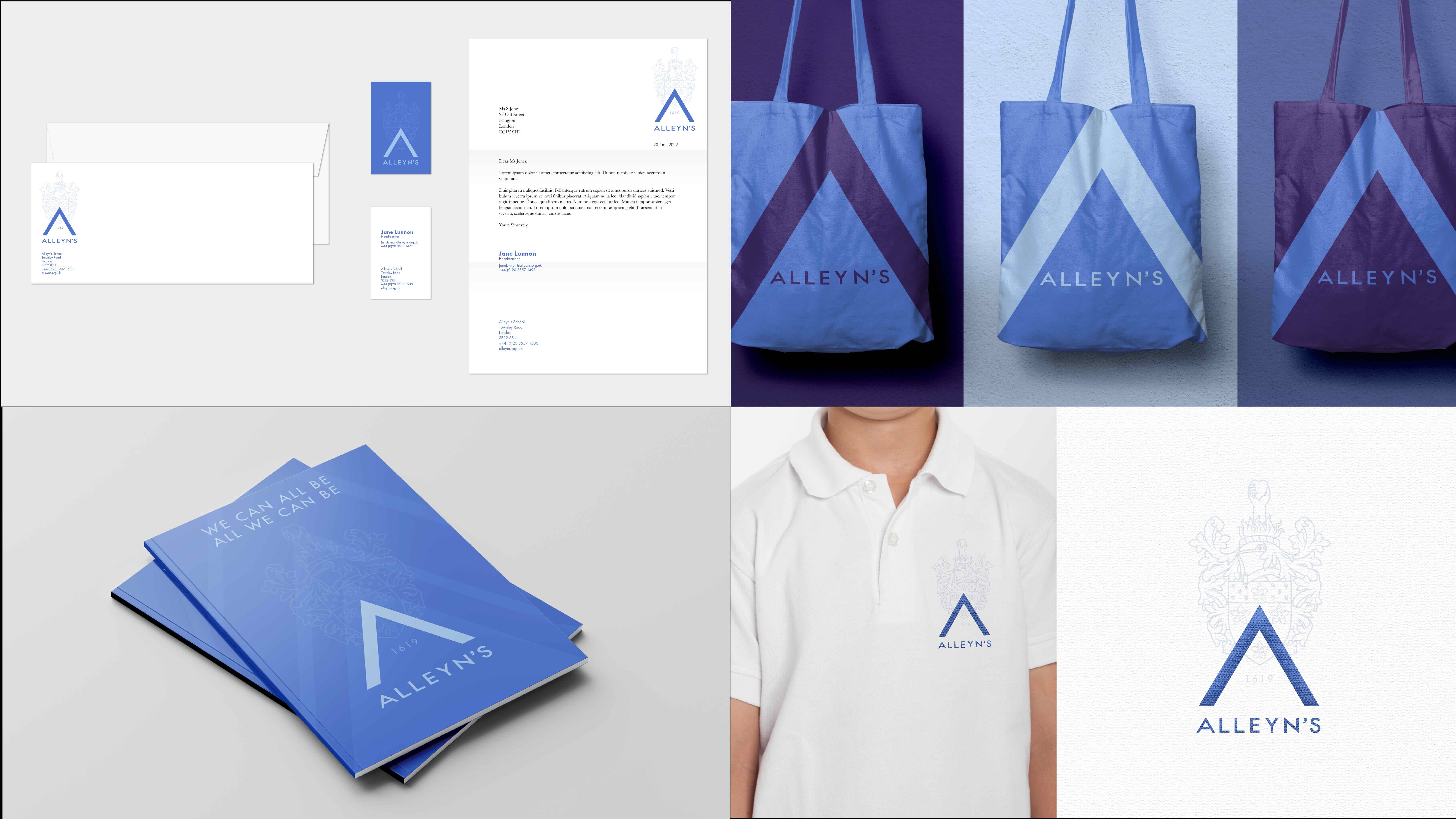
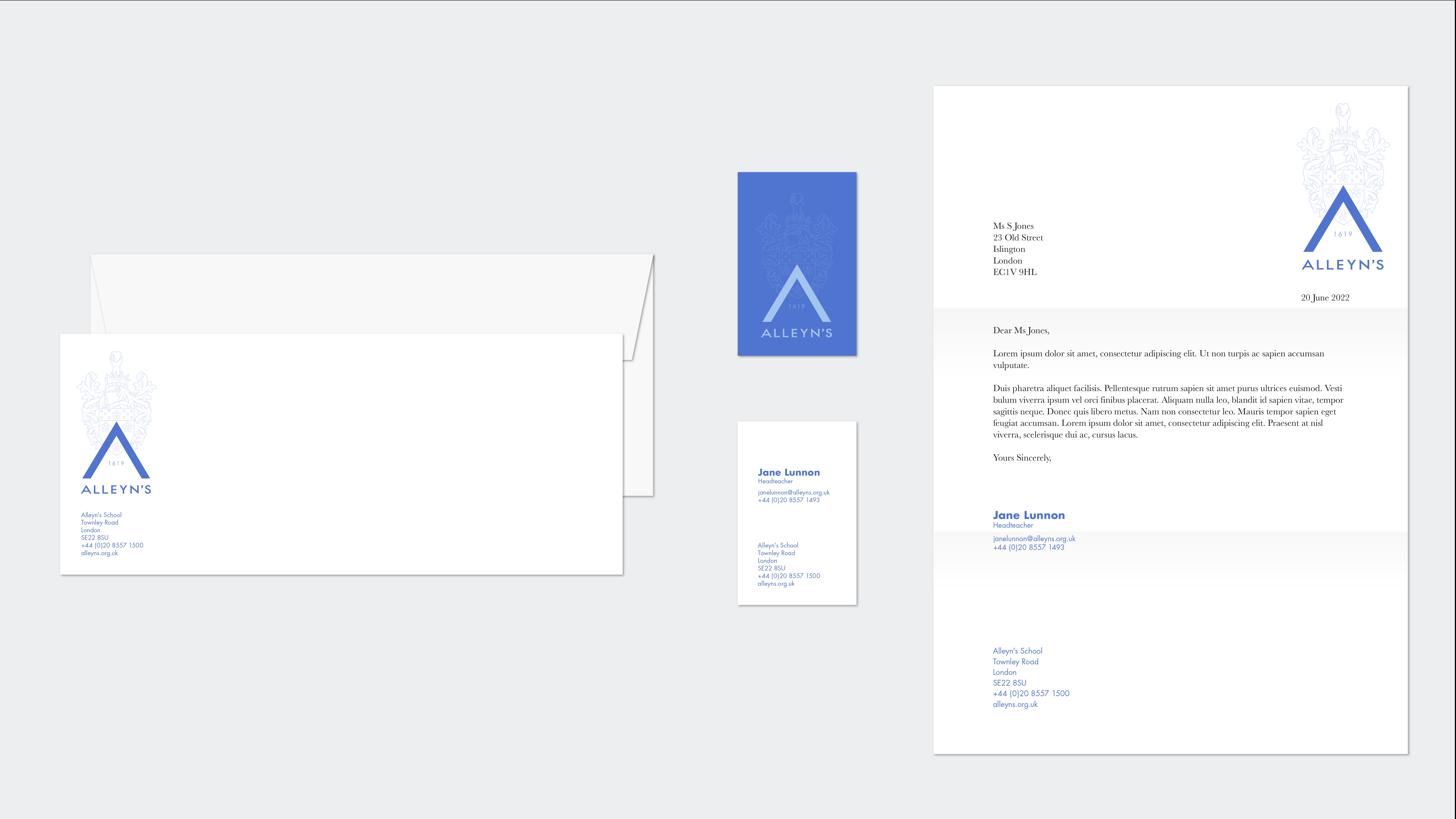
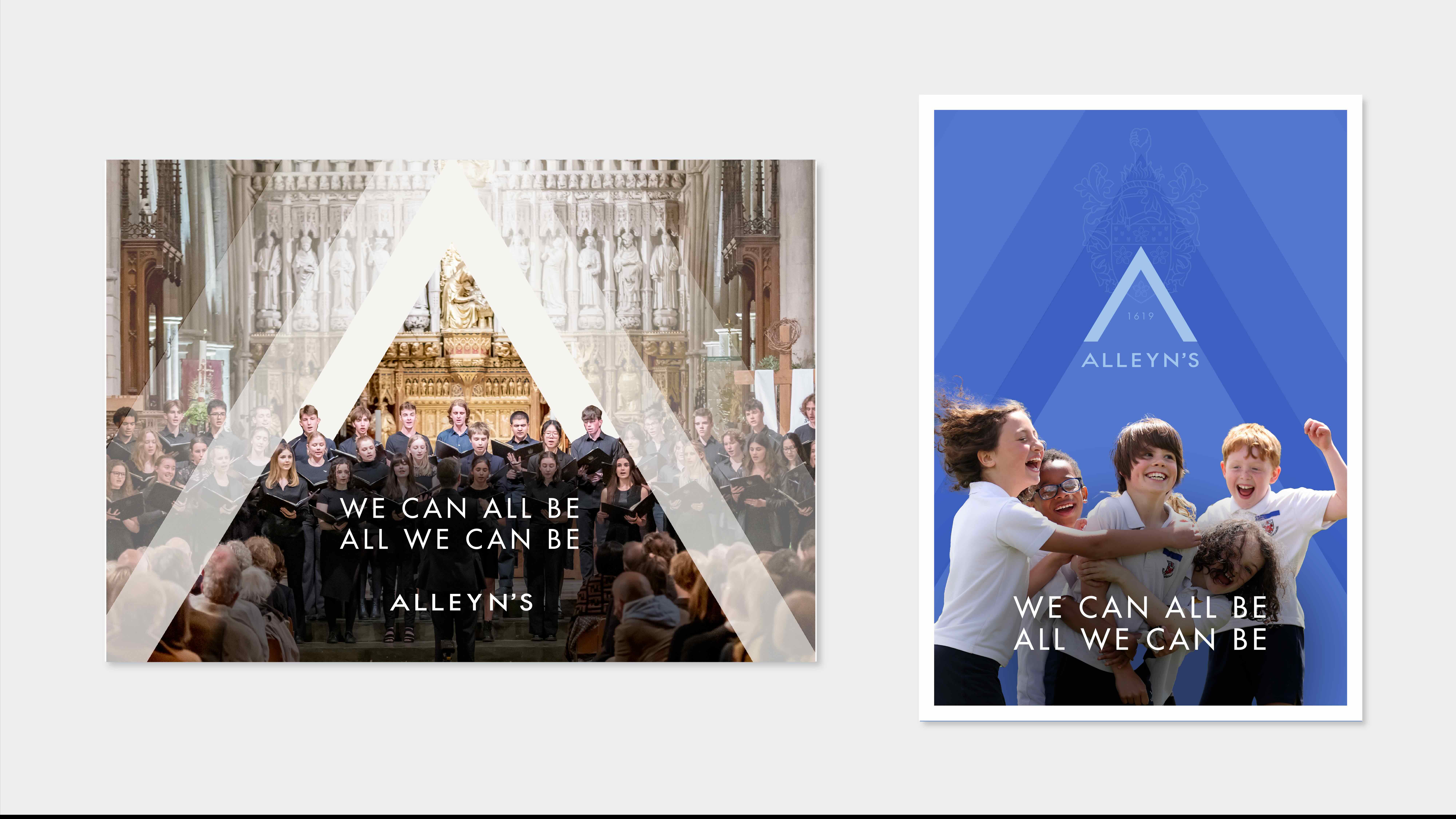
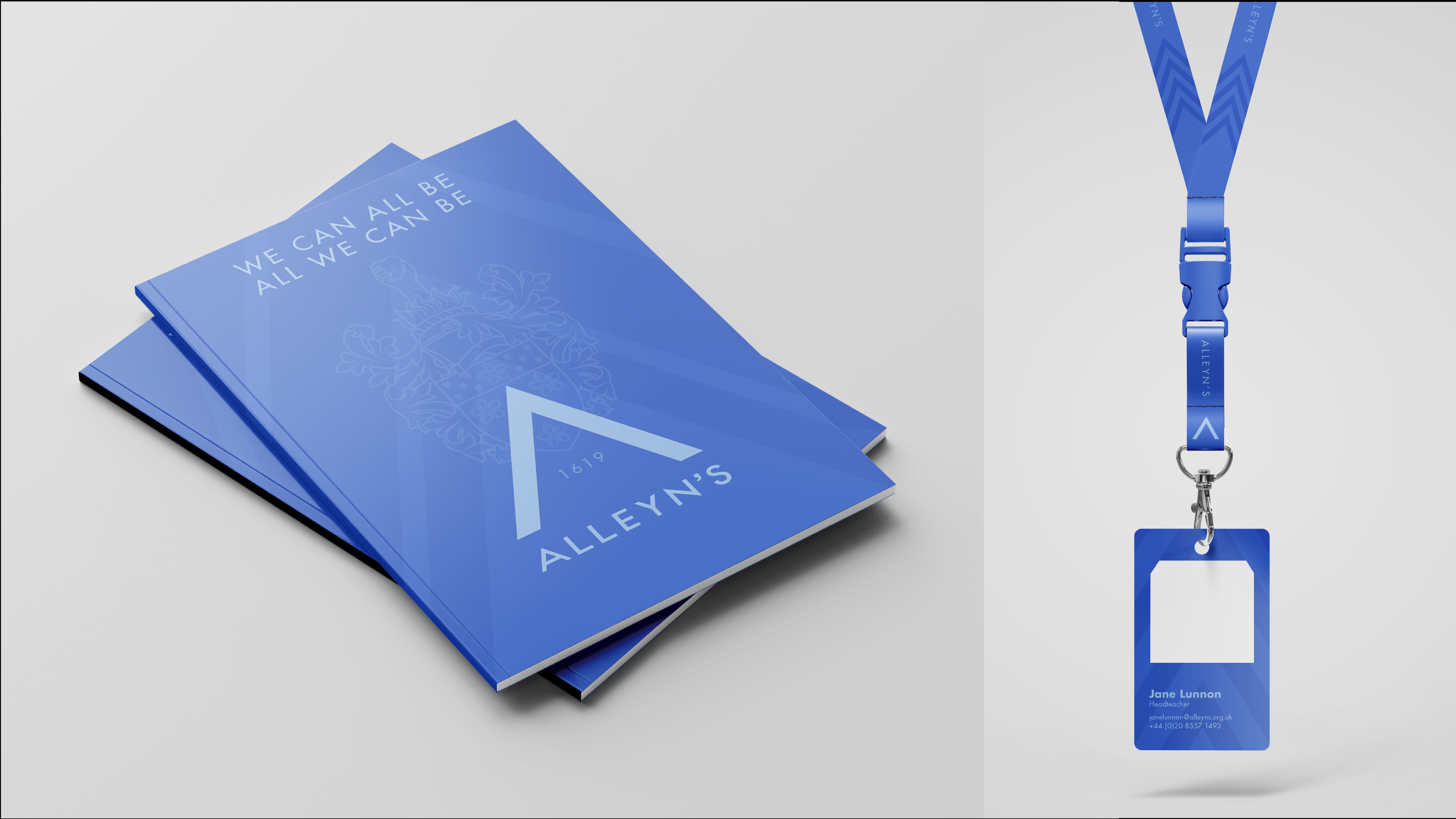
Whilst honouring important historical elements of the school, the brand identity ensured that Alleyn’s is consistent across numerous marketing touch points as well as potential future subsidiaries. The project introduced a new manifesto and tone of voice, as well as a Brand Bible outlining how the new distinctive assets can be deployed.
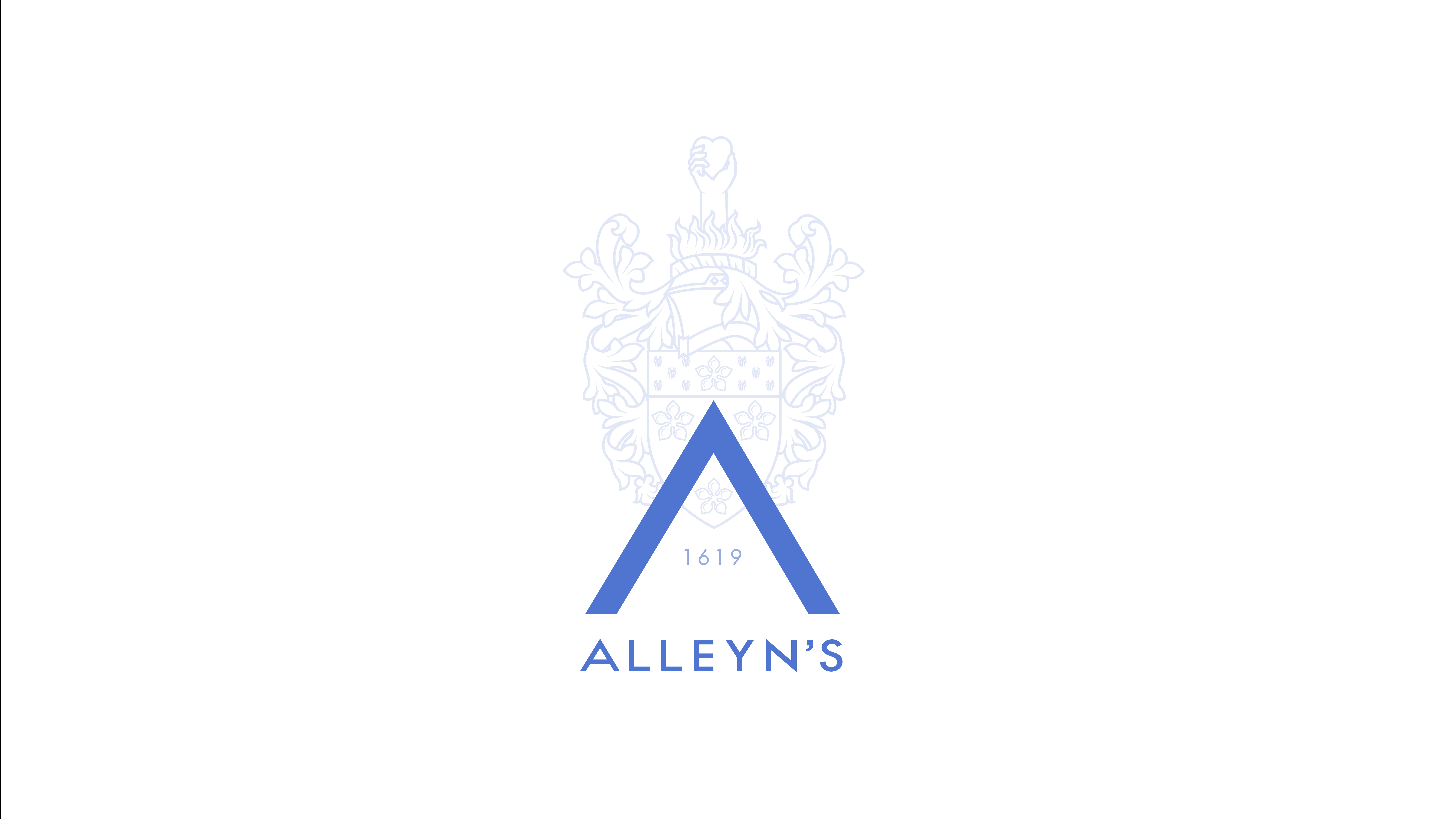
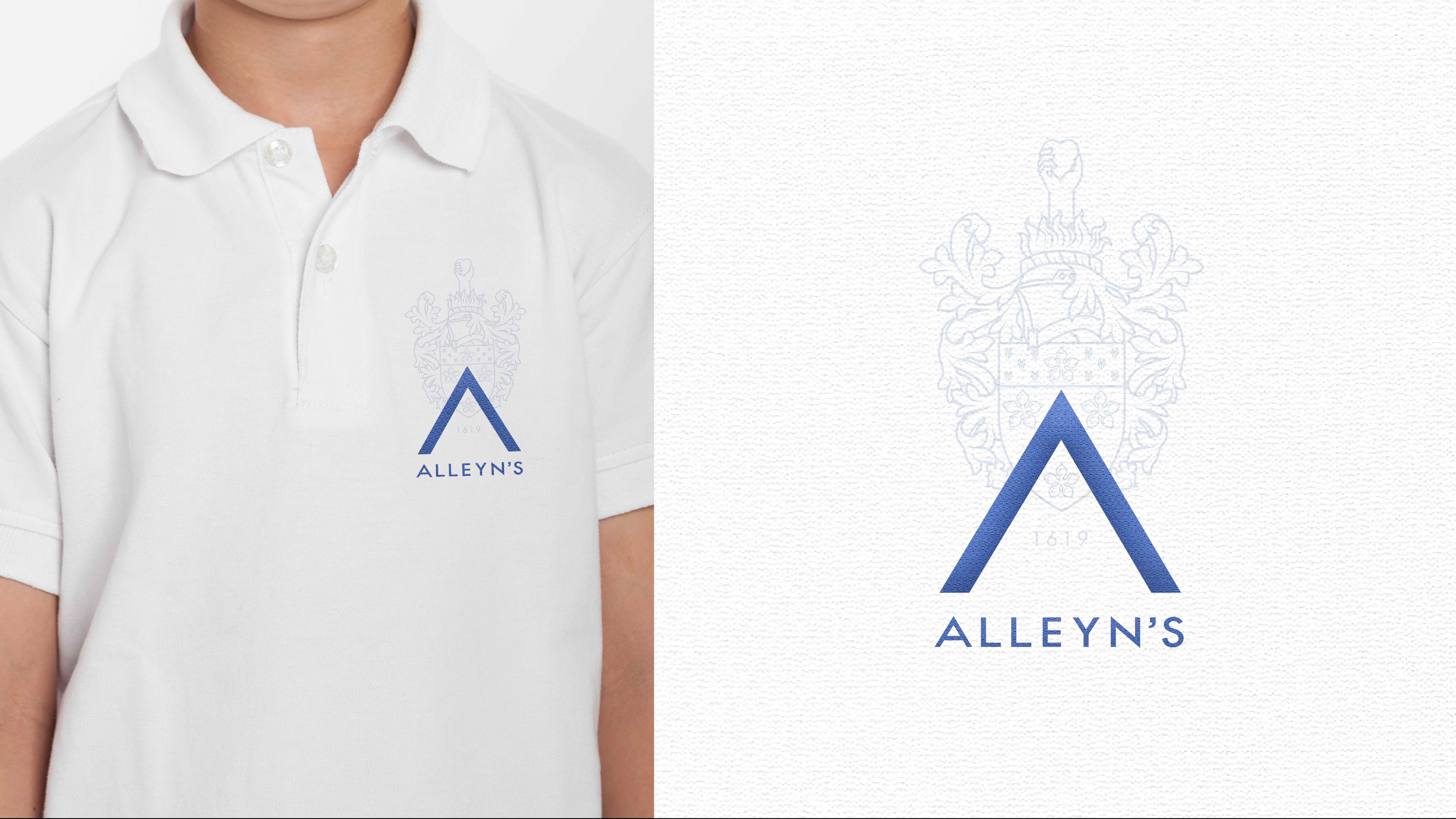
A significant part of this project included the school crest, a key historical consideration treated with great care by Free The Birds. The coat of arms originates from Alleyn’s ‘College of God’s Gift’, and features a hand emerging from fire – known as ‘the flaming Heart of London’ – an emblem of charity presented to Edward Alleyn by King James I.
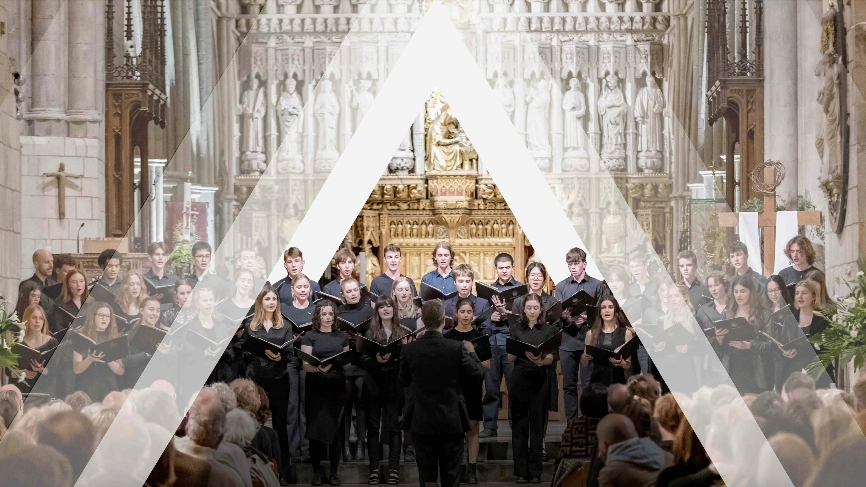
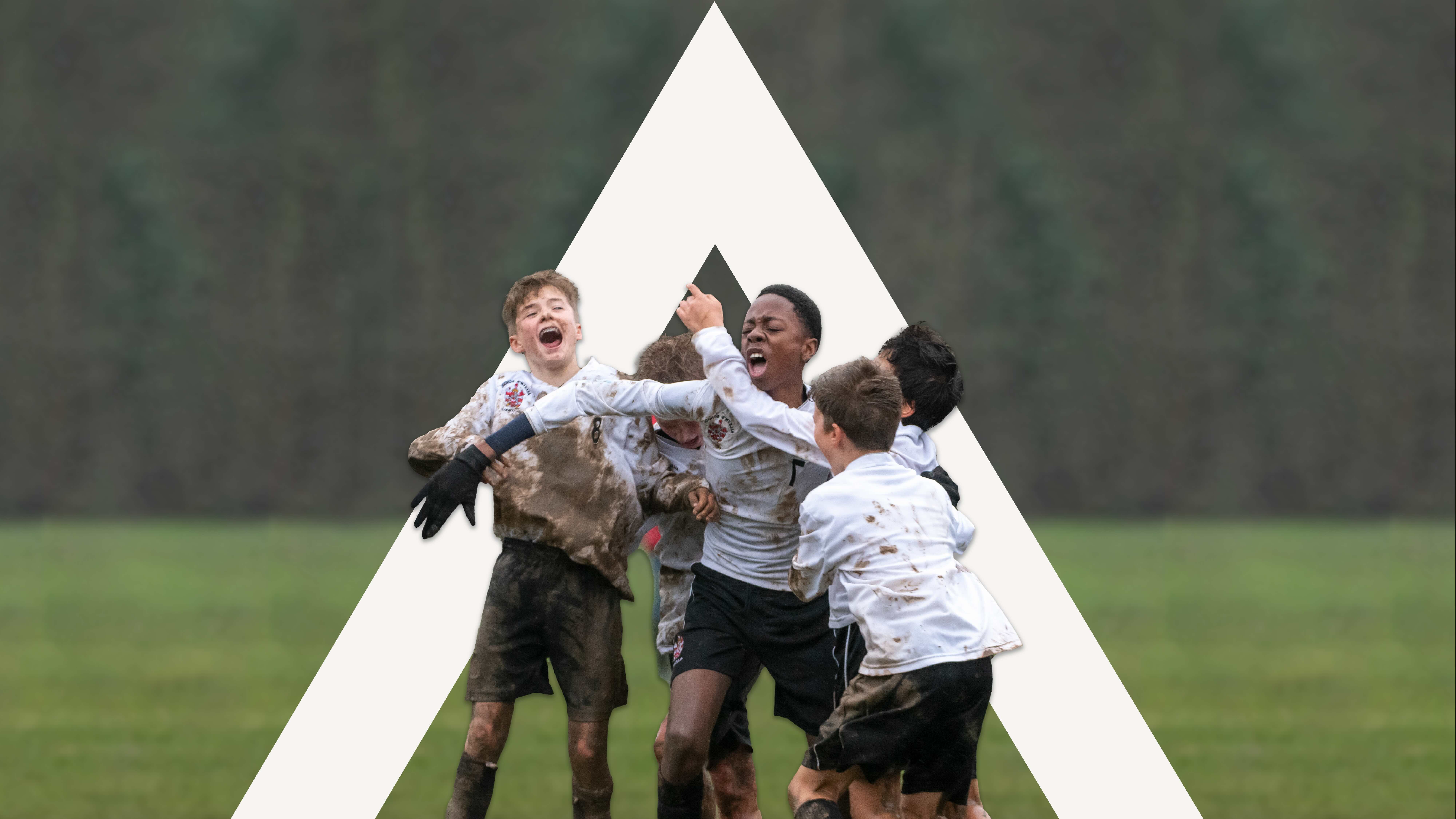
The refreshed logo features a simplified illustration to retain the original identity, with a key addition in the distinctive new chevron which creates an ‘A’ for Alleyn’s, and symbolises positivity and a forward direction for the school and its pupils. The cornflower blue becomes the principal colour, based on Alleyn’s favourite flower and which represents hopeful optimism for the future.
The new school manifesto communicates the core brand values carried forward by Edward Alleyn and celebrated by the students every day, led by the ‘all’ found within Alleyn’s.
Paul Domenet, Partner and Creative Strategy Director at Free The Birds comments, “We were truly inspired by what Alleyn’s represents as a leading educational institution, as well as the vision and goals of Jane Lunnon. Being trusted with breathing new life into Alleyn’s was a process we were honoured to undertake. Employing our unique Brand Island® process to explore three distinct and unique territories, we were thrilled that Alleyn’s chose this progressive new look and feel that pays homage to its rich history. Through our work we have ensured that Alleyn’s remains distinctive, and the goals for their pupils are brought to life.”
Jane Lunnon, The Head of Alleyn’s shares, “It is very important to us at Alleyn’s that we celebrate the character, essence, and success of our school over the last 400 years as well as ensuring that it endures. The heart of our legacy and our dreams for the future find expression in our visual personality: a dynamic and vibrant force that resonates with pupils, staff, and parents past present and future. Free The Birds’ artistry has brought this to life. This revitalised identity blends across all aspects of our self-expression in a contemporary and clean way, weaving intricacies that pay homage to our founder and storied history. We are very grateful for this transformative journey.”
Alleyn’s is the latest respected educational institution to seek Free The Birds’ support in revitalising their branding, including the Girls’ Day School Trust (GDST).
CREDIT
- Agency/Creative: Free The Birds
- Article Title: Renowned Independent School, Alleyn’s Reveals New Visual Identity Devised by Brand Elevation Agency, Free the Birds
- Organisation/Entity: Agency
- Project Type: Identity
- Project Status: Published
- Agency/Creative Country: United Kingdom
- Agency/Creative City: London
- Market Region: Europe
- Project Deliverables: Brand Guidelines, Brand Identity, Brand Mark, Logo Design, Rebranding
- Industry: Education
- Keywords: Brand Identity; Visual Identity; Brand Elevation; Education
-
Credits:
Co-founder & Managing Partner: Nick Vaus
Co-founder & Creative Strategy Director: Paul Domenet
Senior Designer: Mike Peacock
Client Services Director: Emily Mills


