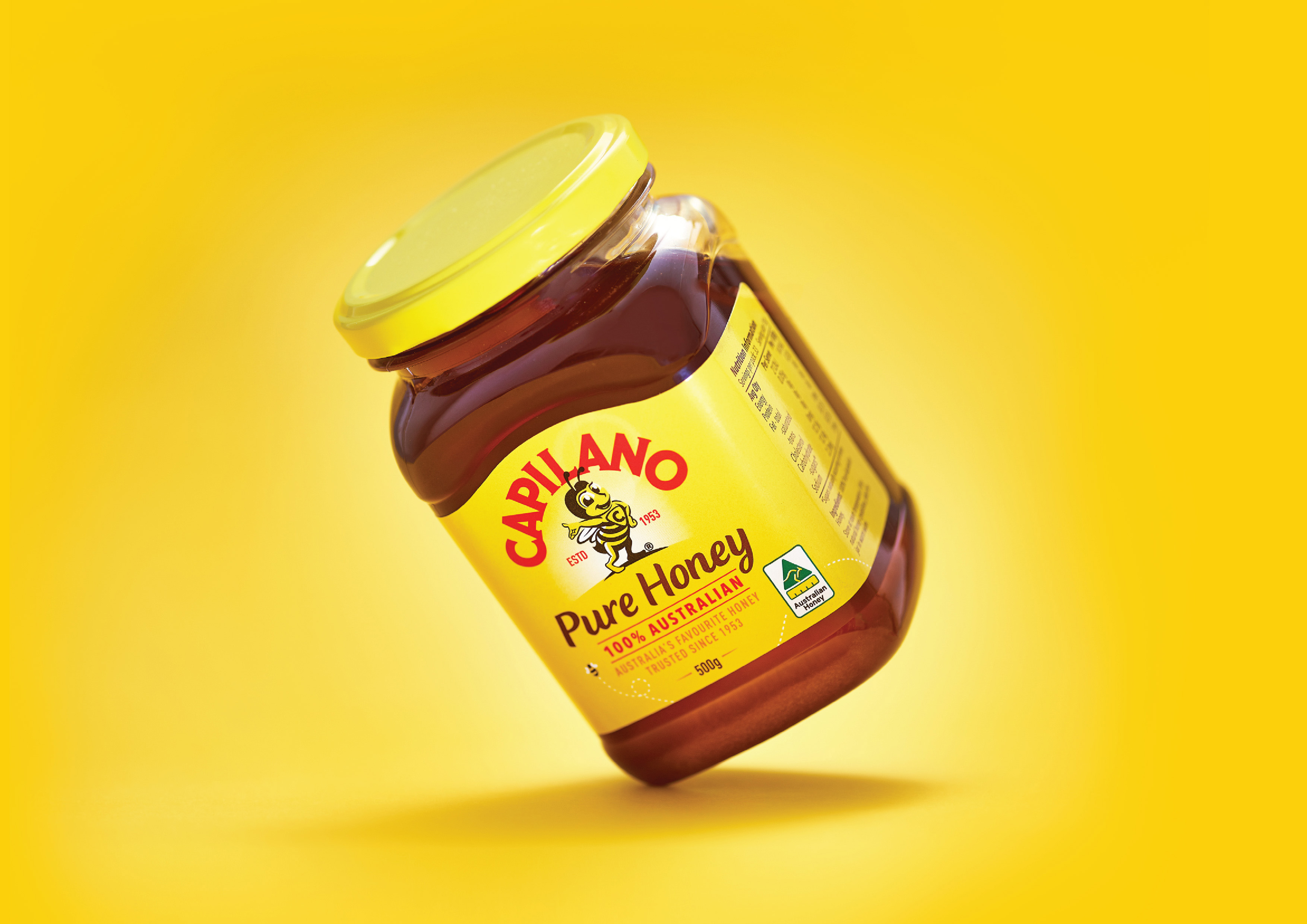
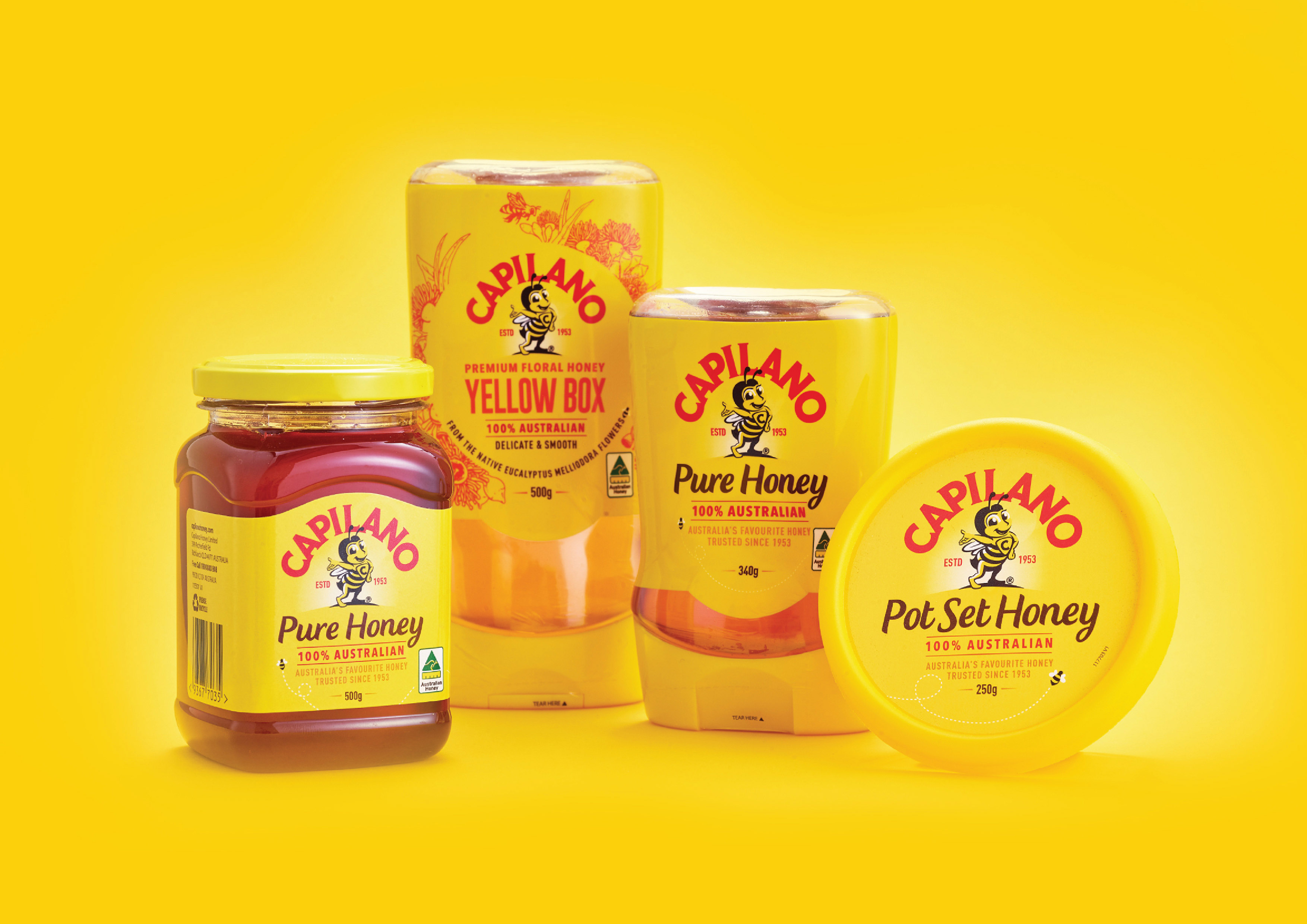
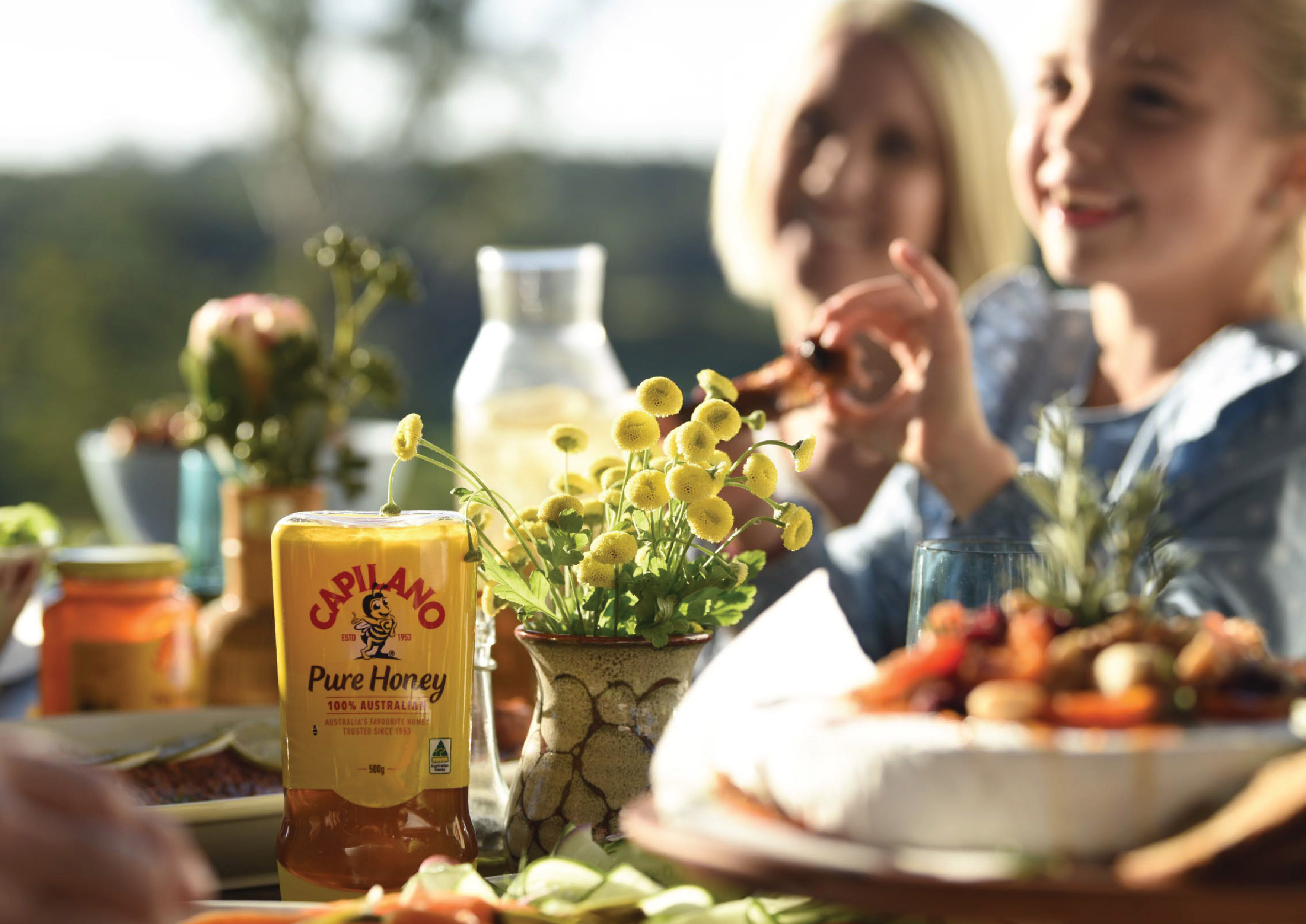
Capilano has been the favoured honey of Australian’s for over 65 years. Their iconic yellow pack and cheeky bee mascot inhabits a fond place in most Australian’s minds. This fondness was being forgotten and Capilano was struggling to connect with an audience inundated with choice and innovation.
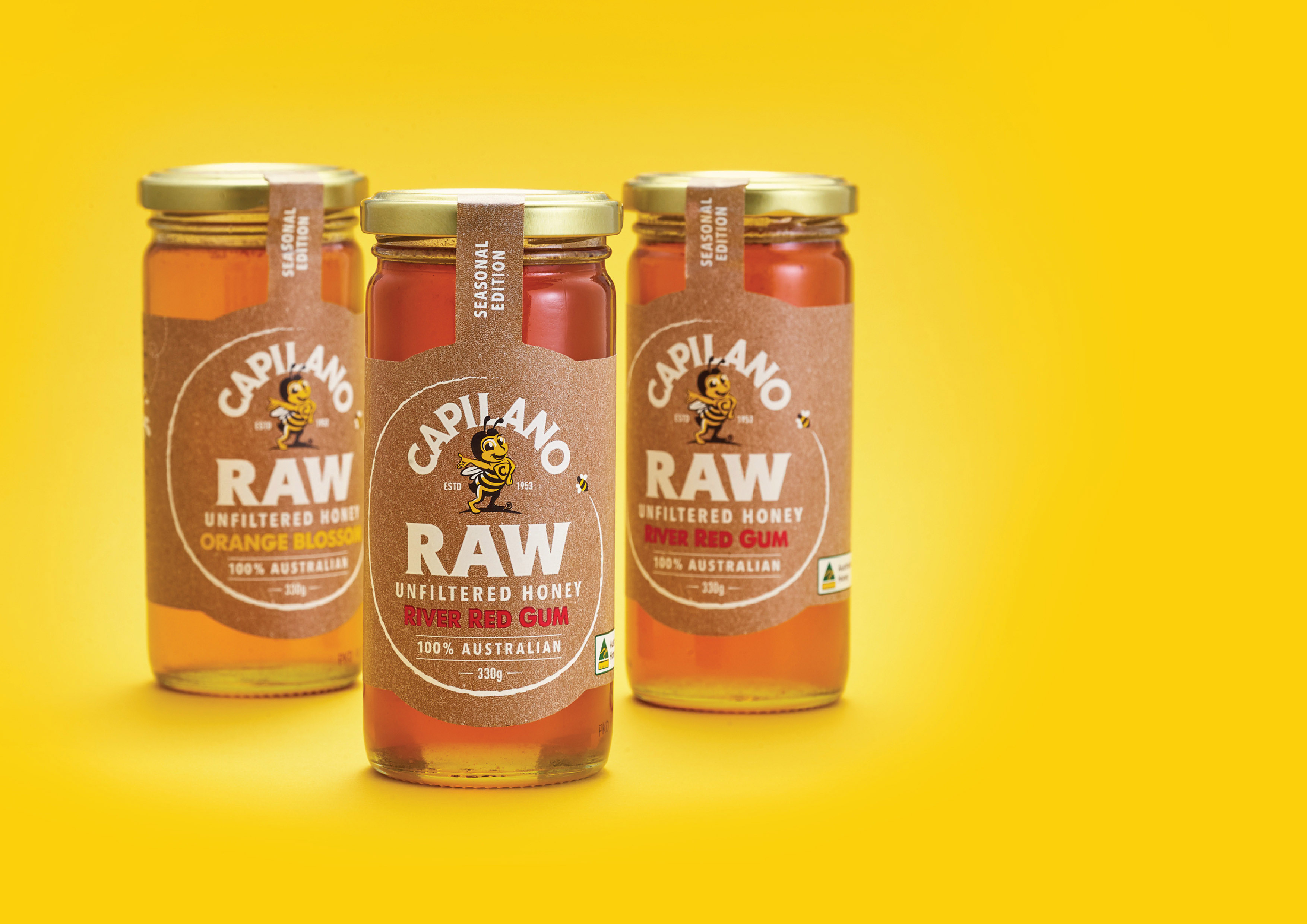
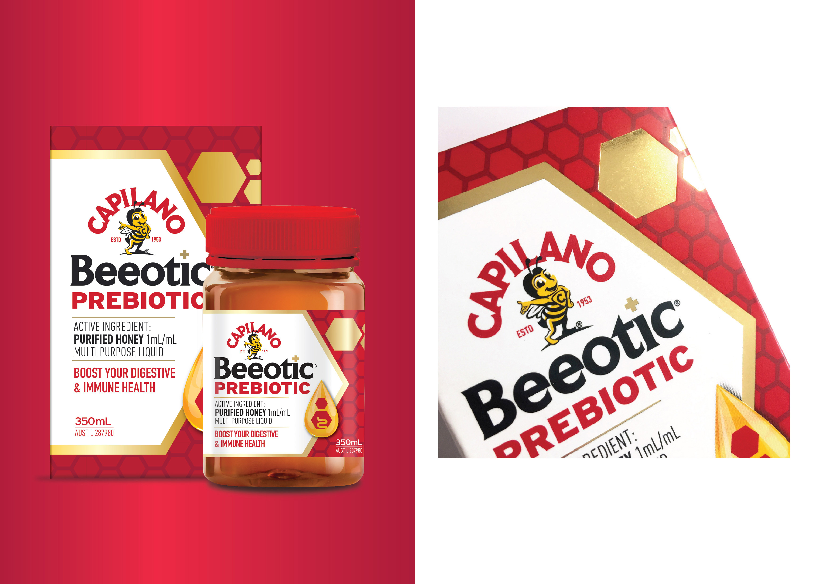
WCN_ worked with Capilano to redefine their brand purpose. Aiming to rebuild credibility and trust, we evolved the design with sensitivity. Putting the icon, our ‘nature champion’ at the heart of the brand we communicate clearly the 100% Natural Australian message.
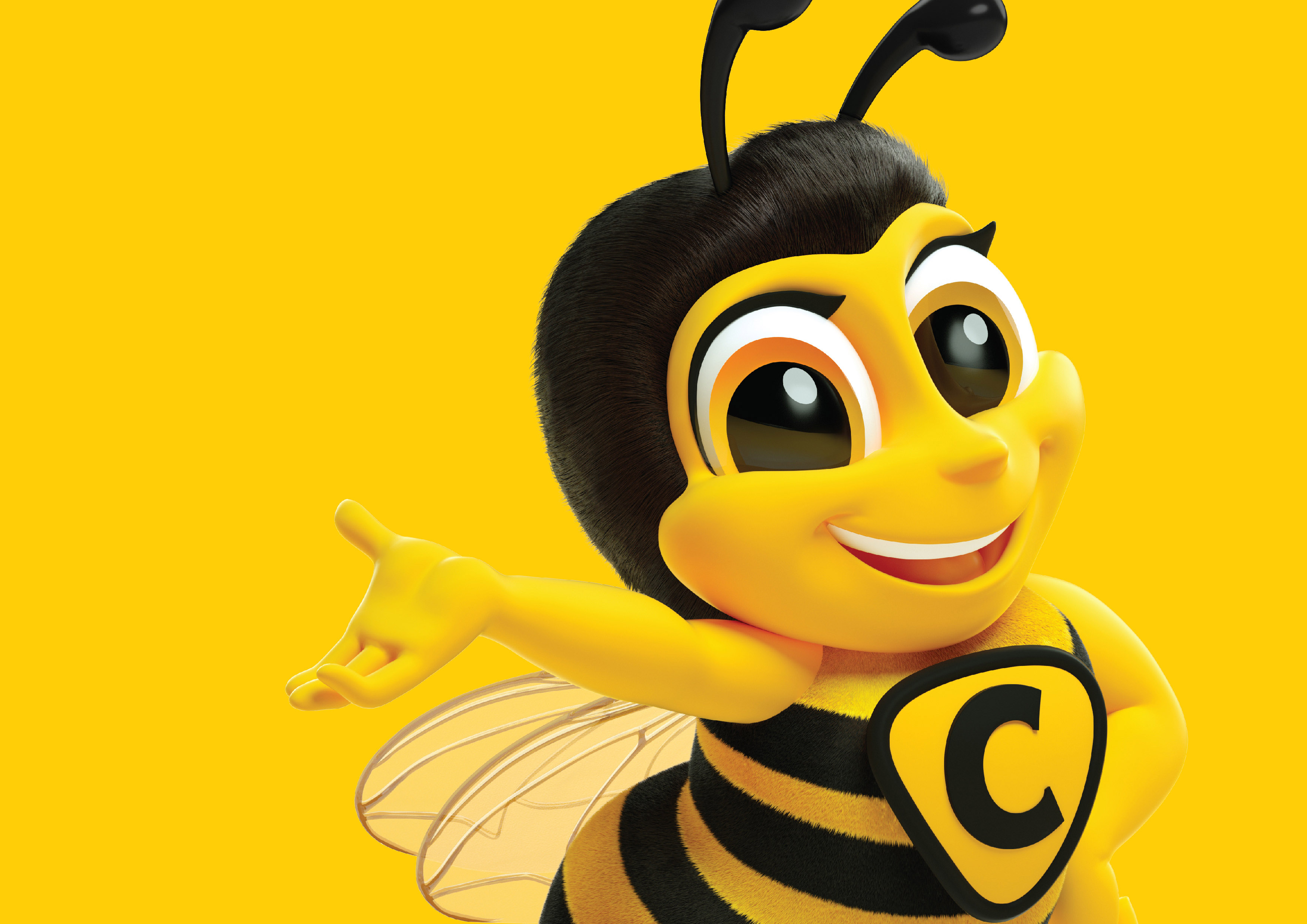
The creation of Capilano’s new brand mascot ‘Phoebe’ it has given the brand an engaging character whose friendly appeal opens up the brand to connect with young families and resonate with international markets.
CREDIT
- Agency/Creative: WhatCameNext_
- Article Title: Reinvigorating Australia’s Favourite Honey Capilano
- Organisation/Entity: Agency, Published Commercial Design
- Project Type: Packaging
- Agency/Creative Country: Australia
- Market Region: Oceania
- Project Deliverables: Brand Architecture, Brand Guidelines, Brand Identity, Brand Redesign, Brand Refinement, Brand Rejuvenation, Brand Strategy, Branding, Graphic Design, Illustration, Packaging Design, Product Architecture, Product Naming, Rebranding, Tone of Voice
- Format: Bottle, Jar
- Substrate: Glass Jar, Plastic


