


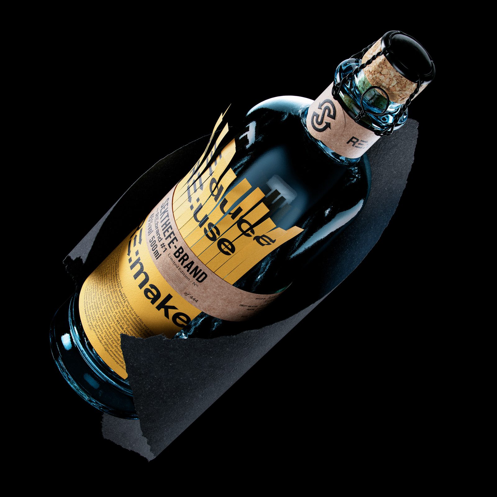
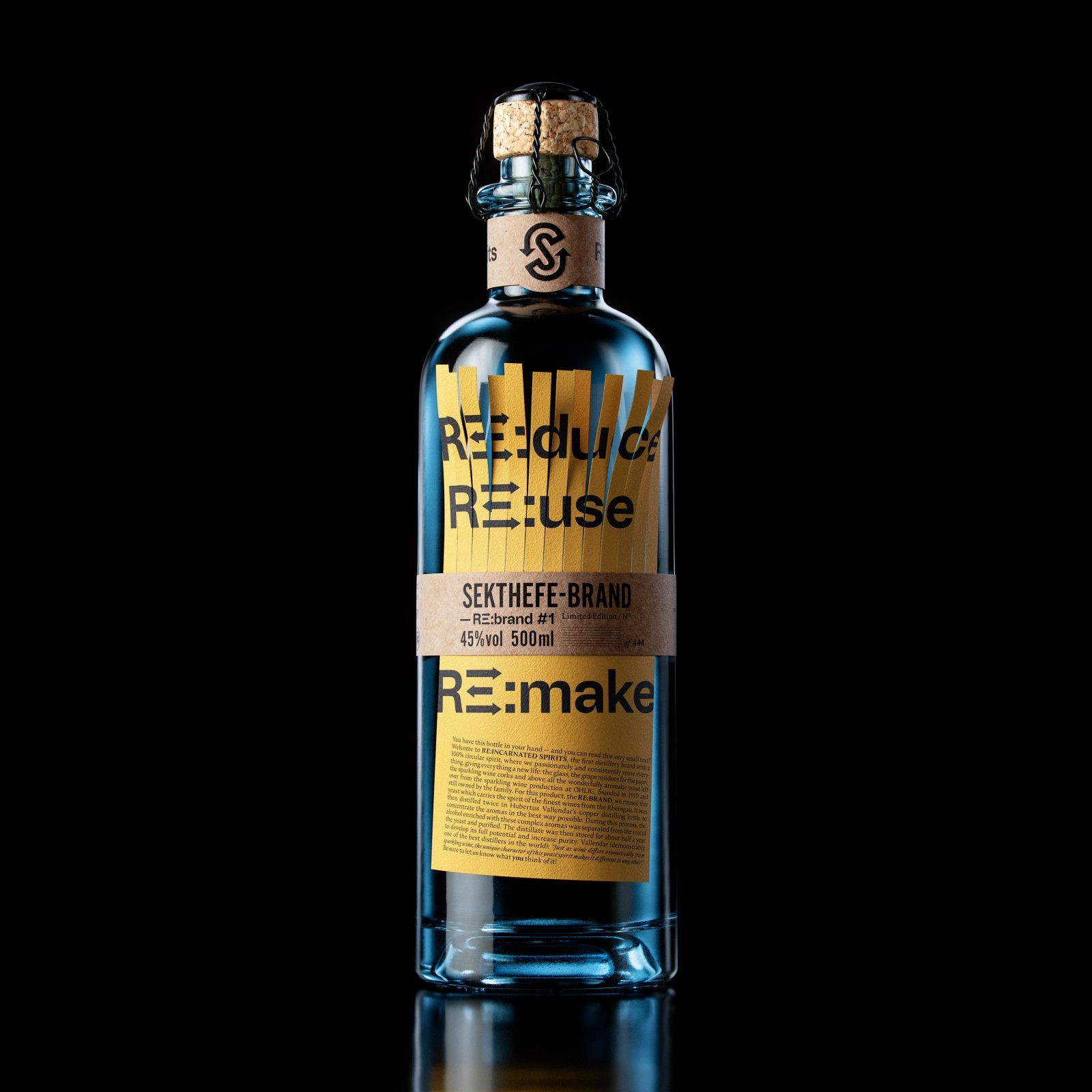
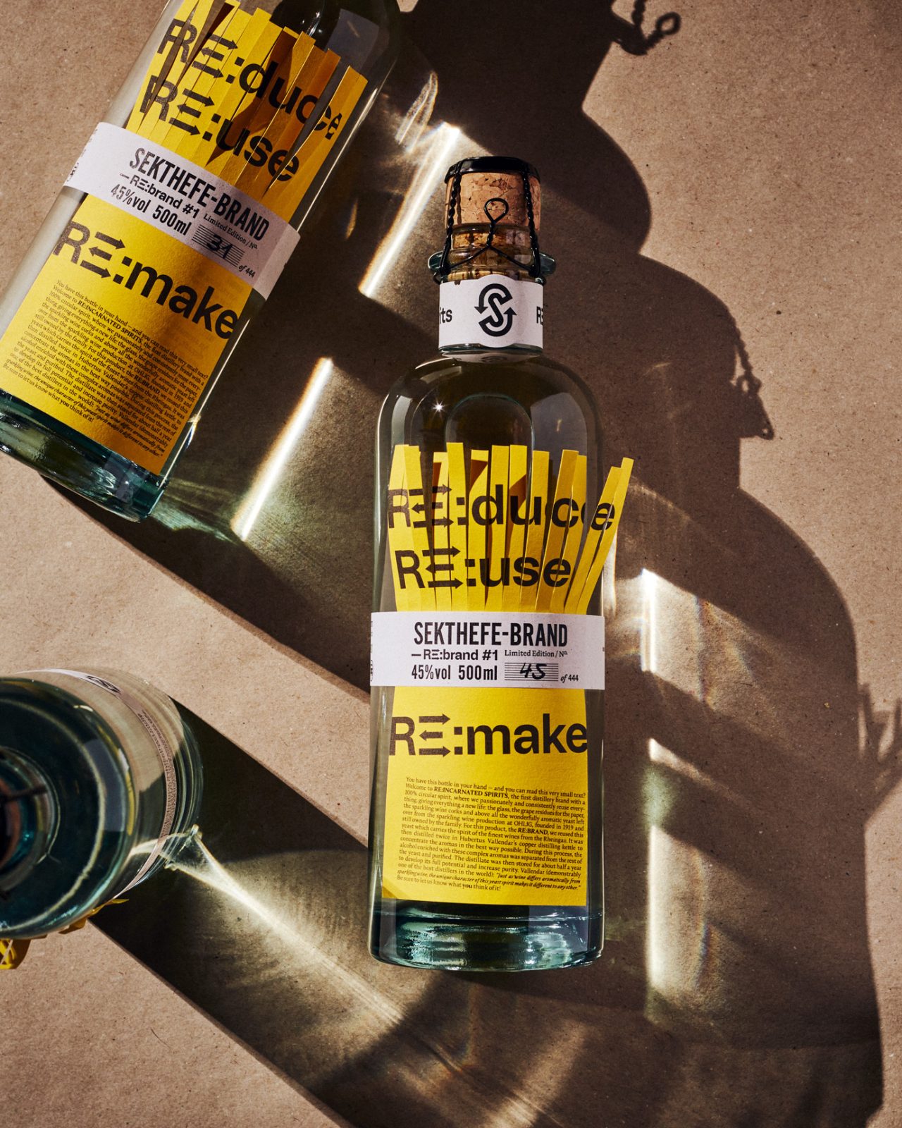
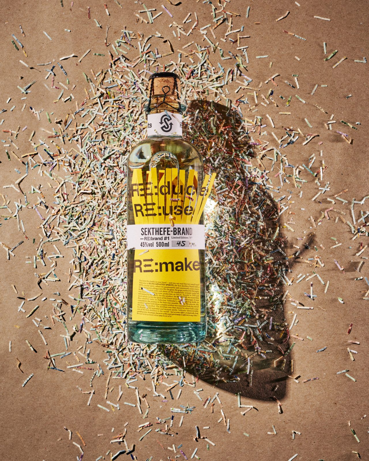
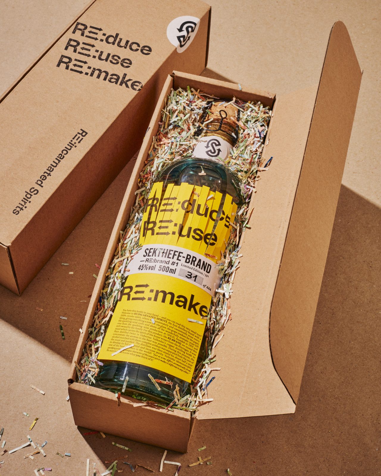
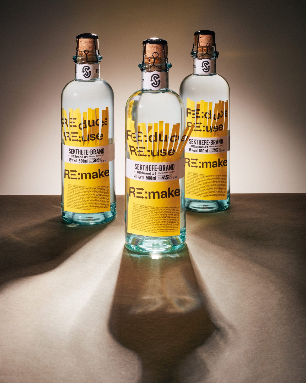
RE:Incarnated Spirits is the first distillery brand with a 100% circular spirit and packaging design, where everything is passionately and consistently reused, giving all elements a new life. The first limited edition – a set of 444 unique bottles – of RE:Incarnated Spiritsis named RE:BRAND #1, using the German word Brand (spirit).
As many good stories do, this one starts with sparkling wine! An ingenious re-think of a traditional process leading to a deliciously tasty outcome. Initiated by Markus Jost, head of the sparkling wine company Ohlig, which was founded in Germany in 1919, this special spirit is distilled from excess residual yeast, called “yeast lees”. This excess yeast is removed from sparkling wine bottles before the cork goes in and is usually discarded. But Markus Jost reexamined this by-product and found a starting point for an entirely new beverage experience.
By re-using the yeast in continued distillation, in Hubertus Vallendar’s copper distilling kettle, a spirit embodying the essence of the finest wines from the Rheingau is produced with an award-winning outcome (already winning the gold medal in “World Spirits Awards 2020), capturing the DNA of champagne. To match this original approach, we too reexamined all aspects of our packaging materials for a uniquely sustainable outcome: from the glass, to the paper, even the corks.
By founding RE:Incarnated Spirits we approach a re-thinking of an old idea of sustainability that our grandparents used to nag us with. The renewed beauty is only now revealing itself to us: nothing should be carelessly thrown away. Everything has a value, a purpose. The most delicious and timeless food has been created from leftovers. All over the world, chefs and cooks are rediscovering old varieties, old techniques that recycle and respect what nature gives us. Not all traditions are out dated – we see zero-waste not only as an attitude, but as a driver for new ideas.
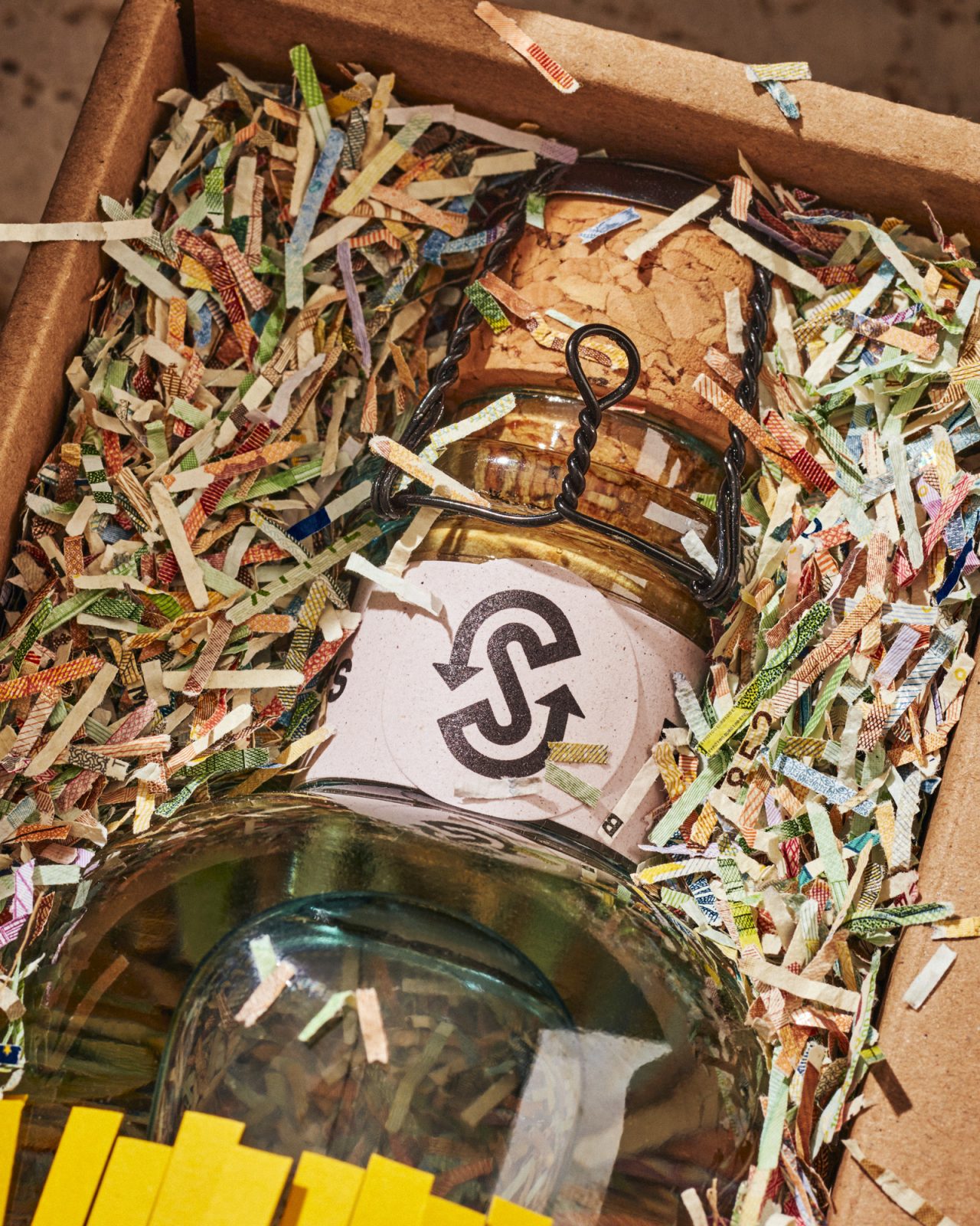
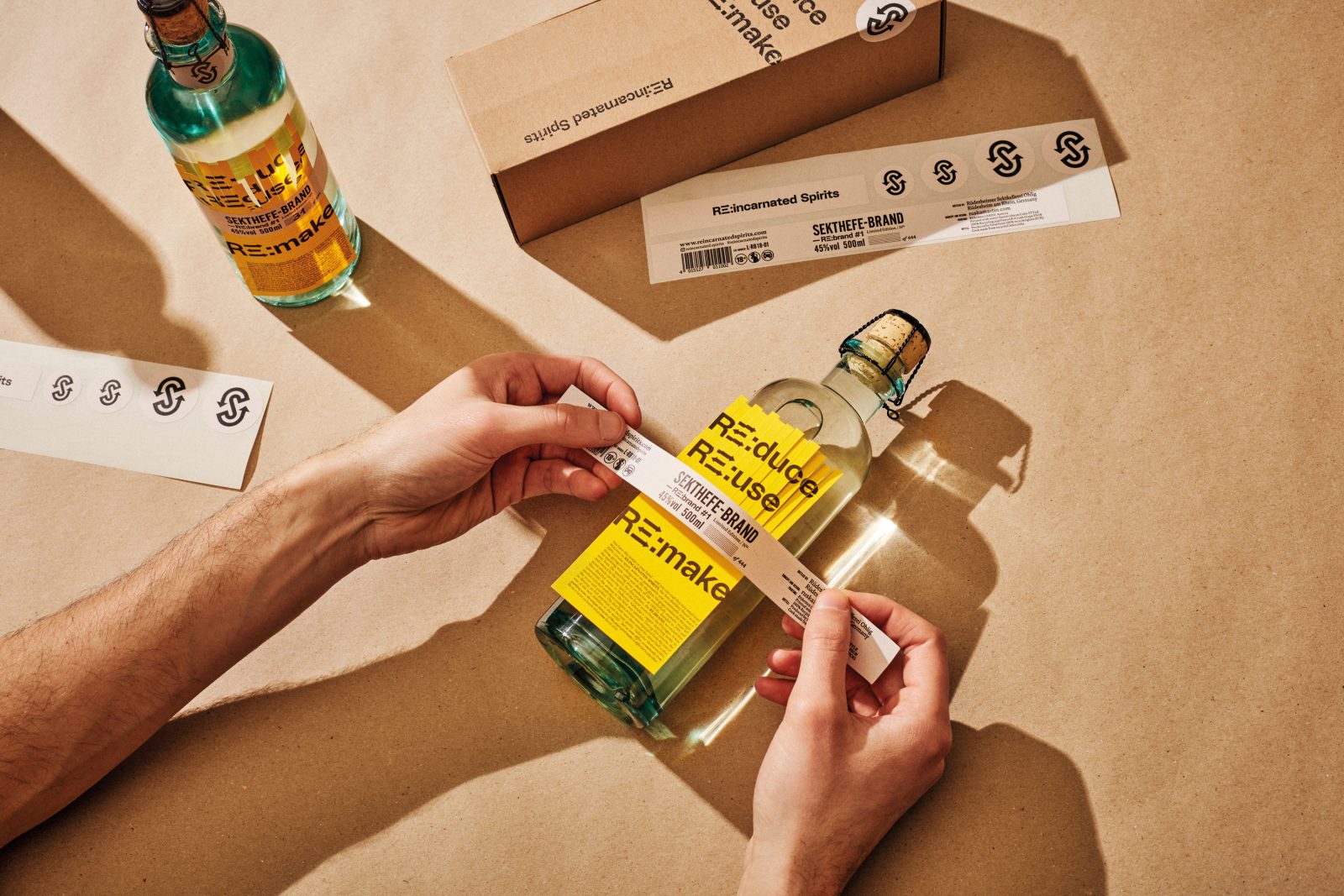
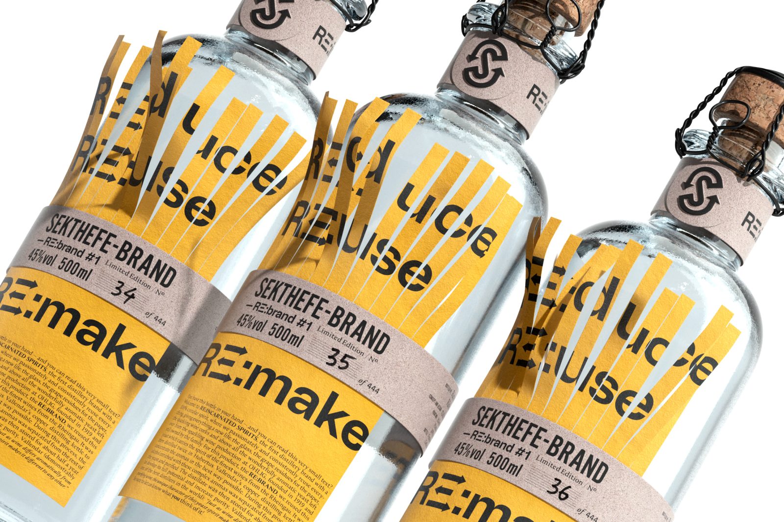
Bringing the old back to life, we explored a label concept that visualizes the reversal of throw-away culture and playfully implements a semi-shredded label. So instead of destruction, this label stops the shredding halfway through and is re-built /re-made below. With minimal use of all materials, the main label is not glued to the bottle, but instead only held in place with an adhesive band securing it through the middle for a fully removable label for optimal continued recycling.
The eye-catching and contemporary yellow label is 100% recycled paper material, the adhesive band is printed on uncoated paper made up of 15% grape-waste (!), 40% post-consumer recycled fibers and the remaining 45% are wood pulp. All printed with water-based inks by Carini. Encompassing the whole body is an uncoated cardboard box for safe transport, including recycled padding made from shredded Euro bank notes that didn’t pass the quality test for public use.
But we didn’t just make a pretty label to convey sustainability. The glass bottle is made entirely of 100% recycled post-consumer glass developed by Estal called “Wild Glass”. Supporting the zero-waste approach from beverage to bottle, no bottles with aesthetic defects are discarded in the production, resulting in a rough and authentic design, adding to the tactile experience of sustainable imperfection.
But the icing on the cake, or dare we say cork in the bottle – is made entirely from recycled sparkling wine corks. Taking our concept of reduce, reuse, remake to the next level by observing and re-approaching all aspects of the packaging design to create a truly unique, fully thought-through and multifacetedly sustainable product.
CREDIT
- Agency/Creative: Ruska Martin Associates
- Article Title: RE:Incarnated Spirits Packaging Design
- Organisation/Entity: Agency
- Project Type: Packaging
- Project Status: Published
- Agency/Creative Country: Germany
- Agency/Creative City: Berlin
- Industry: Food/Beverage
- Keywords: WBDS Agency Design Awards 2022/23
-
Credits:
Strategy & Creative Direction: Roman Ruska
Packaging Concept: Oliver Worsfold
Art Direction & Design: Oliver Worsfold
Packaging Concept: Markus Jost
Photography: Ragnar Schmuck
Rendering: Pablo Gill, Tricycle Studio
Art Direction & Design: Roman Ruska


