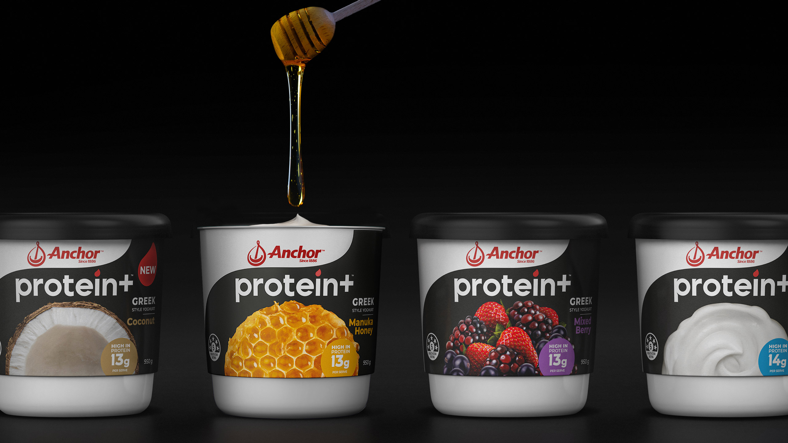
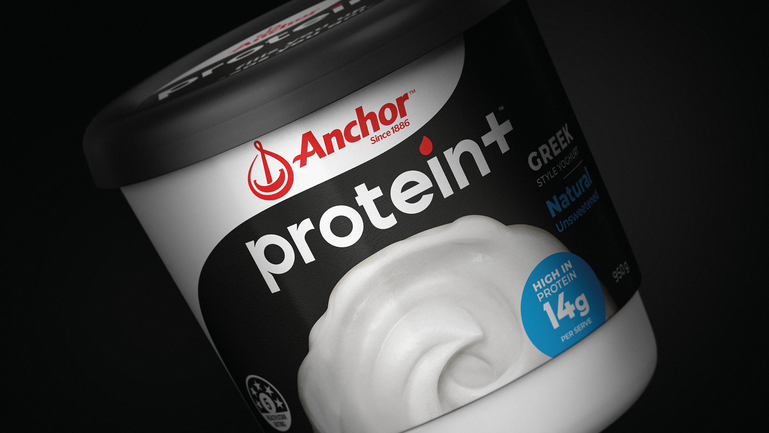
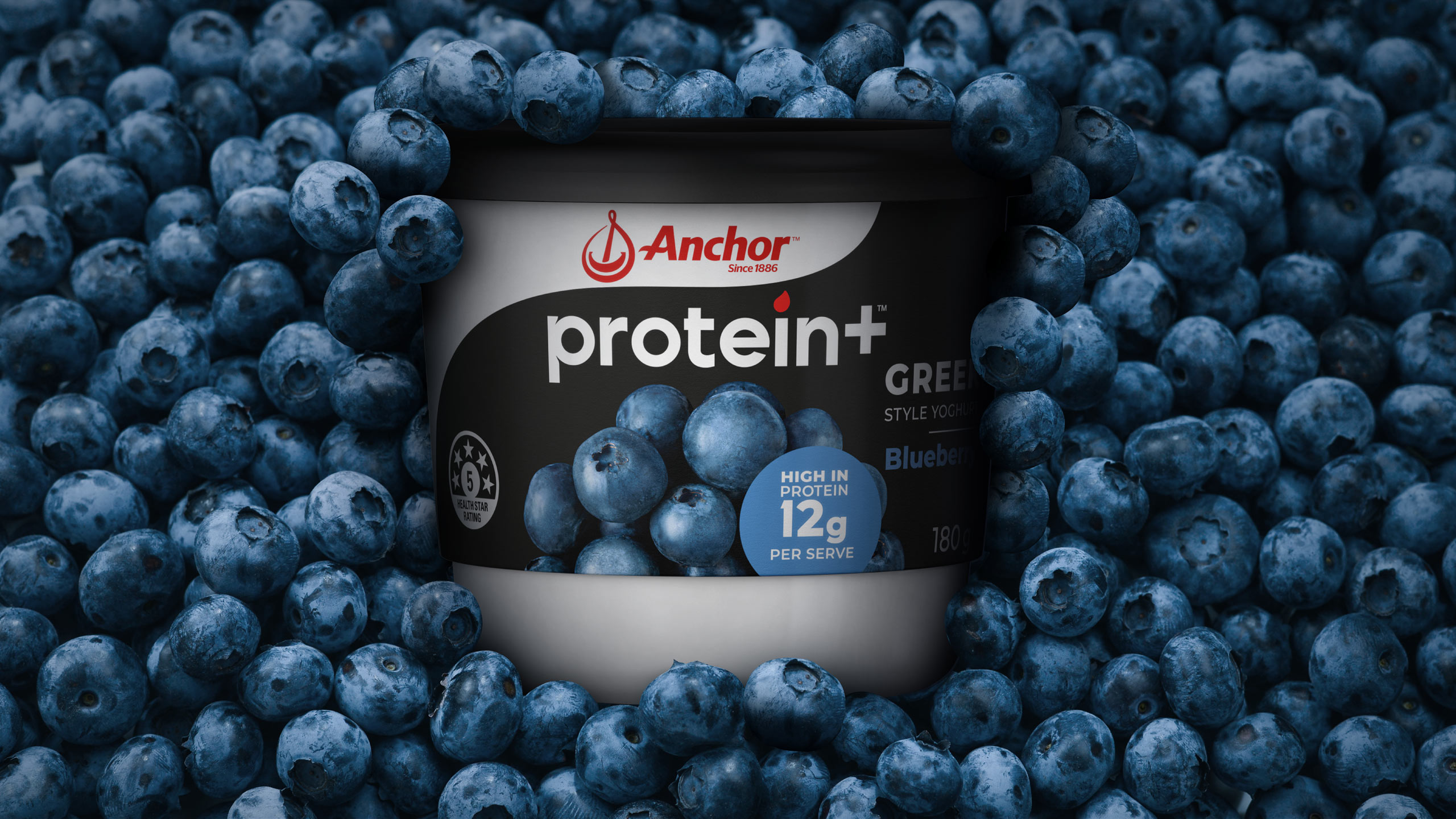
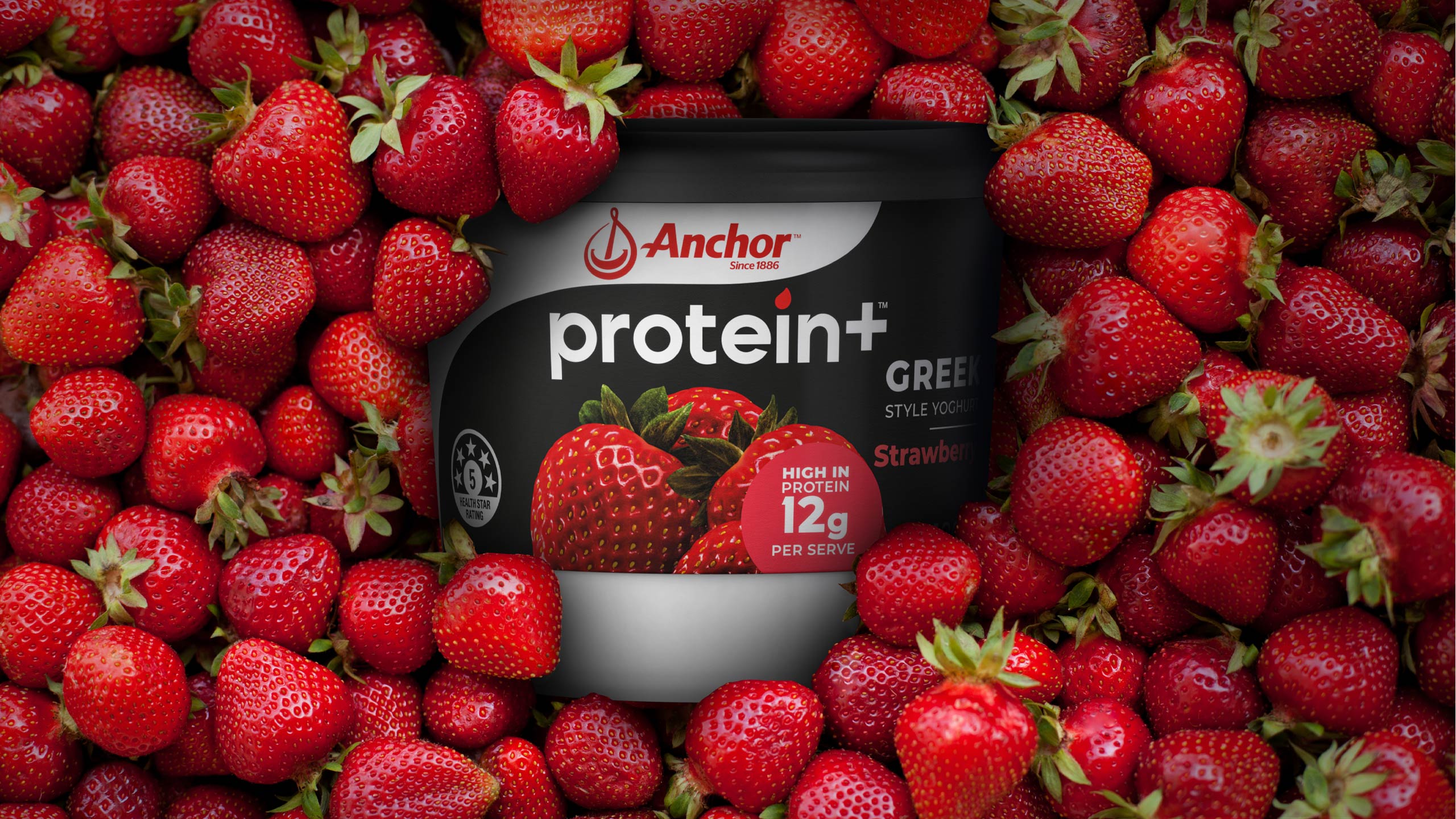
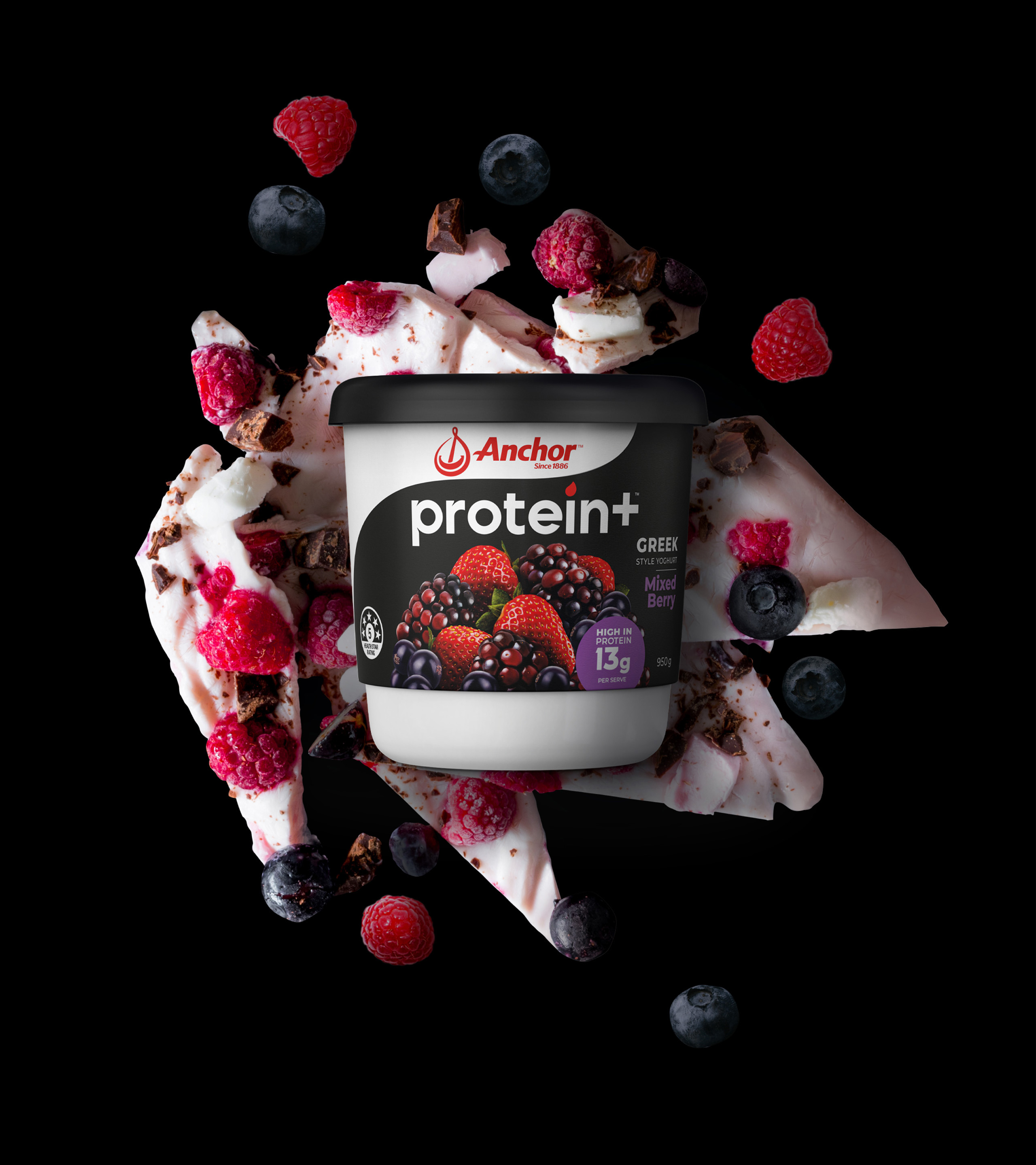
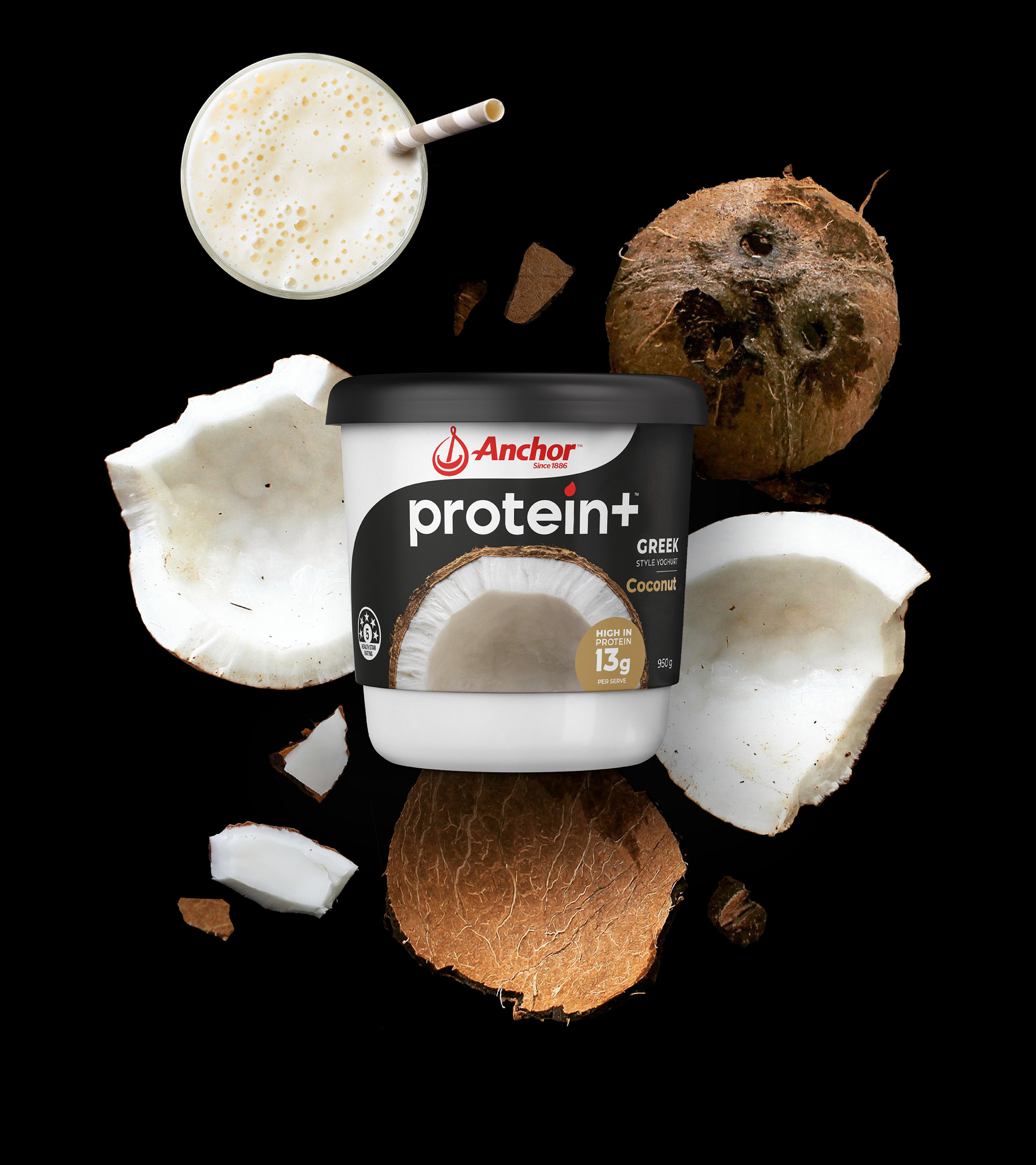
Introducing the fresh new look for Anchor Protein+. With the growing consumer demand for protein products, our team at Tried&True Design was briefed to design new packaging that would dispel the misconception that protein yoghurt isn’t tasty, while effectively communicating the benefits of protein in a distinctive and relevant manner.
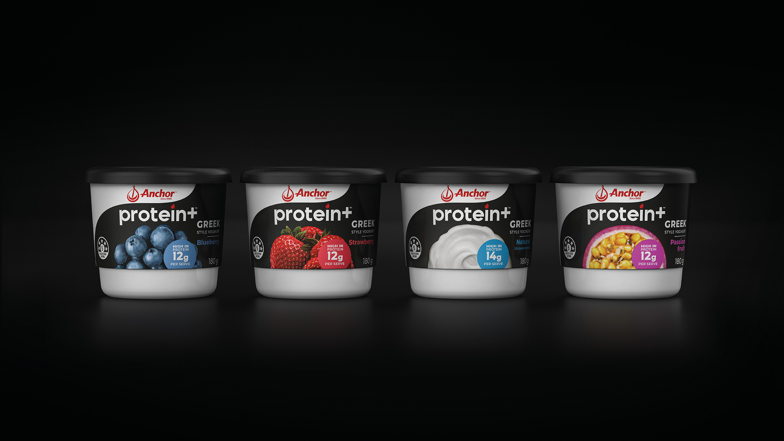
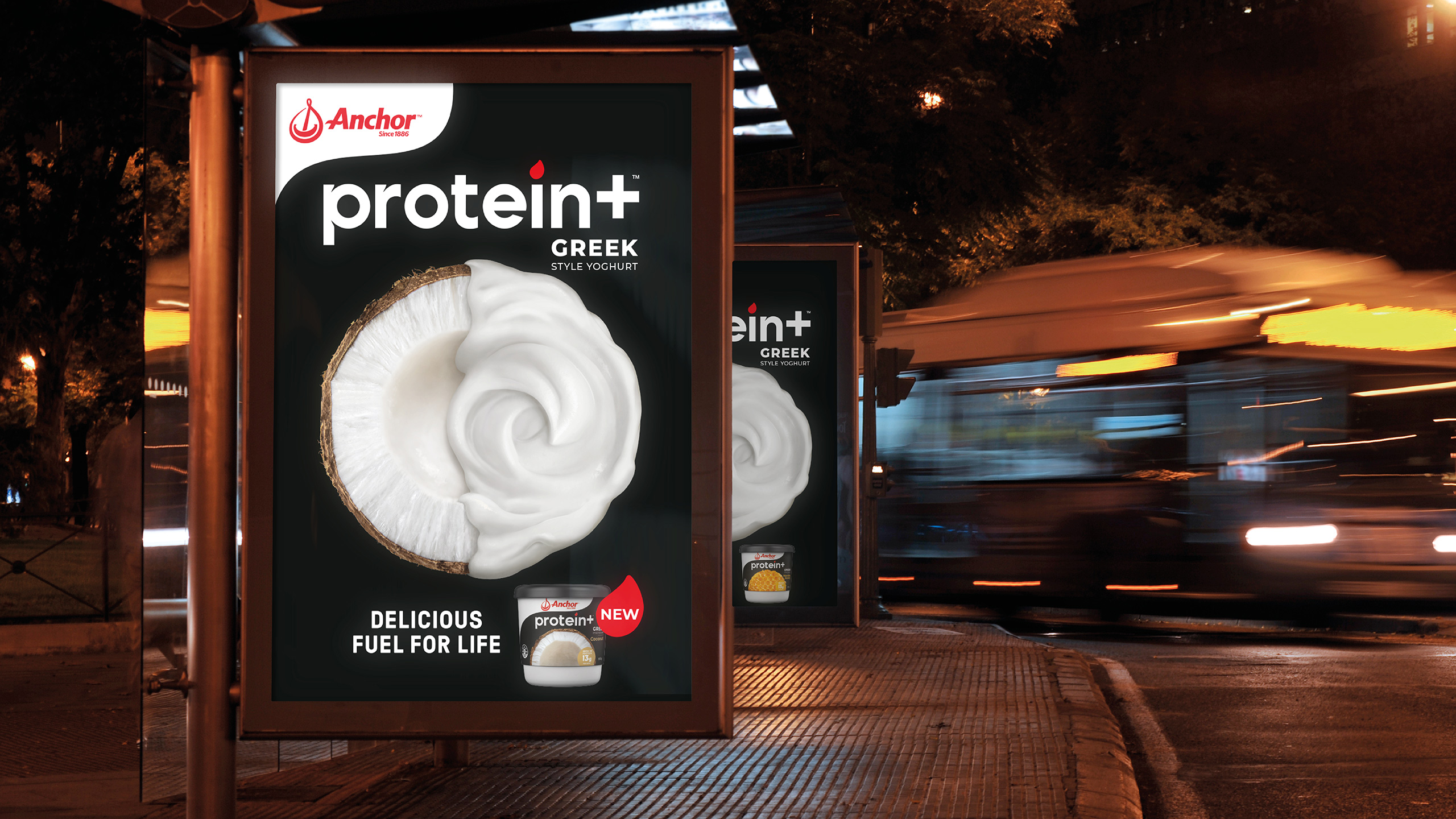
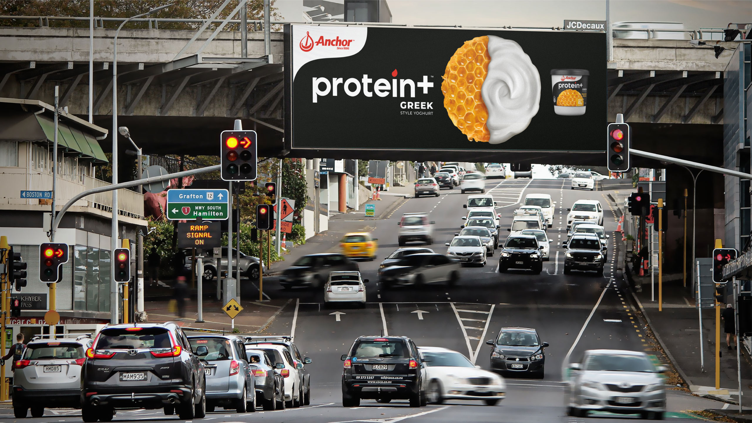
We developed a ‘circle of flavour’ device to be implemented across all product variants, serving as a navigational tool for shoppers and a prominent visual element in advertising campaigns. This innovative design not only aids consumers in exploring the range but also establishes a cohesive brand identity.
At Tried&True Design, we prioritise creating designs that resonate with the target audience. For Anchor Protein+, we focused on blending aesthetics with functionality. The ‘circle of flavour’ device is more than just a visual cue; it’s a strategic element that enhances the consumer’s shopping experience, making it easy to identify and select their preferred yoghurt flavours.
We also paid close attention to the sustainability aspect of our packaging solutions. By choosing eco-friendly materials, we align with Anchor’s commitment to environmental responsibility, ensuring that the new packaging is not only attractive but also environmentally conscious.
Our goal was to ensure that Anchor Protein+ stands out on the shelves, appealing to health-conscious consumers who seek both nutrition and taste. The sleek, modern design of the packaging reflects the premium quality of the product inside, while the consistent use of the ‘circle of flavour’ device reinforces brand recognition and loyalty.
Anchor Protein+ is more than just a yoghurt; it represents a lifestyle choice for those who value health, flavour, and sustainability. Our design effectively communicates this message, making it easier for consumers to make an informed and satisfying choice. Protein+, Delicious fuel for life.
CREDIT
- Agency/Creative: Tried&True Design
- Article Title: Reimagining Protein Yoghurt: Tried&True Design’s Anchor Protein+ Revamp
- Organisation/Entity: Agency
- Project Type: Packaging
- Project Status: Published
- Agency/Creative Country: New Zealand
- Agency/Creative City: Auckland
- Market Region: Oceania
- Project Deliverables: Brand Identity, Design, Graphic Design, Illustration, Logo Design, Packaging Design, Rebranding, Type Design, Typography
- Format: Pot
- Industry: Food/Beverage
- Keywords: yoghurt coconut berry design packaging
-
Credits:
Creative Team: Tried&True Design


