


Regular Practice rebrand Mochi Creamery to Mochiya 餅屋
When Regular Practice was introduced to a Swiss pastry chef and a Japanese snack exporter and investor, the opportunity was clear: reimagine a traditional Japanese snack for a modern taste experience. ‘Mochiya’ was born — the Japanese for ‘mochi store’ trading across delivery, retail and ,in-the-future, tea rooms.
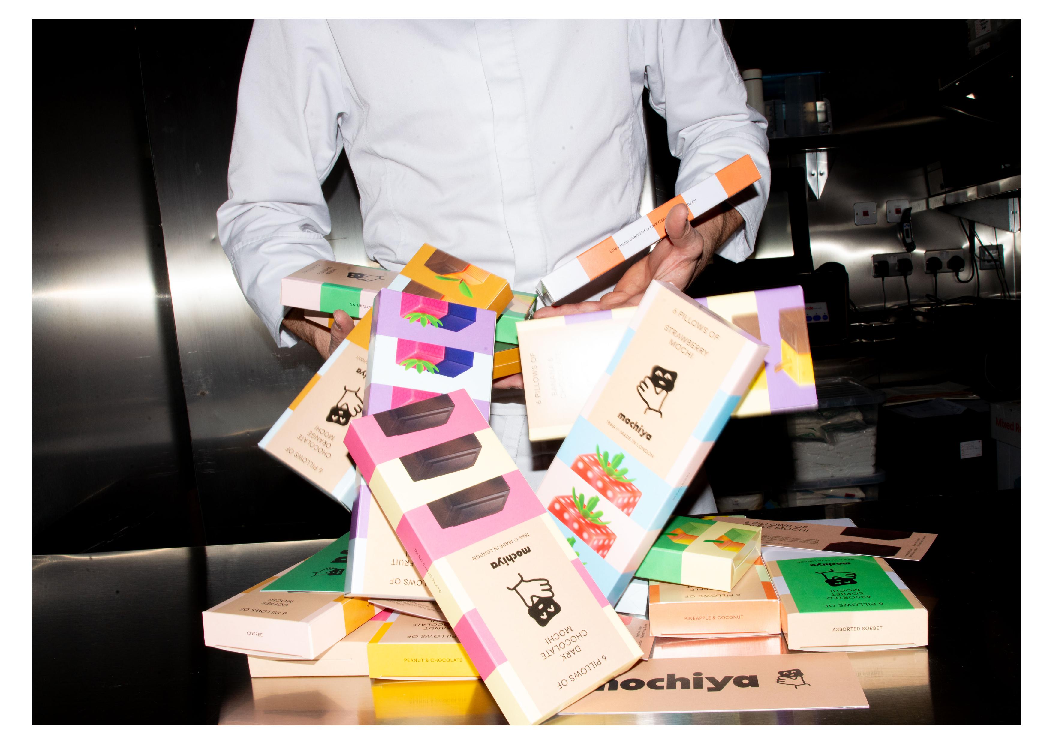
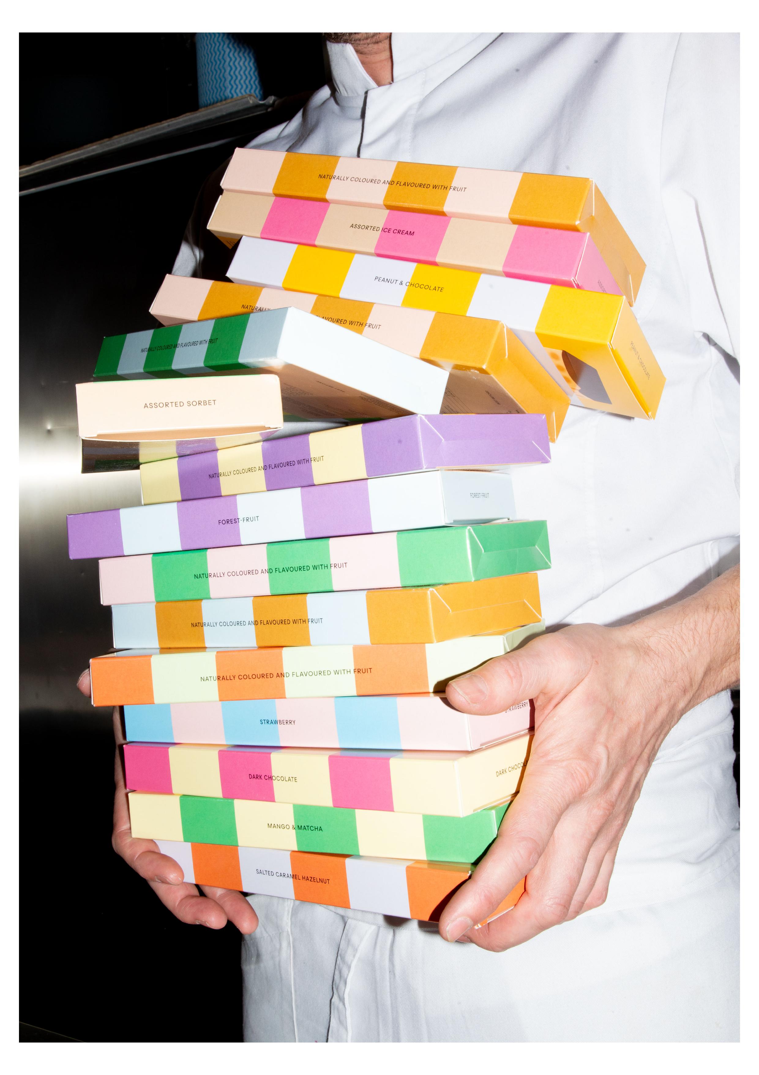
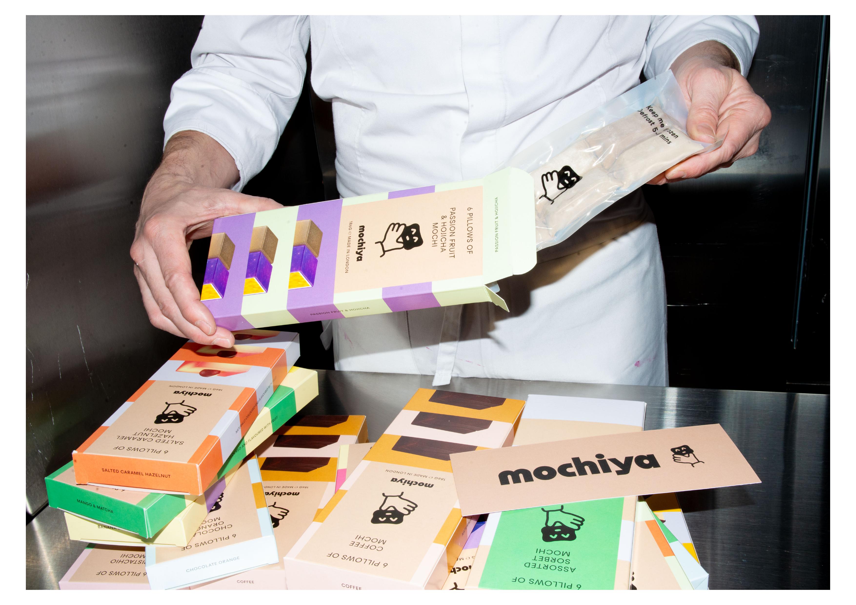
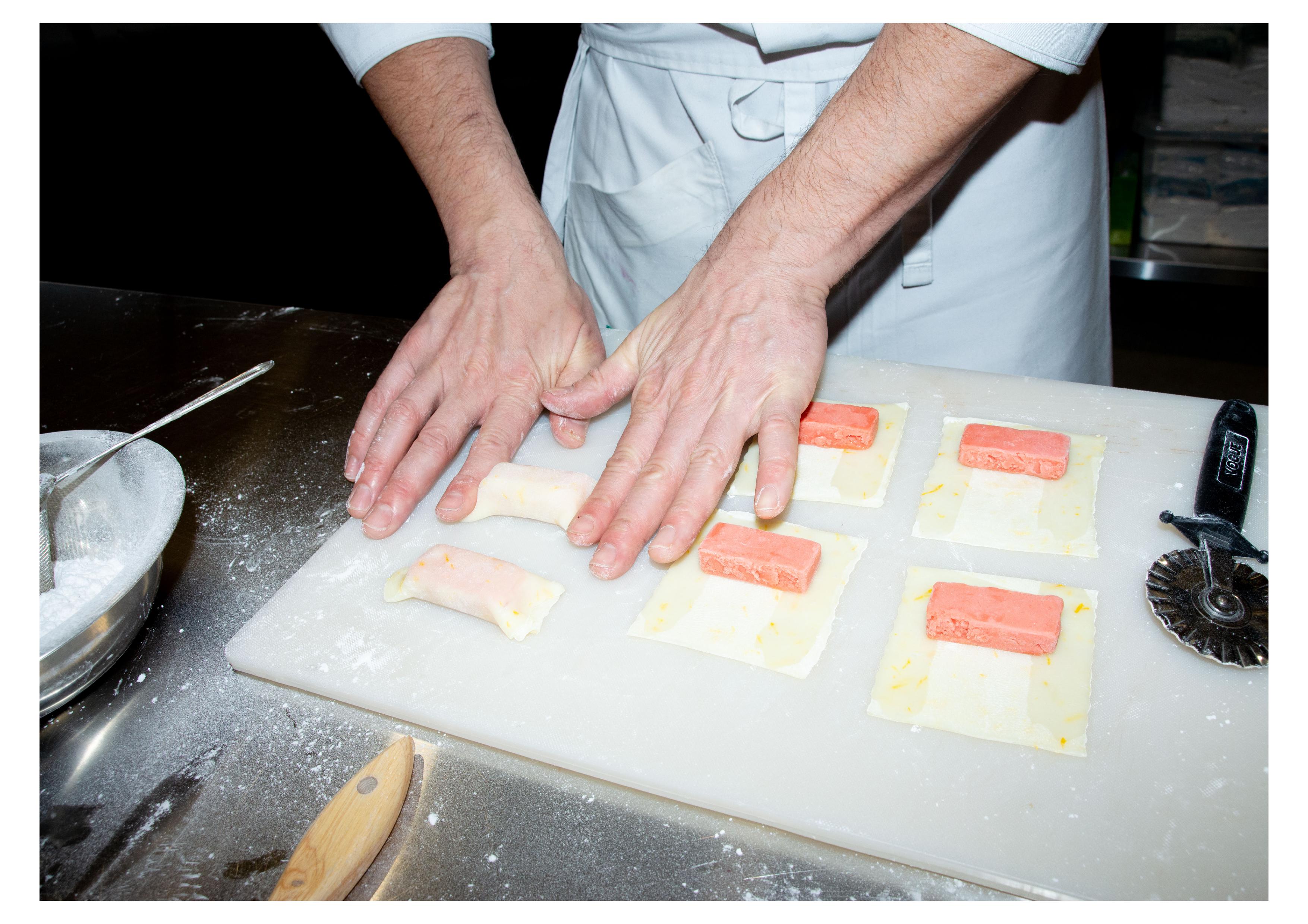
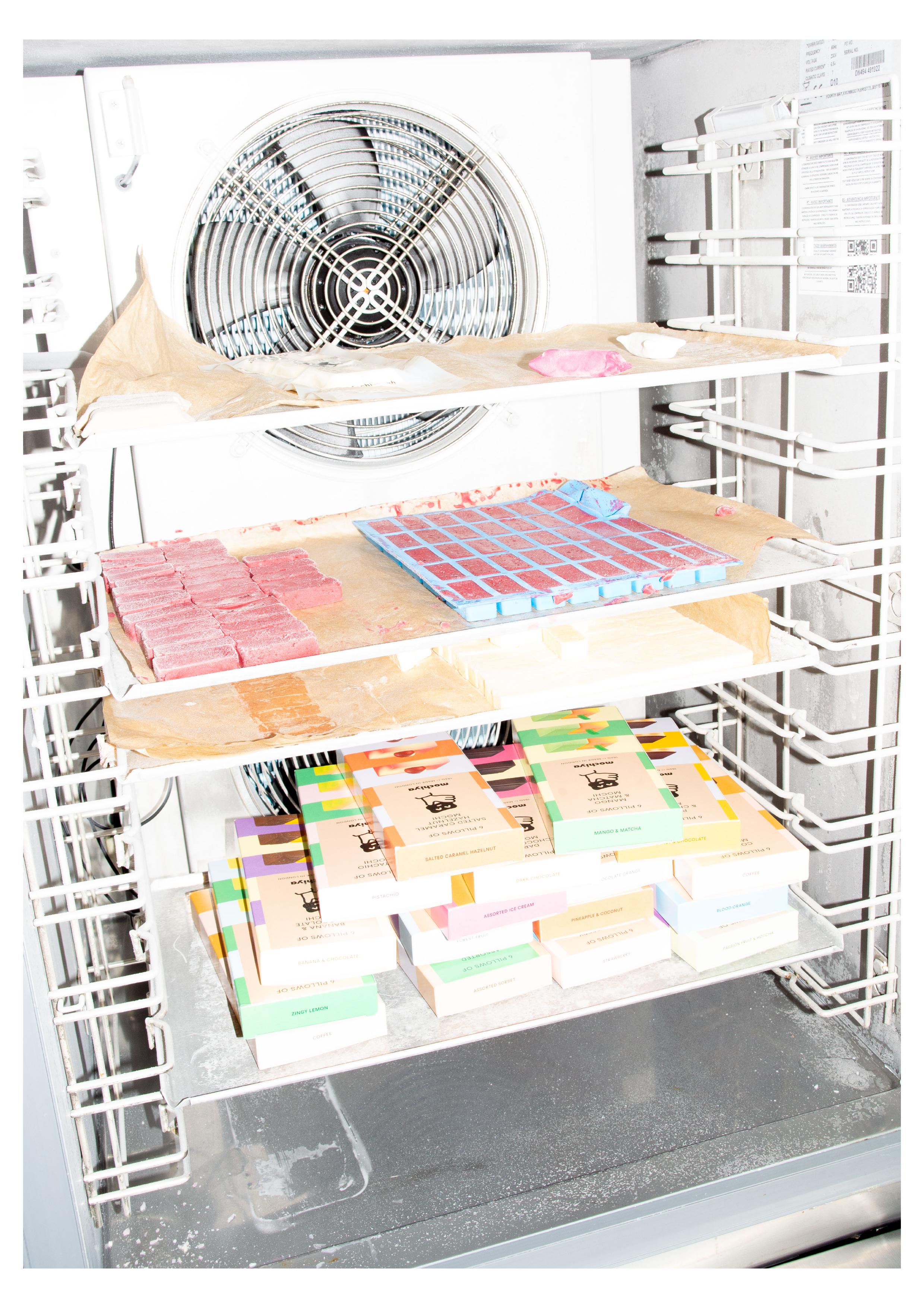
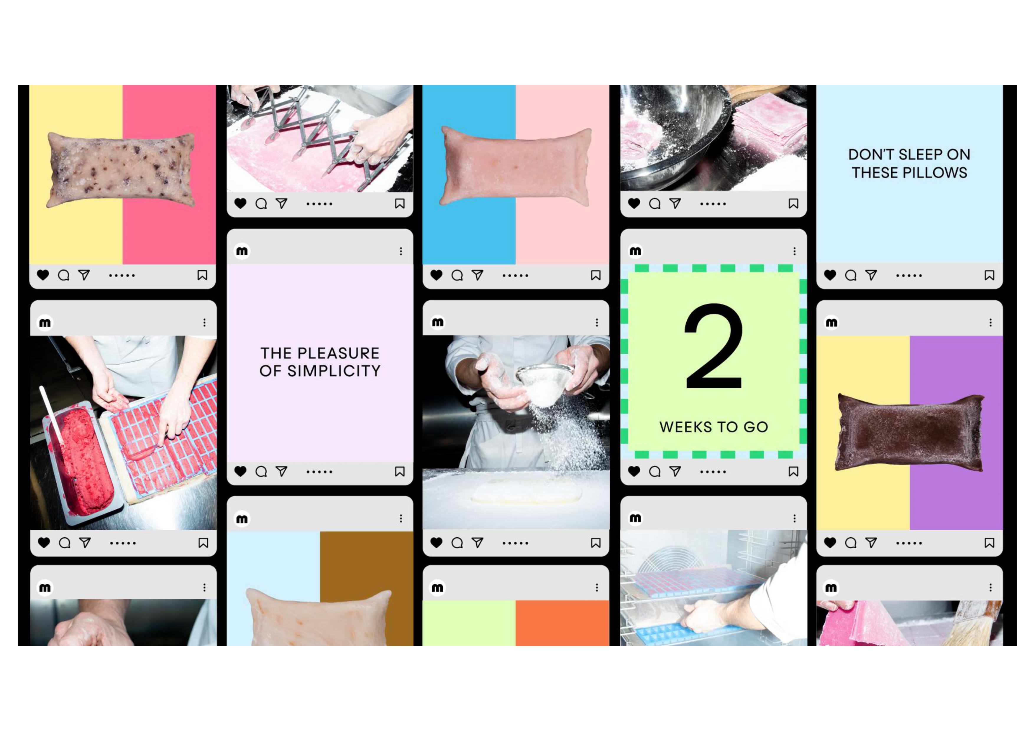
Mochi is a Japanese delicacy that has existed for centuries. Formed of pulverised, glutinous rice-dough shrouding orbs of bean paste. Mochi is traditionally spherical but Florian, Head Chef and co-founder, took the mochi ball and flattened it to a plush pastry pillow, infusing it with ice cream and sorbet using ingredients sourced from around the world – from English fruit farmers to friends in Taiwanese teafields for their iced teas.
“Nothing of this quality really exists in the UK. Little Moon’s dominate the market turning over £68.5mn a year with little or no competition. We wanted to create a high-end alternative more akin to luxury chocolate that could work both in the best department stores as well as their own signature tea rooms in due course.” – Ed Little, Strategy Director
“The brand itself was inspired by the product’s pillow-like shape, fluffy texture and uplifting mouthfeel. After sitting around our studio table together and trying the range of flavours and teas on offer we were hooked.” Tom Finn, founder and Managing Director.
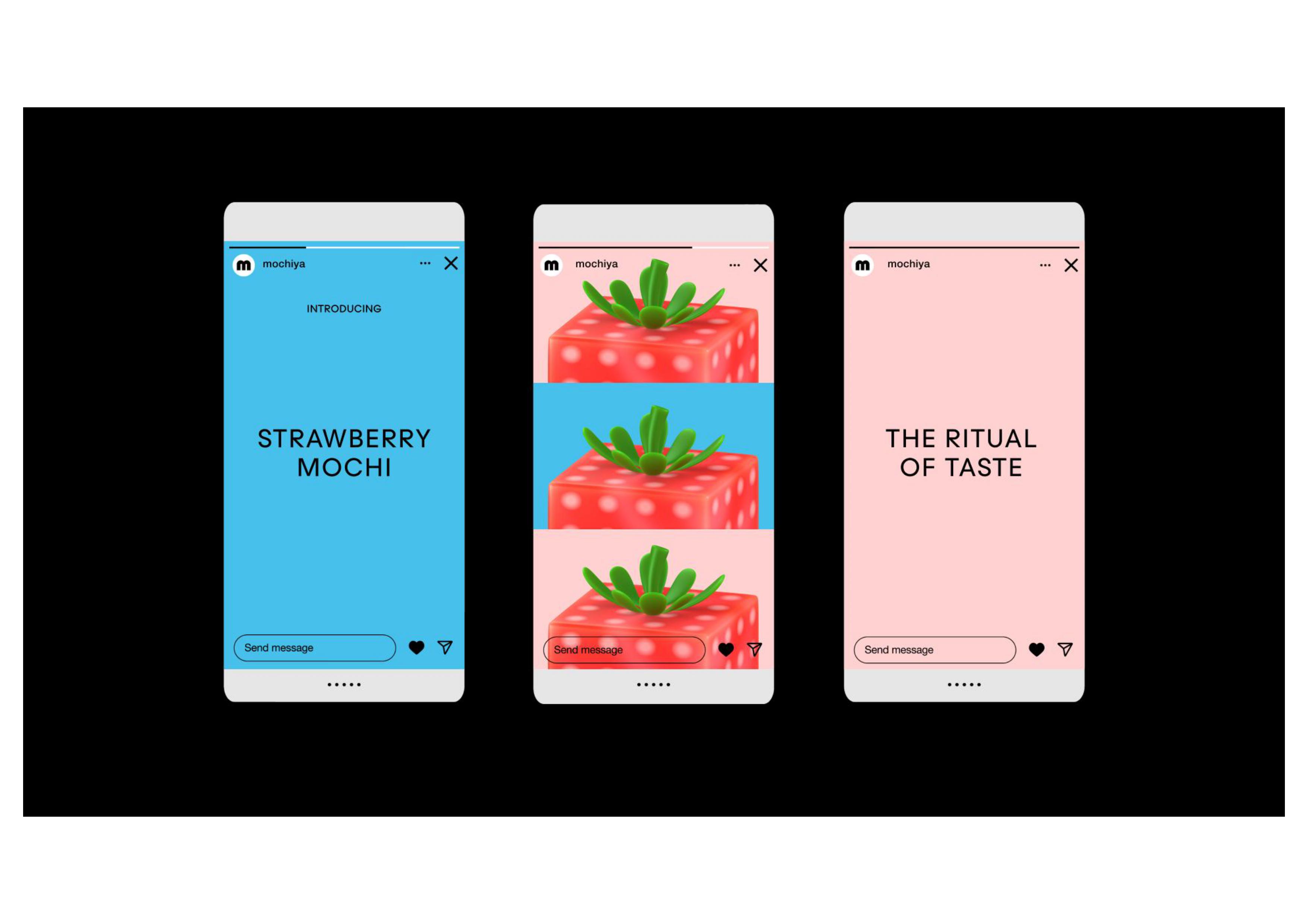
The design emanates from the idea: ‘there’s goodness inside’. Both in terms of ingredients and the comfort you feel from eating them. Escapism from the hardships and noise of everyday life. Mochiya is the destination for relaxation. From the floating animations, to the soft and squishy wordmark, there’s a sense of doughy ease that imbues the brand’s visuals with a floaty feel, conjuring the phrase ‘up, up, and away.’ Mochiya floats above the noise, above the category, occupying its own space entirely.
Regular Practice opted for a “wordmark-centric approach,” says Kristoffer Sølling, founder and Creative Director. The typeface is bouncy and energised, soft yet structured, malleable and doughy — like the mochi itself. “We took our visual cues from the multisensory experience of the product — the texture, the colour, the inherently playful characteristic of the food,” Kristoffer says, supplementing this mood with a humanoid motif that feels “culturally attune” in terms of a new out-there illustration style.
Regular Practice predicated the creative flow on the intriguing USP that sits at the ice creamy core of the brand: the fusion of cuisine and culture. From East Asia to East London, in ways, this project is testament to what can be achieved when East meets East, and when great taste in food meets great taste in design.

CREDIT
- Agency/Creative: Regular Practice
- Article Title: Regular Practice Rebrand Mochi Creamery to Mochiya 餅屋
- Organisation/Entity: Agency
- Project Type: Packaging
- Project Status: Published
- Agency/Creative Country: United Kingdom
- Agency/Creative City: London
- Market Region: Europe
- Project Deliverables: Art Direction, Brand Identity, Brand Redesign, Copywriting, Packaging Design
- Format: Pouch, Tray
- Industry: Food/Beverage
- Keywords: Mochi
-
Credits:
Photographer: Nick Offord


