Governments have been in the need to promote themselves as competitive companies that “seal” their towns, products, services and resources with the end of opening new markets and attract investment.
TAC Agency settled in Costa Rica, take a country, city or town and turn it into a place where people wish to invest, live, visit and acquire goods and services as part of its country branding work.
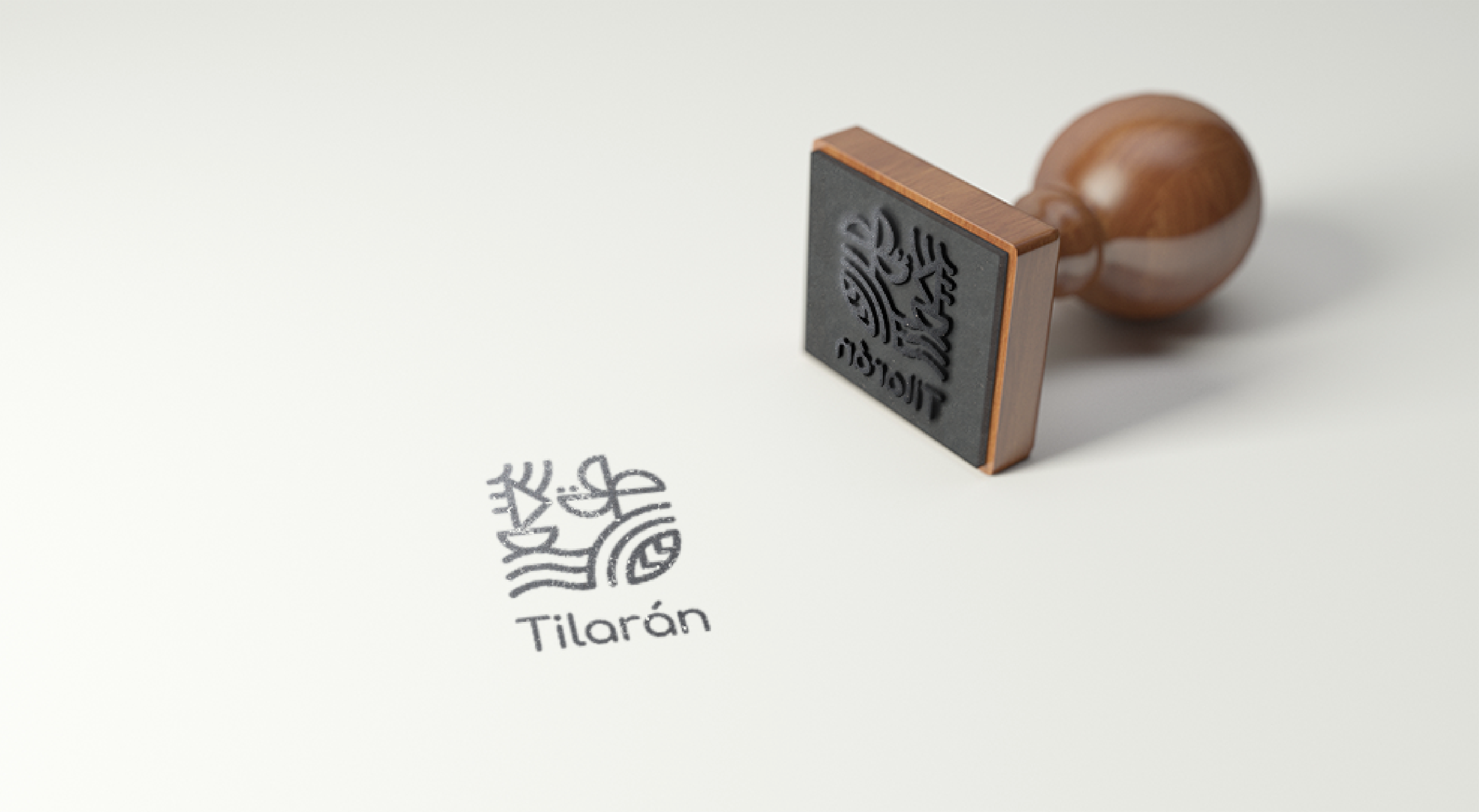
For the visual identity project of Tilarán, a beautiful rural town in Costa Rica, TAC analyzes several relevant factors, as the etymology, history and some characteristics to build a concept for graphic applications.
Tilarán has been a transit town for many tourists, due to its proximity to some Costa Rican most touristic destinies as: Monteverde, La Fortuna and Liberia. In pre-Columbian times these lands were occupied by indigenous people, who inspired the current name.
… “Tilarán should not hide within those mountains, Tilarán must shine with its sunset, fly high with its winds, have fun with its lake and show the warmth of its people.”
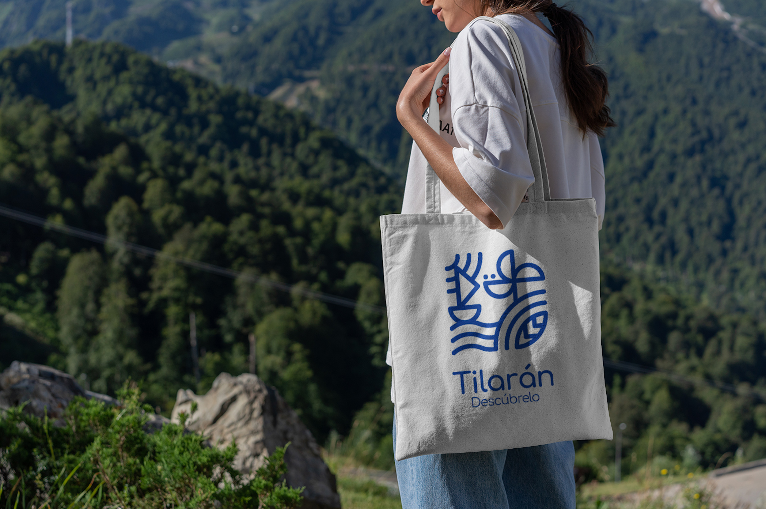
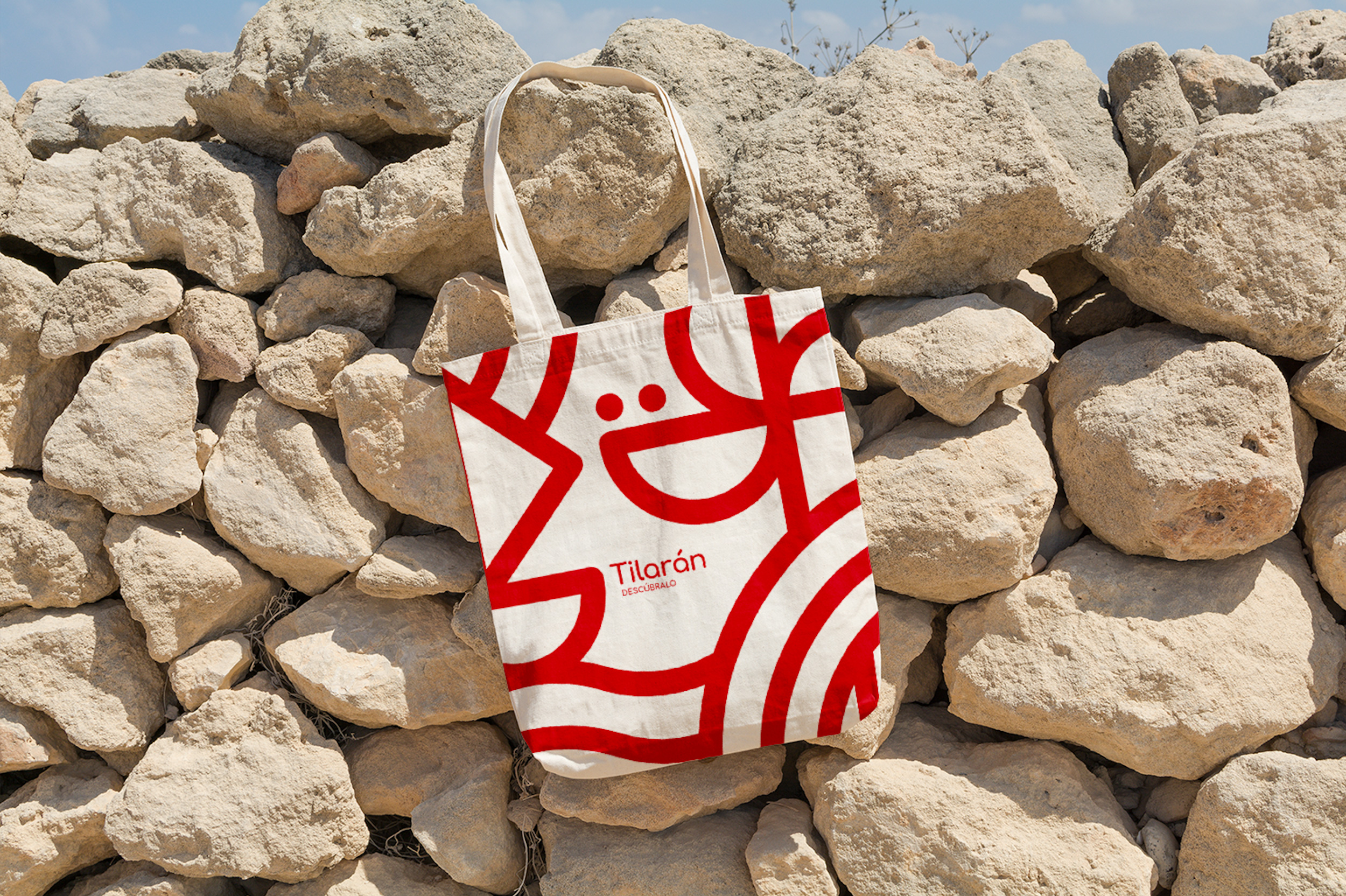
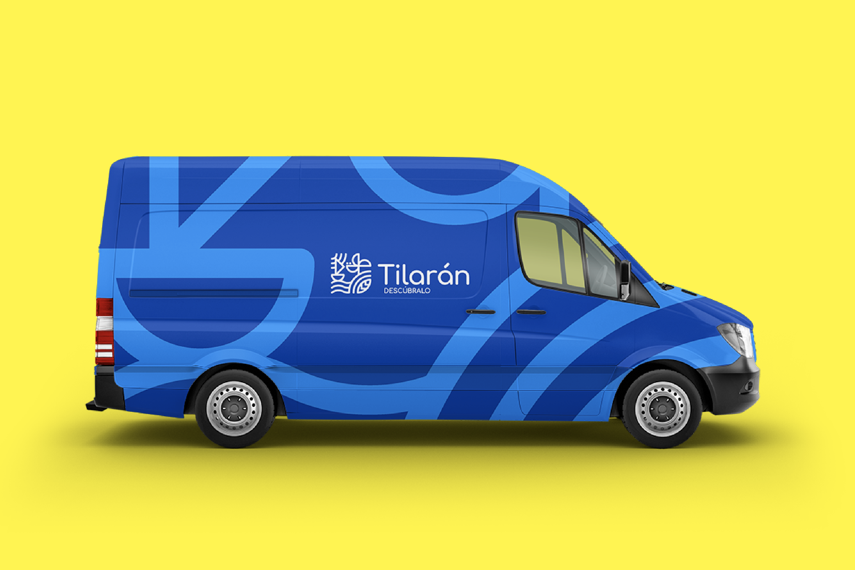
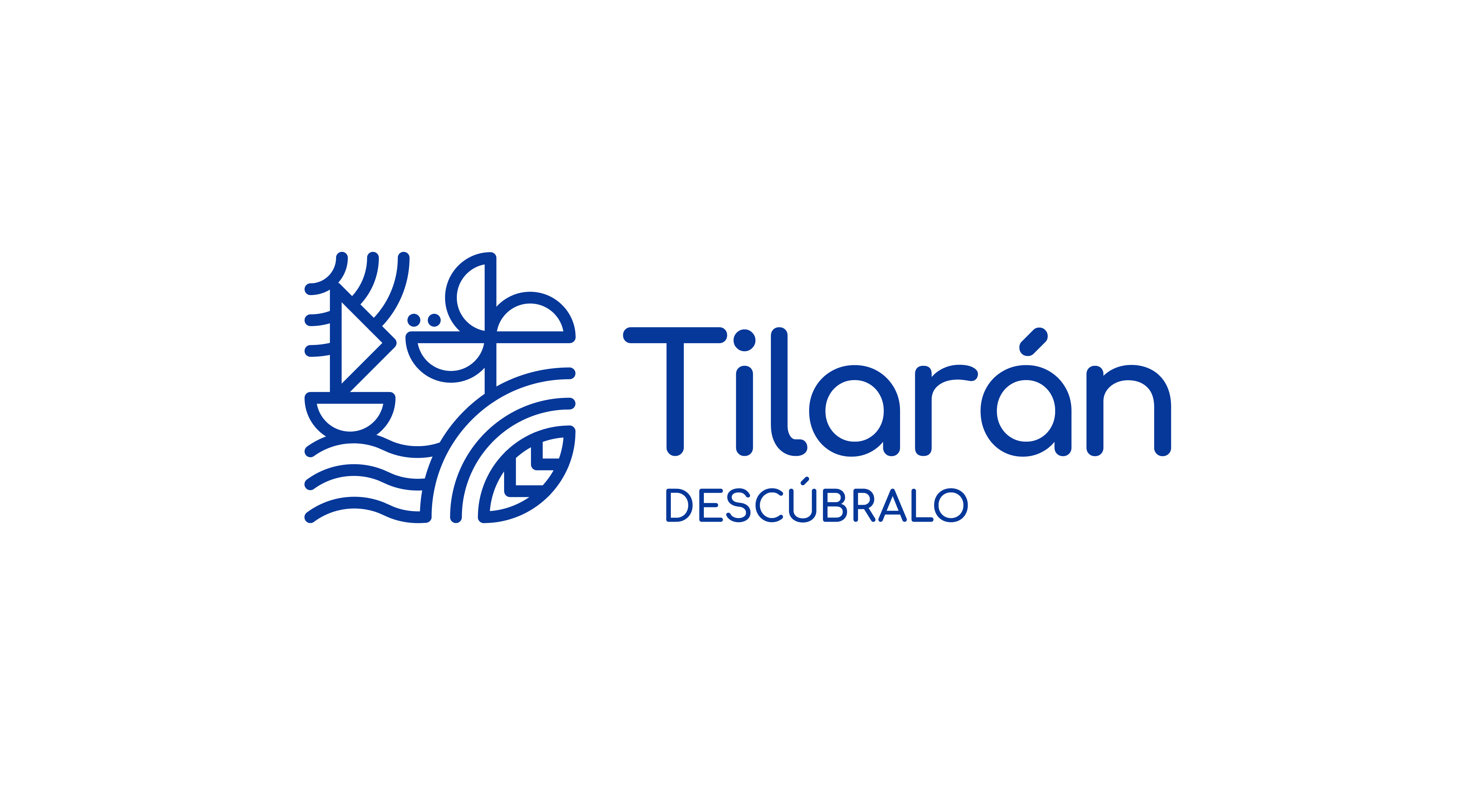
Graphic Concept: Tilarán has wonders hidden, discover them. For the visual language, TAC identified 7 geometric shaped symbols, extracted from elements or situations present in the town and also assigned some colour palettes to enhance the brand and give versatility in the implementation. Isotype: were generated from the geometric shapes found in the visual exploration described above.


CREDIT
- Agency/Creative: TAC
- Article Title: Regional Branding for Tilarán Designed by TAC Agency
- Organisation/Entity: Agency, Published Commercial Design
- Project Type: Identity
- Agency/Creative Country: Costa Rica
- Market Region: Multiple Regions
- Project Deliverables: Brand Architecture, Brand Identity, Brand Strategy, Branding, Research, Tone of Voice
- Industry: Hospitality
- Keywords: Costa Rica. Tilarán. Design. Place branding


