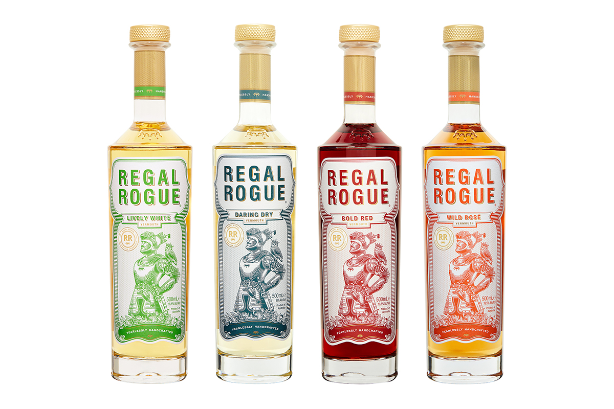
Regal Rogue stands at the forefront of today’s vermouth renaissance with its disruptive twist on the classics. It boldly marries a selection of native Australian aromatics with organic local wines to bring a new and more accessible expression of vermouth to the world.
The challenge for us was to create a new world vermouth brand that carries the prestige of a European vermouth but the proud swagger of a new to market, contemporary product. Our task was to create a confident brand worthy of shaking up the stagnant vermouth category with it’s unorthodox blend of native Australian aromatics and it’s adventurous spirit.
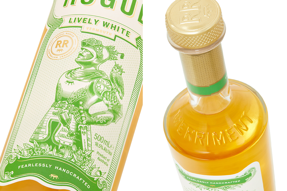
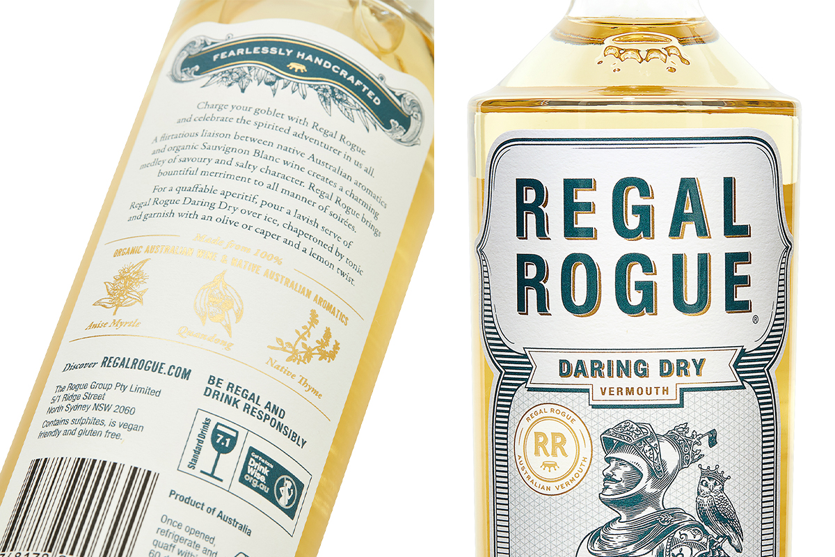
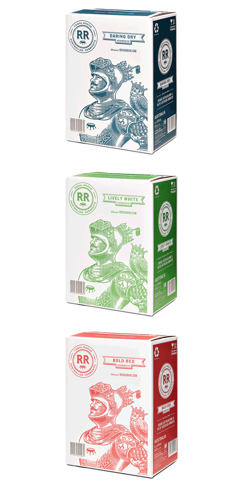
This intriguing character brand is centred around a charismatic knight (The Rogue) who roams the world with his cross-eyed owl companion in search of new discoveries. The knight’s courageous stance offers a bold and commanding presence on the pack that draws you in for a closer look.
“The vermouth beverage category has remained stagnant for too long. So we turned to Squad Ink to revive it with a breathtaking brand.” Mark Ward, Founder
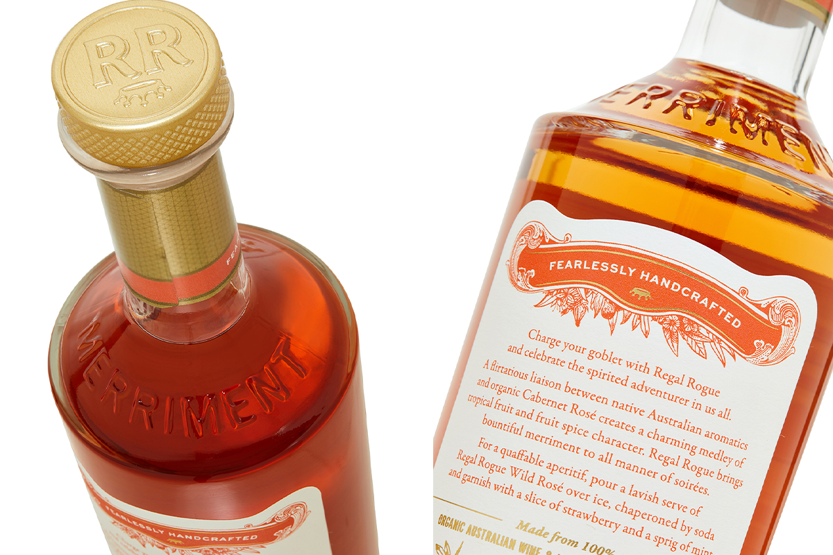
We’ve elevated the product to a whole new level of sophistication and charm. Our custom-designed bottle boasts a proud shoulder that bears the upside-down crown brand mark – a symbol of Regal Rogue’s cheeky and disruptive attitude.
CREDIT
- Agency/Creative: Squad Ink
- Article Title: Regal Rogue Vermouth Packaging Refresh
- Organisation/Entity: Agency, Published Commercial Design
- Project Type: Packaging
- Agency/Creative Country: Australia
- Market Region: Multiple Regions
- Project Deliverables: Brand Identity, Brand Rejuvenation, Brand Strategy, Illustration, Packaging Design, Retail Brand Design, Tone of Voice
- Format: Bottle, Case
- Substrate: Glass Bottle


