Firefly is a delicious range of natural soft drinks carefully crafted from still water, fruit juice and a blend of botanicals. Targeted to adults, it’s a sophisticated soft drink perfect for summertime sipping.
Family (and friends) branding have been helping brand owners Purity Soft Drinks evolve the brand to highlight the unique drinking experience and maximise shelf impact.
A relevant revitalisation.
Founded in 2003, Firefly has enjoyed strong growth across grocery, wholesale and foodservice channels. Following on from extensive consumer research, F&f were asked to help evolve the packaging design and bring the brand image and consumer drinking experience closer together, while reinforcing natural and premium cues.
A time sensitive Journey.
Some feedback denoted to Firefly being perceived as a night-time mixer or sundowner, which could inhibit to growth in the alcohol-free segment. In addition, the research also found that 85% consumers are seeking more interesting flavours in premium soft drinks, while 81% consumers feel it’s important for a soft drink to be ‘light and refreshing’ which firefly truly delivers on. Thus, some work was needed on reinforcing these product truths.
Previous insights revealed that Firefly was often perceived as a carbonated, sweetened drink, in part due to the use of deep colours and a full sleeve which obscured the contents.
To address these challenges, in 2022, Purity approached Family (and friends) to revitalise the pack design to better communicate the brands unique product truths as a natural and still premium tonic. At the same time, they were looking to adapt to a growing category and to constant shifts in consumer mindsets.
As with all of their packaging assignments, F&f applied their ShelfHappy® principles to both the strategic and design challenges.
“The brief here was to bring ‘relevant revitalisation’ to the brand. It’s not about change for change sake, rather ensuring the brand’s proposition to the consumer is accurately reflected in its packaging presentation. That’s a central tenet that makes for ShelfHappy® branding.”
DJ Johnston, Strategy Lead, Family (and friends)
A switch to subtlety.
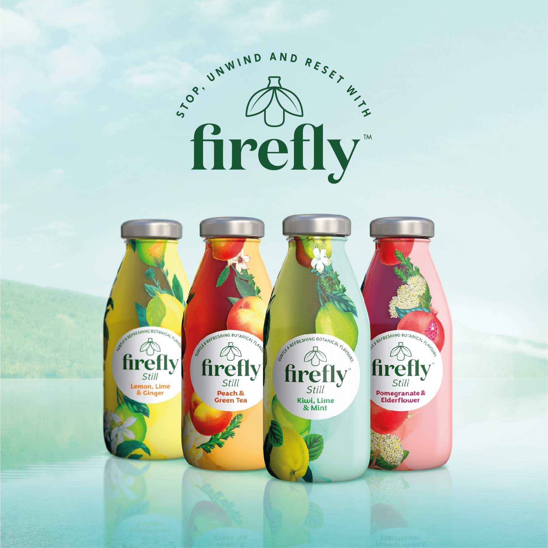
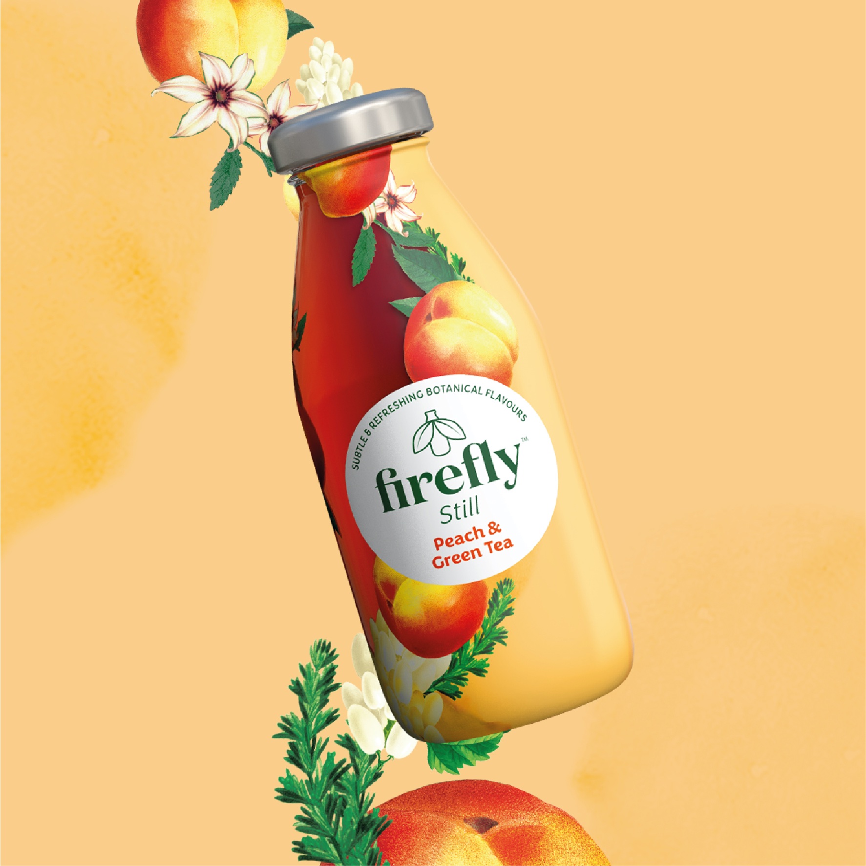
Family (and friends) worked with Purity Soft Drinks to develop a relevant revitalisation for Firefly, creating a refreshed pack which more effectively reflects the natural, pure elements of the drink- while retaining some of the existing codes and devices, to maintain brand recall.
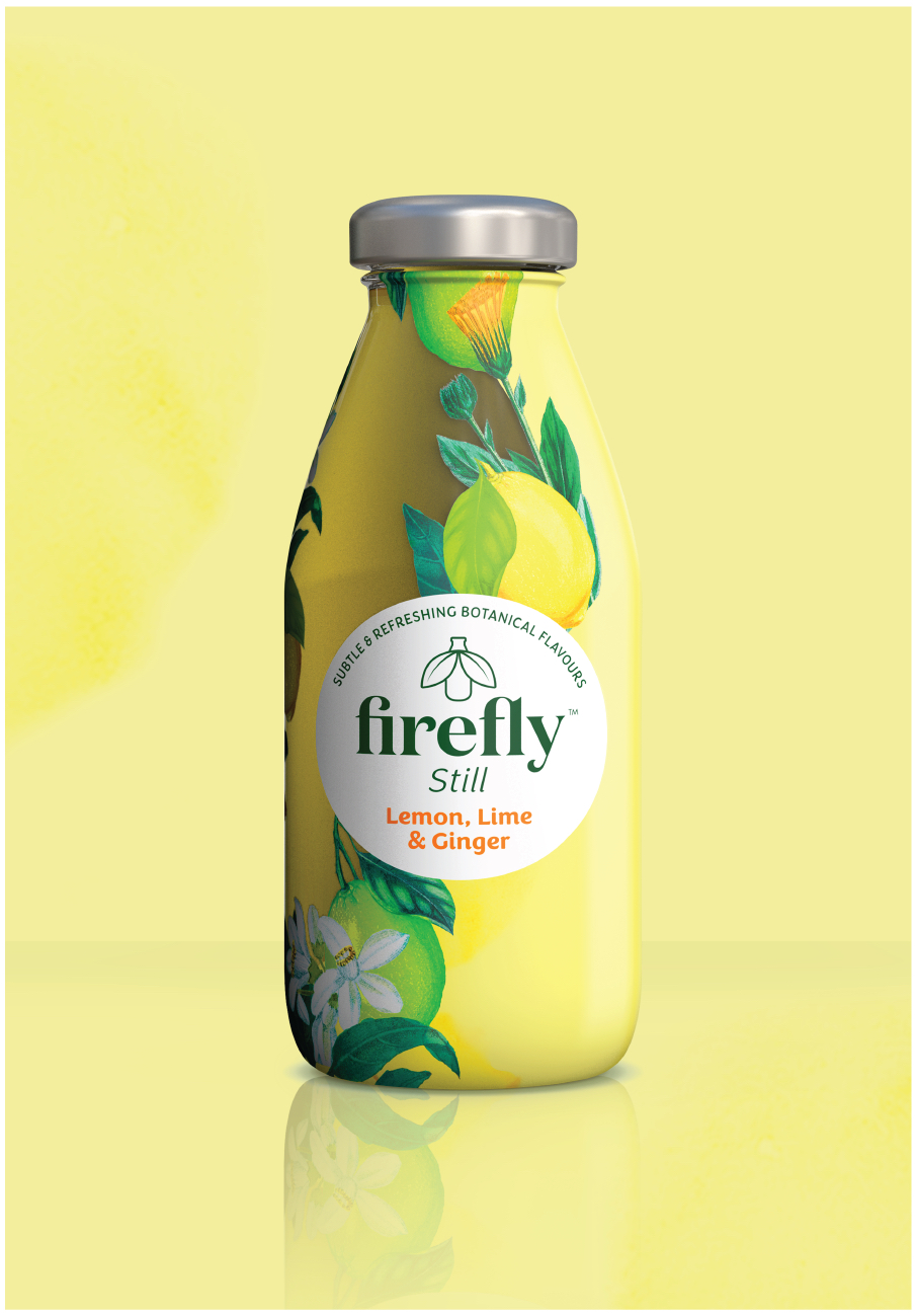
Illustrations of fresh fruit and botanicals endured, but with improved relevance to the actual ingredients blended into each SKU.
F&f were also looking to tidy up the label, make the pack easier to read and create impact by refining the logo and firefly icon, using white to improve instant visibility and enhance natural cues. This created stronger shelf blocking, while the logo is holding shape a focal point to optimise eye-tracking.
Consequently, the evolved packaging pulls together as a range better at retail but also clearly signals Firefly’s positioning as “A refreshing blend of still water, fruit juice and botanical extracts helping you stop, unwind and reset”. With the design, F&f leant further into the light, pure and natural elements of the brand personality and the product.
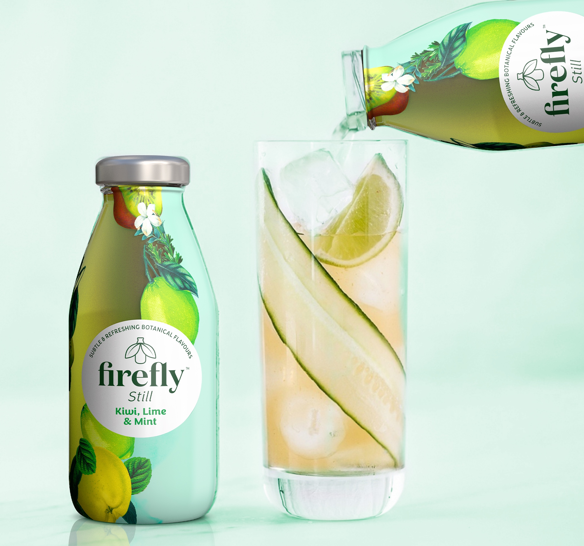
This was further touched upon by introducing a part transparent substrate which shows the still drink and aids a natural, honest brand image.
“These are technical, design details perhaps, but ones that can make all the difference to consumer recall – and sales.” – Alex Durbridge, Creative Director, Family (and friends)
Family and friends have also been adapting the brand’s off-pack look and feel for use in social media and trade stands, using distinctive, toned-down botanical iconography.
And in subsequent consumer research, 87% of consumers agreed that now seeing the drink makes them more likely to purchase firefly going forward.
“Firefly has been gaining real momentum over the last few years and we are excited to elevate the brand further with this new design refresh that ensures that the subtle elegance and unique still and complex flavours are really coming through in its design.” – Sarah McIntyre, Brand Manager, Firefly drinks
The new Firefly design rolls out mid-May 2023 across retailers, including Waitrose & Whole Foods.
Research Sources: Bobs your uncle consumer research July 2021 , Tryit consumer research 2021 , Savanta customer research, 2022
CREDIT
- Agency/Creative: Family (and friends)
- Article Title: Refreshing and Natural Packaging Design for Firefly Soft Drinks
- Organisation/Entity: Agency
- Project Type: Packaging
- Project Status: Published
- Agency/Creative Country: United Kingdom
- Agency/Creative City: London
- Market Region: Europe
- Project Deliverables: Brand Identity, Brand Refinement, Packaging Design
- Format: Bottle
- Substrate: Glass Bottle
- Industry: Food/Beverage
- Keywords: Fruit Juice, Botanicals, Natural, Refreshing, Drink, Beverage
-
Credits:
Strategy Director: DJ Johnston
Creative Director: Alex Durbridge


