


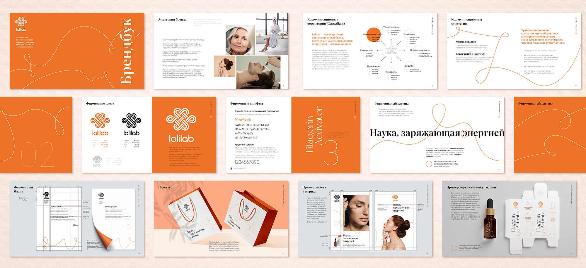
Lolilab is a professional cosmetic created by the ideologists of the scientific approach to cosmetology. In 2022 the client’s team decided to relaunch the brand and expand distribution. We did research, compiled a brand-platform, and updated the identity.
Lolilab — Re-Energize Science
The brand identity is based on strong RTB: fundamental research and development, the skill of biochemists, and innovative processes that keep components active while scaling up production. The functional advantage of the brand is based on this: Lolilab effectively solves aesthetic problems, providing care at a professional level.
The brand translates that youthfulness — is a feeling unrelated to age. Offering professional skin care, Lolilab helps to improve the quality of life and prolong its active period, gives more opportunities to feel young. That’s why the essence of the brand is — Re-Energize Science.
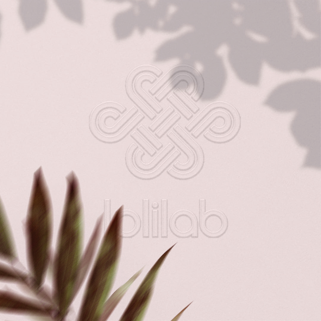
Knot of Youth and Lifeline
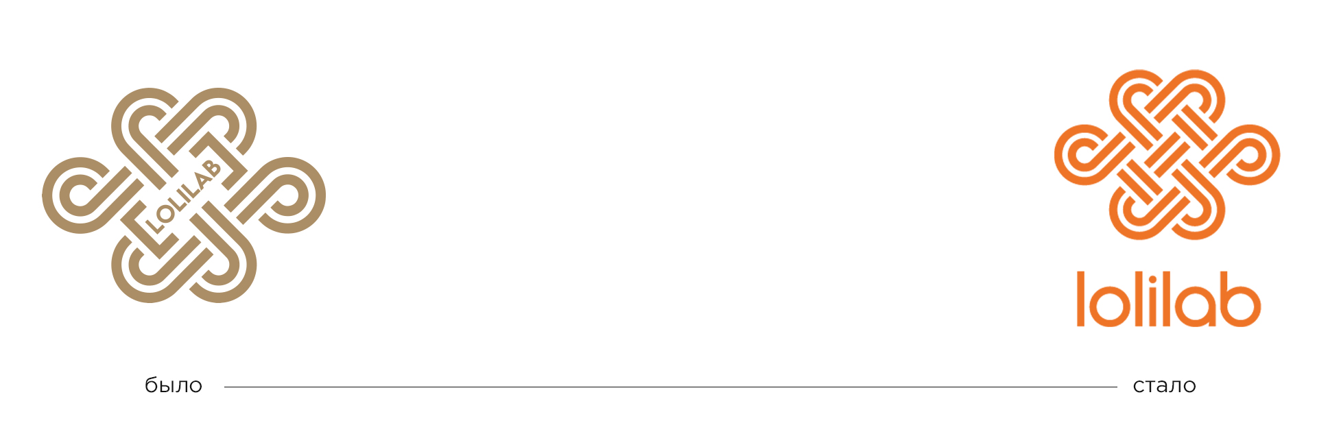
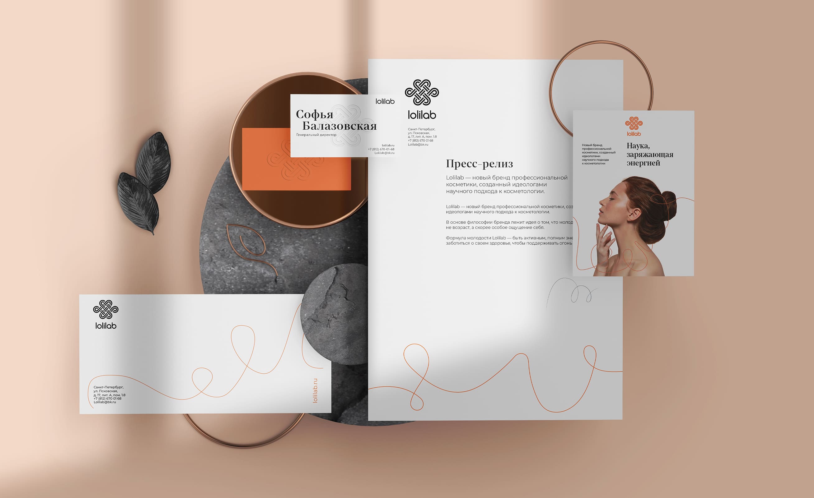
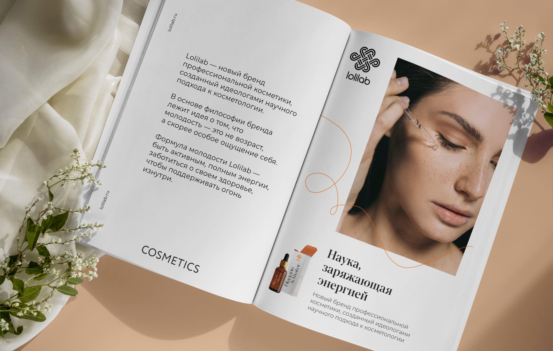
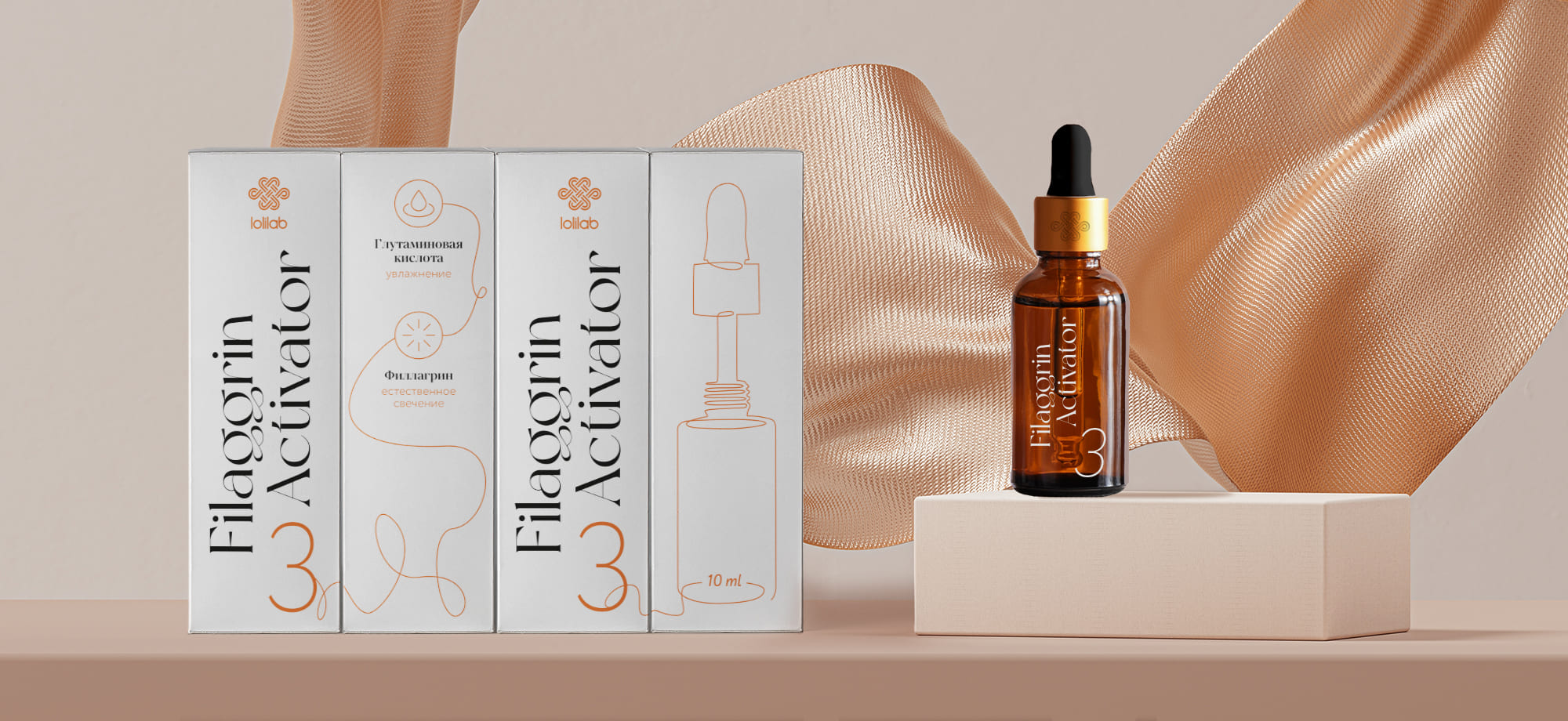
The knot of eternal life, youth and beauty, which is also called the symbol of longevity – we left it unchanged, because the brand team is very sensitive to it. Light updates were made to the logo block. Due to the lower-case letters and rounded font, the logo became more harmonious to the sign, more scientific and open in character.
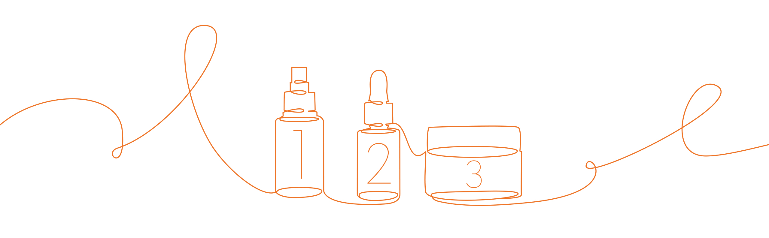
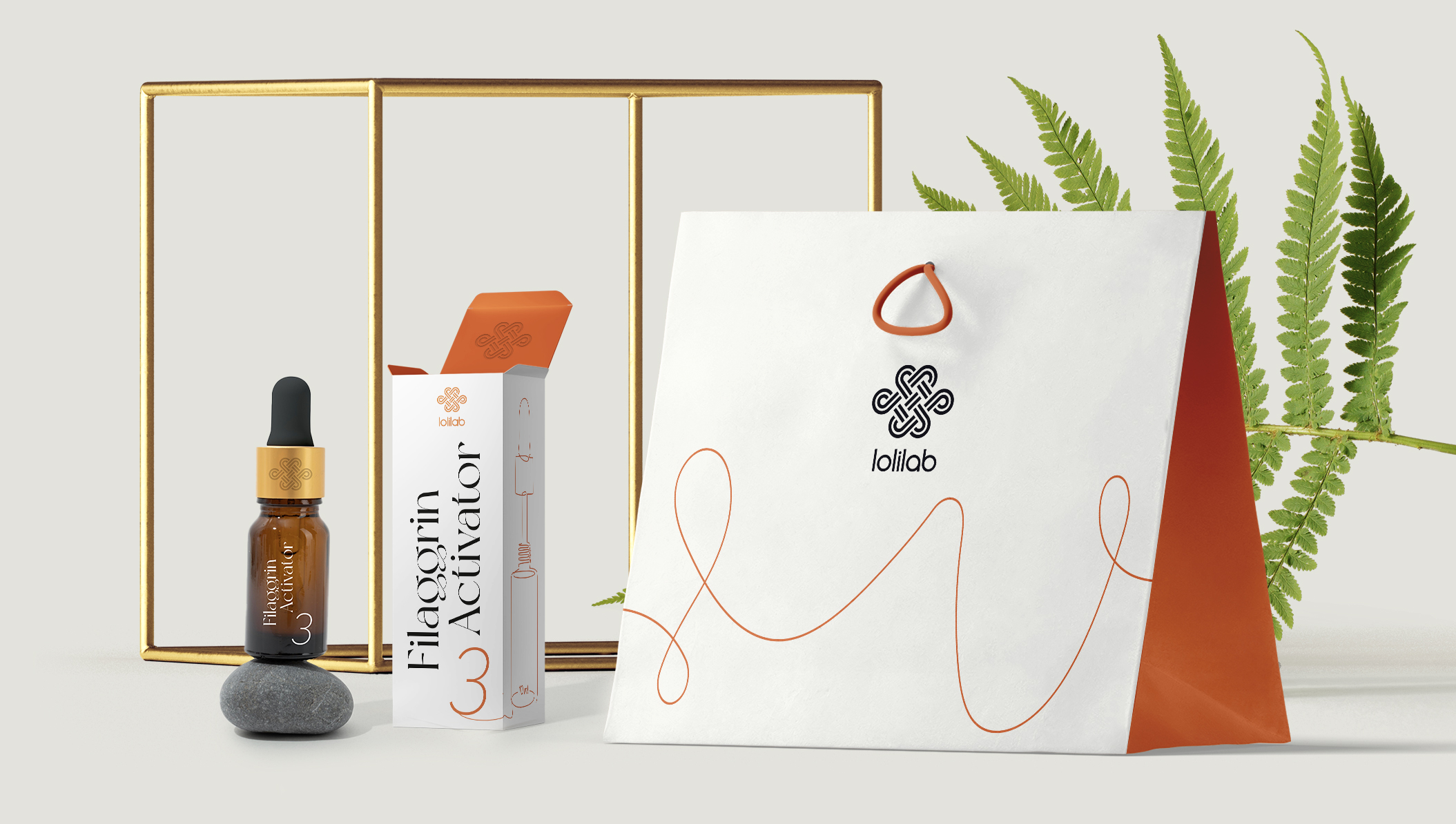
The key element of the identity — the lifeline, made as if by hand — reflects the energetic character of the brand. It behaves differently depending on the media and tasks: somewhere it just creates a mood, somewhere it plays an informational function, forming specific images.
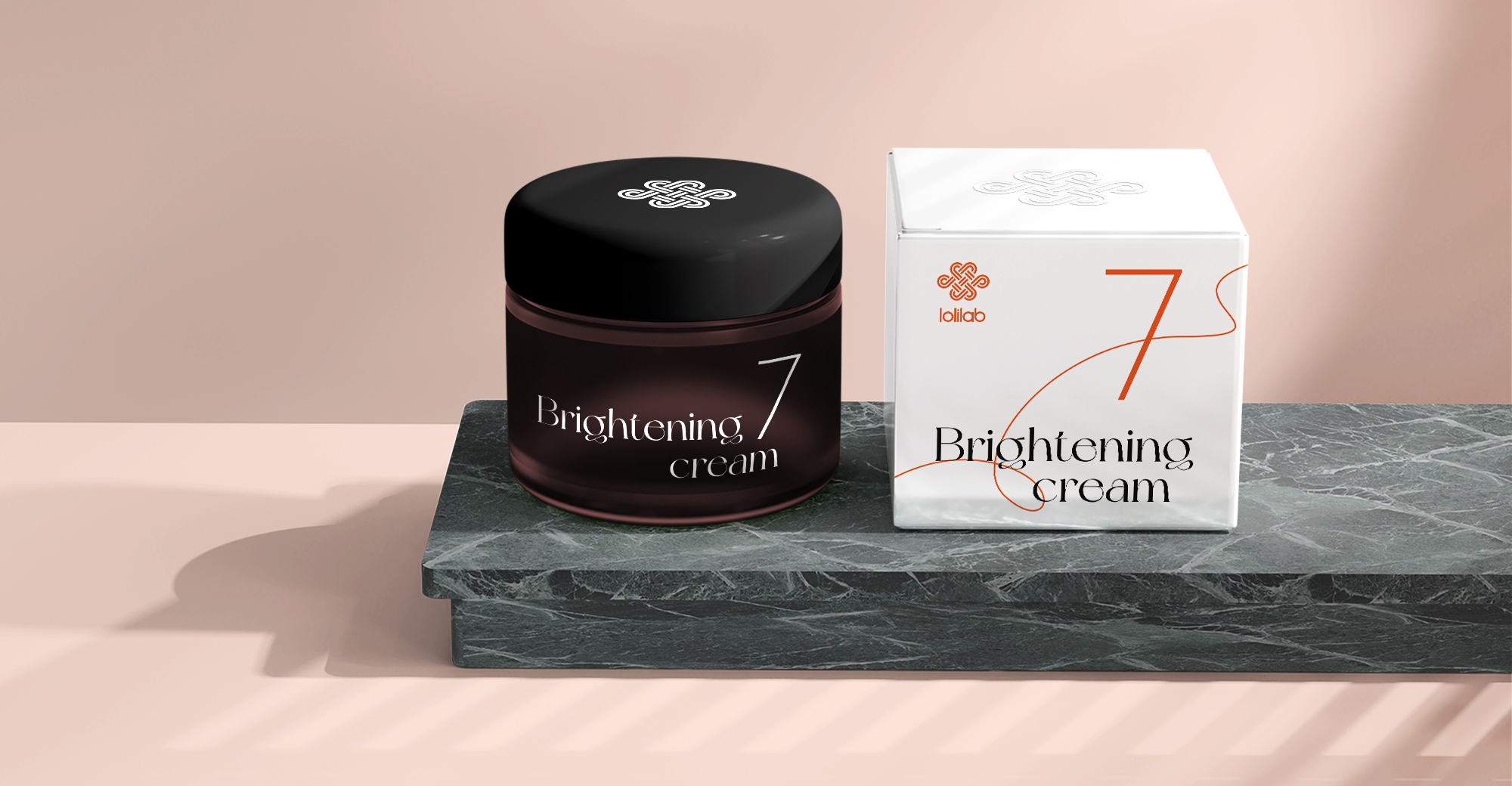
The brand’s orange color is inspired by the iconic French brand Hermès. A complementary color, gray, is used for additional graphics. The “white outside, bright orange inside” technique enhances the sense of contrast and reflects the message that youth — is an internal feeling.
The identity of the Lolilab is built on dualism: on the one hand strict science and intellectual background, on the other — bright energy and free character. We conveyed this connection through visual contrasts: different fonts, white and rich orange colors, smooth and textured surfaces. The corporate identity reflects the essence of the brand and looks convincing to a demanding audience, creating the right sense of balance of premium and scientific.

CREDIT
- Agency/Creative: DEZA
- Article Title: Refresh of Lolilab Сosmetics Brand by Studio Deza
- Organisation/Entity: Agency
- Project Type: Identity
- Project Status: Published
- Agency/Creative Country: Russia
- Agency/Creative City: Saint-Petersburg
- Market Region: Europe
- Project Deliverables: Brand Architecture, Brand Design, Brand Guidelines, Brand Identity, Brand Redesign, Brand Strategy, Identity System
- Industry: Health Care
- Keywords: Branding Identity Beauty Graphic Logotype Brand Architecture Strategy
-
Credits:
Art Director: Irina Schmidt
Strategist: Irina Mokrousova
Designer: Tatyana Savchuk
Project Manager: Marina Andreeva


