


Federation – Ömür Printing House Branding
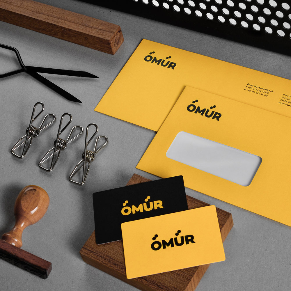
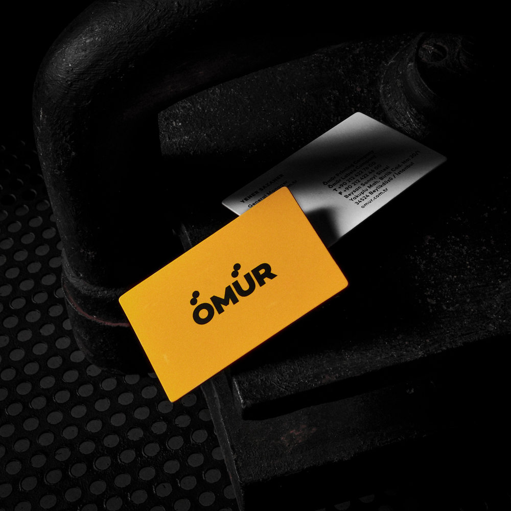
“First of all, while designing the logo, we wanted to stay within the boundaries of typography and create a strong logotype. Yet, we wanted to add an idea that relates the solid and bold use of typography with the basics of printing industry. Thus, we transformed the dots above Ö and Ü to symbolise rolling presses and created a strong link with the printing industry. While designing the identitiy, we chose solid and strong colors and wanted to create a contrast among yellow and black. Since the printing company is one of the oldest and biggest printing houses in İstanbul, we wanted the identity to be simple, confident, bold and strong.”
CREDIT
- Agency/Creative: Federation
- Article Title: Refined Corporate Identity Redesign for One of the Oldest Printing Companies in İstanbul
- Organisation/Entity: Agency Commercial / Published
- Project Type: Packaging
- Agency/Creative Country: Turkey
- Market Region: Europe
FEEDBACK
Relevance: Solution/idea in relation to brand, product or service
Implementation: Attention, detailing and finishing of final solution
Presentation: Text, visualisation and quality of the presentation


